Friday, 24 May 2019

Faber Castell Polychromos pencils full range

I posted the full range of Faber Castell Albrecht Dürer pencils here. The beautiful Polychromos pencils are the same colours with the same colour numbers but I thought I'd add this photo as a quick comparison.


Faber Castell Polychomos pencils full range.


I like to use the Polychromos pencils as a coloured resist, with either watercolour pencils or watercolour over the top. 

In this study you can see the veins on the petals were drawn in the Polychromos. All the washes were created using the Albrecht Dürer pencils as watercolour.

Faber Castell demonstration piece using Polychromos pencils as a resist and Albrecht Dürer watercolour pencils to paint. 

Happy painting and drawing!

Tuesday, 21 May 2019

Aquarius palette

Aquarius Watercolours by Romaa Szmal with their hand-painted labels.


Roman Szmal created a new watercolour range that was launched this year. I have painted out the samples he sent and posted them all here.

Roman Szmal wooden 36 colour palette.


He then sent a lovely wooden palette box with space for 36 colours and wondered which I would use to fill it. I thought this lovely palette justified a new post.


It was quite a challenge choosing actually. My largest palettes are 24 colours so adding 12 more meant I had a huge number of variations of each colour. I don't usually have a cool, medium and warm yellow as well as a quinacridone gold. I included two oranges - both gorgeous, and two turquoises and purples. There are seven blues, seven greens and a massive eight earths colours.

My choices for the 36 colour palette.


Here is the printout of my chosen palette. Far more colours than I need but lots of fun. The mixed greens have quite a few pigments but are really lovely and realistic with interesting granulation. The earths are glowing. Many use variations of PR102 and are interesting and rare earth colours.

Aquarius Watercolours - my 36 colour palette


Some of the paints are quite soft, others firmer. They are designed to rewet easily and do lift from the palette very nicely. I look forward to exploring them further.

Aquarius watercolours by Roman Szmal - 12 colour set.

Artur Przybysz's Master Set
A set of 12 colours was released in a palette, shown left. It contains two yellows, two reds and two blues as well as the lovely Natural Sienna Light that I've chosen above, and a PR102 Red Ochre that is a very lovely burnt sienna option. It also has a neutral purple colour called Przybysz' Grey, which is as close as he has to a mixed grey. This was inspired by the Polish artist who helped a lot in the development of these colours.


I've listed the stockists of these paints on my full range post here. Here is an (affiliate) link to Jacksons in the UK. They ship world wide.


Happy painting!

Sunday, 19 May 2019

Renesans Gouache

I was sent a set of 12 Renesans gouache tubes to try. These come from Poland, and Renesans make an additional three different ranges of watercolours that I have written about here.

There are 26 colours in this range - a smaller number than in most watercolour ranges but that makes sense. I use a much smaller range of colours in gouache than I do in watercolour as I consider gouache to be an opaque medium so I am not looking for transparent or granulating colours.


It's a workable basic set, though I'd switch in a cool red and a cool blue rather than the Cobalt Blue and the four pigment Burnt Umber. I think I'd also use a Raw Sienna more than Flesh Tint. Many of the colours have a slightly chalky look to them. I assume chalk has been added, as is traditional for gouache, but I may be wrong.

The full range can be seen here and below.


Renesans Gouache - Titanium White, Chrome Yellow Deep, Scarlet Vermilion (Hue), Cobalt Blue.

Renesans Gouache - Ultramarine, Bright Green, Emerald Green (Hue), Yellow Ochre.

I would rather see a single pigment Burnt Sienna and Burnt Umber but they are not opaque pigments...
Renesans Gouache - Burnt Sienna, Burnt Umber, Ivory Black, Flesh Tint.

Update
Renesans sent me the missing colours so here is the full range. I have either scanned or photographed these ones, to try to get the best colour match. I'll leave the set information above as it may be useful.


Renesans Gouache - Titanium Whiite, Chrome Yellow Light, Chrome Yellow Deep, Chrome Yellow Orange, Flesh Tint.

The colours of this set are close to correct, but the scarlet Vermilion Hue looks a little more accurate in the photo above. Alizarine Lake is actually slightly less purple.
Renesans Gouache - Scarlet Vermilion (Hue), Carmine, Alizarine Lake, Magenta, Cyan.

These colours have reproduced much better.
Renesans Gouache - Turquoise, Cobalt Blue, Ultramarine, Prussian Blue, Violet Lake.

Renesans Gouache - Bright Green, Emerald Green, Sap Green, Yellow Ochre, Raw Sienna,

The English Red is not quite as crimson as it looks here - it is more like a Quinacridone burnt Scarlet in hue. The others are fairly accurate.
Renesans Gouache - 

I am gradually adding Gouache samples - use the search button to find other posts.

Happy Painting.

Tuesday, 7 May 2019

ShinHan PASS hybrid watercolour-gouache

ShinHan is a Korean company. I posted a blog about their watercolours here.

I was also sent a set of 6 ShinHan PASS hybrid watercolour/gouache last year and didn't get past painting out some swatches using the fresh paint. The colours were vibrant and strong with various levels of transparency, but at that stage I didn't have a chance to experiment further.

ShinHan Pass Colour set of 6.


ShinHan sent out some sample boxes and on Saturday, the Sydney Urban Sketchers had the chance to play with the full range of 48 colours. 

They are quite a mix, as the set contains some excellent pigments, some fluoro colours, some fugitive pigments and a big range of transparent to opaque paints. They are designed to be able to 'pass' from transparent watercolour through to thicker gouache applications seamlessly.


ShinHan PASS colour - set of 48.

ShinHan PASS colour drying in full pans.
They are not necessarily produced to be used dried, but as a travel/urban sketcher, it's always something I like to be able to do - set up a palette and take them with me. Since I usually work with dried paint, I find it more easy to control that way. However for those who like using acrylics or fresh paint, using them fresh from the tube would be more familiar.


I painted out the full range and include them here in the order they are shown in the colour chart. The pigment and lightfast information is taken from the same chart.
S = series, where A is the least expensive and E is the most expensive.
The empty square = transparent
Diagonal through the square is semi transparent
Half filled square is semi opaque
Black square is opaque.
The stars relate to the lightfast rating where **** is the highest lightfast and * is the lowest. There are  a number of colours with a rating of * and ** that would not be suitable for framed work but could be used in a sketchbook, where they are protected from light. Very few have been given the highest **** rating.

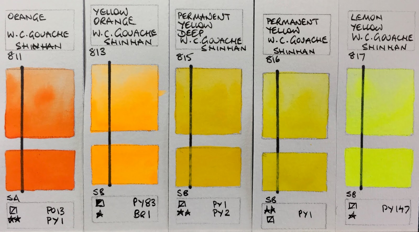
I noticed that the black line that I drew to compare opacity didn't always match the product information, however it should help to see how transparent they are painted very diluted and then in a creaming wash. The swatches are fairly close to original colours.


These reds are fairly close to the original swatches with the Bright Red being really vibrant. Permanent Red was included in my set of 6 though if you were looking for a primary red the Carmine would be a cleaner mixing option. (note - I've not seen PR17 before nor researched its lightfast rating). The Vermilion Hue is a gorgeous orange but only suitable for a sketchbook or reproduction work. I found the paint easier to control in the dried state and the transitions between using it as a watercolour and using it thicker as a gouache were easier to control.

ShinHan PASS hybrid watercolour gouache - Alizarin Crimson, Carmine, Permanent Red, Bright Red, Vermilion Hue.

The brightness of the Yellow Orange and Lemon Yellow really shows up in these photos. Once again the orange is very pretty but the pigments are all going to fade if exposed to light. The Permanent Yellow was in the set of 6 and is a good choice (hue wise) as a primary yellow.

ShinHan PASS hybrid watercolour gouache - Orange, Yellow Orange, Permanent Yellow Deep, Permanent Yellow,
Lemon Yellow

I like the realistic mixed greens (pigments aside).

ShinHan PASS hybrid watercolour gouache - June Brilliant, Linden Green, Light Green, Greenish Yellow,
Olive Green.

These green swatches are quite close to the greens I like to include in my watercolour palettes - especially the Sap, Viridian Hue (as a mixing green) and Shadow Green.

ShinHan PASS hybrid watercolour gouache - Cobalt Green, Sap Green, Hooker's Green, Viridian Hue, Shadow Green.

The lightfast ratings of these blues is lower than I would have expected with these pigments. Cerulean Blue Hue was is the set of 6 and once again was easier to control in the dried form.

ShinHan PASS hybrid watercolour gouache - Compose Blue, Blue Grey, Peacock Blue, Cerulean Blue Hue, Cobalt Blue.

It's hard to beat Ultramarine as a warm mixing blues and the granulation is lovely in a wash. Permanent Violet was in the set of 6.

ShinHan PASS hybrid watercolour gouache - Ultramarine Blue Deep, Prussian Blue, Indigo, Permanent Violet, Helioprope.

There are some colours that I just have no interest in - flouro pigments and tints being right up there - but they are pretty and the added white pigment of course makes them more opaque.

ShinHan PASS hybrid watercolour gouache - Blue Celeste, Red Violet, Lilac, Opera, Brilliant Pink.

I like the yellow ochre - it's one of the most useful gouache colours I find. The Raw Umber is listed as PR101 which is most unusual. It comes in many forms but I've never seen it in this hue before. The Light Red is really vibrant.

ShinHan PASS hybrid watercolour gouache - Shell Pink, Pink, Yellow Ochre, Raw Umber, Light Red.

Burnt Sienna was in the set of 6 and once again was easier to control in dried form. I really like the PBr25 pigment - a rich reddish brown.

ShinHan PASS hybrid watercolour gouache - Burnt Sienna, Red Brown, Burnt Umber, Vandyke Brown, Sepia.

Finally Black, Grey and White. These were not as completely opaque as they are listed but would cover a line if a couple of coats were used.

ShinHan PASS hybrid watercolour gouache - Black, Grey,
White
I have set up a palette of 12 colours that I think will work nicely for urban sketching (in a sketchbook) including 5 of the original 6-colour set - White, Permanent Yellow, Permanent Red (though Carmine would be more versatile), Cobalt Blue Hue (though French Ultramarine Deep would be more versatile), Cerulean Blue Hue, Sap Green, Yellow Ochre, Burnt Sienna, Light Red, Vandyke Brown and Black. With Gouache palettes I break all my rules and include black and white! I'll have a play with them and add more comments in time.

Happy painting!

Thursday, 4 April 2019

Derwent Pencils from childhood


I have always loved colour, so it is no surprise that all I wanted as a child was coloured pencils, markers, pens, paint and other art and stationary materials. This set of 72 Derwent Pencils was my pride and joy at the age of about 7. I use water-soluble pencils much more often these days, so have created a couple of blog posts about those, but as it was National Pencil Day in the US last week, I thought I'd share these old friends. They have travelled with me to over a dozen different housesin three countries over the years yet here they all are - all 72. They don't have any fancy colour names, just numbers, 1 - 72.

Derwent coloured pencils from the 1970s.
 I like the colours of the Derwent (and Faber Castell) pencils as they are very realistic and usable, with a good range of earth browns and interesting greens.
Derwent coloured pencils from the 1970s drawn out.
Happy drawing :-)

Wednesday, 3 April 2019

CARAN d'ACHE Museum Pencils

Caran d'Ache is a Swiss company that has been making a wonderful range of writing and drawing products since 1915. "Caran d'Ache comes from the word "karandash" that is the Russian term for "pencil" and in turn comes from the Turkish root "kara tash" which refers to black stone - the origins of Graphite" (https://www.carandache.com/en/maison/history-and-origin)

They make a range of products for the home as well.

I bought this intriguing set a number of years ago as it looked like a very portable way to carry a number of watercolour pencils. I put the leads into an old cigar package. What I particularly liked was that the pigment information was given - very rare - and the lightfast ratings are excellent. They re-wet well and can easily be used to paint with.

While I believe this set has been discontinued, the new range of traditional wooden watercolour pencils (see here) are probably made using similar pigments though the range of colours is now 80. I haven't tested the new range but they look gorgeous!

Caran d'Ache Museum Watercolour Pencils - Lemon Yellow, Golden Cadmium Yellow (Hue), Orange,
Light Cadmium Red (Hue), Scarlet.
Caran d'Ache Museum Watercolour Pencils - Purplish Red, Violet, Dark Ultramarine, Permanent Blue,
Turquoise Blue.

Caran d'Ache Museum Watercolour Pencils - Phthalocyanine Green, Bright Green, Light Olive,
Yellow Ochre, Brown.


Caran d'Ache Museum Watercolour Pencils - Genuine Umber, Payne's Grey, Black, B graphite, 3B Graphite.

Thursday, 28 March 2019

A fun collaboration

I met Maria of Expeditionary Art when I visited Seattle in 2015, after a few years of chatting online.

She is an avid sketcher and had created a lovely Pocket Palette - a tiny credit card sized palette - that really looked useful for those of us trying to keep our travel kits small and portable. the little metal pans and mini pans are held in place by a magnet so are interchangeable. She also created some really well made Art Tool Kits to hold the palettes and sketching tools. She's made additions and improvements over the years, including and adding more pan sizes, and we've kept in touch and met up again to sketch in 2017.

I'm delighted that she's launching a limited edition (please note - this is no longer available, but you can make it up for yourself!) of the Pocket Palette filled with my Ultimate Mixing Palette of Daniel Smith watercolours - all 15 of them, including the new Jane's Grey. This range is designed to be able to mix any colour, usually using only two colours, no matter what subject you wish to paint.

I created a reference book to go with this set of colours to show how versatile they are, which I self-published through Blurb.com. 

The Pocket Palette filled with The Ultimate Mixing Set of Daniel Smith watercolours - a perfect combination :-)


Here's the link to Maria's blog and store. Here is the link to the Premium Matt version of my book. It is also available in standard paper here, or as a PDF

Happy sketching :-)