Showing posts with label green apatite genuine. Show all posts

Sunday, 23 August 2015

Colour mixing with a single pigment green

I recently wrote a post about mixing with Phthalo Green BS - a basic palette colour for me and one of my recommended Ultimate Mixing Palette colours. 

I love the strength of this pigment, but I thought I would add some other wheels I have done showing this pigment as well as some of the alternative single pigment greens, and demonstrating how they mix with some basic colours.


Here is another colour wheel created using Phthalo Green while I was exploring different palette colours to find the most useful basic set. Here I was experimenting with Transparent Red Oxide as a burnt sienna option, and with lovely DS Permanent Alizarin though I later switched to the very similar but single pigment Pyrrol Crimson as my crimson choice. I also decided on Quinacridone Rose rather than a magenta or violet.
Phthalo Green in a colour wheel, mixed with a range of palette colours. Moleskine watercolour sketchbook A5

Green Apatite Genuine is a little like the two great Daniel Smith convenience mixes Sap Green and Undersea Green - a remarkable paint. This is another colour I love as an 'extra' for when I want a more granulating effect in a painting or sketch.
Green Apatite Genuine Daniel Smith Primatek watercolour mixed with other possible palette colours.
Moleskine watercolour sketchbook A5

Below is wheel showing the Daniel Smith primatek watercolour Jadeite Genuine. It is a gorgeous granulating green that is similar in mixes to the phthalo green, though with granulation. In masstone it can be very dark, rather like a Perylene green. In this chart I was exploring mixes with a custom mixed Quinacridone Magenta that I made by mixing DS Quinacridone Rose with  DS Quinacridone Violet, both PV19. I was also exploring the very granulating Transparent Red Oxide as a burnt sienna option. I love Transparent Red Oxide and use it a lot in my paintings but it is an 'extra' as there are many times when I want the more sedately behaved Burnt Sienna (see that in mixes here.) Mixed with a crimson, in this case Permanent Alizarin, Jadeite will also create a rich black. I love the granulating turquoise hues Jadeite makes with Cerulean and Ultramarine.

Jadeite Genuine mixed with other possible palette colours. Moleskine watercolour sketchbook A5

Viridian is a much softer, granulating and less staining alternative to Phthalo Green BS. Made with PG18, here is Da Vinci Viridian mixed with a number of other possible palette colours. Once again I was exploring the granulating Transparent Red Oxide with the granulating Viridian.
Viridian, Da Vinci watercolour, mixed with a number of possible palette colours. Moleskine watercolour sketchbook.

I have created many charts and wheels in my colour explorations. You can see more here and by searching Sketchbook Pages in my Blog.

Sunday, 29 December 2013

Watercolour Comparisons 5 - Greens

While there are many artists who do not have a green in their palette, I am not one of them! I paint too many botanicals to keep away from greens.

Here I will cover a range of single pigment greens, convenience green mixtures and wonderful special effect greens. You can also see them all, and more, on my website here. You can also see a long paintout of 12 of the most interesting on YouTube here

Single Pigment Greens

There are many single pigment greens. Some are transparent and/or staining. Others are granulating. The advantage of using single pigment greens is that you don't have a multitude of pigments in the mix if you then mix them with other colours.

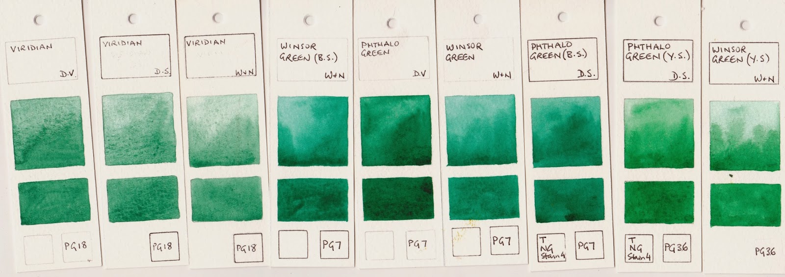
Below are 3 examples of Viridian on the left. I prefer the DaVinci or W&N. The Daniel Smith version is a disappointment and doesn't rewet well - best used fresh or add some glycerin to the paint well and stir if setting up in a palette. Viridian is a softer, granulating and liftable version of Phthalo Green. It is lovely for florals but doesn't have the power of phthalo green PG7, which is a very staining pigment. 

Phthalo Green Yellow Shade is a more neutral green. Made with PG36 it is very popular but not a colour I choose to use. None of these greens is really useful alone - they are generally best mixed with a yellow or a yellow ochre/earth to create realistic greens. (For more on mixing greens see my website here.)

Single Pigment Greens - Viridian PB18 by Da Vinci, Daniel Smith and Winsor & Newton;
Phthalo Green (Blue Shade) PG7 by W&N, Da Vinci, W&N and Daniel Smith;
Phthalo Green (Yellow Shade) by Daniel Smith and Winsor and Newton.


Below are a number of other single pigment greens. Some are useful alone, some are wonderful in mixes. I particularly like Perylene Green PBk31 for deep passages in florals or landscapes, Green Gold PY129 for florals, Green Apatite Genuine for wonderful granulation in landscapes and Jadeite for landscapes and as an alternative to phthalo green BS.

Top from left: Rare Green Earth DS, Perylene Green DS, Perylene Green W&N, Cobalt Green DS,
Verona Green Earth Liquitex, Green Gold OH, Green Gold DR, 
Green Gold W&N and Rick Green Gold DS .
Bottom from left: Ziosite Genuine DS, Malachite Genuine DS, Bohemian Green Earth DS, Jadeite Genuine DS,
Diopside Genuine DS, Green Apatite Genuine DS, Serpentine Genuine DS, Oxide of Chromium W&N and
Chromium Green Oxide DS.

Mixtures

Green mixtures may include two, three or even four pigments. These may well misbehave if mixed with other colours - it just gets to be too many pigments - but they can be popular and convenient.

Top from left: Sap Green Lake OH, Permanent Green DS, Permanent Green Pale MG, Spring Green DS,
Permanent Green Light DS, Phthalo Yellow Green DS, Green Gold DS, Leaf Green Holbein
Bottom from left: Olive Green W&N, Olive Green DS ( PB29+PY97+PBr7), Sap Green Deep DS,
Cadmium Green Light OH, Undersea Green DS, Hooker's Green DS, Sap Green AS, Hookers Green W&N.

From left: Prussian Green DS, Sap Green DV, Terre Verte Hue DR, Hooker's Green Light Lake OH,
Australian Leaf Green Dark AS, Cascade Green DS, Terre Verte DS, Permanent Sap Green W&N

So why include greens in a palette? They are easy to mix, but that takes additional time and space in your mixing palette. You could mix your own from tube colours and have your favourites ready to go, or buy one that you like, or just mix as you need them. As a painter of botanical themes I like to have some premixed but realistic greens so my leaves all look as though they belong to the same plant when I paint them and I am not constantly mixing more and more of the same colour.

How else are they useful?

If you only have one green in your palette, make it phthalo green BS (or Jadeite if you want a granulating alternative). This will neutralise your crimson to make deep shadow and aubergine tones and can be neutralised with crimson to make deep Prussian green and Perylene green hues. It will mix with a warm yellow or and earth yellow to make a nice version of sap green. It will mix with phthalo blue or ultramarine to make turquoise. It will mix with a cool yellow to make very bright greens, should you want them.

If you have two greens, make one warm and one cool so add a yellow-green such as green gold (PY129) or Sap Green or even the gorgeous granulating Green Apatite Genuine for some lovely effects in your painting. Another interesting option that I use a lot in Australia is Undersea Green by Daniel Smith - Ultramarine and Quinacridone Gold. This dark olive green is perfect for so many of the dull greens of Australia, especially gum leaves.

I have 4 or 5 greens in my 24 colour plein air palette, which is a lot - Phthalo green BS, Undersea Green (convenience mixture), Sap Green (convenience mixture), Perylene Green and sometimes Rich Green Gold PY129. (All Daniel Smith, though for the single pigment colours other brands would do.)

I also have Jadeite, Green Apatite Genuine, Ziosite Genuine and Serpentine Genuine and in an extra's palette for granulation  These first two are also wonderful in a limited palette for their multiple uses - Jadeite washes down to a very soft green or makes a deep green comparable with Perylene green. As a 'blue' green it also doubles for phthalo green as stated above and neutralises a crimson. Green apatite genuine is equally versatile - a green gold really watered down, a sap green in a medium wash but in mass-tone it is a wonderful deep olive green with amazing granulation. So why not just use these two for everything? Sometimes I don't want the granulation, simple as that. But in a limited palette of 12 or even 16 they are wonderful.

Enjoy your greens!

Watercolour Comparisons 1 - Ultramarine Blue here
Watercolour Comparisons 2 - mid yellows here
Watercolour Comparisons 3 - Primary Red here
Watercolour Comparisons 4 - Burnt Sienna here
Watercolour Comparisons 5 - Greens (Single Pigment, convenience mixes and special effect) here
Watercolour Comparisons 6 - Reds (Cool, mid and warm) here
Watercolour Comparisons 7 - Yellows (cool mid and warm) here
Watercolour Comparisons 8 - Blues here
Mixing with Phthalo Green here
Mixing with single pigment greens here


Sunday, 2 June 2013

Boyd's Rocks - theme and variations

I went to Bundanon in 2011and painted a sketch of the rocks on the Shoalhaven River that Arthur Boyd painted over and over in so many ways. I had no desire to copy his style or techniques, especially since he was painting in oils where I am using watercolour, but have ended up creating a few large landscapes based on them.
Plein air sketch of Boyd's 'Rock Quartet', 2011.
It was incredibly peaceful sitting on the edge of the river. The water really was a deep gold as it reached the beach below me. Perfect colour - quinacridone gold.

The cliff behind was rather interesting, but I also loved the strong shadows against the light coloured rocks. I used Buff Titanium and bistre for them.
'Boyd's Rock Quartet, Shoalhaven River' 2012

I wanted to focus on the wonderful colour of the sky and the water in this painting. Australian skies are so often a lovely deep warm blue.


'Boyd's Rock Quartet II'  2012
In this one I wanted to really focus on the rocks and the line-work of the cliff. I had fun with a dagger brush for the linework. I really enjoyed using the granulating primate colours by Daniel Smith - Green Apatite Genuine and Serpentine Genuine. They are a whole range of colours in one. I have no problem mixing greens but I can't mix to create this level of granulation!

I did another of these - almost the same - as this one sold before I could exhibit it. And I tried it in acrylic too. I love painting rocks.