Showing posts with label The Ultimate Mixing Palette: a World of Colours. Show all posts

Thursday, 28 March 2019

A fun collaboration

I met Maria of Expeditionary Art when I visited Seattle in 2015, after a few years of chatting online.

She is an avid sketcher and had created a lovely Pocket Palette - a tiny credit card sized palette - that really looked useful for those of us trying to keep our travel kits small and portable. the little metal pans and mini pans are held in place by a magnet so are interchangeable. She also created some really well made Art Tool Kits to hold the palettes and sketching tools. She's made additions and improvements over the years, including and adding more pan sizes, and we've kept in touch and met up again to sketch in 2017.

I'm delighted that she's launching a limited edition (please note - this is no longer available, but you can make it up for yourself!) of the Pocket Palette filled with my Ultimate Mixing Palette of Daniel Smith watercolours - all 15 of them, including the new Jane's Grey. This range is designed to be able to mix any colour, usually using only two colours, no matter what subject you wish to paint.

I created a reference book to go with this set of colours to show how versatile they are, which I self-published through Blurb.com. 

The Pocket Palette filled with The Ultimate Mixing Set of Daniel Smith watercolours - a perfect combination :-)


Here's the link to Maria's blog and store. Here is the link to the Premium Matt version of my book. It is also available in standard paper here, or as a PDF

Happy sketching :-)

Thursday, 3 September 2015

6 - Mixing with Jane's Grey

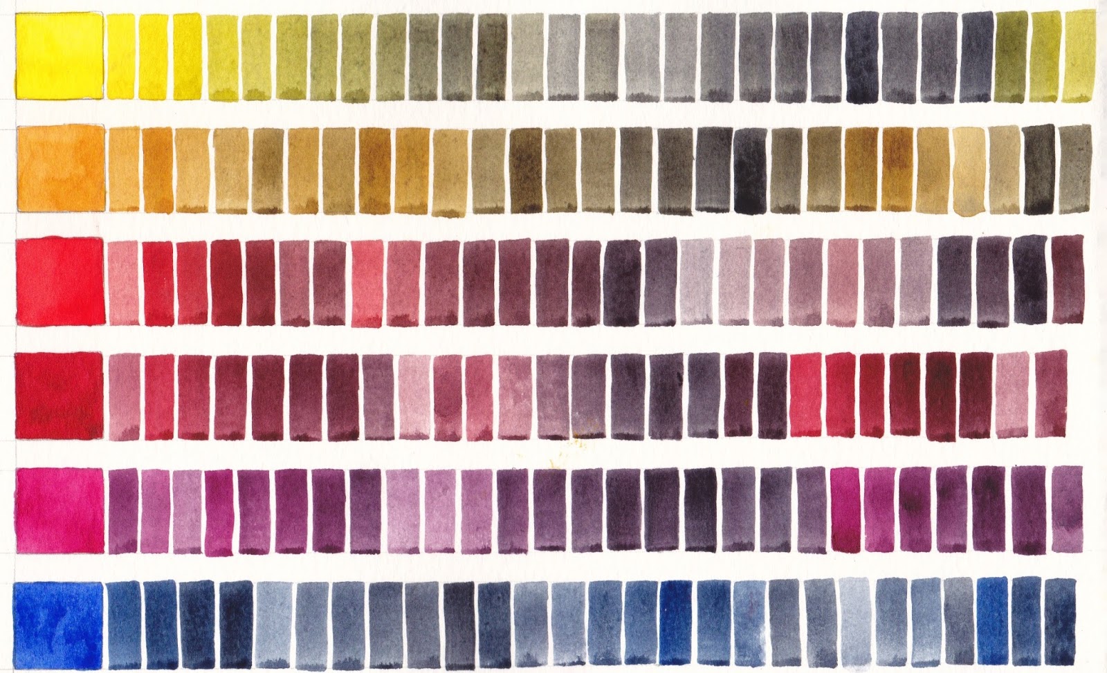
This is the 6th and final part of this series about mixing with my Ultimate Mixing Palette. These charts show 12 of the palette colours mixed with my custom mix Jane's Grey, which is made up of Ultramarine and Burnt Sienna. It acts as a neutral tint, darkening the other colours. Alone it is a lovely granulating and liftable dark grey, useful for shadows, skies and so much more.

Many artists use this combination of Ultramarine + Burnt Sienna, or perhaps Ultramarine + Burnt Umber as a basic grey and mix it each time they use it. I find having it as a premixed dark in the palette incredibly useful. Unlike commercial Payne's Grey or most Neutral Tints, it contains no black to deaden your paintings.

Jane's Grey added to Daniel Smith watercolours Hansa Yellow Medium, Quinacridone Gold, Pyrrol Scarlet, Pyrrol Crimson, Quinacridone Rose and Ultramarine, Moleskine watercolour sketchbook A5.
Jane's Grey added to Daniel Smith watercolours Cerulean Chromium, Phthalo Blue GS, Phthalo Green BS, Goethite, Burnt Sienna and Raw Umber, Moleskine watercolour sketchbook.

I make other greys while painting - Cerulean + Burnt Sienna for a dusty grey, Phthalo Blue + Burnt Sienna for a cooler grey, Pyrrol Crimson + Phthalo Green for a darker staining, non-granulating grey or black, but Jane's Grey is my go-to colour for darks as I would probably always include Burnt Sienna and Ultramarine in my paintings, so it always harmonises.

This series of 6 posts shows a fraction of the huge range of colours that can be produced with my Ultimate Mixing Palette. My book, 'The Ultimate Mixing Palette: a World of Colours' contains over 7500 different mixes, all indexed and cross-referenced. It is available as a hard or soft cover, an eBook or a PDF from Blurb.com here, along with my other comprehensive colour mixing book 'Watercolour Mixing Charts'.

Happy painting :-)

Friday, 21 August 2015

2 - Mixing with Burnt Sienna


Part 2 of a series of posts about mixing with my Ultimate Mixing Palette colours. 

Burnt Sienna comes in a huge range of hues. I have posted about many of them here and more can be seen on my website in the Painted Watercolour swatches section here

Burnt Sienna is a neutralised orange. It is a wonderful colour to have in your palette as a mixing colour. It speeds up the creation of other colours, especially grey mixes with blues, as you would otherwise have to mix a yellow and a red and then to blue to create a grey. Even in a very limited palette of a single red, yellow and blue, Burnt Sienna is an excellent 4th colour addition.

While Burnt Sienna is available in a options from a burnt orange to a burnt umber hue and is made from a range of pigments and pigment mixes, I prefer the earthy PBr7 Burnt Sienna (Daniel Smith, though Da Vinci and M.Graham are very similar in colour) as I find it useful as a convenient skin colour when washed out with lots of water as well as being a great earthy warm brown in landscape work. It is also the perfect mixing partner with Ultramarine to make my Jane's Grey - a convenient dark shadow colour that also acts as a neutral tint for the other colours, without introducing a deadening black pigment. To see some of the alternative pigments I tried, have a look here.

Here is Daniel Smith Burnt Sienna mixed with 13 of my Ultimate Mixing Palette colours. It creates yellow ochre and raw sienna hues with the yellows, burnt scarlet and brown madder hues with the reds, wonderful greys and deep blues and browns with the blues and a range of other browns with Raw Umber and Goethite. With Phthalo Green it creates lovely pine greens and with Buff titanium create flesh-tones. 


To see more mixing charts with these and many more colours see the Watercolour Mixing Charts tab on my website. These charts are also available in book or eBook form.

For the full range of colour mixes that can be created with my Ultimate Mixing Set of colours, see my book The Ultimate Mixing Palette; a World of colours. Both books are available through blurb.com as physical or eBooks here.


Thursday, 20 August 2015

1 - Mixing with Phthalo Green (Blue Shade)


Part 1 of a series I'll do on mixing with my Ultimate Mixing Palette colours. 

To see the mixing range this palette can create, you can see the various versions of my book here and look at the previews.


Phthalo Green comes in Blue Shade and Yellow Shade. The blue shade is made with PG7 and is also called Winsor Green BS, Helio Green, Blockx green and so on. Its full name is phthalocyanine green and is a reliable lightfast, staining, transparent and very powerful colour. The yellow shade is made with PG36 and is, not surprisingly, more of a yellow-green. I prefer the blue shade.

I don't use Phthalo Green alone, and suggest you very rarely would as it simply doesn't look realistic, but I find it invaluable in my palette for mixing. Add a cool or mid yellow for bright spring-greens, add a warm yellow for wonderful Sap greens. Add a crimson for the most amazing range of plum, aubergine, deep green and black hues. Add burnt sienna for pine greens. Add a blue for turquoise hues. While some of these colours could be created using Phthalo Blue + a yellow and then mixing with the third colour, most people struggle with 3-colour mixes so having a green in the palette speeds up the mixing process and simplifies it to just a 2-colour process.

Here is a chart showing how it mixes with 12 of my Ultimate Mixing Palette colours to create bright spring greens, lovely sap greens, deep shadow greens, turquoise hues, and earthy greens. With Burnt Sienna and Indian Red it creates yet more pine greens and deep greens. The biggest surprise is the purples it makes with Quinacridone Rose and of course the wonderful black it makes with its opposite, Pyrrol Crimson. All colours shown are Daniel Smith.

Daniel Smith Phthalo Green BS mixed with 12 of my Ultimate Mixing Palette colours.

If you don't like the staining, non-granulating nature of this pigment, another option is Viridian, made with PG18, as seen on the left in this Da Vinci sample. This isn't as powerful, but is liftable and granulating. It varies considerably from different manufacturers, some of whom add PG7 to the mix.                   Another interesting option is the gorgeous Daniel Smith primatek Jadeite Genuine which is similar in hue though in masstone it is a very deep granulating colour. I love the special effects that this pigment creates, though in my regular palette I like the predictability of Phthalo Green BS (Daniel Smith). To see these painted out with other palette colours, see my post here.

Friday, 13 March 2015

The Ultimate Mixing Palette: a World of Colours - updated

My next book, 'The Ultimate Mixing Palette: as World of colours', is now available on Blurb.com

This is a very different book to my first one 'Watercolour Mixing Charts'. That contains 98 charts and shows a vast range of colours but also uses a huge number of different paints. It's a fascinating study of colour mixing!

This book uses a more limited palette so it is possible to purchase the same colours and re-create the mixes. I really think it will be a most valuable reference for anyone working with watercolour. It has taken almost a year to create and is based on almost 35 years of watercolour exploration. It has over 7500 individual colour swatches - that's a lot of hues with just these fourteen pigments :-). The charts were carefully painted, then professionally photographed with a large format camera and carefully colour-matched. They look fabulous on a computer screen and the printed physical book is also very true-to-life.

You can see my previous book, Watercolour Mixing Charts, as well as the various versions of the Ultimate Palette book here. Click on any to see a preview.

It is available as an eBook or as a physical book in hardback or softcover formats in Premium Lustre paper, which is slightly thicker so my recommended paper. The softcover version is also available in standard paper.

The link to the eBook is here. This shows the first 30 pages. The eBook will work in iBooks on iPhones, iPads and Mac computers.

The Ultimate Mixing Set.


My website has more information and a tab with a list of alternate paints to the Daniel Smith ones I have used.