
I've been using Daniel Smith watercolours since 1995 - just two years after they were first produced. They started with just 18 colours, including quinacridone gold, sap green, new gamboge, yellow ochre and the raw and burnt siennas that I still love today. Over the years I managed to try pretty much every colour they have ever produced, and in 2015 and again in 2017 I went over and visited the factory, taught a number of workshops and met up with many of the wonderful Daniel Smith people. I've met up with the CEO and the Vice President frequently over the years, and have worked with the company exploring ideas and colours.
The original range expanded to a massive 252 colours, including the fascinating Primateks and also the 48 luminescent, pearlescent and interference colours that I won't include here. The following charts are arranged based on the two colour charts I have - the newest and a previous one. Colour reproduction is not bad, but not perfect.
March 2023 - the range is currently 266 colours, with some having been discontinued and new ones added. I've updating this blog post with individually colour-matched scans of each swatch. I've put them in the same order as the current colour chart.
Of course you don't need all these colours and nor have I bought them all. I've bought many of them, collected others as free samples and been sent a few by fellow artists and the Daniel Smith company. But many have been tested only from the wonderful dot cards that Daniel Smith were the first to produce.
I can talk about colours for ever, especially these ones. However I will just include a few comments here about the colours I particularly like or use or recommend a lot. The choices are vast :-)
I love Buff Titanium - think of it as an unbleached white. Lovely granulation and perfect for beaches and sandstone, snow gums and marble. There are quite a few great lemon and mid yellows to enjoy.


Daniel Smith Watercolours - Buff Titanium, Nickel Titanate Yellow, Bismuth Vandate Yellow, Hansa Yellow Light,
Azo Yellow, Cadmium Yellow Light (discontinued 2007-8)
Daniel Smith moved away from cadmiums many years ago but I've included some just for comparison with the cadmium hues. Cadmium colours are very lightfast and fun to use when a more opaque effect is needed, but I generally prefer more transparent watercolours for the yellows and reds. I particularly like Hansa Yellow Medium - a lovely mid yellow.


Daniel Smith Watercolours - Cadmium Yellow Light Hue, Cadmium Yellow Medium Hue, Aureolin (Cobalt Yellow),
Cadmium Yellow Deep (discontinued 2010), Cadmium Yellow Deep Hue (2010), Hansa Yellow Medium.
Indian Yellow has changed formulation from the original single pigment version so I have shown both.


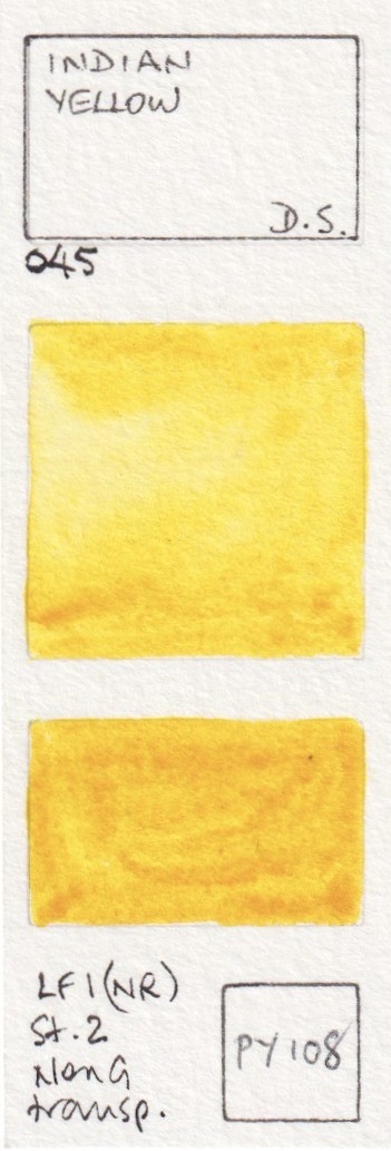


Daniel Smith Watercolours - Mayan Yellow, Lemon Yellow, Indian Yellow (discontinued),
Indian Yellow (updated version), Naples Yellow (updated version), Quinaphthalone Yellow.
Hansa Yellow Deep is another excellent single pigment warm yellow option, that works very nicely as a pair with Hansa Yellow Light or Quinaphthalone Yellow for those wanting a cool and a warm yellow. New Gamboge has also changed formula, since PY153 is not longer available. It's a shame as it's a gorgeous warm yellow pigment so grab any you happen to find if you like the original version. PY110 is very difficult to capture as a scan or a photograph - it is a rich yellow on the cusp of orange. Aussie Red Gold was added in 2017 and is a lovely bright golden orange yellow. It mixes great greens with a range of blues.


Daniel Smith Watercolours - Hansa Yellow Deep, New Gamboge (discontinued), New Gamboge (the new hue),
Isindoline Yellow, Permanent Yellow Deep, Aussie Red Gold (new 2017).
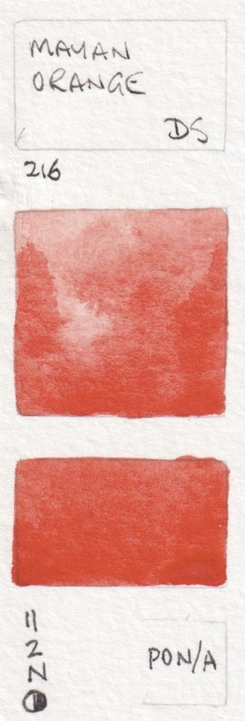
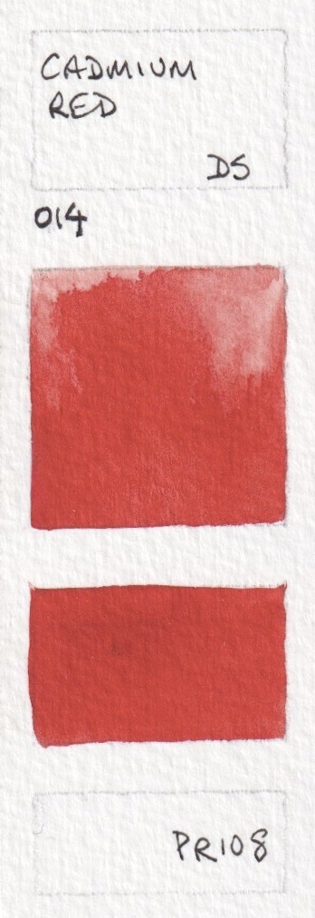
I love orange, but don't tend to have it in my palette since it is easy to mix. In spite of my efforts, it is still difficult to show oranges totally accurately, though these are close. I've included the PR108 as a comparison with the Cadmium Red Scarlet Hue.


Daniel Smith Watercolours - Pyrrol Orange, Permanent Orange, Cadmium Orange Hue, Perinone Orange, Cadmium Scarlet (discontinued 2010), Cadmium Red Scarlet Hue.


Daniel Smith Watercolours - Transparent Pyrrol Orange (old version), Transparent Pyrrol Orange, Organic Vermilion,
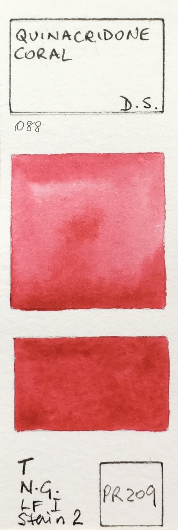
Mayan Orange, Quinacridone Coral, Pyrrol Scarlet.
There are many reds to choose from - some brighter, some more dull. While I don't have one in my palette, my choice for a mid fire-engine red would be Pyrrol Red.


Daniel Smith Watercolours - Perylene Scarlet, Anthraquinoid Scarlet, Cadmium Red (discontinued 2010),
Cadmium Red Medium Hue, Pyrrol Red, Perylene Red


Daniel Smith Watercolours - Permanent Alizarin Crimson, Permanent Red, Permanent Red Deep,
Quinacridone Red, Anthraquinoid Red, Mayan Red.


Daniel Smith Watercolours - Alizarin Crimson, Rhodonite Genuine, Carmine, Rose Madder Genuine (discontinued 2017),
Rose Madder Permanent (new 2017), Opera Pink.


Daniel Smith Watercolours - Potter's Pink, Quinacridone Pink, Quinacridone Rose, Quinacridone Lilac (new 2017),
Quinacridone Magenta, Pyrrol Crimson.
Mayan Violet was painted from a small dot and may not represent the actual qualities of this paint.


Daniel Smith Watercolours - Quinacridone Fuchsia, Mayan Violet, Bordeaux, Permanent Violet (old version),
Permanent Violet (new version), Quinacridone Violet.
I tend to mix my own purples, but there are some lovely granulating pigments that can add texture to your paintings. PV49, PV14 and PV15 are never powerful colours, but have interesting granulation. Mixing Ultramarine with PV19 creates fabulous strong and granulating purples.

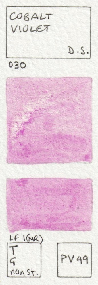


 Daniel Smith Watercolours - Perylene Violet, Cobalt Violet, Wisteria (new 2017), Cobalt Violet Deep,
Ultramarine Red, Rose of Ultramarine.
The photograph doesn't capture the beauty of the Amethyst, which, like many of the Primateks, has a touch of sparkle. It's a powerful but slightly neutralised deep purple

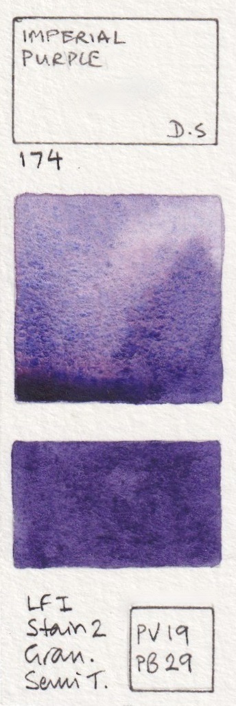


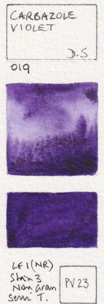
Daniel Smith Watercolours - Quinacridone Purple, Imperial Purple, Purpurite Genuine (#164), Ultramarine Violet,
Amethyst Genuine, Carbazole Violet.
I love the crazy granulation of the three-pigment Moonglow - the rose floats, the viridian speckles and the ultramarine granulates - it is rather fun to play with. Shadow Violet is similar but cooler.


Daniel Smith Watercolours - Cobalt Blue Violet, Moonglow, Shadow Violet, Sugilite Genuine,
Kyanite Genuine, Indigo


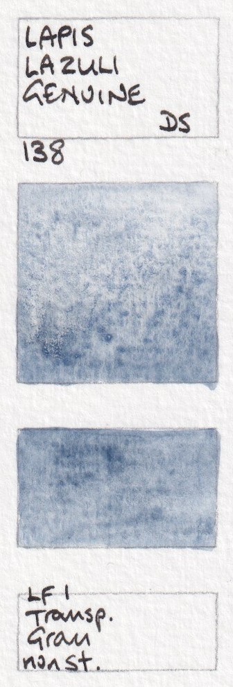


Daniel Smith Watercolours - Mayan Dark Blue, Indanthrone Blue, Sodalite Genuine, Lapis Lazuli Genuine,
French Ultramarine, Ultramarine Blue.
Cobalt blue a beautiful mid blue - neither warm nor cool. Phthalo Blue Green and Red Shades behave in a similar manner - you can see here that the Red Shade is definitely warmer. I generally suggest the Green Shade if you want it to be your cool blue. King's Royal Blue was added in 2022.


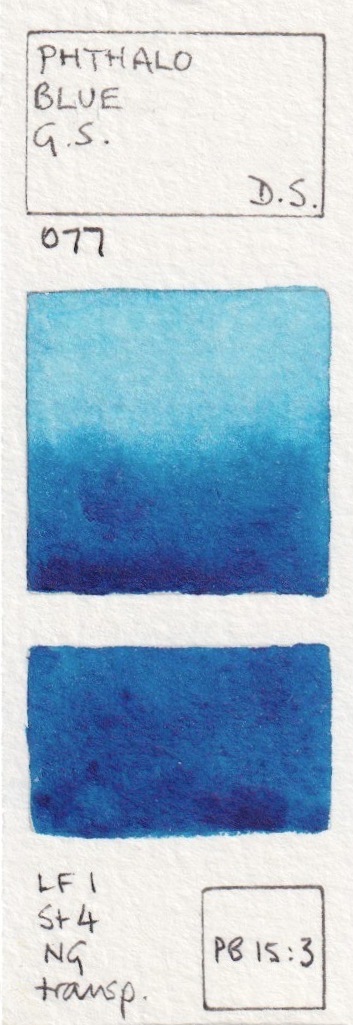
Daniel Smith Watercolours - Cobalt Blue, Phthalo Blue Red Shade, Lavender (new 2017), Lapis Lazuli Genuine,
King's royal blue (new 2022), Verditer Blue, Phthalo Blue Green Shade.
Cerulean Chromium is one of my favourites, mixed with Ultramarine for skies. Great anywhere in the world :-) It is more powerful and slightly cooler than Cerulean. Phthalo Blue Turquoise was released more recently and is the lovely PB16 turquoise pigment.
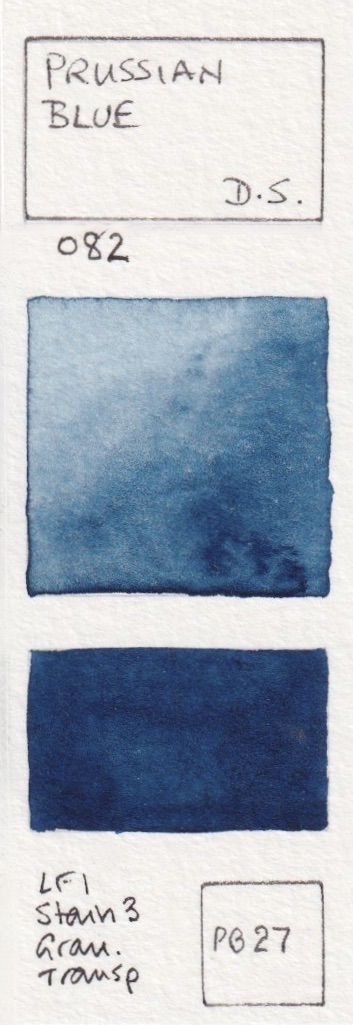
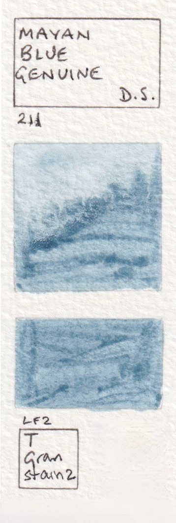


Daniel Smith Watercolours - Prussian Blue, Mayan Blue Genuine, Cerulean Blue, Cerulean Blue Chromium,
Manganese Blue Hue, Phthalo Blue Turquoise (new 2018?)


Daniel Smith Watercolours - Cobalt Teal Blue, Phthalo Turquoise, Ultramarine Turquoise,
Natural Kingman Turquoise Genuine, Sleeping Beauty Turquoise Genuine, Cobalt Turquoise.
I love the granulation of Blue Apatite Genuine and Lunar Blue (so many lovely blues!) Viridian is a wonderful green option if you want a less staining and more granulating mixing green than the very powerful Phthalo Green blue shade.


Daniel Smith Watercolours - Amazonite Genuine, Blue Apatite Genuine, Lunar Blue, Cobalt Green Pale,
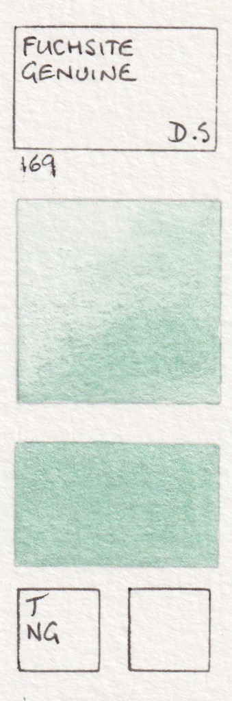
Fuchsite Genuine, Viridian.
Phthalo Green Blue Shade is another of my basic colours. I doubt I've ever used it alone, but it's great for mixing. Jadeite is a lovely alternative for those who don't want to use the potentially overpowering phthalo green. As a cool green, it mixes in a similar way, but with granulating and a bit more of a realistic look. Like Viridian above, it is a less staining and more granulating cool (blueish) green.


Daniel Smith Watercolours - Diopside Genuine, Phthalo Green BS, Cascade Green,
Jadeite Genuine, Cobalt Green, Spring Green.
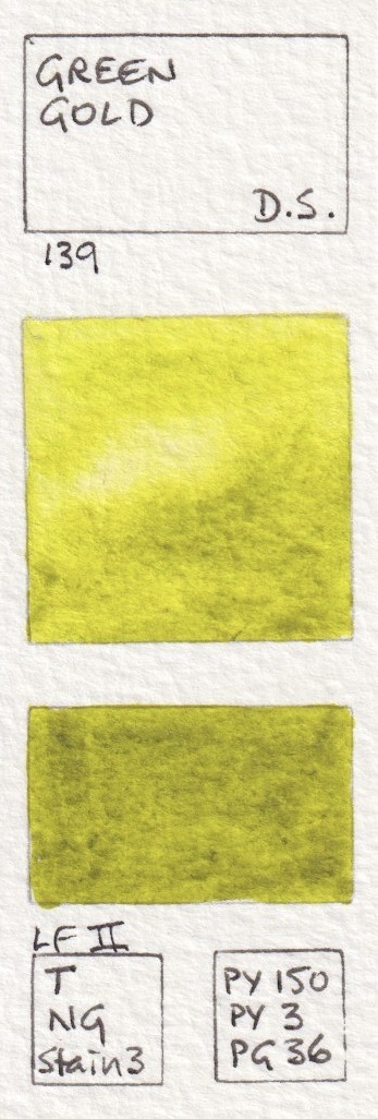
In 2015, PO49 was replaced in DS mixes with the hue made from PO48+PY150. This meant a change in formula for Hooker's green as well as Sap Green and Undersea Green (below).


Daniel Smith Watercolours - Permanent Green Light, Phthalo Yellow Green, Permanent Green, Phthalo Green yellow shade, Hooker's Green (Original formula), Hooker's Green (New formula 2015).
Sap Green is a terrific convenience green for many landscape and botanical studies. The newer formulation is very similar to the original. I love Serpentine Genuine - not just because it also comes from Australia, but because it creates a grassy meadow in one wash :-) Green Apatite Genuine is a remarkable paint as it will create soft greens, grassy greens and deep olive greens depending how thickly is it applied - excellent in a limited or plein air palette.


Daniel Smith Watercolours - Sap Green (original formula - discontinued 2015), Sap Green (new version 2015), Serpentine Genuine, Chromium Green Oxide, Green Apatite Genuine, Terre Verte
Perylene green is fabulous - another of my basic palette colours. I enjoy using Rare Green Earth on stone and pebble studies. Undersea Green is the colour of Australian gum leaves.


.jpeg)


Daniel Smith Watercolours - Sap Green Deep, Perylene Green, Prussian Green (original, discontinued), Prussian Green (new version), Rare Green Earth, Undersea Green (Original, discontinued)


Daniel Smith Watercolours - Undersea Green (new version from 2015), Ziosite Genuine, Olive Green,
Green Gold, Rich Green Gold, Nickel Azo Yellow
There are a lot of yellow earth options, many quite similar. The Bronzite and Burnt Bronzite have a slight shimmer. It is helpful to explore each in mixes, especially with blues. I haven't explored the new Raw Sienna Light much yet, though a yellow earth will generally make useful greens.


Daniel Smith Watercolours - Bronzite Genuine, Verona Gold Ochre, Burnt Bronzite Genuine,
French Ochre. Raw Sienna Light (new 2017), Burgundy Yellow Ochre.
Chrome Titanate Yellow is a new addition (2022) and this brown pigment is a gorgeous golden colour that mixes lovely greens with various blues - as does Transparent Yellow Oxide. I love Raw Sienna for the glow of sunsets in the sky. It's also useful for skin tones. I tend to have Yellow Ochre, Raw Sienna, Quinacridone Gold and Goethite available in my palette.


Daniel Smith Watercolours - Chrome Titanate Yellow (new 2022), Yellow Ochre, Mars Yellow,
Yavapai Genuine, Raw Sienna, Transparent Yellow Oxide.


Daniel Smith Watercolours - Mont Amiata Natural Sienna, Environmentally Friendly Yellow Iron Oxide, Goethite (Brown Ochre), Quinacridone Gold Deep (discontinued), Quinacridone Gold Deep (new version 2015), Italian Deep Ochre.


Daniel Smith Watercolours - Lunar Earth, Burnt Yellow Ochre (discontinued), Burnt Yellow Ochre, Garnet Genuine,
Roasted French Ochre, Burgundy Red Ochre,
I love the most opaque of watercolours - Indian Red - as a red earth. With its slightly pink undertone it will mix interesting earthy purples with a blue. Venetian Red, also a PR101 granulating reddish earth colour, is usually just a little more on the orange side, without the pink undertone of Indian Red. The granulation is terrific.


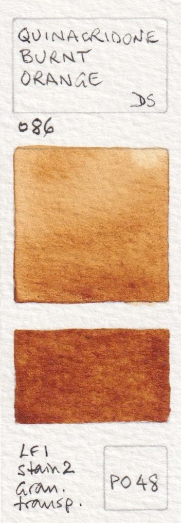

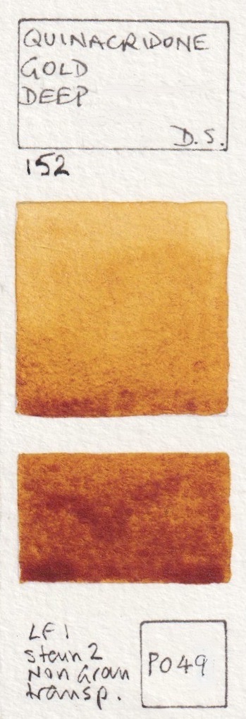
Daniel Smith Watercolours - Indian Red, Venetian Red, Italian Burnt Sienna, Quinacridone Burnt Orange,
Quinacridone Sienna (original mix discontinued), Quinacridone Sienna (from 2015),


Daniel Smith Watercolours - Pompeii Red, Red Fuchsite Genuine, Terre Ercolano, Minnesota Pipestone,
Italian Venetian Red, English Red Earth,
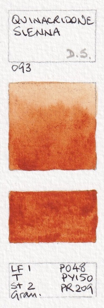
There are so many amazing earth colours! Hematite Burnt Scarlet is a very granulating Burnt Sienna option. Quinacridone Burnt Scarlet, Perylene Maroon or Deep Scarlet could be used if a brighter 'earth' red was required. Quinacridone Burnt Scarlet is also known as brown madder in some ranges.


Lunar Red Rock is very similar to Indian Red but a little less opaque. All the Lunar colours granulate beautifully. Piemontite is another favourite 'extra' colour. It is a bit like an Indian Red but has a gorgeous dusty rose undertone and fascinating granulation. The primateks are so interesting!


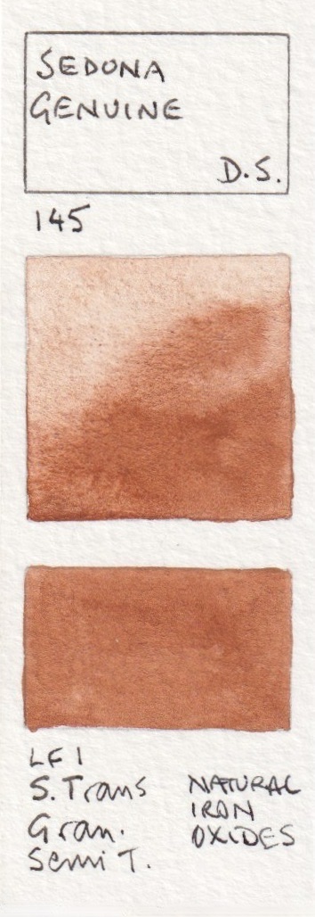
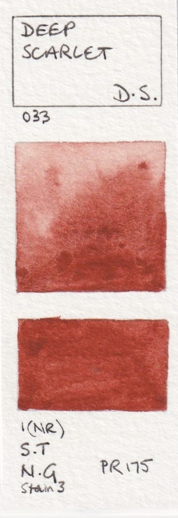
Daniel Smith Watercolours - Red Jasper Genuine(new 2019), Hematite Burnt Scarlet, Quinacridone Burnt Scarlet,
Perylene Maroon, Sedona Genuine, Deep Scarlet,


Daniel Smith Watercolours - Napthalmide Maroon, Lunar Red Rock, Piemontite Genuine, Tiger's Eye Genuine,
Burnt Tiger's Eye Genuine, Hematite Genuine,
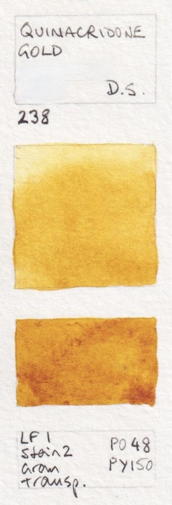
Quinacridone Gold was one of the first Daniel Smith watercolours I bought back in 1995. I still love it. As this pigment is no longer available, the new hue has been produced, which mixes in a very similar manner. Interestingly, the PY150 increases the range of the colour as it can be diluted to a cooler yellow than the original PO49. Permanent Brown is a lovely alternative to an Indian Red if you want a more transparent and non-granulating earth red option.


Daniel Smith Watercolours - German Green Raw Umber, Hematite Violet Genuine, Mummy Bauxite, Permanent Brown,
Quinacridone Gold (discontinued), Quinacridone Gold (from 2015),
Transparent Red Oxide is one of my absolute favourite watercolours - the perfect colour for rust, which I love to paint, or as an alternative for Burnt Sienna (though I tend to have both). The EF Brown Iron Oxide is excellent as a really granulating burnt umber option.


Daniel Smith Watercolours - Raw Umber Violet, Transparent Brown Oxide, Transparent Red Oxide, Fired Gold Ochre,
Burnt Sienna Light (new 2017), Environmentally Friendly Red Iron Oxide.
Burnt Sienna as a palette staple and I love this version - PBr7 rather than the PR101 burnt orange version. It can be used as a very convenient skin tone for many skin colours simply by watering it down. Burnt Umber is a lovely classic colour - a rich warm brown. I love the granulation of the Enviro-friendly watercolours. Raw Umber is a colour I use a lot as a cool dark brown, and I usually include it in a palette of 12 or more as it is not an easy to create a cool dark brown quickly from palette colours.


Daniel Smith Watercolours - Burnt Sienna, English Red Ochre, Burnt Umber,
Environmentally Friendly Yellow Iron Oxide, Raw Umber, Sepia,
And now for some darker darks. I don't tend to use black in watercolours but the Graphite Gray is like working with liquid pencil - lovely!


Daniel Smith Watercolours - Sickerite Genuine, Van Dyck Brown, Bloodstone Genuine, Lunar Violet,
Neutral Tint, Graphite Grey,
There are now many grey options in the Daniel Smith range, many added in 2019. These include my Jane's Grey mix - a lovely granulating and liftable grey without black pigments, Alvaro's greys, created with Alvaro Castagnet, and Joseph Z' greys created with the wonderful painter Joseph Zbukvic.


Daniel Smith Watercolours - Jane's Grey (new 2019), Payne's Blue Gray (new 2017), Payne's Gray, Alvaro's Caliente Grey (new 2019, Alvaro's Fresco Grey (new 2019), Joseph Z's Warm Grey (new 2019),


Daniel Smith Watercolours - Joseph Z's Neutral Grey (new 2019), Joseph Z's Cool Grey (new 2019), McCracken Black (new 2022), Jane's Black (Red/Green) (new 2022), Jane's Black (Blue/Orange) (new 2022), Ivory Black,
Lunar Black makes me break all my not-using-black rules - it's an extra colour I have fun with - just as Buff titanium puts a white pigment in my palette :-) Grey Titanium is a really useful colour for urban sketching - concrete! Titanium White is whiter and more opaque than Chinese White


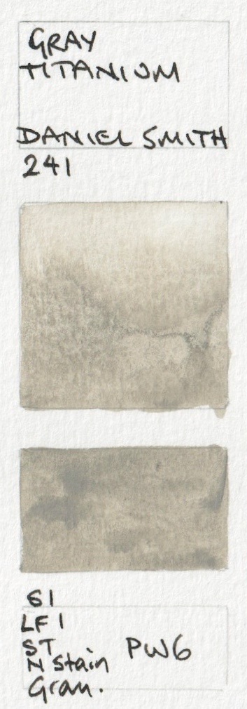


Daniel Smith Watercolours - Lamp Black, Lunar Black, Black Tourmaline Genuine, Gray Titanium (new 2019),
Chinese White, Titanium White
The fifth new colour for 2022 (along with the blacks, the King's Royal Blue and the PB24 yellow) was Iridescent Vibrant Raspberry. I haven't attempted to show the iridescent or pearlescent colours as they are so difficult to capture on screen.
I'll finish with a few colours that have been discontinued but it's rather nice to know what they looked like. Hot Mulled Cider was a scented PY150 seasonal colour. Côte d'Azur Violet was an incredibly subtle granulating pink earth colour. Azurite was really beautiful but oxidised in the tube so is no longer available.


Daniel Smith Watercolours - Hot Mulled Cider (limited seasonal release), Cote d'Azur Violet (discontinued),
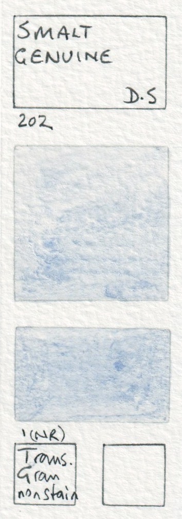
Smalt Genuine (Discontinued), Azurite Genuine (discontinued),
Vivianite or Blue Ochre was another lovely colour for stones. YInMn Blue was a sample colour - not commercially available - but this is a very beautiful version of this rare mineral pigment. I wrote about it here.


Daniel Smith Watercolours - Vivianite Genuine (discontinued), Bohemian Green Earth (Discontinued),
Malachite Genuine (discontinued), YInMn Blue (sample only)
As always, if you notice any errors, do let me know.
Happy painting :-)
Search for more watercolour ranges in the search bar.
You can find the new Daniel Smith Gouache here.
They just discontinued Malachite too so if you like it you might want to stock up. I wasn't that impressed with it but found I used it in a river picture I did that very same week.
ReplyDeleteI found it online but if you hurry you might still find it in stores.
Yes I had noted that in the captions, but since it is recently discontinued, along with Rose Madder Genuine and Azurite Genuine, I've included it in with the rest of the range since tubes will still be available for a while for those who want them. Note that Azurite and Malachite can crystalise at the top of the tube - copper meeting aluminium, (to quote the CEO) but you just flick off the top granules and the rest of the paint is fine. They are not colours I thought were particularly useful but there may be some searching out the remaining tubes.
DeleteWonderful studies, so interesting to read your comments about the colors, and I love your little paintouts!!:)
ReplyDeleteI found your blog several months ago. It has really helped me to understand the different pigments and their properties. I find that I am making much more conscious decisions when I am mixing colors. Thank you!
ReplyDeleteA tour deforce and a dizzying number of colours.
ReplyDeleteThank you Jane, I always learn so much from you!
ReplyDeleteJane, Thank you so much for all the sharing you do. I have poured over your posts over and over in order to absorb your teaching. You pages are an invaluable resource, and so beautifully done.
ReplyDeleteThank you so much Jane, for these useful swatches! I love blue tones and wonderful to see so many wonderful turquoise hies in DS! Must get a few! :)
ReplyDelete*hues
DeleteCobalt Turquoise is my favourite.
DeleteHi Jane, I have been saddened by the discontinuation of PY153. I have an ancient tube of Winsor Newton new gamboge, and so far I haven't been able to find a pigment or convenience mixture that matches it. I recently noticed that sennelier yellow light is indeed the single pigment PY153. It does have that similar glow (for lack of a better description-- I find that PY150 has it too--I think it's the nickel ?), but not the same hue.
ReplyDeleteI heard it was happening and bought up on some of the DS New Gamboge so I have plenty in stock, but I also found a jar of the Schmincke dry pigment and bought that too. I generally mix a new gamboge hue using the hansa Yellow Medium and Quin Gold that I already have in my palette, but there are times that the gorgeous characteristics of PY153 are called for....
DeleteJane, what are your thoughts on Perylene Red? The Daniel smith primary set has it, as its primary red. How does it compare with the pyrrol red?
ReplyDeleteIt is a lovely colour - cooler than pyrrol red i.e. leans less towards orange - a real fire engine red I think.
DeleteA primary red needs to mix oranges and purples. I think this would make rather dull purples, but not as dull as with pyrrol red. I haven't really explored it though as I tend to use three reds in most palettes (an orange-red, a crimson red and a rose red) for full mixing possibilities.
The only palettes I have set up to use with a single 'primary' red, I have chosen to use Quin Rose - it mixes lovely oranges and lovely purples and you can mix nice mid reds too.
I'll have a play with it and see how it mixes purples...
For what it's worth, I've been told via a phone call with Daniel Smith that Manganese Violet (not shown above) was also retired.
ReplyDeleteYes that was retired many years ago. I don't think I ever tried it! It was PV16 - usually that is a lovely granulating red-violet. I wonder if, like manganese blue, there are difficulties with the manufacturing of the pigment?
DeleteNot sure! I recently purchased a handmade version on Etsy and have been pleased so far! I also have it from W&N, though it goes by "Permanent Mauve" with them, and looks quite different from the DS one.
DeleteI think manganese violet has the tendency to separate from its vehicle in the tube. It may have been discontinued because artists purchasing older stock may have returned the paint. That's just a guess. People who like it can use Szmal, for instance, which is in a pan so separation isn't an issue. I have a tube of W&N and it's fine, though.
DeleteJane, I'm curious what you think of perylene maroon? It is highly rated on handprint.com for it's mixing characteristics and usefulness in florals and landscapes. I noticed you favor colors such as transparent red oxide and indian red and would love to hear your thoughts. Thank you for all the wonderful information you share! Bill
ReplyDeletePerylene Maroon is a rich deep Crimson red, that varies somewhat between manufacturers. Yes it is a lightfast pigment, but with quite a strong drying shift. I choose to mix a Maroon hue when I want it, using pyrrol crimson and a little phthalo green - colours already in my palette.
DeleteIt looks like Daniel Smith has discontinued their 15ml Quinacridone Gold PO49. I can't find it anywhere on their website and when I search for it by pigment I only get Undersea Green which currently uses PO49 but who knows for now long?
ReplyDeleteI've put in an order at Merriartist and it looks like there are still supplies out there. Amazon has quite a bit. If you do a search for it on the Daniel Smith website you only get Quinacridone Gold Deep which is a different formulation.
I've been preparing for this. I've been stocking up. But I just bought more and will probably do so again before the supplies are gone. I use this color a lot especially when I'm mixing greens.
I don't think they have run out yet - when it isn't on their website it usually means they are manufacturing. But I also keep 5 tubes in reserve...
DeleteThe last batch of DS genuine PO49 Quinacridone Gold was made in early September. The mixed hue is close - very close - to the original colour and mixes in a similar way. I'll do a blog post showing both shortly. I've stocked up on the PO49 simply because I prefer single pigment colours where possible. Hope you did too.
DeleteHi Jane, hope this doesn't sound silly but can you explain your colour swatches? I see the square of colour on the bottom is darker than the top square but I don't know why.
ReplyDeleteThank you.
I don't think there is such a thing as a silly question ;-)
DeleteI have explained the swatches here http://www.janeblundellart.com/painted-watercolour-swatches---introduction.html but basically the larger shape shows the pigment going from lighter to darker on dampened paper to show how it reacts with water. The smaller swatch shows the full strength of the pigment. It would have been really useful if had drawn a black line on every swatch first - as I do with the whites - to show the opacity, but I didn't when I started this project 5 years ago so I haven't changed the way I paint them.
Permanent Violet isn't PR88 anymore- it's PR202 and PR29. Or at least the tube I bought in December was!
ReplyDeleteThank you - I have amended that one
DeleteWhat watercolor brands use honey besides sennelier and MG?
ReplyDeleteThank you very much for soon reply. I live in germany, daniel smith, Schminke, sennelier is more famous here and i can barely find MG or Holbein here in stores.
DeleteSzmal, Harding, and Kremer use honey, as do most Etsy handmade paints.
DeleteHi jane, nice to see u by help of google, ur site is really helpful thaaanks������
ReplyDeleteI want to set up my own watercolor palette, with transparent n nongranulation colors. Also the colors that spreading not like white night its stay n not runjng to eachother. Could u plz helping me? Als a 24 color set for any brand which one do u recommend me to buy?
Thanks in advance ������
Have a look at the many palette ideas on my website www.janeblundellart.com - some with paintouts and some not, bot lots of great palette and colour selections. However I tend to use a mix of granulating and non-granulating colours, transparent and more opaque, as I like to explore all the characteristics of watercolour.
DeleteHi Jane, thank you for that amazing review of Daniel Smith watercolor. I really want to translate it and post it on my Vietnamese facebook page so that people can get to know about this wonderful brand. Can you please give me permission to do that? Thank you so much
ReplyDeleteYou have my permission to do that provided you acknowledge me and my blog. You might like to give me a link back to your Facebook page so I can add it for any Vietnamese readers to find :-)
DeleteHi Jane, first of all thanks for your lovely work.
ReplyDeleteYou seem to be a bit of an insider with DS and I just wonder if you know what the "ingredient" for Mayan Blue is. As a Primatek with the label "genuine" attached to it, I'm assuming it is a single pigment coming from a semi-precious stone? Could it be Blue-green jade? That was a sacred stone for the Maya symbolic of Quetzalcoatl - the feathered serpent god that joins the heavens with the earth - Would love to know. I really love the colour. I have checked its accuracy against some of the illustrations in the Mayan Dresden Codex and it really is spot on!
All the best
I think many of the Mayan colours are created by grinding up coloured glass. There is a little information here https://www.youtube.com/watch?v=IMQKgjhMHYI
DeleteI use Daniel Smith watercolors almost exclusively, so this chart (and all your hard work that went into it) is so helpful and so very much appreciated! But I do use Qor every now and then, and the occasional winsor & newton from their professional line, so I was thrilled to find that you have done similar charts for those paints as well. Thank you so much for all your hard work and for sharing it with all of us - very, very much appreciated!
ReplyDeleteHi! Thank you for these great studies! I love Daniel Smith's Green Apatite Genuine. Does the Blue Apatite Genuine do the same theatrics? I like how the green has an almost neon green separate out as well as varying particle size and color granulation. I just wondered if the blue behaves in a similar manner.
ReplyDeleteBlue Apatite Genuine also does lovely things on the paper, but not with the same bright undertone of Green Apatite Genuine.
DeleteHi Jane,
ReplyDeleteI've noticed that Luna Blue (my absolute favorite for value study and many other things) looks completely black on your swatch when in reality it looks bluish, similar to Payne's Blue Grey.
thanks
Anna
It may be that I painted it from a small sample, or perhaps the tube wasn't shaken properly.
DeleteThank you very much Jane, it helps me so much!
ReplyDeleteThank you very much Jane, it helps me a lot!
ReplyDeleteThank you for the awesome swatches Jane, I am similarly going through a long process of charting my watercolours, some of which I have in my window for lightfastness. I like the Daniel Smith colours and I have a few, but I stop at purchasing colours such as Lapis Lazuli Genuine and Smalt because they are very expensive, don't really pack much of a punch and are easily overpowered by other colours. I also really get the feeling that colours with the trendy sounding names are for the completists. Give me a good Cobalt Blue any day!
ReplyDeleteOne of the main reasons I have created all these swatches is to show each colour clearly to help others choose the colours they will use most, rather than ending up with a collection of less useful paints.
DeleteI have ended up with a huge collection - many bought, some gifted, some as tubes or pans and some as dot samples - but I actually only use fewer than 30 paints. I do most of my work with fewer than 20, and I could manage pretty well with just 12 if I had to.
Hello Jane, this blog has been a blessing from the beginning of my watercolor journey so thank you so very much for all that you do here, you’re simply amazing!
DeleteAlso if possible directly quoting your comment here; “ - but I actually only use fewer than 30 paints. I do most of my work with fewer than 20, and I could manage pretty well with just 12 if I had to.”
Would you mind sharing these absolute 12 colors? I reside in Turkey and every good art supply is more expensive than gold here. I’d appreciate it if I could here your opinions on which colors one most have.
Also what about the 20 and 30 set?
Thank you as always. Best :)
I show my suggested 20-colour palette on my website https://www.janeblundellart.com/palettes.html and some other larger options too :-)
DeleteI'm relatively new to watercolor, I started with your basic palette but have been adding additional colors that you recommend. Currently I am setting up a new empty palette and notice you don't often have "lemon or light" yellows on your palette, are there circumstances where the cooler yellows would be necessary in addition to Hansa yellow medium? I almost exclusively paint landscape or flowers.
ReplyDeleteI use Hansa Yellow Medium as it is a beautiful and lightfast pigment. It is also nearly transparent. The options for a lemon yellow tend to be more opaque or less lightfast. But the other reason I don't tend to use them is that I can create a lemon yellow hue by adding a tiny touch of Phthalo Green to Hansa Yellow Medium.
DeleteIf you prefer you could have a traditional cool yellow and add a touch of a warm yellow or a red to create a mid yellow, or add a cool yellow to the palette.
Thank you so much, you sharing all of this information it is so helpful and much appreciated.
DeleteHi Jane,
ReplyDeleteLike you I live in a very humid country (Mauritius) and I’m trying to upgrade to artist quality paints but there’s not much choice available here. I wonder if you might have some comments on brands. From my lengthy research I’ve rule out Sennelier & other honey based paints because of the humidity issue. I would like you use already made pans or pour my own - from everything i read Daniel Smith seems to be ideal but I’d heard that they shrink when drying and pop out of the pans, since I think you always pour pans and prefer Daniel smith, do you have any experience with that? And even if they do, is it not such a big deal? otherwise my options seem to be Schmincke, who have reviews which either love or loathe them, W&N who I hear are very expensive in the long run… I know brand preference is subjective but I’d love to hear your thoughts.
Sorry about the delay - for some reason I can't comment on my own blog!
DeleteI do recommend Daniel Smith, whether their premade half pans or tubes. If using tube colour, shake the tubes well before use and top up the palette or pan little by little, stirring each layer to spread it out. If a block of colour does fall out of the palette or the pan, just put a drop of glycerine in the paint well and a drop of distilled (or boiled) water and place the block of watercolour back. After a couple of minutes, press back into place.
Hi Jane. I was wondering if you knew which of the Daniel Smith colours would be the closest match to Winsor Newton's Light Red.
ReplyDeleteThere isn't an exact match to that quite bright orange-earth colour. The closest colour in Daniel Smith is probably Pompeii Red, but that is more granulating and a little more earthy.
DeleteG'day Jane- Daniel Smith changed their webpage so all your links to them are broken :( I'm not sure if their page is an improvement because their search tool doesn't work as well now I've got to rebuild my own links - yes they were a shopping list.
ReplyDeleteJane here - thank you for letting me know. I am going through all brands and updating my blog posts and website with the latest information; rescanning the swatches where necessary and increasing the colour accuracy. I'll also check all links. It's a big job and will take a number of weeks/months but I'll get there.
DeleteHow can Sepia be transparent if it contains PBk9??
ReplyDeleteHi there, Jane! I hope you're still replying to this website. It's so incredibly informative on DS colors, which is really all I use!
ReplyDeleteSo, I'm taking a class and one of the "added" or "convenience" palette colors listed is Yellow Ochre "PY 43" - a single pigment I don't currently have .... But Ahhh, yes, DS has many colors that are exactly, and ONLY, listed as using pigment PY 43, but are only almost the same shade/transparency as Yellow Ochre (e.g. French Ochre, Verona Gold Ochre [weirdly called "Yellow Ochre" on the side label, but NOT the same on paper], Burgundy Yellow Ochre, Geothite ... there are many! LOL).
I know mixing is a literal science and I'm concerned (maybe too much) that if I don't use "Yellow Ochre" in name alone, what ever I mix will not be the color desired.
Am I crazy or just obsessive ... or wait, isn't that the same thing?
Sincerely Yours,
Genuinely Confused
Jane here - All those variations of PY43 are tricky. I like Yellow Ochre as an option but as long as it is an obvious 'yellow' an not moving into a brown, it will work for you palette. Goethite, which I love, is certainly more brown. I tend to use both yellow ochre and goethite when painting. Raw Sienna too at times actually, as they each behave or mix differently.
DeleteAh all the color reformulations can be hard to keep up with. I just noticed your note that Trans Py Orange is now a more orange color. Great it works to neutralize ultra, bad I have come to love using it as a primary red and am almost out. I find I stumble on unexpected and unique colors I really like and sometimes aren’t as easy to mix at the same level of brightness. As I understand your note there is no change in actual pigment so may be hard to figure out if I can find old stock? Your site has become an invaluable resource over the years to find info in such an easy way and I want to thank you for creating it!!
ReplyDeleteJane here - It is difficult. That particular red-version of PO71 is no longer made. The old stock tubes prior to 2019 do look different - ironically they have a more orange label, where the new stock have a more red-orange label. The only other version that comes close is Aquarius Pyrrol Orange PO73 but they are also going to run out of that pigment.
DeleteI am thinking I'll add a little PR188 to the new version of Transparent Pyrrol Orange once I run out of the old version, so I still have that wonderful transparency in a warm red. Or use Pyrrol Scarlet, which is a terrific warm red, just a little less orange.
I mix PR206 Quin Burnt Scarlet with the new PO71 TRO to get similar color and transparency of the redder TRO. I only have PR188 Organic Vermillion in stick form, but see it might keep the luminousness of the old TRO. Even in the new color profile, TRO is a great color for a gamut of skintones.
DeleteI cannot tell you how much I appreciate all the time and effort you went to to make these swatches and give us your thoughts and notes on all the colors in various brand lines. I refer to these charts all the time and they have been an enormous help to me, especially the Daniel Smith swatches as this brand makes up 95% of my palette. So thank you for doing this for us. It is so helpful and informative and very much appreciated!
ReplyDeleteThis chart is hugely helpful. Thanks so much for sharing it. Jude UK
ReplyDeleteHi, Just came across your beautiful color blog. Could you explain your notes in the left bottom corner?
ReplyDeletethx
Hello Jane, thank you so much for these swatches, your comments on them and for continuously updating them. I used this extensively when I built out my main color palette which is entirely composed of Daniel Smith and will do so again when I want to expand my collection.
ReplyDelete
ReplyDeleteHi Jane! Thank you so much for your wonderful website, it has been so helpful on my watercolour journey - I wish I’d found it when I was first starting out!
I was wondering if you could help me with something about Daniel Smith though. Do you know (or can you find out) what preservative/biocide they use in their paints? I have some health problems so I like to be very informed about what is in the paints I’m using, but unfortunately when I contacted the DS customer service to ask for this information they were not very helpful. I though since you’d worked with them you might either know or have better luck finding out! All the other brands I’ve used or investigated either list their biocide in their safety data sheet or just told me outright when I asked them. It isn’t that I think they’re using anything bad but I’d feel a lot more comfortable using these lovely paints if I knew what was in them. Thanks again!
Exciting to see the full range of Daniel Smith watercolors! 🎨🌈 Thanks for the update!
ReplyDeleteExciting update on the full range of Daniel Smith watercolors! 🎨🌈 A fantastic resource for artists seeking vibrant hues and top-notch quality. Thanks for sharing this valuable insight!"
ReplyDeleteHello! I painted out a copycat mix chart on a four colors I have, and WOW!
ReplyDeleteStill new and in habit of mixing on my dozens of palettes as I go but the act of doing it REALLY was an eye opener.
I ended up with a PILE of paints when an online store kept sending me a box of 3, Daniel smith odd-ball (guessing old and not selling, and all LFII) instead of a single tube of the color I ordered. FIVE times before they sent me the one I wanted. Fortunately I was not in a rush for it.
So I was able to create a pleasant mix I know I can use, from two colors I thought would be total losers even if two tubes of these sets were “free”, apart from frustration.
I wanted to thank you! Although I can see mixes in my mind’s eye before I start them on my no palette, having those ranges in front of me were inspiring!
I also didn’t have all the paints you have just to use yours for cheat sheets, so it was REALLY helpful to see up front and I’m thinking I’ll be papering my walls in my work area with these things. 😄
Thank you again for all the tips you share! It’s very helpful as long times go by between paint sessions, so it’s nice to be able to access things you teach!
I am wondering when artist list their palette color for a piece they are working on as cadmium yellow or orange if that is usually the medium hue? Also, what are some replacements for DS cad yellow and orange if one was concerned of the cadmium in the paint? Thank you Jane. :)
ReplyDeleteIt’s been a while Daniel Smith has been claiming their watercolor to be vegan at least from 2017. That would mean there’s no ox-gall, animal glycerine neither honey. This is for elders that have been painting with DS watercolors for a long time. Have you perceived any difference regarding this watercolor performance from the old tubes to the new tubes?
ReplyDeleteDaniel Smith watercolours contain only pigment and gum Arabic solution as far as anything I have seen, read or heard is concerned.
DeleteThank you for getting in touch Jane but it’s impossible to make watercolor with just Pigment plus Gum Arabic as many top brands only statement about their formulation. For this kind of watercolors is necessary an humectant (syrup or honey), a dispersant (ox gall or synthetic ox gall), glycerine (vegetal or animal) aside a fungicide, distilled water, etc. Most top brands include brighteners and fillers that compromises their durability. As well as they have been caught lying about the pigments. Would anyone trust a word by them? For example, Holbein is sold as vegan. The truth is I reached their factory in Osaka and their workers wrote to me they disperse the pigments in animal fats and oils. Surprisingly enough their MSDS for HWC watercolors list their ingredients: Pigment, Gum Arabic, Ox Gall, Glycerine and Benzisothiazoline available for all to see on Holbein’s website. What’s the matter with giving misleading information regarding lightfastness, animal rights and environmental matters, vegan art supplies, etc by top brands, the so-called swatches artists, influencers, art stores such as Jacksons?
ReplyDeleteI respect the desire to reduce animal cruelty but many of the animal products used in art would be thrown away. The same goes for the gut string used for tennis. I think it's worse, overall, to throw away "waste materials" that are going to be present anyway when they could instead be used to make high-quality products. Children in some places in the world use landfills as playgrounds. There are photos of farms next to lead smelters. At least 25% of all freshwater species are teetering on the edge of extinction. We should always try to tackle the biggest problems first, in my view. Ox gall and things like that are the tiniest of small potatoes in the big picture. As for misleading information, knowledge is power and power is used to get money. Caveat emptor, unfortunately, has been a hallmark of the business world since it began. The "cadmium-free" thing, in which pigment codes used in the paint aren't told to buyers, is an especially bad example of that.
DeleteI love that W&N added "Smalt" to their line. It's pretty much identical to the Schmincke Ultramarine Violet that previously was the only source of an ultramarine violet (blue shade). I agree it's not a strong mixer, but it has a nice granulation and works well for shadows and stormy skies.
ReplyDeleteThank you so much for this amazing and helpful swatch listing. I’m new to watercolor classes in the past few months and am loving it so much. I had dabbled with watercolors over the years in my card making. I adore the teachers I have and am grateful for the help artist like you educate us with. Donna
ReplyDeleteThank you Jane for this elaborate listing. I came upon Daniel Smith two years ago, and am still exploring. Your comments are immensely useful.
ReplyDeleteHello,
ReplyDeleteI'm sorry but phthalo yellow green is lightfastness 2 not 1
Thank you for all the work !!!
G'day Jane- I found that (DS) Ultramarine turquoise plus Schmincke's Translucent Orange mix great for a range of Australian foliage. I'm not a fan of granulation (plus I couldn't afford another foliage green so soon after I got two tubes of Art Spectrum's Aus Green Gold and Aus Leaf Green Dark) so I figured I'd try to "waste" some of the giant convenience tube DS instead. Was a great swatching experience along with the two Art Spectrum convenience mixes to get there. I do like the DS Green Apatite even with the granulation- I layer colours and find granulating anything doesn't play as well. Still my goal for 2025 is mixing the blue-green of the gorgeous bluegums near me. I layer layer layer to get the correct "colour". (Btw seems the Schmincke name for the paint has changed to Transparent but I don't know if that means the pigment has.)
ReplyDeleteBack on March 4th 2025, John Cogley posted a video about ochres and mentions the majority are synthetic for industry purposes and perfection. I felt a tinge of disappointment hearing this and was surprised since I believed that many of the earths were from natural sources.
ReplyDeleteI would be really interested to know which are naturally sourced vs synthetic because the latter's authenticity to a natural pigment is remarkable. Unfortunately my question regarding this went unanswered. I can understand the need to be consistent but I've been thinking for years that the ochres, siennas and other earths came from specific quarries around the world.
I had to search to find the video you were referring to. I was also surprised. I understood that PY43 was generally the natural earth pigment and PY42 the synthetic. I guess not.
DeleteHi, I'm very new and I was wondering what winsdor and newton proffesional watercolour half pan best matches a standard red ochre? sorry if this comment is not appropriate for the post
ReplyDeleteDear Jane, what an extraordinary body of work you have accomplished as guides for both beginners and serious artists. Your website is fabulous as are your paintings but there should be a prize for your 'voluntary' work! I've loved discovering watercolours with you and I find swatching a most relaxing occupation as well as a learning experience. No question, just an honest appreciation of your curiosity, and your kindness in sharing it. Many thanks, Jan
ReplyDeleteHi. it is my understanding that Daniel Smith stopped making the Vivianite or Blue Ochre.
ReplyDeleteHi, it is my understanding that Daniel Smith has stopped making the Vivianite or Blue Ochre.
ReplyDelete