Thursday 29 October 2015

Daniel Smith Essentials - a great set to get you started with Artist Quality watercolour

Daniel Smith Essentials Set
I think it is terrific that Daniel Smith have put together a couple of sets of 5ml tubes of colours. These are available in many countries, even where the full range of 88 5ml tubes may not be available.

The 'Essentials' set contains six tubes, a warm and a cool red, yellow and blue. It's a great mixing set, or starter set for those getting into artist quality watercolours.

It contains Hansa Yellow Light as the cool yellow - a great choice as it is transparent which suits most people better than the more opaque cadmium yellows. New Gamboge is the warm yellow - a lovely hue. It will mix wonderful oranges with Pyrrol Scarlet, the warm red. It will also mix lovely earthy greens with French Ultramarine, the warm blue. The cool blue, Phthalo Blue Green Shade, will mix bright greens with Hansa Yellow light or slightly more neutral and useful sap greens with New Gamboge. The cool red is the very pure and bright Quinacridone Rose, which will make the most beautiful purples with either of the blues. Start mixing three colours together and you can create all sorts of yellow ochre, raw sienna, Indian red, light red, burnt sienna and grey hues if you know what you are doing. Brenda Swenson has a wonderful demonstration using these colours on her blog here.

Many people who are new to watercolour struggle a little more with three-colour mixes and it speeds up your painting if you have some neutrals already in your palette so the next question might be - what to add to these essentials?

The answer depends on what you are painting.

Daniel Smith Primatek Set
It might also depend on whether you have also purchased the Daniel Smith Primatek set ;-)
This is another Daniel Smith set, containing six of their Primatek colours - they are all created from ground up minerals or stones. Rhodonite Genuine, Jadeite Genuine, Amethyst Genuine, Mayan Blue Genuine, Hematite Genuine and Piemontite Genuine.


If you have this set, you may choose to use the green and the purple in your palette as convenient secondaries, the blue as an additional cool blue, the Hematite as a dark grey/black and the Piemontite as an earth red. I love this for painting rusty surfaces too. These will all add granulating texture to your paintings. You can see a wonderful demonstration, again by Brenda Swanson, using both of these sets here. She is a fabulous painter :-)

If you don't have the Primatek set, you might like to add some other convenient colours, perhaps a 'landscape' or 'urban sketching' extender set. Here are some suggestions.
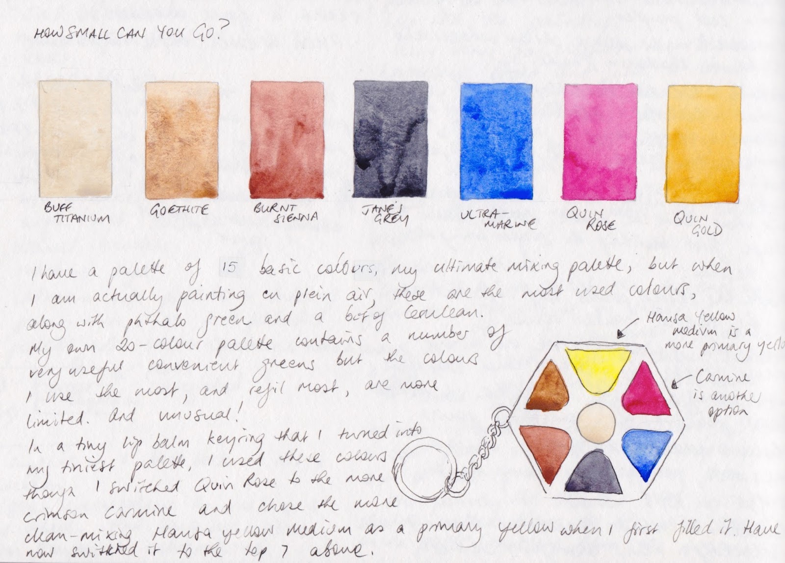
  • An earth yellow is useful - shown is the semi opaque Yellow Ochre but I also love the granulating Goethite (not available in 5ml tubes) or the slightly more orange and transparent Raw Sienna. Mont Amiata Natural Sienna is a transparent yellow ochre colour, though also not available in 5ml tubes. An earth yellow is useful for mixing olive greens and for use in landscapes. 
  • I find Burnt Sienna invaluable and use it with ultramarine to make a huge range of colours, or alone and watered down to make a skin tone. 
  • If you are doing landscapes or urban sketching you might like to add a couple of wonderful convenient greens such as Sap Green and Undersea Green, pictured. 
  • I like Cerulean Chromium as a sky blue, often mixed with Ultramarine. It is not as staining as Phthalo blue so is an excellent third blue option. 
  • Buff Titanium is another very useful paint for Urban sketching and landscapes, though it is also useful in portraits.
Daniel Smith earth and landscape watercolours - Yellow Ochre, Burnt Sienna, Sap Green, Undresea Green, Cerulean Chromium, Buff Titanium along with Moonglow and Jane's Grey (custom mix).


  • If you choose to add a neutralised orange (burnt sienna) and one or two of the neutralised greens (such as Undersea Green), you might also like to add a neutralised purple. The one shown is a three-pigment mix called Moonglow and it is another lovely granulating colour. It is also a useful shadow colour. Bright secondaries are easy to mix with the Essentials set; more neutral oranges, purples and greens may take three pigments to create. 
  • You may wish to add a dark - this is my mixture of Burnt Sienna + Ultramarine, but you may choose to add a Payne's Grey or Neutral Tint or make a mix of your own as a convenient dark.
  • Indian Red - an earth red not shown above - is another useful urban sketching colour but it is very opaque and powerful and can be difficult for beginners to use. Watered right down it is a lovely soft earthy pink - suitable for lips and cheeks in portraits. You can mix the hue with Pyrrol Scarlet and Phthalo Blue GS.
The essentials set is also a good start if you wish to get my Ultimate Mixing Palette set in 5ml tubes. Use the Hansa Yellow Light instead of Hansa Yellow Medium, use New Gamboge instead of Quinacridone Gold, then add 5ml tubes of Buff Titanium, Yellow Ochre (instead of Goethite), Burnt Sienna, Indian Red, Raw Umber, Cerulean Chromium, Permanent Alizarin Crimson (instead of Pyrrol Crimson), Phthalo Green BS and make a grey from Burnt Sienna and Ultramarine.

Happy painting :-)

The Perfect Sketchbook, B5 version

The pocket version of The Perfect Sketchbook was a very successful Kickstarter campaign. This is the B5 version, with 200gsm Italian watercolour paper. You can see the project here.
Looks gorgeous :-)


Tuesday 27 October 2015

My smallest palette - great for urban sketching

I have posted all sorts of interesting limited palette ideas, but I thought I'd share the limited palette I actually use at times. These are set up in a miniature keyring palette - shown here about life-size - that I made from a lip balm tin. You can see a photo of it here. I sprayed the lid with enamel to act as a mixing area. If I had room for one more colour it would probably be Cerulean as I tend to use Ultramarine + Cerulean Chromium for skies. In this little plein air palette I could probably use cerulean instead of Quinacridone Rose as I use so little red of any form in landscape/urban sketching, but that is too limiting for me. I always like to keep my options open, and want to be able to paint an orange or purple flower if the occasion arises :-)


Here are the colours painted out in a couple of colour wheels. There are so many earthy colours that can be mixed with this palette, along with lovely purples, oranges and greens. I really like the slightly neutral greens that are created with Quinacridone Gold and Ultramarine. Hansa yellow medium is a more pure mixing yellow, and was my original yellow in this palette, but I use Quin Gold more when I am urban sketching and the earthy greens can be mixed very quickly from just two colours. 

So many building materials can be painted with the earthy Buff Titanium, Goethite and Burnt Sienna colours mixed with some Jane's Grey.               These are less than half the colours from my Ultimate Mixing Palette set, but they generally represent the colours I actually use up fastest in my palettes when urban sketching, apart from Quin Rose which is only occasionally used. I was out with the San Francisco Urban Sketchers in September and one of the group arrived with a huge bunch of purple orchids. I painted one of them. I couldn't have done that without Quinacridone Rose in my palette. Creating a limited palette without limiting your subject choices is the key I think.

Monday 26 October 2015

Zorn Palette exploration.

I remember coming across a reference to the Zorn palette some time ago. I looked up what it was - a palette of just 4 colours used at times by Swedish artist Anders Zorn (1860 - 1920). It's an oil painting palette, but the gorgeous flesh tones many have created using this palette for figure and portrait work intrigued me. I made a note to test them out some time and finally did, using gouache.

Zorn is said to have used ivory black, titanium white, cadmium red and yellow ochre. His paintings often have other colours as well, but it is this quartet that is named after him.

I chose to use Schmincke Ivory black, Titanium white and Vermilion tone gouache, and Winsor & Newton Yellow ochre. Not identical but similar.

In the oil paintings, the ivory black mixed with white created a slightly blued grey. I tested the Schmincke black and white and there was a slight hint of blue in the mix. I then tried Winsor & Newton Ivory black but that didn't look blue. I tried mixing with M.Graham Titanium white and still not really blue. But I also have Schmincke's Neutral Grey, made from a red (PR 255), orange (PO62) and blue (PB60) mix so I tried that - quite nice blue undertones and I escaped the dreaded black pigments :-)

Using the Neutral Grey rather than black, I mixed up a range of colours with the yellow ochre and vermilion tone. Lots of interesting flesh tones.


I then wanted to see whether I could actually get some greens with this mix, so I made a colour wheel with the yellow, red and grey. Purples wouldn't be possible but very neutralised greens were. I explored some random mixes using these three with white.


Translating these colours into watercolour, I switched to DS Yellow Ochre, DS Cadmium Red Scarlet (discontinued but I still have some) and my Jane's Grey to keep away from black.
In watercolour the white of the paper is usually the white and adding water rather than adding white creates the tints, though with this palette I would probably add white watercolour if I were actually using it for flesh tones. It makes some interesting mixes and might be fun to paint with but since there is indanthrone blue in the gouache mixed grey and ultramarine in my mixed grey, I'd rather add a blue than a grey and be able to make an even greater range of colours.

Fun to explore - maybe more later if I try painting with this palette :-)

Thursday 22 October 2015

Custom watercolour mixes - a question of Greys

I have been adding a number of greys to the Painted Watercolour Swatches section of my website, which you can see here. I noticed how much the colour of 'Payne's Grey' varies between the different brands, ranging from a warmer blue-grey to a cooler blue-grey to a more neutral grey. Pretty much all have black in the mix, which makes it a convenience colour that doesn't interest me as black pigments seem to dull a painting badly.

It got me wondering, though, who Payne was. A little Googling and Wikipedia had the answer - William Payne was an English watercolourist, and the colour was made for him. The term has been used in English since 1835. Interestingly though, the original version did not contain black. It contained iron blue (known as Prussian Blue, PB27), Yellow Ochre (PY43) and Crimson Lake, which as far as I can find is a fugitive carmine pigment PR23. I don't have any PR23 to look at but I thought I'd mix some Yellow Ochre, Prussian blue and a Permanent Alizarin together and see what I could get. (All watercolours Daniel Smith unless otherwise noted.)

Traditional Payne's Grey mix of pigments - yellow ochre, Prussian blue and a crimson.

It makes some interesting greys. With more Prussian blue it turns into a cool dark blue-grey, similar to the commercial black and blue mixes available. The interesting thing is the way the yellow ochre and crimson pop up in blooms. I made these mixes using tube paint mixed in a pan to get it really strong, to have plenty to play with. Yellow ochre, Prussian Blue and Permanent Crimson actually make a rather interesting old-fashioned looking triad to paint with.

Since I don't use Prussian blue in my palette, I thought I'd experiment with some other colours. I switched to Ultramarine PB29 and PV19 Alizarin Crimson Quinacridone - a single pigment crimson from Da Vinci - and tested that trio in a strong wash. Two granulating colours made it too dull. 
     
Next I tried the same yellow ochre and crimson with Phthalo Blue GS - another cool transparent blue, like Prussian blue. I think this may be fairly authentic - I can see this being a useful mixed grey.                                  
I switched to Indanthrone Blue to try making a warmer grey. I like this - rather like my Jane's Grey - so not necessary to create.  
Exploring Payne's Grey variations

Then I tried both transparent blues with Quinacridone Gold instead of Yellow Ochre. This makes almost a black, that could be warmer or cooler depending on the amount of blue added, and which one is used. Interesting to explore, perhaps also with Quinacridone Rose, but not mixtures I feel I need. Though why do all of the commercial mixes contain blacks instead of these wonderful colours?

Next I come to Davy's Grey - another grey named after an Englishman, Henry Davy. It was a mix of powdered slate, iron oxide and carbon black. The commercial versions are quite different, though interestingly QoR make an Ardoise grey using PBk19 which was in the original watercolour for Davy. Winsor & Newton use a white, a green and a black pigment today. It's not a colour I have ever seen a use for.

So then I thought about Neutral Tint - another grey that has been around since the 18th century. It was designed to be used in mixing to darken colours without changing their hue. Today most also contain a black pigment, with a couple of exceptions such as Neutral Tint by M.Graham, which is PG7 + PV19, Schmincke Neutral Grey, which is PR255 + PB60 + P062,  and Old Holland has a 4 pigment mix of PB15:2 + PV19 +PR259 + PBr7!

Bruce MacEvoy of Handprint fame mentions his 'synthetic black' recipe with uses PB60+PB25+PG7 in roughly the ratio 8:6:1. I have Indanthrone Blue and Phthalo Green in my palette, but the only available PBr25 I could find are DS Permanent Brown and W&N limited edition Indian Red Deep - both transparent reddish brown watercolours. I mixed them as suggested and created a rich and rather lovely RGB black. [Update - Mission Gold also have a PBr25 Red Brown, though I haven't tried it.]

However you can easily make a rich transparent black with just Phthalo Green and Pyrrol Crimson, which I premix to make 'Jane's Black (R/G)'. This is a fantastic mixed black that can easily be adjusted to a deep green or a deep maroon when painting and is perfect for floral subjects - especially red flowers.

Mixing blacks and greys - MacEvoy's Synthetic Black, Jane's Black R/G, Jane's Black B/O,
Jane's Black R/B and Jane's Grey.

You can also mix Phthalo Blue RS with Transparent Pyrrol Orange to make my other favourite custom black 'Jane's Black (B/O)'. (2019 Update - Transparent Pyrrol Orange has changed to more of a mid-orange rather than the red-orange I originally used for this mixed black.)

Phthalo Blue Green Shade will make another black with Pyrrol Scarlet, Jane's Black R/B. It could be useful in landscapes where prussian blue and indigo blue hues are also needed.

And then of course there is Jane's Grey that I premix that works as a neutral tint, without the addition of a black pigment. The other advantage of this pair is that the grey is liftable. Many mixed greys are staining. 2018 update - available in the Daniel Smith Ultimate Mixing Set in a half pan. 2019 update - now available in a tube as a signature colour from Daniel Smith (affiliate link to Jacksonsart.com)

There are two single pigment darks that interest me - DS Lunar Black, the fantastic granulation creates wonderful effects, and DS Graphite Grey. This is like painting with liquid pencil - it even has a slight sheen. Really interesting to use.

It is easy to mix a number of greys and blacks with regular palette colours but mixing them from the tube paints and allowing them to dry in the palette does speed up the painting process and enable you to get good darks fast. I'd still rather mix them myself than buy the commercial versions currently available. What about you?

Update - here are some extra swatches of the colours shown above and discussed in comments below. Notice that DS Burnt Sienna PBr7 is slightly more orange than the DS permanent Brown PBr25 or W&N Indian Red Deep PBr25. W&N Burnt Sienna PR101 is much more of a burnt orange hue. Brown Madder W&N or DS Quinacridone Burnt Scarlet are made with PR206 - another transparent earth red option. There is also the option of PR179 Perylene Maroon is another interesting transparent neutralised red but it varies hugely by manufacturer. I have shown the more burnt scarlet version by W&N. In Daniel Smith is is far more of a maroon and in Daler Rowney it is a deep crimson.


Many more interesting red and brown watercolour samples can be found on my website in the Painted Watercolour Swatches section. They are arrange by colour first, then by pigment.

Monday 12 October 2015

Adding more watercolour swatches to my website.

I have been busy painting out another 100 or so watercolour swatches and am gradually cropping the scans to add them to my website.

I'd really like to eventually have a swatch of each of the watercolours currently available - a rather ambitious plan but it would be a helpful resource for those wanting to compare the different colours available. They are arranged by colour, with single pigment colours together and mixed pigment colours together.

Many thanks to the people who have sent me samples from various places around the world - manufacturers and fellow artists. It's a huge help :-) Thank you to those who point out any errors or missed information!

If your favourite brand or colour is not represented, please get in touch if you would like to send me a sample to add.

The website now has all of the Daniel Smith watercolours, the complete Blockx range, most of Winsor & Newton, and many from Da Vinci, Schmincke, Sennelier, Art Spectrum, Holbein, Old Holland, Rembrandt, White Nights, M. Graham, Maimeri Blu, Daler Rowney, Lukas and QoR. There are a couple from Turner, Stephen Quiller, Mission Gold, Permanent Pigments, American Journey and other lesser known manufacturers, but so far none from Kremer, Utrecht, Grumbacher or Lefranc & Bourgeois.

You can see the links to them all here.

Wednesday 7 October 2015

Quiller palette

Here is my paint-out of the 12 colour Steven Quiller palette. The colours are intended to be set out on a round palette so that the mixing opposites are opposite each other. These pairs can be use to mix neutrals including the earth hues. I explored how these colour mixed to see how it worked. I wasn't overly excited, by either the paints or the mixes, though it's a nice version of Ultramarine Violet.
I think there are nicer colour choices for this type of palette, though I still love my earth pigments :-)

To see a number of other opposite mixes, see my 24 colour single pigment colour wheel here.

Tuesday 6 October 2015

Just 6 colours - bright, transparent and non-granulating full gamut palette

I previously posted about limited palettes containing just 6 bright colours here. While I don't use such limited palettes myself, I really enjoy the challenge of working through them. It is also very helpful when those on a limited budget are trying to get started in artist quality watercolour - they can start with just a few but still mix an amazing range of colours.

This palette of six colours is transparent and non-granulating. It contains the full gamut of yellow, orange, red, purple, blue and green with no earth colours so you have to mix them yourself. It is made up of three neutralising pairs of single pigment colours. 

Phthalo Blue Red Shade DS + Transparent Pyrrol Orange DS 
Hansa Yellow Medium DS + Carbazole Violet DS
Pyrrol Crimson DS + Phthalo Green BS DS

Pyrrol Crimson won't make the bright purples that a magenta or more rose-red colour would, but as there is a purple in this palette, the powerful crimson can be included to create deep black hues with Phthalo Green. (see 10)

Transparent Pyrrol Orange and Phthalo Blue RS completely neutralise each other creating another deep black, as well as a gorgeous range of earthy burnt sienna and burnt umber hues (11)

Carbazole Violet and Hansa Yellow Medium will create yellow earth hues and, with a touch of orange, raw umber hues (15)

You need a pretty good understanding of colour to work with these palettes if you are going to successfully create all your earth hues as well. You also need a decent mixing space. They are great fun to explore.

Other explorations you might find interesting.
Just 3 colours - exploring primary triads
Just 4 colours - an amazing bright quartet
Just 5 colours - why it's not for me :-)
Just 6 colours - lovely limited palette
Just 6 colours - bright transparent non-granulating
Ultimate Mixing Palette - palette of 14 paints, 15 colours.
Single pigment wheel - 24 colour wheel


Friday 2 October 2015

Daniel Smith dot card - Jane Blundell

I am home from a fabulous trip to the US, where I met up with Urban Sketchers and SBS sketchers in San Francisco, Seattle and Mount Vernon. I spent six days in the Daniel Smith Seattle store where I had a solo exhibition of my prints, A Splash of Colour, and I had a great time doing demonstrations and workshops, not to mention wandering around exploring the many nooks and crannies of that enormous and very friendly store.

I've brought home a number of my palette Dot Cards - a great way to try new colours. It has 19 of my basic palette colours, the 20th being my custom mixed Jane's Grey.

My personal palette is a bit different from my recommended Ultimate Mixing Palette. It starts with the same 15 colours, with two slight changes, and then includes some more convenience mixtures made from these colours and some lovely deep extra colours to make a total of 20. I have explained each colour as well as the slight changes I make for my own palette in an earlier post about how I designed my palette. You can find that here.

Jane Blundell Dot Card - a nifty way to try new colours