
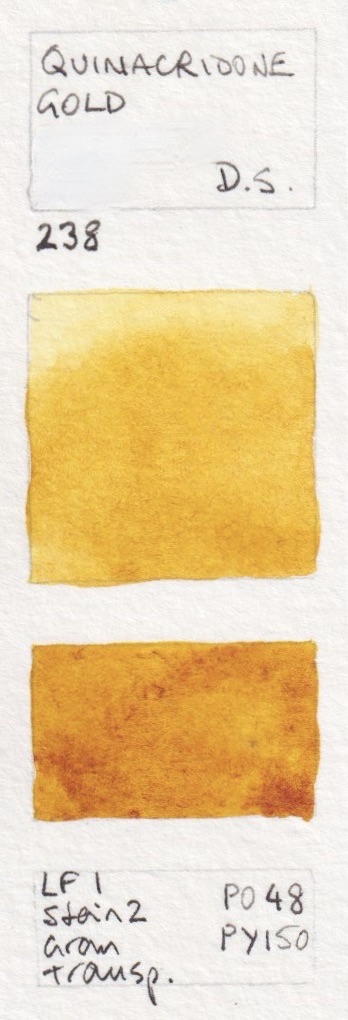
I've been using Daniel Smith watercolours since 1995 - just two years after they were first produced. They started with just 18 colours, including quinacridone gold, sap green, new gamboge, yellow ochre and the raw and burnt siennas that I still love today. Over the years I managed to try pretty much every colour they have ever produced, and in 2015 and again in 2017 I went over and visited the factory, taught a number of workshops and met up with many of the wonderful Daniel Smith people. I've met up with the CEO and the Vice President frequently over the years, and have worked with the company exploring ideas and colours.

The original range expanded to a massive 252 colours, including the fascinating Primateks and also the 48 luminescent, pearlescent and interference colours that I won't include here. The following charts are arranged based on the two colour charts I have - the newest and a previous one. Colour reproduction is not bad, but not perfect.
March 2023 - the range is currently 266 colours, with some having been discontinued and new ones added. I've updating this blog post with individually colour-matched scans of each swatch. I've put them in the same order as the current colour chart.
Of course you don't need all these colours and nor have I bought them all. I've bought many of them, collected others as free samples and been sent a few by fellow artists and the Daniel Smith company. But many have been tested only from the wonderful dot cards that Daniel Smith were the first to produce.
I can talk about colours for ever, especially these ones. However I will just include a few comments here about the colours I particularly like or use or recommend a lot. The choices are vast :-)
I love Buff Titanium - think of it as an unbleached white. Lovely granulation and perfect for beaches and sandstone, snow gums and marble. There are quite a few great lemon and mid yellows to enjoy.


Daniel Smith Watercolours - Buff Titanium, Nickel Titanate Yellow, Bismuth Vandate Yellow, Hansa Yellow Light,
Azo Yellow, Cadmium Yellow Light (discontinued 2007-8)
Daniel Smith moved away from cadmiums many years ago but I've included some just for comparison with the cadmium hues. Cadmium colours are very lightfast and fun to use when a more opaque effect is needed, but I generally prefer more transparent watercolours for the yellows and reds. I particularly like Hansa Yellow Medium - a lovely mid yellow.


Daniel Smith Watercolours - Cadmium Yellow Light Hue, Cadmium Yellow Medium Hue, Aureolin (Cobalt Yellow),
Cadmium Yellow Deep (discontinued 2010), Cadmium Yellow Deep Hue (2010), Hansa Yellow Medium.
Indian Yellow has changed formulation from the original single pigment version so I have shown both.


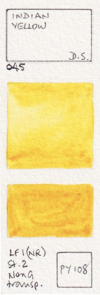


Daniel Smith Watercolours - Mayan Yellow, Lemon Yellow, Indian Yellow (discontinued),
Indian Yellow (updated version), Naples Yellow (updated version), Quinaphthalone Yellow.
Hansa Yellow Deep is another excellent single pigment warm yellow option, that works very nicely as a pair with Hansa Yellow Light or Quinaphthalone Yellow for those wanting a cool and a warm yellow. New Gamboge has also changed formula, since PY153 is not longer available. It's a shame as it's a gorgeous warm yellow pigment so grab any you happen to find if you like the original version. PY110 is very difficult to capture as a scan or a photograph - it is a rich yellow on the cusp of orange. Aussie Red Gold was added in 2017 and is a lovely bright golden orange yellow. It mixes great greens with a range of blues.


Daniel Smith Watercolours - Hansa Yellow Deep, New Gamboge (discontinued), New Gamboge (the new hue),
Isindoline Yellow, Permanent Yellow Deep, Aussie Red Gold (new 2017).
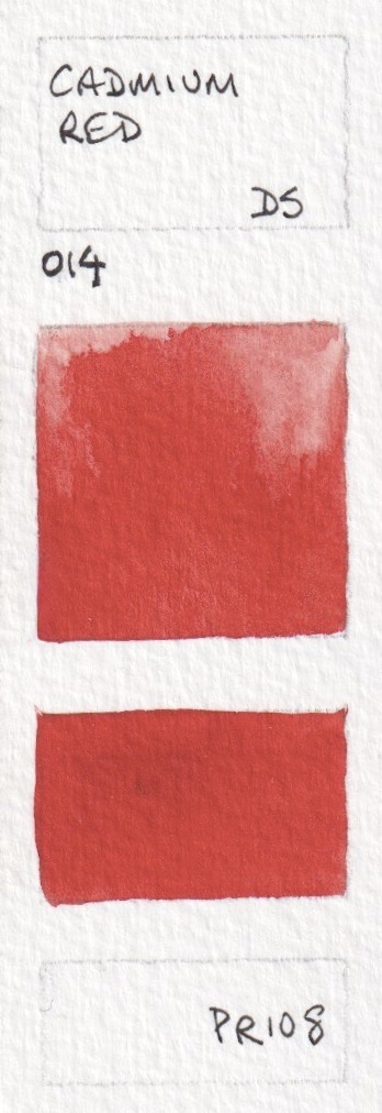
I love orange, but don't tend to have it in my palette since it is easy to mix. In spite of my efforts, it is still difficult to show oranges totally accurately, though these are close. I've included the PR108 as a comparison with the Cadmium Red Scarlet Hue.


Daniel Smith Watercolours - Pyrrol Orange, Permanent Orange, Cadmium Orange Hue, Perinone Orange, Cadmium Scarlet (discontinued 2010), Cadmium Red Scarlet Hue.


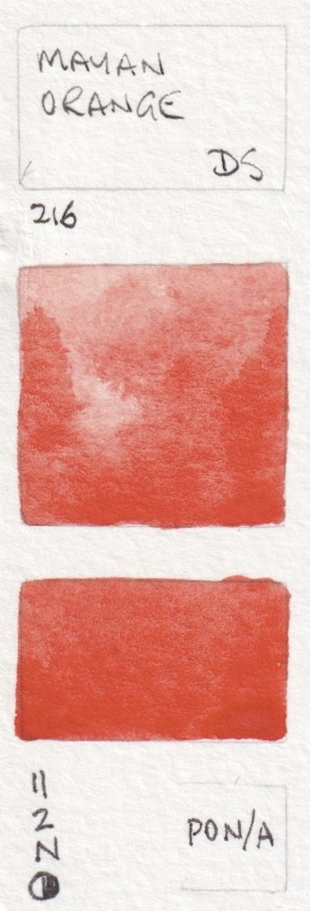
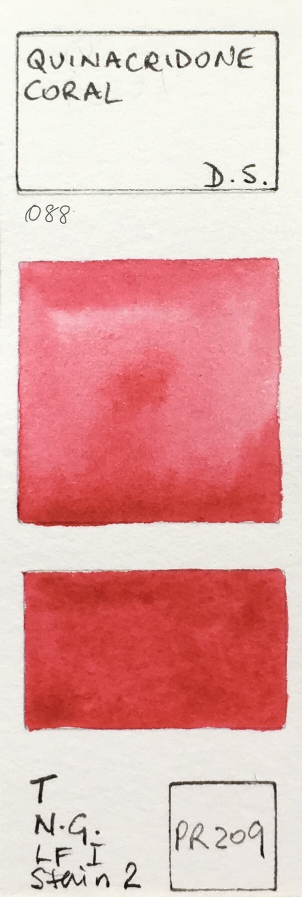

Daniel Smith Watercolours - Transparent Pyrrol Orange (old version), Transparent Pyrrol Orange, Organic Vermilion,
Mayan Orange, Quinacridone Coral, Pyrrol Scarlet.
There are many reds to choose from - some brighter, some more dull. While I don't have one in my palette, my choice for a mid fire-engine red would be Pyrrol Red.


Daniel Smith Watercolours - Perylene Scarlet, Anthraquinoid Scarlet, Cadmium Red (discontinued 2010),
Cadmium Red Medium Hue, Pyrrol Red, Perylene Red


Daniel Smith Watercolours - Permanent Alizarin Crimson, Permanent Red, Permanent Red Deep,
Quinacridone Red, Anthraquinoid Red, Mayan Red.


Daniel Smith Watercolours - Alizarin Crimson, Rhodonite Genuine, Carmine, Rose Madder Genuine (discontinued 2017),
Rose Madder Permanent (new 2017), Opera Pink.


Daniel Smith Watercolours - Potter's Pink, Quinacridone Pink, Quinacridone Rose, Quinacridone Lilac (new 2017),
Quinacridone Magenta, Pyrrol Crimson.
Mayan Violet was painted from a small dot and may not represent the actual qualities of this paint.


Daniel Smith Watercolours - Quinacridone Fuchsia, Mayan Violet, Bordeaux, Permanent Violet (old version),
Permanent Violet (new version), Quinacridone Violet.
I tend to mix my own purples, but there are some lovely granulating pigments that can add texture to your paintings. PV49, PV14 and PV15 are never powerful colours, but have interesting granulation. Mixing Ultramarine with PV19 creates fabulous strong and granulating purples.

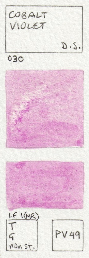


 Daniel Smith Watercolours - Perylene Violet, Cobalt Violet, Wisteria (new 2017), Cobalt Violet Deep,
Ultramarine Red, Rose of Ultramarine.
The photograph doesn't capture the beauty of the Amethyst, which, like many of the Primateks, has a touch of sparkle. It's a powerful but slightly neutralised deep purple

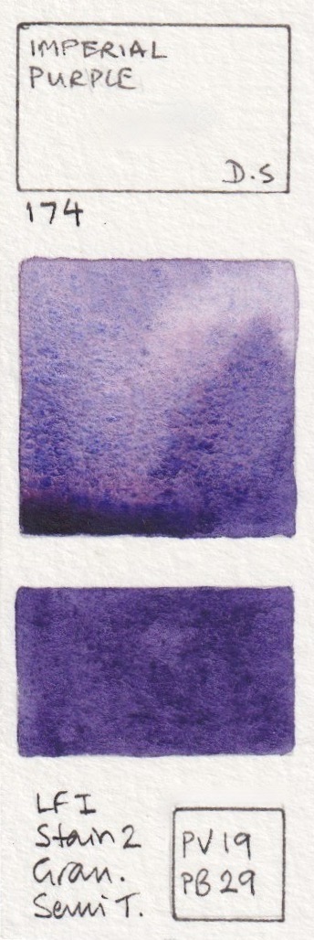


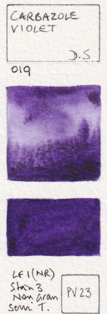
Daniel Smith Watercolours - Quinacridone Purple, Imperial Purple, Purpurite Genuine (#164), Ultramarine Violet,
Amethyst Genuine, Carbazole Violet.
I love the crazy granulation of the three-pigment Moonglow - the rose floats, the viridian speckles and the ultramarine granulates - it is rather fun to play with. Shadow Violet is similar but cooler.


Daniel Smith Watercolours - Cobalt Blue Violet, Moonglow, Shadow Violet, Sugilite Genuine,
Kyanite Genuine, Indigo


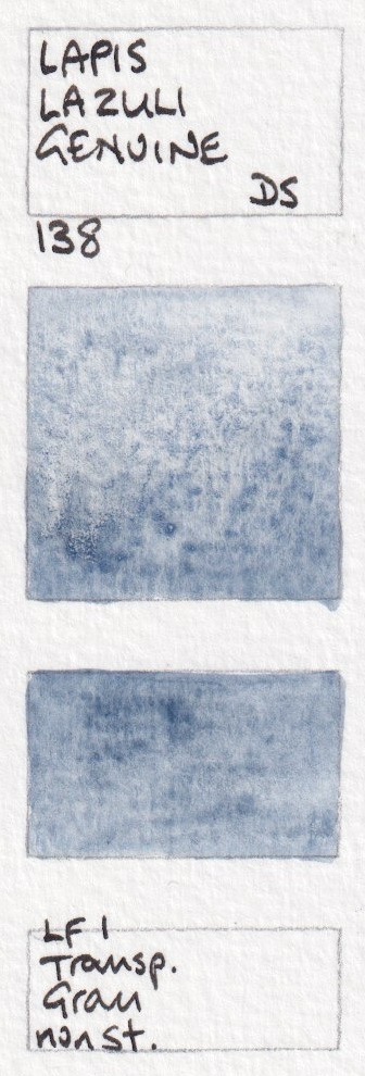


Daniel Smith Watercolours - Mayan Dark Blue, Indanthrone Blue, Sodalite Genuine, Lapis Lazuli Genuine,
French Ultramarine, Ultramarine Blue.
Cobalt blue a beautiful mid blue - neither warm nor cool. Phthalo Blue Green and Red Shades behave in a similar manner - you can see here that the Red Shade is definitely warmer. I generally suggest the Green Shade if you want it to be your cool blue. King's Royal Blue was added in 2022.


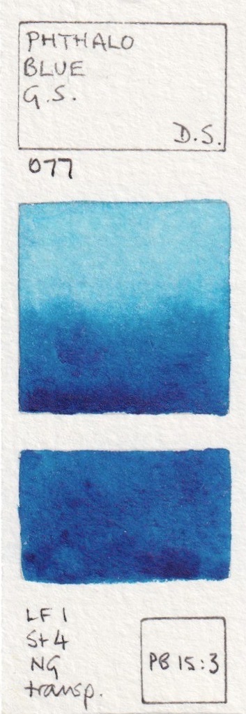
Daniel Smith Watercolours - Cobalt Blue, Phthalo Blue Red Shade, Lavender (new 2017), Lapis Lazuli Genuine,
King's royal blue (new 2022), Verditer Blue, Phthalo Blue Green Shade.
Cerulean Chromium is one of my favourites, mixed with Ultramarine for skies. Great anywhere in the world :-) It is more powerful and slightly cooler than Cerulean. Phthalo Blue Turquoise was released more recently and is the lovely PB16 turquoise pigment.
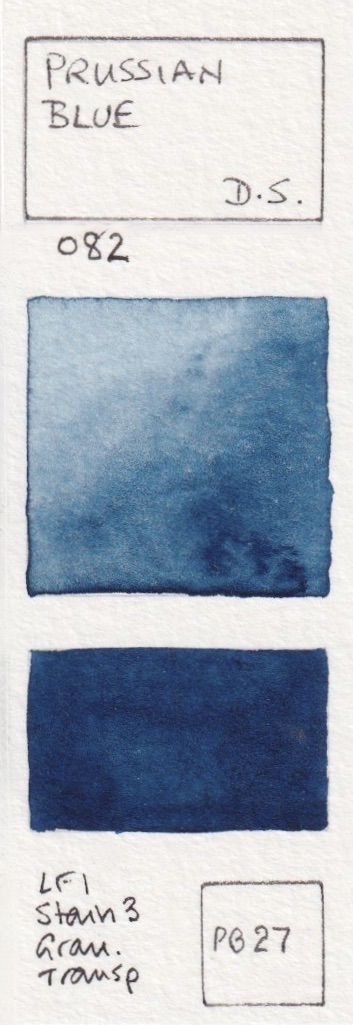
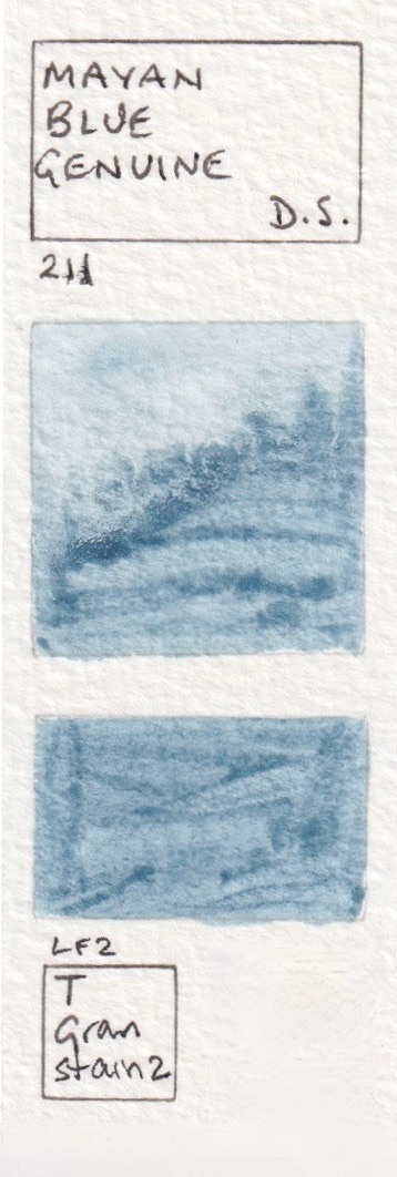


Daniel Smith Watercolours - Prussian Blue, Mayan Blue Genuine, Cerulean Blue, Cerulean Blue Chromium,
Manganese Blue Hue, Phthalo Blue Turquoise (new 2018?)


Daniel Smith Watercolours - Cobalt Teal Blue, Phthalo Turquoise, Ultramarine Turquoise,
Natural Kingman Turquoise Genuine, Sleeping Beauty Turquoise Genuine, Cobalt Turquoise.
I love the granulation of Blue Apatite Genuine and Lunar Blue (so many lovely blues!) Viridian is a wonderful green option if you want a less staining and more granulating mixing green than the very powerful Phthalo Green blue shade.


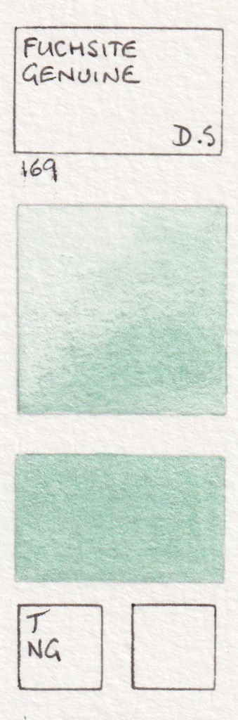

Daniel Smith Watercolours - Amazonite Genuine, Blue Apatite Genuine, Lunar Blue, Cobalt Green Pale,
Fuchsite Genuine, Viridian.
Phthalo Green Blue Shade is another of my basic colours. I doubt I've ever used it alone, but it's great for mixing. Jadeite is a lovely alternative for those who don't want to use the potentially overpowering phthalo green. As a cool green, it mixes in a similar way, but with granulating and a bit more of a realistic look. Like Viridian above, it is a less staining and more granulating cool (blueish) green.


Daniel Smith Watercolours - Diopside Genuine, Phthalo Green BS, Cascade Green,
Jadeite Genuine, Cobalt Green, Spring Green.
In 2015, PO49 was replaced in DS mixes with the hue made from PO48+PY150. This meant a change in formula for Hooker's green as well as Sap Green and Undersea Green (below).


Daniel Smith Watercolours - Permanent Green Light, Phthalo Yellow Green, Permanent Green, Phthalo Green yellow shade, Hooker's Green (Original formula), Hooker's Green (New formula 2015).
Sap Green is a terrific convenience green for many landscape and botanical studies. The newer formulation is very similar to the original. I love Serpentine Genuine - not just because it also comes from Australia, but because it creates a grassy meadow in one wash :-) Green Apatite Genuine is a remarkable paint as it will create soft greens, grassy greens and deep olive greens depending how thickly is it applied - excellent in a limited or plein air palette.


Daniel Smith Watercolours - Sap Green (original formula - discontinued 2015), Sap Green (new version 2015), Serpentine Genuine, Chromium Green Oxide, Green Apatite Genuine, Terre Verte
Perylene green is fabulous - another of my basic palette colours. I enjoy using Rare Green Earth on stone and pebble studies. Undersea Green is the colour of Australian gum leaves.


.jpeg)


Daniel Smith Watercolours - Sap Green Deep, Perylene Green, Prussian Green (original, discontinued), Prussian Green (new version), Rare Green Earth, Undersea Green (Original, discontinued)


Daniel Smith Watercolours - Undersea Green (new version from 2015), Ziosite Genuine, Olive Green,
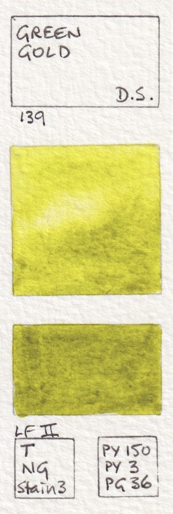
Green Gold, Rich Green Gold, Nickel Azo Yellow
There are a lot of yellow earth options, many quite similar. The Bronzite and Burnt Bronzite have a slight shimmer. It is helpful to explore each in mixes, especially with blues. I haven't explored the new Raw Sienna Light much yet, though a yellow earth will generally make useful greens.


Daniel Smith Watercolours - Bronzite Genuine, Verona Gold Ochre, Burnt Bronzite Genuine,
French Ochre. Raw Sienna Light (new 2017), Burgundy Yellow Ochre.
Chrome Titanate Yellow is a new addition (2022) and this brown pigment is a gorgeous golden colour that mixes lovely greens with various blues - as does Transparent Yellow Oxide. I love Raw Sienna for the glow of sunsets in the sky. It's also useful for skin tones. I tend to have Yellow Ochre, Raw Sienna, Quinacridone Gold and Goethite available in my palette.


Daniel Smith Watercolours - Chrome Titanate Yellow (new 2022), Yellow Ochre, Mars Yellow,
Yavapai Genuine, Raw Sienna, Transparent Yellow Oxide.


Daniel Smith Watercolours - Mont Amiata Natural Sienna, Environmentally Friendly Yellow Iron Oxide, Goethite (Brown Ochre), Quinacridone Gold Deep (discontinued), Quinacridone Gold Deep (new version 2015), Italian Deep Ochre.


Daniel Smith Watercolours - Lunar Earth, Burnt Yellow Ochre (discontinued), Burnt Yellow Ochre, Garnet Genuine,
Roasted French Ochre, Burgundy Red Ochre,
I love the most opaque of watercolours - Indian Red - as a red earth. With its slightly pink undertone it will mix interesting earthy purples with a blue. Venetian Red, also a PR101 granulating reddish earth colour, is usually just a little more on the orange side, without the pink undertone of Indian Red. The granulation is terrific.


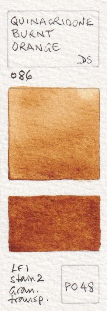

Daniel Smith Watercolours - Indian Red, Venetian Red, Italian Burnt Sienna, Quinacridone Burnt Orange,
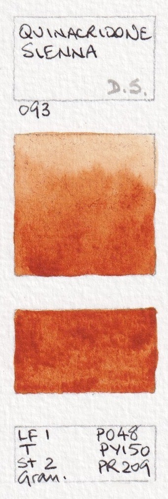
Quinacridone Sienna (original mix discontinued), Quinacridone Sienna (from 2015),


Daniel Smith Watercolours - Pompeii Red, Red Fuchsite Genuine, Terre Ercolano, Minnesota Pipestone,
Italian Venetian Red, English Red Earth,
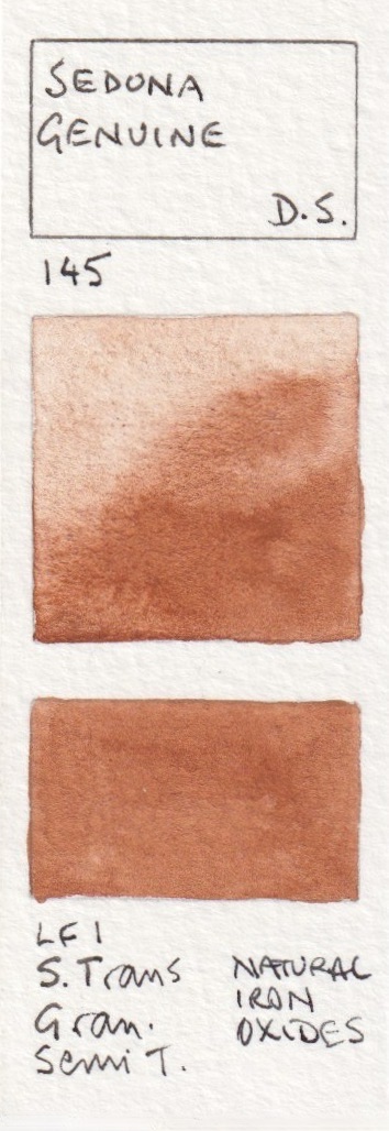
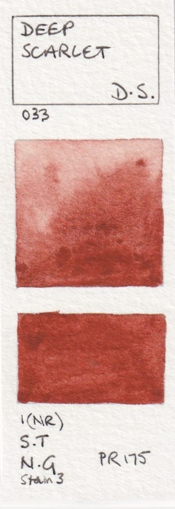
There are so many amazing earth colours! Hematite Burnt Scarlet is a very granulating Burnt Sienna option. Quinacridone Burnt Scarlet, Perylene Maroon or Deep Scarlet could be used if a brighter 'earth' red was required. Quinacridone Burnt Scarlet is also known as brown madder in some ranges.


Lunar Red Rock is very similar to Indian Red but a little less opaque. All the Lunar colours granulate beautifully. Piemontite is another favourite 'extra' colour. It is a bit like an Indian Red but has a gorgeous dusty rose undertone and fascinating granulation. The primateks are so interesting!


Daniel Smith Watercolours - Red Jasper Genuine(new 2019), Hematite Burnt Scarlet, Quinacridone Burnt Scarlet,
Perylene Maroon, Sedona Genuine, Deep Scarlet,


Daniel Smith Watercolours - Napthalmide Maroon, Lunar Red Rock, Piemontite Genuine, Tiger's Eye Genuine,
Burnt Tiger's Eye Genuine, Hematite Genuine,
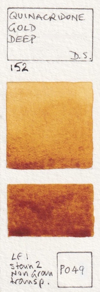
Quinacridone Gold was one of the first Daniel Smith watercolours I bought back in 1995. I still love it. As this pigment is no longer available, the new hue has been produced, which mixes in a very similar manner. Interestingly, the PY150 increases the range of the colour as it can be diluted to a cooler yellow than the original PO49. Permanent Brown is a lovely alternative to an Indian Red if you want a more transparent and non-granulating earth red option.


Daniel Smith Watercolours - German Green Raw Umber, Hematite Violet Genuine, Mummy Bauxite, Permanent Brown,
Quinacridone Gold (discontinued), Quinacridone Gold (from 2015),
Transparent Red Oxide is one of my absolute favourite watercolours - the perfect colour for rust, which I love to paint, or as an alternative for Burnt Sienna (though I tend to have both). The EF Brown Iron Oxide is excellent as a really granulating burnt umber option.


Daniel Smith Watercolours - Raw Umber Violet, Transparent Brown Oxide, Transparent Red Oxide, Fired Gold Ochre,
Burnt Sienna Light (new 2017), Environmentally Friendly Red Iron Oxide.
Burnt Sienna as a palette staple and I love this version - PBr7 rather than the PR101 burnt orange version. It can be used as a very convenient skin tone for many skin colours simply by watering it down. Burnt Umber is a lovely classic colour - a rich warm brown. I love the granulation of the Enviro-friendly watercolours. Raw Umber is a colour I use a lot as a cool dark brown, and I usually include it in a palette of 12 or more as it is not an easy to create a cool dark brown quickly from palette colours.


Daniel Smith Watercolours - Burnt Sienna, English Red Ochre, Burnt Umber,
Environmentally Friendly Yellow Iron Oxide, Raw Umber, Sepia,
And now for some darker darks. I don't tend to use black in watercolours but the Graphite Gray is like working with liquid pencil - lovely!


Daniel Smith Watercolours - Sickerite Genuine, Van Dyck Brown, Bloodstone Genuine, Lunar Violet,
Neutral Tint, Graphite Grey,
There are now many grey options in the Daniel Smith range, many added in 2019. These include my Jane's Grey mix - a lovely granulating and liftable grey without black pigments, Alvaro's greys, created with Alvaro Castagnet, and Joseph Z' greys created with the wonderful painter Joseph Zbukvic.


Daniel Smith Watercolours - Jane's Grey (new 2019), Payne's Blue Gray (new 2017), Payne's Gray, Alvaro's Caliente Grey (new 2019, Alvaro's Fresco Grey (new 2019), Joseph Z's Warm Grey (new 2019),


Daniel Smith Watercolours - Joseph Z's Neutral Grey (new 2019), Joseph Z's Cool Grey (new 2019), McCracken Black (new 2022), Jane's Black (Red/Green) (new 2022), Jane's Black (Blue/Orange) (new 2022), Ivory Black,
Lunar Black makes me break all my not-using-black rules - it's an extra colour I have fun with - just as Buff titanium puts a white pigment in my palette :-) Grey Titanium is a really useful colour for urban sketching - concrete! Titanium White is whiter and more opaque than Chinese White


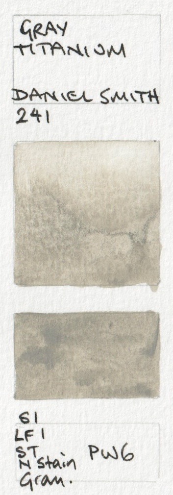


Daniel Smith Watercolours - Lamp Black, Lunar Black, Black Tourmaline Genuine, Gray Titanium (new 2019),
Chinese White, Titanium White
The fifth new colour for 2022 (along with the blacks, the King's Royal Blue and the PB24 yellow) was Iridescent Vibrant Raspberry. I haven't attempted to show the iridescent or pearlescent colours as they are so difficult to capture on screen.
I'll finish with a few colours that have been discontinued but it's rather nice to know what they looked like. Hot Mulled Cider was a scented PY150 seasonal colour. Côte d'Azur Violet was an incredibly subtle granulating pink earth colour. Azurite was really beautiful but oxidised in the tube so is no longer available.


Daniel Smith Watercolours - Hot Mulled Cider (limited seasonal release), Cote d'Azur Violet (discontinued),
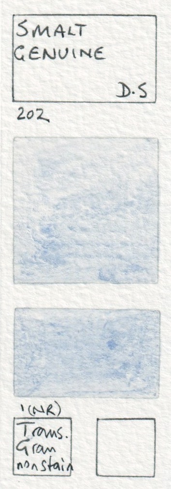
Smalt Genuine (Discontinued), Azurite Genuine (discontinued),
Vivianite or Blue Ochre was another lovely colour for stones. YInMn Blue was a sample colour - not commercially available - but this is a very beautiful version of this rare mineral pigment. I wrote about it here.


Daniel Smith Watercolours - Vivianite Genuine (discontinued), Bohemian Green Earth (Discontinued),
Malachite Genuine (discontinued), YInMn Blue (sample only)
As always, if you notice any errors, do let me know.
Happy painting :-)
Search for more watercolour ranges in the search bar.
You can find the new Daniel Smith Gouache here.