Showing posts with label Schmincke Horadam gouache. Show all posts

Friday, 19 October 2018

Gouache


My Gouache Palette.  

There are two styles of gouache that I have worked with. One has chalk added to make it more opaque. This is really lovely to work with fresh from the tube, but doesn't re-wet well.

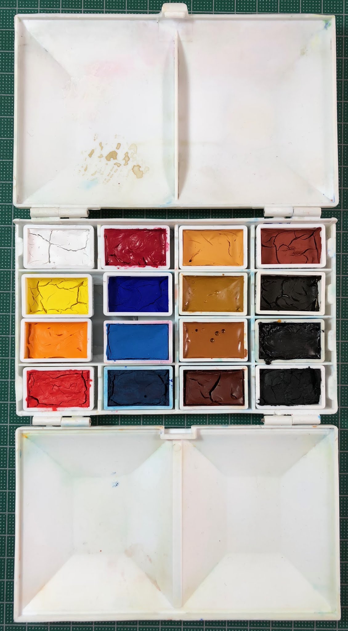
The other is really just a very concentrated watercolour - no added chalk. This is the type I am most interested in. As far as I am aware, the brands that created this sort of gouache are M.Graham, Da Vinci and Schmincke. I've ended up using a mixture of these brands in my gouache palette. I am looking for fairly opaque but re-wettable versions since it is a travel and teaching palette. They will all crack a bit if you fill a pan too fast - it needs to be done in many stages - but I find it is also helpful to add a drop or two of glycerine to help them to rewet. They are designed to work with watercolours or alone. I have shown how it looks if no glycerine is 
added when filling (always bit by bit) - you can see some cracking in the colours along the left side.

I have previously posted a couple of swatches of gouache when setting up a sketching palette -
M.Graham here and painted out here, Schmincke here the Zorn palette here and a photo of a swatch of my gouache palette here.


I will update these individual swatches, but I think it is more helpful to have them altogether.

I had some old gouache from the 1990s - some with no numbers or pigment information so I've included those too.

I used a 6 colour plus black and white set in the Art Spectrum range to create a whole range of colour charts and wheels here, but the Black and White, Deep Yellow, Ultramarine and Vermilion I used have long since dried up so I haven't included a sample of those.

Here are the various tube sizes - the Da Vinci 37ml tubes are enormous! The others range from 14ml for the W&N, 15ml for the Schmincke Horadam, the M.Graham and the smaller Da Vinci, and 22.5 ml for the Art Spectrum.
Tubes of gouache vary quite a bit in size, just like watercolour.

Here are the whites.

White Gouache - Titanium White Da Vinci) Titanium White Schmincke, Opaque White Schmincke, 
Permanent White Winsor & Newton, titanium White M.Graham.

Cadmium pigments made a whole lot of sense if you want opaque colours without additives, but they are expensive.

Cool and mid yellow Gouache - Hansa Yellow Light Da Vinci, Cadmium Yellow Light Schmincke, 
Primary Yellow Winsor & Newton, Azo Yellow M.Graham, Primrose Art Spectrum.


Mid to warm yellow Gouache - Cadmium Yellow Schmincke, Cadmium Yellow Hue Schmincke, 
Indian Yellow Schmincke, Cadmium Yellow Deep Schmincke, Gamboge M.Graham. 

I really love the pigment PR255 as a warm red. It's probably not as opaque as a cadmium scarlet would be but it's gorgeous.

Warm Red Gouache - Vermillion Tone Schmincke, Vermillion Red Schmincke, Naphthol Red M.Graham. 


Cool red Gouache - Alizarin Crimson (Quin) Da Vinci, Carmine Schmincke, Madder Red Schmincke, 
Quinacriodone Rose M.Graham, Crimson Art Spectrum.


Magenta Gouache - Magenta Da Vinci 

I like the depth of the Schmincke Ultramarine Deep, but these are all nice to paint with.

Ultramarine Gouache - Ultramarine Da Vinci, Ultramarine Deep Schmincke, Ultramarine M.Graham. 


Phthalo pigments are not opaque. They are good for tinting other colours though.

Cool blue Gouache - Phthalo Blue Da Vinci, Helio Blue Schmincke, Intense Blue Winsor & Newton, Myosis Blue, Winsor & Newton, Asure Blue Winsor & Newton.

I don't think the Art Spectrum was a genuine cerulean pigment as it looks like a phthalo blue, but the M.Graham certainly is.

Cool blue and cerulean Gouache - Paris Blue Schmincke, Peacock Blue Winsore & Newton, 
Cerulean Blue M.Graham, Cerulean Blue Art Spectrum


This is a lovely turquoise colour. I don't use it much but it is a little more opaque than the phthalos and can be used to neutralise a warm red, or to mix greens with the yellows.

Turquoise Gouache - Helio Turquoise Schmincke.

Phthalo green is usually a transparent pigment.

Green Gouache - Helio Green Bluish Schmincke, Phthalocyaninie Green M.Graham.


I really like PBr24 but only have it in my gouache palette. From 2022 it is also available in Daniel Smith gouache.

Gouache - Naples Yellow Winsor & Newton, Titanium Gold Ochre Schmincke.

The Da Vinci Yellow Ochre is just lovely.

Yellow ochre Gouache - Yellow Ochre Da Vinci, Yellow Ochre Winsor & Newton. 


Raw Sienna Gouache - Raw Sienna Winsor & Newton, Raw Sienna M.Graham, Raw Sienna Da Vinci, 
Raw Sienna Schmincke.


Burnt Sienna Gouache - Burnt Sienna Da Vinci, Burnt Sienna Schmincke, Burnt Sienna Winsor & Newton, 
Burnt Sienna M.Graham. 

Apart from the English Red, these are old Winsor and Newton tubes with no pigment information. They probably pre-date the internet ;-)

Red earth Gouache - English Red Schmincke, Chinese Orange Winsor & Newton, Venetian Red Winsor & Newton,
Red Ochre Winsor & Newton.

The Da Vinci Raw Umber is a lovely deep cool brown.

Dark brown Gouache - Raw Umber Da Vinci, Raw Umber Winsor & Newton, Raw Umber M.Graham, 
Sepia Winsor & Newton.

Schmincke Neutral Grey gouache, like their watercolour, is made from coloured pigments not black or white. I really like that :-). The Winsor & Newton tubes predate pigment information.

Grey Gouache - Neutral Grey Schmincke, Grey No 1 (Light) Winsor & Newton, Grey No 2 Winsor & Newton, 
Grey No 3 Winsor & Newton, Grey No 4 Winsor & Newton, Grey No 5 (Dark) Winsor & Newton.

I liked the Schmincke best in this range, though I tend to use the grey above.

Black Gouache - Black Da Vinci, Ivory Black Schmincke, Jet Black Schmincke, 
Ivory Black CMYK Winsor & Newton, Lamp Black M.Graham.

I use some sparkly colours for calligraphy, not for painting. The Silver and Bronze are very old tubes.

Metallic Gouache - Red Pearl Schmincke, Gold Pearl Schmincke, Silver Linel, Bronze Winsor & Newton.


Sunday, 3 April 2016

Watercolour and gouache choices - some of my palettes painted out.

I have a number of palettes of different sizes set up in many different ways and thought I'd share some of them all in one post. Most I do actually use, but some are set up ready to go and may be sold. I tend to set up the colours from light though yellows to reds to blues, then greens then yellow earths etc through to the darks. It works sell for me - I don't try to separate warms and cools as some do as I nearly always mix up warm and cool colours together.

My intention is always to set up palettes so I can paint any subject - landscape, figures, florals, urban landscapes, seascapes - rather than specialist palettes. I make pigment choices based on what type of palette it is and what sized paintings it will be used for - small travel sketches or larger studio paintings.

If I am setting up a travel or plein air palette, I will tend to include Cerulean and Ultramarine for painting skies, for example, and may well include primatek colours that are fun for extra granulation. I may also tend to put more granulating earth colours to capture the landscape. My studio palettes only contain pigments I have tested to be lightfast and very predictable as I do most of my botanical paintings in my studio. Photos of a range of palettes can be seen on my website. Here are the paint-outs.

Herring Compact half pan palette
set up with 24 half pans of
Daniel Smith watercolour,
covering the thumb hole.

This is the Herring Compact palette from the UK. This can be set up in a number of different ways. This is my favourite configuration - 24 colours with a space for a travel brush. You can see other variations on my website here. It is plastic, so nice and light, but has excellent mixing wells.

The colours are Buff Titanium, Hansa Yellow Medium, Quinacridone Gold, Transparent Pyrrol Orange, Pyrrol Crimson, Quinacridone Rose, Ultramarine, Phthalo Blue RS, Cerulean Chromium,  Cobalt Turquoise, Phthalo Green BS, Perylene Green, Undersea Green, Sap Green, Rich Green Gold, Goethite, Raw Sienna, Transparent Red Oxide, Burnt Sienna, Indian Red, Piemontite Genuine, Burnt Umber, Raw Umber, Jane's Grey.

This palette is wonderful for plein air as there are so many greens, interesting granulating earths and the Transparent Red Oxide and Piemontite are wonderful for painting rust.

24 colour paint-out of a wonderful plein air palette. #Daniel Smith watercolours painted in a handbook watercolour sketchbook A5 landscape.

Mijello palette set up with 18 Daniel Smith watercolours

The Mijello palette is a great design for larger brushes and I am using this for demonstrations when teaching. There are 18 paint wells so I have included less convenience mixes than the above palette.

Colours are Buff Titanium, hansa Yellow Medium, Pyrrol Scarlet, Pyrrol Crimson, Quinacridone Rose, Ultramarine, Cerulean Chromium, Phthalo Blue GS, Phthalo Green BS, Perylene Green, Yellow Ochre, Goethite, Raw Sienna, Burnt Sienna, Indian Red, Raw Umber, Jane's Grey. This is my Ultimate Mixing Set, along with yellow ochre, raw sienna and perylene green - a great range of single pigment colours.

Mijello palette painted out on Stillman & Birn Alpha paper. 18 colour Daniel Smith watercolour palette.

Little lipstick palette set up with
7 Daniel Smith watercolours.
This little palette is actually from a makeup store and was intended for lipsticks. It is too small for a normal travel brush but is set up with an interesting and practical range of 7 colours. I haven't used it yet, and may end up selling it, but I like the way these colours work together.

Colours are Hansa Yellow Medium, Quinacridone Gold, Quinacridone Rose, Ultramarine, Perylene Green, Burnt Sienna and Jane's Grey.

The smallest palette I will actually use is 7 colours, though I love to come up with extremely versatile limited palettes. This is one of three 7-colour palettes I have. The others are a locket and a keyring :-)

Paint-out and mixes of a versatile 7-colour palette of Daniel Smith watercolours,
painted in a Stillman&Birn Alpha A4 Sketchbook


Robertson style Paintbox with 20 colours.

This is my studio palette - a lovely handmade brass palette based on the Robertson designs. The 20 colours are a wonderful range with some convenience greens and great dark blues and greens. These are my basic colours to paint with in my studio, though I have other extras for special purposes.

The colours are Buff titanium, Hansa Yellow Medium, Quinacridone Gold, Transparent Pyrrol Orange, Pyrrol Crimson, Quinacridone Rose, Ultramarine, Indanthrone Blue, Phthalo Blue RS, Cerulean Chromium, Phthalo Green BS, Perylene Green, Undersea Green, Sap Green, Goethite, Burnt Sienna, Indian Red, Burnt Umber, Raw Umber, Jane's Grey.
My favourite 20 palette colours. Daniel Smith watercolour, painted in a Stillman & Birn Alpha sketchbook, A4.


I have another Herring full pan palette set up with gouache. It is a mix of M.Graham and Schmincke gouache as they will re-wet in a palette, along with a couple of opaque watercolours - Buff titanium and Indian Red. 

I carry this palette with me when sketching and use it in my studio. It is more convenient having the gouache ready to paint in the palette than squeezing it out freshly each time.When I use up the yellows I will probably replace them with cadmium pigments for greater opacity.

I paint a palette chart on the first page of each sketchbook. As gouache is an opaque medium I have painted this chart in the Strathmore toned tan sketchbook. It's not a perfect sketchbook for watercolour or gouache but I'll just paint on one side of the paper.


My opaque palette - largely a gouache palette with a mix of Schmincke and M.Graham gouache, along with Buff Titanium and Indian Red DS watercolours. Painted in a Strathmore Toned Tan sketchbook, 5.5"x 8.5" portrait.


This is my Little Lady, a tiny bespoke brass palette set up with my basic palette of 20 colours as painted out at the top. It has 4 extra colours on the right which I can change around. Currently it has Cobalt turquoise (great for copper domes), Serpentine Genuine (great for grassy areas), Green Apatite Genuine (lovely for foliage) and Lunar Black (an amazing granulating black) as the extra colours, though I sometimes put in Piemontite, Transparent Red Oxide and/or raw sienna if I am sketching more urban scenes.

This palette lives in my handbag, in a sketching kit. The waterbrush is an extra short one as seen in the very top photo - this is a really tiny treasure!


This is a little travel palette from Singapore, designed to hold 12 half pans but adapted to hold 14 of my Ultimate Mixing Set. It's just missing Indian Red, but you mix and Indian Red hue with the palette colours Pyrrol Scarlet and Phthalo Blue.

Travel palette with 14 watercolours -
from my ultimate mixing set.
My Ultimate Mixing set of 13 Daniel Smith colours (plus Jane's Grey) in a travel palette.


Travel palette with all 15 of my
Ultimate Mixing Set
The colours are Buff Titanium, Hansa Yellow Medium, Quinacridone gold, Pyrrol Scarlet, Pyrrol Crimson, Quinacridone Rose, Ultramarine, Cerulean Chromium, Phthalo Blue GS, Goethite, Phthalo Green, Burnt Sienna, Raw Umber and Jane's Grey.

Update - thanks to MagaMerlina (comment section) I have squashed the metal divider down (it is very well attached so will take some serious tools to remove completely) and squeezed all 15 of my Ultimate Mixing set into this little palette. I have used the slightly more square Schmincke half pans and sanded a little off the ones in each corner, though if you have the smaller Winsor & Newton pans they will fit in even better.

Indian Red added - I do love this colour not only to create a lovely earth triad with goethite and cerulean chromium, but also for its softness in portraits - lips, eyes and cheeks, if really watered down.

Now to get on with some painting!

Thursday, 11 September 2014

Schmincke Gouache swatches

Here is my small range of Schmincke Horadam artist quality gouache. I don't use them often, but there are times a more opaque watercolour is needed and Schmincke gouache will rewet well so can be squeezed into a palette ready for use. They intermix with the watercolours too.

Schmincke Horadam Gouache Indian Yellow, Cadmium Yellow Hue, Vermillion, Carmine and Ultramarine Deep

Schmincke Horadam gouache Helio Blue, Helio Green Bluish, Burnt Sienna, Neutral Tint and Ivory Black.

Here is the link to the full range PDF

I like the fact that the neutral tint does not contain black. I do have black and white, though, for monochromatic sketches or working on a coloured or watercolour washed paper. I also have a yellow ochre. It's a good basic 12 colour gouache range. :-)