Tuesday 23 February 2021

Van Gogh watercolours.

When I was in Amsterdam for the Urban Sketchers Symposium in 2019, the faculty was taken on a fabulous tour of the Royal Talens factory. Royal Talens has been creating art materials since 1899. 

We also had the chance to 'play' with many of the products created there or under the Royal Talens umbrella - Sakura, Van Gogh, Rembrandt, Bruynzeel, Ecoline and others.

I have shown many of the 120 colour professional Rembrandt watercolour range here, but we were given a dot card sampler of the Van Gogh student range. While I don't usually write about student ranges, as they don't have all the characteristics that I so enjoy about professional watercolours, I decided this one may be helpful since so much work went into producing it. However changes have been made in the formulations since this was produced so the latest product information is best seen on the website.

Van Gogh sample dot card 2019


Student ranges are often less-highly pigmented than professional ranges, and many contain more binders or fillers. While it as more difficult to get a strong wash with many of these colours, others painted out very nicely. 

Van Gogh student watercolours 2019

Van Gogh student watercolours 2019

The information on these charts was based on the dot-card, but some was incorrect. Dusk Yellow is PBk11/PY128, and the PBk101 pigments listed for the gold and metallics should be PBk11.
Van Gogh student watercolours 2019


Happy painting!

Monday 22 February 2021

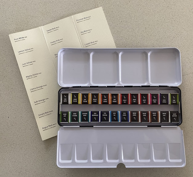
Etchr 24 half pan watercolour set


I have concentrated on artist quality watercolours, but occasionally there is a product in the student range that is worth exploring. I really like the Etchr watercolour sketchbooks and enjoy the innovation of this company. I have included their Mini Palette on my website. The Etchr watercolour set is described as a 'premium student' set. It was launched on Kickstarter and is now available through the Etchr Lab website.

Student sets often contain hues made up of mixes of cheaper pigments, so that each colour can be priced the same. They don't often contain a lot of single pigment colours and they often have a lesser pigment load so can be difficult to work with - weak or difficult to activate. This set has 20 single pigment colours, so when offered a set to try, I was very interested.

I was sent the boxed set with the palette, watercolour paper and felt-tip pens. The 24-colour half pan set comes with a printed colour chart you can fill out yourself. The half pans are wrapped with pigment information, lightfast ratings and a note about transparency. I found some of the pigments very surprising -  - some I haven't come across before, some are not usually found in a student range. The biggest surprise was the cadmium and cobalt pigments. These are usually only found in the series 3 or 4 professional ranges as they are expensive pigments. To see them in a student range is quite exceptional.


You can't buy individual colours or tubes, only the full set. But that can simplify the process of getting started with watercolours for some people. You can also very easily swap out a half pan with a different colour or a different brand, or refill an empty pan with tube colour later.

The set is well balanced around the colour wheel, with a warm and cool yellow, two oranges, three reds and a magenta, a purple, four blues, a turquoise (although it isn't a turquoise in my set, which I believe is a mistake), three greens and five earths. There is also a black and white - colours not necessarily used by professional watercolorists but very common in student sets. 

I found many of the transparency ratings odd, especially Simply Red, which is made with a cadmium red pigment so would normally be opaque, and Sky Blue, a phthalo blue which would normally be transparent. So I added a black line to the swatches before painting them and you can see how transparent or opaque each colour actually is by whether it covers this mark or not. Clearly, some of the ratings are incorrect - as you can see below. 

Etchr Watercolour set of 24 half pan colours

Transparency ratings aside, most colours painted out brightly and cleanly. I would consider renaming some of the earth colours to better represent what we see - Umber Brown is more of a Burnt Sienna hue and Burnt Sienna is more of a Burnt Umber Hue. I rearranged them in the palette and have painted them out in a more logical order.

This set is certainly worthy of the label Premium Student set. For more insight, watch my YouTube video painting out the full set to create this chart.

Happy Painting.

Sunday 14 February 2021

CARAN D'ACHE Museum Watercolour Pencils

Caran D'Ache create a number of different ranges of pencils, pens, fountain pens, crayons and other art and office materials. While I own a few of their beautiful pens and pencils, I am most interested in their watercolour pencils. I've written about the Museum range before - the original clutch style set that is no longer available. 

Over a number of years, the Swiss has redesigned the range as traditional pencils. 

Caran d'Ache Museum pencils - full range of 76

I was given a set of 12, as part of a generous Faculty 'goodie bag' when I taught at the last Urban Sketchers symposium in 2019, and have had a few in my sketching kit to explore. These are terrific watercolour pencils, and though the most expensive range as far as I am aware, they deserve a full post. The colours are often unique so many might be useful to add to other collections.

I bought the rest of the range as single pencils and have placed them all in a 96 slot Global pencil case (affiliate link) for easy storage and transporting. They are also available in many beautiful boxed sets. You can see them at Jacksonsart.com (affiliate links) or on the Caran d'Ache website. 

Caran d'Ache set of 12 Museum Pencils

The website gives pigment information on each colour, and each pencil has the lightfast rating stamped onto it. The range of 76 colours has a number of single pigment colours and some lovely subdued hues. While I prefer the pencils to be painted in a solid colour so it is really easy to find the colour you are looking for, the colours at the end of each grey pencil are accurate.

I've drawn these swatches up on 300gsm hot pressed paper, as many people use smooth paper for pencil. I've coloured each swatch from darker to lighter, and added water to the right-hand-side, then drawn back into the wet wash with the pencil to show the wet pencil strength.


The colours are always difficult to show accurately. Yellow is slightly brighter than it appears here and Golden Yellow is a classic clean deep yellow colour. The three yellows are lovely choices for a cool, mid and warm yellow.

Caran d'Ache Museum pencils - White, Primrose, Naples Ochre, Lemon Yellow, Yellow, Golden Yellow


These are reasonably accurate, but the Vermilion is just on the orange side of a mid red and the Light Cadmium Red is between an orange red and a coral. Scarlet is a definite crimson colour, as it appears here.
 
Caran d'Ache Museum pencils - Golden Cadmium Yellow (Hue), Orange, Cornelian, Vermilion, 
Light Cadmium Red (hue), Scarlet.


Anthraquinoid Pink is a little more coral than it appears here. The other colours look quite accurate. Violet Pink is very like Potter's Pink. Purplish Red is a lovely quinacridone magenta option.

Caran d'Ache Museum pencils- Anthraquinoid Pink, Crimson Aubergine, Carmine Lake, Violet Pink, 
Dark Plum, Purplish Red.


It is wonderful to see these beautiful single pigment violets. PV16 abd PV15 are quite gentle pigments and the pencil versions are lovely. Cobalt pigments appear in the blues :-) These swatches are accurate in colour. Purples and blues are usually easier to show.

Caran d'Ache Museum pencils - Manganese Violet, Periwinkle Blue, Violet, Ultramarine Violet, 
Light Cobalt Blue, Genuine Cobalt Blue.


The colours shown here are very accurate. While most of the colours are five stars for lightfastness, Dark Ultramarine is only 3 due to PB1. Night Blue is the indanthrone blue pigment and Phthalocyanine Blue is a really useful cool blue in any palette.

Caran d'Ache Museum pencils - Middle Cobalt Blue, Dark Ultramarine, Night Blue, Prussian Blue, 
Light Blue, Phthalocyanine Blue


There are more lovely single pigment colours here. Chromium Oxide Green is a very opaque colour in watercolours but a really useful colour as a pencil.

Caran d'Ache Museum pencils - Permanent Blue, Ice Blue, Turquoise Blue, Light Malachite Green, 
Cobalt Green, Chromium Oxide Green


This set of greens are lovely and earthy. It usually takes a few pigments to create earthy greens. 

Caran d'Ache Museum pencils - Moss Green, Dark Phthalocyanine Green, Olive, Light Olive, 
Green Ochre, Olive Yellow.


Personally I find these less useful colours, and not hugely different, though the Emerald Green is slightly bluer than it looks here. It is good to see a single pigment Phthalocyanine Green.

Caran d'Ache Museum pencils - Spring Green, Bright Green, Grass Green, Emerald Green, 
Beryl Green, Phthalcyanine Green.


There is a lovely range of earth colours. 

Caran d'Ache Museum pencils - Dark Sap Green, Brown Olive 50%, Olive Brown, Brown Ochre, 
Raw Sienna, Yellow Ochre.


Genuine Umber was the name of the original 548 colour, now just called Umber. It's a useful cool yellowish-brown. 

Caran d'Ache Museum pencils - Genuine Umber (discontinued), Umber (current version), Saffron, 
Light Flesh 10%, Apricot, Cinnamon.


Cinnamon, Burnt Ochre and Terracotta are all similar variations of a burnt Sienna. Brown is a little more like an Indian red and Chestnut a burnt umber. Russet is a lovely colour but not as crimson as it looks here - more of a burnt coral colour.

Caran d'Ache Museum pencils - Burnt Ochre, Brown, Terracotta, Russett, Burnt Sienna 50%, Chestnut.


Raw Umber is like a deep chocolate colour - quite warm, and Cassel earth is another option for a cool dar brown. 

Caran d'Ache Museum pencils - Raw Umber, Cassel Earth, Dark Flesh 50%, French Grey, Sepia 50%, Sepia 10%


I like the slight blue tint of Payne's Grey. Of the blacks, Ivory is warmer and Black cooler.

Caran d'Ache Museum pencils - Steel Grey, Payne's Grey, Slate Grey, Ivory Black, Black.


These pencils are a joy to use. They wet and activate with ease and can be used alone or with regular pencils, watercolour, inks or whatever you wish. 

Happy sketching!
  

Sunday 7 February 2021

Wichitrong Watercolours

I was sent a few sample dots of Wichitrong Watercolours - an artist quality range from Thailand. 

This is a modest range of 24 colours, many single pigments. The only listed ingredients I could find are pigment and gum Arabic, though they feel as though there may also be a honey-like ingredient as well.

Wichitrong watercolours, taken from the Sikpakorn product catalogue

The pigment information is difficult fo find, so I will list it here. The bold colours are those I have tried, shown below.

801 Titanium White: PW6 (Titanium Dioxide) Series1

803 Lemon Yellow: PY3 (Monoazo) Series 1

805 Azo Yellow: PY154 (Benzimidazolone) Series 1

808 Cadmium Yellow Medium: PY37 (Cadmium) Series 3

809 Gamboge: PY154 (Benzimidazolone) + PY42 (Iron Oxide) + PY83 (Diarylide) Series 2

811 Cadmium Orange: PO20 (Cadmium) Series 3

813 Permanent Red: PR254 (Diketo-Pyrrolo-Pyrrolo) Series 2

816 Crimson Lake: PR177 (Anthraquinone) Series 3

817 Rose Madder: PV19 (Quinacridone) Series 3

819 Deep Magenta: PR122 (Quinacridone) Series 3

820 Dioxazine Purple: PV23 (Dioxazine) + PV23 (Carbazole Dioxazine) Series 2

821 Mauve: PV24 (Dioxazine) = PR81 (Rhodiamine Red) Series 2

822 Ultramarine Blue: PB29: (Ultramarine Blue) + PB28 (CoAI2O4) Series 1

825 Phthalo Blue: PB15.3 (Cu Phthalo.Blue) Series 1

826 Cobalt Blue: PB28 (CoAI2O4) Series 3

827 Cerulean Blue: PG50 (Co2TiO4) + PB28 (Cobalt Aluminium Spinel) Series 3

829 Phthalo Green: PG7 (Cu Phthalo Green) Series 1

831 Sap Green: PY83 (Diarylide) + PY168 (Monoazo Yellow) + PG7 ( Cu Phthalo.Green) Series 2

832 Leaf Green: PY154 (Benzimidazolone) + PG7 (Cu Phthalo.Green) Series 2

834 Raw Sienna: PY42 (Synthetic Hydrated Iron Oxide) + PBr7 (Calcined Natural Iron Oxide) + PY1 (Monoazo) + PR101 (Iron Oxide) Series 1

837 Burnt Sienna: PBr7 (Calcined Natural Iron Oxide) Series 1

848 Burnt Umber: PR101 (Irone Oxide) + PY42 (Synthetic Hydrated Iron Oxide) + PB15.3 (Cu Phthalo.Blue) Series 1

840 Payne's Grey: PB15.3 (Cu Phthalo.Blue) + PBk7 (CArbone Black) + PV19 (Quinacridone) Series 1

Here are the samples I tried. They are finely ground pigments that painted out nice and richly. The Burnt Sienna has a very yellow undertone so will mix greens rather than greys with Ultramarine. 

Wichitrong Watercolours - Burnt Sienna, Azo Yellow, Permanent Red and Rose Madder.

Ultramarine has cobalt blue as an additional pigment which is unusual. Cerulean is made from Cobalt blue and cobalt green pigments so should still be liftable, even though it is not made from genuine cerulean blue PB36 or PB35. It is a lovely bright cerulean hue.
Wichitrong Watercolours - Ultramarine Blue, Phthalo Blue, PHthalo Green and Cerulean.

Happy painting.