Showing posts with label aureolin. Show all posts

Wednesday, 2 October 2013

Lightfast tests - seven months

I painted a number of swatches of as many colours as I could find back in January, cut half away to store in a dark drawer, and placed them in a north facing window for the last 7 months. For the first two months they were inside the window, for the next 5 they were stuck on the outside protected only by the plastic sleeve they were in. There was almost no change at all after the first two months, but a bit more now.

First are photographs of each full sheet. They are too large to fit the whole sheet in the scanner, which was not very thoughtful. Next time - A4 sheets!

Then I will go through each scanned section so you can see what colours faded and which have remained - so far.

Lightfast tests page two seven months
Lightfast tests page one seven months


All Daniel Smith colours. The only change is Aureolin,  6th on the top line. PY40 is known to go grey and you can see this very clearly in the diluted wash on the left. Please don't buy or use this colour.


All Daniel Smith colours. No fading evident after 7 months. Note that Quinacridone coral looks different in the scan, but not in real life. One to watch. 

All Daniel Smith colours. It is difficult to see on this scan, but Rhodonite, second on the top line, has lost some of the rose and greyed slightly. Not recommended. All others are fine so far.
All Daniel Smith colours. Prussian Blue 2nd on the bottom line has changed slightly, and was the first to change when I checked last time. Vivianite Genuine has lost some of the blue hue, so is not recommended. Turquoise Genuine and Sleeping Beauty Turquoise have also changed - the Sleeping Beauty has noticeably greyed. All others seem stable to far.
All Daniel Smith colours. I couldn't see any changes in any of these colours.
All Daniel Smith except the final Old Holland Emerald Green. I couldn't see any changes in any of these.
Most of the top row are Daniel Smith, but you may notice Old Holland Manganese Blue with it's genuine granulating pigment, Art Spectrum Sap Green and Old Holland Flesh tint, which has lost it's red tones so is not stable.
On the bottom row are a set of traditional Japanese pigments. Not that the yellow pigment used in traditional Chinese and Japanese colours is not lightfast so has faded out of the greenm the yellow and even the colour that looks like burnt sienna. The Blue on the right has also changed. 
This final image shows traditional Chinese pigments and the faded yellow is even more obvious. The crimson is probably Alizarin PR83 but I don't know for sure - it has obviously faded.
On the bottom row is a Liquitex Hooker's free, some Art Spectrum colours and some Daler Rowney and lefranc et bourgeois colours that have survived fine so far.

So the main problem colours are PY40 Aureolin, Chinese and Japanese yellow, Prussian Blue, a number of Primatek colours (though MANY are fine) and some crimson reds. Surprisingly, the Opera Rose has not faded as expected...yet. I'll put them back in the window and report back in a few months.

September 2014 update here.

Wednesday, 19 June 2013

Watercolour Comparisons 2 - mid yellows

Mid Yellows

I have added all the yellows to my website here.

It is common to have a few yellows in a palette. Traditionally, a cool and a warm yellow, an earth yellow and perhaps a reduced yellow such as Raw Umber. Some artists also add staining or non-staining options, or add an opaque range. I keep a cadmium deep and light in my studio for specific purposes but generally prefer transparent or at least semi-transparent watercolours.

I find I rarely need to use a cool, or green-biased yellow as I am rarely mixing the very bright greens it can make. For me, a good mid yellow that is neither cool nor warm i.e. neither orange-biased nor green-biased is a more useful option than the traditional cadmium or hansa yellow light. This works very well as the only yellow in a limited palette, but is also a nice building colour for an expanded palette.

Aureolin PY40 was the traditional mid-yellow choice, but is not recommended as it goes brown or grey or fades. Originally recommended as a watercolour, now known to be best avoided entirely.

So in my search for a better alternative I have tried a number of other yellows and my favourite is Hansa Yellow Medium by Daniel Smith. Other great choices are Daniel Smith's Quinaphthalone Yellow, Schmincke's Pure Yellow or M.Graham's Azo Yellow for a studio colour since it never really dries due to the honey mixed into the paint. As far as I can work out, all of these are ASTM II pigments, which is acceptable for watercolour.  Cadmium yellows are ASTM I but opaque. 

Here is my mid-yellows page.
Moleskine Watercolour Sketchbook showing mid yellows including Aureolin (fugitive), Cadmium Yellows and Hansa Yellow Medium.
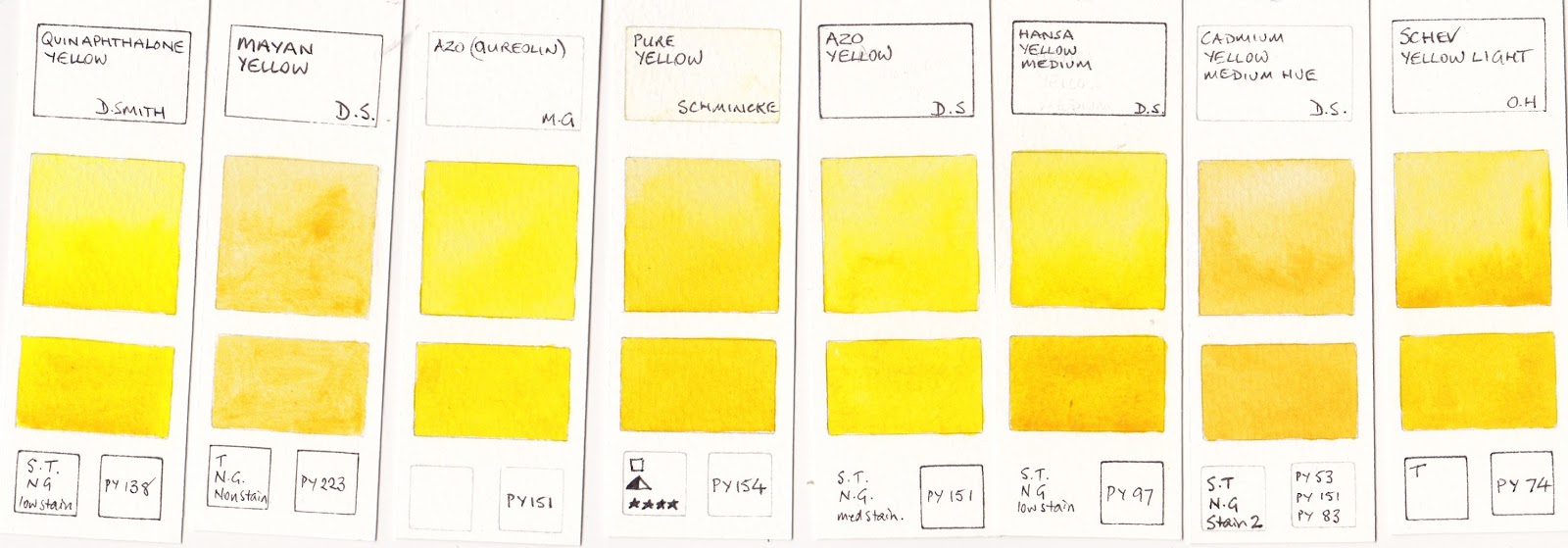
These are the mid-yellows I tried. Once again I am searching for colours that re-wet well once dry in the palette, and single pigment colours. I didn't like the Mayan Yellow since it didn't paint smoothly. The Old Holland yellow is a gorgeous colour but, like many Old Holland colours, it dries with a sheen which is frustrating. Note - Winsor Yellow is also a good option, as is Blockx Primary Yellow.
Quinaphthalone Yellow Daniel Smith, Mayan Yellow Daniel Smith, Azo (quinacridone) M.Graham, Pure Yellow Schmincke, Hansa Yellow Mediun Daniel Smith, Cadmium Yellow Medium Hue Daniel Smith, Schev. Yellow Light Old Holland.


Hansa Yellow Medium or another mid-yellow makes a great triad with Ultramarine and a cool red such as Quinacridone Rose, Quinacridone Magenta or some crimsons - the subject of my next post.

In a larger palette, a warm yellow is convenient for increased mixing options. More on that in Watercolour Comparisons 7.

Watercolour Comparisons 1 - Ultramarine Blue here
Watercolour Comparisons 2 - mid yellows here
Watercolour Comparisons 3 - Primary Red here
Watercolour Comparisons 4 - Burnt Sienna here
Watercolour Comparisons 5 - Greens (Single Pigment, convenience mixes and special effect) here
Watercolour Comparisons 6 - Reds (Cool, mid and warm) here
Watercolour Comparisons 7 - Yellows (cool mid and warm) here
Watercolour Comparisons 8 - Blues here