You have the choice of opaque or transparent yellows, with the very popular cadmiums being more opaque. You also have the choice of single pigment and mixed pigment colours. I use single pigment colours where possible. You also have a choice of staining or non-staining colours and to some extent granulating or not.
Cool Yellows
The cool yellow range includes many lemon yellows, cadmium light, hansa light and so on. These colours lean towards green and have no apparent red in them so will make very bright greens when mixed with a cool blue and more neutral greens when mixed with a warm blue. My favourite is Hansa Yellow Light PY3, made by Daniel Smith or Da Vinci. Art Spectrum use the same pigment in their Lemon Yellow. It is a bright, pure lemon yellow with plenty of tinting strength. Bismuth Yellow is more opaque, as are the genuine Cadmium Yellow Light colours. I don't like the Nickel titanate Yellows PY 53 at all - it is weak and ugly. I have added DS Aureolin here though it could equally be in with the mid yellows - either way it is not recommended as PY40 is not a reliable pigment. |
| Nickel Titinate Yellow Daler Rowney, Cadmium Yellow Winsor &Newton, Lemon Yellow Art Spectrum, Cadmium Yellow Light DS, Cadmium Yellow Light Hue DS, Winsor Lemon W&N, Bismuth Yellow, Steven Quiller |
 |
| Nickel Titanate Yellow Daniel Smith, Bismuth Vandate Yellow DS, Hansa Yellow Da Vinci, Hansa Yellow Light DS, Aureolin DS, Aureolin Hue Lukas |
Mid Yellows
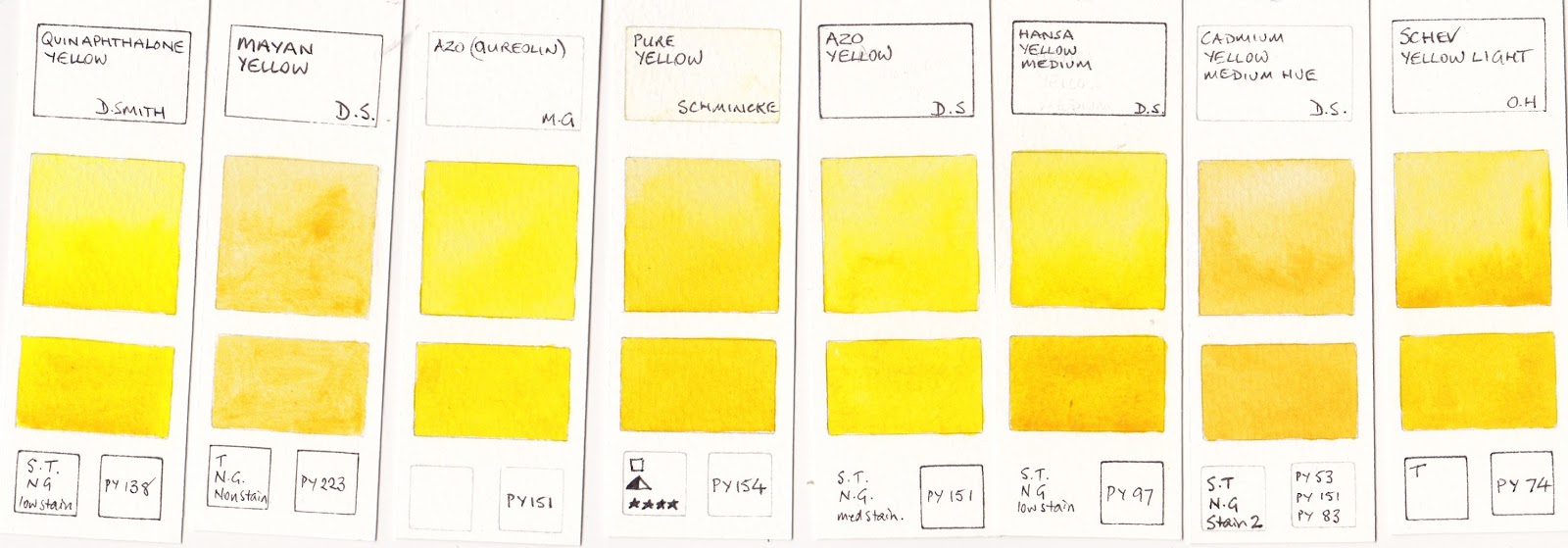
The mid range are yellows that are neither warm nor cool - they don't lean toward green or orange - but can be tinted with a blue to cool them or with a red to warm them. They are ideal in a limited palette, but I rather like them in my regular palette too. The best known mid yellow is Cobalt Yellow or Aureolin PY40. Unfortunately, though you will see this recommended in many many watercolour books, it is not a good choice as the pigment fades in washes and goes grey in mass-tone so look for better alternatives if you want your paintings to last. If you have Aureolin, use it in a sketch book only, where it is protected from light, and photograph or scan your work for posterity.I have written more about Mid Yellows in a previous post here as I tend to use a mid yellow rather than a light yellow in my palette, but have tried out a few more colours since then. There are many that are good, my favourites being Hansa Yellow Medium DS and Arylide Yellow Medium Da Vinci. Schminke Pure yellow and Winsor and Newton Winsor Yellow are also good. In my experience Mayan Yellow didn't rewet well once dry on the palette. W&N Transparent Yellow made with PY150 is shown here, the DS and MG versions are with the warm yellows below, though they are all fairly similar slightly neutral yellows.
 |
| Arylide Yellow DV, Hansa Yellow Medium DS, Mayan Yellow DS, Schev Yellow Light Old Holland, Tranparent Yellow W&N. |
 |
| Azo (Aureolin) M. Graham, Azo Yellow DS, Pure Yellow Schmincke, Aureolin W&N, Cadmium Yellow Medium Hue DS, Winsor Yellow W&N. |
Warm yellows are yellows that lean towards orange. These will mix with blues or phthalo green to make more olive-greens due to the neutralising red in them. In Australia I find the warm yellows make wonderful realistic greens. In Europe mid or cool yellows may be more useful. The first two rows are the brighter hue warm yellows. My favourites of all these are New Gamboge by Daniel Smith and Hansa Yellow Deep by Daniel Smith or Da Vinci. As always, I am less interested in the mixed pigment yellows.
 |
| Isoindoline Yellow DS, Indian Yellow W&N, Cadmium Yellow Deep Hue DR, Cadmium Yellow Deep DR, Indian Yellow DS, New Gamboge DS, Gamboge Hue DV |
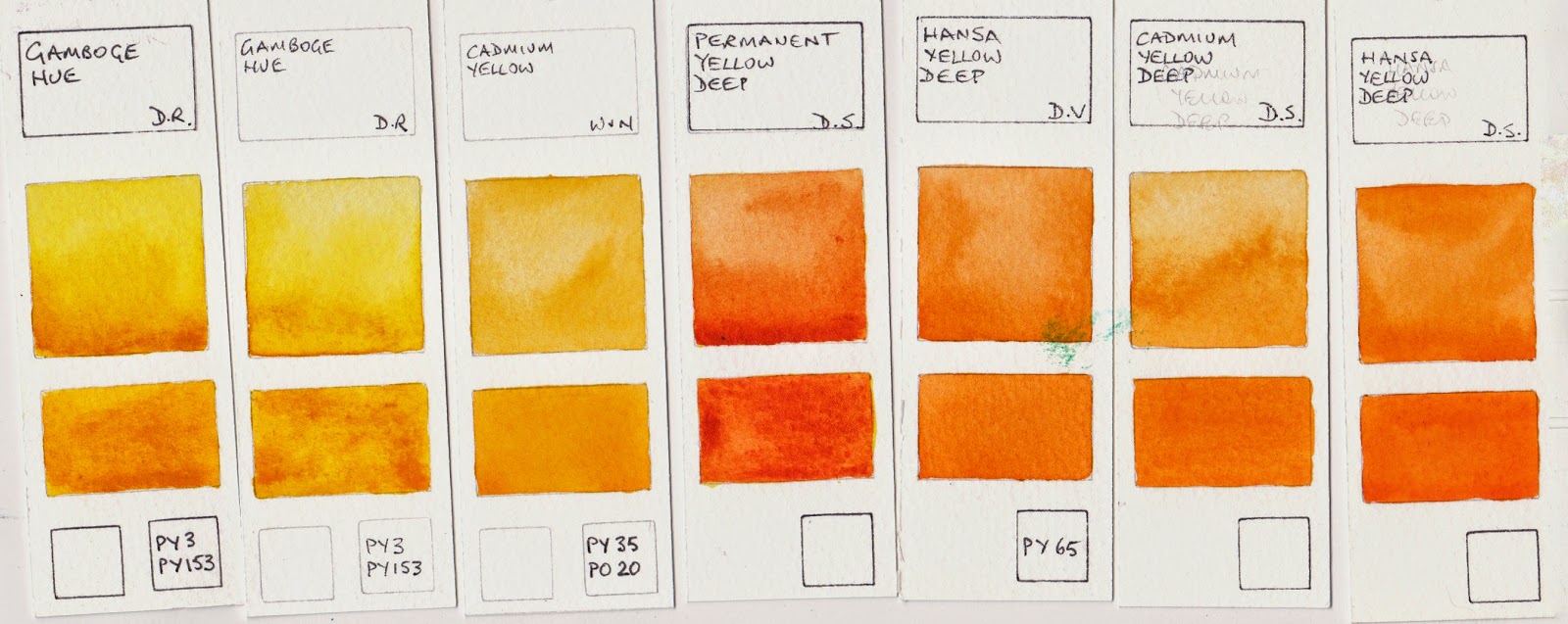 |
| Gamboge Hue DR, Gamboge Hue DR, Cadmium Yellow W&N, Permanent Yellow Deep DS, Hansa Yellow Deep DV, Cadmium Yellow Deep DS, Hansa Yellow Deep DS. |
The next group are slightly neutralised yellows. Quinacridone Gold PO49 by Daniel Smith is one of my favourite warm yellows and can double as a transparent yellow earth colour. Nickel Azo Yellow washes out to a lighter almost lemon yellow but has a deeper, slightly dirty masstone. W&N Transparent Yellow uses the same pigment.
 |
| Nickel Azo Yellow DS, Nickel Azo Yellow MG, Quinacridone Gold W&N, Quinacridone Gold DS, Australian Red Gold AS, Quinacridone Gold Deep DS. |
Watercolour Comparisons 1 - Ultramarine Blue here
Watercolour Comparisons 2 - mid yellows here
Watercolour Comparisons 3 - Primary Red here
Watercolour Comparisons 4 - Burnt Sienna here
Watercolour Comparisons 5 - Greens (Single Pigment, convenience mixes and special effect) here
Watercolour Comparisons 6 - Reds (Cool, mid and warm) here
Watercolour Comparisons 7 - Yellows (cool mid and warm) here
Watercolour Comparisons 8 - Blues here