Tuesday 30 October 2018

De Atramentis Document Inks Revisited.

In late 2014, the De Atramentis Document Inks - a range of lightfast, pigmented, mixable fountain pen friendly inks - was released. It's been a revolution for many sketchers who previously really limited to a few black waterproof inks. I've worked with a number of my own custom mixes - a raw sienna, a burnt sienna and a mixed Jane's Grey in particular, but I use the Black and the Brown as they are all the time.

Now we have these - and other - wonderful pigmented inks to use. What I have always loved about the De Atramentis range though is that they are mixable so it is fun to create your own colours. I did a series of posts showing two colour mixes, three colour mixes, and more three colour mixesmixing greys and mixing with black.

Since that series, a few more colours have been added - Violet, White and Urban grey. This is the latest and was developed by Larrypost.com.au for the urban sketcher. It is about the colour of a graphite pencil so gives lovely pencil-like lines with no smudging.

Here I thought I'd update and show the range of Document ink colours mixed with Document Black and with Document White. I don't have a scanner at present so please accept my apologies for the photos. You can still see the wonderful range of tints and shades you can create.

De Atramentis Document Ink mixes - Yellow and White
De Atramentis Document Ink mixes  - Red and White
De Atramentis Document Ink mixes - Magenta/Fuchsia and White
De Atramentis Document Ink mixes - Violet and White
De Atramentis Document Ink mixes - Blue and White
De Atramentis Document Ink mixes - Dark Blue and White

De Atramentis Document Ink mixes - Turquoise/Cyan and White

De Atramentis Document Ink mixes - Green and White

De Atramentis Document Ink mixes - Brown and White

De Atramentis Document Ink mixes - Urban Grey and White

De Atramentis Document Ink mixes - Urban Grey and Black

De Atramentis Document Ink mixes - White and Black

De Atramentis Document Ink mixes - Brown and Black
De Atramentis Document Ink mixes - Green and Black

De Atramentis Document Ink mixes - Cyan (Turquoise) and Black
De Atramentis Document Ink mixes - Dark Blue and Black

De Atramentis Document Ink mixes - Blue and Black
De Atramentis Document Ink mixes - Violet and Black

De Atramentis Document Ink mixes - Magenta (Fuchsia) and Black

De Atramentis Document Ink mixes - Red and Black

De Atramentis Document Ink mixes - Yellow and Black


Friday 19 October 2018

Gouache


My Gouache Palette.  

There are two styles of gouache that I have worked with. One has chalk added to make it more opaque. This is really lovely to work with fresh from the tube, but doesn't re-wet well.

The other is really just a very concentrated watercolour - no added chalk. This is the type I am most interested in. As far as I am aware, the brands that created this sort of gouache are M.Graham, Da Vinci and Schmincke. I've ended up using a mixture of these brands in my gouache palette. I am looking for fairly opaque but re-wettable versions since it is a travel and teaching palette. They will all crack a bit if you fill a pan too fast - it needs to be done in many stages - but I find it is also helpful to add a drop or two of glycerine to help them to rewet. They are designed to work with watercolours or alone. I have shown how it looks if no glycerine is 
added when filling (always bit by bit) - you can see some cracking in the colours along the left side.

I have previously posted a couple of swatches of gouache when setting up a sketching palette -
M.Graham here and painted out here, Schmincke here the Zorn palette here and a photo of a swatch of my gouache palette here.


I will update these individual swatches, but I think it is more helpful to have them altogether.

I had some old gouache from the 1990s - some with no numbers or pigment information so I've included those too.

I used a 6 colour plus black and white set in the Art Spectrum range to create a whole range of colour charts and wheels here, but the Black and White, Deep Yellow, Ultramarine and Vermilion I used have long since dried up so I haven't included a sample of those.

Here are the various tube sizes - the Da Vinci 37ml tubes are enormous! The others range from 14ml for the W&N, 15ml for the Schmincke Horadam, the M.Graham and the smaller Da Vinci, and 22.5 ml for the Art Spectrum.
Tubes of gouache vary quite a bit in size, just like watercolour.

Here are the whites.

White Gouache - Titanium White Da Vinci) Titanium White Schmincke, Opaque White Schmincke, 
Permanent White Winsor & Newton, titanium White M.Graham.

Cadmium pigments made a whole lot of sense if you want opaque colours without additives, but they are expensive.

Cool and mid yellow Gouache - Hansa Yellow Light Da Vinci, Cadmium Yellow Light Schmincke, 
Primary Yellow Winsor & Newton, Azo Yellow M.Graham, Primrose Art Spectrum.


Mid to warm yellow Gouache - Cadmium Yellow Schmincke, Cadmium Yellow Hue Schmincke, 
Indian Yellow Schmincke, Cadmium Yellow Deep Schmincke, Gamboge M.Graham. 

I really love the pigment PR255 as a warm red. It's probably not as opaque as a cadmium scarlet would be but it's gorgeous.

Warm Red Gouache - Vermillion Tone Schmincke, Vermillion Red Schmincke, Naphthol Red M.Graham. 


Cool red Gouache - Alizarin Crimson (Quin) Da Vinci, Carmine Schmincke, Madder Red Schmincke, 
Quinacriodone Rose M.Graham, Crimson Art Spectrum.


Magenta Gouache - Magenta Da Vinci 

I like the depth of the Schmincke Ultramarine Deep, but these are all nice to paint with.

Ultramarine Gouache - Ultramarine Da Vinci, Ultramarine Deep Schmincke, Ultramarine M.Graham. 


Phthalo pigments are not opaque. They are good for tinting other colours though.

Cool blue Gouache - Phthalo Blue Da Vinci, Helio Blue Schmincke, Intense Blue Winsor & Newton, Myosis Blue, Winsor & Newton, Asure Blue Winsor & Newton.

I don't think the Art Spectrum was a genuine cerulean pigment as it looks like a phthalo blue, but the M.Graham certainly is.

Cool blue and cerulean Gouache - Paris Blue Schmincke, Peacock Blue Winsore & Newton, 
Cerulean Blue M.Graham, Cerulean Blue Art Spectrum


This is a lovely turquoise colour. I don't use it much but it is a little more opaque than the phthalos and can be used to neutralise a warm red, or to mix greens with the yellows.

Turquoise Gouache - Helio Turquoise Schmincke.

Phthalo green is usually a transparent pigment.

Green Gouache - Helio Green Bluish Schmincke, Phthalocyaninie Green M.Graham.


I really like PBr24 but only have it in my gouache palette. From 2022 it is also available in Daniel Smith gouache.

Gouache - Naples Yellow Winsor & Newton, Titanium Gold Ochre Schmincke.

The Da Vinci Yellow Ochre is just lovely.

Yellow ochre Gouache - Yellow Ochre Da Vinci, Yellow Ochre Winsor & Newton. 


Raw Sienna Gouache - Raw Sienna Winsor & Newton, Raw Sienna M.Graham, Raw Sienna Da Vinci, 
Raw Sienna Schmincke.


Burnt Sienna Gouache - Burnt Sienna Da Vinci, Burnt Sienna Schmincke, Burnt Sienna Winsor & Newton, 
Burnt Sienna M.Graham. 

Apart from the English Red, these are old Winsor and Newton tubes with no pigment information. They probably pre-date the internet ;-)

Red earth Gouache - English Red Schmincke, Chinese Orange Winsor & Newton, Venetian Red Winsor & Newton,
Red Ochre Winsor & Newton.

The Da Vinci Raw Umber is a lovely deep cool brown.

Dark brown Gouache - Raw Umber Da Vinci, Raw Umber Winsor & Newton, Raw Umber M.Graham, 
Sepia Winsor & Newton.

Schmincke Neutral Grey gouache, like their watercolour, is made from coloured pigments not black or white. I really like that :-). The Winsor & Newton tubes predate pigment information.

Grey Gouache - Neutral Grey Schmincke, Grey No 1 (Light) Winsor & Newton, Grey No 2 Winsor & Newton, 
Grey No 3 Winsor & Newton, Grey No 4 Winsor & Newton, Grey No 5 (Dark) Winsor & Newton.

I liked the Schmincke best in this range, though I tend to use the grey above.

Black Gouache - Black Da Vinci, Ivory Black Schmincke, Jet Black Schmincke, 
Ivory Black CMYK Winsor & Newton, Lamp Black M.Graham.

I use some sparkly colours for calligraphy, not for painting. The Silver and Bronze are very old tubes.

Metallic Gouache - Red Pearl Schmincke, Gold Pearl Schmincke, Silver Linel, Bronze Winsor & Newton.


Wednesday 17 October 2018

White Nights Watercolours


I've written about this range before. It is known by a number of different names - White Nights is more common in Europe, St Petersburg in the US, but they are made by Nevskaya Palitra in Russia.

The full range was shown in this post here.

They have now added a number of new colours and changed the names of a couple. They have also added tubes to their range for all 66 colours apart from the silver and gold.

I was given the new colours that have recently been added while at the Urban Sketchers Symposium in July and have finally had a chance to paint out the rest of the swatches. Thank you to Tatiana.

The tube colours paint out very nicely fresh from the tubes and allow more options in setting up custom palettes - whether half pans or into the wells of other palettes. They also make it easier to paint larger washes of course. I normally work from dried paint in a palette but will use tube colours in my studio for larger works.

These are a very affordable range to use to get started in watercolour as they use real pigments rather than hues for most colours. Just be wary of a few fugitive pigments or only use in a sketchbook where they are protected from light.

White Nights Watercolours - Zinc White, Lemon, Cadmium Lemon, Hansa Yellow, Cadmium Yellow Medium.

Indian yellow and Indian Gold are new - the Indian Gold is an excellent quinacridone gold hue. It would be a good option as a warm yellow in a small palette.
White Nights Watercolours - Indian Yellow (new), Indian Gold (new), Golden, Golden Deep, Cadmium Orange.
I love the PO36 Titan Red colour.
White Nights Watercolours - Orange Lake, Titan's Red, Cadmium Red Light, Vermilion (Hue), Scarlet.

The new Quinacridone Red is a lovely primary red option.
White Nights Watercolours - Ruby, Madder Lake Red Light, Claret, Carmine, Quinacridone Red (new).
As is Quinacridone Violet Rose - also new.
White Nights Watercolours - Quinacridone Violet Rose (new), Quinacridone Rose, Rose, Quinacridone Lilac, Violet-Rose.

Blue Lake is a beautiful blue but I am very wary of PB1.
White Nights Watercolours - Quinacridone Violet (new), Ultramarine Violet (new), Violet, Blue Lake, Indanthrone Blue.

White Nights Watercolours - Ultramarine, Cobalt Blue, Azure, Blue, Bright Blue (Brilliant).

I'd prefer a stronger version of Cerulean blue - this is rather weak - but it is still a great pigment to use for sketching skies as it is not a staining pigment so clouds can be lifted out with ease.
White Nights Watercolours - Ceruleum Blue, Indigo, Prussian Blue, Azure Blue, Turquoise Blue.

White Nights Watercolours - Emerald Green, Light Green,  Green Original, Yellowing Green, Sap Green (old version).

White Nights Watercolours - Sap Green (new version), Green Earth, Olive Green, Chromium Oxide, Green (Russian).

White Nights Watercolours - Yellow Ochre, Naples Yellow, Raw Sienna, Red Ochre, Shakhnazarskaya Red.

White Nights Watercolours - Burnt Sienna, English Red, Venetian Red (not shown), Burnt Umber, Mars Brown.

White Nights Watercolours - Umber, Sepia, Voronezhskaya Black, Payne's Grey, Neutral Black.

White Nights Watercolours - Antique Gold (not shown), Silver Deep (not shown).
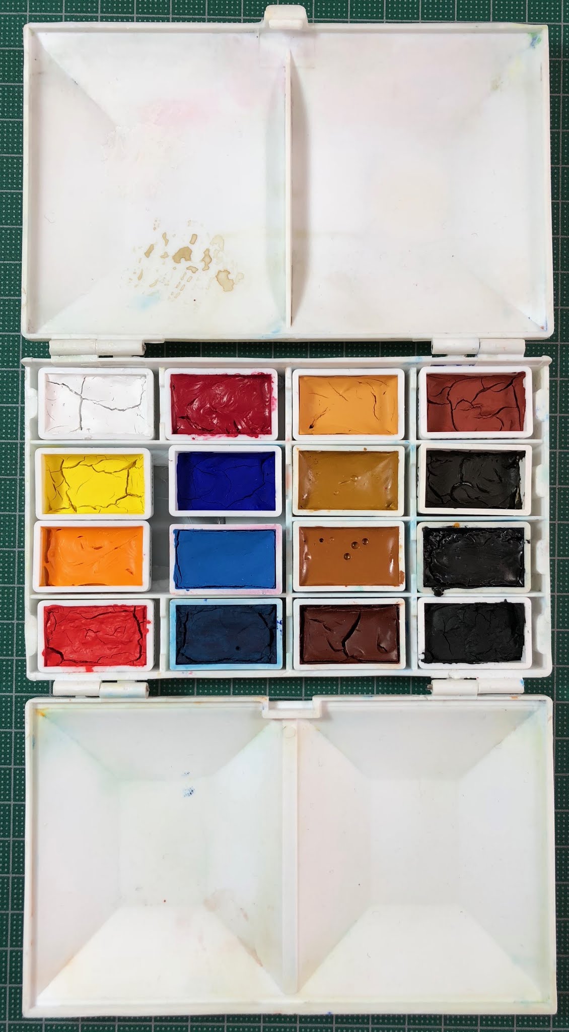
Here is the 12-colour Plein Air palette I suggested back in 2015. This is intended as a starter watercolour set for plein air and/or sketchbook work. There are some colours that are not lightfast.


And here is is open. Full pans are great for brush access!


With the new colours that have beed added to the range it is possible to create a set that is more lightfast. I'd now switch the orange-yellow Golden to the new quinacridone gold hue Indian Gold. I'd switch Carmine to the new Quinacridone Red and I'd switch Green to the new Sap Green. I'd also switch the Cerulean to the new Cobalt Azure Blue launched in 2019 - see below.

Update August 2019

At the Amsterdam Urban Sketching Symposium, Tatiana gave me some more new colours, launched in Spring 2019. I've created a new blog post with the full range that can be found here. I scanned the swatches for that blog but will also update the colours here.

It's great to see a PY151 mid or primary yellow. The Naples Yellows are quite accurate but the Orange is a true bright mid orange. The Geranium Red is very aptly named - it is a bright warm red geranium colour with a slightly pink undertone.

White Nights Watercolours - Aureolin, Naples Yellow Light, Naples Orange, Orange, Geranium Red.
 It's also good to see a PB36 Cobalt Azure Blue.
White Nights Watercolours - Venice Purple, Cobalt Azure Blue, Cobalt Turquoise, May Green.
 Here are the 7 metallics.
White Nights Watercolours - Silver Light, Inca Gold, Bronze, Aztec Gold.

White Nights Watercolours - Antique Gold, Silver Deep, Copper.

Happy painting :-)