Renesans watercolours come from Poland. At the time of writing (November 2018), their
website was being developed. It now shows a large range of art materials including three watercolour ranges.
The samples I used were from the
Intense Watercolour range of tube colours. The
Extra Fine Watercolour range is 54 pan colours, with different names and pigments from the Intense range. The third range is a liquid watercolour called
Liquarel, and comes in 32 colours. There are also oils, pastels, acrylics, gouache, brushes and many other items available.
There are 70 colours in the Intense Watercolours range, 50 of them single pigment colours. I have not tried the pans or tubes themselves but just painted out each colour from the dots of paint. They are available in Europe, and in the US from a Maine based Etsy store alittlecreativeme, and I thank April for the dot card. In Australia they are available from
Adamstown Art. The website mentions changing the formula to add more honey but I don't know if that change pre or post-dates these samples.
I am always very grateful to the generous and thoughtful people who send me paint samples as it has enabled me to get closer to completing my (somewhat crazy) project to swatch out 'every professional watercolour available in the world'. I am also grateful to the companies who put the time and money into creating dot cards of their paints as it is such a perfect way to test out colours and only buy the ones you will actually use.
 |
| Renesans Watercolours - full range dot card page 1 |
 |
| Renesans Watercolours - full range dot card page 2 |
This dot card has all the information needed printed on it - pigment information, lightfast ratings and how staining each colour is. I've copied the information onto the individual swatches. The filled in triangle is very staining, the empty triangle non-staining and of course the half filled triangle moderately staining. The lightfast ratings were given based on teh blue wool scale where 8 and 7 are excellent. On the new website, however, the lightfast ratings are now given as I, II or III where III is excellent.
They are well behaved watercolours in a range of 70 colours. They appear not to have any ox gall added as they behave in a predictable manner, but I don't know whether that is true. I have read that they contain honey and a high quality gum Arabic from Kordofan region (Sudan). The dots rewet with ease but the colours are quite gentle - they are not super powerful to paint with like some I've tried that are almost like painting with ink.
Note - I have updated the swatches from tube paints and added them again below...
 |
| Renesans Watercolours - Titanium Opaque White, Permanent Chinese White, Naples Yellow Pale, Naples Yellow Deep, Naples Yellow Reddish. |
I appreciate that the labels indicate where a hue is used rather than the genuine pigment.
 |
| Renesans Watercolours - Titanium Yellow, Lemon Yellow, Chromium Yellow (Hue), Cadmium Yellow Pale, Aureolin Hue |
Transparent Gold Ochre is a mix that can also be used to create quinacridone gold hues. The cadmiums painted out very smoothly. this set is actually a little brighter than it appears on my screen.
 |
| Renesans Watercolours - Transparent Yellow, Transparent Gold Ochre, Cadmium Yellow Deep, Cadmium Orange, Indian Yellow. |
All the cadmiums seem very finely ground.
 |
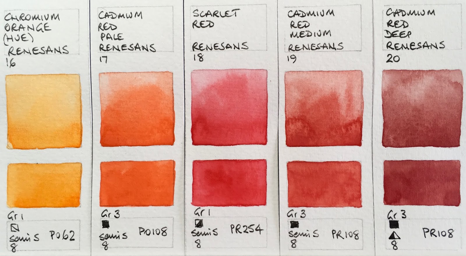
Renesans Watercolours - Chromium Orange (Hue), Cadmium Red Pale, Scarlet Red, Cadmium Red Medium,
Cadmium Red Deep. |
I've not come across PR48:4 before. Looks very like Quinacridone Rose PV19. In this range that colour is called Quinacridone Red.
 |
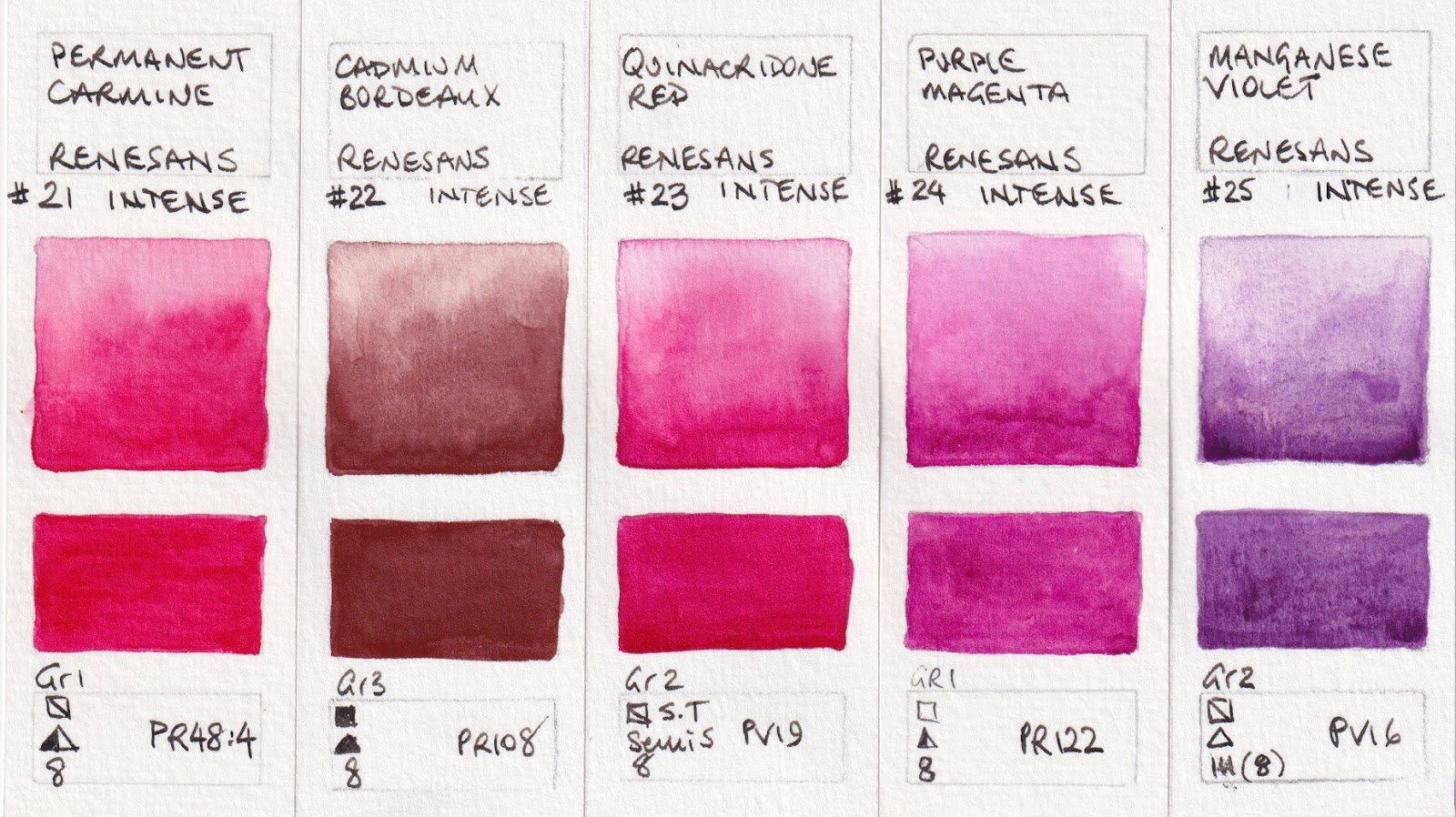
| Renesans Watercolours - Permanent Carmine, Cadmium Bordeaux, Quinacridone Red, Purple Magenta, Manganese Violet. |
 |
| Renesans Watercolours - Ultramarine Violet (Hue), Mineral Violet, Ultramarine Blue, Prussian Blue, Helio Blue. |
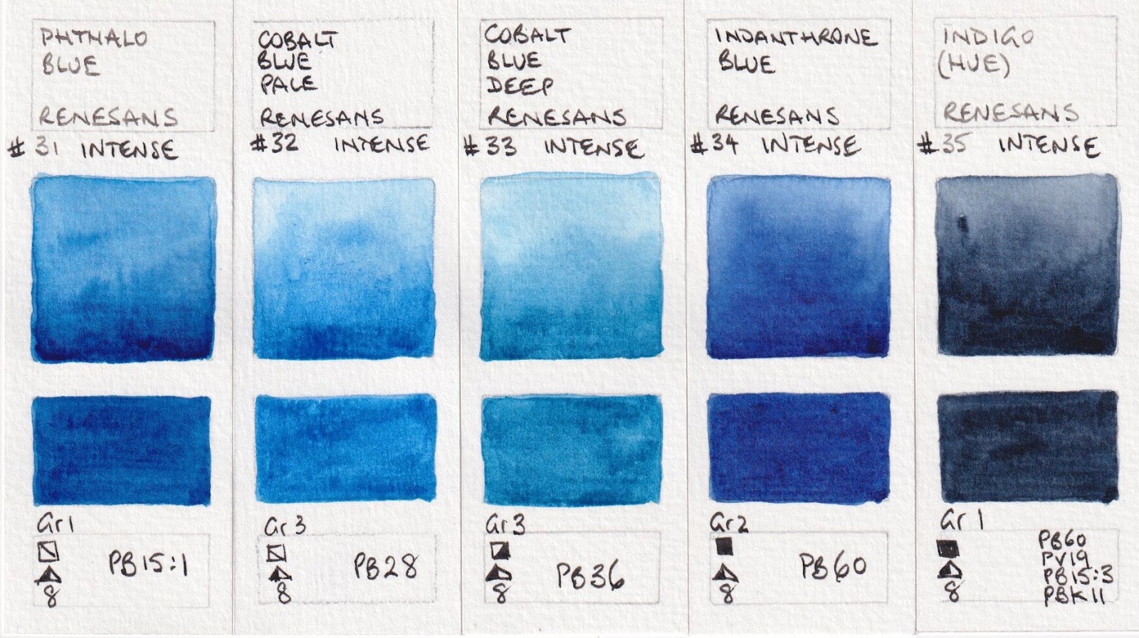
Cobalt Blue Deep is the pigment also used in cerulean blues and some turquoises.
 |
| Renesans Watercolours - Phthalo Blue, Cobalt Blue Pale, Cobalt Blue Deep, Indanthrone blue, Indigo (Hue). |
 |
| Renesans Watercolours - Cobalt Turquoise, Prussian Green, Helio Turquoise, Permanent Green, Sap Green. |
 |
| Renesans Watercolours - Cobalt Green Pale, Phthalo Green, Cobalt Green Deep, Chromium Oxide Green, Olive Green. |
Golden Green was a bit of a surprise - made with five pigments! I really loved the Gold and Yellow Ochres.
 |
| Renesans Watercolours - Green Earth, Hooker's Green, Golden Green, Gold Ochre, Yellow Ochre. |
I also really loved the Orange and Red Ochres and Mars Bordeaux - a great earthy rainbow of warm colours!
 |
Renesans Watercolours - Raw Sienna, Orange Ochre, Burnt Sienna, Red Ochre, Mars Bordeaux.
Polish Brown, is made with an unfamiliar version of PBr25. I wonder if it has been heated? Normally it looks like Brown Madder also seen below.
|
 |
| Renesans Watercolours - Mars Brown, Potter's Pink, Brown Madder, Burnt Umber, Polish Brown. |
Most of the colours are really consistent but I found the raw umber and the raw sienna difficult to get any stronger. This may be quite different if working with fresh paint or a larger sample.
 |
| Renesans Watercolours - Raw Umber, Sepia, Vandyke Brown, Perylene Violet (Hue), Payne's Grey. |
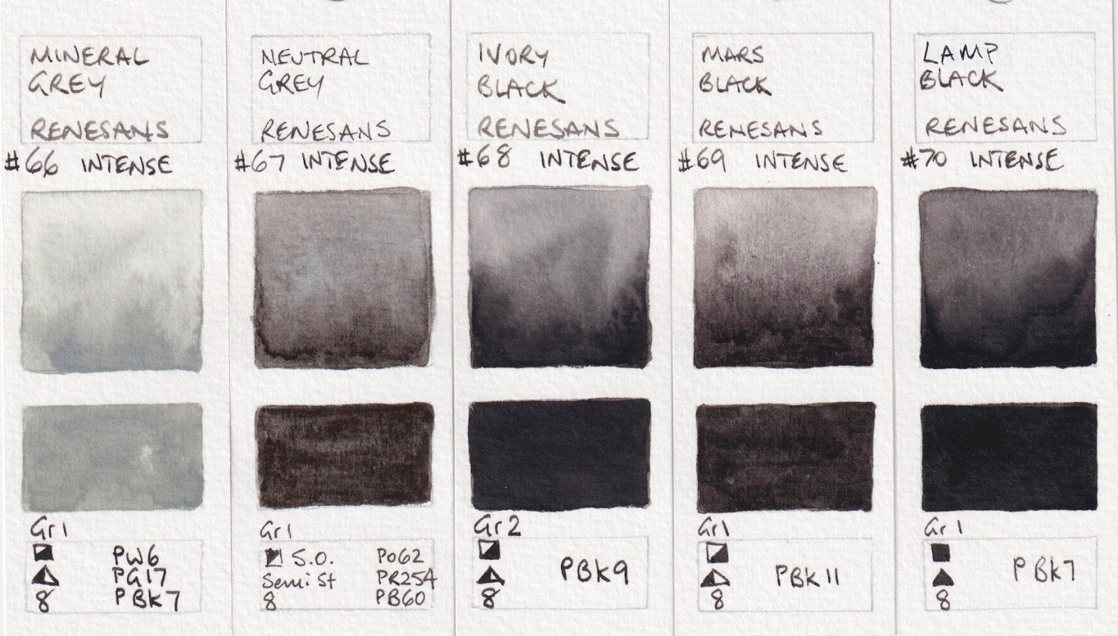
The Neutral Grey is the same mix as Schmincke uses and some of the other names are the same as Schmincke, such as helio blue and purple magenta. I do like to see mixed greys without black pigments.
 |
| Renesans Watercolours - Mineral Grey, Neutral Grey, Ivory Black, Mars Black, Lamp Black. |
Having completed this set from dots of paint, I was sent the tubes to try them out from larger samples. I painted the colour over the top and have re-scanned the samples so the intensity is clearer. I'll add those scans below. I noticed that many of the colours bronzed a little (as in the sheen of the honey was visible) when the second strong wash was added. I used the tube colours from dried pans, but I suspect they are most beautiful used fresh from the tubes where possible.
 |
| Renesans Intense Watercolours - Titanium Opaque White, Permanent Chinese White, Naples Yellow Pale, Naples Yellow Deep, Naples Yellow Reddish.
|
 |
| Renesans Intense Watercolours - Titanium Yellow, Lemon Yellow, Chromium Yellow (Hue), Cadmium Yellow Pale, Aureolin Hue |
 |
| Renesans Intense Watercolours - Transparent Yellow, Transparent Gold Ochre, Cadmium Yellow Deep, Cadmium Orange, Indian Yellow. |
The colours of the first two in this scan are not accurate - refer to the photograph of this set above.
 |
| Renesans Intense Watercolours - Chromium Orange (Hue), Cadmium Red Pale, Scarlet Red, Cadmium Red Medium,
Cadmium Red Deep.
|
#21 and #23 look more accurate in the photo above.
 |
Renesans Intense Watercolours - Permanent Carmine, Cadmium Bordeaux, Quinacridone Red, Purple Magenta,
Manganese Violet.
|
 |
Renesans Intense Watercolours - Ultramarine Violet (Hue), Mineral Violet, Ultramarine Blue, Prussian Blue,
Helio Blue. |
 |
Renesans Intense Watercolours - Phthalo Blue, Cobalt Blue Pale, Cobalt Blue Deep, Indanthrone blue,
Indigo (Hue). |
 |
Renesans Intense Watercolours - Cobalt Turquoise, Prussian Green, Helio Turquoise, Permanent Green,
Sap Green. |
 |
Renesans Intense Watercolours - Cobalt Green Pale, Phthalo Green, Cobalt Green Deep, Chromium Oxide Green,
Olive Green. |
The Gold and Yellow Ochres are really lovely. Hooker's Green looks totally different from the dot I tried, (photographed above) though the pigments on the tube were the same.
 |
| Renesans Intense Watercolours - Green Earth, Hooker's Green, Golden Green, Gold Ochre, Yellow Ochre. |
I really like the Orange Ochre and Red Ochre. The earth pigments are lovely.
 |
Renesans Intense Watercolours - Raw Sienna, Orange Ochre, Burnt Sienna, Red Ochre, Mars Bordeaux.
|
 |
| Renesans Intense Watercolours - Mars Brown, Potter's Pink, Brown Madder, Burnt Umber, Polish Brown. |
 |
| Renesans Intense Watercolours - Raw Umber, Sepia, Vandyke Brown, Perylene Violet (Hue), Payne's Grey. |
 |
| Renesans Intense Watercolours - Mineral Grey, Neutral Grey, Ivory Black, Mars Black, Lamp Black. |
Here is the information about the pan colours. It's a smaller range of colours, numbered and named completely differently. Although some are the same colour name or pigment or both, I'd treat them as a different range. It's good to see Cerulean (Coeruleum) in this set as it is a wonderful pigment for painting the sky, (or use Cobalt blue Deep in the Intense range) and Geranium Lake might be a good strong crimson.
I have read that if using for plein air, the pans are easier to manage as the tube colours have a lot of honey and take a long time to dry. I hope to test out the pan colours some time soon. Update - I've now tested the pan colours and they can be found
here.
 |
| Renesans Watercolour half pan range page 1 |
 |
| Renesans Watercolour half pan range page 2 |
|
There is also a gouache range. That is shown
here
Happy painting!


I've seen and heard many wonderful things about these paints! They are now available to purchase in Australia too from an Australian based etsy store. I would absolutely love to try these and was so happy when I saw they can now be purchased here at an affordable price ( shipping from overseas was quite expensive). May I ask, what colours would you suggest as a starter set? Thank you so much for sharing all your knowledge with us Jane !
ReplyDeleteI don't know what you are painting or your colour preferences, so would suggest you look for a warm and cool yellow, red and blue, a convenience green and /or mixing green if you like to have greens, a few earth colours and a grey.
DeletePerhaps Lemon Yellow, Cad Yellow Pale or Transparent yellow as the cool yellow; Indian Yellow as the warm. For reds - Cadmium Red Pale and Quinacridone Red are the best in terms of colour. For blues - Ultramarine and Helio Cerulean. Then you might add Sap Green (convenience) and/or Phthalo Green (mixing). In the earth colours, I like Yellow Ochre, Burnt Sienna or Orange Ochre, Mars Bordeaux and Polish Brown to give a yellow earth, orange earth, red earth and dark earth. The Neutral Grey would complete the set as it is a three pigment grey without any black in it.
Thank you so incredibly much for your thorough reply Jane! I'm new to watercolour and I'm so grateful for you response and site- it's been priceless. I'm interested in painting a variety of subjects, but primarily portraits ( soft, muted). Whilst weak, I thought that the raw umber may actually be suitable for what I have in mind too. Thank you so much again
DeleteQuestion about 3 colors. I noticed that the raw and burnt sienna are not as intense, but they seem to dry with almost no shift.Did you had the same experience? Did ultramarine seem less intense to you? I compared it to my white nights ultramarine with the same pigment, and seem litlle less intense. Is it just my tube or was that the case with your sample?
ReplyDeletePR48:4 is not lightfast. This company shouldn't be calling the paint made with it "permanent" and shouldn't be using it in an artists' color line. — Justin A.
ReplyDelete