Showing posts with label gouache. Show all posts

Sunday, 19 May 2019

Renesans Gouache

I was sent a set of 12 Renesans gouache tubes to try. These come from Poland, and Renesans make an additional three different ranges of watercolours that I have written about here.

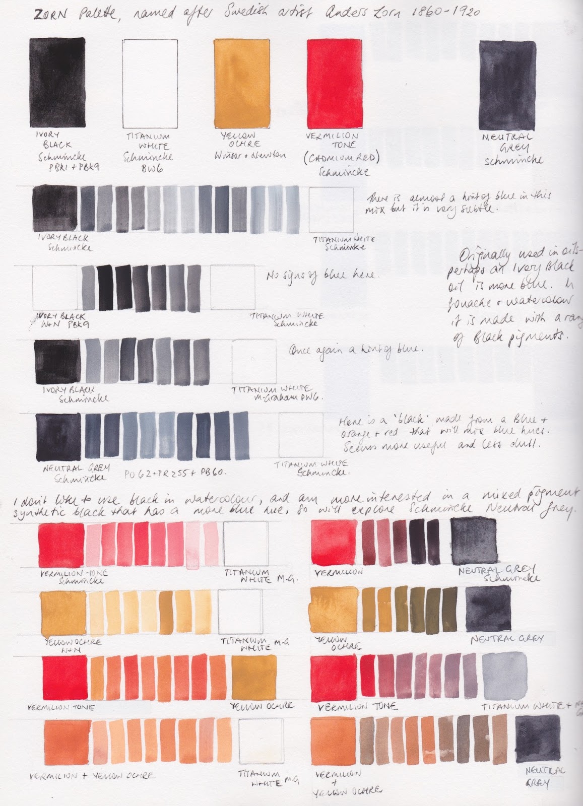
There are 26 colours in this range - a smaller number than in most watercolour ranges but that makes sense. I use a much smaller range of colours in gouache than I do in watercolour as I consider gouache to be an opaque medium so I am not looking for transparent or granulating colours.


It's a workable basic set, though I'd switch in a cool red and a cool blue rather than the Cobalt Blue and the four pigment Burnt Umber. I think I'd also use a Raw Sienna more than Flesh Tint. Many of the colours have a slightly chalky look to them. I assume chalk has been added, as is traditional for gouache, but I may be wrong.

The full range can be seen here and below.


Renesans Gouache - Titanium White, Chrome Yellow Deep, Scarlet Vermilion (Hue), Cobalt Blue.

Renesans Gouache - Ultramarine, Bright Green, Emerald Green (Hue), Yellow Ochre.

I would rather see a single pigment Burnt Sienna and Burnt Umber but they are not opaque pigments...
Renesans Gouache - Burnt Sienna, Burnt Umber, Ivory Black, Flesh Tint.

Update
Renesans sent me the missing colours so here is the full range. I have either scanned or photographed these ones, to try to get the best colour match. I'll leave the set information above as it may be useful.


Renesans Gouache - Titanium Whiite, Chrome Yellow Light, Chrome Yellow Deep, Chrome Yellow Orange, Flesh Tint.

The colours of this set are close to correct, but the scarlet Vermilion Hue looks a little more accurate in the photo above. Alizarine Lake is actually slightly less purple.
Renesans Gouache - Scarlet Vermilion (Hue), Carmine, Alizarine Lake, Magenta, Cyan.

These colours have reproduced much better.
Renesans Gouache - Turquoise, Cobalt Blue, Ultramarine, Prussian Blue, Violet Lake.

Renesans Gouache - Bright Green, Emerald Green, Sap Green, Yellow Ochre, Raw Sienna,

The English Red is not quite as crimson as it looks here - it is more like a Quinacridone burnt Scarlet in hue. The others are fairly accurate.
Renesans Gouache - 

I am gradually adding Gouache samples - use the search button to find other posts.

Happy Painting.

Monday, 26 October 2015

Zorn Palette exploration.

I remember coming across a reference to the Zorn palette some time ago. I looked up what it was - a palette of just 4 colours used at times by Swedish artist Anders Zorn (1860 - 1920). It's an oil painting palette, but the gorgeous flesh tones many have created using this palette for figure and portrait work intrigued me. I made a note to test them out some time and finally did, using gouache.

Zorn is said to have used ivory black, titanium white, cadmium red and yellow ochre. His paintings often have other colours as well, but it is this quartet that is named after him.

I chose to use Schmincke Ivory black, Titanium white and Vermilion tone gouache, and Winsor & Newton Yellow ochre. Not identical but similar.

In the oil paintings, the ivory black mixed with white created a slightly blued grey. I tested the Schmincke black and white and there was a slight hint of blue in the mix. I then tried Winsor & Newton Ivory black but that didn't look blue. I tried mixing with M.Graham Titanium white and still not really blue. But I also have Schmincke's Neutral Grey, made from a red (PR 255), orange (PO62) and blue (PB60) mix so I tried that - quite nice blue undertones and I escaped the dreaded black pigments :-)

Using the Neutral Grey rather than black, I mixed up a range of colours with the yellow ochre and vermilion tone. Lots of interesting flesh tones.


I then wanted to see whether I could actually get some greens with this mix, so I made a colour wheel with the yellow, red and grey. Purples wouldn't be possible but very neutralised greens were. I explored some random mixes using these three with white.


Translating these colours into watercolour, I switched to DS Yellow Ochre, DS Cadmium Red Scarlet (discontinued but I still have some) and my Jane's Grey to keep away from black.
In watercolour the white of the paper is usually the white and adding water rather than adding white creates the tints, though with this palette I would probably add white watercolour if I were actually using it for flesh tones. It makes some interesting mixes and might be fun to paint with but since there is indanthrone blue in the gouache mixed grey and ultramarine in my mixed grey, I'd rather add a blue than a grey and be able to make an even greater range of colours.

Fun to explore - maybe more later if I try painting with this palette :-)

Sunday, 2 August 2015

M. Graham Gouache - painted out.


I wanted to set up a palette of gouache - as I do with watercolour - and the only brands that I've heard will actually rewet and reactivate are Schmincke and M.Graham. I have some Schmincke (see previous post here) but wanted to test the M.Graham as well. I have ended up setting up a palette of 16 colours using a mix of the two. Here I have included a mid and warm yellow, a warm and rose red, a warm and cool blue, a green, three earths and a black and a white. All M. Graham. I found that I still needed to add just a touch of glycerine to some of these colours so they didn't crack up, though if poured into the pans little by little and allowed to dry gradually they fill pretty well.