Sunday 26 February 2017

Handmade watercolours


I painted out a lovely triad with DS yellow ochre, DS cerulean chromium and Sharlie's Pinkcolor deep - a gorgeous colour somewhere between Potter's Pink and Indian red - either of which could equally be used in an earthy primary wheel like this. I posted it on Instagram (Janeblundellart) but I wanted to give a little more information here.


I was sent some samples of some hand-made watercolours to try out. Sharlie also loves granulation and has been making a small quantity of each colour to test. As I have tested so many pigments over the years, there were not many that were completely 'new' or original for me, but her Lapis Lazuli is more beautiful than the commercial ones I have tried and I really like the Pinkcolour deep  - much more interesting then the usual very soft watercolour known as Potter's Pink. I guess I just prefer stronger colours - you can always dilute them. I also really liked the Moroccan earth colours and the lovely rich Maya Blue.

Here are the colours I tested out.


Making my own watercolours, like making my own sketchbooks, is something I have chosen not to do. I want to spend time sketching in the books or painting with the watercolours! However I really admire those who go through the effort of making their own. Sharlie's rewet and painted out very nicely, unlike some others I have tested.

She has an Etsy shop called biscuitswatercolor, where she sells half pans of handmade watercolour. I don't have an Etsy account so can't post a link. I believe she has a number of other colours besides these :-)

2018
Here are some more lovely handmade watercolours. It's the first time I've seen PB71 and such a gorgeous strong Potters Pink. The Graphite sparkles!
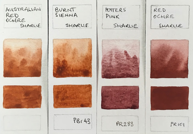
Handmade watercolours by Sharlie. Pigments shown if known. 

Handmade watercolours by Sharlie. Pigments shown if known. I love the Potter's Pink and Red Ochre.

Handmade watercolours by Sharlie. Pigments shown if known. This is the highest chroma yellow ochre I have tried. I assume it is PY43 but don't know for sure.

Handmade watercolours by Sharlie. Pigments shown if known. The PV15 is a gorgeous blue-purple. Lovely to see PB71 - rather like a Cerulean but not the same.


Friday 24 February 2017

Top 60 watercolour blogs

I'm rather delighted to have been included in this list - you may enjoy many of the other blogs mentioned in the list here.


There will be others you know of that are not in the list - feel free to add them in the comments, perhaps saying what you like about them - so others can find them too.

Tuesday 21 February 2017

Quick demonstrations


I've been doing a lot of sorting lately, since moving into a smaller house. It's a good chance to assess what is useful and what is not and reduce the clutter. I thought, however, that some of the things that I don't need to keep may still be useful, so I took a few photographs before recycling these pages. 

When I am running workshops and doing demonstrations I do a number of pages of quick studies and sketches and though they are not carefully finished, they still show what I was explaining. I've selected sections of a few pages to share here.

Anyone familiar with my work will know about Jane's Grey. Here's a quick demo of the mix. I don't suggest for a moment that you don't also explore the gorgeous range of hues you can create mixing ultramarine and burnt sienna on the palette or on the paper, but as a pre-mix it's incredibly useful.
Jane's Grey mix.
Jane's Black mix.
Jane's Black is another favourite mix. Whereas Jane's Grey is a deep slightly blue-grey that is granulating and liftable, Jane's Black is non-granulating, staining and a neutral black - neither looking red nor green. It washes out to a neutral grey. It's very useful for passages of very dark hue - whales or penguins for example. 
My students are currently using it to create a tonal underpainting that will be glazed later with washes of colour.

Here is a demonstration about the various strengths I aim for in watercolour. Starting with a very thick (like cream) mix of watercolour - as shown on the bottom - I add a 'brushful' of water to create gradually lighter tones.
Determining tones in watercolour
The 'cream' mixture will move slowly on the palette, just as pouring cream would. The 'milk' mixture moves a little more freely, but is not as liquid as the 'coffee' mixture. Think of black coffee here - liquid but not at all thick. Then 'tea' is more diluted, just as black tea is usually transparent. The weak tea is exactly that - rather like coloured water.

As we are talking about watercolour, we must always add water - the paint straight from the tube needs to be diluted before use, otherwise it will do what is called 'bronzing' and dry with an ugly sheen.

This quick demonstration shows in a very immediate way what sorts of colour mixes can be obtained when working with a well-chosen warm and cool red, yellow and blue. Here I've used hansa yellow medium (which is strictly speaking a mid yellow, but works much the same as a lemon yellow) along with quinacridone gold (a warm but neutralised yellow); quinacridone rose and pyrrol scarlet as the cool and warm reds respectively and ultramarine and phthalo blue GS as the warm and cool blues. 

Mixing a warm and cool red, yellow and blue.
It's apparent that the greens vary greatly, more than the oranges, and that you can't make a purple with a cool blue and a warm red. 

I have many pages of this sort of sketch explanation. Do you want to see more? And if so, about any particular aspect of watercolour?

Tuesday 14 February 2017

The Portable Painter palette - up close and personal

I received a couple of Portable Painter palettes - an Indiegogo kickstarter project - and have set one up to play with it. It's an improvement on the W&N Cotman palette that many buy (and replace the paint with artist quality) as it has a larger brush space and more mixing areas. It also has the two water containers that act as a container or box when transporting, or as a stand so it can sit on your leg or another surface when sketching. It comes with 12 half pans - custom pans, though the universal ones will fit very tightly - but I set it up here with the paint directly in the wells. Only do that if you know you won't want to change the colours around!
The Portable Painter palette.

Here are the colours painted out, though in a different order from what you see above. This is one of my suggested urban sketching sets of 12. It contains a warm and a cool yellow, red and blue along with some very useful earth colours and a useful green. It also works very well for beginners in watercolour as there are no powerful and staining phthalo colours. More about this colour set here

A suggested urban sketching palette, set up with Daniel Smith watercolours. 


Here is one set up using the half pans that came with the palette. This time I have used my most used colours for urban sketching, rather than a more traditional recommended palette as shown above. It is set up as I usually do moving from lightest to darkest, through the rainbow going from left to right. There is only one bright red - quinacridone rose - as I don't use a lot of red when sketching buildings and can mix the other red hues I want with this very useful cool red. I have also included Indian red as it is so useful for brickwork. I love the earth colours and it makes a beautiful triad with cerulean chromium and goethite (with a touch of quinacridone gold for a little extra glow).

The Portable Painter palette set up with Daniel Smith watercolours

And here are the colours painted out. I really struggle to get down to just 12 colours. My Ultimate Mixing Set has 15. I normally work with 20 or 24. But this would work for me for urban sketching. I chose perylene green for this set rather than phthalo green as I don't have the crimson I'd normally have to mix this lovely shadow green. Perylene green also mixes great greens with the yellows in this palette, and of course there are many greens that can be mixed the the blues and yellows.

My 12-colour urban sketching palette - buff titanium, hansa yellow medium, quinacridone gold, quinacridone rose,
ultramarine, ceruelan chromium, perylene green, goethite, burnt sienna, indian red, raw umber, Jane's grey.
All Daniel Smith.

This set includes the earth triad mentioned above, a very useful almost primary triad of hansa yellow medium, quinacridone rose and ultramarine, and a cool triad of hansa yellow medium, cerulean and quinacridone rose. Goethite, burnt sienna and ultramarine also work beautifully for limited colour studies.

2107 update. The metal clip that holds the water containers together as a 'box' for this palette needed a place to stay while this palette is set up, and a branded elastic band has now been supplied. The plastic pans have also been stuck in as they tended to come out and rattle around. I've actually taken mine out and filled the palette directly with the colours above. You can see the clip held in place by the elastic on the right. This clip slides over the ridges to connect the set together.

You can get this palette from Jacksons in the UK - they ship world wide. Here is an affiliate link.


If you want to add up to six more colours, there is an expansion kit available, allowing 3, larger or up to 6 smaller pans of colour to be added into the brush space. You can see it clearly here.

There is also a Micro Palette, originally designed to hold up to 6 half pans, but with expansion kits allowing up to 16 colours. I've shown it on my website in the Palettes section but you can also see it in detail here

Happy sketching :-)

Thursday 9 February 2017

Urban Sketchers Symposium, Chicago

I'm delighted to be one of the 36 instructors on the teaching faculty at the 8th International Urban Sketchers Symposium in Chicago in July this year. I'm guessing there will be over 500 participants - it's an amazing experience having that size sketching 'flashmob' come to town :-)

It will be my third symposium. I loved demonstrating in Singapore in 2015, then teaching about colour in Manchester in 2016.

The workshop schedule for Chicago is here (http://www.urbansketchers.org/p/usk-symposium-programming.html) Choose your workshops and demonstrations before you register.

Registration is from the 11th February - get all set up in advance as it can be very busy on the day.

I'll be teaching a workshop called Drawing Out the Details.

I often like to draw small sections of a scene rather than the whole view, like this series of sections of the QVB in Sydney. It's a way to tell more about a place than you can in a single view.


 This is a series of sketches from a market in Montreal.


 And this series of sketches are in New York - in the Met and outside the Public Library.

I choose materials to sketch with that will be most suitable for the subject - sometimes a water-soluble pencil to show a softer subject, sometimes a pen, sometimes black ink, sometimes grey or brown. During the workshop I'll be sharing sketching tips and techniques while exploring a range of sketching tools to build a montage of a scene by drawing the details.

Here's a sketch of  some of my favourite sketching tools. I'll have a number with me for participants to try - it's always best to try things out before you buy them and add them to your kit :-) For full information about all these tools see my in blog post.


I'll also be doing a demonstration about how to choose a great sketching palette. More details of the demonstrations are here - all participants can choose one. Workshop participants choose four workshops as well. So much fun! See you in Chicago :-)


Wednesday 1 February 2017

Getting organised - are you a paper diary person?

It's funny how it can take the first month of the year to get organised for the rest of the year. I've been checking through my diary and notes from last year to carry over the (rather too many) unfinished tasks I had hoped to achieve. Moving house takes a lot of time!

I have noticed that I need the next year's diary by about August to start getting things planned, and they are not usually available until October, so I have been making my own. My favourite book is the Leuchtturm1917 dotted format book. I've been using an A6 sized diary for years with an additional notebook but have gone for the larger A5. There are enough pages (249!) in this one one to combine my diary and notes into one book, and enough space to really plan what I will be doing.

I like some of the ideas of the Bullet Journal, where the diary/journal is drawn out over the course of the year in an otherwise blank book, but can't stand the idea of not actually having a full diary to refer to and write in directly. I also like to have each year in a book. Not surprisingly, for one who loves paper and pens, I have never switched to an electronic diary :-)

I draw mine out for the full year with each week over a double page spread, divided into 8. The first section is notes and planning for the week, the other 7 are for each day of the week. It's rare to find a diary that actually had this very practical arrangement in this size. So many have little spaces for the weekend days - which is crazy as these are often the busiest! (Note - there is one that does, and I used it for a few years - made by Kikki.K but I don't use the monthly spreads, and there are not enough extra note pages in that.) Like my palettes, I just prefer to do it myself to get it the way I want it.

In between each month I have a double page for monthly planning. Not ruled up, just space for goals, notes etc. This format gives me the full year structure, then plenty of pages of notes to organise my other lists and ideas.

What I particularly like about the Leuchtturm1917 from Germany is that the pages are numbered, there is an index section so you can easily find your lists and ideas, and the paper is fountain pen friendly. Add to that the dot format, which makes any ruling up a breeze, and the large number of pages and it's no wonder it's the most popular book for journaling. The last pages are perforated in case you need to tear them out, and there is enough space to be able to record everything you want in here - putting and end to piles of sticky notes.

In Australia, Larry Post is probably the best place to get this, as they have a huge range, with the Bullet Journal version as well as blank, ruled and various sizes. Notemaker.com  is another good option.

So what sort of diary system do you prefer?