
I had previously tried a number of Maimeri Blu watercolours, but have recently had the opportunity to test out the whole range with thanks to Winifred. These are a popular range of watercolours from Italy. There are a large number of single pigment colours, including the more expensive but lovely cadmiums, cobalts and ceruleans.
The Cadmiums are bright and clear and paint out nicely. While I only use cadmiums for special purposes, I do like to have them available and have heard that, while generally considered toxic, in fact the amount you would have to consume to have a toxic effect is enormous as the cadmium is so well bound in the pigment compound that it cannot do any harm.
When I first wrote this blog, they were set out in a fairly random way. Interestingly the colour chart also looks fairly random as they are arranged by number not by colour.
January 2017 - Rephotographed and reloaded in my own more logical order. The lightfast ratings on the colour chart are not much help as they are all rated three stars ***, even though many of the pigments are not ASTM I or II.
The pigment information chart includes staining, granulation and, unusually, diffusion, so I'll add those notes into the captions. If non granulating or non staining I'll omit a comment on that aspect.
 |
| MaimeriBlu Superior Watercolours - Chinese White (medium Diffusion) , Nickel Titanate Yellow (high diffusion), Permanent Yellow Lemon (medium diffusion), Cadmium Yellow Lemon (hight diffusion), Cadmium Yellow Light (high diffusion). |
 |
| MaimeriBlu Superior Watercolours - Primary Yellow (staining, high diffusion), Indian Yellow (staining, high diffusion), Permanent Yellow Deep (staining, high diffusion), Cadmium Yellow Deep (high diffusion), Permanent Orange (high diffusion) |
 |
| MaimeriBlu Superior Watercolours - Cadmium Orange (high diffusion), Orange Lake (staining , medium diffusion), Cadmium Red Light (high diffusion), Permanent Red Light (staining, high diffusion), Cadmium Red Deep (granulating, low diffusion). |
 |
| MaimeriBlu Superior Watercolours - Crimson Lake (staining, high diffusion), Sandal Red (staining, high diffusion), Permanent Red Deep (staining, high diffusion), Tiziano Red (staining, high diffusion), Rose Lake (staining, high diffusion). |
These all painted out well, except the always tricky PV16 mineral violet pigment though this granulates nicely.
 |
| MaimeriBlu Superior Watercolours -Primary Red-Magenta (staining, high diffusion), Verzino Red (staining, high diffusion), Garnet Lake (staining, high diffusion), Permanent Violet Reddish (staining, high diffusion), Mineral Violet (granulating, low dispersion). |
 |
| MaimeriBlu Superior Watercolours - Permanent Violet Blueish (staining, high diffusion), Cobalt Violet (granulating, medium diffusion), Ultramarine Violet (granulating, low diffusion), Ultramarine Deep (granulating, medium diffusion), Ultramarine Light (high diffusion). |
 |
| MaimeriBlu Superior Watercolours - Cobalt Blue Deep (granulating, high diffusion), Cobalt Blue Light (low diffusion), Faience Blue (staining, high diffusion. Made with PB60), Indigo (staining, high diffusion), Prussian Blue (staining, high diffusion). |
 |
| MaimeriBlu Superior Watercolours - Cerulean Blue (low diffusion), Berlin Blue (staining, high diffusion), Primary Blue-Cyan (staining, high diffusion), Turquoise Green (staining, high diffusion), Green Blue (staining, high diffusion). |
 |
| MaimeriBlu Superior Watercolours - Cupric Green Deep (staining, granulating, high diffusion), Viridian (granulating, low diffusion), Cupric Green Light (granulating, high diffusion), Cobalt Green Deep (staining, granulating, high diffusion), Hooker's Green staining, medium diffusion). |
 |
| MaimeriBlu Superior Watercolours - Permanent Green Deep (staining, medium diffusion), Cobalt Green Light ((staining, high diffusion), Olive Green (low diffusion), Green Earth (low diffusion), Sap Green (staining, low diffusion). |
 |
| MaimeriBlu Superior Watercolours - Permanent Green Light (staining, low diffusions), Permanent Green Yellowish (low diffusion), Naples Yellow Light (high diffusion), Naples Yellow Reddish (high diffusion), Yellow Ochre (staining, high diffusion). |
 |
| MaimeriBlu Superior Watercolours - Golden Lake (possibly made with PR101? granulating, medium diffusion), Raw Sienna (medium diffusion), Transparent Mars Red (high diffusion), Burnt Sienna (low diffusion), Transparent Mars Brown (staining, low diffusion). |
 |
| MaimeriBlu Superior Watercolours - Dragon's Blood (staining, high diffusion), Avignon Orange (staining, high diffusion), Venetian Red (staining, high diffusion), Stil de Grain Brown (staining, low diffusion), Burnt Umber (granulating). |
 |
| MaimeriBlu Superior Watercolours - Raw Umber (granulating, low diffusion), Vandyke Brown (low diffusion), Sepia (granulating, low diffusion). |
 |
| MaimeriBlu Superior Watercolours -Payne's Grey (granulating, low diffusion), Neutral Tint (medium diffusion), Carbon Black (staining, high diffusion), Ivory Black (staining, granulating, low diffusion). |
October 2018
Maimeri Blu has completely overhauled their range, removing all (but 1) of the mixes so it is almost a purely single pigment range. Wow! The only mix is a surprise - Mars Black has PR101 + PBk11. I wonder why? there is also a colour with two versions of PR206.
Many excellent pigments have been added - Potter's Pink PR233, Pyrrole Orange P071 and Pyrrole Red PR255 to name a few. The many unnecessary greens and purples have been removed.
Here is what the new range looks like. Where the colour number and pigment number has remained unchanged I have included the old swatch. Where the pigment has changed I have created a new one. And of course for the many new colours I've added a new swatch. 34 colours have been removed or changed.
Titanium White is a new addition to the updated range. Nickel Titanate Yellow is not a powerful yellow, but this one paints out nicely. Yellow Vanadium is also a new colour to the range.


Maimeri Blu Watercolours new range - Chinese White, Titanium White (not shown), Nickel Titanate Yellow,
Permanent Yellow Lemon, Cadmium Yellow Lemon, Yellow Vanadium (not shown).
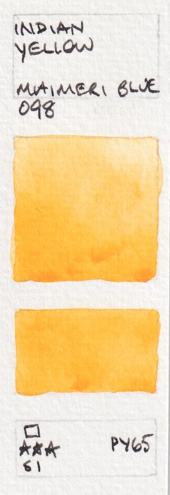
Golden Yellow is a new colour, as are Transparent Yellow and Cadmium Yellow Medium. Permanent Yellow Deep is a new version of a previous colour. I really like PY65 as a pure warm yellow so the new version Indian Yellow should be useful. It looks a little brighter in life than shown here.


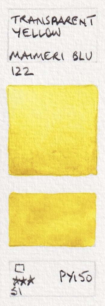


Maimeri Blu Watercolours new range - Primary Yellow, Golden Yellow (not shown), Transparent Yellow,
Cadmium Yellow Medium (not shown), Permanent Yellow Deep (not shown), Indian Yellow.


Maimeri Blu Watercolours new range - Cadmium Yellow Deep, Gamboge (Hue), Permanent Yellow Orange,
Cadmium Orange, Pyrrole Orange.
Orange Lake is brighter than it appears here. The other colours are fairly accurate. Cadmium Red Orange is a new colour in the updated range. Permanent Red Orange is a new name for a previously used pigment, Cadmium Red Medium is a new colour.


Maimeri Blu Watercolours new range - Orange Lake, Cadmium Red Orange (not shown), Cadmium Red Light, Permanent Red Light, Cadmium Red Medium (not shown), Sandal Red.


Maimeri Blu Watercolours new range - Pyrrole Red, Quinacrdione Red, Permanent Red Deep, Permanent Carmine (not shown), Crimson Lake (not shown) and Rose (Alizarin) Crimson Madder (not shown).
 |
| Maimeri Blu Watercolours new range - Permanent Madder Deep (new colour), Rose Lake, Primary Red-Magenta, Versino Violet, Magenta Quinacridone (new colour). |
 |
| Maimeri Blu Watercolours new range - Quinacridone Lake (new colour), Quinacridone Violet (new colour), Manganese Violet (new colour), Permanent Violet Blueish, Ultramarine Violet. |
 |
| Maimeri Blu Watercolours new range - Ultramarine Violet (new colour), Ultramarine Deep, Ultramarine Light, Cobalt Blue Deep (new pigment), Cobalt Blue (new colour). |
 |
| Maimeri Blu Watercolours new range - Cobalt Blue Light, Faience Blue, Indigo (new pigment), Cerulean Sky Blue (new colour), Cerulean Blue. |
Phthalo Turquoise is a lovely turquoise version of PB15 - PB15:4. See bottom of post.
 |
| Maimeri Blu Watercolours new range - Prussian Blue, Berlin Blue, Primary Blue-Cyan, Cobalt Blue Green (new colour), Phthalo Turquoise (new colour). |
Turquoise Cobalt is a very popular colour. See bottom of post.
 |
| Maimeri Blu Watercolours new range - Cobalt Green Bluish (new colour), Turquoise Cobalt (new colour), Turquoise Green, Copper Oxide Green Deep (new colour - but probably replacing 317 Cupric Green Deep), Viridian. |
 |
| Maimeri Blu Watercolours new range - Copper Oxide Green Light (new colour but probably replacing 316 Cupric Green Light), Cobalt Green (new colour), Hooker's Green (new pigment replacing 331), Sap Green (new pigment replacing 358), Cobalt Green Deep. |
Green Gold is made from the lovely PY129 - see bottom of post.
 |
| Maimeri Blu Watercolours new range - Cobalt Green Light, Green Earth (new pigment), Green Gold (new colour, replacing 339 Permanent Green Light), Naples Yellow (new colour), Naples Yellow Medium (new colour). |
The Raw Sienna seems unchanged.
Brown Madder (Alizarin) is one of only two mixed pigment colours in this new range as far as I can see, and it uses two versions of PR206.
The only other two-pigment mix is Mars Black - PBk11 is a fabulous granulating magnetic black pigment. I wonder why PR101 was added?
I'll create a new post once I manage to try the new colours as it is a massive change.
Update - 6 of the new colours.
 |
| Maimeri Blu Watercolours new range - Yellow Ochre, Golden Ochre (new colour replacing 128 Golden Lake), Raw Sienna, Transparent Mars Red, Burnt Sienna. |
Brown Madder (Alizarin) is one of only two mixed pigment colours in this new range as far as I can see, and it uses two versions of PR206.
 |
| Maimeri Blu Watercolours new range - Venetian Red, Pozzuoli Earth (new colour), Dragon's Blood (new pigment), Brown Madder (Alizarin) (new colour replacing Avignon Orange), Mars Brown (new colour replacing Transparent Mars Brown). |
 |
| Maimeri Blu Watercolours new range - Potter's Pink (new colour), Burnt Umber, Raw Umber, Vandyke Brown (new pigment), Sepia (new pigment). |
The only other two-pigment mix is Mars Black - PBk11 is a fabulous granulating magnetic black pigment. I wonder why PR101 was added?
 |
| Maimeri Blu Watercolours new range - Payne's Grey (new pigment), Neutral Tint (new pigment), Ivory Black, Carbon Black, Mars Black ((new colour). |
I'll create a new post once I manage to try the new colours as it is a massive change.
Update - 6 of the new colours.
 |
| MaimeriBlu watercolours after overhaul - Indian Yellow (new pigment), Pyrrole Orange, Quinacridone Lake |
 |
| MaimeriBlu watercolours after the overhaul - Turquoise Cobalt, Phthalo Turquoise, Green Gold. |
I also tested the new versions of Ultramarine Deep, Raw Sienna and Verzino Violet and they appear unchanged.
Here is the website with the whole range of 90 colours.
Here is the website with the whole range of 90 colours.