ShinHan is a Korean company. I posted a blog about their watercolours
here.
I was also sent a set of 6 ShinHan PASS hybrid watercolour/gouache last year and didn't get past painting out some swatches using the fresh paint. The colours were vibrant and strong with various levels of transparency, but at that stage I didn't have a chance to experiment further.
 |
| ShinHan Pass Colour set of 6. |
ShinHan sent out some sample boxes and on Saturday, the Sydney Urban Sketchers had the chance to play with the full range of 48 colours.
They are quite a mix, as the set contains some excellent pigments, some fluoro colours, some fugitive pigments and a big range of transparent to opaque paints. They are designed to be able to 'pass' from transparent watercolour through to thicker gouache applications seamlessly.
 |
| ShinHan PASS colour - set of 48. |
 |
| ShinHan PASS colour drying in full pans. |
They are not necessarily produced to be used dried, but as a travel/urban sketcher, it's always something I like to be able to do - set up a palette and take them with me. Since I usually work with dried paint, I find it more easy to control that way. However for those who like using acrylics or fresh paint, using them fresh from the tube would be more familiar.
I painted out the full range and include them here in the order they are shown in the colour chart. The pigment and lightfast information is taken from the same chart.
S = series, where A is the least expensive and E is the most expensive.
The empty square = transparent
Diagonal through the square is semi transparent
Half filled square is semi opaque
Black square is opaque.
The stars relate to the lightfast rating where **** is the highest lightfast and * is the lowest. There are a number of colours with a rating of * and ** that would not be suitable for framed work but could be used in a sketchbook, where they are protected from light. Very few have been given the highest **** rating.
I noticed that the black line that I drew to compare opacity didn't always match the product information, however it should help to see how transparent they are painted very diluted and then in a creaming wash. The swatches are fairly close to original colours.
These reds are fairly close to the original swatches with the Bright Red being really vibrant. Permanent Red was included in my set of 6 though if you were looking for a primary red the Carmine would be a cleaner mixing option. (note - I've not seen PR17 before nor researched its lightfast rating). The Vermilion Hue is a gorgeous orange but only suitable for a sketchbook or reproduction work. I found the paint easier to control in the dried state and the transitions between using it as a watercolour and using it thicker as a gouache were easier to control.
 |
| ShinHan PASS hybrid watercolour gouache - Alizarin Crimson, Carmine, Permanent Red, Bright Red, Vermilion Hue. |
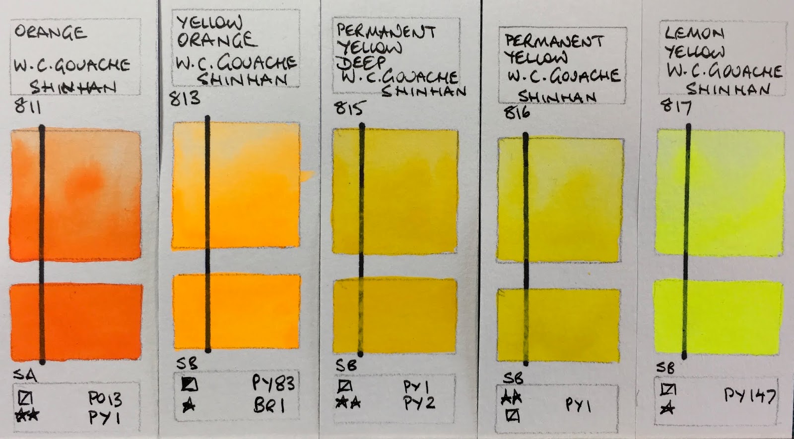
The brightness of the Yellow Orange and Lemon Yellow really shows up in these photos. Once again the orange is very pretty but the pigments are all going to fade if exposed to light. The Permanent Yellow was in the set of 6 and is a good choice (hue wise) as a primary yellow.
 |
ShinHan PASS hybrid watercolour gouache - Orange, Yellow Orange, Permanent Yellow Deep, Permanent Yellow,
Lemon Yellow |
I like the realistic mixed greens (pigments aside).
 |
ShinHan PASS hybrid watercolour gouache - June Brilliant, Linden Green, Light Green, Greenish Yellow,
Olive Green. |
These green swatches are quite close to the greens I like to include in my watercolour palettes - especially the Sap, Viridian Hue (as a mixing green) and Shadow Green.
 |
| ShinHan PASS hybrid watercolour gouache - Cobalt Green, Sap Green, Hooker's Green, Viridian Hue, Shadow Green. |
The lightfast ratings of these blues is lower than I would have expected with these pigments. Cerulean Blue Hue was is the set of 6 and once again was easier to control in the dried form.
 |
| ShinHan PASS hybrid watercolour gouache - Compose Blue, Blue Grey, Peacock Blue, Cerulean Blue Hue, Cobalt Blue. |
It's hard to beat Ultramarine as a warm mixing blues and the granulation is lovely in a wash. Permanent Violet was in the set of 6.
 |
| ShinHan PASS hybrid watercolour gouache - Ultramarine Blue Deep, Prussian Blue, Indigo, Permanent Violet, Helioprope. |
There are some colours that I just have no interest in - flouro pigments and tints being right up there - but they are pretty and the added white pigment of course makes them more opaque.
 |
| ShinHan PASS hybrid watercolour gouache - Blue Celeste, Red Violet, Lilac, Opera, Brilliant Pink. |
I like the yellow ochre - it's one of the most useful gouache colours I find. The Raw Umber is listed as PR101 which is most unusual. It comes in many forms but I've never seen it in this hue before. The Light Red is really vibrant.
 |
| ShinHan PASS hybrid watercolour gouache - Shell Pink, Pink, Yellow Ochre, Raw Umber, Light Red. |
Burnt Sienna was in the set of 6 and once again was easier to control in dried form. I really like the PBr25 pigment - a rich reddish brown.
 |
| ShinHan PASS hybrid watercolour gouache - Burnt Sienna, Red Brown, Burnt Umber, Vandyke Brown, Sepia. |
Finally Black, Grey and White. These were not as completely opaque as they are listed but would cover a line if a couple of coats were used.
 |
ShinHan PASS hybrid watercolour gouache - Black, Grey,
White |
I have set up a palette of 12 colours that I think will work nicely for urban sketching (in a sketchbook) including 5 of the original 6-colour set - White, Permanent Yellow, Permanent Red (though Carmine would be more versatile), Cobalt Blue Hue (though French Ultramarine Deep would be more versatile), Cerulean Blue Hue, Sap Green, Yellow Ochre, Burnt Sienna, Light Red, Vandyke Brown and Black. With Gouache palettes I break all my rules and include black and white! I'll have a play with them and add more comments in time.
Happy painting!