Showing posts with label QoR watercolours. Show all posts

Sunday, 7 January 2018

QoR Watercolours full range


I explored some of the QoR colours some years back when they were first released, and wrote about them here. Rather than update that post, I'll show the full range, organised the same as the colour chart, here. I'd like to express my thanks to Golden for sending me samples to be able to test out and show the full range.


QoR are very different from traditional watercolours and feel different to paint with. They need to be used more liquid and will often explode on a damp paper as they must have a lot of oxgall or other dispersing medium. They can be hard to control. On the other hand, they have a very little to no drying shift so remain very bright, and are largely very finely ground pigments so even the cadmiums are less granulating than the same pigments in other ranges. My initial reaction to them was somewhat critical as they didn't work the way I like watercolours to work, but using them again and fresh from the tubes, watching the colours explode onto the wet wash and seeing what they could do if you want to play with them, I think they add another dimension to the watercolour world. I think it is good that all watercolours are not produced the same way. We are then able to pick and choose those that work the way we each wish to.

I really feel that these are best used fresh from the tube. They don't rewet well enough to work as a travel watercolour as far as I have explored, which makes them less portable. But this is true of M.Graham and Sennelier tube colours too and suits the way some watercolour artists work in the studio.


These yellows are similar in hue, apart from Nickel Yellow which is always a very weak pigment. the cadmiums are really finely ground and are very beautiful.

QoR Watercolours - Nickel Yellow, Cadmium Yellow Primrose, Hansa Yellow Light, Bismuth Vandate Yellow, Cadmium Yellow Light.

These are the mid to warm yellows. Indian Yellow has the look of some of the Quinacridone Gold hues and is slightly brighter than QoR Quinacridone Gold.
QoR Watercolours - Benzimidazolone Yellow, Cadmium Yellow Medium, Aureolin Modern, Nickel Azo Yellow, Indian Yellow.

This is an unusual pigment for Quinacridone Burnt Orange - it's usually called Brown Madder or Quin burnt scarlet. Quin burnt orange is usually more orange - once again it is important to know the pigments when reading a paint name to have a better idea what to expect.

QoR Watercolours - Permanent Gamboge, Quinacridone Gold, Quinacridone Gold Deep, Quinacridone Burnt Orange, Cadmium Yellow Deep.

Transparent Pyrrol Orange is gorgeous - though different from the Daniel Smith paint of the same name. Pyrrole Red Light is a lovely pigment for a warm red in a classic split primary palette.

QoR Watercolours - Diarylide Yellow, Cadmium Orange, Transparent Pyrrole Orange, Cadmium Red Light, Pyrrole Red Light (previously made with PR207).

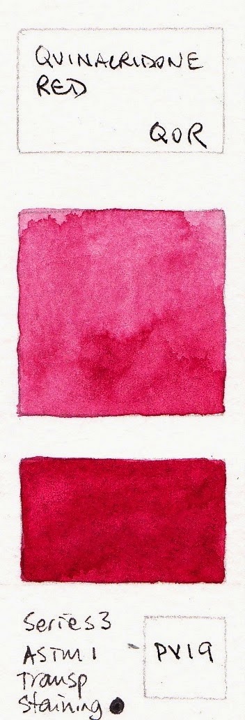
Pyrrole Red Deep is my favourite pigment for a crimson red. I tend to use PR255 as warm, and have PV19 and PR264 as my cool reds.
QoR Watercolours - Quinacridone Red Light, Pyrrole Red Medium, Cadmium Red Light, Cadmium Red Deep, Pyrrole Red Deep.
Quinacridone Red makes a great primary red, though I also use it as one of two cool reds in a palette.

QoR Watercolours - Permanent Scarlet, Quinacridone Red, Permanent Alizarin Crimson, Quinacridone Crimson, Quinacridone Magenta.


The violets pigments PV15 and PV49 are always weak, but the Ultramarine Violet PV15 is a nice version of this colour.

QoR Watercolours - Ultramarine Pink, Quinacridone Violet, Cobalt Violet, Ultramarine Violet, Dioxazine Purple.

QoR Watercolours - Indigo, Ultramarine Blue, Ultramarine Blue Violet, Cobalt Blue, Cerulean Blue Chromium.


These blues all painted out nicely.

QoR Watercolours - Indanthrone Blue, Prussian Blue, PHthalo Blue (Green Shade), French Cerulean Blue, Manganese Blue.

 Viridian is often a weak pigment but is quite strong in the QoR range.

QoR Watercolours - Cobalt Teal, Phthalo Turquoise, Cobalt Turquoise, Phthalo Green (Blue Shade), Viridian Green.

The Cobalt Green is made from a lovely PG26 pigment rather than the PG50 - deep and granulating usually. I found it a little hard to get a smooth wash. Terre Verte is always a weak pigment but perhaps would be stronger fresh from the tube? These versions of Sap And Hooker's Green are very usable as convenience colours though I'd prefer two-pigment rather than three-pigment mixes if possible.

QoR Watercolours - Permanent Green Light, Cobalt Green (not shown), Hookers Green Sap Green, Terre Verte.

These convenience greens are also interesting, though have many pigments. Buff Titanium is one of my favourite Daniel Smith colours and QoR is the only other source available commercially. However, this version has little granulation though is a lovely creamy ecru colour.

QoR Watercolours - Chromium Gren Oxide, Olive Green, Bohemian Green Earth, Green Gold, Titan Buff.

Many of these were painted from dry samples which look weaker. I really think QoR colours need to be used fresh. Raw Sienna is ideally made from PBr7 rather than PY43, which is yellow ochre.

QoR Watercolours - Naples Yellow, Yellow Ochre (Natural), Transparent Yellow Oxide, Raw Sienna (Natural),
Transparent Red Oxide.

Lots of single pigment earth colours. Transparent Brown Oxide was tested from a small dry sample so may be stronger fresh from the tube. You can really see the difference.

QoR Watercolours - Mars Orange Deep, Venetian Red, Burnt Sienna (Natural), Transparent Brown Oxide,
Burnt Umber (Natural).

I like the use of natural earth pigments - they are not mixed with anything else, and the siennas and umbers are nearly all made with the appropriate PBr7 pigment. Raw Umber Natural is especially dark and rich. Van Dyke Brown is far warmer than usual.

QoR Watercolours - Rae Umber (Natural), Sepia, Van Dyke Brown, Carbon Black, Ivory Black.

I am always delighted to see a mixed grey made without the deadening effect of a black pigment. Neutral Tint contains a yellow (yellow oxide), a magenta (quin magenta) and a blue (phthalo blue) pigment. I think this would be an interesting watercolour for some tonal studies. I last tried Ardoise Gray from a very small sample dot but it is a very gentle colour from the tube too.

QoR Watercolours - Payne's Gray, Neutral Tine, Ardoise Gray, Chinese White, Titanium White.

Update - And here are the three Iridescent colours. They are difficult to show but since I have them it gives an idea. They are not particularly strongly tinting.

QoR Watercolours - Iridescent Pearl Fine, Iridescent Silver (fine) and Iridescent Gold (fine)

2018 update


QoR are now available in a 12 colour palette of standard 1/2 pans. See the website here. The colours include Cadmium Yellow Primrose, Nickel Azo Yellow, Transparent Pyrrole Orange, Pyrrole Red Medium, Quinacridone Magenta, Dioxazine Purple, Ultramarine Blue, Phthalo Blue (Green Shade), Sap Green, Transparent Brown Oxide, Burnt Umber (Natural) and Payne’s Gray. The website claims that they are easier to re-wet, which would be a great step.


QoR Mini 1/2 pan palette, from the website www.qorcolors.com

Tuesday, 12 January 2016

A limited palette with 6 QoR watercolours. Another with 6 Daniel Smith colours.

I tested quite a few QoR colours when they first came out in 2014 - 6 from tubes I was sent as samples and others from small dried out sample dot cards. You can see them all here.

They are all on my website in the Painted Watercolour Swatches section, which is creeping to almost 800 different painted samples now. If you have some more watercolours and would like to send me a sample to paint out, please get in touch :-)

I've been asked about adding some mixing information about these paints.

They are made with a new type of synthetic binder rather than the traditional gum arabic. It makes them feel and behave differently from traditional watercolours - a bit like painting with liquid acrylic, I felt. Golden make wonderful acrylics but I'm afraid I don't find these to be wonderful watercolours - I guess they are just not what I am used to. However, for those who are starting out they may work well. There are certainly some excellent colours but also some that are simply.... weird.

Anyway, I'll include a paintout I did using the palette of 6 that I chose. I decided to go with a balanced full gamut palette of nickel azo yellow PY150, transparent pyrrol orange PO71, quinacridone magenta PR122, ultramarine violet PV15, ultramarine blue PB29 and viridian PG18. No earth colours, and all transparent with three normally granulating pigments. Viridian and ultramarine violet are often quite weak colours so I thought these would be good to test the QoR claim of stronger colours. They are pretty powerful if you pre-wet them well before use, but not very granulating and quite difficult to lift.

QoR exploration - 6 colour full gamut palette.
I was intending having three neutralising pairs in this little palette. As you can see each pair doesn't quite make a grey but there's a lot they could do.

QoR have a much more powerful purple than this - Dioxazine purple, and a much more powerful green - Phthalo green. So this palette could be made up with stronger colours. Bismuth Vandate yellow could be used instead of Nickel Azo yellow. They also have a strong crimson which is the mixing opposite to Phthalo green, which could be used rather than the magenta. So this palette is not intended as a recommended palette, just an exploratory one.


That's the limit of my exploration of these paints. Partly, I guess, since I would actually very rarely set up a palette without burnt sienna, cerulean and a good warm yellow. Also, though it's a pretty colour, and a great mixer, I don't like painting with quinacridone magenta. While I love exploring what limited palettes can do but I don't actually choose to paint with them :-)

I don't know how well this brand would mix with traditional watercolours as I haven't tested them further. If anyone else has, please comment below.

Here is a similar full gamut palette made up with Daniel Smith paints - a powerful crimson (Pyrrol crimson), and the very strong Carbazole violet (the same pigment as Dioxazine violet) and phthalo green. There is more about this palette here. Once again it isn't a palette I would necessarily choose to paint with though even though they are so much fun to explore! My smallest palette contains lots of earthy pigments including burnt sienna and is shown here though I do have a full gamut palette in a silver locket ;-)

Daniel Smith 6-colour full gamut palette exploration 


Friday, 17 October 2014

QoR watercolours by Golden - Updated

Three QoR sample cards and some tubes to play with.


I recently tried a number of samples of the new Golden watercolour range - QoR (pronounced 'core'). Golden has the reputation as one of the best acrylic paint makers in the world, though I haven't actually used them :-) The range of watercolours has a different binder from the usual Gum Arabic - Aquazol - and the aims of the company, according to the excellent website, was to create:


  • Vibrant, intense colors that stay brilliant even after they dry
  • Exceptionally smooth transitions, flow and liveliness on paper
  • Excellent resolubility in water and glazing qualities
  • Vivid depth of color with each brushstroke
  • Greater resistance to cracking and flaking
  • More density of color than traditional watercolors
  • Exclusive Aquazol® binder used in conservation
(Copied from http://www.qorcolors.com/about-us)

Note - no mention of granulation - one of the characteristics I love to explore in watercolour.

The sample cards are beautifully presented on waterproof paper with a little sheet of watercolour paper so you can test the colour. I understand thousands of cards were made before they realised that the sample was too small to try properly. See right. The other cards had a bit more paint to be able to create a wash with (see below)

I painted out my usual swatches as best I could using every trace of the paint sample. The paints feel different to paint with. It was as though I were painting with alcohol rather than water though that doesn't really describe it properly - they had a different consistency from what I am used to, though some of the samples were not enough to create a 'juicy' wash. They seem very matt and flat with absolutely none of the slight sheen that the gum arabic creates in some watercolours. Some brands of course are too gummy!

They also didn't have the level of granulation I am used to, which would suit some people very well.

The Permanent Alizarin is made with PR177 - Anthraquinoid Red - which is a very powerful and staining crimson. The Ultramarine is rich and vibrant and there really is less of a drying shift than normal watercolours. I didn't document it with a before and after photo but it is interesting. Would that make it difficult to intermix them with other brands? Perhaps. I'd be reluctant. The Pyrrole Red Light behaved quite strangely as you can see above, but there wasn't much in the sample to explore this further. Note 2017 - the pigment is not PR255 which is a lovely warm red pigment.


I was particularly interested in trying Ultramarine Violet and Viridian as these are generally not very strong colours that I had heard were very good in the QoR range. They do have a little more bang to them, though of course they are still gentle colours compared with their powerful dioxazine purple and phthalo green cousins - that's the nature of their pigments. Nickel Azo Yellow was very powerful. Burnt Sienna, though my preferred PBr7, was less so though hard to really tell from a small sample. It's a nice colour. I wasn't able to mix it with Ultramarine to see how it neutralised.

This bright set of swatches above were all rather lovely colours. Strong and clean and nearly all single pigment colours, except of course Quinacridone Gold, which is a nice hue made from PO48 + PY150. The orange is particularly beautiful.


This above set of swatches has a couple of three pigment mixes, which is too many for my liking. The Venetian Red is strong and opaque and very like Indian Red in other brands and the Transparent Brown Oxide is finely granulating. This could be a nice choice as a Burnt Sienna option if a more granulating version is desired. Sap Green is usually a mixture and this is a very usable version, even though it is a three pigment mix. They are very good pigments!

Note that the tubes are only 11ml and quite expensive compared with many brands.

I have made up a little palette of six to explore further. Somehow I think I will use them alone rather like coloured inks. My rather bright primary and secondary palette is Nickel Azo Yellow, the gorgeous Transparent Pyrrol Orange, Quinacridone Magenta, Ultramarine Violet, Ultramarine and Viridian. I'll see how they go to paint with...

The complete colour chart along with painted out samples and pigment information on all 83 colours can be found here. I have added them to my other watercolour swatches on my website here.

Brights sample card
Earth sample card


November update
I have also tried samples of a number of other colours so will add them to this Blog to keep them together. It isn't really necessary as there are painted samples on the QoR website that do show the colours very well, but I like to be thorough :-) I'll also add them to my website.

I had more paint to finish the Cerulean Blue sample,  so have added that again here.


September 2017 update - I'll be painting out the rest of the range soon. Of note is Neutral Tint - it's a rare mixed grey without any black in it, made with PY42+PR122+Pb15:3 - I look forward to testing that one.