Showing posts with label quinacridone gold. Show all posts

Thursday, 28 December 2017

Quinacridone Gold Hues

Quinacridone Gold could be considered a non-essential colour, but it very quickly became one of my personal go-to favourites when I first tried the Daniel Smith PO49 version back in about 1995. I think it was the first company to produce the colour, and I loved not only the way it mixed, but also the gorgeous glow it could add to a painting. I've also tried a PO49 version from Winsor & Newton, but otherwise only hues from other manufactures.

It is brighter than most earth yellows, but more neutralised that most warm yellows so is a neutralised warm yellow. It's perfect for making the gorgeous dull greens of the Australian landscape.

This year saw the end of the world's PO49 supply that Daniel Smith bought up about 17 years ago, when the car industry lost interest in the beautiful pigment and production ceased. The last batch was produced in September. Though I did see some available in dry pigment form in New York...(see edit below)

Since PO49 has run out, I thought I'd post up a sample of different versions for comparison.

The first has the yellower Nickel Quinacridone Gold from M.Graham, followed by the new (2017) Schmincke Quinacridone Gold Hue and the QoR Quinacridone Gold. PY150 is a perfect base for this colour hue and it appears in all versions.

M.Graham Nickel Quinacridone Gold, Schmincke Quinacridone Gold Hue, QoR Quinacridone Gold.

Next are Quinacridone Gold Hue from Daniel Smith introduced in 2015 for 5ml tubes and sticks, and now used in 15ml tubes. This hue was used in the mixes (including Sap green and Undersea green) from that time instead of PO49. Next shown are the genuine PO49 from Daniel Smith and the genuine PO49 from Winsor & Newton (also no longer available).

Daneil Smith Quinacridone Gold, Daniel smith Quinacridone Gold (PO49), Winsor & Newton Quinacridone Gold (PO49)

And finally the Winsor & Newton three pigment hue which looks ok in this sample but is often very dull, the three pigment Sennelier hue and the deeper and more orange Da Vinci hue.

Winsor & Newton Quinacridone Gold, Sennelier Quinacridone gold, Da Vinci Quinacridone Gold.

They are all very similar, though the W&N is less bright due to the PV19 and the Da Vinci is deeper - almost like a PO48 Quin Gold deep. As always, it's hard to show on the screen.

My favourite mix is PY150 plus PR101 (DS transparent red oxide, DS Burnt Sienna Light or W&N burnt sienna) that Schmincke uses, though PR206, PO48 and also work.

The world hasn't ended, and just as we survived the end of PY153 and other gorgeous pigments, we'll survive the end of this one (though I admit I started hoarding tubes of PO49 a while ago....)

I'll also show these pictures on Instagram (Janeblundellart) where they may look slightly different.


Edit January 2018 - The dry samples I had noticed (mentioned above) were from Guerra Pigments in New York. Thanks to RiverdaleWatercolor who commented below, here is a sample of the Guerra PO49 pigment compared with Daniel Smith PO49. Apparently this took some hours to mull to get smooth enough for watercolour, but there is also a dispersion available which may be more suitable for home made watercolours. It certainly looks beautiful on the screen if you click on the link.

Daniel Smith PO49 (left) compared with Guerra Pigments PO49 (right).
As far as mixing is concerned, the Guerra pigment behaved more like a raw sienna.


Edit March 2018 - Riverdale watercolours sent me a sample of her hand made Quinacridone Gold made with the Guerra dry pigment and it's quite something! Not what I expect for PO49, but very beautiful with extreme granulation. It is almost a burnt sienna colour.


If you are using my ultimate mixing set, you can also create a very nice Quin Gold hue by mixing hansa yellow medium with burnt Sienna. However I think the DS hue is close enough to still be a useful colour in the palette - it will still mix gorgeous greens and provide a beautiful warm glow.

Happy painting!


Wednesday, 24 September 2014

A Question of Hues - Jane's Gold

I recently found an old pan of Winsor and Newton genuine Quinacridone Gold watercolour. PO49. (I had already stocked up on old supplies of the W&N acrylic version :-) Needless to say I snatched it up as I was curious to see how their version compared with the Daniel Smith colour I know and love. Daniel Smith bought up the last supplies of this pigment many years ago and are the only ones still making the genuine version. On the screen they look very alike, though in real life the DS is a little warmer. It is interesting to note that a number of the DS colours that used to have PO49 are now using PO48 or other pigments.


What I have always tried to understand is why Winsor & Newton make such a complex and ugly hue of this colour. They use PY150 - a lovely slightly acid transparent yellow that is an excellent base colour, and is available in W&N as Transparent Yellow or M.Graham and Daniel Smith as Nickel Azo Yellow; PR206 a burnt red, available in W&N as Brown Mader, Daniel Smith as Quinacridone Burnt Scarlet and Daler Rowney as Transparent Red Brown; and PV19 - a rose to violet pigment. W&N Quin Gold (hue) ends up being a very dirty colour, with too much violet-red though once again that is difficult to see on the screen. If they simply mixed the PY150 with their own Burnt Sienna PR101 they would have a cleaner colour that exactly matches genuine Quinacridone Gold. Other companies make the hue with PY150 + PO48 or other variations. Once again, the simplest solution is the best? Anyway, my quin gold hue - Jane's Gold - is PY150 (DS Nickel Azo Yellow) + PR101 (W&N Burnt Sienna) :-)

So how much of each? Making Jane's Gold :-)

 I have used with a half pan and added a decent blob of Nickel Azo Yellow PY150, but left room to mix. Then a much smaller blob of W&N Burnt Sienna PR101. It really depends on the brands you are using how much you need. I mixed these thoroughly with a very fine quill (or use a metal skewer of needle) and came up with a colour that is still too yellow.


 Here is the first mix - not enough PR101

So I added another small blob using the tip of a palette knife - you can see the small blob in the corner of the palette
 The second mix is warmer, but not deep enough and still too much yellow in a wash.

So I added the third small blob amount again, stirred it well, and came out with a very close match, pictured on the left.

Here is my mix compared with the actual PO49 paint. I estimate it is 5 parts PY150:1 part PR101, but the different brands will be different thicknesses so there is no magic formula.
Here is my testing page. You can see Quin gold mixed with Ultramarine on the top left, Jane's gold with Ultramarine below it. It could still have a little more PR101 but is very close. The thing about making your own custom mixes is you can decide exactly what warmth to take it to.

Other good Quin gold hue mixes are PY150 + PO48, PY129 + PBr7 and even PY97 as a base yellow colour.
And here are the pigments in their pure form.

Happy custom mixing :-)


To see my Jane's Grey custom mix, click here
For Jane's Black and other custom mixes click here
For more custom mixes (Jane's golden Earth, Jane's Sienna and Jane's Earth Rose) click here.

Thursday, 14 August 2014

Watercolour Comparisons 7 - Yellows

I have posted about mid yellows in a primary triad palette, but here I will show comparisons of a full range of yellows, including warm and cool yellows. I will post about earth yellows separately. I have also added all these and more to my website so you can compare them here.

You have the choice of opaque or transparent yellows, with the very popular cadmiums being more opaque. You also have the choice of single pigment and mixed pigment colours. I use single pigment colours where possible. You also have a choice of staining or non-staining colours and to some extent granulating or not.

Cool Yellows

The cool yellow range includes many lemon yellows, cadmium light, hansa light and so on. These colours lean towards green and have no apparent red in them so will make very bright greens when mixed with a cool blue and more neutral greens when mixed with a warm blue. My favourite is Hansa Yellow Light PY3, made by Daniel Smith or Da Vinci. Art Spectrum use the same pigment in their Lemon Yellow. It is a bright, pure lemon yellow with plenty of tinting strength. Bismuth Yellow is more opaque, as are the genuine Cadmium Yellow Light colours. I don't like the Nickel titanate Yellows PY 53 at all - it is weak and ugly. I have added DS Aureolin here though it could equally be in with the mid yellows - either way it is not recommended as PY40 is not a reliable pigment.

Nickel Titinate Yellow Daler Rowney, Cadmium Yellow Winsor &Newton, Lemon Yellow Art Spectrum, Cadmium Yellow Light DS, Cadmium Yellow Light Hue DS, Winsor Lemon W&N, Bismuth Yellow, Steven Quiller

Nickel Titanate Yellow Daniel Smith, Bismuth Vandate Yellow DS, Hansa Yellow Da Vinci, Hansa Yellow Light DS, Aureolin DS, Aureolin Hue Lukas

Mid Yellows

The mid range are yellows that are neither warm nor cool - they don't lean toward green or orange - but can be tinted with a blue to cool them or with a red to warm them. They are ideal in a limited palette, but I rather like them in my regular palette too. The best known mid yellow is Cobalt Yellow or Aureolin PY40. Unfortunately, though you will see this recommended in many many watercolour books, it is not a good choice as the pigment fades in washes and goes grey in mass-tone so look for better alternatives if you want your paintings to last. If you have Aureolin, use it in a sketch book only, where it is protected from light, and photograph or scan your work for posterity.
I have written more about Mid Yellows in a previous post here  as I tend to use a mid yellow rather than a light yellow in my palette, but have tried out a few more colours since then. There are many that are good, my favourites being Hansa Yellow Medium DS and Arylide Yellow Medium Da Vinci. Schminke Pure yellow and Winsor and Newton Winsor Yellow are also good. In my experience Mayan Yellow didn't rewet well once dry on the palette. W&N Transparent Yellow made with PY150 is shown here, the DS and MG versions are with the warm yellows below, though they are all fairly similar slightly neutral yellows.

Arylide Yellow DV, Hansa Yellow Medium DS, Mayan Yellow DS, Schev Yellow Light Old Holland, Tranparent Yellow W&N.

Azo (Aureolin) M. Graham, Azo Yellow DS, Pure Yellow Schmincke, Aureolin W&N, Cadmium Yellow Medium Hue DS, Winsor Yellow W&N.
Warm Yellows

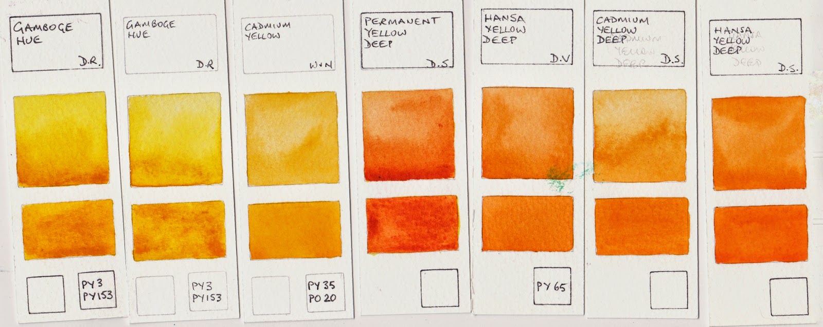
Warm yellows are yellows that lean towards orange. These will mix with blues or phthalo green to make more olive-greens due to the neutralising red in them. In Australia I find the warm yellows make wonderful realistic greens. In Europe mid or cool yellows may be more useful. The first two rows are the brighter hue warm yellows. My favourites of all these are New Gamboge by Daniel Smith and Hansa Yellow Deep by Daniel Smith or Da Vinci. As always, I am less interested in the mixed pigment yellows.

Isoindoline Yellow DS, Indian Yellow W&N, Cadmium Yellow Deep Hue DR, Cadmium Yellow Deep DR, Indian Yellow DS, New Gamboge DS, Gamboge Hue DV

Gamboge Hue DR, Gamboge Hue DR, Cadmium Yellow W&N, Permanent Yellow Deep DS, Hansa Yellow Deep DV, Cadmium Yellow Deep DS, Hansa Yellow Deep DS.

The next group are slightly neutralised yellows. Quinacridone Gold PO49 by Daniel Smith is one of my favourite warm yellows and can double as a transparent yellow earth colour. Nickel Azo Yellow washes out to a lighter almost lemon yellow but has a deeper, slightly dirty masstone. W&N Transparent Yellow uses the same pigment.
Nickel Azo Yellow DS, Nickel Azo Yellow MG, Quinacridone Gold W&N, Quinacridone Gold DS, Australian Red Gold AS, Quinacridone Gold Deep DS.
Remember with yellows, like all colours, the most expensive are not always the best - the price of artist quality colours relates to the cost of the pigment. Cadmium and Cobalt pigments are expensive. Arylide pigments are cheaper, so the Hansa colours, which have wonderful purity, are a good choice for colour and for price.

Watercolour Comparisons 1 - Ultramarine Blue here
Watercolour Comparisons 2 - mid yellows here
Watercolour Comparisons 3 - Primary Red here
Watercolour Comparisons 4 - Burnt Sienna here
Watercolour Comparisons 5 - Greens (Single Pigment, convenience mixes and special effect) here
Watercolour Comparisons 6 - Reds (Cool, mid and warm) here
Watercolour Comparisons 7 - Yellows (cool mid and warm) here
Watercolour Comparisons 8 - Blues here


Sunday, 2 June 2013

Boyd's Rocks - theme and variations

I went to Bundanon in 2011and painted a sketch of the rocks on the Shoalhaven River that Arthur Boyd painted over and over in so many ways. I had no desire to copy his style or techniques, especially since he was painting in oils where I am using watercolour, but have ended up creating a few large landscapes based on them.
Plein air sketch of Boyd's 'Rock Quartet', 2011.
It was incredibly peaceful sitting on the edge of the river. The water really was a deep gold as it reached the beach below me. Perfect colour - quinacridone gold.

The cliff behind was rather interesting, but I also loved the strong shadows against the light coloured rocks. I used Buff Titanium and bistre for them.
'Boyd's Rock Quartet, Shoalhaven River' 2012

I wanted to focus on the wonderful colour of the sky and the water in this painting. Australian skies are so often a lovely deep warm blue.


'Boyd's Rock Quartet II'  2012
In this one I wanted to really focus on the rocks and the line-work of the cliff. I had fun with a dagger brush for the linework. I really enjoyed using the granulating primate colours by Daniel Smith - Green Apatite Genuine and Serpentine Genuine. They are a whole range of colours in one. I have no problem mixing greens but I can't mix to create this level of granulation!

I did another of these - almost the same - as this one sold before I could exhibit it. And I tried it in acrylic too. I love painting rocks.