Tuesday 10 December 2019

Watercolour sketchbooks

I've used and travelled with many sketchbooks since I first sat outside trying to sketch a duck pond when I was 11. In recent years, I've really concentrated on working in sketchbooks that will take watercolour washes. I'll include a number of them here. 

I created a template so I could easily draw the same arrangement of squares in each book, then painted the boxes in the same colours to give a comparison of the papers. I've then scanned them all on the same scanner. Most colours look pretty accurate but Cerulean Chromium looks more turquoise in all of the samples. I'll add my notes about now I felt painting them. Some papers required a faster touch than others.

While I have more information on these on my website here, I thought this may be the best way to allow easy comparison of the paper types. I have loaded them in no particular order. I haven't shown the liftability of each paper. (That's not a word, but I think it's useful ;-) so will do that another time.

The colours I've used are my suggested 12-colour urban sketching palette and are all Daniel Smith - buff titanium, hansa yellow medium, quinacridone gold, quinacridone rose, ultramarine, cerulean chromium, perylene green, goethite, burnt sienna, Indian red, raw umber and Jane's grey. You can read more about that on my website here or on my blog, set up in a palette, here.

The sketchbooks that I like best may not suit everyone best. It depends how quickly you work, how detailed, how much water you use and whether you paint on both sides. I work relatively slowly, with a lot of detail and accurate colour. I love watercolour granulation. The paper that works best for me generally has a high cotton content and I really like 200gsm for sketchbooks so you get a lot of pages in the book. For my framed works outside of a sketchbook, though, I prefer 300gsm paper. I personally always prefer a medium or cold pressed paper to rough or really smooth, as I like to use fountain pens with fine or even extra fine nibs along with the watercolour. And yet I have enjoyed using a lot of 150gsm Alpha books! So I use one type for quick work and another for more detailed watercolour painted sketches.


Stillman & Birn - Alpha. 
This comes in a range of sizes and in spiral, hardcover or soft cover. It is 150gsm paper designed to take light washes. The paper is a bright white, takes fountain pen and pencil really well and has a very slight texture, described as a vellum surface. 

I enjoy this as a paper to use for notes and sketches, where I'll be doing more writing than sketching, or for quick sketches, demonstrations or colour studies. I've used many of them in many sizes, especially the landscape format hard-bound 9x6" hardbound books. There is some show-through, but remarkably little. There is also a little buckling but it has never worried me. The soft-bound are lighter for travel but I personally prefer the hard covers. 

This is the lightest weight paper I've used with watercolour and I think I've used more Alpha books than any other!

Stillman & Birn Alpha sketchbook sample page

Global Handbook Watercolour sketchbook. 
This paper comes in a range of sizes and interesting shapes and is fairly strongly textured paper. The cover is a light grey fabric hard-cover. It is 200gsm, which I think is a good thickness for a sketchbook. The paper is natural white and the texture is similar, though not identical, on both sides. I feel that is has slightly too much of a right and wrong side for best results but it's a nice book. 

Global Handbook Watercolour Sketchbook sample page

Hahnemühle Watercolour Book
This paper is a natural white, acid free and has a fine grained texture on both sides. I think it is great for pencil and pen with smaller areas of wash, though a little more tricky if you want to create larger smooth washes. It comes in a range of shapes and sizes including new zig-zag formats.

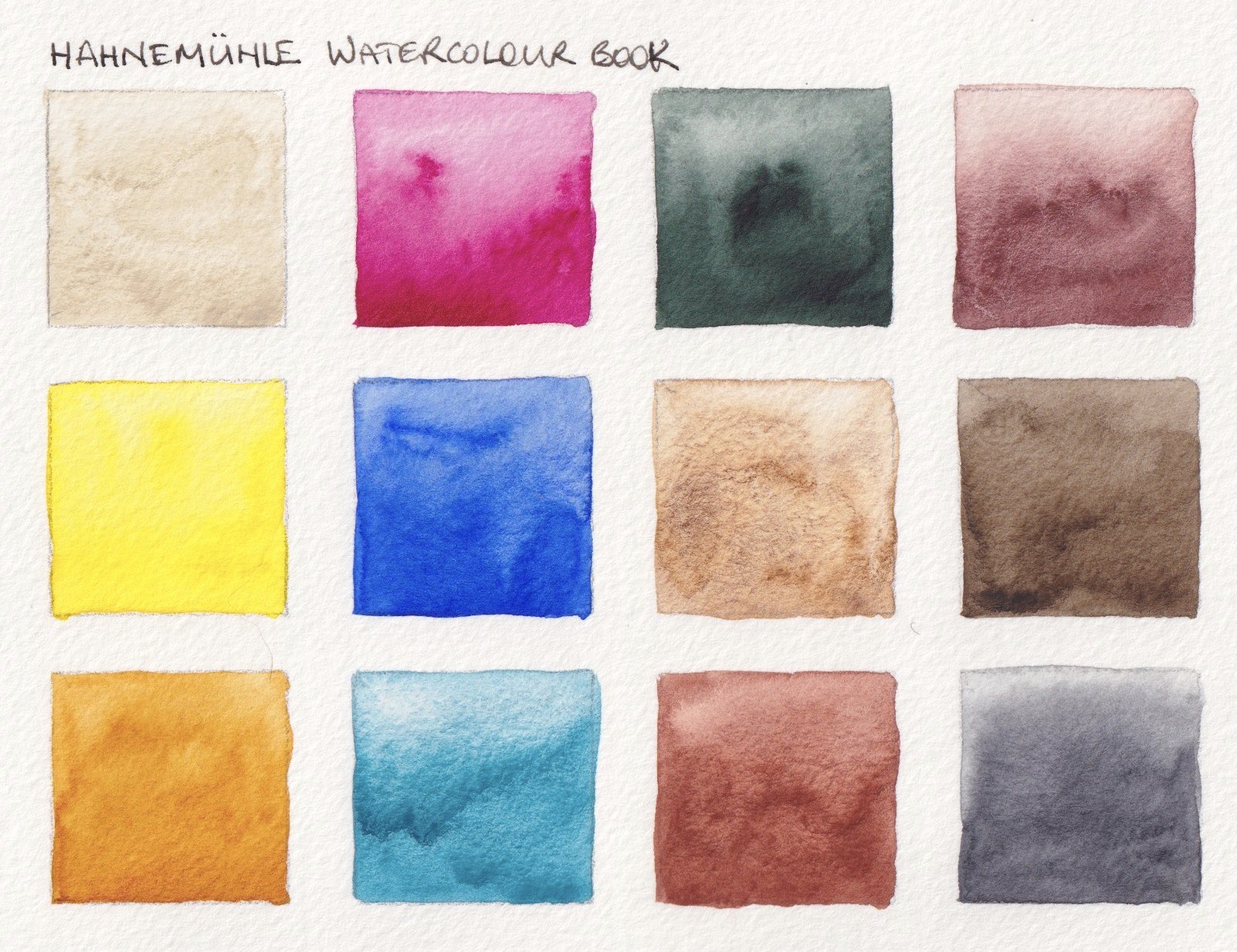
Hahnemühle Watercolour Book sample page

Moleskine Watercolour notebook (original)
The original Moleskine watercolour notebook had wonderful 200gsm natural white paper, with the same cold pressed texture on both sides. I loved this paper when I first started using it in 2009. It took pen and pencil well and watercolour behaved very predictably on it.

Moleskine Watercolour sketchbook (original) sample page

Moleskine Watercolour Notebook (2nd Generation)
This is 200gsm paper in the same natural white colour as the Hahnemühle and Global. It is 25% cotton, acid free. But is has quite a different texture on each side of the paper. I understand it has improved but I haven't tried the latest version. This sample is painted on the 'right' side.

Moleskine Watercolour sketchbook (2nd generation) sample page

Stillman & Birn - Zeta
This is a smooth surfaced 270 gsm paper in a bright white. It is gorgeous for pen and pencil but you need to use watercolour very quickly to keep in under control. Personally I always prefer to use watercolour on cold pressed rather than smooth or hot-pressed papers, but many like the smooth surface. Excellent for pen or pencil work.

Stillman & Birn Zeta sketchbook sample page

Stillman & Birn - Beta
This is a brighter white paper like the Alpha, but in a heavier 270gsm weight. While it is cold pressed with a surface that takes pen or pencil beautifully, you have to work quickly with watercolours so it is more difficult to control. It is best for single pass watercolour techniques and no fiddling.

Stillman & Birn Beta sketchbook sample page

Koval Sketch Book - Pro
This is 300gsm cold pressed, acid free, 100% cotton extra white Fabriano Artistico paper. Just lovely. It is very easy to control the watercolour washes and it shows the granulation of the pigments beautifully.

Hand made and really well put together, this is available in a range of sizes and shapes. They also make 50% cotton and 200gsm weight and include rough and smooth surfaces in the range.

This is a company well worth checking out. It was started by an artist looking for his own perfect sketchbook and ending up making them.

Koval sketch Book Pro sample page


Winsor & Newton Watercolour Book
This is another 100% cotton, cold pressed 300gsm acid free sketchbook. It comes in a range of sizes and in hard or soft cover. Very easy to control, with a gentle grained texture so it takes pencil and pen well.

Winsor & Newton Watercolour Book sample page

Etchr Lab - The Etchr Sketchbook
Made from 230gsm cold pressed paper, this is the most textured of the papers included in this list. 100% cotton, natural white, with a heavy fabric cover. It is available in A5 and A4 but also in a hot pressed (smooth) 220gsm version. Hardcover with a cream fabric cover. The paper would skip more than some others with pencil or pen but watercolour behaved nicely in it.

Etchr sketchbook sample page

Etchr Lab - The Perfect sketchbook 
Artist grade, 100% cotton, 300gsm Cold Pressed paper. This is a joy to use. The watercolour behaves with a high degree of predictability and control. The paper has a soft texture on both sides. It is a creamy white. Available in A5 or A4 landscape only. Hardcover, with a grey cover.

Etchr Lab The Perfect sketchbook sample page

The Perfect Sketchbook B5 (Indiegogo 200gsm version)
This is the sketchbook I have been using since I received them in April 2016. It is Fabriano Artistico cold pressed 200gsm 100% cotton paper. It is a slightly cream white, which is my only criticism. I really enjoy using this sketchbook. It works beautifully for pencil or ink and gives tremendous control with traditional watercolour techniques. Lovely.
It is available in 300gsm from Etchr Lab as their Signature sketchbook.

The Perfect Sketchbook B5 sample page


Canson All Media 

I've used a 9x12" spiral bound format with this paper. It is 185gsm, acid free paper with a pledge to low emissions for water and air. The surface is slightly more textured on one side than the other but both sides take watercolour or pen well. I used the spiral format so I could easily stick in photos, samples of papers and other items as I've used this as my visual arts process diary - a visual record of my larger artworks.


Canson All Media sample page

Laloran Sketchbook 
I bought the Extra Large square Laloran sketchbook at the Urban Sketchers Symposium in Amsterdam in July as I wanted to test out the lovely 21cm square format. It is made in Portugal from 180gsm Clairefontaine Dessin à Grain paper. These are hand made books with 96 pages (48 sheets). They have a fabric spine, which can be plain or a lovely hand made fabric from East Timor. Available in range of colours.

The grain is very similar to the Stillman & Birn, but heavier at 180gsm rather than 150gsm. The prices are excellent. See the range here.
Laloran Square sketchbook sample page
The Perfect Sketchbook A6 (Indiegogo crowd funded project)
This was the first collaboration between Erwin Lian and Bynd Artisan book binders. The paper is a cold pressed 190gsm 100% cotton watercolour paper. The book is beautifully made with a back pocket, bookmark and elastic closure. Though similar, there is a slightly more textured surface on one side of the paper than the other. This sample is the more textured side.
The Perfect Sketchbook A6 sample page.
SM.LT Art Watercolour #authenticbook
This is a 280gsm stitched sketchbook with a simple cardboard cover. The paper is 280gsm acid free, with an almost smooth surface though it is described as rough. I found I had to paint quickly to get an even wash, but the granulation shows up nicely. This is an interesting company - you can read more about them here. Made 'by caring hands in the centre of Europe' they were a sponsor of the Urban Sketchers Symposium in Amsterdam.
SM.LT sketchbook sample page

Strathmore 500 Series Mixed Media.
This is 190gsm paper, acid free and 100% cotton with a slight tooth that shows up the watercolour granulation nicely. It is a lovely surface for pen and pencil. I have a soft-cover 7.75x9.75 portrait format sketchbook, which is a useful size. I think I'd prefer a hard cover though - soft cover books always feel more casual.
Strathmore 500 series sample page

Wednesday 13 November 2019

My Studio Palette and favourite Pigments


Note - I try to regularly update posts with additional information but they don't normally repost. I wrote this post in 2013 and, for some reason, this re-posted in 2019 when I updated it. So I've updated it again to make it completely current!


I am often asked what other colours I use or like, and why. There are rather a lot. I have posted a paint-out of my main studio palette before, which I have recently updated. This would have some of my top 20 pigments, and allows me to paint almost anything I choose as it has a good range of yellows, reds, blues, greens and neutrals. These are all Daniel Smith watercolours as follows:
  • Yellows  - 
  1. Hansa Yellow Medium as my mid or primary yellow
  2. Quinacridone Gold as my warm yellow
  3. Goethite DS as my earth yellow
  4. Raw Umber as my dark cool brown
  • Reds/Oranges - 
  1. Quinacridone Rose as my cool and purple-mixing red
  2. Transparent Pyrrol Orange as my warm red (note 2019 - this colour seems to have changed to a mid orange rather than a red-orange so pyrrol scarlet is probably more useful here), 
  3. Indian Red as my earth red  
  4. Pyrrol Crimson as my deep crimson. (In my smallest travel palette I sometimes use Carmine in place of the crimson and rose pigments)
  • Blues - 
  1. Phthalo Blue Red Shade as my cool blue. 
  2. Ultramarine DS or DV, as my warm blue
  3. Cerulean Chromium as my liftable granulating cool blue
  4. Indanthrone Blue just because I love it - a deep warm blue.
  • Greens - 
  1. Phthalo Green Blue Shade as a mixing green
  2. Undersea Green mix DS (PB29+PO49) for foliage and leaves
  3. Sap Green (PO49 + PG7) for foliage, botanicals
  4. Perylene Green that is so useful for foliage in shadow.
  • Neutrals - 
  1. Buff titanium which is so useful for urban and beach subjects
  2. Burnt Sienna PBr7 is my preferred pigment for Burnt Sienna
  3. Burnt Umber as my warm deep brown
  4. Jane's Grey mixture of Burnt Sienna and Ultramarine. This is the one I refill the most. 
Here is the palette - In the first photo from 2013 I arranged the colours with all the yellows together in the first column, then all the reds, then the blues, then greens, then earths. There is more on this arrangement here.

My 20 colour brass studio palette from littlebrassbox  - photo from 2013. 
I now have them in a more 'rainbow' order with light buff titanium, then yellows running down the first column, into reds, blues, greens and then the earths. This is how I tend to arrange all my palettes.

My 20 colour brass studio palette from littlebrassbox in 2019 - same colours but in a different order.

My studio palette colours.

So then what to do with the colours I want to use on occasions but not all the time? 

One option was to use a bigger palette. I had a wonderful large palette that worked very well in many ways. It held 34 colours and had good mixing areas but it took up a lot of space on my work desk and was not easily portable if wet so it was really only good in my studio. (Called the Bullet Proof Palette, by the way, though it is not actually made of glass but strong plastic.) It also had a number of colours that were more for special use than for all the time. My brass one is very compact when not in use, with great mixing space during use. What I wanted was a separate 'extras' set that I could keep in the drawer when not in use but pull out easily when painting in my studio. I've ended up using a set of 18 half pans in a custom made brass box. It works fine :-)

So what are these special extras?

My studio 'extras' palette.
Some are opaque versions of colours I have, some are more granulation, some are cool yellows for florals. They are colours that have their uses in particular paintings. I try to limit the number of pigments I use in any one painting but I like to have a good range to choose from.

Included in this little extras set might be - 

Cadmium Yellow Light - an opaque yellow for when more coverage is required or Hansa Yellow Light Daniel Smith PY3 which is a lovely transparent cool yellow. 

New Gamboge  - the original PY153 version from Daniel Smith. It is the most lovely transparent warm yellow I have tried. Mixable, but at times it's good to start with a single pigment colour. Hansa Yellow Deep is another excellent option.

Benzimida Orange Deep DaVinci - this is a gorgeous orange with a lovely and unusual orange  undertone. Once again it is mixable, but just lovely. Or Transparent Orange Schmincke, which is more transparent and has a more yellow undertone. 2019 update - The DS Transparent Pyrrol Orange that I use in my main palette as a warm red seems to have changed to more of a true mid orange - rather like the Benzimida Orange Deep, Winsor & Newton Transparent Orange and almost the Schmincke Transparent Orange. It would now sit in with my extras and I'd change the main palette to Pyrrol Scarlet for the warm red.

Pyrrol Scarlet DS - a very lightfast warm red. I like the pyrrols and they intermix very well. A bright red can be perfect for certain flower studies. This is the red I recommend in all my teaching, rather than the Transparent Pyrrol Orange that I have in my main palette.

Quinacridone Lilac DS - this is the lovely PR122 magenta that makes the most gorgeous purples, and is prefect for painting bougainvillea. It's great if I want to work in a limited CYM palette too! Not currently in my extras palette as I use Quinacridone Rose to make most purples.

Imperial Purple DS - purely convenience if painting purple flowers. Some might prefer a PV23 Dioxazine violet.

Moonglow DS - this mix of Ultramarine, Anthraquinoid Red and Viridian is just lovely for many floral shaded areas.

Cobalt Blue - this lovely mid or primary blue doesn't get a lot of use, though it's wonderful in the Greek Islands and for skies.

Phthalo Blue GS DS - this is the colour I recommend in all my teaching, rather than the Red Shade that is in my main palette. I have it for demonstration purposes for my on-line tutoring since it is a traditional choice for most people. The Red Shade can be adjusted to look like the Green Shade with the addition of a little Phthalo Green.

Cobalt Turquoise DS - this is an easy enough colour to make but the granulation is something special.

Jadeite Genuine DS - this granulating pine-like green is a beautiful pigment. It mixes a bit like Phthalo green but is much deeper in mass-tone, more like Perylene Green, and more liftable thatn phthalo green. Wonderful in foliage. Still in my little travel palette.

Green Apatite Genuine - I love this colour and use it often. Goes from a light green gold through a sap green to a deep undersea green all in one - still in my little travel palette.

Serpentine Genuine DS - wonderful fro grassy meadows, with lovely flecks of brown in the green wash.

Green Gold - PY129  DS - this is another useful convenience colour for botanicals and foliage.

Yellow Ochre PY43 DS - an earth yellow that is a little opaque. Makes great olive greens, when I don't want the granulation of Goethite.

Raw Sienna PBr7 DS - for skin tones or if I want a warm glow in the sky without it turning green mixed with a blue - one of the characteristics of this pigment.

Transparent Red Oxide DS- this is an option for a burnt sienna but is wilder so I keep it for special purposes, especially rust. Fabulous granulation!

Piemontite Genuine DS - a granulating Primatek colour that has an amazing tonal and colour range. It washes down to a dusty pink. A very interesting alternative to Indian Red, but I like to use both.

Grey Titanium  DS - introduced in 2019, along with Jane's Grey, this is an interesting colour that can be just perfect for concrete, neutral passages in a wash and some stone effects. I tend to use this in my plein air extras palette too.

Lunar Black DS - I don't generally use a black pigment but I love this one due to its extraordinary granulation.

My 'extras' palette colours


I have many other watercolours that I don't use so often so my other problem was how to store and potentially carry these extra pigments when teaching colour workshops. I found the answer that solved all the rattling pans and wrote about Malcolm Carver's flower palettes, and my 'special use' pigments in another post - here. I have also written about 48 'special pigments' that I put into a MAC travel case here, with more detail in the following post here.

Tuesday 12 November 2019

Da Vinci Travel Brushes

Da Vinci travel brushes - size 3, 4, 5, 6, 8 and 10,
followed by the Caseneo in a size 8 and a size 10 dagger (Slant brush)


I've posted about the Da Vinci brushes previously here, but I wanted to focus this time just on their travel brushes.

They have three main ranges - the Pure Kolinsky 1503 range, the Caseneo 1593 synthetic squirrel range, and the Cosmotop Spin synthetic 1573 range.

All are made with the screw on caps so they are very secure while painting or when capped for travel.
(There is also a series 4156 travel range and a series 910 travel range with retractable brush tips, but I haven't tried any of these.)

I love the Kolinsky range, and have used the number 8 to sketch with for years, especially when I am teaching. It is a great size and shape for up to A4 sketch books. It holds a lot of water and comes to a lovely point.

In the same range, you can see the size 3, 4, 5 and 6 - the first four. There is a big jump in size from the 6 to the 8 as the barrel size goes up. There is another jump in barrel size for the 10. Click here to see the full Maestro range. I find I use the number 8 and 5 or 6 for just about all of my sketches. There is a set with the 4, 6 and 8 in a travel wallet that is a great option for travel sketching.

Also pictured above is the size 8 Caseneo pointed brush and the size 10 dagger - a new shape recently released and really useful as a general purpose brush. It can be used to lay on larger washes, for finer lines or for more random leaf and foliage marks.

Smaller sized pointed brushes are available in this excellent synthetic hair.

As well as the slanted or dagger brush, a travel flat and a lovely mop were released in 2019 - shown left. By 2023 the liner brush and the pointed round complete the Caseneo Travel range.

The Caseneo are wonderful synthetic squirrel brushes that really perform well. Click here to see the full Caseneo range.
To see the full Cosmotop Spin synthetic range click here.

Da Vinci is a German company, and one of the largest brush manufacturers in the world. I've been very happy with all the brushes I've used. 

Happy painting!


Wednesday 6 November 2019

The Greek Islands Sketching Tour and other adventures


It's been a busy year with some wonderful trips including Japan, London, Amsterdam for the Urban Sketchers Symposium and Lord How Island, where I hope to run a week-long workshop in a couple of years. If you follow me on Instagram you'll have seen a number of sketches and paintings from all these places. (Janeblundellart)

Fabulous colours to paint and enjoy :-)
I've recently returned from teaching a wonderful sketching tour of the Greek Islands. We had three weeks and travelled to six quite different islands, with optional day trips to Turkey and another lovely small island. Our task was to document them in our sketchbooks using pen, pencil, watercolour, ink, gouache, watercolour pencil and some other fun tools.

Sketching in Vathy, Kalymnos. Watercolour.


It was a wonderful group of people and a fabulous itinerary organised by Artemisarttours.com.

I'll have enough photos to paint from for years!

I set different challenges for the various subjects we were painting.

Sometimes we painted first then drew onto the wash, sometimes we left the white of the page, sometimes we just drew in ink. That's the joy of a sketchbook - you are free to do what you want :-)


Looking across from Kalymnos to Telendos Island. Watercolour pencil and watercolour.
Some of the group sketching the ancient olive trees.

Demonstrating a study of an olive sprig in an ancient olive grove. Ink and watercolour.

I will be teaching another three-week tour next September, going to a few different islands. Details are on my website here - I keep this updated with all upcoming workshops and demonstrations.

Coming up in Australia is a one day travel sketching workshop at Art Est on the 1 December; a 5-day workshop in Mittagong as part of the Sturt Summer School. Full information is here. And another 5-day workshop in Bathurst teaching Mastering Watercolour. Details here.


Happy Painting!


Friday 2 August 2019

Rembrandt Artist Watercolours by Royal Talens

I have just returned home from Amsterdam, home of the Urban Sketchers Symposium for 2019. It was a pleasure and an honour to be part of the faculty, and we were treated to a tour of the Royal Talens factory. It was an hour outside of the city but well worth visiting. Of course, no photos were allowed. We saw parts of the processes of many of their large range of paints and colours. We were also able to try the Van Gogh (student range) watercolours and the pencils and other tools.

I've posted a blog about the previous 80 colour Rembrandt watercolour range here, but it has been updated this year to celebrate the 120th anniversary of these professional watercolour paints. Is is now a range of 120 colours. 18 colours have been reformulated and 40 new ones added in this complete overhaul. I was able to try many of the new colours at the factory experience centre, but they were not able to find all the colours so there are still some missing.

Having tried to work out all that had been done, I then found a very useful brochure here.

I'll make a note of the discontinued colours in case you particularly love any and want to stock up before they are gone.

Once again, they painted out very nicely. They tend to be on the runny side straight from the tube but dry smoothly and rewet with ease.


The number of cadmium colours has been reduced so Cadmium Yellow Light is discontinued.

Rembrandt Watercolours - Chinese White, Transparent Titanium White (not shown), Opaque White (new - not shown), Cadmium Yellow Lemon (improved formula), Permanent Lemon Yellow (not shown).

The yellows are almost all single pigment now.

Rembrandt Watercolours - Transparent Yellow Medium (new), Azo Yellow Light (changed in number from 268), Cadmium Yellow (new name and was 271), Azo Yellow Medium (new formula and number - was 269),
Azo Yellow Deep (not shown - new number and new formula was 270)

Rembrandt Watercolours - Indian yellow (not shown), Aureoline, Gamboge, Naples Yellow Deep (not shown),
Titanium Buff (new).

Three new oranges have been added, with the mixed pigment 266 Permanent Orange removed and replaced with Brilliant Orange. I've used a photo here and for the next reds, rather than a scan, to try to show the brilliance of these oranges and reds. I just love the oranges made with PO71 and PO72.

Rembrandt Watercolours - Naples Yellow Red (not shown), Benzimidazolone Orange (new), Pyrrole Orange (new),
Brilliant Orange (new). 

303 Cadmium Red Light and 370 Permanent Red Light were removed and a number of single pigment reds added.

Rembrandt Watercolours - Vermilion, Permanent Red Medium (not shown, but a lovely warm red pigment).

Cadmium Red (replaces 413 Cadmium Red Medium), Permanent Red Deep, Perylene Red Deep (new).

Rembrandt Watercolours - Cadmium Red Deep, Quinacridone Red (new), Perylene Red (new),
Naphtol Red Bluish (new). Alizarin Crimson (not shown).

Rembrandt Watercolours - Madder Lake Deep (not shown), Permanent Madder Lake (new formula),
Carmine (new formula), Permanent Madder Brown, Permanent Madder Purple (not shown).

Rembrandt Watercolours - Venetian Red, Indian red, Permanent Madder Light (not shown), Quinacridone Rose, Quinacridone Rose Reddish (new)

Many new rose reds have been added.

Rembrandt Watercolours - Quinacridone Rose Magenta (new), Rose (new), Permanent Red Violet,
Quinacridone Red Violet (new), Benzimiazolone Violet (new)


568 Permanent Blue Violet has been removed, a number of other purples added.

Rembrandt Watercolours - Mauve, Quinacridone Purple bluish (new), Manganese Violet (new), Blue Violet (new),
Ultramarine Violet (not shown)

Rembrandt Watercolours - cobalt Violet, Lavender (new), Ultramarine Deep, French Ultramarine
(now from a new source so very granulating), Cobalt Blue (Ultramarine) (not shown).

Rembrandt Watercolours - Cobalt Blue, Phthalo Blue Red, Phthalo Blue Green, Prussian Blue,
Indanthrene Blue.

Rembrandt Watercolours - Indigo (not shown), Cerulean Blue, Cerulean Blue Greenish (new - with PB36),
Crerulean Blue (Phthalo) (improved), Cobalt Turquoise Blue (new).

 Cobalt Green has been removed and replaced with a more brilliant pigment.

Rembrandt Watercolours - Turquoise Blue, Cerulean Blue Deep (new), Cobalt Turquoise Green (new),
Bluish Green (not shown), Viridian.


Rembrandt Watercolours - Phthalo Green, Emerald Green, Phthalo Green Yellow (new), Permanent Green.

Rembrandt Watercolours - Permanent Yellow Green (not shown), Sap Green, Hooker Green Light (not shown),
Hooker Green Deep, Chromium Oxide Green.

Rembrandt Watercolours - Green Earth (not shown), Olive Green (not shown), Azomethine Green Yellow (new),
Yellow Ochre, Gold Ochre (improved).

Rembrandt Watercolours - Transparent Oxide Yellow, Raw Sienna, Quinacridone Orange (new), Transparent Red Oxide,
Burnt Sienna.

 408 Raw Umber was removed, as was 426 Transparent Oxide Brown.

Rembrandt Watercolours - Burnt Umber, Greenish Umber (new), Transparent Oxide Umber (new), Sepia,
Vandyke Brown.

The Spinal Grey is made with a newly developed synthetic grey pigment - I'll be interested in exploring this further.

Rembrandt Watercolours - Spinal Grey (new), Neutral Tint, Payne's Grey, Davy's Grey (new), Oxide Black (new).

Rembrandt Watercolours - Ivory Black (improved), Lamp Black (improved), Dusk Yellow (new), Dusk Pink (new),
Dusk Green (new).

 The new Metallic colours are best seen on black watercolour paper or over dark pigments.

Rembrandt Watercolours - Silver (new), Light Gold (new), Copper (new), Graphite (new).

 The subtle sparkle of Interference colours doesn't show up in a scan but I'll include them for reference.

Rembrandt Watercolours - Interference White, Blue, Violet and Green. Chameleon Gold/Red/Violet,
Chameleon Red/ Violet/Blue

Rembrandt Watercolours - Chameleon Violet/Blue/Green, Chameleon Blue/Green/Gold, Spark Green, Spark Blue,
Spark Violet, Spark Pink.


Index to symbols used:
+++ means will last for at least 100 years under museum conditions.
++ 25 - 100 years under museum conditions.
+ 10 - 25 years under museum conditions.
G = granulation
Empty box = transparent
Diagonal line in box is semi-transparent
Half filled box = semi opaque
Filled box = opaque

These lovely Dutch watercolours are available in half pans, 10ml tubes, 20ml tubes and a range of sets.

Happy painting!