Saturday 25 October 2014

Painting Sydney Sandstone

The Gardener's Lodge, Sydney University. 2014 Watercolour and Pencil.


Sandstone is such a distinctive feature of Sydney. The city is built on it and out of it so we see it all over the place in new and in aged form.


 Hyde Park drinking fountain! 2013

I love drawing and painting it. I started drawing the wind and water eroded sandstone rocks in my teens (see these drawings here) and continued with etchings and coloured pencil drawings (which can also be found in my website) and even some book illustrations exploring this lovely stone.


 Here are a series of sketches done since June 2013, in no particular order.


Window at Cockatoo Island,
watercolour over ink sketch. 2014


The Coal Tunnel, watercolour and pencil 2013

A doorway in the convict area, Cockatoo Island.
Watercolour and ink. 2014


A column on the steps of the State Library.
Watercolour and pencil.


Sandstone in the bay, Vaucluse 2013


Sydney University grotesque 2013


A gate at the Botanic Gardens, Watercolour. 2014


Columns at the entrance to the State Library
Watercolour and brown ink. 2014
Congregational Church, Hunter's Hill
Watercolour over brown ink. 2014

I don't think I'll ever stop painting this lovely stone.

Saturday 18 October 2014

45th World Wide Sketch Crawl


Sketching in Bourke Street, Surry Hills


We had a small but cheerful group of sketcher's at the Bourke Street Bakery, Surry Hills, yesterday for the World Wide Sketch Crawl.

Last time we met there for our monthly Sydney Urban Sketchers meet it rained so we stayed under cover and drew our coffee cups, salt shakers or each other :-) This time we were able to sit on the bench seats and sketch the bakery or surrounding terrace houses. Lots of character and so many beautiful trees.

The queues to the bakery were constant all morning - what a business that is!

The terrace, left, was finished on location.

The Bakery was sketched on location with colour added later.


Friday 17 October 2014

QoR watercolours by Golden - Updated

Three QoR sample cards and some tubes to play with.


I recently tried a number of samples of the new Golden watercolour range - QoR (pronounced 'core'). Golden has the reputation as one of the best acrylic paint makers in the world, though I haven't actually used them :-) The range of watercolours has a different binder from the usual Gum Arabic - Aquazol - and the aims of the company, according to the excellent website, was to create:


  • Vibrant, intense colors that stay brilliant even after they dry
  • Exceptionally smooth transitions, flow and liveliness on paper
  • Excellent resolubility in water and glazing qualities
  • Vivid depth of color with each brushstroke
  • Greater resistance to cracking and flaking
  • More density of color than traditional watercolors
  • Exclusive Aquazol® binder used in conservation
(Copied from http://www.qorcolors.com/about-us)

Note - no mention of granulation - one of the characteristics I love to explore in watercolour.

The sample cards are beautifully presented on waterproof paper with a little sheet of watercolour paper so you can test the colour. I understand thousands of cards were made before they realised that the sample was too small to try properly. See right. The other cards had a bit more paint to be able to create a wash with (see below)

I painted out my usual swatches as best I could using every trace of the paint sample. The paints feel different to paint with. It was as though I were painting with alcohol rather than water though that doesn't really describe it properly - they had a different consistency from what I am used to, though some of the samples were not enough to create a 'juicy' wash. They seem very matt and flat with absolutely none of the slight sheen that the gum arabic creates in some watercolours. Some brands of course are too gummy!

They also didn't have the level of granulation I am used to, which would suit some people very well.

The Permanent Alizarin is made with PR177 - Anthraquinoid Red - which is a very powerful and staining crimson. The Ultramarine is rich and vibrant and there really is less of a drying shift than normal watercolours. I didn't document it with a before and after photo but it is interesting. Would that make it difficult to intermix them with other brands? Perhaps. I'd be reluctant. The Pyrrole Red Light behaved quite strangely as you can see above, but there wasn't much in the sample to explore this further. Note 2017 - the pigment is not PR255 which is a lovely warm red pigment.


I was particularly interested in trying Ultramarine Violet and Viridian as these are generally not very strong colours that I had heard were very good in the QoR range. They do have a little more bang to them, though of course they are still gentle colours compared with their powerful dioxazine purple and phthalo green cousins - that's the nature of their pigments. Nickel Azo Yellow was very powerful. Burnt Sienna, though my preferred PBr7, was less so though hard to really tell from a small sample. It's a nice colour. I wasn't able to mix it with Ultramarine to see how it neutralised.

This bright set of swatches above were all rather lovely colours. Strong and clean and nearly all single pigment colours, except of course Quinacridone Gold, which is a nice hue made from PO48 + PY150. The orange is particularly beautiful.


This above set of swatches has a couple of three pigment mixes, which is too many for my liking. The Venetian Red is strong and opaque and very like Indian Red in other brands and the Transparent Brown Oxide is finely granulating. This could be a nice choice as a Burnt Sienna option if a more granulating version is desired. Sap Green is usually a mixture and this is a very usable version, even though it is a three pigment mix. They are very good pigments!

Note that the tubes are only 11ml and quite expensive compared with many brands.

I have made up a little palette of six to explore further. Somehow I think I will use them alone rather like coloured inks. My rather bright primary and secondary palette is Nickel Azo Yellow, the gorgeous Transparent Pyrrol Orange, Quinacridone Magenta, Ultramarine Violet, Ultramarine and Viridian. I'll see how they go to paint with...

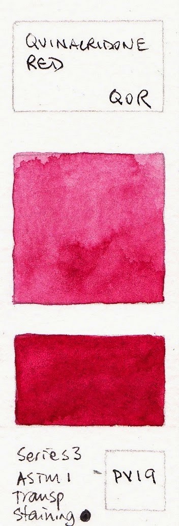
The complete colour chart along with painted out samples and pigment information on all 83 colours can be found here. I have added them to my other watercolour swatches on my website here.

Brights sample card
Earth sample card


November update
I have also tried samples of a number of other colours so will add them to this Blog to keep them together. It isn't really necessary as there are painted samples on the QoR website that do show the colours very well, but I like to be thorough :-) I'll also add them to my website.

I had more paint to finish the Cerulean Blue sample,  so have added that again here.


September 2017 update - I'll be painting out the rest of the range soon. Of note is Neutral Tint - it's a rare mixed grey without any black in it, made with PY42+PR122+Pb15:3 - I look forward to testing that one.

Thursday 16 October 2014

Brown Inks - sketchbook exploration.

I picked up a box of vintage pen nibs on Saturday - the Mitchell 0528 with a fine slightly slanted calligraphy nib. I thought I'd give one a whirl. I started by doing a little sketch of the nib, then tested it in a walnut ink. This led to a page of explorations on inks. I love that about working in a sketchbook - you never know where the page will end up :-)


In this page I began exploring other inks for use with a dip pen with or without a water wash.

Up the top left is Daniel Smith Walnut Ink. This is also the first of the solid rectangles at the bottom right. It is a fairly thin raw umber colour - a cool brown. It is not waterproof, but if re-wet it remains true to colour so creates tints of itself. Only for use with a dip pen. Not a necessity but I think it would be very nice to explore with a reed pen.

Left of the nib sketch is Noodler's Kiowa Pecan ink, which is also the small rectangle at the bottom right of the page. This is a fountain pen ink but I'll only use it in a dip pen. It is not waterproof and the colours that bleed out with a water wash are quite harmonious but I think I'd just allow it to dry and leave it alone if I use this one to draw with.

Art Spectrum Burnt Sienna Ink is a lovely ink to use with a dip pen and add wash while wet. It is basically waterproof once dry. It is a pigmented ink and not suitable for fountain pens, but lovely with reed pens, sticks and nibs as well as a brush and wash. It comes in a small but also a 1 litre bottle so is a great one for teaching and really splashing around. It does need a good shake before use as the pigment settles to the bottom.

De Atramantis Copper Brown was one I bought to try as a sketching ink in a fountain pen. It is almost an Indian Red colour, but in a wash it shows as a crimson. I think it is best used as a stand alone ink in a pen or with a dip pen rather than with watercolour. It is the rectangle at the bottom left of the group.

De Atramentis Ochre Yellow was the closest I could find for a Burnt Sienna fountain pen ink. It is also a really nice colour in its full strength but quite orange in a wash. It's the middle rectangle on the top line of the group. I wanted to use it with watercolour and allow it to soften in a wash but found the orange too much in most drawings. Interesting as a pen and water wash only though.

So both the ink I bought to use as water-soluble inks have been a little disappointing for that task - they are better just used straight or washed over with water only. I'll go back to just using water-soluble pencils for this task. 

De Atramentis Document Brown, also shown in the middle rectangle on the bottom line, is a winner. It dries quickly and is then waterproof and is lovely in a fountain pen. It flows well, is a great burnt umber colour, and being waterproof I can add watercolour without the strange colour change that I was getting with other non-waterproof inks. The black is also terrific, by the way.

Noodler's Polar Brown separates into an interesting range of colours when washed over with water. It is the second rectangle in the top line and also the sketch of the pen. I rather like the effects using it with water but will only use it with a dip pen.

Art Spectrum Sepia is another pigmented ink. Very dark and waterproof, but only for use with a dip pen. It is so dark that it is rather like using a black. It is the last large rectangle in the bunch.

Finally Noodler's Apache Sunset - a pretty orange colour that I may use in a fountain pen but not for drawing. It is the bright orange small rectangle in the group. 

So my conclusions from my scribbles and swatches is that I'll use the De Atramentis Document Brown Ink in my fountain pens for drawing and writing, and the Noodlers Polar Brown or Art Spectrum Burnt Sienna with dip pens for pen and water wash. 

For more on drawing with inks see Working in Ink here, or sketchbook pages exploring fountain pen inks here. For more on coloured inks see here. For mixing the De Atramentis Document inks see here


Sunday 12 October 2014

Working in Ink

I have always loved ink. Indian ink with a dip pen. Rapidograph pens. Calligraphy Pens. Chinese ink with pen or with lovely Chinese brushes. Fountain pens. Felt tip pens. Love them.

Here are some ink sketches done over many years.

Dried Strelitzia, Indian Ink. 1987


Left is a pen and ink drawing in Indian ink with a 'post office' nib of a dried strelitzia - a favourite subject since I was 16 and drew it in minute detail with rapidograph pens. This is a much looser sketch exploring the lines with a bit more freedon in the wash


Flax Flowers. Ink and wash. 1981.


Right is a drawing with rapidograph pens and watercolour wash. The pens came in a set with a good range of sizes but took an awful lot of cleaning out to keep them working properly.


Garlic. Chinese ink. 1987


Left is a study of garlic done in Chinese stick ink, ground on an ink stone, with a brush. The range of greys and black possible with Chinese ink sticks are wonderful. They tend to brush onto the paper very smoothly too.


Ayers Rock, watercolour and Indian Ink. 1986?


Right is a sketch done on location at Ularu using watercolour and Indian Ink that creates crazy blooms in the wet watercolour.


Queen Victoria above the Post Office building 1984?


Left is a sketch done in Martin Place with a fountain pen with a sketch nib.


Rhinoceros Beetle pen and ink. 2013
Above is a traditional drawing using a fountain pen with black ink and added watercolour. This was done with a Sailor 1911 with and Extra Fine nib.

Working with brown or grey ink is something I have been exploring for a couple of years - with mixed success. Some subjects suit a line that isn't black.

Cockatoo Island machine. Micron pen and wash 2014


Left is a pen and wash drawing done using brown felt tip pen - a Sakura Micron 01. There is also some grey Copic pen work in this sketch.

Rookwood cemetary, ink and wash


Right is a study at Rookwood cemetary. I used a water soluble ink for the wrought Iron work but the colours that exploded were too pink to be realistic or desirable.


Saxophone study, pen and watercolour wash 2014


Left is a drawing with De Atramentis Document Black ink in a Flexible fountain pen - a Pilot Falcon with an Extra Fine nib. This is great ink and totally waterproof so I am really enjoying working with it in a number of my fountain pens.

A machine at Cockatoo Island,
Brown ink and wash 2014


And finally I received the Brown De Atramentis Document Ink I have been waiting for. It's a lovely burnt umber colour and once again, totally waterproof. I drew the machine on the right in the brown ink using the Pilot Falcon fountain pen and added watercolour.


Now I just need a waterproof grey ink, and perhaps Burnt Sienna........


Sunday 5 October 2014

Watercolour characteristics

If you look at a tube of artist quality watercolour, you will sometimes find some helpful information - usually pigment number and lightfast rating. If you look on the manufacturer's website you may also be able to find out if it is staining or easy to lift, transparent or opaque, or somewhere in between.

I like to do my own tests - lightfast, lifting, staining and so on. Here's an idea of how to go about it. It's best to use the sort of paper you usually work on so you can see how each colour works for you.


Want to know more about watercolour? I have put together an on-line introductory lesson and a series of classes called Mastering Watercolour that you can find on my website here.

Wednesday 1 October 2014

Cockatoo Island in the Spring

Watercolour in Molekine watercolour sketchbook.
I went to Cockatoo Island again today.

I think I could sketch there every week for the rest of my life and not run out of interesting textures, shapes, lines and colours to explore. Here are today's sketches, all done in an an A5 Moleskine watercolour sketchbook.

I love these large machines that remind me of guardians of some sort. They look out over the water towards Greenwich and gradually rust further. Huge, patient relics.

I have painted a group of them before (see all my Cockatoo Island sketches here) but this time I wanted to zoom in on just this one.
There are pipes of all sorts all over the island. Ugly but interesting. This large set of pipes is in a cave on the sandstone wall. Pen and watercolour.


There are many surprising things about the island, but one is the lovely attention to detail in the windows of the sandstone factory. As with the pipes above, this was a quick sketch in pen with a watercolour wash.