
 |
| Antique Winsor & Newton 'Japanned Tin Box' palette - closed |
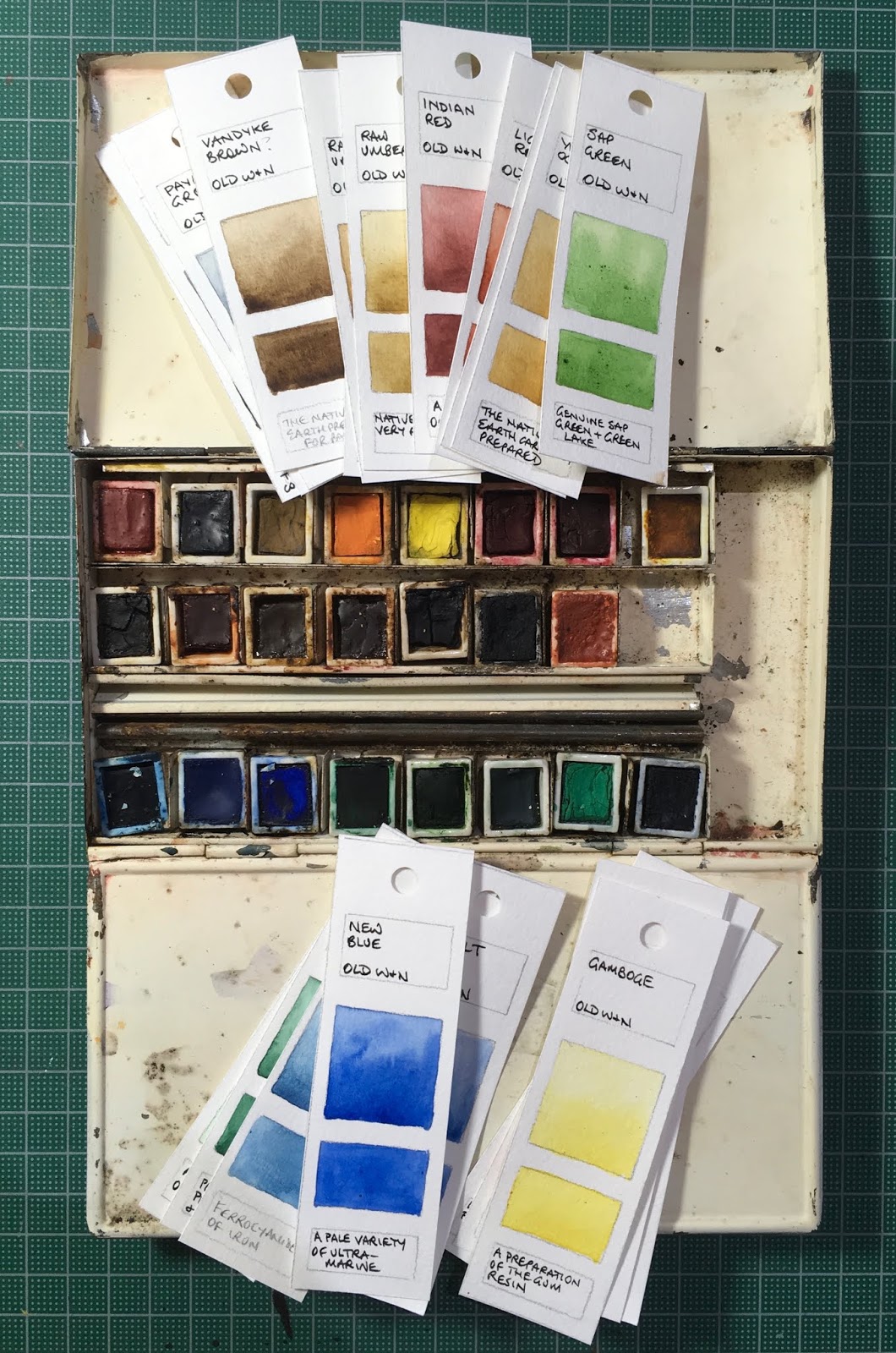
I recently had the opportunity to test out the paints in a paintbox that probably dates back to the from the 1890s. I don't know the exact date nor how recently the paints might have been updated, but it was rather fun to see that mostly they still rewet nicely.
The box is a great size - just under 7" wide (175mm) and a little under 4" deep (98mm). It's about an inch high with the thumb ring and the domes of the mixing wells.
 |
| Antique Winsor & Newton palette |
 |
| Antique Winsor & Newton palette - open. |

The paints are in ceramic half pans, with W&N ENGLAND stamped on the bottom. How lovely! It would be great to be able to get those again...
Some had labels on them, which might help with dating them I suppose.
The colours painted out nicely once any crud was scrubbed off the top. I've used the names that were on the labels where there were labels and guessed otherwise. The information on the bottom of each swatch is from a Winsor & Newton catalogue from perhaps1894 that was with the watercolour box.
Here they are painted out..
The Gamboge was made from the gum resin from Cambodia, and is not lightfast. The second yellow was really lovely. I am guessing it is Cadmium Yellow. Both Rose Madder Alizarin and Alizarin Crimson were far more delicate than I suspect they would originally have been. Rose Madder Alizarin is not mentioned in the catalogue so may date from later years.
 |
| Antique Winsor & Newton Watercolours - Gamboge (genuine), Possibly Cadmium Yellow, Chrome Orange, Rose Madder Alizarin and Alizarin Crimson. |
New Blue is a version of Ultramarine but I am just guessing that the third blue is Prussian Blue rather than cerulean. It paints out rather chalky but looks like Prussian Blue in the pan. It could be Antwerp Blue, which is described as 'a weak variety of Prussian Blue containing Alunina'.
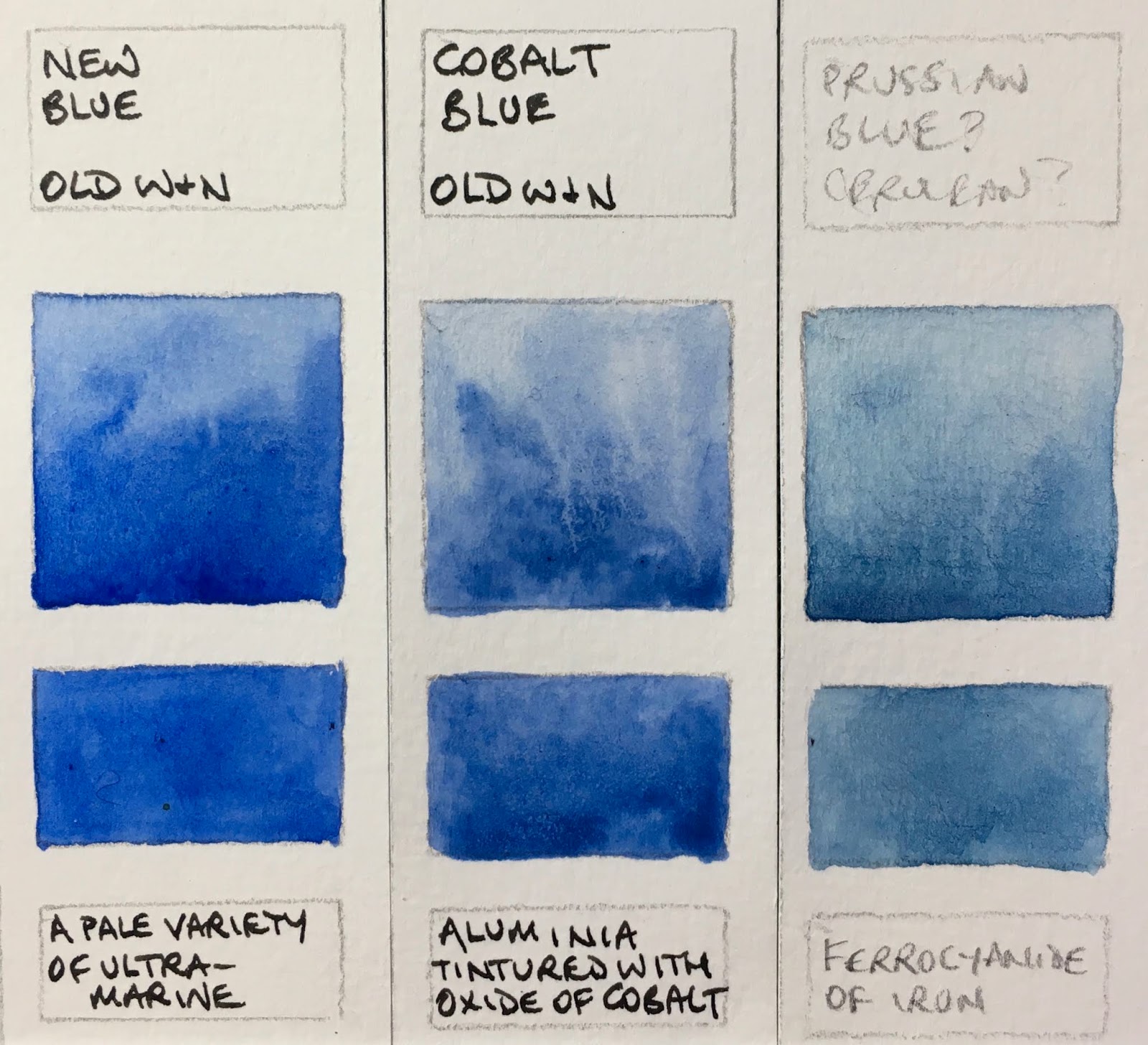 |
| Antique Winsor & Newton Watercolours - New Blue, Cobalt Blue, possibly Prussian Blue or Antwerp Blue? |
 |
| Antique Winsor & Newton Watercolours - Hooker's Green No 2, Emerald Green, Terre Verte, Sap Green. |
Yellow ochre is a bit of a surprise - not as yellow as I'd have expected as I wouldn't expect this colour to change over the years. Burnt sienna was lovely - I'm sure this is a natural PBr7 version. Light Red and Indian Red are also lovely.
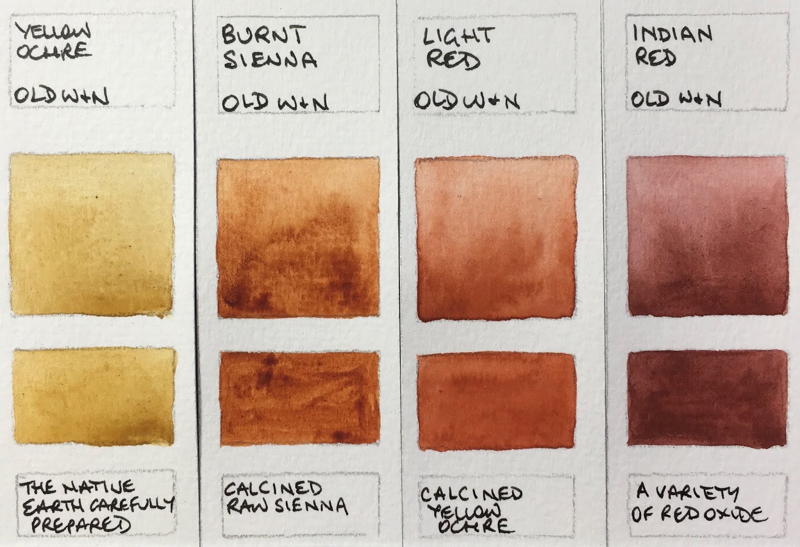 |
| Antique Winsor & Newton Watercolours - Yellow Ochre, Burnt Sienna, Light Red, Indian Red. |
There were two half pans of raw umber and they were slightly different. It is described as 'Native Umber of very fine quality, and possessing the greenish cast of colour which is much prized by Artists'. The warmer Burnt Umber was there and I am guessing the other is Vandyke Brown - made with 'native earth prepared for painting'
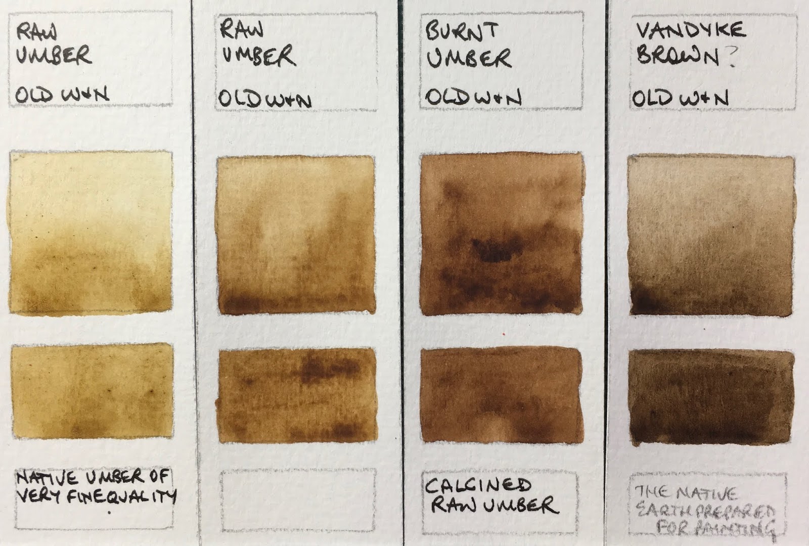 |
| Antique Winsor & Newton Watercolours - Raw Umber, Raw Umber, Burnt Umber, Vandyke Brown? |
Payne's Grey had already changed rom the original yellow ochre, Prussian blue and crimson lake formula that I understand William Payne devised and was made with Indigo, Cochineal Lake and Carbon Black. The same mix was used for what I assume to be Neutral Tint.
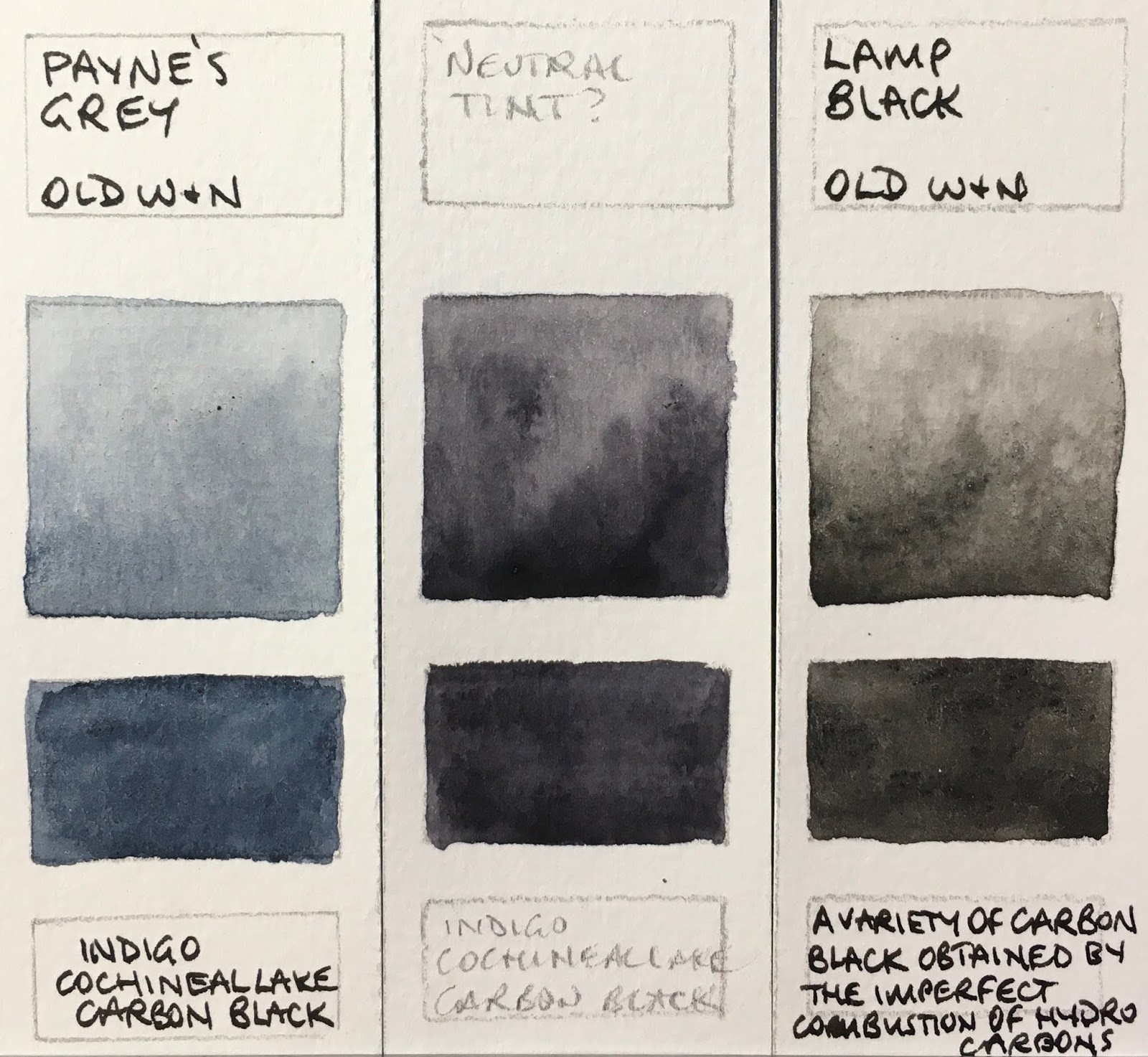 |
| Payne's Grey, Neutral Tint?, Lamp Black. |
*Quotes are from the Catalogue - 'Winsor & Newton Limited. Manufacturing Artists' Colourmen by special appointment to Her Majesty and to their Royal Highnesses the Prince and Princess of Wales'.
The catalogue is illustrated with wonderful engravings showing some fabulous watercolour boxes and palettes, sketcher's hold-alls, pencil sets, chalk boxes and views inside the factory. Just fascinating!


