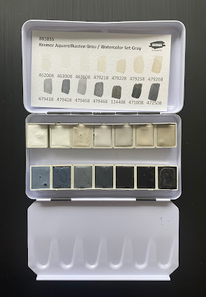
Since I don't often work with black and white pigments, I find this an intriguing set, and will eventually test it out on toned paper, working with limited number of paints for each study.
The colours are as follows.
 |
| Kremer Watercolours: Titanium White Rutile, Zinc White, Kremer White (pigment is PW12 - Zirconium white, C.I. 77995), Warm Grey No 1, Warm Grey No 2. |
 |
| Kremer Watercolours: Warm Grey No 5, Warm Grey No 6, Cool Gray No 1, Cool Grey No 2, Cool Gray No 5. |
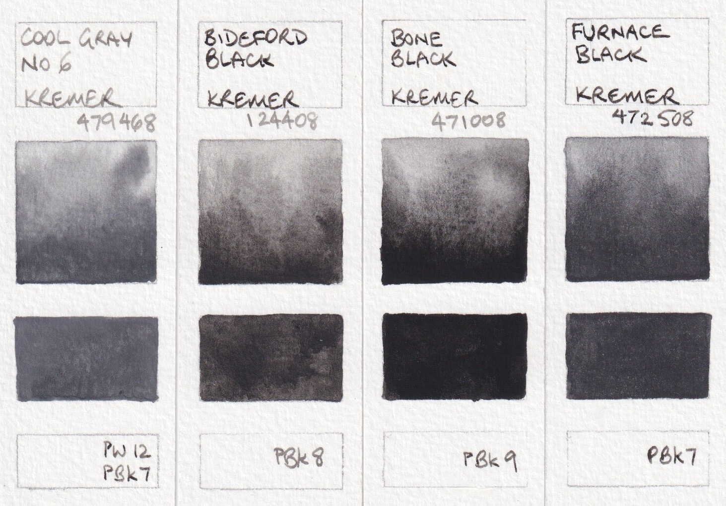 |
| Kremer Watercolours: Cool Gray No 6, Bideford Black, Bone Black, Furnace Black. |
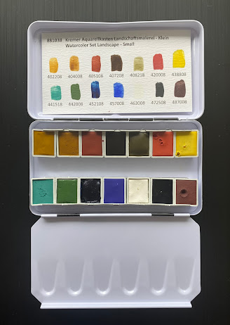
The colours are a little less bright and many are more opaque than the modern colours I'd normally use so it would be an interesting set to use on toned paper.
Italian Gold Ochre Light, Raw Sienna, Venetian Red, Burnt Umber and Green Earth from Verona are all earth pigments. 'Natural earths have a larger particle size than synthetic pigments and every earth colour is an individual mix of natural minerals. Hiding power (opacity) and tinting strength can very depending on the type of earth and its composition. Raw Sienna and green earths are typically transparent pigments, while burnt umber can have more hiding power, though it will never be as opaque as synthetic iron oxide'. (See Caput Mortuum below.)
Italian Gold Ochre Light is a lovely yellow ochre colour and painted out beautifully. Raw Sienna was a little more difficult to get smooth - interesting that these are both PY43. I'd have to explore how they mix as I often use a PBr7 Raw Sienna for a glow in the sky. Venetian Red is more pink than usual, almost like a more gentle and more transparent Indian red.
 |
| Kremer Watercolours: Italian Gold Ochre Light, Raw Sienna Italian, Venetian Red, Burnt Umber Dark Brown, Green Earth from Verona. |
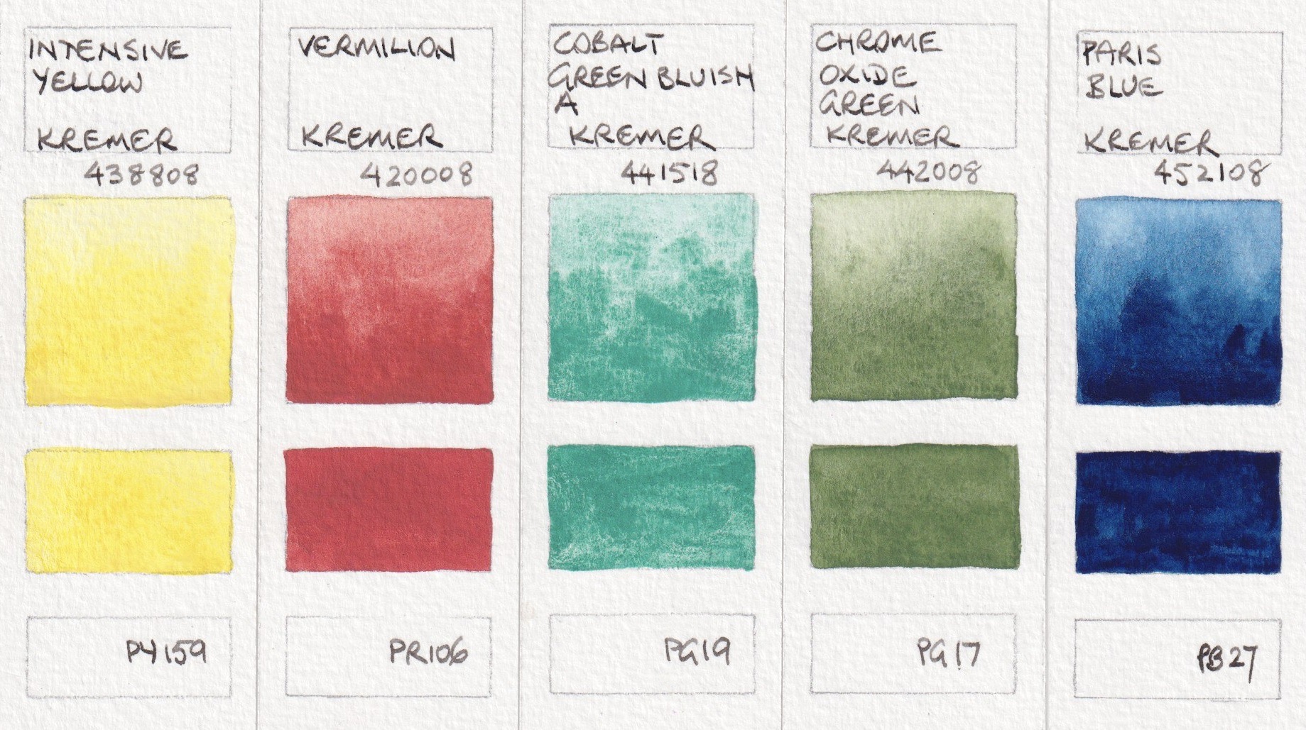 |
| Kremer Watercolours: Intensive Yellow, Vermilion, Cobalt Green Bluish A, Chrome Oxide Green, Paris Blue |
| Caput Mortuum 'is a synthetic red iron oxide with a typical grey-ish violet hue. It is the only synthetic iron oxide that has been produced and used even before the 19th Century. This pigment is courser and more brownish than other synthetic iron oxides and this gives interesting granulation effects in watercolours. Caput Mortuum can be used to depict rocks, bark or shadows. It can be used to darken other colours or mix brown greys.' It can also be used with Cobalt Dark Blue and Italian Red Ochre Light for an earth triad. |
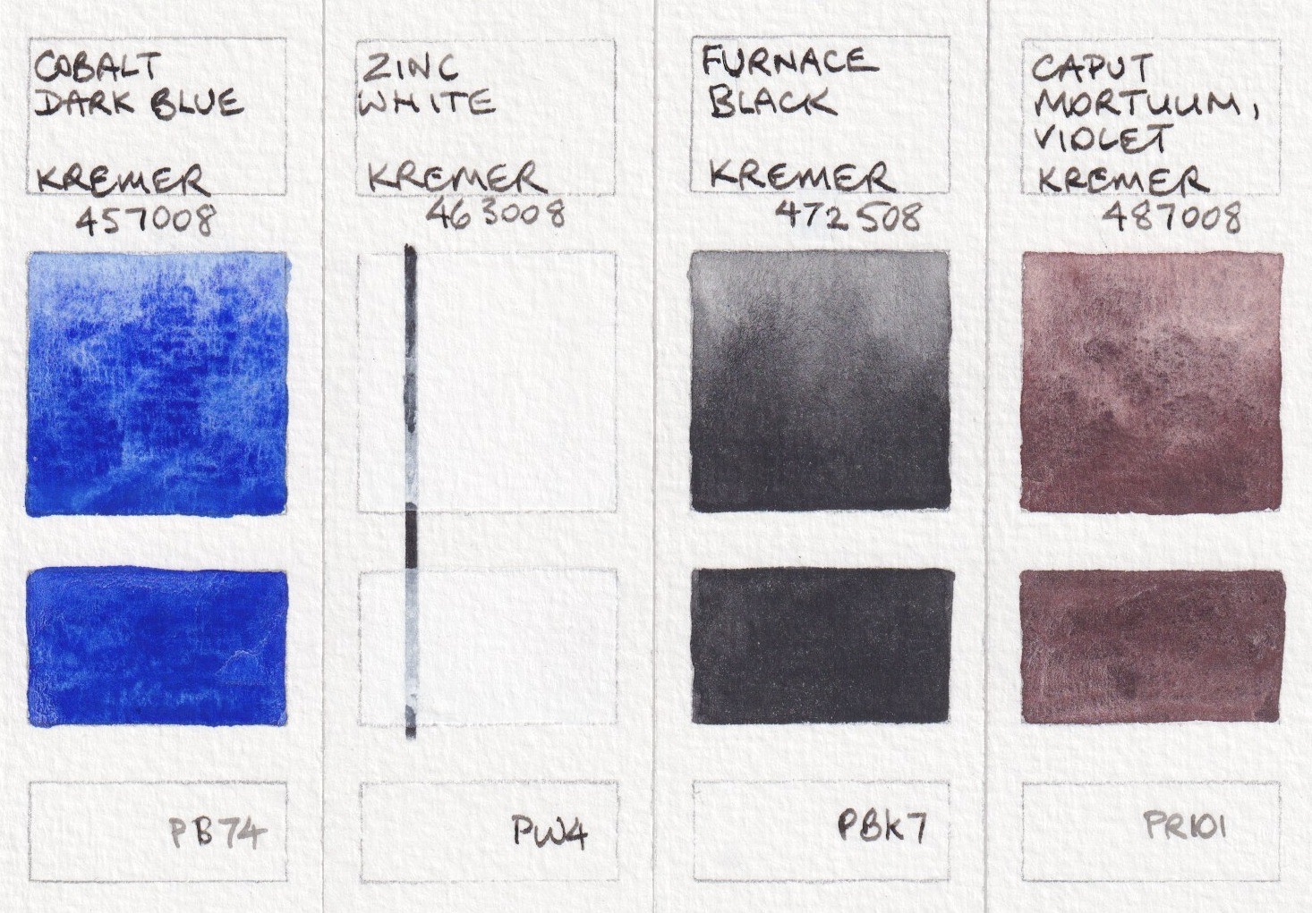 | ||
| Kremer Watercolours: Cobalt Dark Blue, Zinc White, Furnace Black, Caput Mortuum Violet.
|
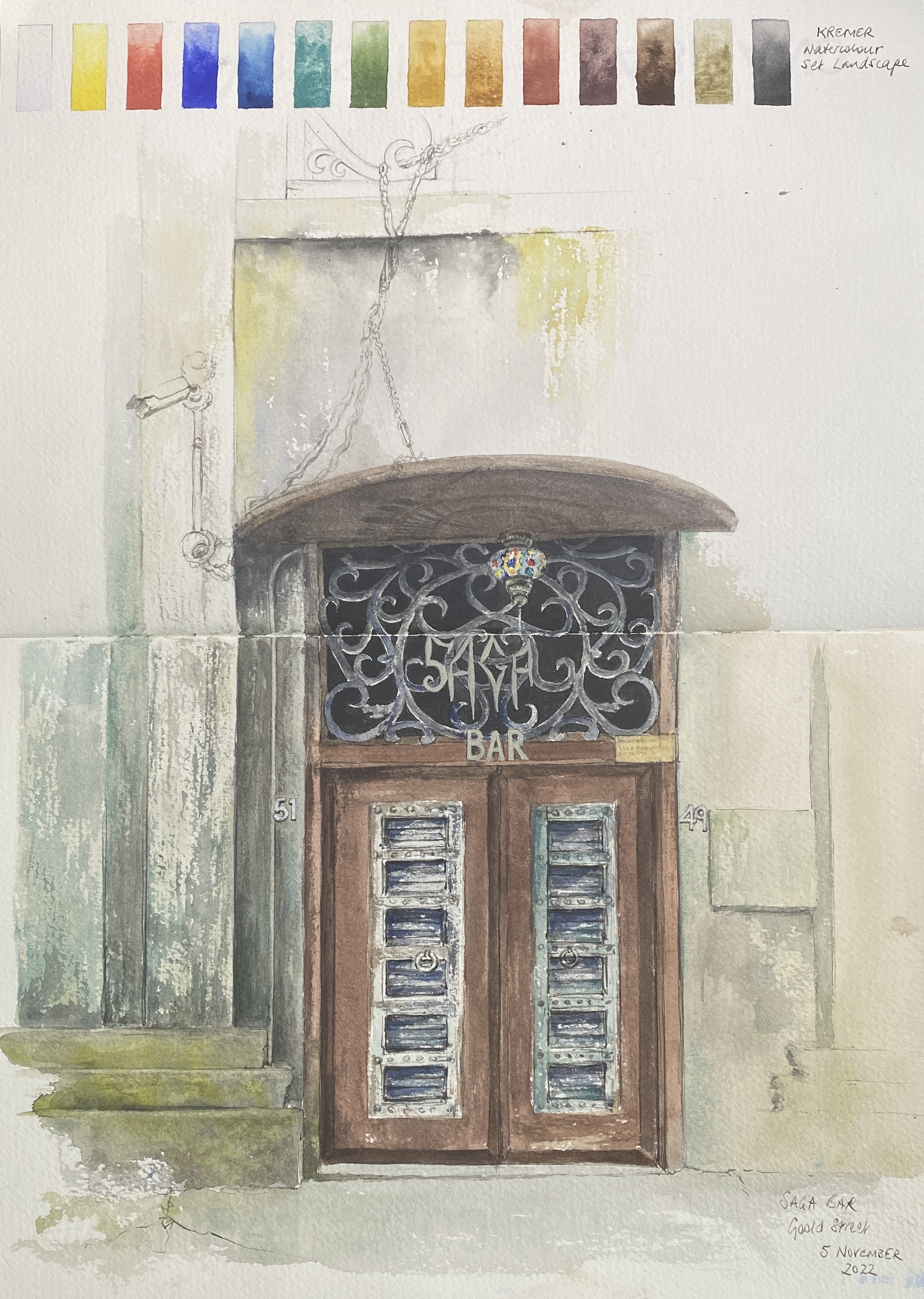
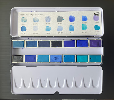
The third set is Watercolour Set Blue - 14 full pans of blues, including some rare and special colours.
 |
| Kremer Watercolours: Blue Verditer, Asurite MP Sky-Blue Light, Lapis Lazuli from Chile, Indigo Indian Genuine, Ultramarine Blue Very Dark. |
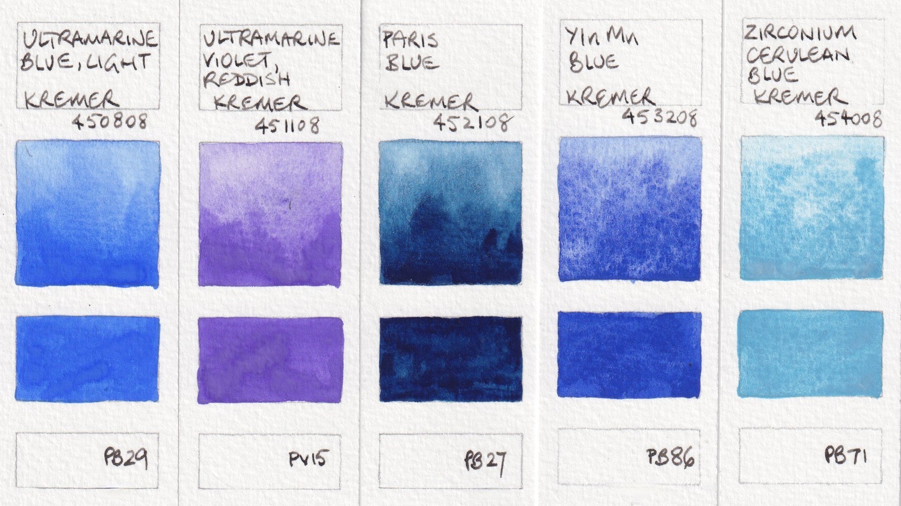 |
| Kremer Watercolours: Ultramarine Blue Light, Ultramarine Violet Reddish, Paris Blue, YInMn Blue, Zirconium Cerulean Blue |
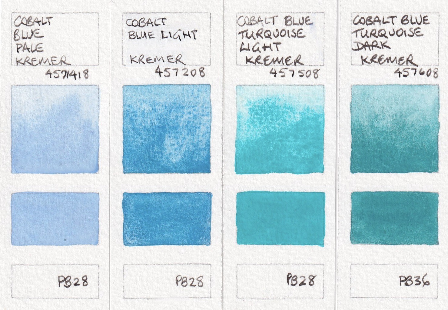 |
| Kremer Watercolours: Cobalt Blue Pale, Cobalt Blue Light, Cobalt Blue Turquoise Light, Cobalt Blue Turquoise Dark. |