
I'll First created in 1885, Nicholson's Peerless Watercolour sheets were founded by Chaz Nicholson. He had found a convenient way to hand-tint black and white photos. These watercolours are dried watercolour dyes on sheets of paper. A damp brush activates them.
Artists also enjoyed the bright colours of these colour sheets and a set of 15 was created in 1902 that is unchanged today. That is the 'Complete Edition' that I bought in 2014. It contains the original instructions from when they were first made available. I'll show that set first.
The 'Complete Edition' set contains:
The 'Complete Edition' set contains:
(Note that the Orange Yellow from my 2014 set is different to the Orange Yellow from the 2022 Sidekick set.)


One of the tricky things about this set of watercolours is that they are presented in a booklet. You flip through the pages to find the colour you want, then use it with a damp brush. But when you flip to the next colour the damp papers stick together. To get around this, I cut little section from each colour sheet and pasted them onto a separate 'palette' of paper.
The company was bought by new owners a couple of years ago. There are 80 colours available in total and the new owners have come up with other ways the present these colours. The latest is the Sidekick. This set of 45 colours are set up in booklets with serrated sheets. There are five colours along each page and the spiral binding allows you to open the book to your choice of a yellow, red, blue, green and brown, for example, to use for one painting. The colour sheets are much smaller, but the process of painting is more straightforward. Replacement sets of colour sheets are available.
The 45 colours in this set are


The black and various greys are not very different, even in real life. (And Peerless Jane's Grey is certainly not my version!)
Along with the Sidekick, I was also sent the set of 'Summer Palette' colours, which contains full sheets of Gamboge Yellow, Ripe Peach, Nectar, Jackqueminot Red (see below), Mixed Berry, Mauve, Deep Blue (see below), Butterfly Wing Blue, Mountain Green, Olive Green, Bismarck Brown and Neutral Tint (see below). Also shown here are a couple of colours I bought as single sheets in 2014.

These are an interesting way to use watercolours in a sketchbook. I haven't tested them for lightfastness as dye-based pigments are not usually considered lightfast. Nor have I included pigment information as there is none available. However if you want to work with bright colours and a very minimal setup in a sketchbook, these are a real interesting option to consider.
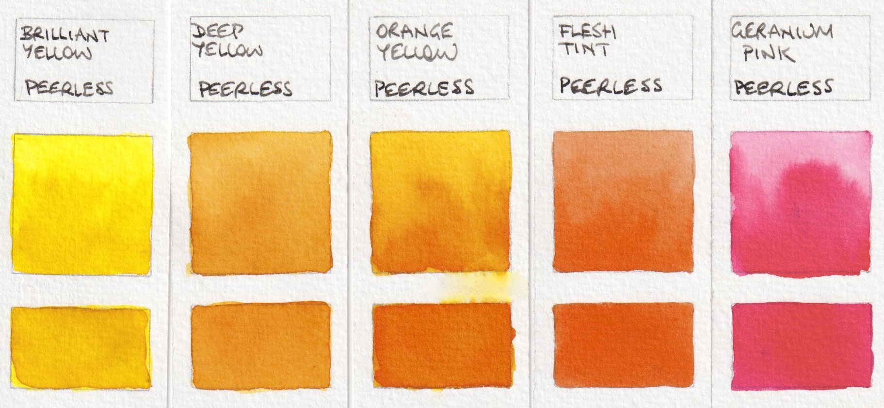
Peerless Transparent Watercolours: Brilliant Yellow, Deep Yellow, Orange Yellow (2014),
Flesh Tint, Geranium Pink
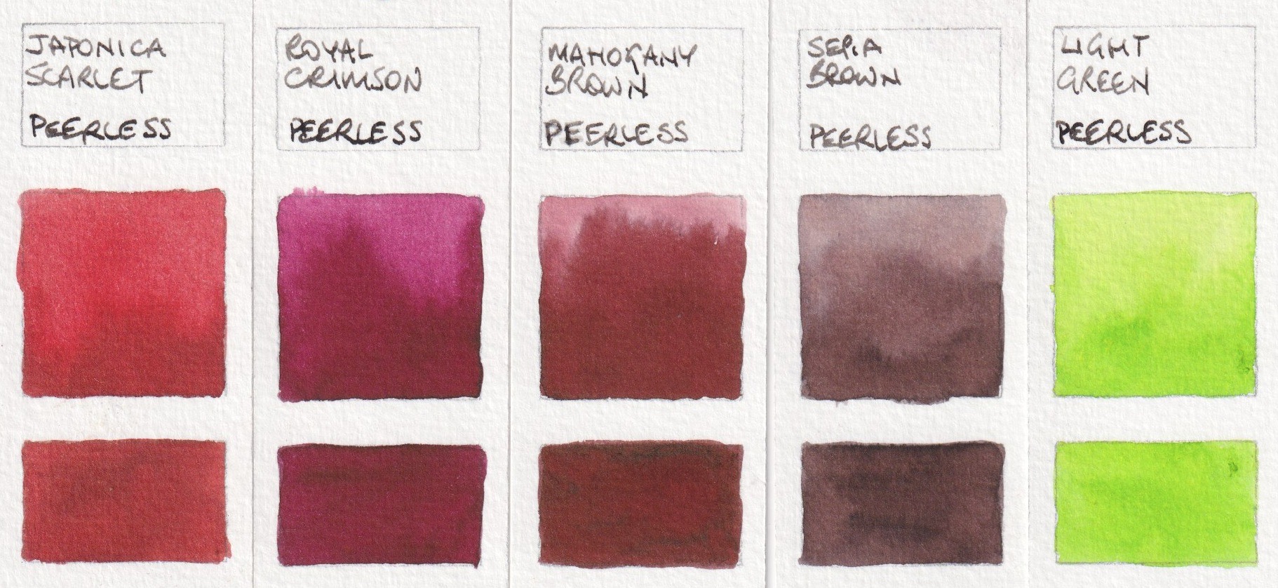
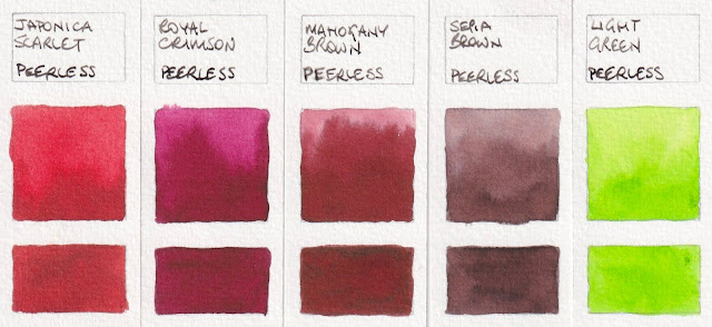
Peerless Transparent Watercolours: Japonica Scarlet, Royal Crimson,
Mahogany Brown, Sepia Brown, Light Green.
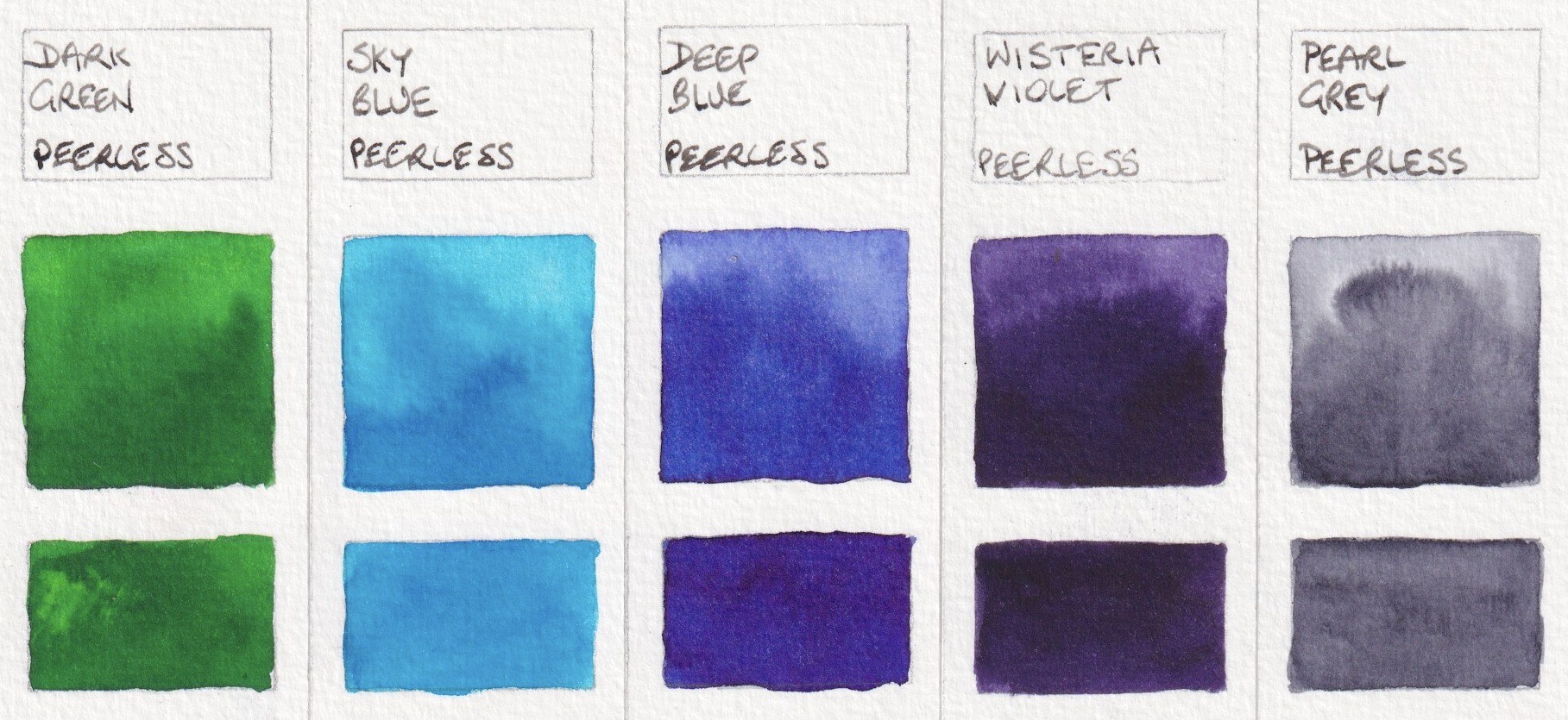
Peerless Transparent Watercolours: Dark Green, Sky Blue, Deep Blue (2014),
Wisteria Violet, Pearl Grey.
One of the tricky things about this set of watercolours is that they are presented in a booklet. You flip through the pages to find the colour you want, then use it with a damp brush. But when you flip to the next colour the damp papers stick together. To get around this, I cut little section from each colour sheet and pasted them onto a separate 'palette' of paper.
The company was bought by new owners a couple of years ago. There are 80 colours available in total and the new owners have come up with other ways the present these colours. The latest is the Sidekick. This set of 45 colours are set up in booklets with serrated sheets. There are five colours along each page and the spiral binding allows you to open the book to your choice of a yellow, red, blue, green and brown, for example, to use for one painting. The colour sheets are much smaller, but the process of painting is more straightforward. Replacement sets of colour sheets are available.
The 45 colours in this set are

Peerless Transparent Watercolours: Alizarine Red, Blood Red,
Scarlet Vermillion, Nectar, Scarlet Lake.

Peerless Transparent Watercolours: Chrome Orange, Chrome Yellow, Orange Yellow,
Red Golden Hair, Ripe Peach.

Peerless Transparent Watercolours: Amber Yellow, Daffodil Yellow,
Gamboge, Marigold, Yellow Ochre
Peerless Transparent Watercolour: Grass Green, Hunter's Green,
Mountain Green, Olive Green, Viridian Green.

Peerless Transparent Watercolours: Butterfly Wing Blue, Cobalt,
Neptune Blue, Peacock Blue, Turquoise Blue.

Peerless Transparent Watercolours: Amethyst, Autumn's Indigo,
Heliotrope, Mauve, Wisteria Violet.
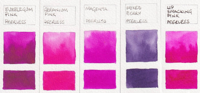
Peerless Transparent Watercolours: Bubble gum Pink, Geranium Pink,
Magenta, Mixed Berry, Lip Smacking Pink.

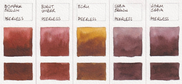
Peerless Transparent Watercolours: Bismark Brown, Burnt Umber,
Ecru, Sepia Brown, Warm Sepia.
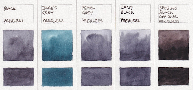
The black and various greys are not very different, even in real life. (And Peerless Jane's Grey is certainly not my version!)

Peerless Transparent Watercolours: Black, Jane's Grey, Pearl Grey,
Lamp Black, Spotting Black Opaque.
Along with the Sidekick, I was also sent the set of 'Summer Palette' colours, which contains full sheets of Gamboge Yellow, Ripe Peach, Nectar, Jackqueminot Red (see below), Mixed Berry, Mauve, Deep Blue (see below), Butterfly Wing Blue, Mountain Green, Olive Green, Bismarck Brown and Neutral Tint (see below). Also shown here are a couple of colours I bought as single sheets in 2014.
Peerless Transparent Watercolours: Jackquiminot Red, Rose Red,
Deep Blue (2022), Bismarck Brown (2014), Neutral Tint.
These are an interesting way to use watercolours in a sketchbook. I haven't tested them for lightfastness as dye-based pigments are not usually considered lightfast. Nor have I included pigment information as there is none available. However if you want to work with bright colours and a very minimal setup in a sketchbook, these are a real interesting option to consider.
Jane's Grey as in Davenport:
ReplyDeletehttps://janedavenport.com/peerless-2/
Beautiful!!
ReplyDeleteAlthough I do more pastels than watercolor I enjoy your posts immensely and have learned a great deal about color, pigments, inks, and pens. After years of following your blog I’ve found that when it comes to fountain pens and ink (as well as watercolor) you’re one of a handful of people I trust enough to spend a couple of hundred dollars on a pen—sight unseen. I’ve done so in the past—a Lamy Joy with gold nib, a few Sailor 1911’s, and two Namiki/Pilot Falcons with soft/fine and extra-fine nibs, and I have at least half a dozen inks that you’ve suggested. I just ordered a Pilot Custom Heritage 92 after reading your recent post and look forward to its arrival.
ReplyDeleteMostly though, I’m posting to thank you for the vast amount of information that you continue to provide to what I have to imagine is a large audience. Anytime I’m looking for information regarding a color or pigment this is the place I come and it happens a lot more frequently than you might imagine. Thank you for all that you do.
Thank you Jerry for taking the time to write that. I would like to create many more blog posts, but other commitments take up a lot of time. Currently I am working on paintings for my solo exhibition in December.
DeleteI've never written about pastels - sorry - though my favourite are Rembrandt as they are a nice balance between hard and soft.
I hope you like your new fountain pen as much as I do :-)
I’m happy to report that my Pilot Custom Heritage 92 arrived a few days ago and I’m thrilled with it. I’ve been doing most of my sketching recently with Pilot Falcons in SF and SEF, and this new Custom Heritage in EF seems to be able to take the place of both the Falcons. It has the perfect amount of flex to go from extra fine to fine and it’s slightly smoother than the Falcons. I also love that it’s a piston filler. I have to refill the Falcons every day or two and after three days and 8 or 9 hours this piston filler is still 2/3 full. Thanks again for the review and recommendation!
DeleteI, too, like Rembrandt pastels and use them frequently for under-paintings and blocking in but my main set are Unison.