Tuesday, 18 October 2022

Peerless Transparent Watercolours

I mentioned the Peerless watercolours in a blog post in March 2014 - Travelling Light with Colour but I haven't written about them in detail before. I was contacted by the new owners of the company and sent out a couple of updated sets, so I've swatched out all the 60-odd colours I have and show them here. 

I'll First created in 1885, Nicholson's Peerless Watercolour sheets were founded by Chaz Nicholson. He had found a convenient way to hand-tint black and white photos. These watercolours are dried watercolour dyes on sheets of paper. A damp brush activates them.

Artists also enjoyed the bright colours of these colour sheets and a set of 15 was created in 1902 that is unchanged today. That is the 'Complete Edition' that I bought in 2014. It contains the original instructions from when they were first made available. I'll show that set first.

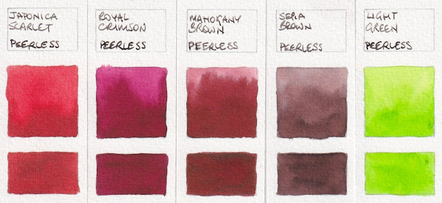
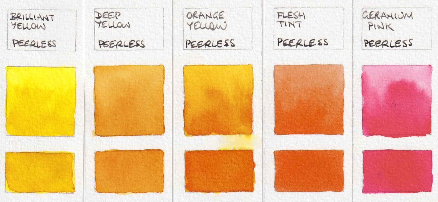
The 'Complete Edition' set contains:

(Note that the Orange Yellow from my 2014 set is different to the Orange Yellow from the 2022 Sidekick set.)

Peerless Transparent Watercolours: Brilliant Yellow, Deep Yellow, Orange Yellow (2014), 
Flesh Tint, Geranium Pink


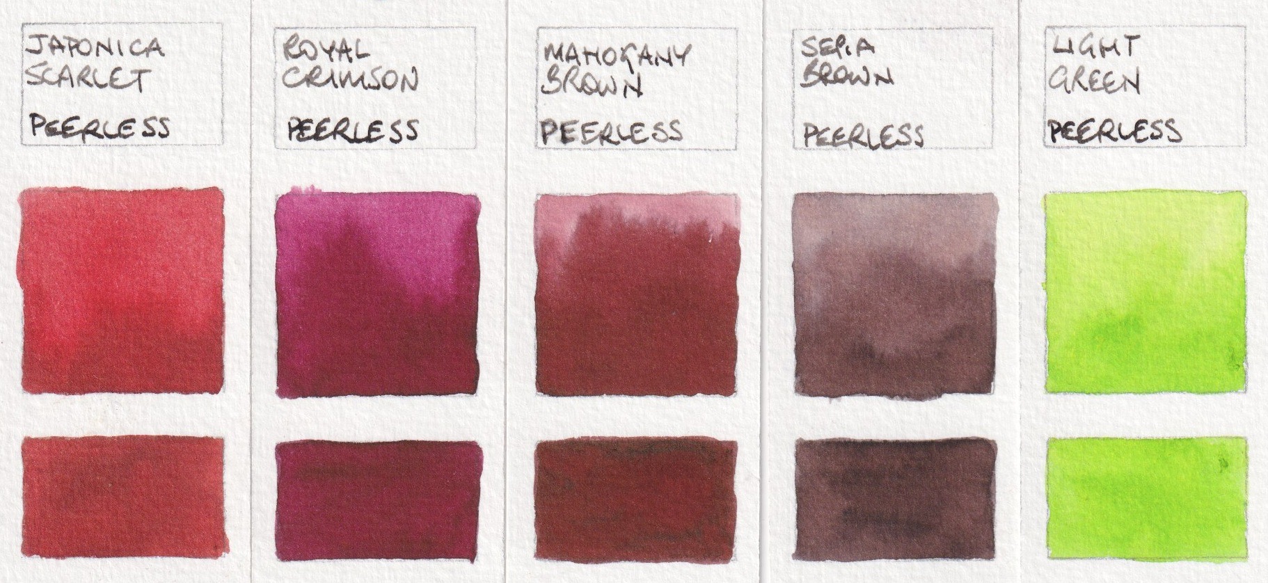
Peerless Transparent Watercolours: Japonica Scarlet, Royal Crimson, 
Mahogany Brown, Sepia Brown, Light Green.


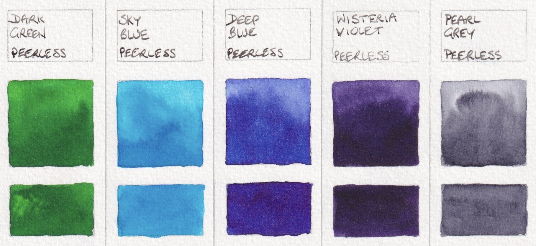
Peerless Transparent Watercolours: Dark Green, Sky Blue, Deep Blue (2014), 
Wisteria Violet, Pearl Grey.

One of the tricky things about this set of watercolours is that they are presented in a booklet. You flip through the pages to find the colour you want, then use it with a damp brush. But when you flip to the next colour the damp papers stick together. To get around this, I cut little section from each colour sheet and pasted them onto a separate 'palette' of paper.

The company was bought by new owners a couple of years ago. There are 80 colours available in total and the new owners have come up with other ways the present these colours. The latest is the Sidekick. This set of 45 colours are set up in booklets with serrated sheets. There are five colours along each page and the spiral binding allows you to open the book to your choice of a yellow, red, blue, green and brown, for example, to use for one painting. The colour sheets are much smaller, but the process of painting is more straightforward. Replacement sets of colour sheets are available.

The 45 colours in this set are


Peerless Transparent Watercolours: Alizarine Red, Blood Red, 
Scarlet Vermillion, Nectar, Scarlet Lake.


Peerless Transparent Watercolours: Chrome Orange, Chrome Yellow, Orange Yellow, 
Red Golden Hair, Ripe Peach.


Peerless Transparent Watercolours: Amber Yellow, Daffodil Yellow, 
Gamboge, Marigold, Yellow Ochre


Peerless Transparent Watercolour: Grass Green, Hunter's Green, 
Mountain Green, Olive Green, Viridian Green.


Peerless Transparent Watercolours: Butterfly Wing Blue, Cobalt, 
Neptune Blue, Peacock Blue, Turquoise Blue.


Peerless Transparent Watercolours: Amethyst, Autumn's Indigo, 
Heliotrope, Mauve, Wisteria Violet.


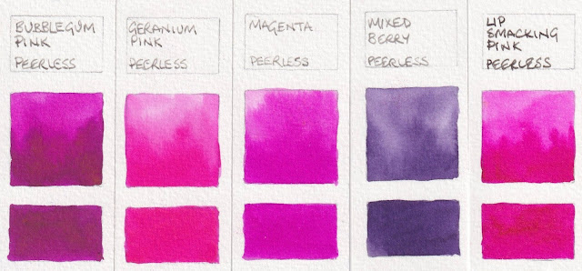
Peerless Transparent Watercolours: Bubble gum Pink, Geranium Pink, 
Magenta, Mixed Berry, Lip Smacking Pink.


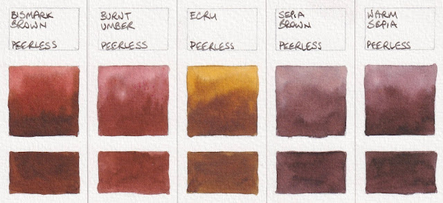
Peerless Transparent Watercolours: Bismark Brown, Burnt Umber, 
Ecru, Sepia Brown, Warm Sepia.

The black and various greys are not very different, even in real life. (And Peerless Jane's Grey is certainly not my version!)
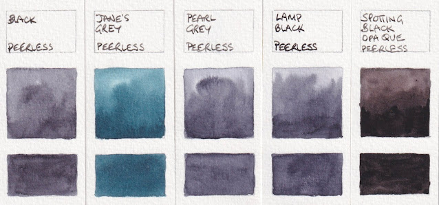

Peerless Transparent Watercolours: Black, Jane's Grey, Pearl Grey, 
Lamp Black, Spotting Black Opaque.

Along with the Sidekick, I was also sent the set of 'Summer Palette' colours, which contains full sheets of Gamboge Yellow, Ripe Peach, Nectar, Jackqueminot Red (see below), Mixed Berry, Mauve, Deep Blue (see below), Butterfly Wing Blue, Mountain Green, Olive Green, Bismarck Brown and Neutral Tint (see below). Also shown here are a couple of colours I bought as single sheets in 2014.


Peerless Transparent Watercolours: Jackquiminot Red, Rose Red, 
Deep Blue (2022), Bismarck Brown (2014), Neutral Tint.


These are an interesting way to use watercolours in a sketchbook. I haven't tested them for lightfastness as dye-based pigments are not usually considered lightfast. Nor have I included pigment information as there is none available. However if you want to work with bright colours and a very minimal setup in a sketchbook, these are a real interesting option to consider.

Tuesday, 23 August 2022

Rockwell Self-Evolving Watercolours


Rockwell is a high quality pigment supplier, with 32 years of experience. They have recently created a number of ranges of watercolours. I was given dot-samples of these 'Magic' self-evolving watercolours to try. They contain a mixture of pigments, minerals and plant colours. They claim to be lightfast 'under museum conditions', which requires thinking about if you plan to use them for work to be framed and hung in normal household conditions.

On rough paper, they create some amazing effects - as do most granulating watercolours of course. That is one of the joys of this medium. These are painted on medium watercolour paper so show less of what is possible.

I haven't explored these in depth, but have heard that many people enjoy working with them.

Rockwell also make a set of 35 Classical watercolours, a Natural Beauty range and a Masters G12 range that includes China Red Mirror Cinnabar, made 'using the highest grade cinnabar', and a lovely looking Cajun Lapis Lazuli, along with acrylics and oils. You can read more about Rockwell Art Supplies, from a Canadian distributer, here.

I don't know what the F7 and F5 refer to, but have copied them from the website information.

Rockwell self-evolving Mineral Watercolour - Alexandria Diamond Purple, Palaiba Diamond Blue, 
Royal Purple and Onat Diamond Yellow.

Rockwell self-evolving Mineral Watercolour - Limugreen Brown, Valentine Purple, 
Cleopatra Green, Obsidian Brown

Rockwell self-evolving Mineral Watercolour - Lapis Brown, Opal Yellow, 
Magic Wizard, Morai Witch.


I find it fascinating exploring granulating pigments. What is also interesting is that sometimes, even if you mix the same single pigment colours, you don't get the same effects as is possible with commercial pre-mixed paints. Watercolour has a mind of its own :-)


Happy painting.


Tuesday, 19 July 2022

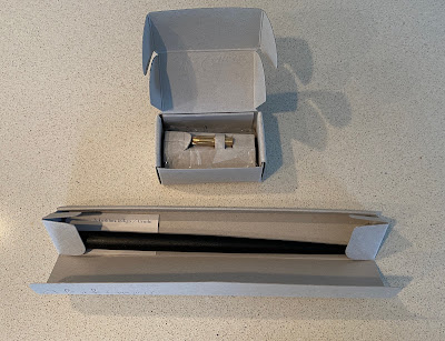
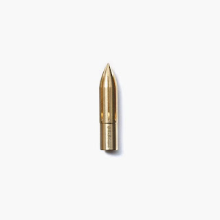
Kakimori brass nib

I love it when a company comes up with a new design for an old tool! 

The Kakimori company has done that with the nib, creating bullet-shaped nibs in stainless steel or brass, along with a lovely design in glass that can be fitted to a pen holder. The stainless steel nib is supposed to be slightly finer than the brass nib.

They have created 4 pen holders too, and will probably add to the range. You can see all the designs on their website here.  You can also see the gorgeous ink bottles, glass pens and beautiful made-to-order notebooks. 

They ship internationally.

I've used dip pens for ever! I use them for writing and drawing, for calligraphic lettering and for masking fluid. They must be held at the correct angle to work, and can easily blob or blot if not used with care.

This new nib doesn't have a right and wrong side. Changes in the line width are created by changing the angle of the nib to the paper. The steeper the eagle, the finer the lines. Working flatter gives very broad strokes. This nib should be easier for left-handers to use too.

I think this will be a really fun nib to use for drawing, but also for applying masking fluid and even watercolours. 

The nib holders that are available are lovely, but it will also fit into some nib holders you may already have - such as the Koh-I.Noor and the Tachikawa. 

I've created a YouTube video to show the brass nib in use.

They are available from Kaimori.com in Japan or internationally, or from Larrypost or Bookbindersdesign in Australia or from StLouisArtSupply in the US.

Friday, 24 June 2022

My favourite all-round fountain pen

I've used fountain pens for writing and sketching since I was a teenager. I go into a lot of detail about them in my Travel Sketching Course, where I devote a whole lesson to their use, and have written a number of blog posts about these gorgeous tools. What I most often get asked is 'what would my recommended pen for sketching if money were no object'. Now - pen prices can go sky high and my collection is more about utility than collectability so I haven't really explored the amazing decorative pens in lacquer, gold and other precious metals that are available. Compared to those, my pens are quite humble. However I do prefer a gold nib, which raises the price, but I love the smooth writing experience that a gold nib provides. 

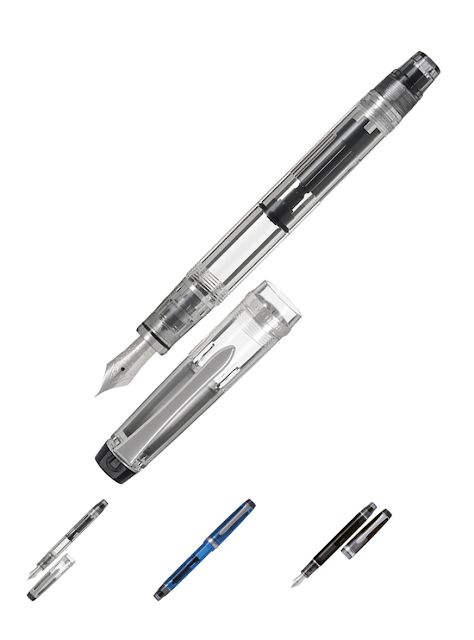
Pilot Custom Heritage 92 (photo from pilot pen.com.au)
The other characteristics that I enjoy are large ink capacity and comfort in the hand. 

I prefer that the pen is not too thick and not too heavy so it can be comfortable to draw with for many hours. 

The Pilot Custom Heritage 92 is just such a pen. I use the F nib in this pen, which gives a fine line with a little flex, but no scratch. While lovely for drawing and sketching, it is also a pen I enjoy writing with. 

It is only available in the clear, the smoky black and the blue models as shown, and I have one of each that I ink up in different colours, usually Brown, Grey and a light grey. It has a piston feed rather than a converter, and a large 1.2ml ink capacity. The pen is comfortable to use with the cap posted or not.


Pilot also makes a custom Heritage 912 that looks similar, but it comes in solid black and has a converter. It is the Pilot CON-70 converter that has a plunger for easy filling, and holds up to 1.1ml of ink. If the Con-70 vac converter appeals, there is also the more rounded body of the Pilot Custom 743 and Pilot Custom 74 to consider. 

Right now, Larrypost in Australia is offering a range of fountain pens at fantastic prices as we approach the end of our financial year. Other great pen sites are Gouletpens.com and Jetpens.com - which specialises in Japanese pens.

I really enjoy Pilot pens. I use the E95s in my diary for everyday writing, and love the Pilot Falcon pens that I wrote about in another post. 

While I almost always use pens in my sketches, I also often use fountain pens in my larger paintings. In this work, completed earlier this year, I drew using the Pilot Custom Heritage 92 pens inked in De Atramentis Document Ink in lighter and darker greys, and painted with watercolour in Jane's Grey and Jane's Black with a very little raw umber and burnt sienna for colour. This mixture of techniques combines my two great loves - drawing and painting.

'Grounded' - ink and watercolour on paper

Other wonderful Japanese pen brands include Sailor, Pelican and Platinum - which I think has the finest nibs available in an UXF (Ultra Extra Fine). While I haven't used Pelican or Platinum at all myself, I do love the super fine EF nibs of my Sailor pens for when I want to draw in really fine detail.

I've posted a number of articles about fountain pens, which I use for writing as well as drawing and sketching. I'll add the links here for convenience.

Favourite pens for sketching (originally 2015, updated 2019, soon to be updated again as some models have changed.) 

Lamy pens 2015 - great pens for writing and sketching 

TWSBI Diamond 580 2018 - huge ink capacity 

My Sketching Tools 2019 shows some other pens too, including the Pilot Heritage Custom 92 that I'd like to talk more about here.

For more on inks for sketching in fountain pens, check my other blog posts.

Packing inks and pens 2015

Fountain Pen and Drawing Inks 2014

Fountain pen inks 2018

Working in Ink 2014

De Atramentis Inks Revisited 2018 (with numerous links to posts about mixing coloured inks)

Happy drawing :-)

Thursday, 23 June 2022

Folio Palette by Art Toolkit

I've written about the Pocket Palette, a number of times before (you can search on my blog to find them all!) The first post was back in 2014 here, and I show a number of variation in my website. 

The idea of a compact sketching palette has always appealed to me, as has the idea of compact kits of all sorts. I love to have my watercolours or pens or tools organised for safe and portable use.

The newest addition to the palette family is the Folio. This palette is the same credit-card design, but this time 13.5 x 8.5cm closed - about the size of a mobile phone. 


It comes with a mix of the original rectangular pans, the tiny half pans, some larger square pans and two larger mixing pans so the number of possible configurations are huge. The mixing pans are really useful, and you'd probably keep those in it, but you might choose to set with up to 18 of the original pans, or 36 tiny pans, 9 large pans or your own combination based on the colours you use most. Part of the fun of a palette like this is deciding how to set it our for yourself!

The folio palette - open.


I've set up the Demi palette with a great 12-colour set, and the Pocket Palette with my 15 Ultimate Mixing Set colours. This credit-card size palette fits perfectly into a Galen leather EDC wallet if you want a compact carry case for it. I love the Galenleather.com products and will write about more of them another time.

The Folio Palette, the Demi Palette and the original business-card sized Pocket Palette.

Happy painting.

Wednesday, 11 May 2022

The Affordable Art Fair, Sydney


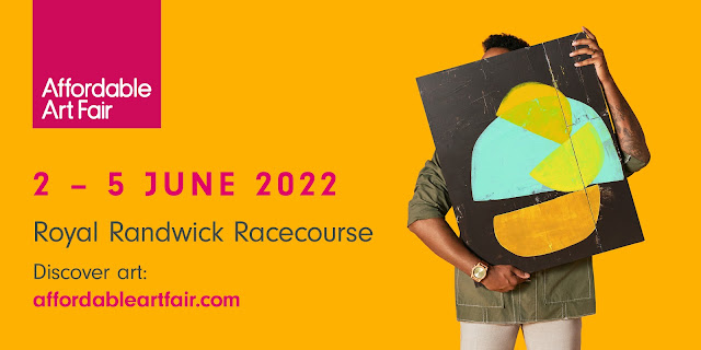
I have been a little quiet here lately as I am working solidly on a number of new paintings for the first ever Sydney Affordable Art Fair, where I am delighted to exhibiting with Gallery 11:11. 

We will be exhibiting at the Royal Randwick Racecourse from the 2-5th June, along with over 30 galleries from across Australia. Gallery 11:11 will also be showcasing two of my fellow Sydney artists Kristine Ballard and Rebecca Anne Brady. 

On behalf of Gallery 11:11, I would like to invite you to the Royal Randwick Racecourse from 2 - 5 June, including the Opening Night. Please click here to register. Each registration is for two people, but passes are limited.

To redeem your digital tickets, simply follow these step-by-step instructions:

  • Click the above link to 'Register'

  • The promo code will have been automatically applied

  • Select their preferred date

  • Select the number of tickets, including children under 16, and click on ‘Register’

  • Fill in their contact details and click on ‘Register’

  • You will then be taken to the confirmation page and the e-ticket will be emailed to you

Should you have any difficulties with this process, please contact our ticket provider ‘Eventbrite’ using this link: https://www.eventbrite.com/support

Affordable Art Fair is a global family of fairs in ten cities around the world from Hamburg to Hong Kong, New York to London and now Sydney. The fair helps people discover the joy or collecting art and there will be thousands of original artworks priced between $100 and $10,000. 

If you would like more information about the programme please to check out their website 

My paintings for this exhibition are centred around a different palette from the bright florals I exhibited last December in my solo show Drawn to Nature. This body of work falls into the theme Grounded. My palette is far more earthy as I look at rocks, pebbles, tree roots, fallen leaves and dried plants. Here are some sections of a few paintings I've been working on.


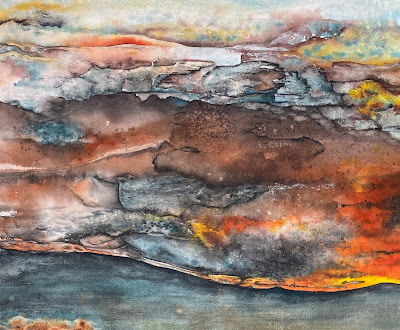
This is part of a large painting inspired by rust. The title is Rust,Transposed. Largely watercolour on huge sheets of 640gsm watercolour paper, it also incorporates ink, watercolour pencils, gouache and pastel. The original image of rust on a pole becomes more like a volcanic landscape.


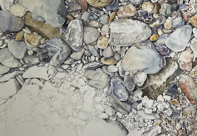
This detail from a full sheet watercolour painting River Stones, Daintree explores a favourite subject - stones and pebbles - that I've painted, drawn or etched since my teenage years. I love trying to capture the exact colours, cracks, crevices and textures of these many and varied stones. I sat on these river stones while sketching the rainforest then a visited the area a few years ago.


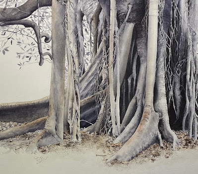
This detail is from the painting Grounded. It is a full sheet watercolour painting, and a largely tonal study of one of my favourite trees - a Morton Bay Fig in the Sydney Botanic Gardens. I've painted, etched and sketched this tree, and others like it, many times too. This shows the tree from a different direction. The full painting shows the embrace of the root system in the ground.


For those in Sydney - I hope to see you there. Now - back to my painting table :-)

For the full images of these and other work form this year, see my website here.

Saturday, 12 March 2022

Mastering Watercolours online course


I've just begun an annual run-through of Mastering Watercolours, my 13-lesson online course (including the huge introductory lesson) that delves deeply into watercolour - how to mix it, how to control it and how to paint with it using a range of techniques. It's a huge course that can be completed entirely at your own pace at any time. See a short video here 

However for those who like to have a sense of a community going through together, a scheduled run-through, available at some stage each year, is a great time to dive in and begin, or to do it all over again!

In a scheduled run-through, I concentrate on each lesson for the one or two week period as scheduled (see my website). That means I'll be checking each section of each lesson in detail - commenting, answering questions etc on a far more detailed and daily basis. I do a run-though of each of my courses once a year.

See you there!

(Anyone already registered just needs to log into their Ruzuku account or click on the link of any of my course newsletters.)