
Zorn is said to have used ivory black, titanium white, cadmium red and yellow ochre. His paintings often have other colours as well, but it is this quartet that is named after him.
 I chose to use Schmincke Ivory black, Titanium white and Vermilion tone gouache, and Winsor & Newton Yellow ochre. Not identical but similar.
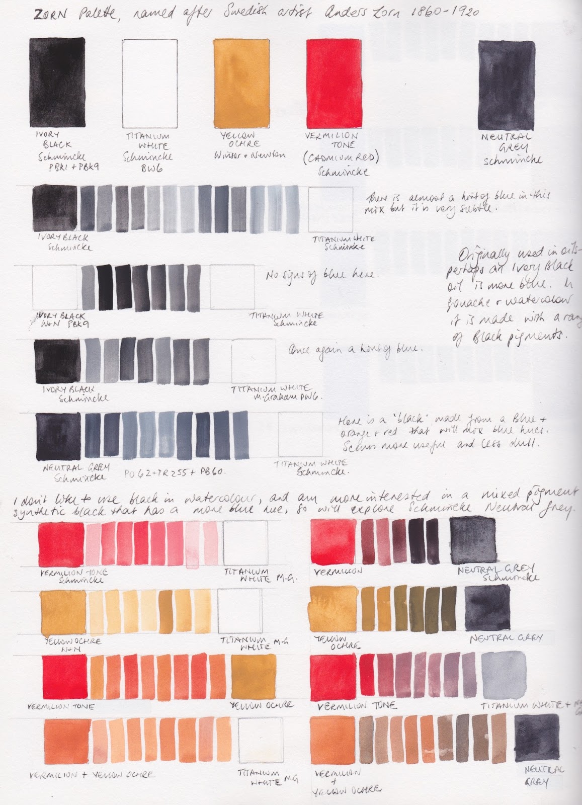
In the oil paintings, the ivory black mixed with white created a slightly blued grey. I tested the Schmincke black and white and there was a slight hint of blue in the mix. I then tried Winsor & Newton Ivory black but that didn't look blue. I tried mixing with M.Graham Titanium white and still not really blue. But I also have Schmincke's Neutral Grey, made from a red (PR 255), orange (PO62) and blue (PB60) mix so I tried that - quite nice blue undertones and I escaped the dreaded black pigments :-)
Using the Neutral Grey rather than black, I mixed up a range of colours with the yellow ochre and vermilion tone. Lots of interesting flesh tones.

I then wanted to see whether I could actually get some greens with this mix, so I made a colour wheel with the yellow, red and grey. Purples wouldn't be possible but very neutralised greens were. I explored some random mixes using these three with white.
Translating these colours into watercolour, I switched to DS Yellow Ochre, DS Cadmium Red Scarlet (discontinued but I still have some) and my Jane's Grey to keep away from black.
In watercolour the white of the paper is usually the white and adding water rather than adding white creates the tints, though with this palette I would probably add white watercolour if I were actually using it for flesh tones. It makes some interesting mixes and might be fun to paint with but since there is indanthrone blue in the gouache mixed grey and ultramarine in my mixed grey, I'd rather add a blue than a grey and be able to make an even greater range of colours.
Fun to explore - maybe more later if I try painting with this palette :-)
Fascinating - would love to see you paint with this palette!
ReplyDeleteIt needs to be the right subject - probably a portrait!
DeleteVery interesting breakdown. I've always admired Zorn's paintings but wondered about his limited palette. I think I'd miss green! Thank you so much for laying it out so clearly!
ReplyDeleteI know what you mean, but if the black tints to a blue-grey, some sort of green is possible. If only used for portraits and figures I guess a strong green isn't needed.
DeleteIn Watercolour, a very rich Payne’s Grey works beautifully as the black. French vermillion OR Venetian red for the red. I have used this palette and love its quietness. :)
ReplyDeleteYou can do variations of the zorn palette, like ditching the black for ultramarine and the yellow ochre for a hansa yellow medium, a pyrol red and buff white; that way you're not stuck to just portraits but by swatching the ocher and the black you can use it for landscapes,botanicals and portraits,but because it is now more translucent it is more suitable for a watercolor zorn; you can chose any variaty of yellows of your liking for that matter,as long as the mixing values are the same you should have a similar result; i hate black so i use ultramarine and use my grey as my darkest value and so on.
ReplyDeleteexample; mix hansa yellow with ultramarine= green, add red; you get brown; add ultramarine and you get grey wich you can scale down to any variation of your liking by adding buff white or white gouache. I use gouache since i dont use ds paints.
DeleteI got me, by accident, a really awesome zorn quingold @jane. Mix blue,red= purple. Add yellow mix brown. Add more yellow mix = light brown; add a hint of red and voila.
DeleteIt's a fun starting point, as is any limited palette, to then explore and adapt to your own requirements :-)
DeleteI am getting overhelmed fast so i always use a limited palette. I can have a 36 color palette but to use them all in one piece i would get an adhd flatline,lol. I like having options. But per painting i use a max of 6 colors. For skintones zorn works awesome,but my travelpalette needs 6 more as i like bright. mute is not my cup of tea; but even with my favorite set,the sennelier paints,zorn works awesome.
DeleteZorn was dead before they invented titanium white.
ReplyDeleteI believe Zorn used what was known as Flake White (in oil paints). It's highly toxic and is rarely used anymore for good reason. Titanium White is much safer so it replaced the need for the hazardous Flake White in a palette.
DeleteThe Winsor and Newton Ivory black is more brown. The lamp black is the one with the blue Hue. For some reason it is reversed
ReplyDelete