Showing posts with label Sketchbook pages. Show all posts

Thursday, 3 September 2015

6 - Mixing with Jane's Grey

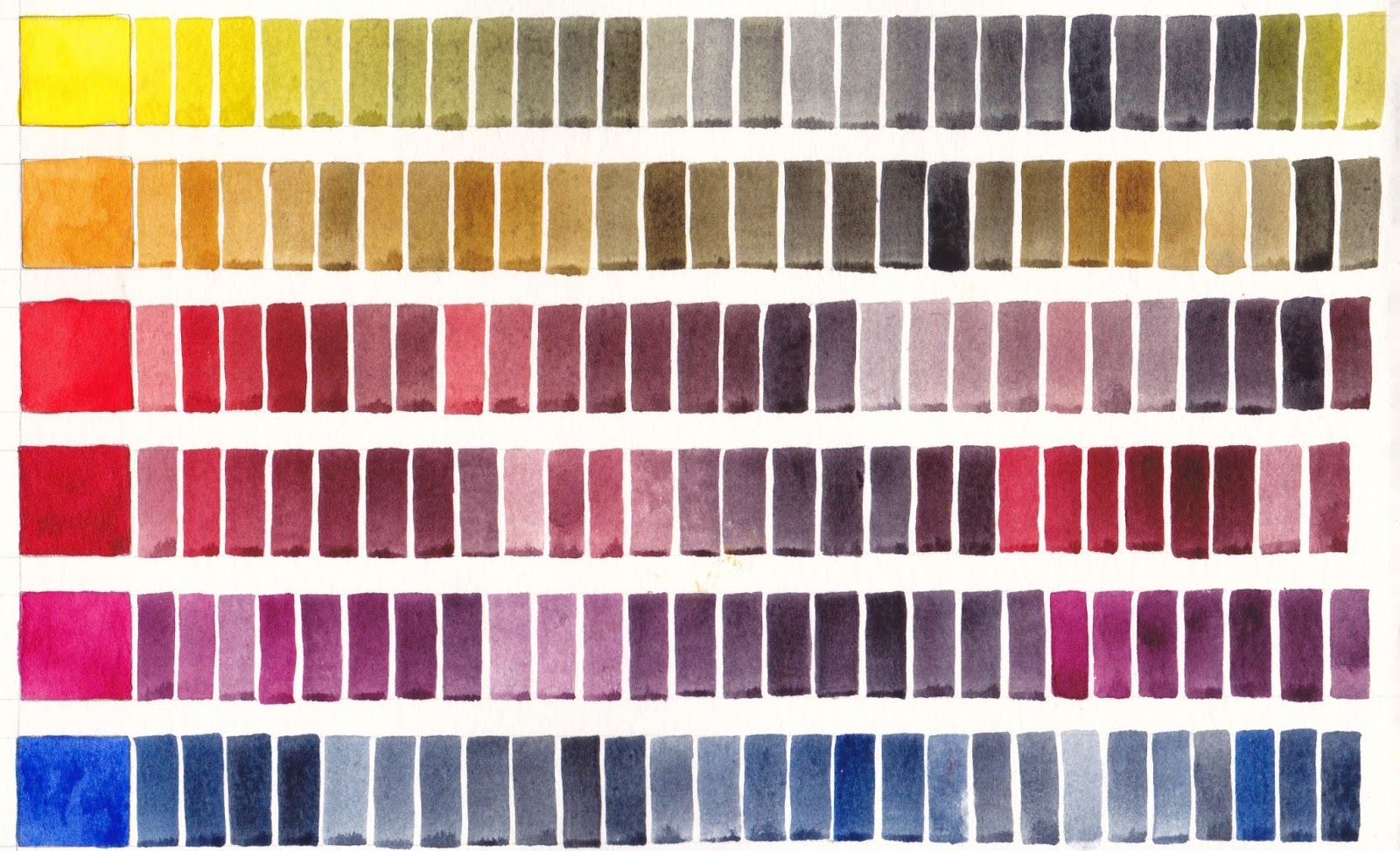
This is the 6th and final part of this series about mixing with my Ultimate Mixing Palette. These charts show 12 of the palette colours mixed with my custom mix Jane's Grey, which is made up of Ultramarine and Burnt Sienna. It acts as a neutral tint, darkening the other colours. Alone it is a lovely granulating and liftable dark grey, useful for shadows, skies and so much more.

Many artists use this combination of Ultramarine + Burnt Sienna, or perhaps Ultramarine + Burnt Umber as a basic grey and mix it each time they use it. I find having it as a premixed dark in the palette incredibly useful. Unlike commercial Payne's Grey or most Neutral Tints, it contains no black to deaden your paintings.

Jane's Grey added to Daniel Smith watercolours Hansa Yellow Medium, Quinacridone Gold, Pyrrol Scarlet, Pyrrol Crimson, Quinacridone Rose and Ultramarine, Moleskine watercolour sketchbook A5.
Jane's Grey added to Daniel Smith watercolours Cerulean Chromium, Phthalo Blue GS, Phthalo Green BS, Goethite, Burnt Sienna and Raw Umber, Moleskine watercolour sketchbook.

I make other greys while painting - Cerulean + Burnt Sienna for a dusty grey, Phthalo Blue + Burnt Sienna for a cooler grey, Pyrrol Crimson + Phthalo Green for a darker staining, non-granulating grey or black, but Jane's Grey is my go-to colour for darks as I would probably always include Burnt Sienna and Ultramarine in my paintings, so it always harmonises.

This series of 6 posts shows a fraction of the huge range of colours that can be produced with my Ultimate Mixing Palette. My book, 'The Ultimate Mixing Palette: a World of Colours' contains over 7500 different mixes, all indexed and cross-referenced. It is available as a hard or soft cover, an eBook or a PDF from Blurb.com here, along with my other comprehensive colour mixing book 'Watercolour Mixing Charts'.

Happy painting :-)

Tuesday, 25 August 2015

3 - Mixing with Buff Titanium

Here is part 3 of my series on mixing with my Ultimate Mixing Palette colours, this time with Daniel Smith Buff Titanium. The granulating nature of this ecru colour adds a wonderful dimension to a number of watercolour mixes and creates pastel colours otherwise not possible. I especially like it for skin tones, and for the lovely sandy beach and sandstone rock effects it creates with Goethite.
All the possible mixes with buff titanium and my other 14 ultimate mixing colours are painted out in my book and eBook, but this gives a nice summary look :-)

Daniel Smith Buff Titanium mixed with other Ultimate Mixing Palette colours. Moleskine watercolour sketchbook A5.

Monday, 24 August 2015

Mixing with Burnt Sienna options

Burnt Sienna mixed with most of my Ultimate Mixing Palette colours.
I have created a post about mixing with Daniel Smith Burnt Sienna PBr7, as part of a series on mixing my Ultimate Mixing Palette colours, which can be found here.

Burnt Sienna is one of my favourite basic palette colours. Here I'll show some of the other mixing options I explored.


The first shows Burnt Sienna mixed with a basic pair of yellows, reds and blues. Here I was still experimenting with a custom mixed magenta but I switched to Quinacridone Rose as a more useful basic cool red.
Burnt Sienna mixed with possible palette options, Moleskine watercolour sketchbook A5


I like Burnt Umber but it isn't as useful as a mixing colour as Burnt Sienna. I include it in my palette as a convenient warm brown even though it is easily mixed as you can see above - just a little Ultramarine mixed with Burnt Sienna creates a burnt umber hue. Here it is mixed with other possible palette colours.

Burnt Umber mixed with different palette colour options. Moleskine watercolour sketchbook, A5.

Here is the gorgeous Transparent Red Oxide mixed with other possible palette colours. It is slightly more orange than Burnt Sienna and can be wildly granulating, which I really love, but Burnt Sienna is a more useful basic palette colour as granulation is not always required. Another interesting Burnt Sienna option is the W&N PR101 Burnt Sienna, which is very much a burnt orange colour, but without the granulation you can see here.

Transparent Red Oxide mixed with possible palette colours. Moleskine watercolour sketchbook, A5


Sunday, 23 August 2015

Colour mixing with a single pigment green

I recently wrote a post about mixing with Phthalo Green BS - a basic palette colour for me and one of my recommended Ultimate Mixing Palette colours. 

I love the strength of this pigment, but I thought I would add some other wheels I have done showing this pigment as well as some of the alternative single pigment greens, and demonstrating how they mix with some basic colours.


Here is another colour wheel created using Phthalo Green while I was exploring different palette colours to find the most useful basic set. Here I was experimenting with Transparent Red Oxide as a burnt sienna option, and with lovely DS Permanent Alizarin though I later switched to the very similar but single pigment Pyrrol Crimson as my crimson choice. I also decided on Quinacridone Rose rather than a magenta or violet.
Phthalo Green in a colour wheel, mixed with a range of palette colours. Moleskine watercolour sketchbook A5

Green Apatite Genuine is a little like the two great Daniel Smith convenience mixes Sap Green and Undersea Green - a remarkable paint. This is another colour I love as an 'extra' for when I want a more granulating effect in a painting or sketch.
Green Apatite Genuine Daniel Smith Primatek watercolour mixed with other possible palette colours.
Moleskine watercolour sketchbook A5

Below is wheel showing the Daniel Smith primatek watercolour Jadeite Genuine. It is a gorgeous granulating green that is similar in mixes to the phthalo green, though with granulation. In masstone it can be very dark, rather like a Perylene green. In this chart I was exploring mixes with a custom mixed Quinacridone Magenta that I made by mixing DS Quinacridone Rose with  DS Quinacridone Violet, both PV19. I was also exploring the very granulating Transparent Red Oxide as a burnt sienna option. I love Transparent Red Oxide and use it a lot in my paintings but it is an 'extra' as there are many times when I want the more sedately behaved Burnt Sienna (see that in mixes here.) Mixed with a crimson, in this case Permanent Alizarin, Jadeite will also create a rich black. I love the granulating turquoise hues Jadeite makes with Cerulean and Ultramarine.

Jadeite Genuine mixed with other possible palette colours. Moleskine watercolour sketchbook A5

Viridian is a much softer, granulating and less staining alternative to Phthalo Green BS. Made with PG18, here is Da Vinci Viridian mixed with a number of other possible palette colours. Once again I was exploring the granulating Transparent Red Oxide with the granulating Viridian.
Viridian, Da Vinci watercolour, mixed with a number of possible palette colours. Moleskine watercolour sketchbook.

I have created many charts and wheels in my colour explorations. You can see more here and by searching Sketchbook Pages in my Blog.

Friday, 21 August 2015

2 - Mixing with Burnt Sienna


Part 2 of a series of posts about mixing with my Ultimate Mixing Palette colours. 

Burnt Sienna comes in a huge range of hues. I have posted about many of them here and more can be seen on my website in the Painted Watercolour swatches section here. 

Burnt Sienna is a neutralised orange. It is a wonderful colour to have in your palette as a mixing colour. It speeds up the creation of other colours, especially grey mixes with blues, as you would otherwise have to mix a yellow and a red and then to blue to create a grey. Even in a very limited palette of a single red, yellow and blue, Burnt Sienna is an excellent 4th colour addition.

While Burnt Sienna is available in a options from a burnt orange to a burnt umber hue and is made from a range of pigments and pigment mixes, I prefer the earthy PBr7 Burnt Sienna (Daniel Smith, though Da Vinci and M.Graham are very similar in colour) as I find it useful as a convenient skin colour when washed out with lots of water as well as being a great earthy warm brown in landscape work. It is also the perfect mixing partner with Ultramarine to make my Jane's Grey - a convenient dark shadow colour that also acts as a neutral tint for the other colours, without introducing a deadening black pigment. To see some of the alternative pigments I tried, have a look here.

Here is Daniel Smith Burnt Sienna mixed with 13 of my Ultimate Mixing Palette colours. It creates yellow ochre and raw sienna hues with the yellows, burnt scarlet and brown madder hues with the reds, wonderful greys and deep blues and browns with the blues and a range of other browns with Raw Umber and Goethite. With Phthalo Green it creates lovely pine greens and with Buff titanium create flesh-tones. 


To see more mixing charts with these and many more colours see the Watercolour Mixing Charts tab on my website. These charts are also available in book or eBook form.

For the full range of colour mixes that can be created with my Ultimate Mixing Set of colours, see my book The Ultimate Mixing Palette; a World of colours. Both books are available through blurb.com as physical or eBooks here.


Thursday, 20 August 2015

1 - Mixing with Phthalo Green (Blue Shade)


Part 1 of a series I'll do on mixing with my Ultimate Mixing Palette colours. 

To see the mixing range this palette can create, you can see the various versions of my book here and look at the previews.


Phthalo Green comes in Blue Shade and Yellow Shade. The blue shade is made with PG7 and is also called Winsor Green BS, Helio Green, Blockx green and so on. Its full name is phthalocyanine green and is a reliable lightfast, staining, transparent and very powerful colour. The yellow shade is made with PG36 and is, not surprisingly, more of a yellow-green. I prefer the blue shade.

I don't use Phthalo Green alone, and suggest you very rarely would as it simply doesn't look realistic, but I find it invaluable in my palette for mixing. Add a cool or mid yellow for bright spring-greens, add a warm yellow for wonderful Sap greens. Add a crimson for the most amazing range of plum, aubergine, deep green and black hues. Add burnt sienna for pine greens. Add a blue for turquoise hues. While some of these colours could be created using Phthalo Blue + a yellow and then mixing with the third colour, most people struggle with 3-colour mixes so having a green in the palette speeds up the mixing process and simplifies it to just a 2-colour process.

Here is a chart showing how it mixes with 12 of my Ultimate Mixing Palette colours to create bright spring greens, lovely sap greens, deep shadow greens, turquoise hues, and earthy greens. With Burnt Sienna and Indian Red it creates yet more pine greens and deep greens. The biggest surprise is the purples it makes with Quinacridone Rose and of course the wonderful black it makes with its opposite, Pyrrol Crimson. All colours shown are Daniel Smith.

Daniel Smith Phthalo Green BS mixed with 12 of my Ultimate Mixing Palette colours.

If you don't like the staining, non-granulating nature of this pigment, another option is Viridian, made with PG18, as seen on the left in this Da Vinci sample. This isn't as powerful, but is liftable and granulating. It varies considerably from different manufacturers, some of whom add PG7 to the mix.                   Another interesting option is the gorgeous Daniel Smith primatek Jadeite Genuine which is similar in hue though in masstone it is a very deep granulating colour. I love the special effects that this pigment creates, though in my regular palette I like the predictability of Phthalo Green BS (Daniel Smith). To see these painted out with other palette colours, see my post here.

Tuesday, 30 June 2015

Designing my palette

I was asked a very good question about why my Ultimate Mixing Palette and my personal palette are not quite the same. I answered the question in the Blog post but I want to explain more about how I go about choosing colours, and show some of the exploration I do. I have pages and pages of colour mixing experiments. I generally document what I do and will include some of the pages here.

My Ultimate Mixing Palette is designed to be a universally useful range of colours, without the idiosyncratic colours that are often found in recommended palettes. I chose each colour not only for what they could do alone, but also how they mixed with the other pigments to create more colours. It is designed so that usually only two colours are needed so it is easy to create whatever colour is desired. I included some my own palette choices, of course, but I wanted to explore other options to see if there were better ways to work. I wanted a relatively small number of colours with excellent mixing options. I wanted colours that are readily available and didn't cause confusion. I really wanted to focus on yellows, reds, blues and some interesting granulating earths but also added phthalo green for its versatile mixing potential.

I tend to start with blues. Ultramarine is a basic blue in a watercolour palette and a real favourite. If I only had one blue that's what I'd have. My second would be Cerulean Chromium as it is great in skies, then I look at the phthalo blues as a strong, staining cool blue. Here I was comparing warm blues including different brands of ultramarine blue. The various ultramarines are largely interchangeable though the DS version once again is my favourite because of how it mixes with DS Burnt Sienna to make my Jane's Grey. I like the less granulating Schmincke version and Da Vinci paints are always excellent. I liked the M.Graham colour too but I don't like the gooey M.Graham paints for plein air work. I also love the richness of Indanthrone Blue, which is the fourth blue in my 20 colour personal palette, though it is not an essential colour. Cobalt is beautiful but doesn't have the depth of Ultramarine.


When creating a palette I tend to start with a basic mixing pair - blue and its opposite - orange. In painting I find a burnt orange/burnt sienna more useful than a bright orange. I choose to use a PBr7 earthy looking burnt sienna as it doubles as a skin tone if watered right down and is also useful in landscape and botanical work. There are some ultramarine and burnt sienna options above, and more below.

On the next page I was comparing more burnt sienna options and ultramarine. I wanted to explore some of the many other neutral orange options too. I looked at DS Burnt Sienna, Da Vinci Burnt Sienna, M. Graham Burnt Sienna, DS E.F. Red Iron Oxide, DS Transparent Red Oxide, DS Quinacridone Burnt Orange and Schmincke English Venetian Red. I also explored a few different ultramarine options along with the more purple W&N Smalt Genuine. I concluded that the DS ultramarine and DS Burnt Sienna was still my favourite due to the lovely grey this pair makes. Da Vinci Burnt Sienna is also very nice - it is slightly more orange. I use the DS burnt Sienna in my personal palette but also have the slightly wild DS Transparent Red Oxide as a more granulating and brighter 'extra' in a 24 colour palette as it is perfect for Australian sandstone.


At the bottom of the above page I was looking at the various Burnt Umber options. I have this in my 20-colour palette simply because it is faster than mixing ultramarine and burnt sienna to make its hue. It is not an essential colour but a useful convenience colour.

In the next tests I was trying to decide whether it was perhaps worth having an orange rather than a warm red in the palette. Burnt Sienna is a basic neutral orange in my palette so I was looking at whether a bright orange would also be useful. I concluded that it doesn't add as much as a warm red. A bright orange can be mixed very easily, and I find that burnt sienna is more useful as a base colour. In this case I was looking at Transparent Pyrrol Orange as my warm red. I also looked at Pyrrol Scarlet later. The first mixed explorations on this page were looking at what combination of a warm red and a crimson would make a bright 'fire engine' red - useful to be able to mix but not an essential palette colour. 


I don't choose to have a purple in my palette as they are so easy to mix but I do need the right pigments in the palette to be able to make a beautiful clean purple. I planned to have a cool red - either Quinacridone Rose PV19 or Quinacridone Magenta PR122 as the cool red for making purples. The blue was going to be Ultramarine so I tested DS Quin Red, MG Quin Rose, DS Quin Rose, Schmincke Purple Magenta, DS Carmine and DS Pyrrol Crimson to compare the purples they created. I settled on DS Quin Rose as it is a lovely colour for floral works.

The yellow explorations are to see whether a warm yellow, such as New Gamboge or Hansa Yellow Deep is necessary. I tested Nickel Azo yellow here but elsewhere I also tested other cool and mid yellows and chose DS Hansa Yellow Medium as the most useful primary yellow, along with DS Quin Gold as the warm yellow as it mixes such gorgeous greens.


Here I am looking at mixing pairs and my goal was to create a 24 colour wheel with single pigment colours where each would neutralise its opposite. Notice how close together Transparent Pyrrol Orange and Pyrrol Scarlet are on the colour wheel. Also how close together Phthalo Blue GS and Phthalo Blue RS are. These were two important pairs to consider, as I'll discuss below.


The next mixes are the opposites from the colour wheel mixed together. Most neutralise each other beautifully, creating wonderful neutralised red, oranges and yellows which are of course Indian and venetian red hues, yellow ochre, raw sienna and raw umber hues and burnt sienna and burnt orange hues. If you know how to mix them, you don't need to have the earth pigments in a palette, though painting is faster and simpler if you do.

A really important couple of mixes are shown here. Look at number 6 and 7. Notice that in mix 6, Phthalo Blue RS + Transparent Pyrrol Orange - the hues are a series of warm browns. They are beautiful burnt orange, burnt sienna and burnt umber colours along with a rich black (with I sometimes premix as Jane's Black B/O) and greys. You can see this pair again further down this post, with the rich blacks and browns shown.

In mix 7, Phthalo Blue GS + Pyrrol Scarlet, the hues are lovely indian red, venetian red, light red colours. This is generally a more useful mixing pair as it doesn't replicate the fantastic Burnt Sienna + Ultramarine pair shown in mix 5. I chose this mixing pair - mix 6 - for my Ultimate Mixing Palette set as I wanted a set of colours that give the most options. This is true even if you reduce the palette to just 12 colours and remove the Indian Red and Raw Umber. 

Personally, though, I like the warm browns made in mixture 6 and use this pair in my palette. It isn't as useful generally but is a personal preference. I know how to adjust the colours to make the Indian red hues if I need them. In my Ultimate palette I also thought it would be less confusing if the warm red was called Pyrrol Scarlet rather than Transparent Pyrrol Orange! Phthalo Blue GS is a very common palette colour. The Red Shade is the perfect colour for an Australian sky, at times, but the Green Shade is a more obvious cool blue, so it is also in my Ultimate Palette, and my teaching palette. Phthalo Blue GS and Pyrrol Scarlet are an almost perfect neutralising pair, creating another interesting black. (Jane's Black R/B.)

Another really important mix is shown above - number 9. This mix of Phthalo Green BS and Pyrrol Crimson creates a fabulous rich black, that I mix as a pre-mix if I am working with a lot of dark passages (Jane's Black R/G). Adjusting the balance slightly to the red side creates a range of deep aubergine and plumb colours that are otherwise not easy to create. It also creates a deep perylene green hue if adjusted to the green side - fantastic for deep foliage shadows. I have other pages that test out different crimson mixes but chose the single pigment Pyrrol Crimson. So I find that 3 reds - a warm, a crimson and a pink/rose red really is ideal for maximum mixing options. 

In this next page I was looking at how few colours you could get away with and still create a range of colours (if you know how to mix them). The key to these limited palettes is the orange/blue combination once again as that is what creates the brown and grey range. The red needs to create clean purples with the blue but also clean oranges with the yellow. This palette is interesting as it has no earth colours since they can be created by mixing. I was looking at whether Carmine (a crimson) or Quin magenta is most useful, though I think I prefer Quin Rose in the end as a great cool primary red.


Here is the same idea using Phthalo Blue RS and Transparent Pyrrol orange with Schmincke Purple Magenta (PR122 - Quinacridone Magenta in most brands) this is a gorgeous set if you only want a few colours, but you need a lot of mixing space. Notice again the lovely mixtures you can make with Transparent Pyrrol Orange and Phthalo blue GS. The mixes would be similar with Quinacridone Rose instead of the PR122 magenta.


Here is my Ultimate Mixing Palette, set up around the colour wheel. Orange and purple are so easy to mix they are not necessary unless you want them for convenience.


If you find these explorations helpful, do please let me know and I'll post up some more.
Colour is such fun! Happy painting.

Thursday, 16 October 2014

Brown Inks - sketchbook exploration.

I picked up a box of vintage pen nibs on Saturday - the Mitchell 0528 with a fine slightly slanted calligraphy nib. I thought I'd give one a whirl. I started by doing a little sketch of the nib, then tested it in a walnut ink. This led to a page of explorations on inks. I love that about working in a sketchbook - you never know where the page will end up :-)


In this page I began exploring other inks for use with a dip pen with or without a water wash.

Up the top left is Daniel Smith Walnut Ink. This is also the first of the solid rectangles at the bottom right. It is a fairly thin raw umber colour - a cool brown. It is not waterproof, but if re-wet it remains true to colour so creates tints of itself. Only for use with a dip pen. Not a necessity but I think it would be very nice to explore with a reed pen.

Left of the nib sketch is Noodler's Kiowa Pecan ink, which is also the small rectangle at the bottom right of the page. This is a fountain pen ink but I'll only use it in a dip pen. It is not waterproof and the colours that bleed out with a water wash are quite harmonious but I think I'd just allow it to dry and leave it alone if I use this one to draw with.

Art Spectrum Burnt Sienna Ink is a lovely ink to use with a dip pen and add wash while wet. It is basically waterproof once dry. It is a pigmented ink and not suitable for fountain pens, but lovely with reed pens, sticks and nibs as well as a brush and wash. It comes in a small but also a 1 litre bottle so is a great one for teaching and really splashing around. It does need a good shake before use as the pigment settles to the bottom.

De Atramantis Copper Brown was one I bought to try as a sketching ink in a fountain pen. It is almost an Indian Red colour, but in a wash it shows as a crimson. I think it is best used as a stand alone ink in a pen or with a dip pen rather than with watercolour. It is the rectangle at the bottom left of the group.

De Atramentis Ochre Yellow was the closest I could find for a Burnt Sienna fountain pen ink. It is also a really nice colour in its full strength but quite orange in a wash. It's the middle rectangle on the top line of the group. I wanted to use it with watercolour and allow it to soften in a wash but found the orange too much in most drawings. Interesting as a pen and water wash only though.

So both the ink I bought to use as water-soluble inks have been a little disappointing for that task - they are better just used straight or washed over with water only. I'll go back to just using water-soluble pencils for this task. 

De Atramentis Document Brown, also shown in the middle rectangle on the bottom line, is a winner. It dries quickly and is then waterproof and is lovely in a fountain pen. It flows well, is a great burnt umber colour, and being waterproof I can add watercolour without the strange colour change that I was getting with other non-waterproof inks. The black is also terrific, by the way.

Noodler's Polar Brown separates into an interesting range of colours when washed over with water. It is the second rectangle in the top line and also the sketch of the pen. I rather like the effects using it with water but will only use it with a dip pen.

Art Spectrum Sepia is another pigmented ink. Very dark and waterproof, but only for use with a dip pen. It is so dark that it is rather like using a black. It is the last large rectangle in the bunch.

Finally Noodler's Apache Sunset - a pretty orange colour that I may use in a fountain pen but not for drawing. It is the bright orange small rectangle in the group. 

So my conclusions from my scribbles and swatches is that I'll use the De Atramentis Document Brown Ink in my fountain pens for drawing and writing, and the Noodlers Polar Brown or Art Spectrum Burnt Sienna with dip pens for pen and water wash. 

For more on drawing with inks see Working in Ink here, or sketchbook pages exploring fountain pen inks here. For more on coloured inks see here. For mixing the De Atramentis Document inks see here


Thursday, 28 August 2014

Colour exploration - a single pigment colour wheel


My sketch books have been busy!

Below is a colour wheel painted out in only single pigment colours. Some are not quite ideal, and not all are necessary, but an interesting exercise to do.

  • Ultramarine Violet in the 5.30 position is very weak in Daniel Smith. Another brand may be better, though it is a weak tinting pigment. Try Da Vinci or perhaps QoR.
  • Amethyst Genuine could go in the 5.30 spot instead, but is very dark and neutralised. 
  • Indanthrone Blue in the 4.30 position is also a neutralised blue. 
  • Cobalt Turquoise in 2.30 is not as bright and powerful as a mix of Phthalo blue and Phthalo green would be, and is more opaque and granulating but I love it!  Amazonite genuine is a more transparent alternative.
  • Cobalt Green in 1.30 would be better replaced with phthalo green YS.
  • In the 11.30 position I have placed New Gamboge, but have mixed Quinacridone Gold below as that's my favourite warm yellow.
  • Quin Rose in 7.30 could equally be Quin Magenta PR122. They are different but are both used as a cool clean mixing red for making purples.
Notice the two triangles in the middle connect the primary triad Hansa Yellow Medium, Ultramarine and Pyrrol Crimson and the secondary triad Benzamida orange, Phthalo Green and Carbazole Violet. Together they make fantastic 6 colour palette seen here.


Each of these pairs opposite each other on the wheel neutralise each other to a grey or black, creating a huge range of earth and tertiary colours, with the exception of the yellow greens and the red purples.

Here they are painted out in pairs.


3 - lovely deep greys

12 - don't neutralise each other to grey. good for orchids!


1 makes raw umber hues

2 neither ultramarine violet nor Smalt a perfect combination. Try amethyst?

4 Lovely orange earth colours


5 Indigo and red earth hues


6 Orange earth hues


7 Indian red and venetian red hues


8 Deep greens and greys

9 Black, grey, plum, aubergines

10 Lovely purples and deep greens


11 not so interesting.


I don't tend to work with a palette of pure bright colours as I love the earth pigments, but it's fascinating to see where they all fit into the palette.


Colour exploration - Super bright 6 colour palettes - updated.


Once again I have been exploring palettes with no earth colours but this time using neutralising pairs. Here are a couple of gorgeous bright palettes to consider. 

The first is based on my gorgeous bright quartet, posted here, that contains DS Hansa Yellow Medium, DS Transparent Pyrrol Orange,  S Purple Magenta (or use DS Quinacridone Lilac) and DS Phthalo Blue RS. The Red Shade of Phthalo Blue neutralises completely with Transparent Pyrrol Orange to create a black. (2020 update - Transparent Pyrrol Orange is now mid orange rather than a red-orange.)

Here in this set I have switched to Phthalo Blue GS. I have added Phthalo Green YS PG36 which neutralises purple magenta to a grey, though not a black. I have also added  Carbazole Violet which neutralises Hansa Yellow Medium to create yellow earth hues and raw umber hues. So the palette contains one of each primary and one of each secondary in neutralising pairs. They are quite neatly arranged around the colour wheel, though not completely evenly. All are Daniel Smith watercolours except the Schmincke Purple Magenta.

Super bright 6 colour palettes
The second set switches Purple magenta to Carmine (or better yet a crimson such as Pyrrol Crimson or Permanent Alizarin). This will neutralise with phthalo green BS to a black and a whole range of lovely aubergine and plum colours. That combination is why I tend to have a crimson in my palette. Ultramarine is my favourite blue for painting and is completely neutralised by the orange as seen here. The yellow and purple neutralise each other as noted above. (see these and other neutralising pairs here.) Notice how evenly the colours fit around the colour wheel. I think this would be the brightest, most balanced 6 colour set I could find. See this star set of colours on the full colour wheel here. All are Daniel Smith watercolours except the Benzimida Orange Deep, which is Da Vinci (sorry it is actually PO36 not PO71 as labelled). (W&N and QoR also make gorgeous transparent/translucent oranges of a similar hue using PO71, or DS Transparent Pyrrol Orange could be used as it is now (2020) a mid orange.)


Thursday, 21 August 2014

Ultramarine, Mid yellow and Magenta - a gorgeous basic bright triad with Ultramarine.

I wrote a post about this set here in May 2013. I wanted to have another look at them, so here is the amazing range you can get with Ultramarine Finest Schmincke PB29, Purple Magenta PR122 Schmincke and Hansa Yellow Medium PY97 Daniel Smith, though Schmincke Pure Yellow would do the same thing. Or if using W&N, Winsor Yellow, the more granulating French Ultramarine and Quinacridone Magenta.
If you want to add a 4th to create neutral browns and greys more quickly, add an orange - a bright orange as seen here or a Burnt Sienna as seen here. 

Other Burnt Sienna options are shown here

This is an alternative to the beautiful bright quartet using Phthalo Blue Red Shade shown here.

Alternative primary red options are the more crimson W&N Permanent Alizarin, DS Carmine or DV Permanent Alizarin Quinacridone. I prefer the more crimson primary reds, since I don't see a lot of 'magenta' out in the real world - more pinks and crimsons, but nothing I have used mixes cleaner than PR122. Another excellent primary red is a PV19 Quinacridone Rose (or Permanent Rose). It will also mix clean purples and oranges. It is slightly less powerful than the magenta, but more lightfast and is a basic colour in my palette.