Wednesday, 26 January 2022

ShinHan Designer Gouache


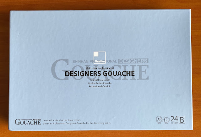
There are 72 colours in the new ShinHan Professional Designer Gouache range, available in single 15ml tubes or in 12 or 24-colour sets. I received the Set B of 24 Designers Gouache tubes from ShinHan to try. 

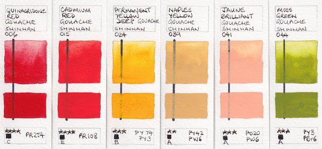
The colour chart and tube labels detail the pigments used, along with a lightfast rating where * is for low lightfastness,  and **** is the highest. There is also a letter indicating the price series with A being the lowest and E the highest price. The only ingredients mentioned are pigment and gum Arabic.


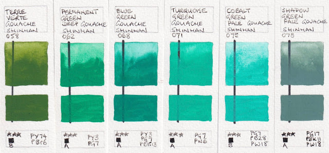
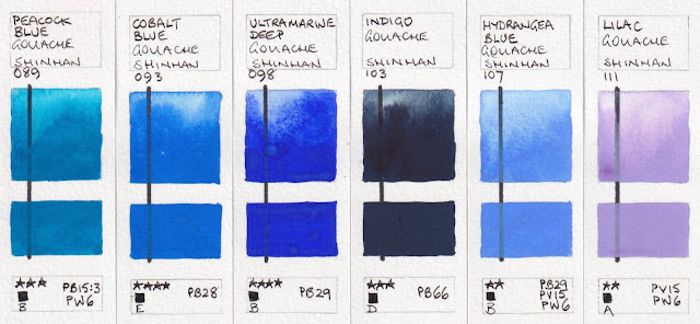
I have painted them out over a permanent black line to show the degree of opacity of this set. While all are labelled as opaque, some cover the line more completely than others when used in a creamy consistency. The top square of each swatch shows the more diluted wash of gouache.

The Quinacridone Red is made with the PR254 pigment, usually known as pyrrol red - probably the most true mid-red pigment. It looks slightly too crimson here on my screen. Cadmium Red is actually more of a scarlet or orange-red than it looks on my screen. The other colours in this row are close to true, though the Jaune Brilliant is slight more peachy in reality. Reds, oranges and yellows are always difficult to capture correctly.

ShinHan Designer Gouache: Quinacridone Red, Cadmium Red, Permanent Yellow Deep, Naples Yellow,
Jaune Brilliant, Moss Green

The colours are fairly true in the next two rows.
ShinHan Designer Gouache: Terre Verte, Permanent Green Deep, Blue Green, 
Turquoise Green, Cobalt Green, Shadow Green

ShinHan Designer Gouache: Peacock Blue, Cobalt Blu, Ultramarine Deep, Indigo, Hydrangea Blue, Lilac

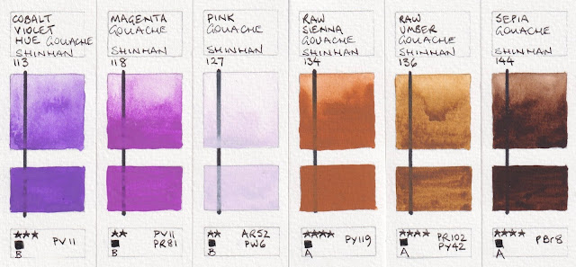
The Magenta is much brighter than it appears on my screen and the Pink actually looks more like the colour of a pink highlighter, but neither show up on my screen. I don't think any of these purple colours would be lightfast enough to use outside of a sketchbook, or for work created for reproduction.

ShinHan Designer Gouache: Cobalt Violet, Magenta, Pink, Raw Sienna, Raw Umber, Sepia


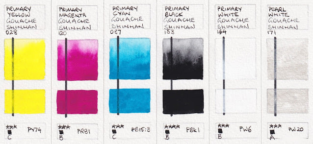
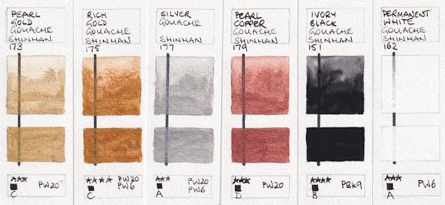
I was also sent tubes of the primary yellow, magenta and blue along with Primary White and Primary Black. This set of 5 would create a vast range of colours. Also here are the metallic and pearlescent colours and an additional black and white. The colours are fairly true though the sheen is less visible of course.

ShinHan Designer Gouache: Primary Yellow, Primary Magenta, Primary Cyan, Primary Black,
Primary White, Pearl White

ShinHan Designer Gouache: Peral Gold, Rich Gold, Silver, Peal Copper, Ivory Black, Permanent White

Like most designer gouache, these are largely quite flat and matte when painted out in a creamy strength. It would be possible to put together a workable warm and cool primary set with black, white and a few useful earth pigments to explore these paints further.

Note: For some reason I am currently unable to reply to comments and questions on my blog. Sorry to those who have asked questions and not had a response. Hopefully I'll solve the issue soon.

Wednesday, 3 November 2021

Watercolour Triads

October has been a big month! I completed my third course, the extension watercolour course Special Effects in Watercolour, last Tuesday. My solo exhibition 'Drawn To Nature' ended on Saturday and last Wednesday I published my new book - Watercolour Triads.

My three books - Watercolour Mixing Charts, The Ultimate Mixing Palette: a World of Colours
and Watercolour Triads


My first book, Watercolour Mixing Charts, began when I found a stack of slightly water-damaged watercolour mixing charts in an art shop in Singapore over twenty years ago. They were blank watercolour charts designed by Michal Wilcox, printed on watercolour paper, and I bought the whole stock - hundreds of them.

I began creating charts of my watercolours, exploring the various mixes. I created almost a hundred of them, but started creating extra charts on each one to show variations. I tried mixing every colour I had with every other colour. I found it a really interesting process, and discovered some amazing and surprising two-colour mixes along the way. I put the charts into a cover I had painted - which later became the cover of the book - and kept them in my studio.

Much later, in 2012, I added those charts to my website and created a book so people could have them handy. 

That book has dozens of colours mixed with dozens more colours, so it's interesting for those who have loads of colours, but I wanted to create a more focused reference book using a more limited palette. This was designed for people to be able to replicate.

I did a whole lot of experimenting using two-colour mixes to choose the most versatile colours. Twelve wasn't enough to do all that I wanted and I ended up with my 15 colour Ultimate Mixing Set. I created all the charts, mixing every colour with every other colour, then a large number of interesting three-colour mixes.  I painted all the charts in two A5 Moleskine watercolour notebooks. While convenient to keep them together, it was a laborious task to have each page photographed. Those charts were published as The Ultimate Mixing Palette: a World of Colours in 2015. I created the cover using the 15 colours, to match the style of the previous cover. Later, Daniel Smith released the 15 colours Ultimate Mixing Set, including my custom mixed Jane's Grey, in a plastic travel palette. They are a terrific set to begin a watercolour journey.

I created my first totally online course Mastering Watercolours using the Daniel Smith 15-colour Ultimate Mixing Set, and the book was very helpful. However I knew another was needed.

Watercolour Triads follows from The Ultimate Mixing Palette - it begins with the same 15 colours but this time exploring them in triads. The book includes 34 different watercolour triads painted in colour wheels, including all the bright primary triad combinations, and then a number of interesting earth triads. I've also included some three-colour charts, and wheels showing interesting secondary and other non-primary triads, and some sample paintings and studies to show the triads in action. 

I started work on this book years ago - I've been teaching about working with triads for many years and have had a section on my website with some examples. I had painted many of the wheels in more A5 notebooks but decided to do them all again on full sheets of Fabriano Artistico extra white paper to make them easier to photograph and colour match. I've created my own stencils for the charts and wheels so they were a joy to draw up :-) 

Here are four of those sheets under way. The charts show the three-colours greens, oranges/browns, purples and greys that can be created with each wheel.
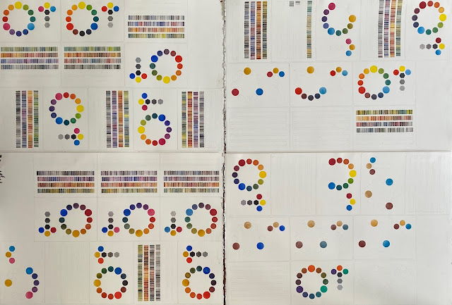
Painting the charts and wheels took many months, but getting the book fully written took even longer. I carefully cross-referenced each mix with The Ultimate Mixing Palette to make it easier to use the books together. The cover, designed to follow the theme of the other two, was painted in just three colours - the triad I call a Basic Primary Triad - Hansa Yellow Medium, Quinacridone Rose and Ultramarine.

My books are self-published through Blurb.com. There are Blurb sites in Australia, the UK, the US, and Europe so you can compare currency and shipping costs. They are available in hardcover image-wrap or as softcover printed books, or as eBooks for Apple or Kindle devices. I plan to create an index for each book as a separate PDF. 

This book completes this reference series. I have two other art books in mind for the future, but I don't plan on starting work on them for a little while. Eventually I'd like to create another children's book too.

Happy painting :-)


Saturday, 25 September 2021

Drawn to Nature - Solo Exhibition

I'm delighted to announce a solo exhibition at Gallery 11:11, a wonderful teaching studio and exhibition space in Epping, Sydney. The exhibition, Drawn to Nature, runs from the 16th October to the 30th October 2021, with in-person and online viewing options available. Wherever you are in the world, you can have a look :-)

I'll be showing more than 20 watercolours, all inspired by nature. In this exhibition I have really focused on the beauty of the natural world, especially flowers, so it will be an explosion of colour. 

This exhibition contains a mix of original works on paper or canvas, and limited edition Giclée prints. There will also be a display of my sketchbooks, showing some of the original sketches created on location in the same space as the final paintings.

“My art inspiration and ideas come largely from the natural world – flowers, trees, rocks, people and landscapes – and I prefer to work from life, beginning with drawing. I enjoy the challenges of abstraction and incorporate abstracted backgrounds and features into many of my paintings.

My work covers a range of media – watercolour, pen and ink, collage, pastels, acrylic, oils and etching – often incorporating several into a single work. Of all these media, my favourite is watercolour, which I have been exploring for over 40 years. It is a remarkable medium that allows the qualities of the pigments to become an integral part of the painting, rather than just the addition of colour. I am constantly searching for new ways to incorporate watercolours and watercolour techniques into my art, including works with watercolour on canvas.”

Booking link - book a time to see the exhibition, then send an email to make it a Zoom visit.

I've added a video walkthrough to my Instagram account Janeblundellart for those who can't see it in person. To see the paintings click here.

Tuesday, 21 September 2021

YInMn Blue

This blog was originally from 4th December 2017, but I've updated it with a number of other samples of this interesting pigment.


I was so excited when I heard that a new pigment had been discovered. Like many pigments, it was discovered or created by accident, back in 2009, in Oregon State University. The Professor's name is Mas Subramanian.

The name of the pigment comes from the chemicals that form this colour - Yttrium, Indium and Manganese.

Manganese oxide is normally black, Yttrium and Indium are yellow and white, so creating a blue when they were heated was a total surprise! It is a stable and non-toxic inorganic pigment, that reflects heat and absorbs ultraviolet so may be used for insulation.

The colour is described as being between ultramarine and cobalt blue. It is also compared with cobalt deep blue. I think of it as rather like a granulating Indanthrone blue - like a mix of PB60 and PB74. Very beautiful.

I've been curiously watching for it to be made into a paint. I saw an acrylic limited edition made by Matisse, and an oil version made by Gamblin but these were described as very opaque paints. Here it is in watercolour. The granulation really makes it something special.

The pigment originally cost about 6 times more than cobalt or cerulean pigments due to the cost of the rare earth element Indium. It was not necessarily likely to be made as a watercolour...

This was a Daniel Smith R&D sample and it was thought that as it is really expensive, it may not be developed further. 

Since then, this pigment has begun to trickle out in various forms and many other companies are exploring it. It is available from Kremer pigments, and Golden did some custom testing. Derivan has an acrylic version in their Matisse range and it is also available in oils. I'd only be interested in this pigment for its granulation, which shows up in watercolour. 


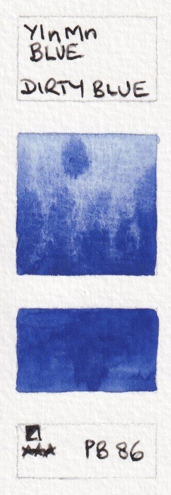
The first sample is the Daniel Smith R&D version. This is by far the most granulating and unique version I have come across.  The second watercolour sample is from A.Gallo, a hand-made Italian brand. Schmincke has also released a version, added below. You can find it here (affiliate link). Interesting how different these first two samples are in colour - scanned together. The third sample was scanned separately but with the same scanner, as was the fourth sample from Kremer. You can find that here. The fifth sample is from Dirty Blue, and is a little darker.


YInMn Blue from Daniel Smith (sample only), from A.Gallo (available for sale), from Schmincke (limited edition), 
from Kremer (available for sale) and from Dirty Blue (available for sale)


Wednesday, 8 September 2021

Albrecht Durer Watercolour Pencils

I've updated this post from 2018, re-scanning all the swatches and setting them out more clearly.

There are many brands of water-soluble pencils, but Albrecht DĂĽrer, made by Faber Castell, are my favourites of the readily available ranges. They are great colours - very natural - and 'fairly' to 'extremely' lightfast. There is sometimes a shift in colour when you wet them but not as crazy as some pencils. They behave well and dilute nicely. 

I've had a lovely boxed set of 80 Albrecht DĂĽrer watercolour pencils for over 30 years and use them mostly in conjunction with other media - watercolours in particular. The current range is 120 pencils and I thought I'd draw and paint them all out to show how they all look since the colour charts can be hard to tell. I've taken screen shots of the colour chart from the Faber-Castell website to enlarge them here. I'll show the colours painted and drawn out below, but in a different order. 

The samples are drawn on Arches 300gsm hot pressed (smooth) paper - not what I usually use as I prefer cold pressed. The right side of each swatch has been brushed over with water then the pencil drawn through the damp section to show its full wet strength.

The Faber Castell Polychomos pencils can be seen in a blog post here. They are also gorgeous to use, and are the same colours with the same numbers, which is very helpful! As are the Pitt pastel colours and even the Pitt artist pens. This makes it really easy to find a favourite colour across the Faber Castell range. I've also added the full range of all pencils in alphabetical order to the end of this post.

As I have had some colours for 30 years, I've also added the newer versions of these colours next to each swatch. In some cases the colour has changed more than others. I've included the discontinued colours I have for reference.


As always, some colours are very difficult to scan accurately. The new version of #104 is not noticeably different, but the swatch is added here.


Faber Castell Albrecht DĂĽrer Watercolour Pencils - White, Ivory, Cream, Zinc Yellow (old), 
Light Yellow Glaze, Cadmium Yellow Lemon.

A number of these have slightly changed in hue and name so the newer versions are also shown.
Faber Castell Albrecht DĂĽrer Watercolour Pencils - Lemon Cadmium (old), Light Cadmium Yellow, 
Light Chrome Yellow (previously called Light Chrome), Lemon (old), Cadmium Yellow.

Faber Castell Albrecht DĂĽrer Watercolour Pencils - Canary Yellow (old), Dark Cadmium Yellow, 
Orange Yellow (old), Dark chrome Yellow, Cadmium Orange.

Faber Castell Albrecht DĂĽrer Watercolour Pencils - Light Orange (old), Orange Glaze, Dark Orange (old), 
Dark Cadmium Orange, Light Cadmium (old), Light Cadmium Red.

Faber Castell Albrecht DĂĽrer Watercolour Pencils - Scarlet Lake (old), Scarlet Red, Pale Geranium Lake, 
Deep Red, Deep Scarlet Red.

Faber Castell Albrecht DĂĽrer Watercolour Pencils - Dark Carmine (old), Permanent Carmine, Middle Cadmium Red, 
Dark Red, Madder, Alizarin Crimson.

Faber Castell Albrecht DĂĽrer Watercolour Pencils - Light Carmine (old), Pink Carmine, Rose Carmine,
Rose Mader Lake (old), Light Purple Pink, Fuchsia.

I find the change in 134 a little odd as the Magenta is now called Crimson, though is more of a mauve - perhaps a translation glitch. 
Faber Castell Albrecht DĂĽrer Watercolour Pencils - Pink Madder Lake, Light Magenta, 
Middle Purple Pink, Magenta (old), Crimson.

There is quite a change between the old Red Violet 136 and the new Red violet 194.
Faber Castell Albrecht DĂĽrer Watercolour Pencils - Wine Red (old), Magenta, Purple (old),
Red Violet, 
Red Violet (old), Light Red Violet.


Faber Castell Albrecht DĂĽrer Watercolour Pencils - Manganese Violet, Violet, Dark Violet (old), Purple violet, 
Blue Violet, Light Violet (discontinued).


Faber Castell Albrecht DĂĽrer Watercolour Pencils - Mauve, Delft Blue, Prussian Blue (old), Helioblue Reddish, 
Light Ultramarine, Indanthrone Blue.

Faber Castell Albrecht DĂĽrer Watercolour Pencils - Deep Cobalt Blue (old), Cobalt Blue, Ultramarine,
Sky Blue, Light Cobalt Blue (old), Cobalt Blue Greenish

Faber Castell Albrecht DĂĽrer Watercolour Pencils - Dark Indigo, Azure Blue (old), Phthalo Blue, Middle Phthalo Blue,
Light Phthalo Blue, Light Blue (discontinued)


Faber Castell Albrecht DĂĽrer Watercolour Pencils- True Blue (discontinued), Oriental Blue (old), Bluish Turquoise,
Prussian Blue, Night Green (old), Helio Turquoise.


Faber Castell Albrecht DĂĽrer Watercolour Pencils - Peacock Blue (old), Cobalt Turquoise, Aquamarine (old), 
Light Cobalt Blue, Cobalt Green.

Faber Castell Albrecht DĂĽrer Watercolour Pencils - Sea Green (old), Deep Cobalt Green, Hooker's Green, 
Dark Phthalo Green, Chrome Oxide Green Fiery.

Faber Castell Albrecht DĂĽrer Watercolour Pencils - Viridian (old), Phthalo Green, Emerald Green, True Green (old), 
Light Phthalo Green, Light Green.

Faber Castell Albrecht DĂĽrer Watercolour Pencils - Grass Green, Leaf Green, Permanent Green, Juniper Green, 
Sap Green (old), Permanent Olive Green.

Faber Castell Albrecht DĂĽrer Watercolour Pencils - Pine Green, Moss Green (old), Earth Green, 
Apple Green (old), May Green.

I find many of these more natural greens really useful.

Faber Castell Albrecht DĂĽrer Watercolour Pencils - Grey Green (old), Earth Green, Olive Green, Cedar Green (old),
Chrmomium Green Opaque, 
Chrome Oxide Green.

Faber Castell Albrecht DĂĽrer Watercolour Pencils - Gold Ochre (old), Light Yellow Ochre, Ochre (old),
Dark Naples Ochre, Light Ochre (old), Naples Yellow.

The names of the 'flesh' colours have been changed and are far useful. I've used these mostly for botanical colours.
Faber Castell Albrecht DĂĽrer Watercolour Pencils - Light Flesh (now called Beige Red), Medium Flesh
(now called Coral), Dark Flesh (now called Salmon), Caput Mortuum Violet, Caput Mortuum, Burnt Sienna.

Faber Castell Albrecht DĂĽrer Watercolour Pencils - Burnt Umber, Raw Umber, Bistre, Nougat,
Light Sepia (old), Walnut Brown.

Faber Castell Albrecht DĂĽrer Watercolour Pencils - Van Dyke Brown, Sepia (old), Dark Sepia, Green Gold,
Brown Ochre, Terracotta.

Faber Castell Albrecht DĂĽrer Watercolour Pencils -Burnt Ochre, Sanguine, Cinnamon,
Venetian Red, 
Pompeian Red, Indian red

Faber Castell Albrecht DĂĽrer Watercolour Pencils - Burnt Carmine, Warm Grey 1, Warm Grey II, Warm Grey III,
Warm Grey VI, Warm Grey V.

Faber Castell Albrecht DĂĽrer Watercolour Pencils - Warm Grey VI, Cold Grey I, Cold Grey II,
Cold Grey III, Cold 
Grey IV, Cold Grey V.


Faber Castell Albrecht DĂĽrer Watercolour Pencils - Cold Grey VI, Payne's Grey, Black, Silver, Gold, Copper.

I have shown three other pencils from my original 80 colour set that are no longer available - 138 Light Violet, 147 Light Blue and 148 True Blue. There are many numbers that are missing altogether now. Whether they have ever been created or are around somewhere I don't know - please feel free to comment below. Missing numbers are 114, 116, 122, 138, 150, 164, 195-198, 200 - 204, 206 - 216, 218, 220 - 222, 224, 227 - 229, 232 - 234, 236 - 245, 248, 253 - 262, 265, 268 - 270, 272 - 274, 277, 279, 281 and 282.

While there are many sets (affiliate link) available of 12, 24, 36 and so on, they don't necessarily have the most useful selections, often being really bright so less useful for realistic work. 

I'd suggest the following set, bought as individual pencils. This set fairly closely matches my suggested 20-colour watercolour palette colours, along with a convenience purple, orange, black and white. Add your own favourites of course!

There are wonderful storage options available for loose pencils from Derwent, Global (affiliate link) and others that are more portable than a tin or a box. While I have a boxed set of these pencils for my studio, I also have a great Global art pencil roll with my most used 30 colours so I can have them with me when travelling, and a book-style leather pencil holder for my Museum pencils.

101 White
103 Ivory (to approximately match Buff Titanium)
105 Light Cadmium Yellow (to match Hansa Yellow Medium)
108 Dark Cadmium Yellow (as an useful extra)
183 Light Yellow Ochre (to match Quinacridone Gold)
115 Dark Cadmium Orange (as a useful extra)
117 Light Cadmium Red (to match  Pyrrol Scarlet)
225 Dark Red (to match Pyrrol Crimson)
123 Fuchsia (to match Quinacridone Rose)
249 Mauve (as a useful extra)
120 Ultramarine (to match Ultramarine)
144 Cobalt Blue greenish (to match Phthalo Blue and also Cerulean Chromium)
276 Chrome Oxide Green Fiery (to match Phthalo Green)
278 Chrome Oxide Green (to match Perylene Green, though not a great match)
174 Chromium Green Opaque (to match Undersea Green)
168 Earth Green Yellowish or the slightly darker 167 Permanent Olive Green (to match Sap Green)
182 Brown Ochre (to match Goethite)
187 Burnt Ochre (to match Raw Sienna)
188 Sanguine (to match Burnt Sienna)
169 Caput Mortuum or 192 Indian red, which is a bit brighter (to match Indian Red)
283 Burnt Sienna (to match Burnt Umber)
178 Nougat (to match Raw Umber)
181 Payne’s Grey (to match Jane's Grey - not perfect)
199 Black (a useful extra in a pencil)

Here they are as a set.


Here is the full colour range of art and graphic pencils - arranged by number. It is interesting to see when certain colours were added. 
Full colour chart information by colour number, from Faber Castell 2021


Monday, 9 August 2021

Special Effects in Watercolour - my newest course

In spite of this being our 7th week of lockdown in Sydney, I am keeping busy and actually having a lot of fun creating the extension course to my huge Mastering Watercolours course. This is a six lesson course with very complex and detailed projects along with some extra challenges to explore.

In Mastering Watercolours, we build a solid foundation in the understanding of colour mixing and watercolour techniques, creating a sketchbook filled with colour charts, wheels and notes along with a number of completed paintings. In Special Effects in Watercolour I introduce more techniques to take these ideas further. 

It's based on natural subjects - four of the lessons are on flowers but we also look carefully at mushrooms and some wonderful stones and pebbles. Each feature special effects that are demonstrated but then put to use. Each lesson contains lots of video content and step by step explanations.

Watercolour is a magical medium and it's great fun to be explaining it in even more depth.

Special Effects in Watercolour is available now. The course begins on the 18th of August, with a new lesson being released each fortnight. 

Mastering Watercolours is available as an open access course - work through at your own pace.

Travel Sketching, my other 13-lesson foundation course, is also available as an open access course.