Tuesday, 9 October 2018

ShinHan PWC Watercolours - full 104 colour range.

ShinHan is based in Korea. They have a number of different art materials - oils, acrylics, poster colours, art makers etc - but I'll concentrate on their Extra Fine range of watercolours - the PWC range. They also have a ShinHan range with 30 colours and a student range with 24.

The PWC range originally consisted of 84 colours, with many being single pigment colours. They have added another 20 to the range and I am very grateful that they sent me a dot-card of the full range to paint out.

There is a full colour chart available from their website as a PDF download.

Page one of the ShinHan PWC watercolour dot card
Page two of the shin Han PWC watercolour dot card

New colours - PWC watercolour dot card.

They paint out brightly and rewet beautifully. Many colours are so vibrant that it is like painting with inks. There is not as much granulation in this range as there is in some - which some people will really enjoy.

However there are a few pigments that don't rate as highly as I'd like on the lightfast scales such as many of the reds, which are made with the very fugitive PR83.


ShinHan PWC Watercolours - Crimson Lake, Alizarin Crimson, Quinacridone Red, Permanent Rose, Carmine.

ShinHan PWC Watercolours - Rose Madder, Pyrrole Red, Permanent Red, Brown Madder, Scarlet Lake.

ShinHan PWC Watercolours - Opera, Cadmium Red Deep, Vermilion, Vermilion Hue, Cadmium Red Orange.


ShinHan PWC Watercolours - Brilliant Orange, Permanent Yellow Orange, Cadmium Yellow Orange,
Cadmium Yellow Deep, Cadmium Yellow.

ShinHan PWC Watercolours - Cadmium Yellow Light, Cadmium Yellow Pale, Indian Yellow, Permanent Yellow Deep, Permanent Yellow Light.

ShinHan PWC Watercolours - Lemon Yellow, Naples Yellow, Aureolin, Greenish Yellow, Terre Verte (Yellow Shade).

ShinHan PWC Watercolours - Olive Green, Cadmium Green Pale, Cadmium Green Light, Permanent Green No 1,
Cadmium Green Middle.

ShinHan PWC Watercolours - Cadmium Green, Cadmium Green Deep, Sap Green, Oxide of Chromium, Hooker's Green.

ShinHan PWC Watercolours - Green Deep, Phthalo Green Dark, Viridian, Viridian Hue, Terre Verte.

ShinHan PWC Watercolours - Shadow Green, Peacock Green, Cobalt Green, Turquoise Blue Light, Turquoise Blue.

ShinHan PWC Watercolours - Blue Pale, Marine Blue, Peacock Blue, Verditer Blue, Cerulean Blue.

ShinHan PWC Watercolours - Cerulean Blue Hue, Cobalt Blue, Cobalt Blue Hue, Phthalo Blue (Red Shade),
Ultramarine Light.

ShinHan PWC Watercolours - Ultramarine Deep, Prussian Blue, Royal Blue, Indigo, Lavender.

ShinHan PWC Watercolours - Ultramarine Violet, Permanent Violet, Mineral Violet, Cobalt Violet Light,
Permanent Magenta.

ShinHan PWC Watercolours - Brown Red, Light Red, Brown, Burnt Sienna, Burnt Umber.

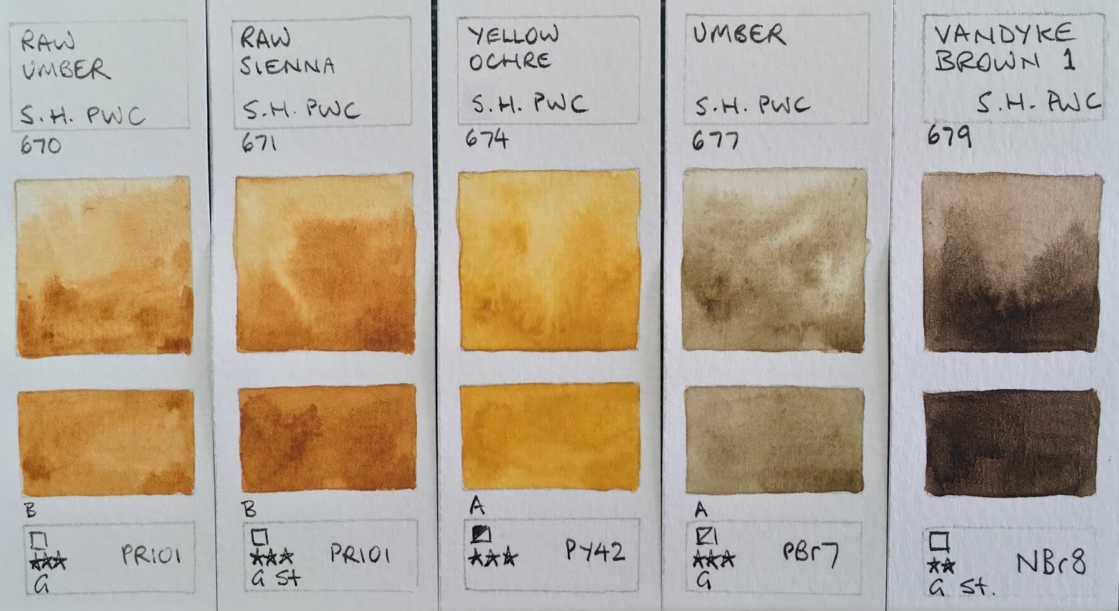
ShinHan PWC Watercolours - Raw Umber, Raw Sienna, Yellow Ochre, Umber, Vandyke Brown 1.

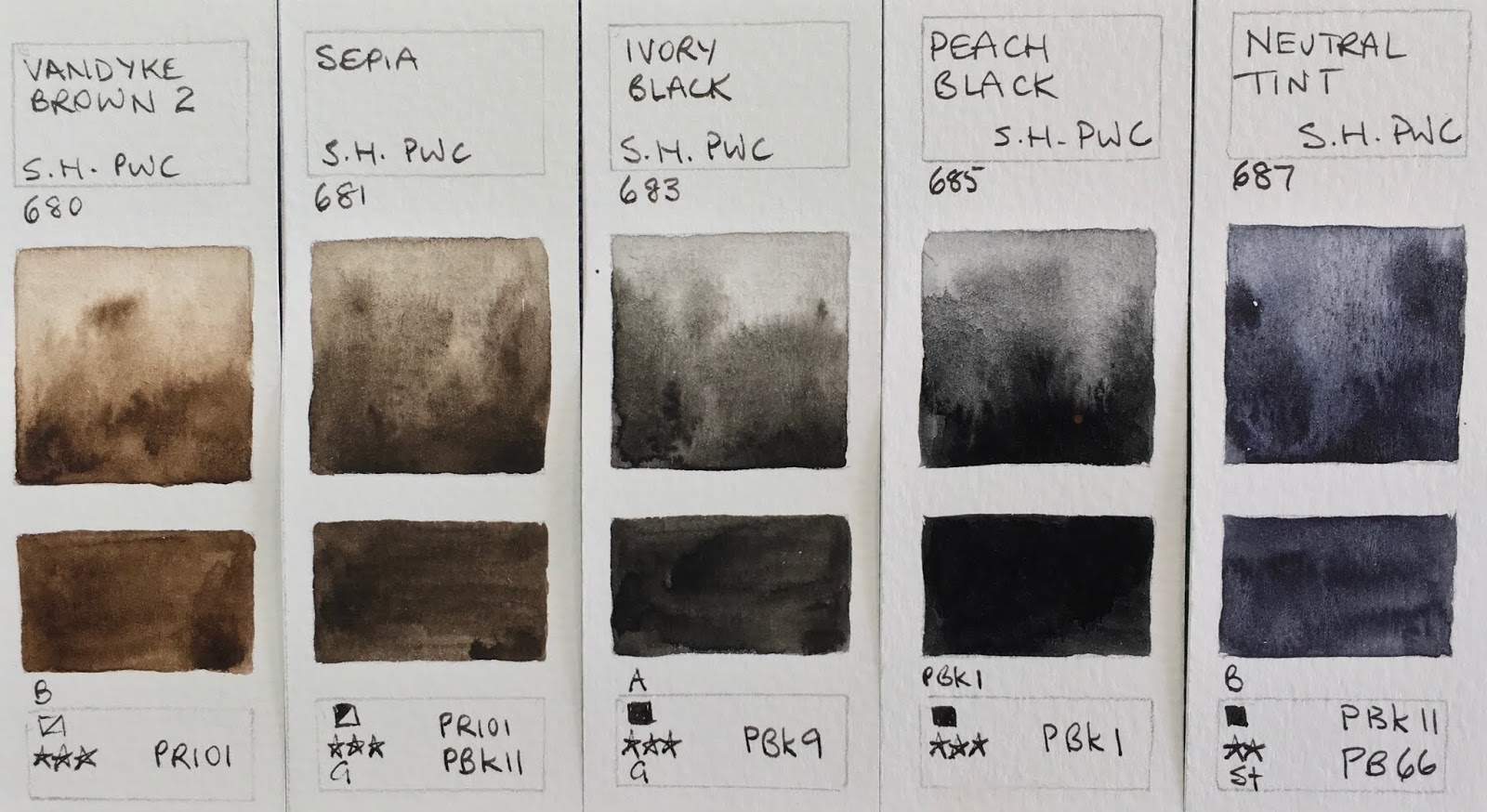
ShinHan PWC Watercolours - Vandyke Brown 2, Sepia, Ivory Black, Peach Black, Neutral Tint.

ShinHan PWC Watercolours - Payne's Grey, Davy's Grey, Grey, Chinese White, Titanium White.


Tints.
ShinHan PWC Watercolours - Brilliant Pink, Shell Pink, Jaune Brilliant 1, Jaune Brilliant 2, Leaf Green. 

ShinHan PWC Watercolours - Permanent Green No 2, emerald Green Nova, Green Pale, Bleu Grey, Horizon Blue.

ShinHan PWC Watercolours - Lilac, Purple Grey, Bright Violet, Bright Rose.


Tuesday, 25 September 2018

The Ultimate Mixing Set

The Ultimate Mixing Set, Daniel Smith half pan palette.
The new Daniel Smith 15 half pan Ultimate Mixing Set is due to be launched in mid October 2018.

I thought I'd put together some of the many mixing diagrams, charts and wheels that I've created over the years I was developing this set. Some have been posted up before, others are new. Note that in my charts I've used Pyrrol Crimson while, for technical reasons,  the pan set contains Permanent Alizarin Crimson - they mix in almost exactly the same manner.


Here is the full DS half pan set painted out.

The Daniel Smith Ultimate Mixing Set painted out.

I love Buff Titanium. It is a fabulous pigment for landscape and buildings, marble and some botanicals. It's a unique colour and I love the way it mixes with Goethite to make wonderful sandstone and beach effects.

Mixing with Buff Titanium. Daniel Smith Watercolours The Ultimate Mixing Set.

You can find more on buff titanium here.

Next is Burnt Sienna, which is shown mixed with nearly all the other colours. This version of Burnt Sienna, made with PBr7, is also useful for many skin tones. Find more on mixing with burnt sienna here

Mixing with Burnt Sienna. Daniel Smith Watercolours The Ultimate Mixing Set.

Indian red, the most opaque watercolour in the set, is lovely in portraits and landscapes. I'd rarely use it full strength but I love the granulation and the soft dusty rose hues you can create when you dilute it. 

Here is is mixed with most of the other colours. 

Mixing with Indian Red. Daniel Smith Watercolours The Ultimate Mixing Set.

Phthalo green is best mixed rather than used alone. Here are some of the many colours it can create. While it is wonderful for mixing a range of greens with the yellows, it is also worth exploring the colours you can create mixing it with the other earth colours and reds.


Mixing with Phthalo Green. Daniel Smith Watercolours The Ultimate Mixing Set.

One of my favourite mixes with Phthalo Green is with its opposite, Pyrrol Crimson/Permanent Alizarin Crimson. You can see the wonderful range of deep greens, aubergine, greys, maroons and a rich black that I often premix, called Jane's Black. The deep green mix can be created with the palette colours, or you could add Perylene Green. 

Fabulous mixing pairs - Pyrrol Crimson/Permanent Alizarin Crimson and Phthalo Green BS. Daniel Smith Watercolours The Ultimate Mixing Set.

Another great mix shown here is Phthalo Green and Quinacridone Gold. This makes a really useful range of realistic foliage greens, including the DS Sap Green hue. Mix it yourself or add this great colour to save time as you paint.

Useful realistic greens using Phthalo Green and Quinacridone Gold. Daniel Smith Watercolours The Ultimate Mixing Set.

Raw Umber is a deep cool brown - great for shadows of trees and figures, leaf litter and deepening other colours. In some brands it is a rather insipid colour but the DS version is very dark. 

Mixing with Raw Umber. Daniel Smith Watercolours The Ultimate Mixing Set.

Another of my favourite or most used mixes is Ultramarine and Quinacridone Gold. This is available as a premixed Daniel Smith colour called Undersea Green - one of my favourite premixed greens, or it can be created as needed from the palette colours. I love this range of olive greens, which are especially useful for the colours of gum trees or distant trees in a landscape.

Quinacridone Gold mixed with Ultramarine, Daniel Smith Watercolours The Ultimate Mixing Set.

Jane's Grey, the new Daniel Smith colour, can be used as a a shadow or sky colour, or as a neutral tint to deepen other colours, as well as being a beautiful granulating and non-staining grey on it's own. As it is made from burnt sienna and ultramarine is contains no black pigments, is transparent and granulating. It won't stain so you can lift it off or soften shadows. Here it is mixed with most of the other colours in the set. See more on this here.

Mixing each colour with Jane's Grey. Daniel Smith Watercolours The Ultimate Mixing Set.
Within the set there are also many great primary triads to explore.

The first is a great basic triad - Hansa Yellow Medium, Quinacridone Rose and Ultramarine. You can mix lovely oranges and red, purples and realistic greens with ease just by mixing two together.


But it gets really interesting once you mix all three in various ratios. Here are just some of the possible three-colour mixes you can create with this triad.


If you start with the above triad and change Ultramarine to Phthalo Blue (green shade) you'll have a staining triad with no granulation.

Hansa Yellow Medium, Quinacridone Rose and Phthalo Blue GS
Daniel Smith Watercolours The Ultimate Mixing Set.

Change the Hansa Yellow Medium to Quinacridone Gold for another lovely triad with more neutralised greens, and oranges.


I love the earth triad made from Goethite, Indian Red and Cerulean Chromium. You could change the blue to Ultramarine for another variation. I enjoy using a triad like this when painting the southern Californian landscape.

Goethite, Cerulean Chromium and Indian Red Earth triad.
Daniel Smith Watercolours The Ultimate Mixing Set.

My 'Aussie Triad' is Permanent Alizarin Crimson, Quinacridone Gold and Ultramarine - this creates perfect neutralised greens, oranges and purples for the Australian bush, though it also works very well for many landscapes, including the colours of Oregon and Washington State.


There are many other triads you could explore for wonderful colour harmony.

You can paint anything with this set. But feel free to add your own favourites :-)

For more information about mixing the colours I've created a reference book which includes all 105 two-colour mixing combinations and the most useful three-colour mixes. It is available as an eBook, Kindle, hard cover and paperback. For more information see here.

The Ultimate Mixing Palette: a World of Colours - available in paperback or hardcover.


Happy painting!

Monday, 10 September 2018

Rosemary and Co Brushes

I've been posting a series of chats about different brushes and here is another favourite range - Rosemary and Co, made in the UK and shipped directly to artists. These are lovely brushes that are available directly to artists so the prices are really worth a look. While I have updated the information shown here, you can see the full range of travel brushes in this post

I've included a Raphael 8404 and a Lamy Joy pen for scale. Links below are affiliate links.

Rosemary &Co Pocket/Travel/Reversible brushes and a few others.

8404
R0

R1
R2
R3


R4
R5

R7

R8
R9


R12

R13
R14
R15
Small eradicator

1/2" Dagger

SP


Lamy Joy


Rosemary R0 - about a size 2 sable
Rosemary R1- about a size 4 - this is a lovely second travel brush for those who like to add more detail.
Rosemary R2 - about a size 8 - this is a fabulous first sable brush for travel. It works beautifully for A5 to A4 sketchbooks.
Rosemary R3 - about a size 10 sable pointed. This is now available in a larger casing.
Rosemary R4 - 1/4 inch flat sable One Stroke. I use this for doors and windows, and making colour charts of course :-) It is now made from a synthetic sable fibre called Red Dot
Rosemary R5 - Sable Rigger
(Rosemary R6 is not shown but is a Kolinsky Filbert brush.)
Rosemary R7 1/4" sable comber
Rosemary R8 - sable mop about the same size as the R2 and a lovely brush. I love mops.
Rosemary R9 - squirrel mop - this (or the R2) is the brush I generally recommend as a first travel brush. Being squirrel, it is softer than the R2 sable, but also has a lovely point. the quill version has been replaced with a ferrule version.
(Rosemary R10 - not shown - is a synthetic pointed brush.)
(Rosemary R11 - not shown - a red sable synthetic mix size 10 pointed round)
Rosemary R12 - sable and synthetic mix 1/4" dagger - the brush I requested Rosemary to create and   another excellent choice for a single travel brush. Daggers can be used in so many ways for different   effects - the tip for fine detail and drawing and the full width of the diagonal for for larger washes.
Rosemary R13 - extra pointed sable mix size 8
Rosemary R14 - small squirrel mop
Rosemary R15 - 1/4" oval squirrel wash brush
Rosemary Eradicator (small) also available in medium and large. This is a precision correcting brush that is also perfect for lifting out veins in leaves or windows in urban sketching. One of my key brushes. It is also available as a travel brush - the R24.
Rosemary 1/2" dagger sable and synthetic mix. I really like this in the 3/8" size (now available as a travel brush - the R16) and of course the R12 pocket brush.
Roger Jones Brush - Massive size 12 SP sable extra pointed tip - suitable for large washes and fine detail.
Lamy Joy (for scale)

There are also some new brushes that have been added to the travel range - smaller squirrel quills and others. I've added labels to my brushes but R&Co are adding more labels to their range for easier identification. I also tend to add my name label to my tools too!

Rosemary has a massive catalogue of brushes for all mediums and the hard copy is available with true to life photos for perfect size comparisons. I've focussed on the travel/pocket/reversible range but the other brushes I've tried have been lovely too.

Here are some more studio brushes.

Rosemary and Co studio watercolour brushes.

From left
Lamy Joy for scale
Rosemary & Co Series 769 Sable nylon blend 1/2"
Rosemary & Co Series 79 Pure Sable Round size 10
Rosemary & Co Series 32 Tree & Texture 1/2"
Rosemary & Co Series 32 Tree & Texture 3/8"
Rosemary & Co Series 32 Tree & Texture 1/4"
Rosemary & Co Series 779 Sable Blend Sword 1/4" 
Rosemary & Co Series 22 Kolinsky Sable size 8
Rosemary & Co Series 22 Kolinsky Sable size 7
Rosemary & Co Series 22 Kolinsky Sable size 6
Rosemary & Co Series 22 Kolinsky Sable size 4
Rosemary & Co Series 22 Kolinsky Sable size 2
Raphael Series 8404 Kolinsky Sable size 4 for scale

Next, here are some of the Rosemary & Co special effect brushes I have tried. The three combers on the left create different effects - grasses etc. I don't use these a lot but I am always curious about different brush shapes and what they can do :-) The first is a Series 2240 Filbert Comber 1/2", then a series 2250 comber 1/2" and then a series 2230 Spiky Comber 1/2".
As mentioned above, I really like the eradicators, and use the small one all the time. It is shown on the right (as well as in the first picture of this post). The others are the Large and Medium Eradicators.

Here is the type of machine I use to make labels. I lend out my tools all the time so usually make sure I name them, but I also add labels where helpful. This is the Brother P-Touch. There are many models but mine looks something like this. It is battery operated. You can get a range of different tapes - transparent, coloured and various widths. There are also numerous font sizes and styles.


Brother P-Touch 2300 label maker


Happy painting!

Thursday, 26 July 2018

Daniel Smith half pan watercolour sets.

I've been asking Daniel Smith paints to create pan colours for many years, as they are a far simpler way for people to get started in artist quality watercolours than buying tubes. It takes time and care to create pan colours, but finally, earlier this month, it was announced that they would introduce 6 half pans sets, which will be available in September (early October more likely). You can see the information on Doodlewashed here.

At this stage, Daniel Smith won't be creating open stock pans.


Rather than individually wrapping each half pan and packaging them up, they have also created a rather nice compact palette that was designed to hold 15 half pans. This will be included at no extra charge - a bonus - with each set, along with spare empty half pans. For the 15 colour set a second empty palette with 15 empty half pans will be provided!

Here's the new palette!

Daniel Smith hand-poured watercolour half pan set of 15 - Ultimate Mixing Set.

The largest set, pictured above, is my 15 colour Ultimate Mixing Set, including the new DS colour Jane's Grey that anyone who's been reading my blog is familiar with. It also contains Buff Titanium, Hansa Yellow Medium, Quinacridone Gold, Pyrrol Scarlet, Permanent Alizarin Crimson, Quinacridone Rose, Ultramarine, Cerulean Chromium, Phthalo Blue Green Shade, Phthalo Green Blue Shade, Goethite, Burnt Sienna, Indian Red and Raw Umber. The recommended retail price of this set will be US$114.60.

The Ultimate Mixing Set painted out - though due to technical difficulties producing the pans,
Permanent Alizarin Crimson will replace Pyrrol Crimson in the pan set.

Book cover using all the Ultimate Mixing Set colours.


I have created a book showing thousands of possible mixes - see a preview of the eBook here. It is also available as a hardcover or softcover with premium matt paper, or a softcover with standard paper.


The Daniel Smith Ultimate Mixing half pan set paint out, showing the new quinacridone hue, permanent alizarin crimson and the new Daniel Smith Jane's Grey.

You can mix any other colour with this set, but it is not intended as a limited set so a bonus empty palette box with an additional 15 empty half pans will also be included so you can add others you use a lot. I work with these colours as my basic palette, but add other convenience colours to speed up the painting process. These colours can be made with those in the set for harmony, or may be colours that can be mixed but add extra characteristics. Examples are Undersea Green (made from Ultramarine and Quinacridone Gold - both colours already in the set) and Sap Green (made from phthalo green and quinacridone gold - both in the set). Or I might add Raw Sienna (which can be created as a hue using Quinacridone Gold and burnt sienna) or Perylene Green (which can also be created as a hue with Phthalo Green and Permanent Alizarin Crimson). Other favourite extras are burnt umber (a mix burnt sienna and ultramarine) and the extraordinary Primatek pigments that add wonderful granulation.

The next set is the 'Sketcher' set, which is Liz Steel's watercolour starter set. It includes Hansa Yellow Medium, Quinacridone Rose and Ultramarine - a fabulous basic triad also included in me Ultimate Mixing Set. You can get an idea of how versatile this mixing triad is from this chart of three-colour mixes.


A basic mixing triad of Hansa Yellow Medium, Ultramarine and Quinacridone Rose can create an extraordinary range of colours. Daniel Smith Watercolour.


Also included are Mont Amiata Natural Sienna, Cerulean Chromium and the absolutely gorgeous Transparent Red Oxide, providing an earth yellow, a non-staining cool blue and a bright and granulating version of a burnt sienna. This set will be packaged in a 15 half pan palette with 9 empty half pans.


The Daniel Smith Sketcher half pan set

All the 6-colour sets will have a Recommended Retail Price of US$55.31.

The four remaining sets will be Colours of Inspiration sets. They will also come in a 15 half pan palette with 9 spare empty pans.

Pink Rose, Jane Blundell. Daniel Smith Watercolours.


'Colors of Inspiration' has a mix of purples including Wisteria, Lavender, Rose of Ultramarine, Moonglow and Shadow Violet along with the lovely Australian Primatek colour Serpentine Genuine - a really unique granulating set.

I really love DS Moonglow - it is a three pigment mix of ultramarine, anthraquinoid red and viridian. It makes a really interesting background colour to florals as the crimson particles float and the viridian granulation is lovely. Shadow Violet is similar but has an orange in the mix rather than the crimson so is even more grey.

Rose of Ultramarine, Moonglow and Shadow Violet were all used to create the background for this rose study.


The Daniel Smith Colours of Inspiration half pan set.


Congregational Church Hunters Hill with
green apatite genuine in the gardens.
Jane Blundell


'Floral - Cottage Gardens to Botanicals' has some great colours for painting florals. Quinacridone Gold, Quinacridone Rose and Phthalo Blue Green Shade make a wonderful primary triad; Cadmium Yellow Medium Hue gives a mid yellow, Cascade Green (created for painting the Cascade mountains) and one of my other favourites, Green Apatite Genuine, make up the rest of this set. I've used that in the foreground of this sketch of a lovely sandstone church. It is an extraordinary pigment as it can be used very diluted for soft grassy effects or strongly for deep olive greens.


The Daniel Smith Floral - Cottage Gardens to Botanicals half pan set.


Untitled abstract watercolour. Jane Blundell.


'Blues  - Serene to Dramatic' set has a mix of dramatic blues and blue-greys including Sodalite Genuine, Sleeping Beauty Turquoise Genuine, Lunar Blue, Payne's Blue Gray, Cerulean Chromium and Indigo. This was developed with thanks to Julie Karlsson from Sweden.

Working with a range of colours that are very close can be very rewarding. Sodalite Genuine, Cerulean Chromium and other granulating beauties were used to create this study.


The Daniel Smith 'Blues - Serene to Dramatic' half pan set.


Untitled abstract watercolour. Jane Blundell

'Earth - Desert to Mountains' set - contains the amazing Buff Titanium, Raw Sienna Light, Bronzite Genuine, Venetian Red, Burnt Sienna Light and the extraordinary Lunar Black. This set was recommended by the lovely artist Brenda Swenson, who's blog provides wonderful insights into art materials she enjoys and who's work in pen and watercolour is well worth looking at.

I love using these very granulating pigments for abstract studies. Here you can see the interplay of buff titanium and lunar black with earth reds.


The Daniel Smith Earth - Desert to Mountains half pan set.


Daniel Smith half pan watercolours: Earth - Desert to Mountains set in the specially designed palette.

So what will you do with the empty pans? They can be removed and mixed around as desired. Or they can be filled with tube colours, or watercolour sticks that you already own or choose to add. (Each DS watercolour stick can be cut up to create 5 half pans of colour.)

I have written before about filling pans and half pans from tubes here (and also partially filling them at a slope here) but will add the basic information again as there are few key points to keep in mind.

1- Shake the tube well. You don't know how long it may have been sitting around or perhaps exposed to different temperatures during transportation and the heavier pigments may drop to the bottom leaving gum Arabic on the top. Shake really well and open with care away from your clothing just in case the paint comes out a little too enthusiastically! I hold the tube at the bottom widest part and am ready so give a gentle squeeze if the paint comes out too fast - a gentle squeeze will suck a little back in again.

2 - Label the half pan with the colour name, pigment information and brand (if you use more than one brand) with a permanent marker.

3 - Fill in parts - ideally 1/3 at a time. If gum Arabic comes out, put the lid on a shake again. Stir with a toothpick, blunt needle or other fine point to get the paint into the corners of the pan and allow to dry. Top up with the next third and stir and dry again. The DS pans are hand-filled in 3 or 4 pours - this allows the paints to dry really evenly without cracking. When making your own it is best to do it gradually as well.

It is best to air dry the pans. I put them on a windowsill with the palette open, not closed.

4 - Once dry, arrange in your palette in a logical order. Make a chart and write out the colours you have included.

When painting, there is not need to spray Daniel Smith paints with water to reactivate them - they will rewet at the touch of a brush.

The paint used in the DS half pans is exactly the same as in the tubes, so when empty, the pans can be re-filled with tube colours.

Do have a look at the Doodlewashed page to see all the original announcement, but note that due to technical difficulties the Blues set will be slightly different to what is shown there and won't include Blue Apatite Genuine due to technical difficulties with creating pans with that pigment.

Happy painting!


Sunday, 15 July 2018

Da Vinci Triad - a cool triad for the northern summer

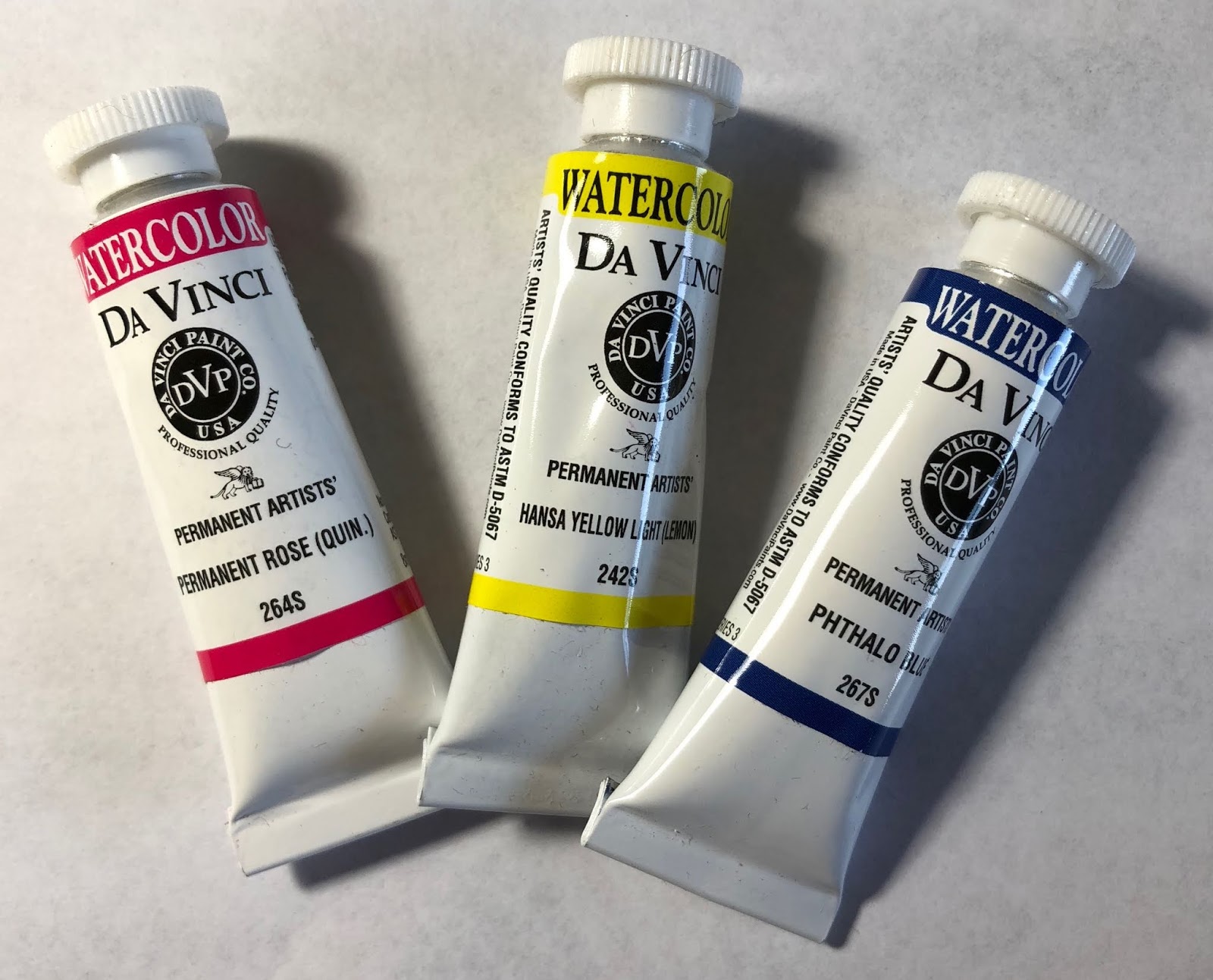
Permanent Rose, Hansa Yellow Light and Phthalo Blue
in 8ml tubes create a cool bright triad.

Da Vinci have been featuring a range of triads as they launch their new smaller 8ml tubes. I was asked to suggest a Summer triad. When I am teaching, I always encourage my students to consider basic primary (or other) triads as a starting point for their paintings. This is the second one I would normally teach in a workshop, and is rather fun for summer - a cool bright triad to paint the warm colours of summer :-)


This triad consists of a cool bright yellow, cool bright red and cool bright blue - Hansa Yellow Light PY3, Permanent Rose PV19 and Phthlao blue PB15. It will mix in a similar way to a printing CYM triad, though I rather like the rose rather than magenta. It will create gorgeous bright greens, purples and oranges, but the three colours can also be mixed to create a fabulous rich black, which can be watered down to many shades of grey. The colours are all powerful and non-granulating.


Wheel painted with Hansa Yellow Light, Permanent Rose and Phthalo Blue, Da Vinci Watercolours

The mixing possibilities are extraordinary with a well-matched triad. 

Below you can see the lovely bright greens that can be mixed using the yellow and blue, the oranges and reds along with warm yellows that can be mixed with the rose and cool yellow and the lovely purples, magentas and warm blues that can be mixed with the blue and rose. This chart was created using random mixes of the two primaries - a little more of one or the other, or a little more water, or stronger pigment, just to see what is possible. The strokes were painted with a 1/4" brush.


Hansa Yellow Light mixed with Phthalo Blue; Permanent Rose mixed with Hansa Yellow Light; Phthalo Blue mixed with Permanent Rose - Da Vinci Watercolours.

It gets even more interesting when you start to explore the three-colour mixes. 

Here we have a blue-purple mixed with the hansa yellow light, creating gorgeous blacks, greys and interesting shadow greens. The blue-purple I use for all the first row can be seen on the left.

Next is a mid purple mixed with the Hansa yellow light, creating raw umber and mute purple hues. Once again the mid-purple I used for all these mixes can be seen on the left.

Then a red-purple mixed with Hansa yellow light. creating yellow ochre, raw sienna and burnt sienna hues. The red-purple mixture I used for this row can be seen on the left. 


Purples mixed with Hansa Yellow Light. top is a blue-purple, middle is a mid-purple and bottom is a rose-purple.


Below are greens mixed with the Rose. First is a yellow-green mixed with Permanent rose creating lovely spring greens and oranges.

Next a mid green is mixed with Permanent Rose creating great foliage greens and dusty pinks.

Then a blue-green is mixed with Permanent Rose creating lovely deep greens and blue-purples.


Greens mixed with Permanent Rose - top is a yellow-green, Middle is a mid green and bottom is a blue-green.
Finally oranges are mixed with the Phthalo Blue

A red-orange creates lovely earth red and grey and deep blue colours.

A mid-orange creates a fabulous range of olive greens, turquoises and burnt orange colours.

A yellow-orange creates more bright greens.

Oranges mixed with Phthalo Blue - top is a red-orange, middle is a mid orange, bottom is a yellow-orange.


This sketch was painted using only the three colours. There is not much you can't create with them if you try! What you also achieve with a well-matched triad is wonderful colour harmony.


Tulip painted with PY3, PV19 and PB15, Da Vinci watercolours.

The new 8ml tubes will be a useful addition to the Da Vinci range. 
I love their massive 37ml tubes too!

Da Vinci tubes - the new 8ml, the 15ml and the jumbo 37ml.

This triad was launched as a Da Vinci set in September - here is the link to the triad series.

Happy painting.

Tuesday, 3 July 2018

Princeton Brushes

One of the great companies I recommend for those looking for good quality synthetic brushes is Princeton. Though they also make beautiful looking sable brushes (see the Siberia range), the ones I've tried have been the really good range of synthetic squirrel and sable brushes, in interesting shapes and sizes. These ones are really lovely. My absolute favourite is the 1" Mottler - I carry one of these little cuties with me every day in my little travel kit! It has a precise tip and is great for doing quick washes or wetting the paper in preparation for a wash and the short size it prefect for travel. for studio work the 1" short handle is great. I like the interesting tip to these green handles - it gives another painting tool for scraping paint.

Some of the Princeton Neptune brush range
The Neptune range is synthetic squirrel, so fairly soft hairs. I find this works best for the larger brushes.

For smaller brushes I prefer a bit more stiffness.


Below are some more sizes of the Neptune range, including the 1/4' Dagger and the 1/4" flat. The Mottler is there for size comparison. This brush has done some travelling!

Princeton brushes from the Neptune, Select and Elite ranges.

Sable hair is firmer than squirrel, and is what I tend to use for smaller brushes. The Princeton synthetic Kolinsky sable range is the Elite. You can see two of these at the bottom of the picture above. The number 6 flat shader is great for creating windows or other regular rectangular or square shapes, as well as general painting for those who like flats. It is also terrific for creating colour mixing charts ;-) The Elite rounds are nicely pointed and easy to control. There is also a Heritage synthetic sable range.

Another interesting range is the Select. A number from this range are shown here with the blue handles. There are some special purpose brushes in this range, such as the Filbert Grainer and the very useful Scumbler - perhaps designed for acrylic but really useful fo scrubbing out in watercolour or cleaning up the odd accidental splatter. It seems to be called the 'Fix it scrubber' on the website now.

There are many brush sizes and brands to look at, and it can be difficult to choose what to buy. I'd always suggest getting fewer great brushes rather than lots of cheapies. A good brush becomes an extension of your fingers :-)


2019 update
I was sent this rather nice set of Princeton brushes, so I can show a few more of the range. It includes the size 6 mop and the ½" flat along with a size 8 round and my favourite 1" Mottler.


Happy painting!