
Mid Yellows
I have added all the yellows to my website here.
I find I rarely need to use a cool, or green-biased yellow as I am rarely mixing the very bright greens it can make. For me, a good mid yellow that is neither cool nor warm i.e. neither orange-biased nor green-biased is a more useful option than the traditional cadmium or hansa yellow light. This works very well as the only yellow in a limited palette, but is also a nice building colour for an expanded palette.
Aureolin PY40 was the traditional mid-yellow choice, but is not recommended as it goes brown or grey or fades. Originally recommended as a watercolour, now known to be best avoided entirely.
So in my search for a better alternative I have tried a number of other yellows and my favourite is Hansa Yellow Medium by Daniel Smith. Other great choices are Daniel Smith's Quinaphthalone Yellow, Schmincke's Pure Yellow or M.Graham's Azo Yellow for a studio colour since it never really dries due to the honey mixed into the paint. As far as I can work out, all of these are ASTM II pigments, which is acceptable for watercolour. Cadmium yellows are ASTM I but opaque.
Here is my mid-yellows page.
 |
| Moleskine Watercolour Sketchbook showing mid yellows including Aureolin (fugitive), Cadmium Yellows and Hansa Yellow Medium. |
These are the mid-yellows I tried. Once again I am searching for colours that re-wet well once dry in the palette, and single pigment colours. I didn't like the Mayan Yellow since it didn't paint smoothly. The Old Holland yellow is a gorgeous colour but, like many Old Holland colours, it dries with a sheen which is frustrating. Note - Winsor Yellow is also a good option, as is Blockx Primary Yellow.
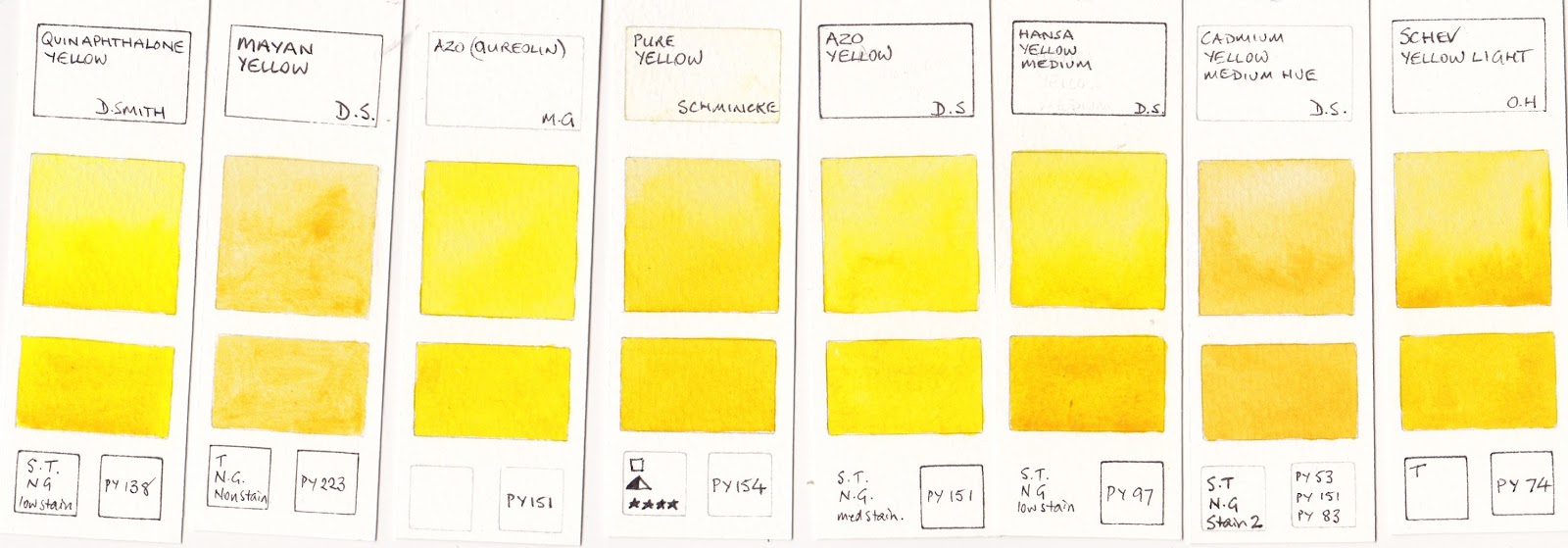 |
| Quinaphthalone Yellow Daniel Smith, Mayan Yellow Daniel Smith, Azo (quinacridone) M.Graham, Pure Yellow Schmincke, Hansa Yellow Mediun Daniel Smith, Cadmium Yellow Medium Hue Daniel Smith, Schev. Yellow Light Old Holland. |
In a larger palette, a warm yellow is convenient for increased mixing options. More on that in Watercolour Comparisons 7.
Watercolour Comparisons 2 - mid yellows here
Watercolour Comparisons 3 - Primary Red here
Watercolour Comparisons 4 - Burnt Sienna here
Watercolour Comparisons 5 - Greens (Single Pigment, convenience mixes and special effect) here
Watercolour Comparisons 6 - Reds (Cool, mid and warm) here
Watercolour Comparisons 7 - Yellows (cool mid and warm) here
Watercolour Comparisons 8 - Blues here
Have you tried the New Gamboge by DS as a Yellow for the Basic Three yet ?
ReplyDeleteIf so, what did you think ?
Kenneth
New Gamboge is a warm yellow. It is a lovely hue and can certainly work provided you only want to make more neutralised greens. Suits Australia where the greens are not generally so high chroma, but probably wouldn't suit some landscapes.
DeleteWhat do you think of Winsor Newton's "Transparent Yellow" as a substitute for Aureolin?
ReplyDeleteIt's a good option - very transparent and much more lightfast than Aureolin. PY150 is also used in Schmincke's Transparent Yellow and Daniel Smith's Nickel Azo Yellow. It can look a bit odd in the palette but washes out to a lovely colour.
ReplyDeleteI need to update this post...
I started using DS Hansa Yellow Medium after reading your recomendation, but I'm finding that it doesn't play nice with other yellows when I'm working wet-on-wet and dropping in other colors to mix with them on the paper. It also seems to be easily disturbed when I attempt to work it before it dries. Have you noticed anything similar in your experience?
ReplyDelete