Wednesday, 13 November 2019

My Studio Palette and favourite Pigments


Note - I try to regularly update posts with additional information but they don't normally repost. I wrote this post in 2013 and, for some reason, this re-posted in 2019 when I updated it. So I've updated it again to make it completely current!


I am often asked what other colours I use or like, and why. There are rather a lot. I have posted a paint-out of my main studio palette before, which I have recently updated. This would have some of my top 20 pigments, and allows me to paint almost anything I choose as it has a good range of yellows, reds, blues, greens and neutrals. These are all Daniel Smith watercolours as follows:
  • Yellows  - 
  1. Hansa Yellow Medium as my mid or primary yellow
  2. Quinacridone Gold as my warm yellow
  3. Goethite DS as my earth yellow
  4. Raw Umber as my dark cool brown
  • Reds/Oranges - 
  1. Quinacridone Rose as my cool and purple-mixing red
  2. Transparent Pyrrol Orange as my warm red (note 2019 - this colour seems to have changed to a mid orange rather than a red-orange so pyrrol scarlet is probably more useful here), 
  3. Indian Red as my earth red  
  4. Pyrrol Crimson as my deep crimson. (In my smallest travel palette I sometimes use Carmine in place of the crimson and rose pigments)
  • Blues - 
  1. Phthalo Blue Red Shade as my cool blue. 
  2. Ultramarine DS or DV, as my warm blue
  3. Cerulean Chromium as my liftable granulating cool blue
  4. Indanthrone Blue just because I love it - a deep warm blue.
  • Greens - 
  1. Phthalo Green Blue Shade as a mixing green
  2. Undersea Green mix DS (PB29+PO49) for foliage and leaves
  3. Sap Green (PO49 + PG7) for foliage, botanicals
  4. Perylene Green that is so useful for foliage in shadow.
  • Neutrals - 
  1. Buff titanium which is so useful for urban and beach subjects
  2. Burnt Sienna PBr7 is my preferred pigment for Burnt Sienna
  3. Burnt Umber as my warm deep brown
  4. Jane's Grey mixture of Burnt Sienna and Ultramarine. This is the one I refill the most. 
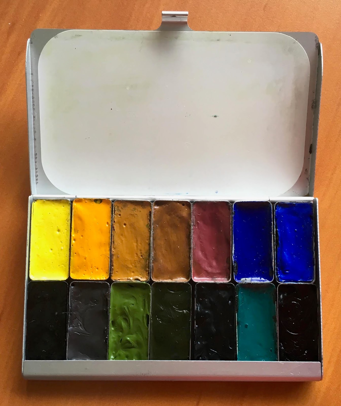
Here is the palette - In the first photo from 2013 I arranged the colours with all the yellows together in the first column, then all the reds, then the blues, then greens, then earths. There is more on this arrangement here.

My 20 colour brass studio palette from littlebrassbox  - photo from 2013. 
I now have them in a more 'rainbow' order with light buff titanium, then yellows running down the first column, into reds, blues, greens and then the earths. This is how I tend to arrange all my palettes.

My 20 colour brass studio palette from littlebrassbox in 2019 - same colours but in a different order.

My studio palette colours.

So then what to do with the colours I want to use on occasions but not all the time? 

One option was to use a bigger palette. I had a wonderful large palette that worked very well in many ways. It held 34 colours and had good mixing areas but it took up a lot of space on my work desk and was not easily portable if wet so it was really only good in my studio. (Called the Bullet Proof Palette, by the way, though it is not actually made of glass but strong plastic.) It also had a number of colours that were more for special use than for all the time. My brass one is very compact when not in use, with great mixing space during use. What I wanted was a separate 'extras' set that I could keep in the drawer when not in use but pull out easily when painting in my studio. I've ended up using a set of 18 half pans in a custom made brass box. It works fine :-)

So what are these special extras?

My studio 'extras' palette.
Some are opaque versions of colours I have, some are more granulation, some are cool yellows for florals. They are colours that have their uses in particular paintings. I try to limit the number of pigments I use in any one painting but I like to have a good range to choose from.

Included in this little extras set might be - 

Cadmium Yellow Light - an opaque yellow for when more coverage is required or Hansa Yellow Light Daniel Smith PY3 which is a lovely transparent cool yellow. 

New Gamboge  - the original PY153 version from Daniel Smith. It is the most lovely transparent warm yellow I have tried. Mixable, but at times it's good to start with a single pigment colour. Hansa Yellow Deep is another excellent option.

Benzimida Orange Deep DaVinci - this is a gorgeous orange with a lovely and unusual orange  undertone. Once again it is mixable, but just lovely. Or Transparent Orange Schmincke, which is more transparent and has a more yellow undertone. 2019 update - The DS Transparent Pyrrol Orange that I use in my main palette as a warm red seems to have changed to more of a true mid orange - rather like the Benzimida Orange Deep, Winsor & Newton Transparent Orange and almost the Schmincke Transparent Orange. It would now sit in with my extras and I'd change the main palette to Pyrrol Scarlet for the warm red.

Pyrrol Scarlet DS - a very lightfast warm red. I like the pyrrols and they intermix very well. A bright red can be perfect for certain flower studies. This is the red I recommend in all my teaching, rather than the Transparent Pyrrol Orange that I have in my main palette.

Quinacridone Lilac DS - this is the lovely PR122 magenta that makes the most gorgeous purples, and is prefect for painting bougainvillea. It's great if I want to work in a limited CYM palette too! Not currently in my extras palette as I use Quinacridone Rose to make most purples.

Imperial Purple DS - purely convenience if painting purple flowers. Some might prefer a PV23 Dioxazine violet.

Moonglow DS - this mix of Ultramarine, Anthraquinoid Red and Viridian is just lovely for many floral shaded areas.

Cobalt Blue - this lovely mid or primary blue doesn't get a lot of use, though it's wonderful in the Greek Islands and for skies.

Phthalo Blue GS DS - this is the colour I recommend in all my teaching, rather than the Red Shade that is in my main palette. I have it for demonstration purposes for my on-line tutoring since it is a traditional choice for most people. The Red Shade can be adjusted to look like the Green Shade with the addition of a little Phthalo Green.

Cobalt Turquoise DS - this is an easy enough colour to make but the granulation is something special.

Jadeite Genuine DS - this granulating pine-like green is a beautiful pigment. It mixes a bit like Phthalo green but is much deeper in mass-tone, more like Perylene Green, and more liftable thatn phthalo green. Wonderful in foliage. Still in my little travel palette.

Green Apatite Genuine - I love this colour and use it often. Goes from a light green gold through a sap green to a deep undersea green all in one - still in my little travel palette.

Serpentine Genuine DS - wonderful fro grassy meadows, with lovely flecks of brown in the green wash.

Green Gold - PY129  DS - this is another useful convenience colour for botanicals and foliage.

Yellow Ochre PY43 DS - an earth yellow that is a little opaque. Makes great olive greens, when I don't want the granulation of Goethite.

Raw Sienna PBr7 DS - for skin tones or if I want a warm glow in the sky without it turning green mixed with a blue - one of the characteristics of this pigment.

Transparent Red Oxide DS- this is an option for a burnt sienna but is wilder so I keep it for special purposes, especially rust. Fabulous granulation!

Piemontite Genuine DS - a granulating Primatek colour that has an amazing tonal and colour range. It washes down to a dusty pink. A very interesting alternative to Indian Red, but I like to use both.

Grey Titanium  DS - introduced in 2019, along with Jane's Grey, this is an interesting colour that can be just perfect for concrete, neutral passages in a wash and some stone effects. I tend to use this in my plein air extras palette too.

Lunar Black DS - I don't generally use a black pigment but I love this one due to its extraordinary granulation.

My 'extras' palette colours


I have many other watercolours that I don't use so often so my other problem was how to store and potentially carry these extra pigments when teaching colour workshops. I found the answer that solved all the rattling pans and wrote about Malcolm Carver's flower palettes, and my 'special use' pigments in another post - here. I have also written about 48 'special pigments' that I put into a MAC travel case here, with more detail in the following post here.

Tuesday, 12 November 2019

Da Vinci Travel Brushes

Da Vinci travel brushes - size 3, 4, 5, 6, 8 and 10,
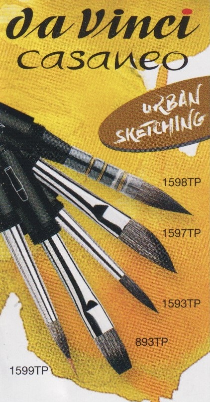
followed by the Caseneo in a size 8 and a size 10 dagger (Slant brush)


I've posted about the Da Vinci brushes previously here, but I wanted to focus this time just on their travel brushes.

They have three main ranges - the Pure Kolinsky 1503 range, the Caseneo 1593 synthetic squirrel range, and the Cosmotop Spin synthetic 1573 range.

All are made with the screw on caps so they are very secure while painting or when capped for travel.
(There is also a series 4156 travel range and a series 910 travel range with retractable brush tips, but I haven't tried any of these.)

I love the Kolinsky range, and have used the number 8 to sketch with for years, especially when I am teaching. It is a great size and shape for up to A4 sketch books. It holds a lot of water and comes to a lovely point.

In the same range, you can see the size 3, 4, 5 and 6 - the first four. There is a big jump in size from the 6 to the 8 as the barrel size goes up. There is another jump in barrel size for the 10. Click here to see the full Maestro range. I find I use the number 8 and 5 or 6 for just about all of my sketches. There is a set with the 4, 6 and 8 in a travel wallet that is a great option for travel sketching.

Also pictured above is the size 8 Caseneo pointed brush and the size 10 dagger - a new shape recently released and really useful as a general purpose brush. It can be used to lay on larger washes, for finer lines or for more random leaf and foliage marks.

Smaller sized pointed brushes are available in this excellent synthetic hair.

As well as the slanted or dagger brush, a travel flat and a lovely mop were released in 2019 - shown left. By 2023 the liner brush and the pointed round complete the Caseneo Travel range.

The Caseneo are wonderful synthetic squirrel brushes that really perform well. Click here to see the full Caseneo range.
To see the full Cosmotop Spin synthetic range click here.

Da Vinci is a German company, and one of the largest brush manufacturers in the world. I've been very happy with all the brushes I've used. 

Happy painting!


Wednesday, 6 November 2019

The Greek Islands Sketching Tour and other adventures


It's been a busy year with some wonderful trips including Japan, London, Amsterdam for the Urban Sketchers Symposium and Lord How Island, where I hope to run a week-long workshop in a couple of years. If you follow me on Instagram you'll have seen a number of sketches and paintings from all these places. (Janeblundellart)

Fabulous colours to paint and enjoy :-)
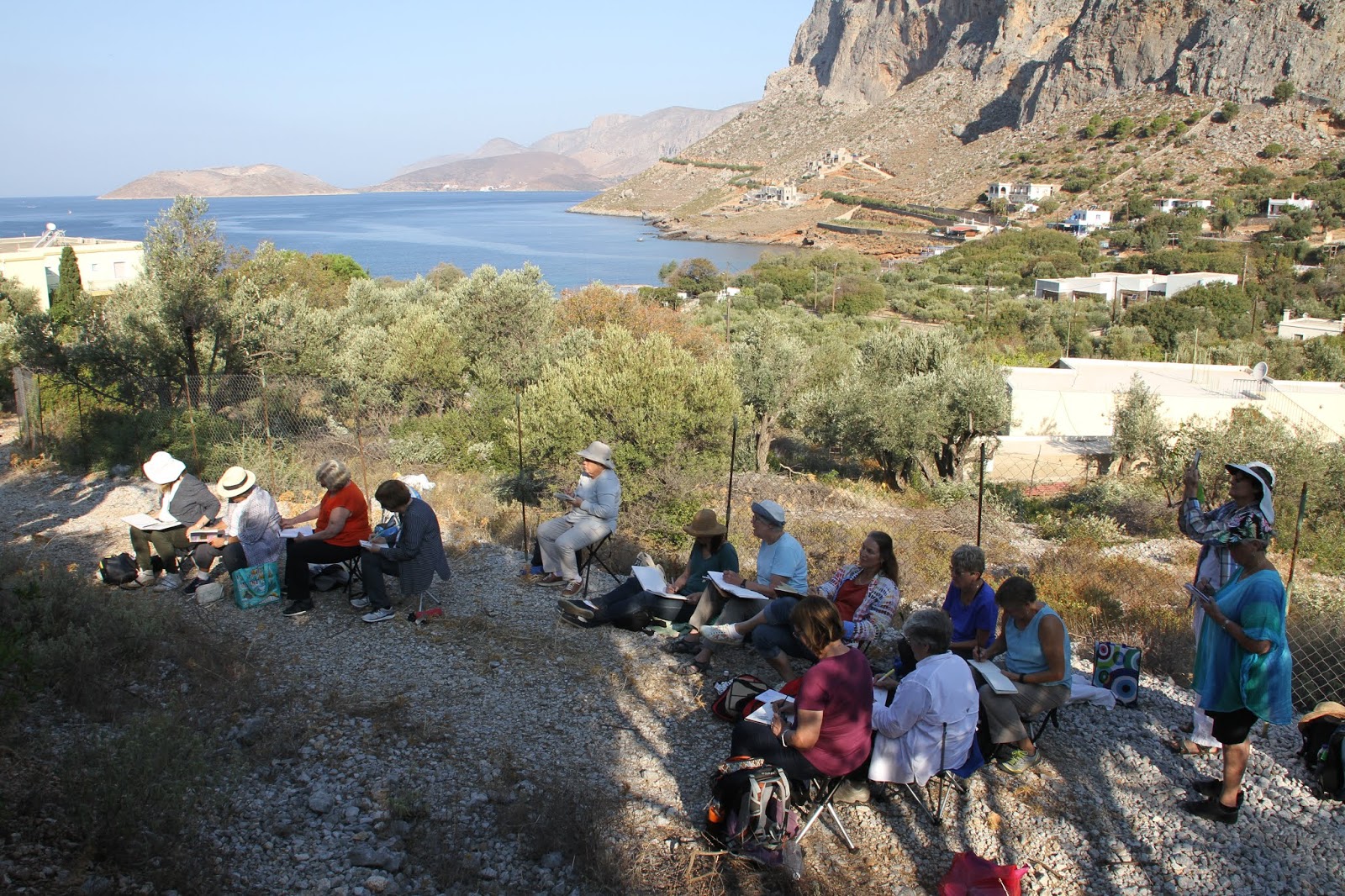
I've recently returned from teaching a wonderful sketching tour of the Greek Islands. We had three weeks and travelled to six quite different islands, with optional day trips to Turkey and another lovely small island. Our task was to document them in our sketchbooks using pen, pencil, watercolour, ink, gouache, watercolour pencil and some other fun tools.

Sketching in Vathy, Kalymnos. Watercolour.


It was a wonderful group of people and a fabulous itinerary organised by Artemisarttours.com.

I'll have enough photos to paint from for years!

I set different challenges for the various subjects we were painting.

Sometimes we painted first then drew onto the wash, sometimes we left the white of the page, sometimes we just drew in ink. That's the joy of a sketchbook - you are free to do what you want :-)


Looking across from Kalymnos to Telendos Island. Watercolour pencil and watercolour.
Some of the group sketching the ancient olive trees.

Demonstrating a study of an olive sprig in an ancient olive grove. Ink and watercolour.

I will be teaching another three-week tour next September, going to a few different islands. Details are on my website here - I keep this updated with all upcoming workshops and demonstrations.

Coming up in Australia is a one day travel sketching workshop at Art Est on the 1 December; a 5-day workshop in Mittagong as part of the Sturt Summer School. Full information is here. And another 5-day workshop in Bathurst teaching Mastering Watercolour. Details here.


Happy Painting!


Friday, 2 August 2019

Rembrandt Artist Watercolours by Royal Talens

I have just returned home from Amsterdam, home of the Urban Sketchers Symposium for 2019. It was a pleasure and an honour to be part of the faculty, and we were treated to a tour of the Royal Talens factory. It was an hour outside of the city but well worth visiting. Of course, no photos were allowed. We saw parts of the processes of many of their large range of paints and colours. We were also able to try the Van Gogh (student range) watercolours and the pencils and other tools.

I've posted a blog about the previous 80 colour Rembrandt watercolour range here, but it has been updated this year to celebrate the 120th anniversary of these professional watercolour paints. Is is now a range of 120 colours. 18 colours have been reformulated and 40 new ones added in this complete overhaul. I was able to try many of the new colours at the factory experience centre, but they were not able to find all the colours so there are still some missing.

Having tried to work out all that had been done, I then found a very useful brochure here.

I'll make a note of the discontinued colours in case you particularly love any and want to stock up before they are gone.

Once again, they painted out very nicely. They tend to be on the runny side straight from the tube but dry smoothly and rewet with ease.


The number of cadmium colours has been reduced so Cadmium Yellow Light is discontinued.

Rembrandt Watercolours - Chinese White, Transparent Titanium White (not shown), Opaque White (new - not shown), Cadmium Yellow Lemon (improved formula), Permanent Lemon Yellow (not shown).

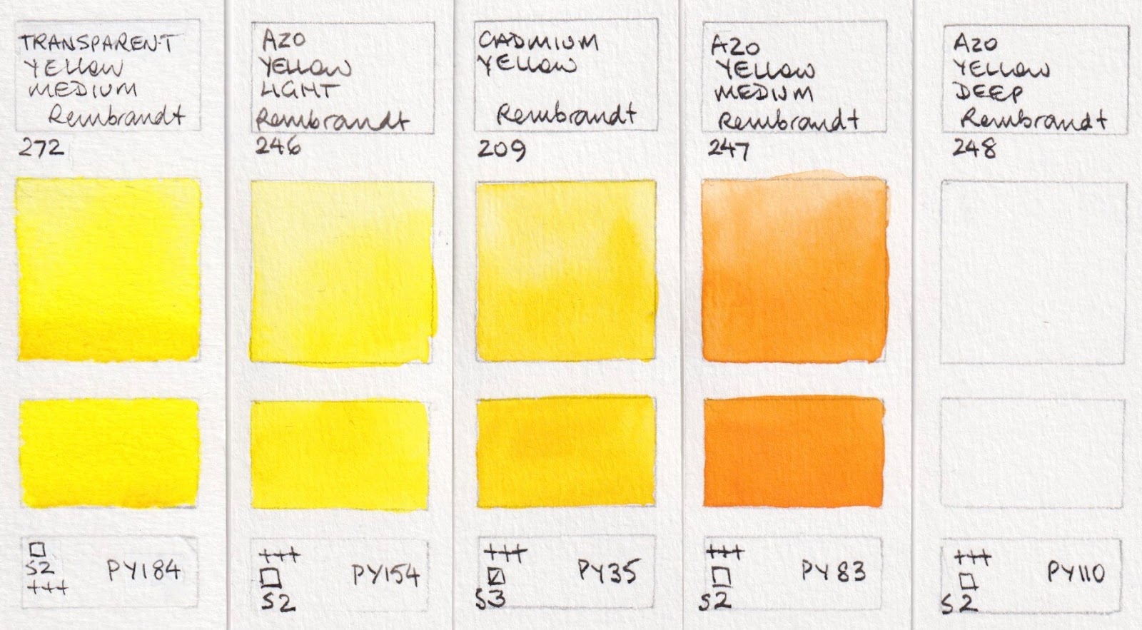
The yellows are almost all single pigment now.

Rembrandt Watercolours - Transparent Yellow Medium (new), Azo Yellow Light (changed in number from 268), Cadmium Yellow (new name and was 271), Azo Yellow Medium (new formula and number - was 269),
Azo Yellow Deep (not shown - new number and new formula was 270)

Rembrandt Watercolours - Indian yellow (not shown), Aureoline, Gamboge, Naples Yellow Deep (not shown),
Titanium Buff (new).

Three new oranges have been added, with the mixed pigment 266 Permanent Orange removed and replaced with Brilliant Orange. I've used a photo here and for the next reds, rather than a scan, to try to show the brilliance of these oranges and reds. I just love the oranges made with PO71 and PO72.

Rembrandt Watercolours - Naples Yellow Red (not shown), Benzimidazolone Orange (new), Pyrrole Orange (new),
Brilliant Orange (new). 

303 Cadmium Red Light and 370 Permanent Red Light were removed and a number of single pigment reds added.

Rembrandt Watercolours - Vermilion, Permanent Red Medium (not shown, but a lovely warm red pigment).

Cadmium Red (replaces 413 Cadmium Red Medium), Permanent Red Deep, Perylene Red Deep (new).

Rembrandt Watercolours - Cadmium Red Deep, Quinacridone Red (new), Perylene Red (new),
Naphtol Red Bluish (new). Alizarin Crimson (not shown).

Rembrandt Watercolours - Madder Lake Deep (not shown), Permanent Madder Lake (new formula),
Carmine (new formula), Permanent Madder Brown, Permanent Madder Purple (not shown).

Rembrandt Watercolours - Venetian Red, Indian red, Permanent Madder Light (not shown), Quinacridone Rose, Quinacridone Rose Reddish (new)

Many new rose reds have been added.

Rembrandt Watercolours - Quinacridone Rose Magenta (new), Rose (new), Permanent Red Violet,
Quinacridone Red Violet (new), Benzimiazolone Violet (new)


568 Permanent Blue Violet has been removed, a number of other purples added.

Rembrandt Watercolours - Mauve, Quinacridone Purple bluish (new), Manganese Violet (new), Blue Violet (new),
Ultramarine Violet (not shown)

Rembrandt Watercolours - cobalt Violet, Lavender (new), Ultramarine Deep, French Ultramarine
(now from a new source so very granulating), Cobalt Blue (Ultramarine) (not shown).

Rembrandt Watercolours - Cobalt Blue, Phthalo Blue Red, Phthalo Blue Green, Prussian Blue,
Indanthrene Blue.

Rembrandt Watercolours - Indigo (not shown), Cerulean Blue, Cerulean Blue Greenish (new - with PB36),
Crerulean Blue (Phthalo) (improved), Cobalt Turquoise Blue (new).

 Cobalt Green has been removed and replaced with a more brilliant pigment.

Rembrandt Watercolours - Turquoise Blue, Cerulean Blue Deep (new), Cobalt Turquoise Green (new),
Bluish Green (not shown), Viridian.


Rembrandt Watercolours - Phthalo Green, Emerald Green, Phthalo Green Yellow (new), Permanent Green.

Rembrandt Watercolours - Permanent Yellow Green (not shown), Sap Green, Hooker Green Light (not shown),
Hooker Green Deep, Chromium Oxide Green.

Rembrandt Watercolours - Green Earth (not shown), Olive Green (not shown), Azomethine Green Yellow (new),
Yellow Ochre, Gold Ochre (improved).

Rembrandt Watercolours - Transparent Oxide Yellow, Raw Sienna, Quinacridone Orange (new), Transparent Red Oxide,
Burnt Sienna.

 408 Raw Umber was removed, as was 426 Transparent Oxide Brown.

Rembrandt Watercolours - Burnt Umber, Greenish Umber (new), Transparent Oxide Umber (new), Sepia,
Vandyke Brown.

The Spinal Grey is made with a newly developed synthetic grey pigment - I'll be interested in exploring this further.

Rembrandt Watercolours - Spinal Grey (new), Neutral Tint, Payne's Grey, Davy's Grey (new), Oxide Black (new).

Rembrandt Watercolours - Ivory Black (improved), Lamp Black (improved), Dusk Yellow (new), Dusk Pink (new),
Dusk Green (new).

 The new Metallic colours are best seen on black watercolour paper or over dark pigments.

Rembrandt Watercolours - Silver (new), Light Gold (new), Copper (new), Graphite (new).

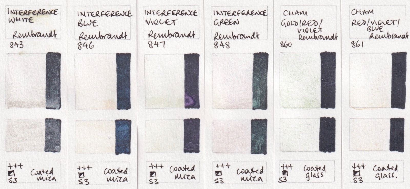
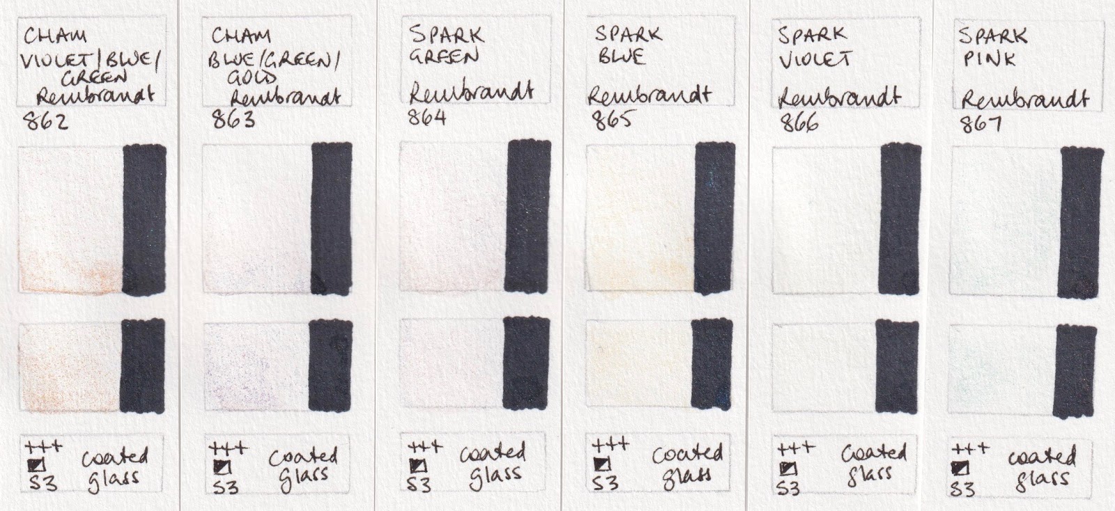
 The subtle sparkle of Interference colours doesn't show up in a scan but I'll include them for reference.

Rembrandt Watercolours - Interference White, Blue, Violet and Green. Chameleon Gold/Red/Violet,
Chameleon Red/ Violet/Blue

Rembrandt Watercolours - Chameleon Violet/Blue/Green, Chameleon Blue/Green/Gold, Spark Green, Spark Blue,
Spark Violet, Spark Pink.


Index to symbols used:
+++ means will last for at least 100 years under museum conditions.
++ 25 - 100 years under museum conditions.
+ 10 - 25 years under museum conditions.
G = granulation
Empty box = transparent
Diagonal line in box is semi-transparent
Half filled box = semi opaque
Filled box = opaque

These lovely Dutch watercolours are available in half pans, 10ml tubes, 20ml tubes and a range of sets.

Happy painting!

Saturday, 15 June 2019

Winsor & Newton Water Colour Markers.

I had the chance to try out the full range of Winsor & Newton Water Colour Markers a few weekends ago, as part of a great day with the Sydney Urban Sketchers. We met at the Jasco offices and had a play with paints and pens. Thanks to Carla and the team :-)


This is not a tool I've used a lot, so it was good to see how it performed. The markers have a broad pointed tip and a brush tip. If you wash over them soon after drawing/colouring with them, they wash out as watercolour would. Leave them longer and the marks will be more distinct.


The pigments used are largely the phthalo pigments and other small particle sizes, so they can flow through the marker pen. Consequently many of the colours have been accurately named 'hue'. All but two are given an 'A' rating (Permanent) for lightfast, with Burnt Sienna and Lamp Black receiving AA rating.

Most are made from a relatively small number of pigments, so colour harmony should be easy to achieve.


Winsor & Newton Watercolour Markers - Cadmium Yellow Hue, Gamboge Hue, Cadmium Orange Hue,
Cadmium Red Hue, Cadmium Red deep Hue, Pale Rose.

Winsor & Newton Watercolour Markers - Lemon Yellow Hue, Cadmium Yellow Pale Hue, Cadmium Red Hue,
Alizarin Crimson Hue, Permanent Rose, Quinacridone Magenta.

Winsor & Newton Watercolour Markers - Mauve, Dioxazine Violet (whoops - miss-spelt), Mid Blue,
Phthalo Blue (Red Shade), Prussian Blue Hue, Phthalo Blue (Green Shade).

I have a few markers to explore more with, so added a line with the 'fine' end of the pen to some of the swatches.
Winsor & Newton Watercolour Markers - Cerulean Blue Hue, Turquoise, Phthalo Green, Phthalo Green (Yellow Shade), Hooker's Green Dark, Hooker's Green.

Winsor & Newton Watercolour Markers - Sap Green, Yellow Ochre, Raw Sienna, Burnt Sienna, Burnt Red, Raw Umber.

Winsor & Newton Watercolour Markers - Burnt Umber, Sepia, Indigo, Payne's Grey, Ivory Black, Lamp Black.

These swatches were painted out in a Stillman & Birn Alpha sketchbook and there was no bleed-through.


Thursday, 13 June 2019

My sketching tools

I do a lot of travelling and take my sketching supplies with me all over the world. I've often been asked to do a blog about what I carry with me, so here it is. I'm packing it up to take to Cairns today!

It wouldn't be the same kit for everyone, but may give you some ideas. Feel free to add other suggestions in the comments section :-)

I try to keep my kit as compact as I can, while maintaining a good range of tools to work with. I've sketched each tool here using my new Daniel Smith Jane's Grey watercolour.

The sketchbook is The Perfect Sketchbook B5. It was a kickstarter project but apparently it will be available again through Etchrlab.com. It is made with Fabriano Artistico paper, 200gsm cold pressed. This is the 5th of these books that I've used so far and I really like them. The cover is recycled leather and the paper is a joy to use.


I love to begin each new book with swatches of one of my palettes. I'll talk about those below.

The tools are, from left, a 0.7 2B clutch/propelling pencil. I like the 0.7mm as it is not too fine for sketching but is also excellent for writing. I use either B or 2B leads - dark enough to do finished drawings or just light initial sketches, soft enough that it doesn't damage the paper.

Mottler - 1" size. I love this little brush. I use it for pre-wetting the background for sky washes or larger areas or for when I want more of a geometric shape.

Waterbrush. They are especially useful on planes or in galleries where it is difficult to manage a separate water container.

Uniball Broad white pen. For adding highlights or lost whites to a sketch or for writing on darker paper or darker washes.

Rosemary & Co Eradicator small sized. Great for lifting out fine details such as white window sills or for making minor corrections.

Post Office Nib in a cut down nib holder. I use this to draw or write with watercolour, loading the colour into the nib with a brush.

Small Scrubber brush - another correction tool. For cleaning up small splatters or softening parts of a wash.

Pilot custom Fountain pen (fine) with black De Atramantis Ink.

TWSBI 580 AL fountain pen (Extra Fine) with brown De Atramantis Ink

Pilot Custom Fountain pen (fine) with Urban Grey De Atramentis ink.

Porcupine Quill - for stirring paint in a palette or for scratching or denting the damp wash on a sketch to add fine details.

Da Vinci Maestro Travel Brush size 6

Faber Castell water-soluble graphite pencil 4B - I usually begin my sketches with this. If used lightly, the lines will wash into the watercolour and disappear. No need for erasing.

Da Vinci Maestro Travel Brush size 8.


The swatches on the page on the right is my usual sketching palette. This is a Herring Compact set up with 24 half pans. It includes my basic 15 Ultimate Mixing colours as well as some lovely convenience mixes and great granulating pigments. The full details are here. The Herring Compact palette is available in half pan or full pan models from Jackson's in the UK. I've adapted it slightly to hold the 24 colours and waterbrush.


The swatches on the left page are of my Pocket Palette with my plein air extras - special pigments that I may not often use but are lovely at times. The details of those colours are also found here at the bottom of the page.


I use two plastic Nalgene bottles for my painting water. One clean, the other dirty.

I also carry a water bottle with drinking water. I love the A4 and A5 bottles as they fit into my Messenger Bag - a bike bag I bought in Canada.

I use a travel stool - the Helinox Chair One - as it is light (less than 1kg), compact and comfortable. The low height of this stool means I can have my water bottles on the ground next to me - one less item to have the juggle - and also that I can work with my sketchbook in my knee.

I have a few sheets of paper towel and a few very small Nalgene bottles to carry the inks I use - De Atramentis Document Inks. Black, Brown and my own mixed grey or Urban Grey.

I have a compact raincoat, a compact down jacket, fingerless gloves, sunscreen, a hat, sunglasses, and umbrella and a very fine woollen scarf available, depending on the season, so I can be out in most weather. Rain and snow are of course rather too challenging!

As I mentioned, I'm off to Cairns today and will take all this with me. I'm teaching a 5-day 'sketching with watercolour' workshop in the botanic gardens. I'll be posting on Instagram - Janeblundellartist

Happy sketching!


Jackson's Professional Watercolours. Full range.

Jackson's Art Supplies in the UK is an amazing store as they stock so many different brands of watercolour. They also have a signature range called Jackson's Artist Watercolour Paint. It's a manageable sized range of 50 colours, available in 10ml, 21ml, half and full pans, for an excellent price. They recently sent me a sample dot card so here they are. They were lovely to paint out as they rewet with ease. Made with pigment, Sudanese Kordofan gum arabic, water and honey.

I have scanned some, and photographed others to try to get the most accurate colour for these swatches. It's always the yellows, oranges and reds that are difficult to show perfectly.


These are close to reality, but the Cadmium Yellow Light is actually a little warmer - a lovely primary yellow colour.
Jackson's Artist Watercolours - Chinese White, Lemon Yellow, Aureolin, Cadmium Yellow Light,
Jackson's Yellow Light.

Jackson's Artist Watercolours - Indian Yellow Hue, Naples Yellow Hue, CadmiumYellow Deep, 
Cadmium Yellow Orange, Red Orange.

The Cadmium Red Orange really is this lovely bright orange-red. Colours look pretty accurate for these swatches. I think the Cadmium Red Purple sample may have been a bit too gummy - this is normally a strong deep red.
Jackson's Artist Watercolours - Cadmium Red Orange, French Vermilion, Cadmium Red Light, 
Bright Red, Cadmium Red Purple.

This is the old version of Permanent Alizarin Crimson Deep - it has been replaced with a three-pigment mix of PR179, PR209 and PY83. The Alizarin Crimson hue shown has also been replaced with PR83. Carmine makes a great primary red.
Jackson's Artist Watercolours - Permanent Alizarin Crimson Deep (old version), Alizarin Crimson (old version),
Jackson's Red (Pyrrole), Carmine, 
Opera Rose.

Jackson's Artist Watercolours - Quinacridone Purple, Permanent Magenta, Cobalt Violet Light Hue, 
Cobalt Violet Deep Hue, Cobalt Blue.

Jackson's Artist Watercolours - French Ultramarine Light, French Ultramarine Blue, Prussian Blue, 
Cerulean Blue, 
Phthalocyanine Blue.

Jackson's Artist Watercolours - Indigo, Phthalocyanine Green, Viridian, Hooker's Green, Cadmium Green.

Jackson's Artist Watercolours - Permanent Sap Green, Yellow Ochre, Quinacridone Gold, Raw Sienna, Raw Umber.

Jackson's Artist Watercolours - Burnt Sienna, Red Ochre, Venetian Red, Burnt Umber, Van Dyke Brown.

Jackson's Artist Watercolours - Warm Sepia, Payne's Grey, Neutral Tint, Ivory Black, Lamp Black.
Happy painting!