Sunday, 7 December 2025

Michael Harding Watercolours

Michael Harding watercolours have been available since 2021, but I haven't had a chance to try them until he visited Sydney at the end of last month. Thanks to Parkers for organising a really interesting talk about the Michael Harding oil paints, mediums and Watercolours.

It was a really interesting talk about his life and the influence of his 6' tall grandmother, who was an art teacher and who encouraged him to see what was there - such as the blue haze in the shadows.

Studying art in the UK, he looked at a Rembrandt and wondered why other paintings didn't look so radiant. An eccentric guru named Graham and the terrific Ralph Mayer's book The Artist handbook led him to begin making his own oil paints, just as the old masters had done. Just starting with the background colours made a difference to his paintings and he was amazed at what was possible. His many challenges and developments are really interested to read, but eventually he released a full range of Oil paints in about 2000 - 2009.

Fast forward many years and four reformulations, his watercolour range was made available during the long Covid shutdowns. This range has 135 colours, 92 single pigment colours, 30 opaques. They contain pigment, gum Arabic, a small amount of honey and a biocide (anti fungal).

These photos of the painted watercolour cards show the full range. I was able to try 50 colours, and will add those below.


Michael and his wife had been travelling for some time so many of the colours were no longer available to try. Either of these yellows would work as a bright primary yellow.

Michael Harding Watercolours - Titanium White, Chinese White, Warm White, 
ellow Benzimidazolone, Yellow Lake

Indian Yellow and Indian Yellow Deep are similar, with just a little more of an orange tinge to the second. This is always difficult to capture. The three reds are also rather similar - the PR170 just a bit more crimson and the PR254 exactly as you would expect for this rich mid red pigment.
Michael Harding Watercolours - Indian Yellow, Indian Yellow Red Shade, 
Scarlet Lake, Pyrrole Red, Rose Doré.

These are fairly true to colour, though the brilliance of Opera Rose is always challenging to capture. Alizarin Crimson is marked as fugitive but is still, as always, very pretty. Just keep it for a sketchbook.
Michael Harding Watercolours - Cinaquasia Maroon, Perrindo Maroon, 
Alizarin Crimson, Quinacridone Rose, Opera Rose.

These purples are very close to their actual colour.
Michael Harding Watercolours - Magenta, Amethyst, Potter's Pink, 
Corinthian Purple, Perylene Violet.

There were a lot of purples to try! The Lapis was very pretty. Only available when the genuine high quality stone is available.

Michael Harding Watercolours - Belladona, Deep Purple (Dioxazine), Ultramarine Blue, 
Lapis Lazuli, Cobalt Teal blue Shade


There are some useful convenience greens in the range. These are fairly accurate.
Michael Harding Watercolours - Caribbean Turquoise, Aqua Green,  
Phthalo Green Yellow Shade, Bright Green Lake, Hooker's Green

Sap Green is darker than in many ranges. Forest Green may have had some contamination - I only had a tiny dot of paint to play with. 
Michael Harding Watercolours - Sap Green, Forest Green, Perylene Green, 
Green Gold, Turner's Yellow

Quinacridone Bronze is almost the same pigment mix as Winsor & Newton Quinacridone Gold but is far prettier. This is an unusually brown version of a Burnt Sienna made with PR101.

Michael Harding Watercolours - New Gamboge, Quinacridone Gold, Quinacridone Bronze, 
Italian Burnt Ochre, Burnt Sienna

Purple Haze and Moonlight are the same pigments as Daniel Smith Shadow Violet and Moonglow, but with different ratios producing more grey purples with less granulation. 
Michael Harding Watercolours - Transparent Oxide Brown, Permanent Brown, 
Neutral Grey (N5), Moonlight, Purple Haze.


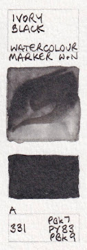
Michael Harding Watercolours - Cosmic Blue, Neutral Tint, Vine Black, 
Lamp Black, Ivory Black

It was great to finally have a chance to explore some of this range from the UK. They were a pleasure to paint out.

Tuesday, 29 October 2024

Back to Madeline Island

In July, I had a fabulous time exploring Minneapolis and a bit of the state of Minnesota with my dear friend Aleta before heading into Wisconsin and staying for a few nights on the bank of Lake Superior. This is so massive - a fresh water ocean - and just beautiful day or night.

Highlights included seeing some gorgeous bald eagles and the amazing caves as we kayaked along the rocky cliffs of the lake. Another was the island cruise, going around many of the 22 Apostle islands.


Study of 4 of the lighthouses we saw.

I finally headed to Madeline Island - the largest of the 22 islands, accessed by a ferry - in time for the Fourth of July parade and fireworks. It was then time to sketch with Eduardo Bajzek, Oliver Hoeller and Nina Johansson. We explored the island, sketched together and finalised our plans for the week.

Madeline Island School of the Arts is a stunning purpose-built school with very comfortable and attractive student accommodation on site. 

The meals are amazing - colourful and fresh and exceptional quality. The salads alone would be worth painting for those who love sketching food!

Everyone had a wonderful time, spending a day with each of us and the final day working all together. We also had fun events for some of the evenings.


The rest of the group are going to return next July, 21st - 25th, with new workshops to make the most of the school and the island locations. Last time, I focused on working with primary triads to depict some lovely botanical subjects. I'd love to return, but have a grandchild due to arrive in the world exactly that week. So this time Rita will join the group, with a workshop on mastering depth to bring your sketches to life.

Eduardo concentrated on atmospheric trees in graphite this year. Next year he'll work with perspective and creating studies of buildings and extending to toned paper with white chalk for greater contrast.

Oliver worked on creating a story of a place in the museum with great layouts in pen and watercolour this year and next year he'll be based on the campus and add acrylic pens and coloured pencils to the lineup.

Nina took everyone on a trip to Bayfield this year, to capture the spirit of the town. Next year she'll be working on campus looking at some fabulous old cars from unusual angles!  

Here's the full information. We've limited the numbers so please apply early.

Urban Sketching and Beyond – Solid Foundations, Exciting Applications


Some of my sketches from Madeline Island.

Quick sketches from to boat, trying to capture the caves in the rocks. Twilight cruise.

Cropped sketch of a tree, sitting in a car with Eduardo to avoid the sprinkling of rain, 
with a Kakimori nib and Jane's Grey watercolour. See Eduardo's sketch here

Studies in the museum.

An old General Motors car Nina and I sketched together.

The Madeline Island Museum

Tom's Burnt Down Cafe - the hot spot of Madeline Island and a must visit! 
Have a look at all our sketches on Eduardo's post here.

Happy painting! đŸ™‚

Tuesday, 28 May 2024

Brush markers - watercolour and permanent pigmented ink

I've been working through a number of different brands and styles of pigmented fine-line markers and previous posts and on mu YouTube channel. I use these a lot in my sketchbooks, especially for writing or for fine drawing when I want to add watercolour and not have a pencil line that may smudge over time.

I'll now look at a number of brush tip markers. These are not something I tend to use very often, but many others do so I'll share what I have come across. Some are water-soluble watercolour markers and others are waterproof pigmented ink.

Winsor & Newton Promarker Watercolour markers

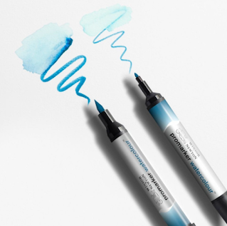
W&N Pomarker Watercolour maker tips. (from the W&N website)

Winsor & Newton released a range of 36 watercolour markers in the Promarker range a few years ago and I had the opportunity to try them all out in a Stillman & Birn Alpha sketchbook. I'm finally sharing them here. 

I don't own many of them, so the full range is shown in much smaller swatches than usual, but the colour scan is pretty close to accurate so it should be helpful.

They have two tips - a sharp bullet tip and a brush tip. The ink is described as water-based pigmented ink. They will active with water, and reactivate when dry.


Here are some swatches created with the brush pens I actually own. I've drawn around the outside of the square with the bullet-tip, then brushed marks into that square with the brush tip, then washed water into the square. The rectangle is filled with the brush tip with no water application.

Winsor & Newton watercolour markers.


While my preference is to work with traditional watercolour and brushes, these are an option that some may really enjoy as they are water-soluble and intermixable. They didn't bleed through the 150gsm Alpha paper - unlike many other markers, including the W&N Brush Markers - and the colour range is pretty good.

It is recommended that you work on watercolour paper with watercolour brushes.

Faber-Castell Watercolour Markers

Faber-Castell also has a range of watercolour markers in their Albrecht DĂ¼rer range. The colour numbers match other Albrecht DĂ¼rer products so watercolour pencils, fine liner pens, watercolour pens, regular pencils and so on can all be chosen to match each other across the range. The website has a terrific colour wheel and some instructional videos on these markers.


Faber-Castell Albrecht Durer Watercolour marker. Image  from the Faber-castell website.


I have only tried a few, but will show those swatches here.

Faber-Castell Albrecht Durer watercolour markers


Faber-Castell Pitt brush pens

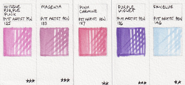
Faber-Castell also has a range of Pitt brush pens, which are pigmented and waterproof - a totally different medium. These come in 60 colours, as full sets or special purpose sets. I have only tried half of them but here is a look at these waterproof brush-pen swatches.


Faber-Castell Pitt brush pens


Faber-Castell Pitt brush pens

Faber-Castell Pitt brush pens

Faber-Castell Pitt brush pens

Faber-Castell Pitt brush pens

I have a few other individual brush pens to add over time. Feel free to share your favourites in the comments.

Tuesday, 30 April 2024

Watercolour Palettes 1 - The Herring Palette - updated

There are so many different palettes available that I thought I'd write a few posts exploring some of them in a bit more detail. Have a look at my website or thewatercolourfanatic for even more!

This plastic palette, based perhaps on the brass paint box, is a great design. I've been using the half-pan version as my sketching palette for about since about 2013. In 2024 I finally 'renewed' it with the exact same model. 

I use the full pan version for my gouache travel palette of full pans. It is from jacksons in the UK. Here is an affiliate link to both versions.

While it is a bit more expensive than some of the other folding palettes, it is so versatile that I have made up a few different versions for my students. I rather like having all the colours in one section so they don't spill into each other when the palette is shut. This also has very deep mixing areas. It is light and strong and big enough to use in the studio but light enough to take into the great outdoors. The catch is very secure and there is a video showing how to open it!

Here is the half-pan option. You can use half pans and change your colours around, or put the watercolour directly into the wells. Standard half pans fit in snugly without rattling about.
Frank Herring : Compact Palette Half Pan : 26x13cm Open 13x8cm Closed

Here is the whole-pan version, designed to take 12 whole (or full) pans. Each pan section will actually fit two half pans if you sand them down a little so it is also very versatile.

Frank Herring : Compact Palette Whole Pan : 26x13cm Open 13x8cm Closed

Here are some options - the first is the whole-pan version with half pans added into some of the the spaces. The second is the half-pan option with 8 additional half pans added into the brush section - great if you want to hold it for plein air. The third is the half pan option with the thumb hole filled in and extra half pans added to the space. This was my plein-air palette for years. Note that a compact water brush fits in well.


The pans can be glued in but I prefer to use blu-tac so they can come out again! Or fill the paint directly into the palette without using half pans if you are sure you won't want to change your colours around!


This is another configuration - designed to have just 8 colours around the outside, with the space to mix other colours in the added half pans. Just a little sanding with fine sandpaper allows two half pans to fit in the whole pan wells, though the Schmincke half pans fit without sanding. The paint was squeezed directly into the full pan well holes though whole pans could be used for ease of changing them.

I really recommend this palette option for sketching or plein air. I've been very happy with it.

You can see a number of other palette suggestions, including more configurations of this one, on my website here.

You can also see a video I crated about this palette here.