Sunday, 27 November 2022

A. Gallo Hand Made Watercolours


A. Gallo watercolours come from Assisi, Italy. This is a honey-based range, created to be highly lightfast and free of mercury, lead, arsenic, cobalt and cadmium. I originally tried the full range in September 2021. As of 2022, these hand-made colours are available in individual half pans in 86 colours, or a range of interesting sets. 

The Signature set from 2021 is shown below. There are also various collections and some lovely wooden palettes as part of a limited edition range. This is a range created with passion. A new brick and mortar shop has opened in Assisi for those travelling. They are also available from Jacksonsart (affiliate link) who ship world-wide.
Signature set of 24, 2021

Dot card from September 2021

The pans were wrapped in watercolour paper with the colour sample brushed over it and the presentation is gorgeous. The website was very clear and the printouts in the colour chart were so well done that I almost felt I didn't need to add the swatches here. There were some lovely primary colours and interesting purple mixes. Interestingly, about half the range was made up of realistic greens and earth colours. I updated these swatches to include the new colours added, and removed those that have been discontinued.

Update August 2024: the range has grown to 110 colours, with a couple discontinued and a couple of extra sample colours as well. I'll gradually update this blog post, including the new colours where I have them and the swatches with the details for those I don't have. Many thanks to Anish for the extra colours 🙂

A.Gallo watercolours: Buff Titanium, Titanium Yellow Hue (new 2024 not shown), Lemon Yellow PY3 (not shown), 
Lemon Yellow Permanent, Azo Yellow gold, Royal Yellow


Oranges and orange-reds are difficult to capture accurately, but these oranges are very close.
A.Gallo watercolours: Indian yellow, Arancione, Hokkaido Orange, Pyrrole Orange (new 2024, not shown), 
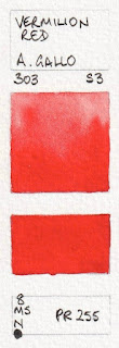
Vermilion Red, Cinabro Hue (new 2024)


Permanent Carmine was one of the most lovely to paint out - a beautiful example of this really useful primary red.

A.Gallo watercolours:  Medici Red, Scarlet Red, Ruby Red, Alizarin Crimson Hue, Permanent Carmine,

Quinacridone Magenta (previously Opera. Note - this is now made with PR202. It was originally PR122).


Not many companies include genuine Rose Madder. This is an earthy coral-pink version. Dragon's Blood looks a little like Perylene Maroon but with loads of granulation. It was quite difficult to activate from the half pan.


A.Gallo watercolours: Ultramarine Pink, Pietra Rosa, Potter's Pink, Rose Madder, Dragon's Blood, Lilac (new 2024)


It's nice to see a good range of single pigment purples, along with the gorgeous granulating Han Purple added in 2024. I generally mix purples with a rose and a blue, but for special effects, gorgeous granulation or gentle pigment triads or studies these purples can be a real treat.

A.Gallo watercolours: Quinacridone Violet, Mineral Violet, Tyrian Purple, Han Purple (new 2024), 
Ultramarine Violet, Dioxazine Violet.


As this range contains no cobalts of cadmiums, there isn't an option of a single pigment cerulean, but there are two cerulean hues. 'Transparent Cerulean' made with PB15:3 is basically Phthalo Blue Green Shade, though perhaps a less staining version? 
A.Gallo watercolours: Notturno, Zirconium Blue, Azurite Blue (new 2024)
Cerulean Hue (not shown), Translucent Cerulean, 
Azzurro.


It is wonderful to see YInMn Blue and Lapis Lazuli in this range. YInMn Blue is the newest pigment to have been discovered - in 2009 - and Lapis is often a very washed-out colour - a far cry from its original form. It was once the price of gold until PB29 was available.
A.Gallo watercolours: Phthalo Blue Red Shade (new 2024), YInMn Blue, Lapis Lazuli, Ultramarine Blue (not shown), Ultramarine Blue Dark, Periwinkle, 


Most of these are mixes but they are pretty colours.

A.Gallo watercolours: Midnight Blue, Indanthrone Blue, Copper Blue, Teal Blue, Aquamarine, Harbor Blue


I enjoy using the lovely green earth pigments in stone and pebble studies.

A.Gallo watercolours: Dar Forest (not shown), Perylene Green, Forest Green, Green Earth Cool, 
Deep Sea Green, Ultramarine Turquoise (not shown)


A.Gallo watercolours: Viridian Hue, Malachite Hue (new 2024), Spring Green (not shown), Sap Green, 
Phthalo Green Light (not shown), Fig Green.


A.Gallo watercolours: Victoria Green, Chromium Oxide, Green Earth Warm, 
Olive Green Deep, Indigo Green (new 2024), Verdaccio


The notation 'N' before a pigment number means Natural, so NG2 is Natural Green 2 - in this case Buckthorn Berry. Pigments from plants don't tend to be lightfast but they are lovely. NG2 was used with NB1 (natural indigo) in Indigo Green above.
A.Gallo watercolours: Green Umber, Buckthorn Berry Green (new 2024), Green Gold, French Ochre Sahara,
Jarosite, 
Still de Grain Light (new 2024)


Update in progress. Come back soon!

A.Gallo watercolours: French Ochre Sahara, Verdaccio, Green Umber, Jarosite, 
Gold Ochre, Moroccan Yellow Ochre.

I found some colours were best used in a very liquid state - painting with a 'cream' consistency lost some of the glow.
A.Gallo watercolours: Raw Sienna, Raw Sienna Badia, Yellow Ochre - Burgundy (not shown), Quinacridone Gold,
Transparent Red Oxide (not shown), 
Castile Orange.

A.Gallo watercolours: Ercolano Red, Burnt Sienna, Sartorio Red,
Venetian Red, Hematite, 
Morellone.

A.Gallo watercolours: Perylene Maroon (not shown), Quinacridone Chestnut, Burnt Umber - Cyprus,
Burnt Umber - Brownish, 
Chromite Brown, Burnt Umber - Dark.

A.Gallo watercolours: Sepia, Indigo, Payne's Gray, Roman Black Earth, Ivory Black, Slate Gray. 

A.Gallo watercolours: Titanium White, Antique Gold,
Buckthorn Green (
discontinued), Quinacridone Red Gold (discontinued).

I've added all these painted swatches to my website, arranged by colour and pigment.

Happy painting!


Tuesday, 1 November 2022

Kremer Watercolours


Kremer Pigmente has been providing a huge range of pigments for many purposes since 1977. They 
stock pigments, ready-made colours, mediums, binders, glues, gold and guilding materials and many more. I visited a store in New York many years ago but they were out of stock of the colours I was most interested in trying. I was delighted to be contacted to try out some of their hand-made watercolour sets.

There are 132 individual watercolours shown on the website, including a number of Iriodin glitter and pearl colours, and a number of boxed sets including an Earth set, a Pearl Luster set, an Illumination set, a gold Retouching set and other interesting options. 

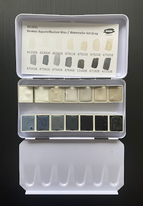
The sets are in black metal palettes with the Kremer logo. They have 14 colours. The first I'll show here is the Watercolour Set Gray. Originally designed for retouching photos, artists have enjoyed this set too. It includes single pigment blacks and whites but also a number of mixes - all the greys - which is unusual as most Kremer watercolours are made with a single pigment. The warm greys are mixtures of Zinc White and Raw Umber and the cool greys are mixtures of either Zinc White and Furnace Black or Kremer White and Furnace Black.

One side of the enclosed card has the hand-painted colour swatches and numbers and the other has the numbers with the pigment information.

Since I don't often work with black and white pigments, I find this an intriguing set, and will eventually test it out on toned paper, working with limited number of paints for each study.

The colours are as follows.

Kremer Watercolours: Titanium White Rutile, Zinc White,
Kremer White (pigment is PW12 - Zirconium white, C.I. 77995), Warm Grey No 1, Warm Grey No 2.


Kremer Watercolours: Warm Grey No 5, Warm Grey No 6, Cool Gray No 1,
Cool Grey No 2, Cool Gray No 5.

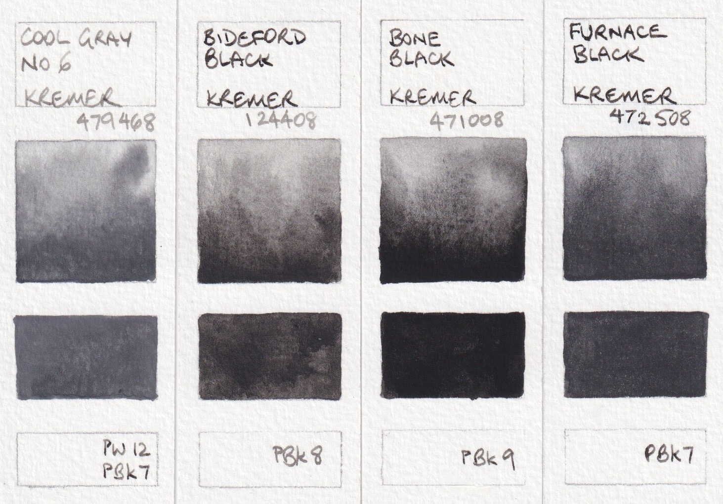
Kremer Watercolours: Cool Gray No 6, Bideford Black,
Bone Black, Furnace Black.

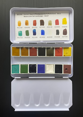
Watercolour landscape Set - Small, contains 14 half pans of a really interesting range of colours. It was inspired by the palette of the 19th Century landscape paintings. I'll add more detail about each colour, thanks to information from Eva from Kremer, below. 

Due to the pigments choices, it is not a general purpose set as there isn't a bright cool red, so it isn't possible to make bright purples, however they are not usually needed in a landscape set. It would also work well for Urban Sketching. See image below.

The colours are a little less bright and many are more opaque than the modern colours I'd normally use so it would be an interesting set to use on toned paper. 

Italian Gold Ochre Light, Raw Sienna, Venetian Red, Burnt Umber and Green Earth from Verona  are all earth pigments. 'Natural earths have a larger particle size than synthetic pigments and every earth colour is an individual mix of natural minerals. Hiding power (opacity) and tinting strength can very depending on the type of earth and its composition. Raw Sienna and green earths are typically transparent pigments, while burnt umber can have more hiding power, though it will never be as opaque as synthetic iron oxide'. (See Caput Mortuum below.)

Italian Gold Ochre Light is a lovely yellow ochre colour and painted out beautifully. Raw Sienna was a little more difficult to get smooth - interesting that these are both PY43. I'd have to explore how they mix as I often use a PBr7 Raw Sienna for a glow in the sky. Venetian Red is more pink than usual, almost like a more gentle and more transparent Indian red. 

Kremer Watercolours: Italian Gold Ochre Light, Raw Sienna Italian, Venetian Red,
Burnt Umber Dark Brown, Green Earth from Verona.

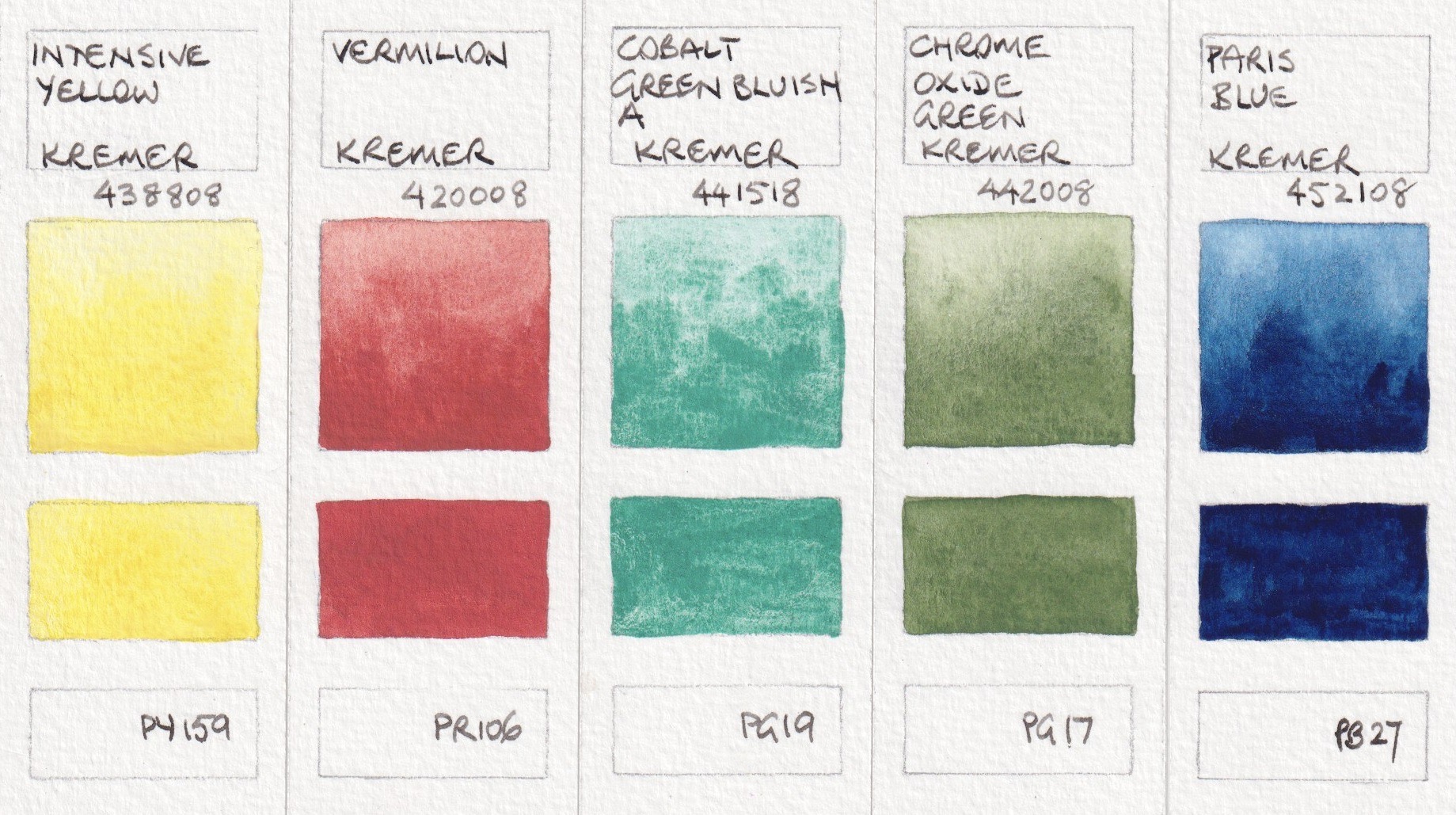
The set was originally created using only the pigments that were typical of the 19th century, but with the restriction on chromate pigments, barium chromate has been replaced with Intensive Yellow (PY159). Intensive yellow is an 'inorganic zirconium-praseodymium-silicate, which is inert and non-toxic'.

The red in the set is Vermillion (PR106). 'Synthetic mercury sulphide was produced since the 8th century and has been the only permanent and intense red until the first alternatives came up in the 19th Century. It is a very heavy pigment with strong hiding power. Typical for vermilion (and natural cinnabar) the colour of this pigment depends on the particle size. Finer particles are more orange-red, which later ones are darker. The earlier settling of the larger, darker particles can also be observed ed in this paint during use.'

The yellow and red are a little more dull than in most modern sets and would suit landscape painting. 

The greens would mix with the three yellows to create a range of useful foliage greens. Cobalt Blue and Cobalt Green pigments were discovered in the early 18th century. Both the Cobalt Green Bluish and the Cobalt Dark Blue have a strong tendency to granulate in watercolours.

'Chrome Oxide Green was also discovered in the 19th Century but has not lost its importance ever since. This pigment is very fine and has excellent hidden power, but its slightly broken green shade makes it ideal for depicting nature and landscapes.'

Paris Blue, often knows as Prussian Blue, Milori Blue or Berlin Blue, was discovered early in the 18th Century. It was 'one of the first pigments produced industrially and it did not lose its importance throughout the 19th Century.' Is a very dark intense blue pigment that gets greener if used in glazes. 'Paris Blue was used traditionally in mixtures with yellow ochres, iron orchids or chromate yellows to achieve green shades. It is not recommended to mix it with white pigments as these can cause it to fade.' It is a deeper cool blue than phthalo blue. It is also less staining so a bit more forgiving than phthalo blue. 
Kremer Watercolours: Intensive Yellow, Vermilion, Cobalt Green Bluish A,
Chrome Oxide Green, Paris Blue

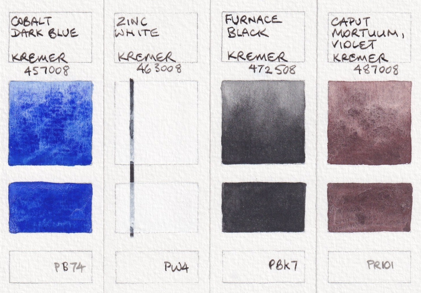
It is unusual to see a Cobalt Dark Blue rather than Ultramarine (discovered around 1826) in a curated set. It's a lovely warm blue colour, but an expensive pigment. As mentioned, Cobalt Blues and Greens were discovered in the early 18th Century.
Zinc White is included in this set instead of the toxic lean white that was in use until the last 18th Century. It is a semi-transparent pigment to it is more suitable for mixing then the opaque and dominant titanium White.
Furnace Black or Lamp Black is a very fine pigment with high tinting strength that can be used for transparent glazes as well as more opaque layers. Lamp black mixes well with other colours too.

Caput Mortuum 'is a synthetic red iron oxide with a typical grey-ish violet hue. It is the only synthetic iron oxide that has been produced and used even before the 19th Century. This pigment is courser and more brownish than other synthetic iron oxides and this gives interesting granulation effects in watercolours. Caput Mortuum can be used to depict rocks, bark or shadows. It can be used to darken other colours or mix brown greys.' It can also be used with Cobalt Dark Blue and Italian Red Ochre Light for an earth triad.
Kremer Watercolours: Cobalt Dark Blue, Zinc White,
Furnace Black, Caput Mortuum Violet.


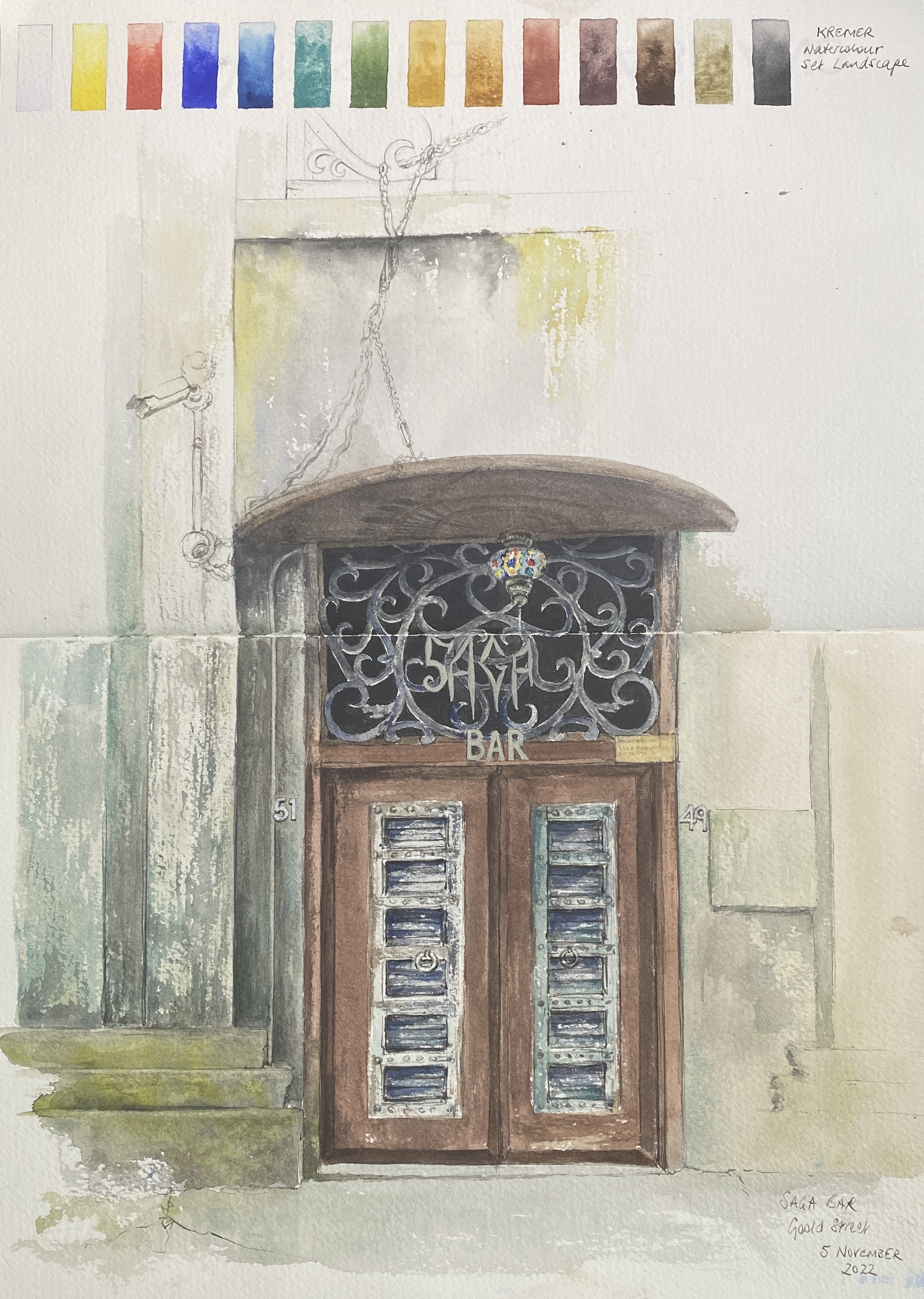
The Saga Bar, Chippendale, using the Kremer Landscape Set.

Here is a sketch of a fascinating doorway using just the Landscape Set. It was started on location, where I took this palette to see what it would be like to work with more opaque colours and without my usual modern pigments. It was finished in the studio to work with all that detail.


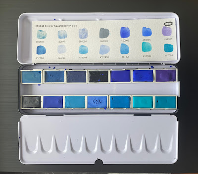
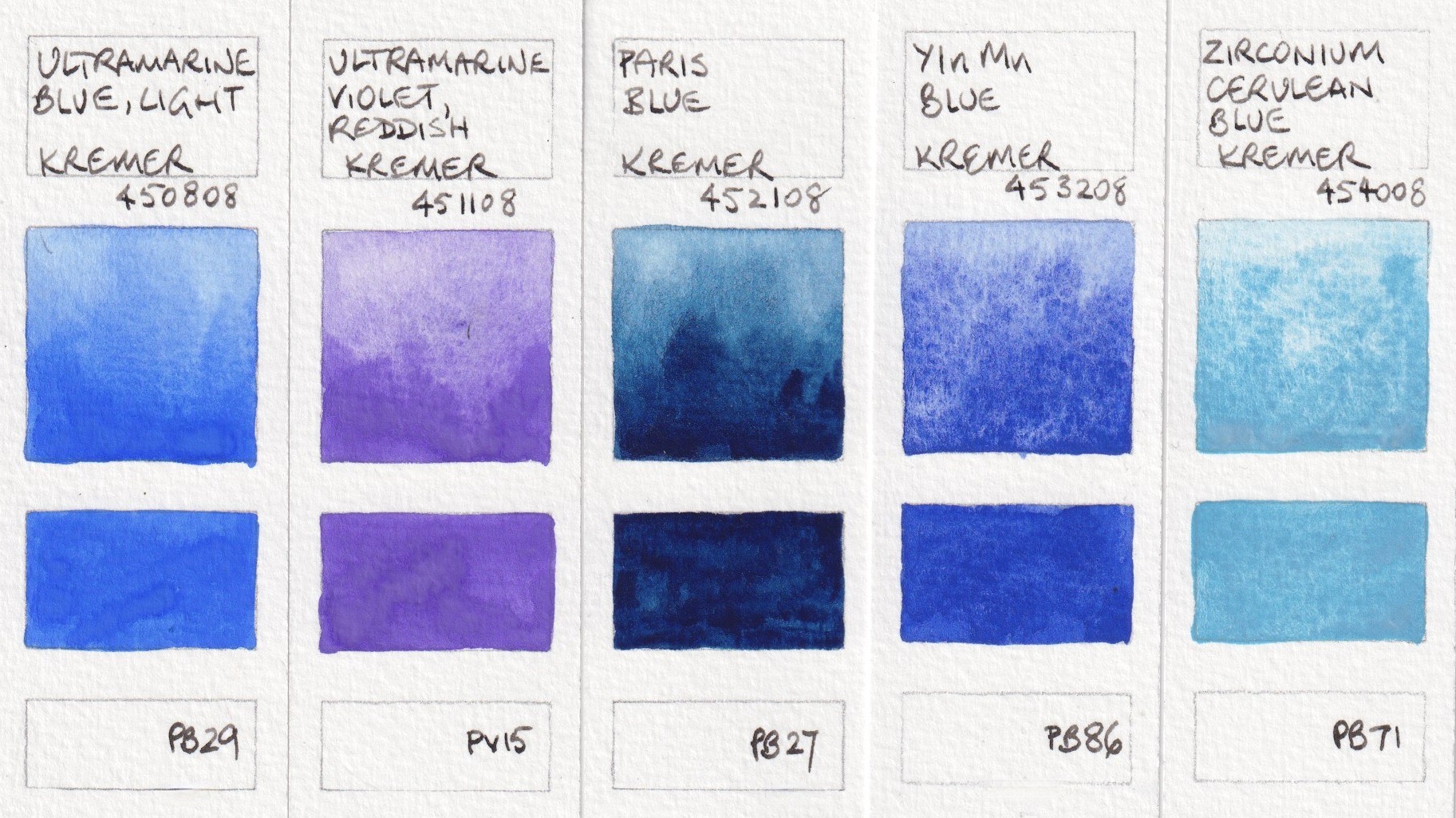
The third set is Watercolour Set Blue - 14 full pans of blues, including some rare and special colours.

PB30 is not a pigment number I remember seeing before, but azurite my not always be given a pigment number. It's a very granulating blue to slightly greenish blue. The two versions are quite different. Lapis Lazuli is a very expensive pigment that varies a lot from manufacturer to manufacturer. This is  areasonably rich version, though not as rich as the lovely Ultramarine Very Dark. Genuine Indigo (Natural Blue) is not considered lightfast, but it is always great to see the real pigment, even if you only use it in a sketchbook.

Kremer Watercolours: Blue Verditer, Asurite MP Sky-Blue Light, Lapis Lazuli from Chile,
Indigo Indian Genuine, Ultramarine Blue Very Dark.


YInMn Blue is another rare colour. This pigment was discovered in 2009 and I've written about it here. This is a lovely version - a little warmer than ultramarine. Zirconium is another rare colour in the watercolour world. It bronzes if used too thick, but has amazing granulation.

Kremer Watercolours: Ultramarine Blue Light, Ultramarine Violet Reddish, Paris Blue,
YInMn Blue, Zirconium Cerulean Blue

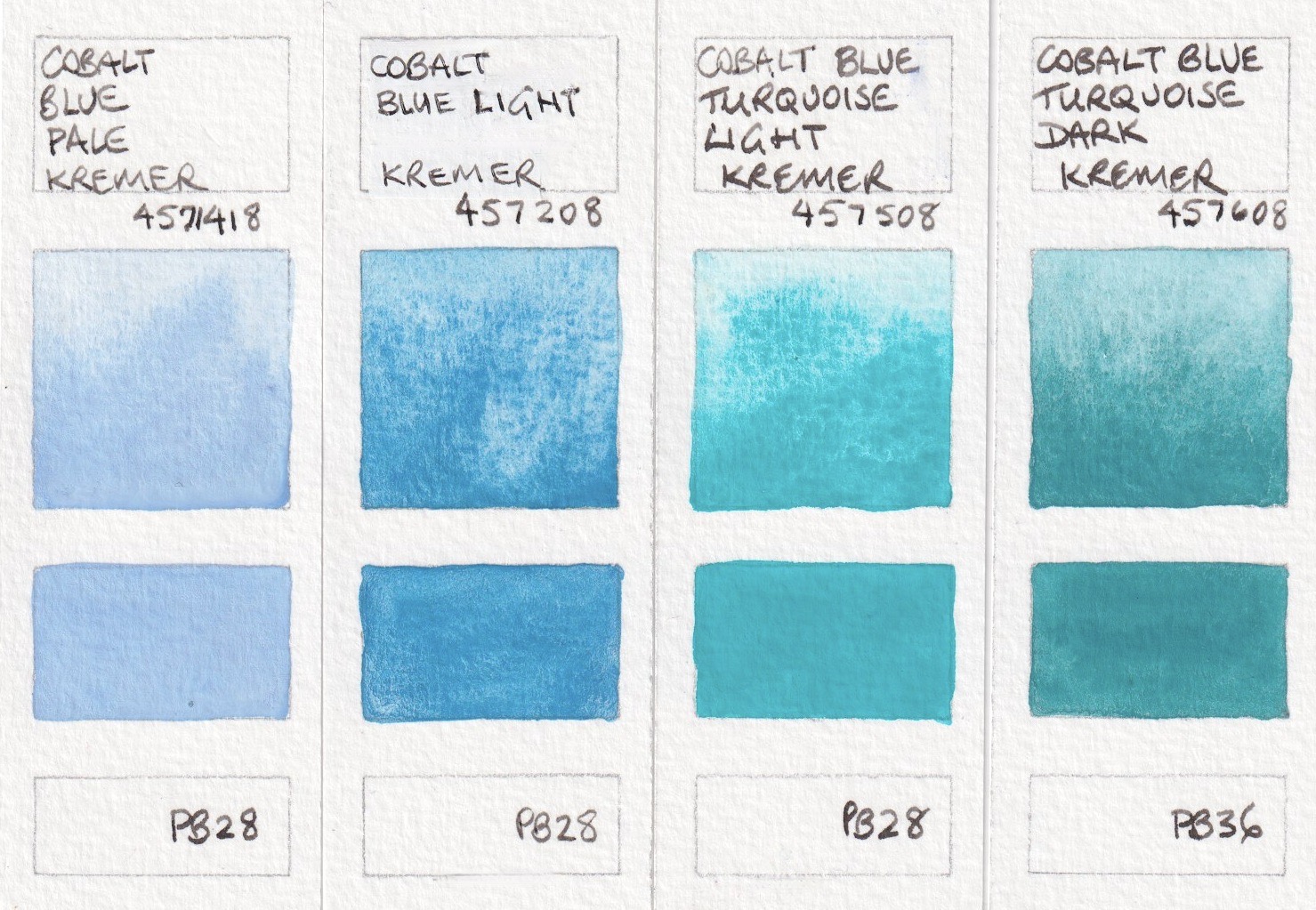
These are all cobalt colours made with PB28 or PB36. Gorgeous and granulating, they are lovely to explore. 

Kremer Watercolours: Cobalt Blue Pale, Cobalt Blue Light,
Cobalt Blue Turquoise Light, Cobalt Blue Turquoise Dark.


I also received samples of Yellow, Greenish (PY129), which is a synthetic-organic azo-pigment. I find PY129 an interesting option as a cool yellow in mixing, as I don't usually include a high chroma cool yellow in my palettes. It is also a pigment that is useful to paint the glow of light through foliage or to mix with blues to create more greens. 
Red Bole (PR102) was made specifically for another Kremer set - a Gold Retouching Colours set that also includes a number of sparkling colours. Red Bole is traditionally used in water gilding to make red poliment, which was layered under the gold leaf to make it easier to burnish and to give a warm feel tot he gold. 'Red Bole is a natural red earth colour with a high clay content. This type of earth is rarely used in paints, because its clay content makes this earth a little bit sticky or smeary'. The Gold Retouching Set was created with colours 'chosen to allow the conservator the widest range of shades from yellow to red to imitate the poliment colours that may occur in an historic gilded object'. So it wasn't intended for painting, but it a lovely earth orange-red watercolour colour.
Kremer Watercolours: Yellow Greenish, Bole Red.


Happy painting :-)

Tuesday, 18 October 2022

Peerless Transparent Watercolours

I mentioned the Peerless watercolours in a blog post in March 2014 - Travelling Light with Colour but I haven't written about them in detail before. I was contacted by the new owners of the company and sent out a couple of updated sets, so I've swatched out all the 60-odd colours I have and show them here. 

I'll First created in 1885, Nicholson's Peerless Watercolour sheets were founded by Chaz Nicholson. He had found a convenient way to hand-tint black and white photos. These watercolours are dried watercolour dyes on sheets of paper. A damp brush activates them.

Artists also enjoyed the bright colours of these colour sheets and a set of 15 was created in 1902 that is unchanged today. That is the 'Complete Edition' that I bought in 2014. It contains the original instructions from when they were first made available. I'll show that set first.

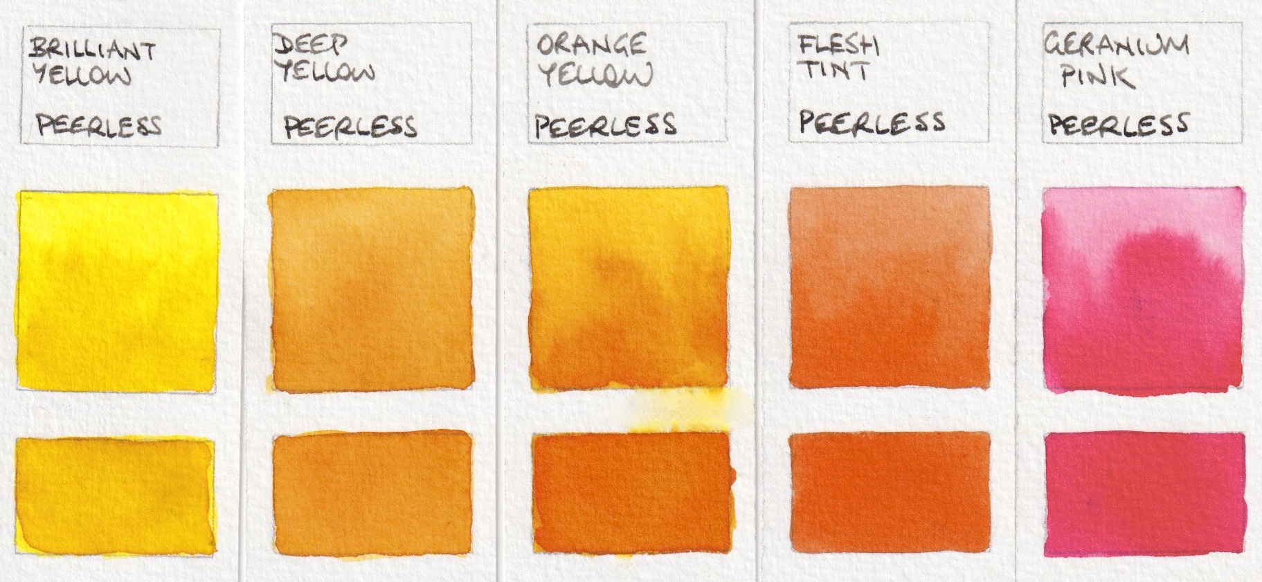
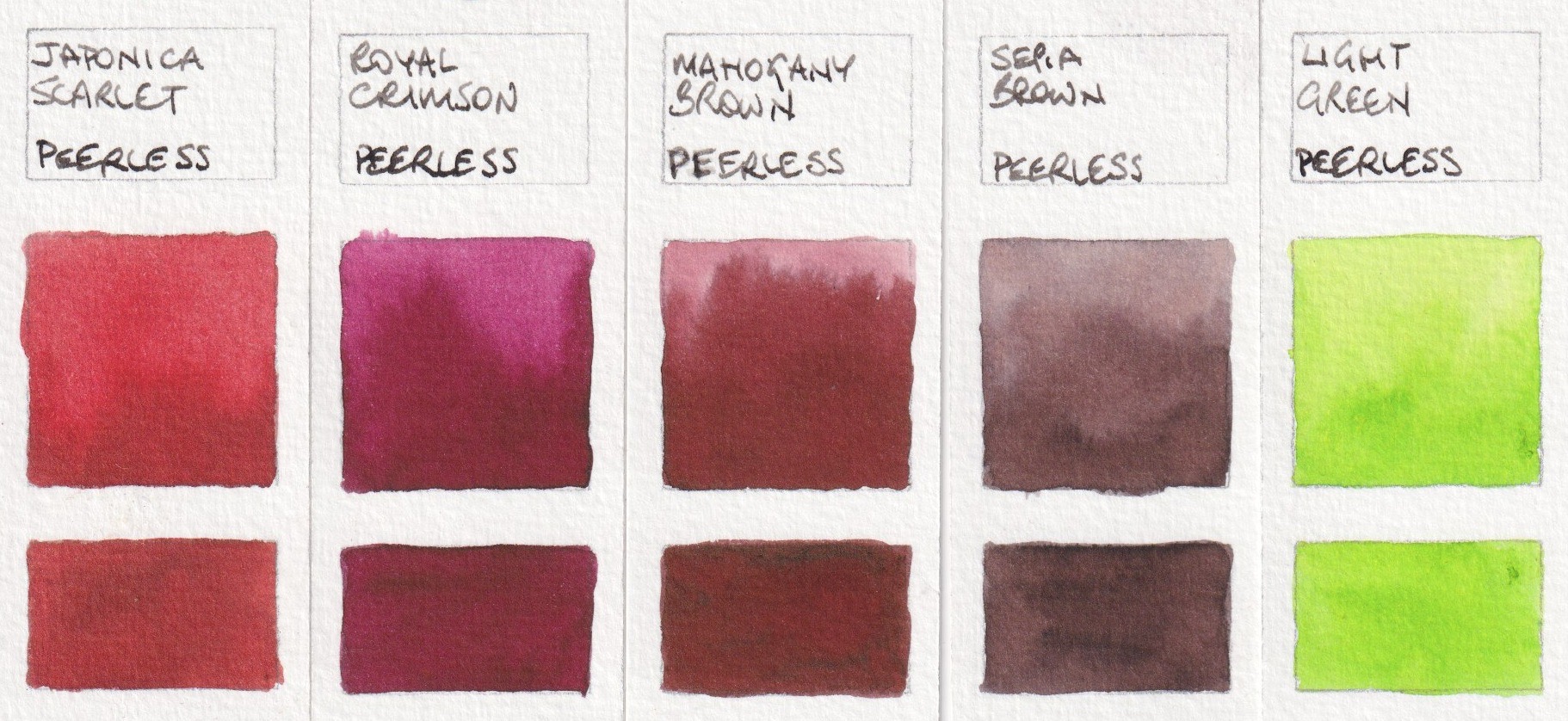
The 'Complete Edition' set contains:

(Note that the Orange Yellow from my 2014 set is different to the Orange Yellow from the 2022 Sidekick set.)

Peerless Transparent Watercolours: Brilliant Yellow, Deep Yellow, Orange Yellow (2014), 
Flesh Tint, Geranium Pink


Peerless Transparent Watercolours: Japonica Scarlet, Royal Crimson, 
Mahogany Brown, Sepia Brown, Light Green.


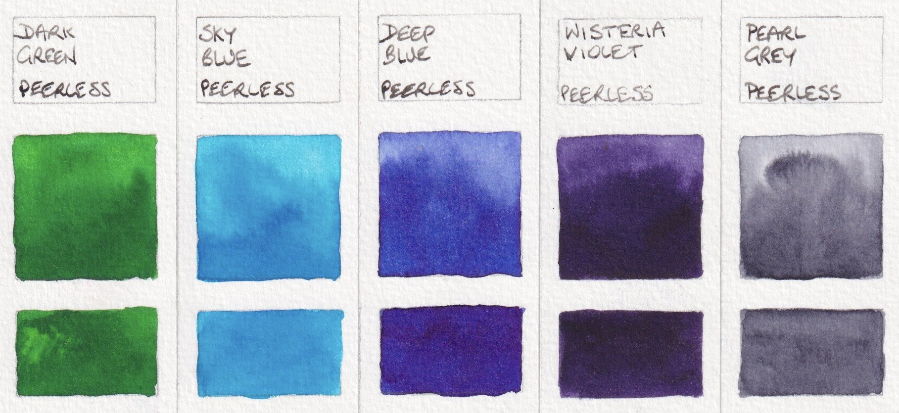
Peerless Transparent Watercolours: Dark Green, Sky Blue, Deep Blue (2014), 
Wisteria Violet, Pearl Grey.

One of the tricky things about this set of watercolours is that they are presented in a booklet. You flip through the pages to find the colour you want, then use it with a damp brush. But when you flip to the next colour the damp papers stick together. To get around this, I cut little section from each colour sheet and pasted them onto a separate 'palette' of paper.

The company was bought by new owners a couple of years ago. There are 80 colours available in total and the new owners have come up with other ways the present these colours. The latest is the Sidekick. This set of 45 colours are set up in booklets with serrated sheets. There are five colours along each page and the spiral binding allows you to open the book to your choice of a yellow, red, blue, green and brown, for example, to use for one painting. The colour sheets are much smaller, but the process of painting is more straightforward. Replacement sets of colour sheets are available.

The 45 colours in this set are


Peerless Transparent Watercolours: Alizarine Red, Blood Red, 
Scarlet Vermillion, Nectar, Scarlet Lake.


Peerless Transparent Watercolours: Chrome Orange, Chrome Yellow, Orange Yellow, 
Red Golden Hair, Ripe Peach.


Peerless Transparent Watercolours: Amber Yellow, Daffodil Yellow, 
Gamboge, Marigold, Yellow Ochre


Peerless Transparent Watercolour: Grass Green, Hunter's Green, 
Mountain Green, Olive Green, Viridian Green.


Peerless Transparent Watercolours: Butterfly Wing Blue, Cobalt, 
Neptune Blue, Peacock Blue, Turquoise Blue.


Peerless Transparent Watercolours: Amethyst, Autumn's Indigo, 
Heliotrope, Mauve, Wisteria Violet.


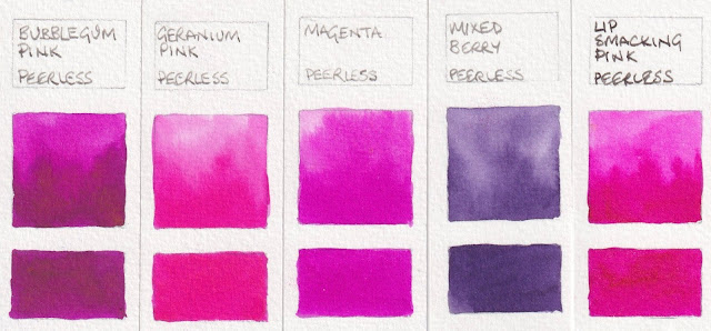
Peerless Transparent Watercolours: Bubble gum Pink, Geranium Pink, 
Magenta, Mixed Berry, Lip Smacking Pink.


Peerless Transparent Watercolours: Bismark Brown, Burnt Umber, 
Ecru, Sepia Brown, Warm Sepia.

The black and various greys are not very different, even in real life. (And Peerless Jane's Grey is certainly not my version!)


Peerless Transparent Watercolours: Black, Jane's Grey, Pearl Grey, 
Lamp Black, Spotting Black Opaque.

Along with the Sidekick, I was also sent the set of 'Summer Palette' colours, which contains full sheets of Gamboge Yellow, Ripe Peach, Nectar, Jackqueminot Red (see below), Mixed Berry, Mauve, Deep Blue (see below), Butterfly Wing Blue, Mountain Green, Olive Green, Bismarck Brown and Neutral Tint (see below). Also shown here are a couple of colours I bought as single sheets in 2014.


Peerless Transparent Watercolours: Jackquiminot Red, Rose Red, 
Deep Blue (2022), Bismarck Brown (2014), Neutral Tint.


These are an interesting way to use watercolours in a sketchbook. I haven't tested them for lightfastness as dye-based pigments are not usually considered lightfast. Nor have I included pigment information as there is none available. However if you want to work with bright colours and a very minimal setup in a sketchbook, these are a real interesting option to consider.


Tuesday, 23 August 2022

Rockwell Self-Evolving Watercolours


Rockwell is a high quality pigment supplier, with 32 years of experience. They have recently created a number of ranges of watercolours. I was given dot-samples of these 'Magic' self-evolving watercolours to try. They contain a mixture of pigments, minerals and plant colours. They claim to be lightfast 'under museum conditions', which requires thinking about if you plan to use them for work to be framed and hung in normal household conditions.

On rough paper, they create some amazing effects - as do most granulating watercolours of course. That is one of the joys of this medium. These are painted on medium watercolour paper so show less of what is possible.

I haven't explored these in depth, but have heard that many people enjoy working with them.

Rockwell also make a set of 35 Classical watercolours, a Natural Beauty range and a Masters G12 range that includes China Red Mirror Cinnabar, made 'using the highest grade cinnabar', and a lovely looking Cajun Lapis Lazuli, along with acrylics and oils. You can read more about Rockwell Art Supplies, from a Canadian distributer, here.

I don't know what the F7 and F5 refer to, but have copied them from the website information.

Rockwell self-evolving Mineral Watercolour - Alexandria Diamond Purple, Palaiba Diamond Blue, 
Royal Purple and Onat Diamond Yellow.

Rockwell self-evolving Mineral Watercolour - Limugreen Brown, Valentine Purple, 
Cleopatra Green, Obsidian Brown

Rockwell self-evolving Mineral Watercolour - Lapis Brown, Opal Yellow, 
Magic Wizard, Morai Witch.


I find it fascinating exploring granulating pigments. What is also interesting is that sometimes, even if you mix the same single pigment colours, you don't get the same effects as is possible with commercial pre-mixed paints. Watercolour has a mind of its own :-)


Happy painting.


Tuesday, 19 July 2022

Kakimori brass nib

I love it when a company comes up with a new design for an old tool! 

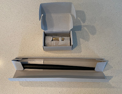
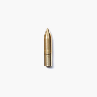
The Kakimori company has done that with the nib, creating bullet-shaped nibs in stainless steel or brass, along with a lovely design in glass that can be fitted to a pen holder. The stainless steel nib is supposed to be slightly finer than the brass nib.

They have created 4 pen holders too, and will probably add to the range. You can see all the designs on their website here.  You can also see the gorgeous ink bottles, glass pens and beautiful made-to-order notebooks. 

They ship internationally.

I've used dip pens for ever! I use them for writing and drawing, for calligraphic lettering and for masking fluid. They must be held at the correct angle to work, and can easily blob or blot if not used with care.

This new nib doesn't have a right and wrong side. Changes in the line width are created by changing the angle of the nib to the paper. The steeper the eagle, the finer the lines. Working flatter gives very broad strokes. This nib should be easier for left-handers to use too.

I think this will be a really fun nib to use for drawing, but also for applying masking fluid and even watercolours. 

The nib holders that are available are lovely, but it will also fit into some nib holders you may already have - such as the Koh-I.Noor and the Tachikawa. 

I've created a YouTube video to show the brass nib in use.

They are available from Kaimori.com in Japan or internationally, or from Larrypost or Bookbindersdesign in Australia or from StLouisArtSupply in the US.