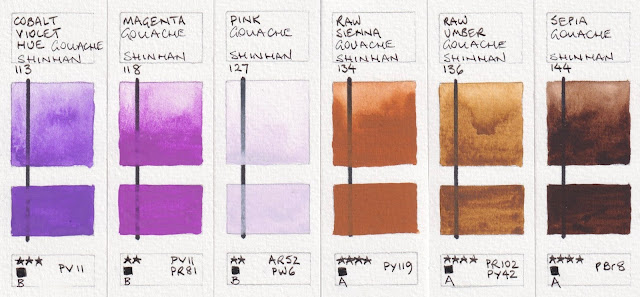
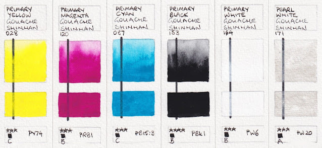
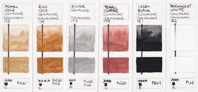
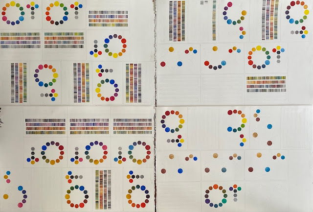
Originally published in January 2022, this post has been updated a number of times!
Happy New Year for 2022.
For my first post of the year, I'm updating a previous post of the Aquarius range. I hope to add many more posts and updates this year :-)
Roman Szmal launched Aquarius Watercolours, a honey-based range, in 2019 with 140 colours.
In 2020 this was extended to 165 full pan colours with an additional 25 colours. There was still a huge proportion of single pigment colours (all but 26) and some unique pigments for watercolours.
In 2020 this was extended to 165 full pan colours with an additional 25 colours. There was still a huge proportion of single pigment colours (all but 26) and some unique pigments for watercolours.
In 2021, another 15 colours were added to the range, bringing it up to 180.
The full range is stocked at Jacksons (affiliate link) in the UK and many other places around the world. In Australia they are available from Adamstown Art in sets or individual full pans.
The full range is stocked at Jacksons (affiliate link) in the UK and many other places around the world. In Australia they are available from Adamstown Art in sets or individual full pans.
More colours were added in 2023 and more again in 2024, however some pigments have been removed as they are not longer available. I'll show those at the end.


,%20PY151.%20Aquarius%20watercolours.jpeg)


,%20PY108.%20Aquarius%20Watercolours.jpeg)



There is a huge range of gorgeous oranges. Golden Orange is just on the yellow-orange side, a little brighter than it looks here. Transparent Pyrrol Orange and Aquarius Orange are stunning transparent mid oranges.


















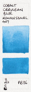
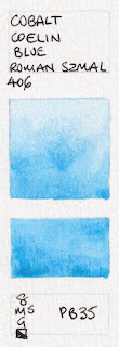

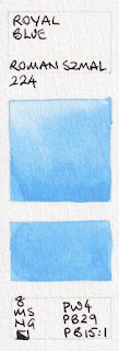
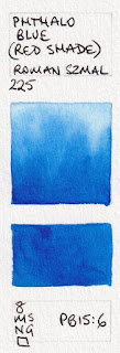


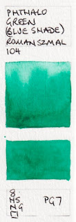
Phthalo Green (Blue Shade) is another key mixing colour. I wouldn't use it alone, but it can create a fabulous range of greens.


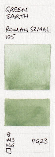

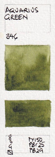
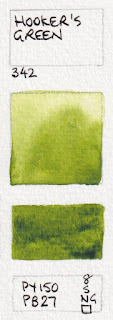
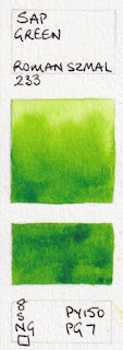

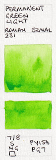
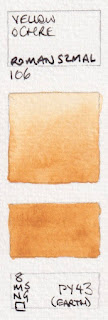
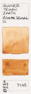
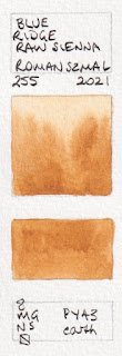



APRIL 2025 update; For my previous post I photographed the swatches, this time they are scanned. Some colours are really difficult to show accurately using either method - the yellow oranges and orange yellows, along with oranges and reds generally! So I have updated this post and colour matched each swatch individually to get them as close as I can. These are now all pretty accurate :-) The colours generally align with the latest colour chart I have, with the new 2023 and 2024 colours.
Anyone familiar with my blog will know that I love Buff Titanium and use it a lot. This is less granulating than the version I use, but still a lovely colour.

Aquarius Watercolour - Chinese White, Titanium White, Buff titanium, Nickel titanate Yellow,
Cadmium Yellow, Bismuth Yellow.
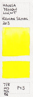
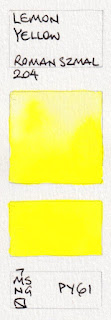
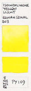
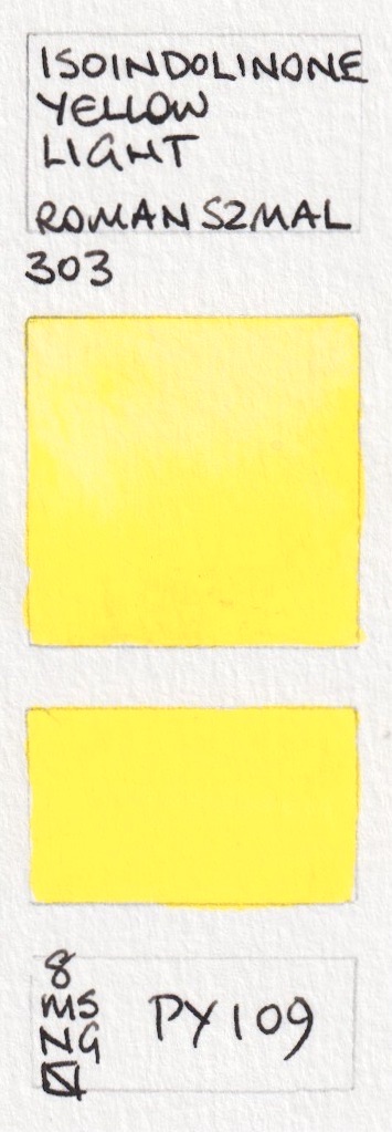
Many of these yellows are very similar, though Cadmium Lemon, Bismuth Yellow, Hansa Yellow Light and Lemon Yellow and Quinaphthalone Yellow are slightly more lemon, then Isoindolinone Yellow Light and Aquarius Yellow and are really mid yellows and Aureoline Hue has a hint of warmth. They are colour matched as closely as I can.



,%20PY151.%20Aquarius%20watercolours.jpeg)
Aquarius Watercolour - Nickel Tungsten Yellow (new 2023), Hansa Yellow Light, Lemon Yellow,
Isoindolinone Yellow Light, Aquarius Yellow, Aureoline (Hue)
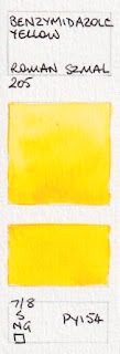
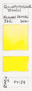
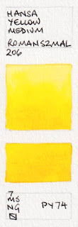
Aureoline Hue, Cadmium Yellow Pale and Benzymidazole Yellow are very similar mid primary yellows, with Hansa Yellow Medium being the brightest and sunniest by a small margin. Characteristics vary - how transparent do you want your yellow to be?


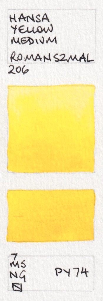
,%20PY108.%20Aquarius%20Watercolours.jpeg)
Aquarius Watercolour - Azo Yellow, Cadmium Yellow Pale, Benzymidazole Yellow, Quinaphthalone Yellow (new 2021),
Hansa Yellow Medium, Indian Yellow (Hue)
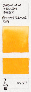
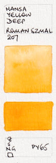
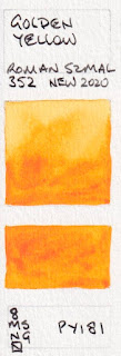
The first four are warm yellows. Hansa Yellow Deep is the easy option as a warm yellow in your palette although PY95 is also gorgeous. The others shown here are very bright and beautiful warm yellows, very difficult to capture exactly. There are a lot of interesting pigments that are not used by other manufacturers. The last two move into the yellow-orange sphere.


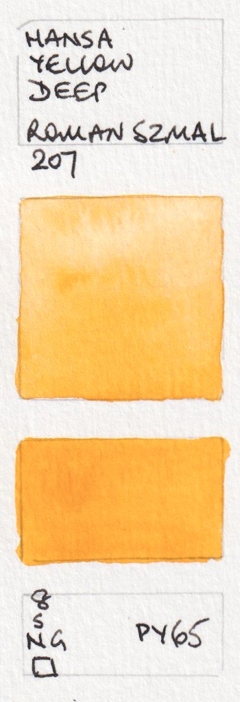


Aquarius Watercolour - Anthraquinone Yellow, Gamboge (Hue), Cadmium Yellow Deep, Hansa Yellow Deep,
Golden Yellow, Isoindolinone Yellow Deep.


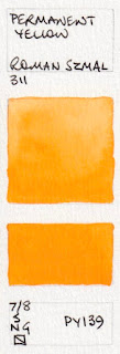
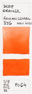
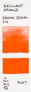
Aquarius Watercolour - Permanent Yellow, Golden Orange, Aquarius Orange, Transparent Pyrrol Orange,
Deep Orange, Brilliant Orange.
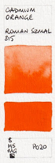
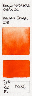
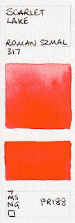
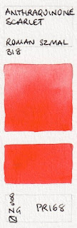
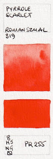
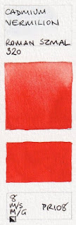
The next two oranges are attractive, if overshadowed by the new additions above, though I still like the Benzimidazole Orange. Scarlet Lake is almost identical to W&N Scarlet Lake. Scarlet Lake, Anthraquinone Scarlet and Pyrrol Scarlet are definite reds - on the warm side. I really like PR255 as a warm red option.


Aquarius Watercolour - Cadmium Orange, Benzimidazole Orange, Scarlet Lake,
Anthraquinoid Scarlet, Pyrrole Scarlet, Cadmium Vermilion
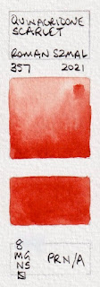
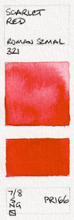
These bright mid reds lean slightly to the orange side or the crimson side and vary in transparency.


Aquarius Watercolour - Quinacridone Scarlet (new 2021), Scarlet Red, Scarlet Lake,
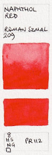
Naphthol Red, Raspberry Red (new 2023), Perylene Vermilion (new 2023).
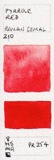
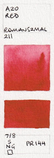
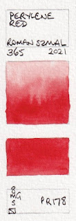
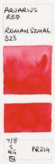
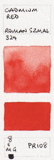
These are all mid reds to slightly crimson reds, with more or less pink. Azo Red is a rich crimson, Aquarius Red is a little brighter and Permanent Red brighter still. Cadmium Red is a duller mid red. Naphthol Red (above) and Pyrrol Red are rich mid reds - fire engine or pillar box. PR254 is my favourite for this colour. Perylene Red is just a little more crimson.

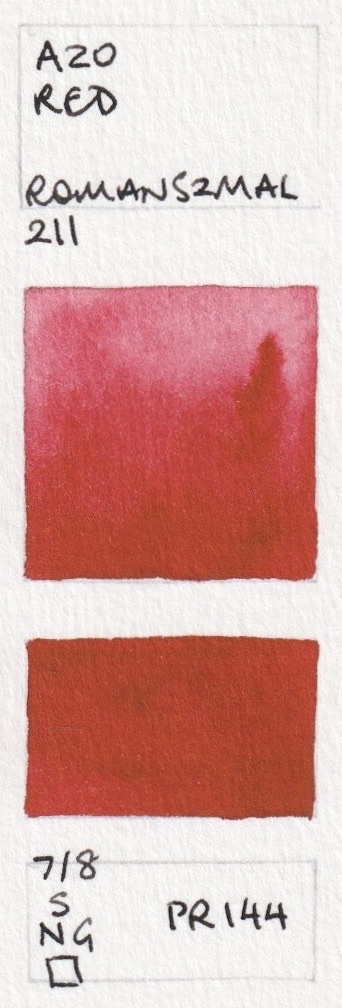


Aquarius Watercolours - Pyrrole Red, Azo Red, Permanent Red, Perylene Red (new 2021),
Aquarius Red, Cadmium Red.
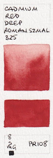
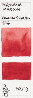
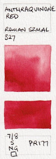
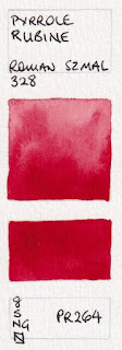
Cadmium Red Deep has the more 'purple' hue and Perylene Maroon is richer than Azo red. Pyrrole Rubine is my favourite of the crimson reds.


Aquarius WatercoloursCadmium Red Deep, Perylene Red Deep (new 2023), Carmine (Hue) (New 2024),
Perylene Maroon, Anthraquinoid Red, Pyrrole Rubine.
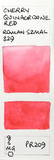
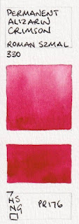
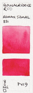
If you wanted a more primary crimson rose the PR176 is a good option. Cherry Quinacridone is a lovely coral that is difficult to replicate on screen - this photo is close. the newer Quinacridone Warm Scarlet is similar but more red. Quinacridone Red is my favourite rose and primary red colour.


Aquarius Watercolour - Cherry Quinacridone Red, Quinacridone Warm Scarlet (new 2023), Permanent Alizarin Crimson,
Quinacridone Red, Quinacridone Rose (new 2024), Quinacridone Warm Pink (new 2024).
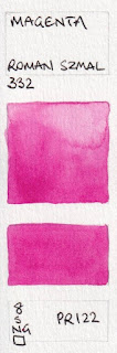
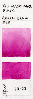
PR122 is as close as we can get to the printing Magenta colour. Quinacridone Pink is almost identical to Quinacridone Magenta, but richer. PR202 is slightly stronger but duller.


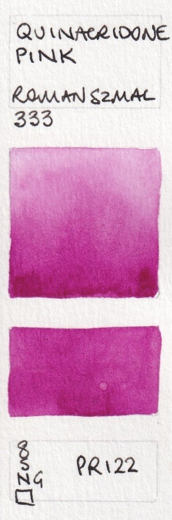


Aquarius Watercolour - Quinacridone Magenta, Quinacridone Magenta Intense (new 2024), Quinacridone Pink,
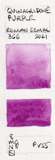
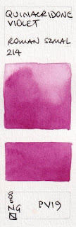
Quinacridone Fuchsia, Quinacridone Purple (new 2021), Quinacridone Violet (new 2021)
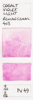
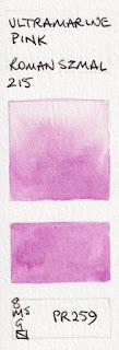
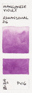
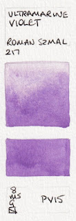
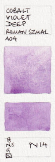
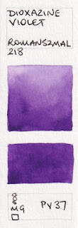
This range has so many of the gentle granulating violet pigments - PV 14, PV15, PV16, PV49 as well as the unusual PV37 (see below) instead of the more common PV23.


Aquarius Watercolour - Perylene Violet, Cobalt Violet Light, Ultramarine Pink, Manganese Violet,
Ultramarine Violet, Cobalt Violet Deep.
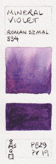
There are a number of convenience and atmospheric violets and purples here.

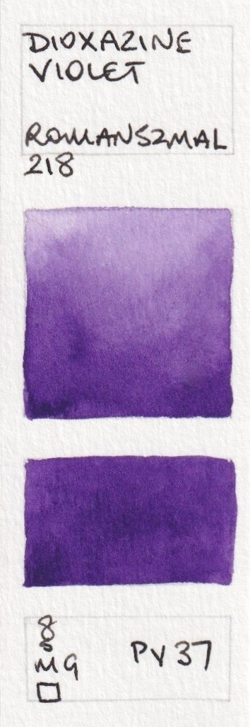


Aquarius Watercolour - Strontium Violet (new 2023), Dioxazine Violet, Mineral Pink (new 2024),
Mineral Violet, Aquarius Violet (new 2023)
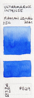
The fascinating Misty Morning as it is not made with a traditional red and blue. French Ultramarine, or the new Ultramarine Intense shown next, is my pick for this pigment.


Aquarius Watercolour - Misty Morning, Shadow Violet Light, Shadow Violet, Lavenda,
Ultramarine Light, French Ultramarine.
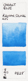
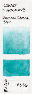
There are also many cobalt colours in the range. These are granulating and liftable and quite beautiful. I use PB36 along with Ultramarine in skies, though many use cobalt blue PB28.


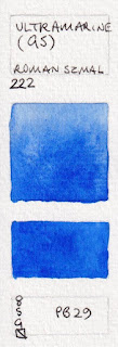
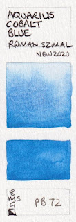
Aquarius Watercolour - Ultramarine Intense (new 2021), Ultramarine (Green Shade), Cobalt Blue Deep,
Aquarius cobalt blue, Cobalt Blue, Cobalt Cerulean Blue.


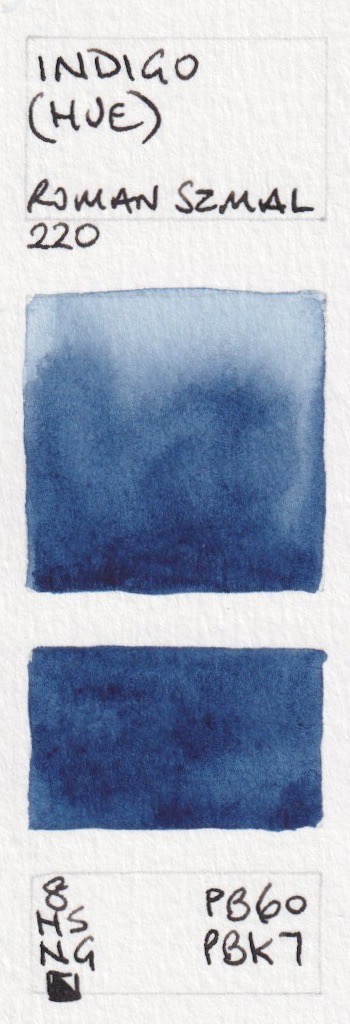
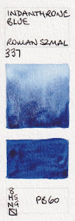
Aquarius Watercolour - Cobalt Coelin Blue, Royal Blue Light (new 2023), Royal Blue,
Phthalo Blue (Red Shade), Indanthrone blue.
Phthalo Blue GS is one of my key mixing colours.


,%20Aquarius%20Watercolour.%20PB15.3.jpeg)


,%20Aquarius%20Watercolour.%20PB15.3.jpeg)


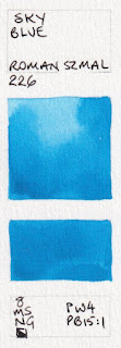
Aquarius Watercolour - Prussian Blue, Sky Blue, Phthalo Blue (Turquoise Shade) (new 2023), Phthalo Blue (Green Shade),
Ocean Blue, Indigo Greenish (new 2024)
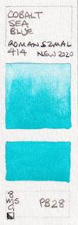
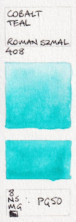
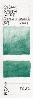
PB16 is a gorgeous pigment. Cobalt Turquoise is a lovely granulating pigment. So is the new PG26 Cobalt Green Deep added in 2021.
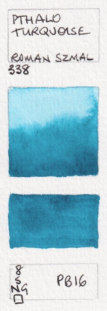


Aquarius Watercolour - Phthalo Turquoise, Cobalt Blue Light (not shown), Cobalt Sea Blue, Cobalt Teal,
Cobalt Turquoise, Cobalt Green Deep (new 2021),

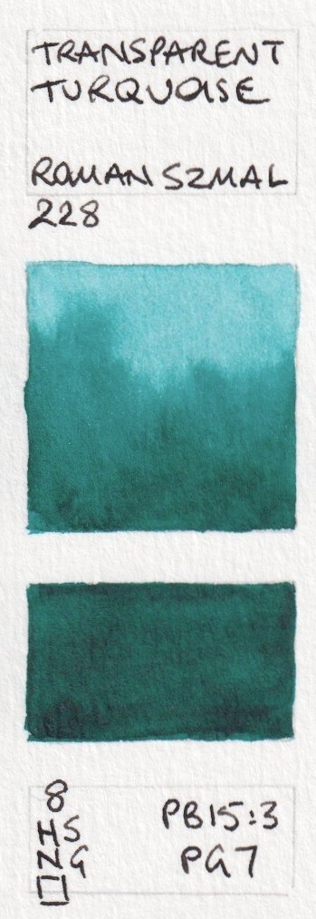


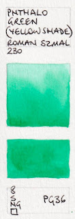
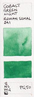
Aquarius Watercolour - Viridian, Transparent Turquoise, Phthalo Green (Blue Shade), Phthalo Green (Yellow Shade),
Cobalt Green Light, Green Earth.
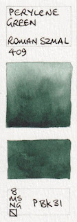
Glauconite is an historical colour. I use PBk31 all the time for shadows in foliage. Perylene Green Deep made with PBk32 is a unique addition to the range.

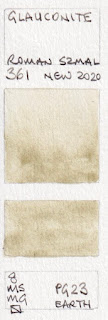
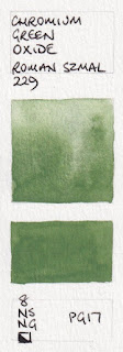
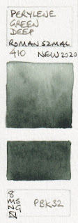


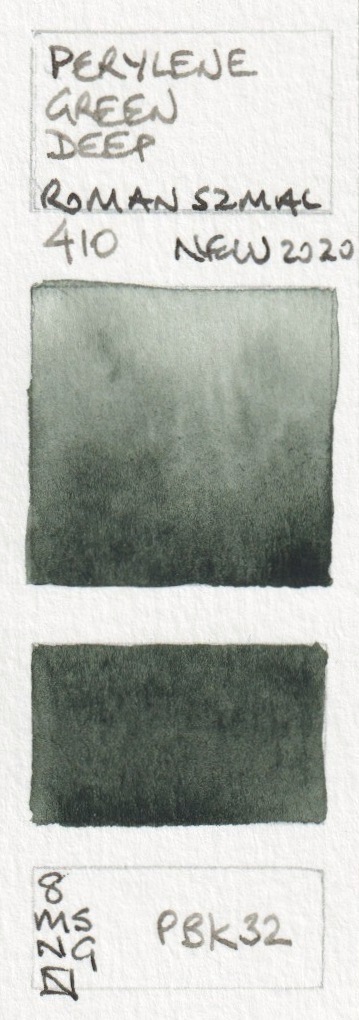
Aquarius Watercolour - German Green Earth, Glauconite, Chromium Green Oxide,
Chromium Green Oxide Dark (not shown), Perylene Green, Perylene Green Deep.
These mixed greens are mostly very useful. I particularly like the Aquarius Green and the Sap Green Light for convenient realistic landscape greens.


Aquarius Watercolour - Forest Green (new 2024), Aquarius Green, Hooker's Green, Sap Green,
Sap Green Light, Permanent Green Light,
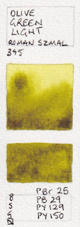
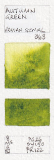
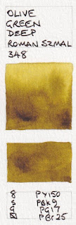
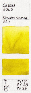
Deep Green Gold is lovely for the glow of sunlight through leaves or as an alternative to a cool or lemon yellow. Autumn Green is new 2022.

%20Aquarius%20watercolour.%20PR102,%20PY150%20(new%202021).jpeg)


,%20Aquarius%20Watercolours.%20PO82%202021.jpeg)
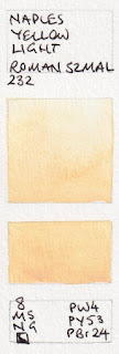


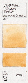
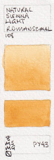
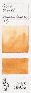
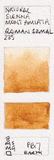
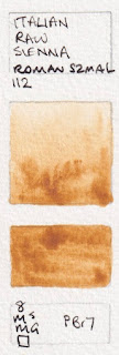
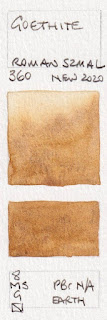
The new Blue Ridge Raw Sienna may be even nicer and richer than these as a yellow earth colour. The new Goethite granulates nicely, though not as much as the version I use.

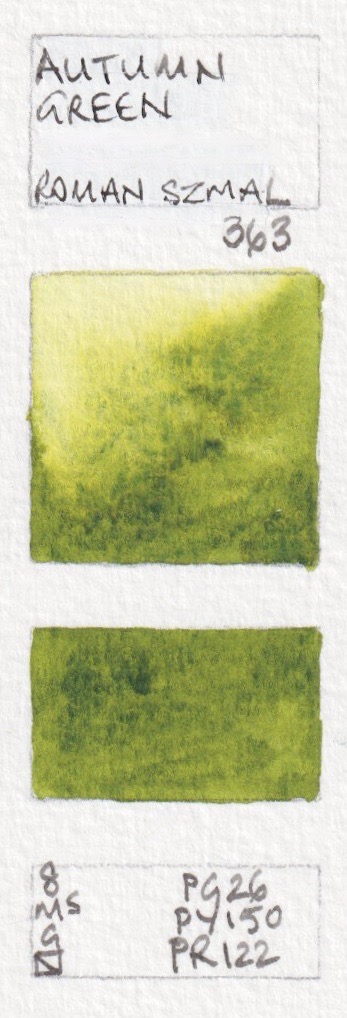


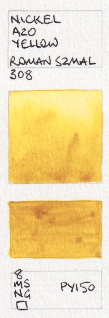
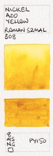
Aquarius Watercolour - Olive Green Light, Autumn Green (new 2022), Olive Green Deep,
Deep Green Gold, Green gold, Nickel Azo Yellow.
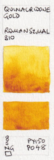
This is a lovely version of Quinacridone Gold, but will be unavailable once PO48 runs out. The new version is yellower - the colours are quite accurate.
%20Aquarius%20watercolour.%20PR102,%20PY150%20(new%202021).jpeg)


,%20Aquarius%20Watercolours.%20PO82%202021.jpeg)

Aquarius Watercolour: Quinacridone Gold Hue (2021), Quinacridone Gold (old version), Nickel Azo Gold (new 2024),
Bismuth Orange (new 2023), Chrome Orange (Hue), Naples Yellow Light.
There is a confusion of yellow earths made with PY43. Gold Ochre is the brightest of them and would be my choice, though Yellow Ochre is Transparent. These need a bit of exploring.


Aquarius Watercolour - Flesh Tint, Naples Yellow Reddish, Transparent Gold Ochre,
Venetian Yellow Earth, Natural Sienna Light, Gold Ochre.


Aquarius Watercolours - Yellow Ochre, Titanium Brown (not shown), Veronese Yellow Earth,
Blue Ridge Raw Sienna (new 2021), Natural Sienna Mont Amiata, Italian Raw Sienna,Transparent Yellow Oxide
I do like PBr24 though I've never painted with it! I rather like these earth colours, especially French Ochre and Mummy Transparent Red.

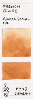
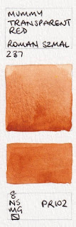
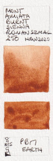
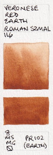
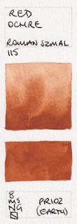
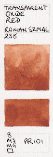
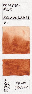
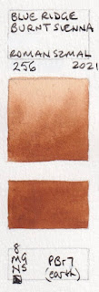










.jpeg)
.jpeg)



.jpeg)


.jpeg)
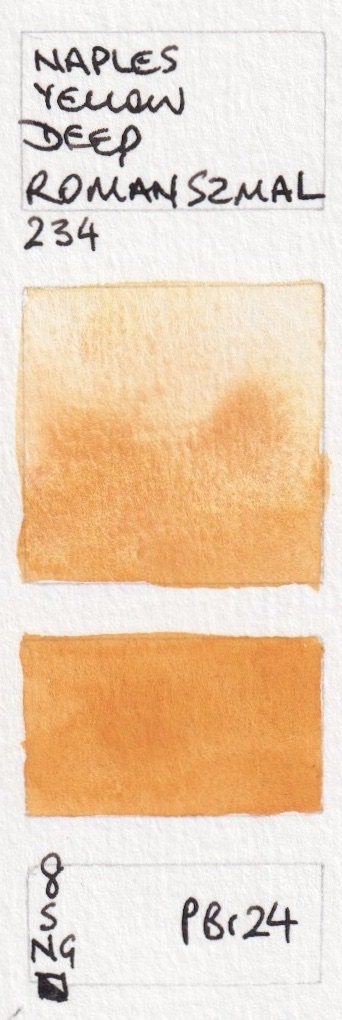


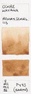
Aquarius Watercolour - Naples Yellow Deep, Ochre Havana, Goethite, French Ochre,
Mummy Transparent Red, Mont Amiata Burnt Sienna
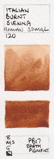
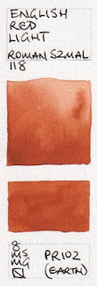
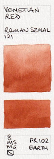
Many of these are all quite similar in hue, and any could be used as a burnt sienna colour. They differ in characteristics.


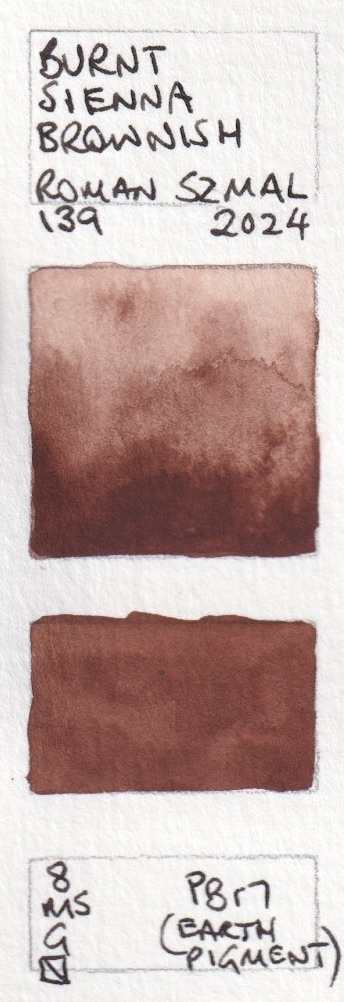
Aquarius Watercolours - Veronese Red Earth, Red Ochre, Transparent Oxide Red, Pompeii Red,
Blue Ridge Burnt Sienna (new 2021), Burnt Sienna Brownish (new 2024)
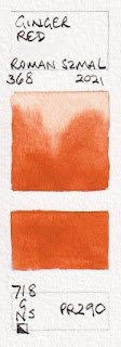
Aquarius Brown is a super granulating pigment. Ginger Red is a bright neutralised orange.


Aquarius Watercolour: Italian Burnt Sienna, Aquarius Brown, Terra Pozzuoli, English Red Light,
Venetian Red, Ginger red ( new in 2021)
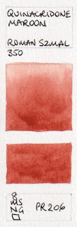
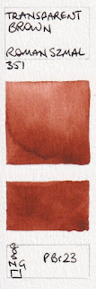
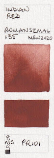
The red earth colours are quite lovely. PBr23 is a unique pigment. The new Indian Red has the pink undertone I look for in an earth red.


Aquarius Watercolour - Quinacridone Maroon, English Red Deep, Benzimidazole Brown (new 2023
Transparent Brown, Mars Red, Indian Red.


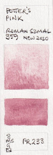
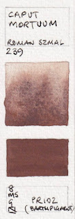
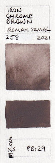
Aquarius Watercolours: Porter's Pink, Caput Mortuum, Lava (new 2024), Manganese Brown (new 2021),
Hematite (Violet Shade),Iron Chrome Brown, (new 2021)
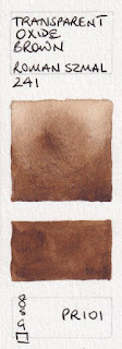
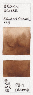
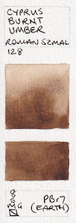
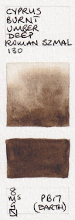
Brown Ochre or Cyprus Burnt Umber is my choice for a Burnt Umber colour. While it can be mixed as a hue using burnt sienna and ultramarine, having a warm dark brown is often useful.


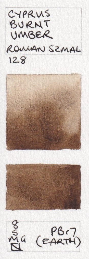
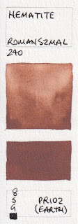
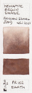
Aquarius Watercolour - Hematite, Hematite Brown Shade (new 2020), Transparent Oxide Brown, Brown Ochre,
Natural Umber Reddish (new 2023), Cyprus Burnt Umber,
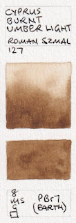
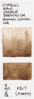
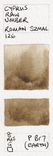
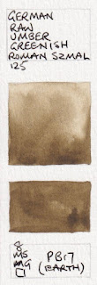
There are many raw umber variations. German Raw Umber Greenish painted out the smoothest…


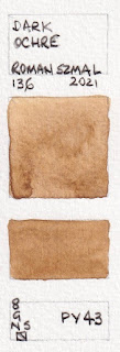
Aquarius Watercolour - Cyprus Burnt Umber Light, Cyprus Raw Umber Brownish, Dark Ochre, Cyprus Raw Umber, German Raw Umber Greenish, Cyprus Burnt Umber Deep.
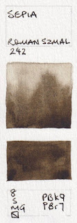
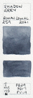
...however Cyprus Raw Umber Deep is my favourite of these cool dark browns. Shadow Grey is very close to my Jane's Grey. Urban Grey is the colour of lead pencil.
.jpeg)

.jpeg)


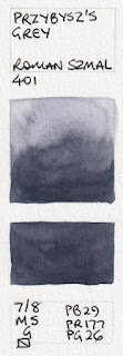
Aquarius Watercolour - Cyprus Raw Umber Deep, Sepia, Van Dyck Brown, Shadow Grey (new 2021),
Przybysz's Grey, Urban Grey (new 2024)
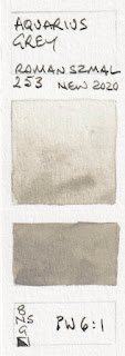
Aquarius Grey is a great addition - useful for concrete and urban sketching.

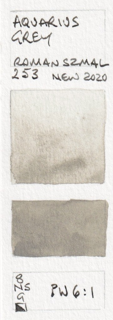


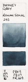
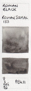
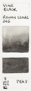
Aquarius Watercolour - Payne's Grey, Davy's Grey (new 2024), Aquarius Grey, Roman Black,
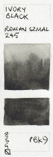
Vine Black, Ivory Black.
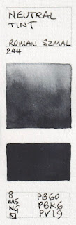
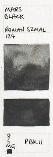
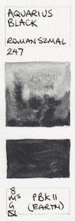
I don't tend to use black pigments - with the exception of PBk31 (Perylene Green) and PBk11 - here seen in Aquarius Black - for its amazing granulation. I do use mixed blacks, and especially like the combination used in Velvet Black. I've created a version of this - Jane's Black (red/green) for years.


.jpeg)


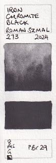
Aquarius Watercolour: Neutral Tint, Velvet Black (new 2023), Graphite (new 2023), Mars Black,
Aquarius Black, Iron Chromite Black (new 2024)
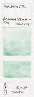
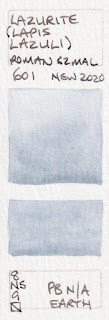
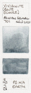
These are the mineral colours available.
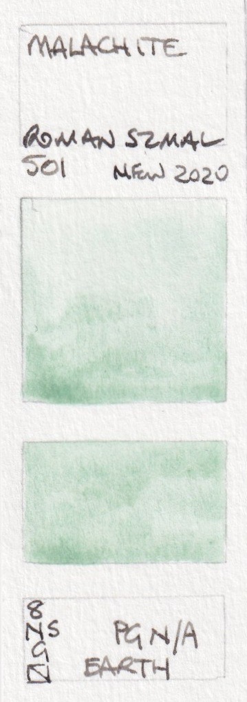


Aquarius Watercolour: Malachite, Lazurite (Lapis Lazuli), Vivianite (Blue Ochre) and Lapis Lazuli (Afghan)
Discontinued colours: these pigments are no longer available.


.jpeg)
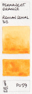
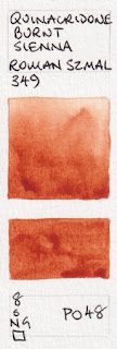
Aquarius Watercolour - Permanent Orange, Quinacridone Burnt Sienna,
Pyrrol Orange, Lapis Lazuli (limited edition 2023)
.
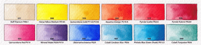
While my preference is for paints made without honey, I was asked to suggest a 24 colour set of Aquarius colours. It is daunting to come up with a set when faced with such a huge choice, but here is my suggested set.
- Buff Titanium
- Hansa Yellow Medium
- Quinacridone Gold
- Aquarius Orange
- Pyrrol Scarlet
- Pyrrol Rubine
- Quinacridone Red
- Mineral Violet
- Ultramarine Intense
- Cobalt Cerulean Blue
- Phthelo Blue (Green Shade)
- Cobalt Turquoise
- Phthalo Green (Blue Shade)
- Perylene Green
- Aquarius Green
- Sap Green Light (or Autumn Green or Hooker's Green)
- Gold Ochre
- Goethite
- Mummy Transparent Red
- Blue Ridge Burnt Sienna
- Indian red
- Cyprus Burnt Umber
- Cyprus Raw Umber Deep
- Shadow Grey.
Here they are painted out. This is a really lovely balanced palette for any subject, with the convenience of an orange and a purple, along with a great range of earth tones and realistic mixed greens.


Some colours are available in half pans, and tubes are in progress.
Here is the newest little mini set for Urban Sketching.
It comes in a range of colours. It contains 8 half pans and you can choose the extra four colours. Many larger metal boxes with full pans are available, along with a great range of brushes.Happy Painting.