Saturday, 12 December 2015

Daniel Smith artist palette dot cards - Joseph

An artist's colour and palette choice is a very individual thing and the subjects an artist chooses to paint can have a huge impact on the choice of colours used. Conversely, the pigments included in the palette can limit or open up subject possibilities. One of the fascinating things I always love to see is another artist's palette. I always enjoy analysing what any set of colours will be able to do.

As well as the fabulous sets of dot cards of their watercolour range, which make it possible to try a colour before buying a whole tube, Daniel Smith have made dot cards of a number of artists' chosen palette colours. It's a great tool for us to have when running workshops but it's also a great way for others to try new colours.

I have collected a number of Daniel Smith Artist palette dot cards over the years, and found some more doing internet searches and with a bit of help from a few friends. There are about 20 of them, and they include in total about 125 colours from the Daniel Smith range! Isn't it fantastic that we all like such different paints :-)

I decided to paint a swatch of each of the colours used in one of my sketchbooks. As it's not always possible to get hold of each of these cards I thought I'd share a scan of each of those I can find here, with a paint-out so the colours can be seen. I'm also including, where possible, the information printed on the back of the cards which has each artist's website so you can see what magic they weave with their chosen palette.

The most commonly included colour is, not surprisingly, Ultramarine/French Ultramarine - such a wonderful basic blue for watercolour or any medium. Second is Cobalt Teal blue, third is Cobalt blue, which many artists have along with Ultramarine.


Keep in mind, palettes also evolve and change over time, so any choices made may not remain constant for ever. Artists may also use extra colours beyond the basic palette colours for particular purposes. Furthermore, some colours that look similar as a 'dot' of paint have different characteristics - transparent/opaque/granulating and so on and not every colour from the palette will be used in every painting :-)

More of these to come.

You can see Joseph's website here


Friday, 11 December 2015

Agapanthus


Agapanthus, pen and watercolour.


These are some more studies from my large studio sketch book. The purple one below was painted in 2008 - the first painting in the book. The white agapanthus was from last week - the only white one we had in the garden.

I am enjoying using more pen again these days, which worked well with the white flowers since this isn't a book for washed in backgrounds.

One of the reasons I love painting flowers is that I can work from life - unlike when painting birds. Another reason, of course, is that they are just beautiful.

Agapanthus, watercolour.

Thursday, 10 December 2015

Seed pod study

'Seed Pods' etching 1987
Many (almost 30!) years ago  - I did a copper etching of some seed pods. It was etched in a very gentle Dutch Mordant, which allows exquisite detail. It's one of my favourite etchings.

Yesterday one of my students gave me a branch full of these seed pods. I am still fascinated by these complex though rather dull and ugly subjects.


I decided to do a life-sized study in a gorgeous leather-bound book I keep specially for studio work. It's lovely Italian paper that is great for pen and careful watercolour rather than large washes - perfect for botanicals.


Starting with a very light pencil line to get the proportions correct, I then switched to my Sailor 1911 - a lovely pen for super fine detail - and drew the whole plant.

I then used watercolour to finish it off.

Tuesday, 8 December 2015

Another Daniel Smith 5ml set - Alvaro Castagnet.

Another Daniel Smith 5ml set has recently been released, including a new colour - Burnt Sienna Light. Here's the link 
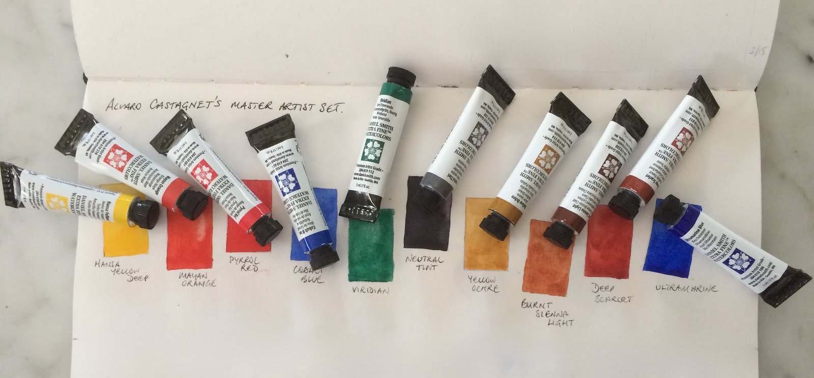

I am always fascinated by the different colours artists choose, and have painted out many palette choices in my sketchbook from the wonderful artist dot cards that Daniel Smith have produced.

Alvaro paints with passion and adores reds. The interesting thing for me is that this set doesn't include a 'warm and cool' of each colour but rather a 'warm and neutral' of each colour. Hansa Yellow Deep is a warm yellow, Yellow Ochre as a great neutralised warm yellow. Mayan Orange as a warm orange-red, Burnt Sienna Light as the neutralised orange. Pyrrol Red is a bright red, Deep scarlet is a neutralised warm red.

Then there is the lovely pair of a mid and a warm blue - Cobalt Blue and Ultramarine Blue. Neutral Tint and Viridian (a granulating and liftable pigment similar in hue to phthalo green) complete the set of 10 colours. There are no cool yellows, reds or even blues.

The new colour, Burnt Sienna Light, is made from PR101 + P048 so provides a more orange and less earthy burnt sienna hue than the regular Burnt Sienna PBr7. I imagine it will be particularly welcome for those switching to Daniel Smith from other brands.

I had a bit of a play when I first heard about the new colour (new colours are such fun!) mixing Quinacridone Burnt Orange and Transparent Red Oxide to create what I expected would be the new colour. (see the top row) I love the wild granulation of Transparent Red Oxide (top right) PR101.

I then added the W&N Burnt Sienna PR101, then below left is the regular Burnt Sienna PBr7 that I love.

The new Burnt Sienna Light arrived today and is shown below right. It is nicely granulating. I'll play with it some more soon :-)
Some of the colours are only available in 5ml tubes if you buy this set, though you can still get them in 15ml tubes. Burnt Sienna Light is exclusive to this set but I hope to see it extended in to the 15ml range.


Sunday, 22 November 2015

Daniel Smith 'try it' dot cards for watercolour

I have been cleaning up my studio, and I found a number of dot cards that I had filed away to play with some time. These are a terrific way to try new colours and I really appreciate the companies that make them. Daniel Smith were the first, and they make a fabulous series of four sheets with 238 of their colours to try. These have been invaluable for deciding which colours to buy in full tubes. Colour charts and websites are great, but nothing beats getting a brush to the paint yourself.

I have used up a few of these sets to create the watercolour swatches found on my website, to test colour mixes and just to play :-) but with this one I painted the colours out on the chart. It can be very helpful to compare the colours side by side like this.


Daniel Smith have also created dot cards of the Primateks, a number of individual artists' palettes and other sets over the years. I've painted them out and I thought I'd post a few here as it can be hard to track them down if you are interested in finding them.

Winsor & Newton created a dot card of a few limited edition colours and QoR created a few for their watercolour launch, which I wrote about here.


Tuesday, 17 November 2015

Brush Pens

I have had a Pentel brush pen for decades. They come with ink cartridges that are pretty much waterproof when dry and the tip lasts remarkably well. As I have been doing more and more sketching with pen rather than with pencil, I have been using a brush pen more often - as you can see in this sketch done at the Coal Loader in September. This has led me to want to try some others. There are loads of disposable brush pens available but I always prefer refillable pens where possible.


Parka did a comprehensive review of a number of disposable and refillable brush pens here with links to individual pen reviews. I am only looking at the refillable Pentel Pocket Brush Pen, the Kuretake No 13 Fountain Brush pen and the Kuretake No 40 and Platinum natural weasel hair brush pens. They are quite different in price and as always you get what you pay for, but the Pentel is a good entry level refillable brush pen.

The Pentel costs US$13.50 at Jetpens.com. It is also available from Kinokuniya in many cities. It is a synthetic hair tip, with a pretty fine point. You can also lay down some hefty broad strokes. That's what I used for the sketch above.

Kuretake No13 brush pen


The Kuretake No 13 Fountain Brush Pen is available in a black or red body for US$28 from Jetpens. It is a little more expensive than the Pentel and a little more 'classy' to look at. The brush nib is also finer so it creates a lovely delicate line.


The ink that comes with it is not waterproof. It can be fitted with a Platinum converter but I haven't yet explored other inks in this pen. Non-waterproof inks can be interesting to explore for special effects :-)


The Platinum natural weasel hair brush pen is available from Goulet pens for US$64. Since it is a Platinum pen, I have loaded it up with Platinum Carbon Ink in a cartridge and so far it is flowing very nicely.

It comes in a presentation box, and interestingly is fitted with a cartridge with a clear fluid in it when it arrives, I suppose so the hair doesn't dry out in storage.

Platinum Natural Weasel brush pen.


It's tip is exquisite. It is finer in diameter than the Pentel or Kuretake pens, and will make the most gorgeous delicate lines. It looks heavier than it is - it is 18gms, just a little more than a Lamy Joy pen, but the kuretake No 13 is only 11gms.

The only disconcerting aspect is that while the cap does close snugly, it doesn't 'click' or screw into place. It is available in black, blue or red marbled colours.


If you are interested in genuine hair brushes without quite such a hefty price tag, there are also Kuretake sable hair fountain brush pens available from Jetpens for US$36 for the No 40 and US$46 for the fancier looking No 50.

This is the #40 version and is 16gms. The tip is very similar to the Kuretake No 13 above and a little wider in diameter than the delicate Platinum. The cap posts firmly and closes with a satisfying 'click'. It has a dull finish with a nice feel in the hand.

Much as I love the fine Platinum brush tip, based on price, weight and closure, this is the natural weasel brush pen I would recommend, though I have not tried it with either the Platinum Carbon ink or De Atramentis ink. If anyone has, I would welcome your feedback :-) The ink that is supplied with it is not waterproof.
Kuretake No 40 natural weasel brush pen


I haven't tested the De Atramentis inks that I like so much in any of these brush pens - I don't know if it might be too hard on the hairs. Hopefully the carbon ink will be fine. I intend to try a water-soluble brown or grey ink in the Kuretake pen once I use up the black ink cartridge that came with it.


Mission Gold watercolours

I have continued to test various brands of watercolours and add all the samples to my website here so you can compare them side by side.

Some of the latest I have tried are Mission Gold watercolours from Korea, which were launched a few years ago. They are made by Mijello, who have also created some very innovative palettes. Initially they had a number of fugitive pigments and have reformulated many of their colours. They now have a range of 105 colours, some of which are lovely, but you would have to pick and choose what you might try and read not only the colour name but also the pigment numbers as otherwise you'll get a number of surprises!

Take Burnt Sienna for example. This should be made from PBr7 - though often the transparent PR101 is used - and should be a neutral orange that is useful alone or mixed with Ultramarine to make a huge range of hues, including great greys and deep warm browns.

Mission Gold Burnt Sienna looks like a deep Quinacridone Gold hue - there's no way this would make greys with Ultramarine! It is made from PBr25, PR112 and PY150 - all perfectly good pigments but not burnt sienna PB7. Why? No idea. It's a lovely colour but it isn't Burnt Sienna.

On the other hand - Prussian Blue, also picture left, is exactly what you'd expect - a cool, slightly neutralised blue, made from PB27.


I scanned these in a fairly random order, but you can see Permanent Red (PR112), Permanent Yellow Deep (PY65), Prussian Green (PB27 + PG7), Crimson Lake (PR202), Cobalt Blue #2 (PB28) - this is Genuine cobalt blue, Cobalt Blue #1 (PB29 +PB15:3) - this is a hue that doesn't resemble cobalt blue in any way. Why? Once again, it's not helpful.

Then there are two versions of Ultramarine: Ultramarine Light which is a regular PB29, and a slightly warmer version with PV15 added called Ultramarine Deep. They are not different enough to need both though I prefered the single pigment version.


I've also tried the Lemon Yellow PY3, Vermilion PR112 + PO73, Permanent Magenta PR122 and these all painted out beautifully. The last of this set, Cerulean Blue PB15:3 is a standard phthalo blue and should be called Phthalo Blue - it's nothing like a Cerulean.


Permanent Red Deep is a gorgeous deep red - almost a crimson - that also painted out beautifully.

Looking at the colour chart, there are very few earth colours that are not a mixture of pigments. Once again I don't understand this. Earth pigments are wonderful and not expensive - why fiddle with them?

What I found interesting though is that these paints claim to have a small drying shift, and they do dry very bright. It makes me wonder exactly what binder is being used as there is normally quite a large drying shift in watercolours.

Update April 2016 - I now have samples of all the 105 colours so will update this blog here and my website soon.


See more watercolour ranges here:

Art Spectrum watercolours here
Blockx full range of Watercolours here
Daler Rowney Artists' Watercolours here
Daniel Smith new colours 2017 here
Daniel Smith full range here
Da Vinci range here
Dr PH Hydrus Watercolours here
Lukas watercolours here
M.Graham watercolours here
MaimeriBlu full range here
Mission Blue full range here
Old Holland full range here
QoR watercolours here
Rembrandt Watercolours here
Schmincke new colours 2017 here
Schmincke full range here
Sennelier watercolours here
St Petersburg Watercolours here
Wallace Seymour Artists Watercolours here
White Nights watercolours here
Winsor & Newton Full range here

Only Holbein to go...