Kremer Pigmente has been providing a huge range of pigments for many purposes since 1977. They
stock pigments, ready-made colours, mediums, binders, glues, gold and guilding materials and many more. I visited a store in New York many years ago but they were out of stock of the colours I was most interested in trying. I was delighted to be contacted to try out some of their hand-made watercolour sets.
There are 132 individual watercolours shown on the website, including a number of Iriodin glitter and pearl colours, and a number of boxed sets including an Earth set, a Pearl Luster set, an Illumination set, a gold Retouching set and other interesting options.
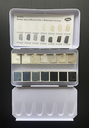
The sets are in black metal palettes with the Kremer logo. They have 14 colours. The first I'll show here is the Watercolour Set Gray. Originally designed for retouching photos, artists have enjoyed this set too. It includes single pigment blacks and whites but also a number of mixes - all the greys - which is unusual as most Kremer watercolours are made with a single pigment. The warm greys are mixtures of Zinc White and Raw Umber and the cool greys are mixtures of either Zinc White and Furnace Black or Kremer White and Furnace Black.
One side of the enclosed card has the hand-painted colour swatches and numbers and the other has the numbers with the pigment information.
Since I don't often work with black and white pigments, I find this an intriguing set, and will eventually test it out on toned paper, working with limited number of paints for each study.
The colours are as follows.
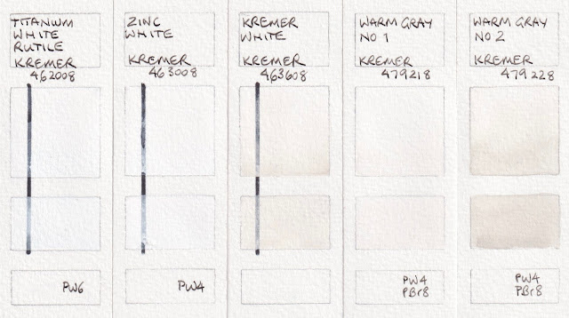 |
Kremer Watercolours: Titanium White Rutile, Zinc White,
Kremer White (pigment is PW12 - Zirconium white, C.I. 77995), Warm Grey No 1, Warm Grey No 2. |
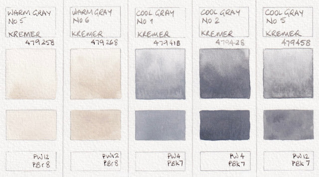 |
Kremer Watercolours: Warm Grey No 5, Warm Grey No 6, Cool Gray No 1,
Cool Grey No 2, Cool Gray No 5. |
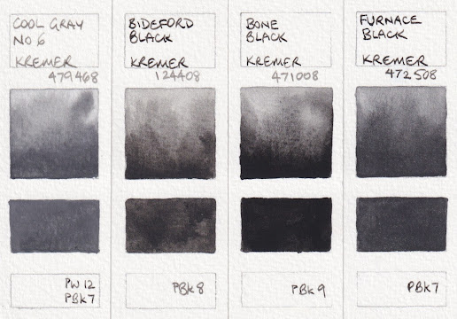 |
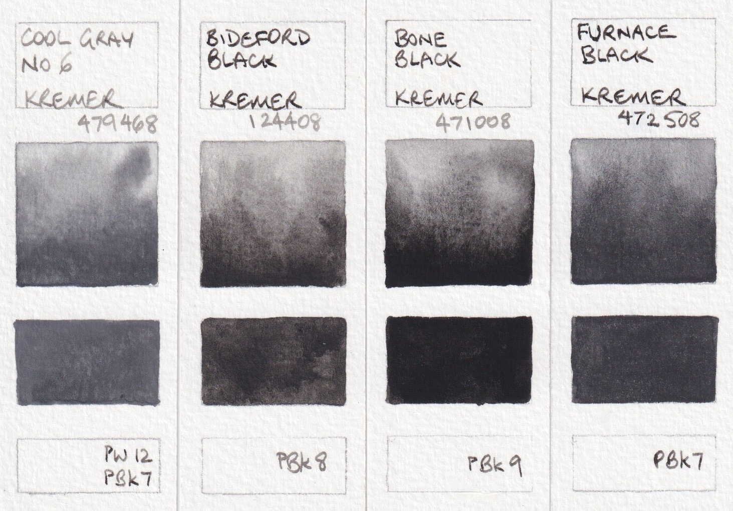
Kremer Watercolours: Cool Gray No 6, Bideford Black,
Bone Black, Furnace Black. |
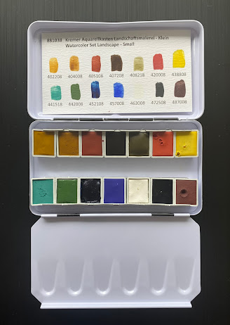
Watercolour landscape Set - Small, contains 14 half pans of a really interesting range of colours. It was inspired by the palette of the 19th Century landscape paintings. I'll add more detail about each colour, thanks to information from Eva from Kremer, below.
Due to the pigments choices, it is not a general purpose set as there isn't a bright cool red, so it isn't possible to make bright purples, however they are not usually needed in a landscape set. It would also work well for Urban Sketching. See image below.
The colours are a little less bright and many are more opaque than the modern colours I'd normally use so it would be an interesting set to use on toned paper.
Italian Gold Ochre Light, Raw Sienna, Venetian Red, Burnt Umber and Green Earth from Verona are all earth pigments. 'Natural earths have a larger particle size than synthetic pigments and every earth colour is an individual mix of natural minerals. Hiding power (opacity) and tinting strength can very depending on the type of earth and its composition. Raw Sienna and green earths are typically transparent pigments, while burnt umber can have more hiding power, though it will never be as opaque as synthetic iron oxide'. (See Caput Mortuum below.)
Italian Gold Ochre Light is a lovely yellow ochre colour and painted out beautifully. Raw Sienna was a little more difficult to get smooth - interesting that these are both PY43. I'd have to explore how they mix as I often use a PBr7 Raw Sienna for a glow in the sky. Venetian Red is more pink than usual, almost like a more gentle and more transparent Indian red.
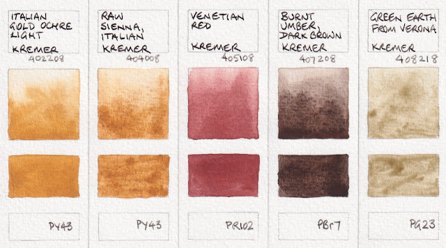 |
Kremer Watercolours: Italian Gold Ochre Light, Raw Sienna Italian, Venetian Red,
Burnt Umber Dark Brown, Green Earth from Verona. |
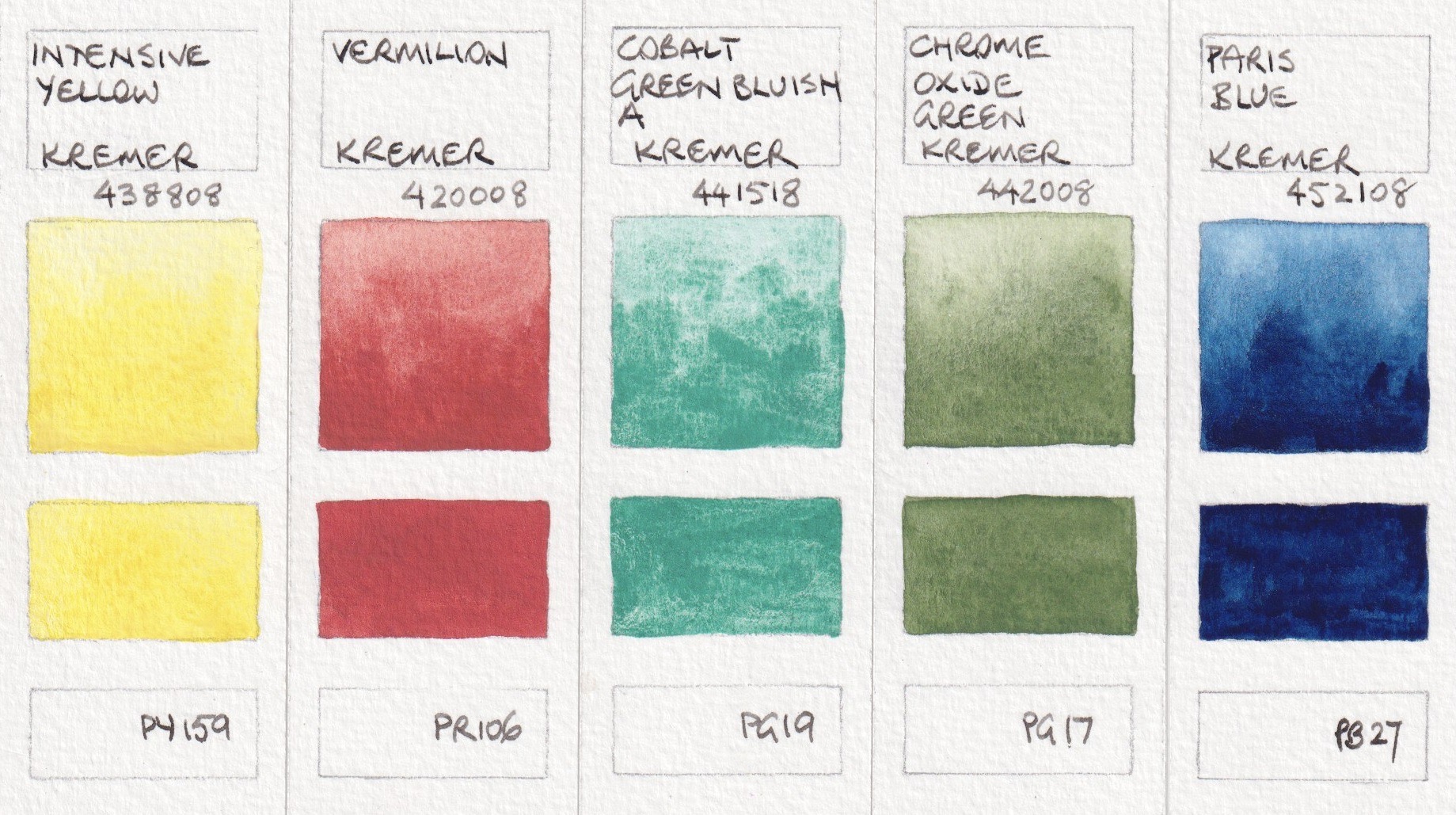
The set was originally created using only the pigments that were typical of the 19th century, but with the restriction on chromate pigments, barium chromate has been replaced with Intensive Yellow (PY159). Intensive yellow is an 'inorganic zirconium-praseodymium-silicate, which is inert and non-toxic'.
The red in the set is Vermillion (PR106). 'Synthetic mercury sulphide was produced since the 8th century and has been the only permanent and intense red until the first alternatives came up in the 19th Century. It is a very heavy pigment with strong hiding power. Typical for vermilion (and natural cinnabar) the colour of this pigment depends on the particle size. Finer particles are more orange-red, which later ones are darker. The earlier settling of the larger, darker particles can also be observed ed in this paint during use.'
The yellow and red are a little more dull than in most modern sets and would suit landscape painting.
The greens would mix with the three yellows to create a range of useful foliage greens. Cobalt Blue and Cobalt Green pigments were discovered in the early 18th century. Both the Cobalt Green Bluish and the Cobalt Dark Blue have a strong tendency to granulate in watercolours.
'Chrome Oxide Green was also discovered in the 19th Century but has not lost its importance ever since. This pigment is very fine and has excellent hidden power, but its slightly broken green shade makes it ideal for depicting nature and landscapes.'
Paris Blue, often knows as Prussian Blue, Milori Blue or Berlin Blue, was discovered early in the 18th Century. It was 'one of the first pigments produced industrially and it did not lose its importance throughout the 19th Century.' Is a very dark intense blue pigment that gets greener if used in glazes. 'Paris Blue was used traditionally in mixtures with yellow ochres, iron orchids or chromate yellows to achieve green shades. It is not recommended to mix it with white pigments as these can cause it to fade.' It is a deeper cool blue than phthalo blue. It is also less staining so a bit more forgiving than phthalo blue.
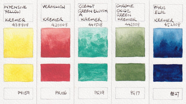 |
Kremer Watercolours: Intensive Yellow, Vermilion, Cobalt Green Bluish A,
Chrome Oxide Green, Paris Blue |
It is unusual to see a Cobalt Dark Blue rather than Ultramarine (discovered around 1826) in a curated set. It's a lovely warm blue colour, but an expensive pigment. As mentioned, Cobalt Blues and Greens were discovered in the early 18th Century.
Zinc White is included in this set instead of the toxic lean white that was in use until the last 18th Century. It is a semi-transparent pigment to it is more suitable for mixing then the opaque and dominant titanium White.
Furnace Black or Lamp Black is a very fine pigment with high tinting strength that can be used for transparent glazes as well as more opaque layers. Lamp black mixes well with other colours too.
| Caput Mortuum 'is a synthetic red iron oxide with a typical grey-ish violet hue. It is the only synthetic iron oxide that has been produced and used even before the 19th Century. This pigment is courser and more brownish than other synthetic iron oxides and this gives interesting granulation effects in watercolours. Caput Mortuum can be used to depict rocks, bark or shadows. It can be used to darken other colours or mix brown greys.' It can also be used with Cobalt Dark Blue and Italian Red Ochre Light for an earth triad. |
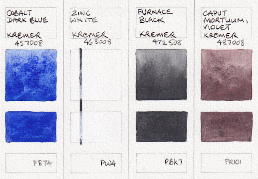 |
Kremer Watercolours: Cobalt Dark Blue, Zinc White,
Furnace Black, Caput Mortuum Violet.
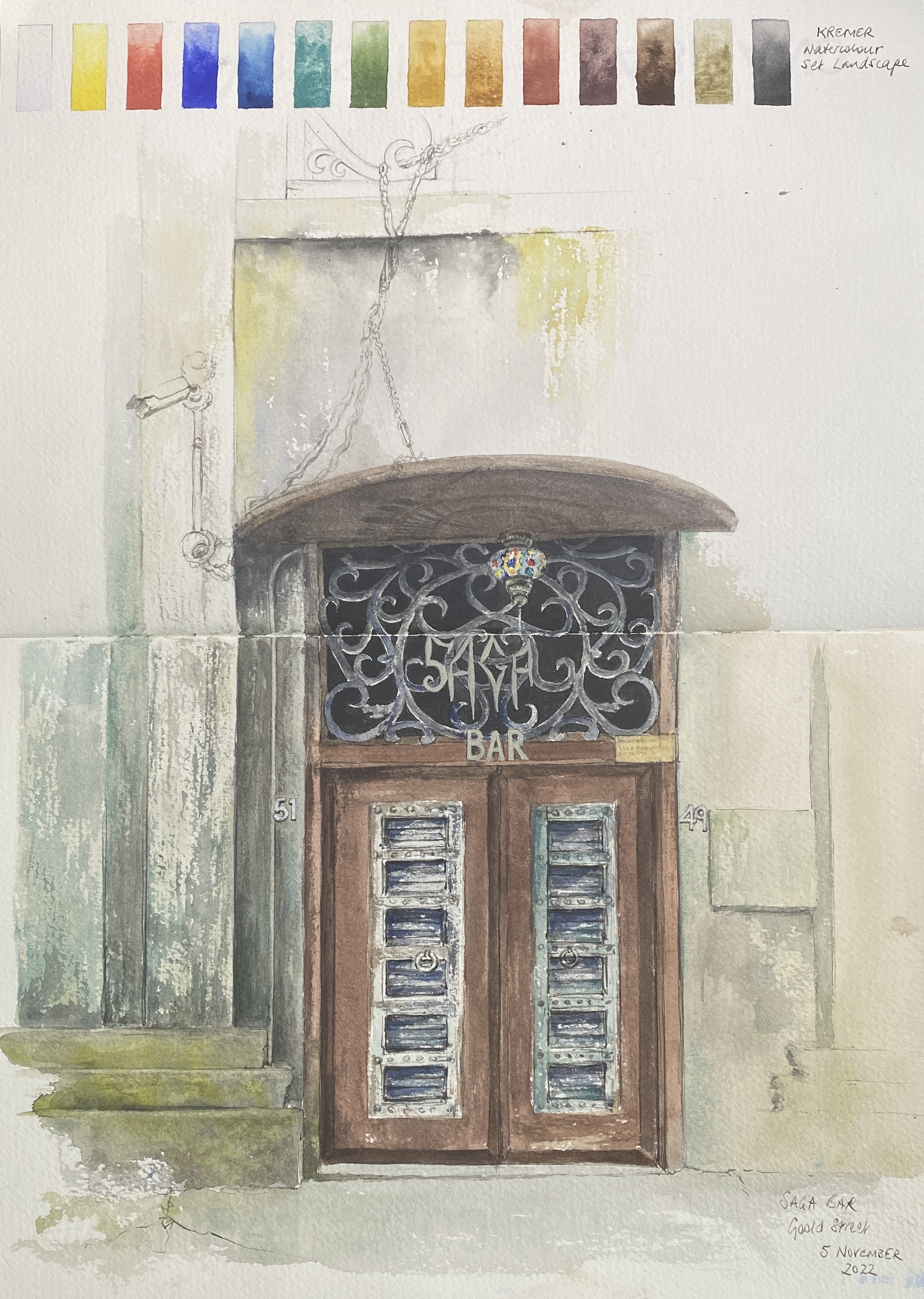
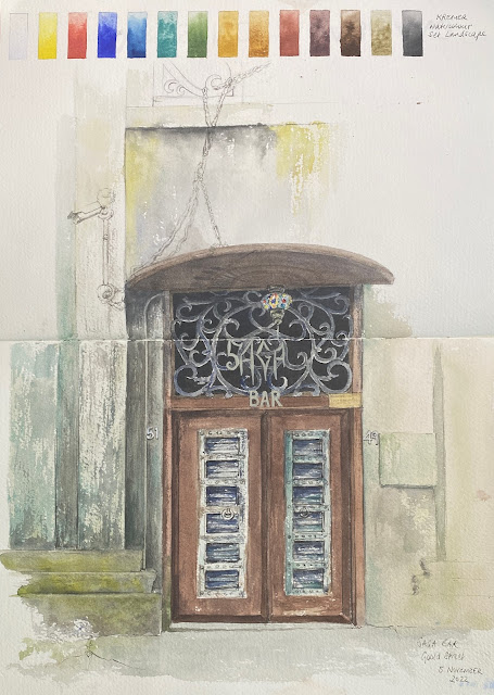 | The Saga Bar, Chippendale, using the Kremer Landscape Set.
|
Here is a sketch of a fascinating doorway using just the Landscape Set. It was started on location, where I took this palette to see what it would be like to work with more opaque colours and without my usual modern pigments. It was finished in the studio to work with all that detail.
|
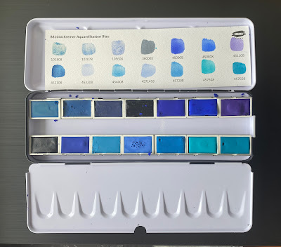
The third set is Watercolour Set Blue - 14 full pans of blues, including some rare and special colours.
PB30 is not a pigment number I remember seeing before, but azurite my not always be given a pigment number. It's a very granulating blue to slightly greenish blue. The two versions are quite different. Lapis Lazuli is a very expensive pigment that varies a lot from manufacturer to manufacturer. This is areasonably rich version, though not as rich as the lovely Ultramarine Very Dark. Genuine Indigo (Natural Blue) is not considered lightfast, but it is always great to see the real pigment, even if you only use it in a sketchbook.
 |
Kremer Watercolours: Blue Verditer, Asurite MP Sky-Blue Light, Lapis Lazuli from Chile,
Indigo Indian Genuine, Ultramarine Blue Very Dark.
|
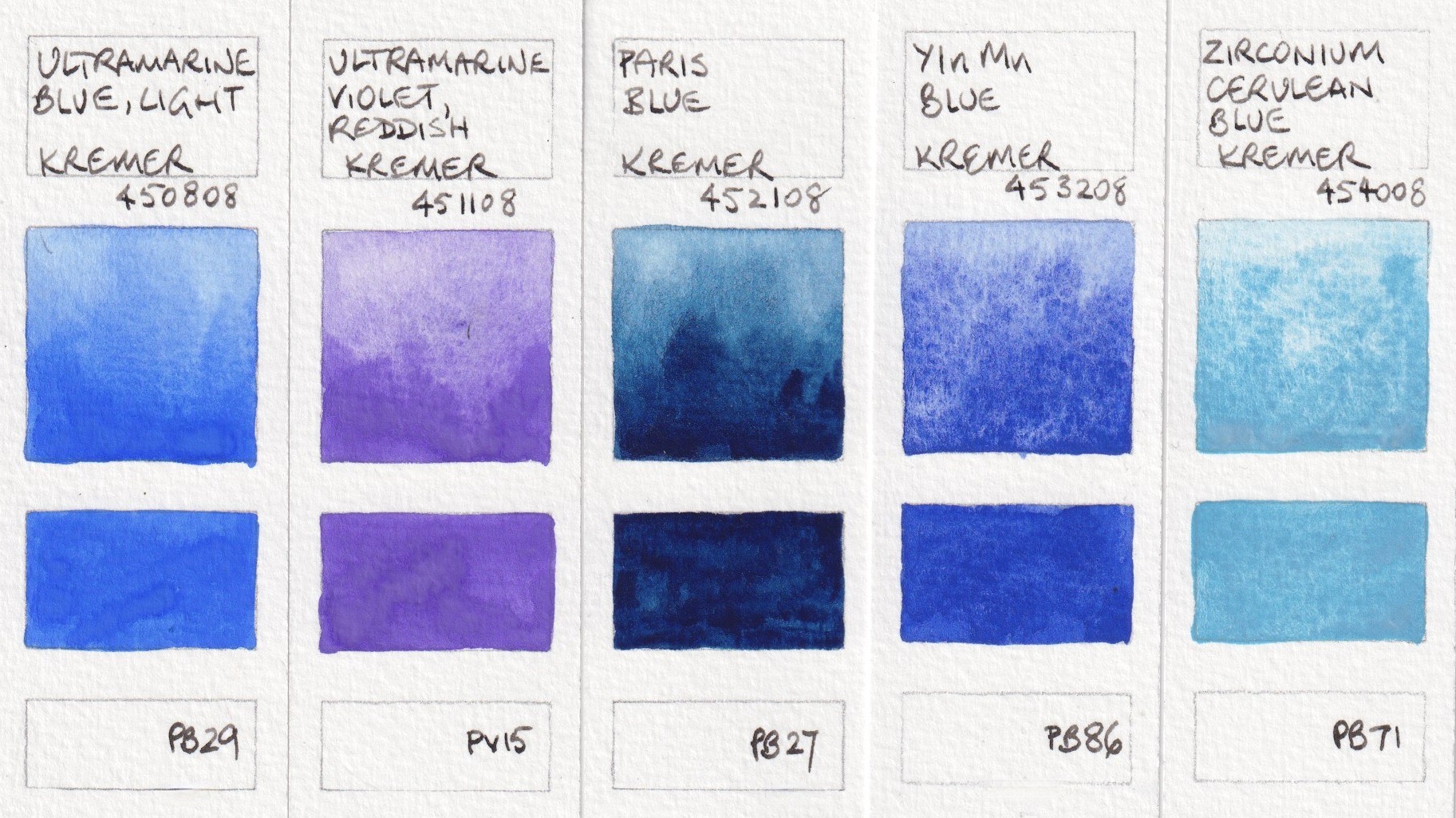
YInMn Blue is another rare colour. This pigment was discovered in 2009 and I've written about it
here. This is a lovely version - a little warmer than ultramarine. Zirconium is another rare colour in the watercolour world. It bronzes if used too thick, but has amazing granulation.
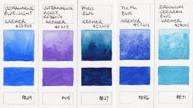 |
Kremer Watercolours: Ultramarine Blue Light, Ultramarine Violet Reddish, Paris Blue,
YInMn Blue, Zirconium Cerulean Blue |
These are all cobalt colours made with PB28 or PB36. Gorgeous and granulating, they are lovely to explore.
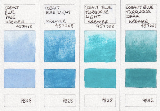 |
Kremer Watercolours: Cobalt Blue Pale, Cobalt Blue Light,
Cobalt Blue Turquoise Light, Cobalt Blue Turquoise Dark.
|
I also received samples of Yellow, Greenish (PY129), which is a synthetic-organic azo-pigment. I find PY129 an interesting option as a cool yellow in mixing, as I don't usually include a high chroma cool yellow in my palettes. It is also a pigment that is useful to paint the glow of light through foliage or to mix with blues to create more greens.
Red Bole (PR102) was made specifically for another Kremer set - a Gold Retouching Colours set that also includes a number of sparkling colours. Red Bole is traditionally used in water gilding to make red poliment, which was layered under the gold leaf to make it easier to burnish and to give a warm feel tot he gold. 'Red Bole is a natural red earth colour with a high clay content. This type of earth is rarely used in paints, because its clay content makes this earth a little bit sticky or smeary'. The Gold Retouching Set was created with colours 'chosen to allow the conservator the widest range of shades from yellow to red to imitate the poliment colours that may occur in an historic gilded object'. So it wasn't intended for painting, but it a lovely earth orange-red watercolour colour.
 |
| Kremer Watercolours: Yellow Greenish, Bole Red. |
Happy painting :-)


I should mention that natural Indigo I got from Kremer is very smelly.
ReplyDeleteI don't have their curated sets, but did purchase quite some individual pans, however, only of mineral pigments. They all tend to be on the more opaque side with heavy texture. Some crack in pans, some rub off in thick layers from cellulose papers, meaning insufficient binder and/or inadequate formula for some pigments. Azurite and verditer blue turn green with honey in the binder. But I can forgive all these issues for their cobalt blue light (which is actually PB35). Even though I strongly prefer its slightly redder varieties, the hue and the intensity of their variety are absolutely unmatched. Moreover, their highly granulating and green-leaning cobalt blue light (PB35) and cobalt blue turquoise light (PB28) make a pretty close dupe of manganese blue. You can spot the difference when the real PB33 is painted sided by side, but for all practical purposes this mixture is a pretty good match.
ReplyDelete