
Granulation is one of the characteristics of some pigments that is best seen in watercolour. You may not notice it in oils or acrylics, and certainly not in pastels and pencils. However in watercolour, granulation is a fabulous characteristic to explore. It is also very important since watercolour is basically a 2-dimensional or flat medium, so granulation is a way of adding texture to the wash.
Granulating pigments show their true nature best on damp cold pressed or rough paper though they will tend to granulate to some degree on any paper. For those new to watercolour, it may look as though something is wrong!
Some of the most granulating pigments have been used to create the Super Granulating colours from Schmincke - some released in 2020, some in 2021 and then another 15 later. They are available in boxed sets or individual tubes or half pans.
The full initial range of 25 were made from quite a limited number of granulating pigments. You can see all the colours used to create them in my blog post here - it may be useful to have that open side-by side on your computer screen. The 15 colours added later use some different pigments and are are shown below.
There are five colours in the 'Forest' set. The most useful and realistic greens are often created using two or three pigments so these might be useful colours in foliage paintings.
Forest Olive contains Viridian, a PBr7, in this case probably Green Umber, and Yellow Ochre, which is interesting as there isn't a PY43 Yellow Ochre in the Schmincke range.
Forest Green contains Cobalt Green and the brown pigment used in the colour Mahogany Brown (It was also used in the old colour Walnut Brown, which was darker.)
Forest Blue contains Cobalt Green Turquoise (or possibly Cobalt Cerulean) and the Mars Black pigment. Forest Brown contents Cobalt Green Dark, Cobalt Turquoise and Yellow Ochre.
Forest Brown is not as brown as Forest Olive, and contains the stronger tinting Cobalt Green Dark, a PBr7 earth pigment and Yellow Ochre.
Forest Grey contains a brown earth pigment along with Cobalt Turquoise and Mars Black.


Schmincke Watercolours - Forest Olive, Forest Green, Forest Blue, Forest Brown and Forest Grey
Deep Sea Blue is made using Cobalt Green pigment, Manganese Violet and French Ultramarine.
Deep Sea Indigo is made from Viridian and PV62, which I haven't seen as a colour though it makes a lovely granulating violet-blue here. The greens and violet don't show up much in my little dot sample.
Deep Sea Green uses Viridian and French Ultramarine to create this granulating turquoise.
Deep Sea Black uses the incredibly granulating PBk11 (used in Schmincke Mars Black and Daniel Smith Lunar Black amongst others) with Cobalt Blue Deep and Cerulean pigments (used in Cobalt Azure), to create this deep blue-grey with spots of black.


.jpeg)
.jpeg)
jpeg.jpeg)
.jpeg)
.jpeg)
Galaxy Pink is made with Manganese Violet and the mahogany brown pigment.
Galaxy Blue is more subtle - like Deep Sea Blue without the violet.
Galaxy Brown has specks of violet in the granulating oxide brown.
Galaxy Black is a mix of French Ultramarine and Mars Black.


The set of 5 'Tundra' colours have some interesting mixes. However I do rather wonder how useful many of these are.
Tundra Orange contains Yellow Ochre, Potter's Pink and an earth brown - possibly burnt Sienna this time.
Tundra Pink is a granulating violet made with Ultramarine and Potter's Pink.
Tundra Violet is a dark grey-violet due to the reddish Mars Brown pigment mixed with Ultramarine.
Tundra Blue has a small amount of a brown earth mixed with Ultramarine.
Tundra Green is the Mars Brown mixed with Cobalt Green.


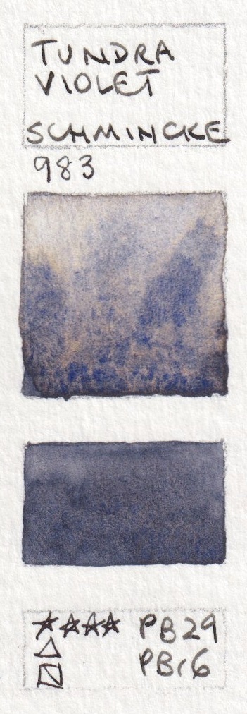


Schmincke Watercolours - Tundra Orange, Tundra Pink, Tundra Violet, Tundra blue and Tundra Green
Often, when making colours, manufacturers are producing 'hues' and blending the pigments into new compounds that effectively behave like a single pigment. Mixtures like these are intended to keep the different pigments in the mix separate, so they can each contribute to the liveliness of the colour. What is interesting is that the mixtures in tubes may behave differently from the mixtures of the same pigments then mixed in your palette in your own studio.
I certainly wouldn't suggest this whole range is necessary, but some granulating watercolour mixtures can be really lovely to explore in watercolour painting.
The Volcano set, Shire set and Desert set were added tot he range later. These are based around some rarely seen pigments - PY159 ( Zirconium Praesodymium Silicate Yellow), ad granulating yellow which is only used in W&N Lemon Yellow Deep and Kremer Intensive Yellow as far as I know; and PV62 (Strontium Phosphate Violet) which I have only seen in Aquarius Strontium Violet. The cadmium red used is a very granulating version.


Schmincke Watercolours - Shire Yellow, Shire Olive, Shire Green, Shire Blue, Shire Grey.


You can see them all at Jacksonsart (affiliate link).

Thank you for this! I love Schmincke.
ReplyDeleteMore to come! We are spoilt for choice with excellent watercolours. Schmincke is certainly one of them :-)
Deletehi jane, looks like they have REALLY expanded their offerings since this post!!! there is now desert, haze, etc. would love to see you do an update on these.
Deletethanks for everything you do. yours is one of the sites i reference ALL the dang time. much appreciated!! (you and handprint lol. so you see i hold you in great esteem)
The PV62 is the pigment designation given to their Cobalt Violet Hue, if I remember correctly - it was given the designation quite recently. I don't know if I'd buy any of these tubes myself, but I'll certainly take them as inspiration for making funky granulating mixes (especially the Galaxy Violet and Glacier Green), and it's always lovely to see a new post from you - fab as always!
ReplyDeleteI agree - fun to explore, or play with the pigments from single tube colours. They are not as rich as many of the DS Primatek colours, but really interesting combinations.
DeleteYes...I have the Cobalt Violet Hue full pan...it is very granulating and I finally found out it is PV62, like you said...initially...there was no pigment info on the pan label...very strange...but it is now clearly PV62...lovely pigment...granulates a lot.
DeleteJust came here to say that I really appreciate your effort. Your blog is a great tool for us. Very useful. Thank you. Do you have a Youtube Channel?
ReplyDeleteYes I do. I don't have many videos up as I've been working on my online courses, but what I have should be helpful to many getting going in watercolour. Just search Jane Blundell. You'll also find links to some interviews I have done.
DeleteI have an obsession with muted, granulating purples and violets, and Galaxy Violet is calling my name.
ReplyDeleteI will have to splurge on the Galaxy set on my next Jackson's haul.
Thank you..
ReplyDeleteIf you were to mix the two pigments that make up these colors would you get the same effect as you would from the tubes above?
ReplyDeleteI haven't tried it with these colours, but often no you don't.
DeleteI choose to create custom mixes or use conveniences mixes because they often behave differently than when you mix them yourself in the palette. I'd suggest giving it a go with these colours - if you have the pigments - and see!
Hi Jane, do you know what pigment the lagoon blue colour 989 made up of. It was developed for the Japanese artist Yuko Nagayama and came in various size special sets by Schmincke Horadam. It looks very pretty. Can’t seem to get here, in UK.
ReplyDeleteIt is a pretty colour, but very easy to make with regular palette colours - Phthalo Blue Green Shade (PB15:3) and Phthalo Green Blue Shade. This combination is available from many manufacturers as phthalo turquoise, which can be adjusted with a little more green or blue or water as you prefer.
DeleteThanks Jane. I love your website. So much cool info.
ReplyDeleteI am loving your bloggg
ReplyDelete