
Originally published in January 2022, this post has been updated a number of times!
Happy New Year for 2022.
For my first post of the year, I'm updating a previous post of the Aquarius range. I hope to add many more posts and updates this year :-)
Roman Szmal launched Aquarius Watercolours, a honey-based range, in 2019 with 140 colours.
In 2020 this was extended to 165 full pan colours with an additional 25 colours. There was still a huge proportion of single pigment colours (all but 26) and some unique pigments for watercolours.
In 2020 this was extended to 165 full pan colours with an additional 25 colours. There was still a huge proportion of single pigment colours (all but 26) and some unique pigments for watercolours.
In 2021, another 15 colours were added to the range, bringing it up to 180.
The full range is stocked at Jacksons (affiliate link) in the UK and many other places around the world. In Australia they are available from Adamstown Art in sets or individual full pans.
The full range is stocked at Jacksons (affiliate link) in the UK and many other places around the world. In Australia they are available from Adamstown Art in sets or individual full pans.
More colours were added in 2023 and more again in 2024, however some pigments have been removed as they are not longer available. I'll show those at the end.


,%20PY151.%20Aquarius%20watercolours.jpeg)


,%20PY108.%20Aquarius%20Watercolours.jpeg)


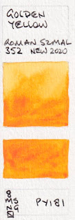

There is a huge range of gorgeous oranges. Golden Orange is just on the yellow-orange side, a little brighter than it looks here. Transparent Pyrrol Orange and Aquarius Orange are stunning transparent mid oranges.


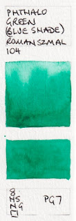
Phthalo Green (Blue Shade) is another key mixing colour. I wouldn't use it alone, but it can create a fabulous range of greens.


APRIL 2025 update; For my previous post I photographed the swatches, this time they are scanned. Some colours are really difficult to show accurately using either method - the yellow oranges and orange yellows, along with oranges and reds generally! So I have updated this post and colour matched each swatch individually to get them as close as I can. These are now all pretty accurate :-) The colours generally align with the latest colour chart I have, with the new 2023 and 2024 colours.
Anyone familiar with my blog will know that I love Buff Titanium and use it a lot. This is less granulating than the version I use, but still a lovely colour.

Aquarius Watercolour - Chinese White, Titanium White, Buff titanium, Nickel titanate Yellow,
Cadmium Yellow, Bismuth Yellow.
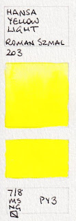
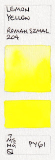
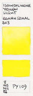
Many of these yellows are very similar, though Cadmium Lemon, Bismuth Yellow, Hansa Yellow Light and Lemon Yellow and Quinaphthalone Yellow are slightly more lemon, then Isoindolinone Yellow Light and Aquarius Yellow and are really mid yellows and Aureoline Hue has a hint of warmth. They are colour matched as closely as I can.


,%20PY151.%20Aquarius%20watercolours.jpeg)
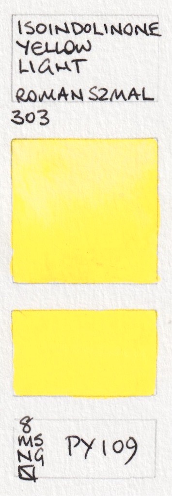
Aquarius Watercolour - Nickel Tungsten Yellow (new 2023), Hansa Yellow Light, Lemon Yellow,
Isoindolinone Yellow Light, Aquarius Yellow, Aureoline (Hue)
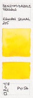
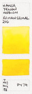
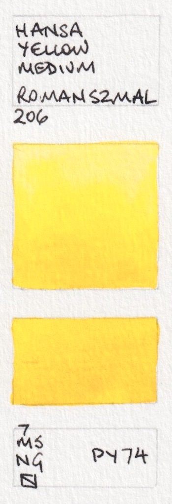
Aureoline Hue, Cadmium Yellow Pale and Benzymidazole Yellow are very similar mid primary yellows, with Hansa Yellow Medium being the brightest and sunniest by a small margin. Characteristics vary - how transparent do you want your yellow to be?


,%20PY108.%20Aquarius%20Watercolours.jpeg)
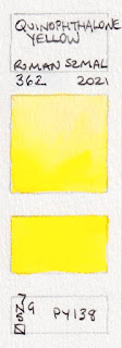
Aquarius Watercolour - Azo Yellow, Cadmium Yellow Pale, Benzymidazole Yellow, Quinaphthalone Yellow (new 2021),
Hansa Yellow Medium, Indian Yellow (Hue)
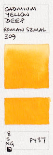
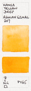
The first four are warm yellows. Hansa Yellow Deep is the easy option as a warm yellow in your palette although PY95 is also gorgeous. The others shown here are very bright and beautiful warm yellows, very difficult to capture exactly. There are a lot of interesting pigments that are not used by other manufacturers. The last two move into the yellow-orange sphere.


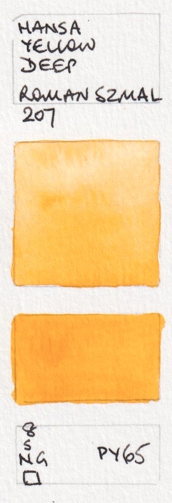


Aquarius Watercolour - Anthraquinone Yellow, Gamboge (Hue), Cadmium Yellow Deep, Hansa Yellow Deep,
Golden Yellow, Isoindolinone Yellow Deep.


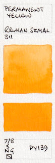
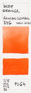
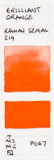
Aquarius Watercolour - Permanent Yellow, Golden Orange, Aquarius Orange, Transparent Pyrrol Orange,
Deep Orange, Brilliant Orange.
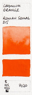
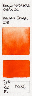
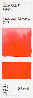
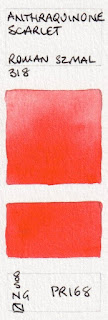
The next two oranges are attractive, if overshadowed by the new additions above, though I still like the Benzimidazole Orange. Scarlet Lake is almost identical to W&N Scarlet Lake. Scarlet Lake, Anthraquinone Scarlet and Pyrrol Scarlet are definite reds - on the warm side. I really like PR255 as a warm red option.


Aquarius Watercolour - Cadmium Orange, Benzimidazole Orange, Scarlet Lake,
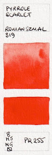
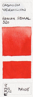
Anthraquinoid Scarlet, Pyrrole Scarlet, Cadmium Vermilion
These bright mid reds lean slightly to the orange side or the crimson side and vary in transparency.


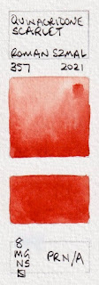
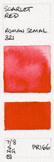
Aquarius Watercolour - Quinacridone Scarlet (new 2021), Scarlet Red, Scarlet Lake,
Naphthol Red, Raspberry Red (new 2023), Perylene Vermilion (new 2023).
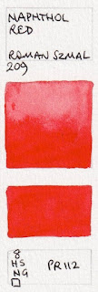
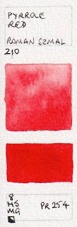
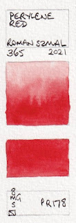
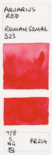
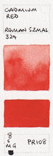
These are all mid reds to slightly crimson reds, with more or less pink. Azo Red is a rich crimson, Aquarius Red is a little brighter and Permanent Red brighter still. Cadmium Red is a duller mid red. Naphthol Red (above) and Pyrrol Red are rich mid reds - fire engine or pillar box. PR254 is my favourite for this colour. Perylene Red is just a little more crimson.


Aquarius Watercolours - Pyrrole Red, Azo Red, Permanent Red, Perylene Red (new 2021),
Aquarius Red, Cadmium Red.
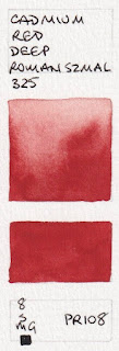
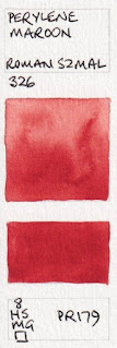
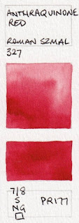
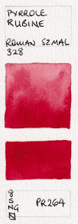
Cadmium Red Deep has the more 'purple' hue and Perylene Maroon is richer than Azo red. Pyrrole Rubine is my favourite of the crimson reds.


Aquarius WatercoloursCadmium Red Deep, Perylene Red Deep (new 2023), Carmine (Hue) (New 2024),
Perylene Maroon, Anthraquinoid Red, Pyrrole Rubine.
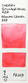
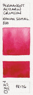
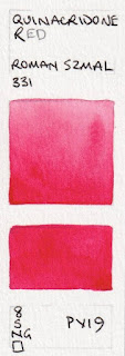
If you wanted a more primary crimson rose the PR176 is a good option. Cherry Quinacridone is a lovely coral that is difficult to replicate on screen - this photo is close. the newer Quinacridone Warm Scarlet is similar but more red. Quinacridone Red is my favourite rose and primary red colour.


Aquarius Watercolour - Cherry Quinacridone Red, Quinacridone Warm Scarlet (new 2023), Permanent Alizarin Crimson,
Quinacridone Red, Quinacridone Rose (new 2024), Quinacridone Warm Pink (new 2024).
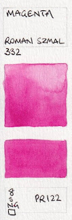
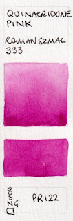
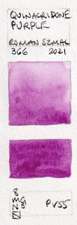
PR122 is as close as we can get to the printing Magenta colour. Quinacridone Pink is almost identical to Quinacridone Magenta, but richer. PR202 is slightly stronger but duller.


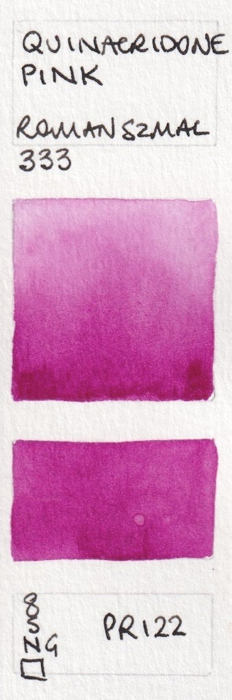


Aquarius Watercolour - Quinacridone Magenta, Quinacridone Magenta Intense (new 2024), Quinacridone Pink,
Quinacridone Fuchsia, Quinacridone Purple (new 2021), Quinacridone Violet (new 2021)
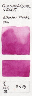
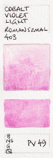
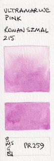
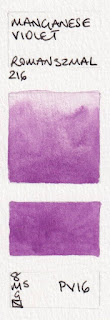
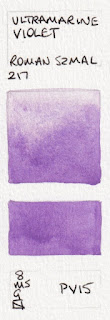
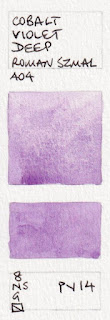
This range has so many of the gentle granulating violet pigments - PV 14, PV15, PV16, PV49 as well as the unusual PV37 (see below) instead of the more common PV23.


Aquarius Watercolour - Perylene Violet, Cobalt Violet Light, Ultramarine Pink, Manganese Violet,
Ultramarine Violet, Cobalt Violet Deep.
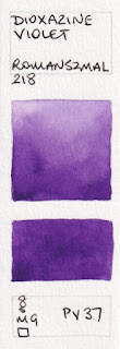
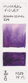
There are a number of convenience and atmospheric violets and purples here.


Aquarius Watercolour - Strontium Violet (new 2023), Dioxazine Violet, Mineral Pink (new 2024),
Mineral Violet, Aquarius Violet (new 2023)
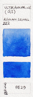
The fascinating Misty Morning as it is not made with a traditional red and blue. French Ultramarine, or the new Ultramarine Intense shown next, is my pick for this pigment.


Aquarius Watercolour - Misty Morning, Shadow Violet Light, Shadow Violet, Lavenda,
Ultramarine Light, French Ultramarine.
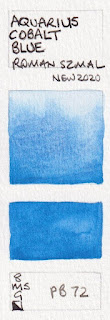
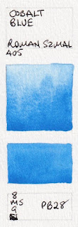
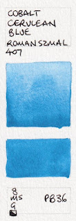
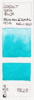
There are also many cobalt colours in the range. These are granulating and liftable and quite beautiful. I use PB36 along with Ultramarine in skies, though many use cobalt blue PB28.


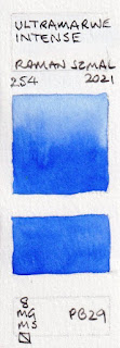
Aquarius Watercolour - Ultramarine Intense (new 2021), Ultramarine (Green Shade), Cobalt Blue Deep,
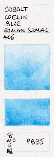
Aquarius cobalt blue, Cobalt Blue, Cobalt Cerulean Blue.


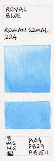
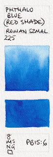
Aquarius Watercolour - Cobalt Coelin Blue, Royal Blue Light (new 2023), Royal Blue,
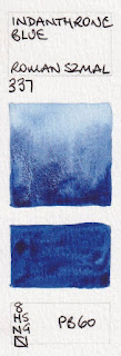
Phthalo Blue (Red Shade), Indanthrone blue.
Phthalo Blue GS is one of my key mixing colours.


,%20Aquarius%20Watercolour.%20PB15.3.jpeg)


,%20Aquarius%20Watercolour.%20PB15.3.jpeg)


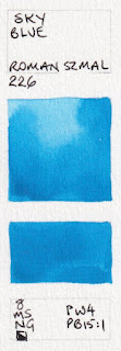
Aquarius Watercolour - Prussian Blue, Sky Blue, Phthalo Blue (Turquoise Shade) (new 2023), Phthalo Blue (Green Shade),
Ocean Blue, Indigo Greenish (new 2024)
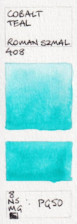
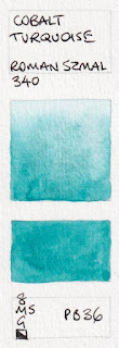
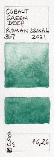
PB16 is a gorgeous pigment. Cobalt Turquoise is a lovely granulating pigment. So is the new PG26 Cobalt Green Deep added in 2021.
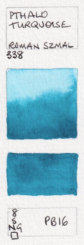


Aquarius Watercolour - Phthalo Turquoise, Cobalt Blue Light (not shown), Cobalt Sea Blue, Cobalt Teal,
Cobalt Turquoise, Cobalt Green Deep (new 2021),

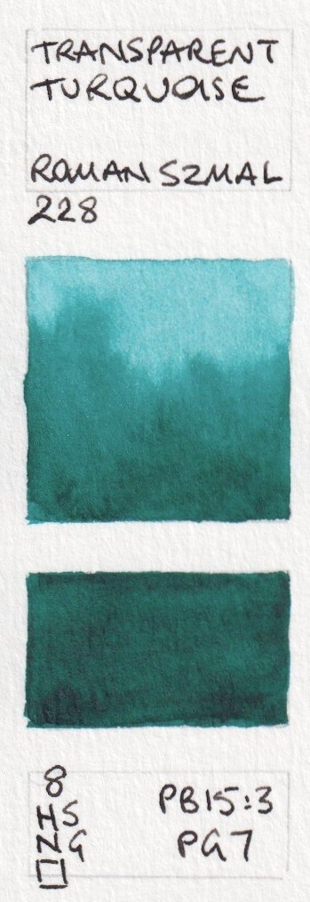


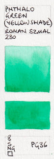
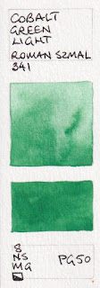
Aquarius Watercolour - Viridian, Transparent Turquoise, Phthalo Green (Blue Shade), Phthalo Green (Yellow Shade),
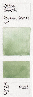
Cobalt Green Light, Green Earth.
Glauconite is an historical colour. I use PBk31 all the time for shadows in foliage. Perylene Green Deep made with PBk32 is a unique addition to the range.

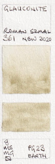
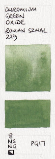
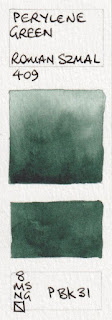
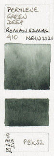


Aquarius Watercolour - German Green Earth, Glauconite, Chromium Green Oxide,
Chromium Green Oxide Dark (not shown), Perylene Green, Perylene Green Deep.
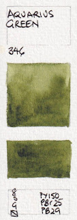
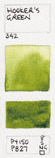
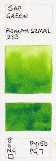
These mixed greens are mostly very useful. I particularly like the Aquarius Green and the Sap Green Light for convenient realistic landscape greens.


Aquarius Watercolour - Forest Green (new 2024), Aquarius Green, Hooker's Green, Sap Green,
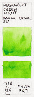
Sap Green Light, Permanent Green Light,
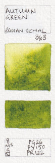
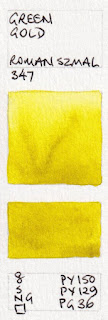
Deep Green Gold is lovely for the glow of sunlight through leaves or as an alternative to a cool or lemon yellow. Autumn Green is new 2022.

%20Aquarius%20watercolour.%20PR102,%20PY150%20(new%202021).jpeg)


,%20Aquarius%20Watercolours.%20PO82%202021.jpeg)


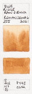
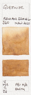
The new Blue Ridge Raw Sienna may be even nicer and richer than these as a yellow earth colour. The new Goethite granulates nicely, though not as much as the version I use.


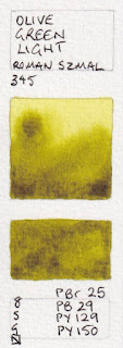
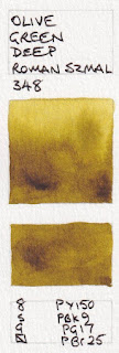
Aquarius Watercolour - Olive Green Light, Autumn Green (new 2022), Olive Green Deep,
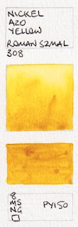
Deep Green Gold, Green gold, Nickel Azo Yellow.
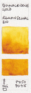
This is a lovely version of Quinacridone Gold, but will be unavailable once PO48 runs out. The new version is yellower - the colours are quite accurate.
%20Aquarius%20watercolour.%20PR102,%20PY150%20(new%202021).jpeg)


,%20Aquarius%20Watercolours.%20PO82%202021.jpeg)

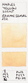
Aquarius Watercolour: Quinacridone Gold Hue (2021), Quinacridone Gold (old version), Nickel Azo Gold (new 2024),
Bismuth Orange (new 2023), Chrome Orange (Hue), Naples Yellow Light.
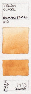
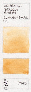
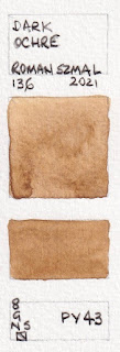
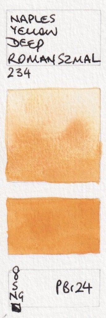
There is a confusion of yellow earths made with PY43. Gold Ochre is the brightest of them and would be my choice, though Yellow Ochre is Transparent. These need a bit of exploring.


Aquarius Watercolour - Flesh Tint, Naples Yellow Reddish, Transparent Gold Ochre,
Venetian Yellow Earth, Natural Sienna Light, Gold Ochre.


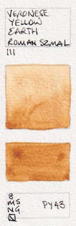
Aquarius Watercolours - Yellow Ochre, Titanium Brown (not shown), Veronese Yellow Earth,
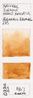
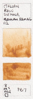
Blue Ridge Raw Sienna (new 2021), Natural Sienna Mont Amiata, Italian Raw Sienna,Transparent Yellow Oxide
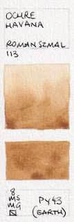
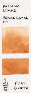
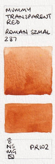
I do like PBr24 though I've never painted with it! I rather like these earth colours, especially French Ochre and Mummy Transparent Red.


.jpeg)
.jpeg)


.jpeg)


.jpeg)


Aquarius Watercolour - Naples Yellow Deep, Ochre Havana, Goethite, French Ochre,
Mummy Transparent Red, Mont Amiata Burnt Sienna
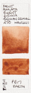
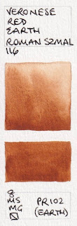
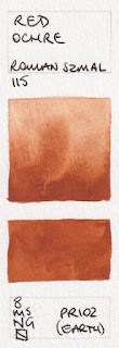
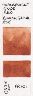
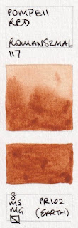
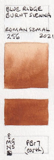
Many of these are all quite similar in hue, and any could be used as a burnt sienna colour. They differ in characteristics.


Aquarius Watercolours - Veronese Red Earth, Red Ochre, Transparent Oxide Red, Pompeii Red,
Blue Ridge Burnt Sienna (new 2021), Burnt Sienna Brownish (new 2024)
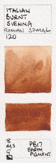
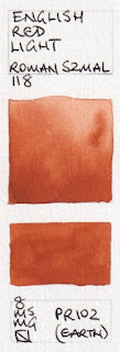
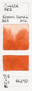
Aquarius Brown is a super granulating pigment. Ginger Red is a bright neutralised orange.


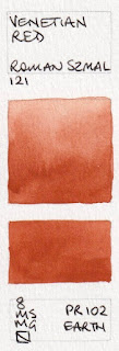
Aquarius Watercolour: Italian Burnt Sienna, Aquarius Brown, Terra Pozzuoli, English Red Light,
Venetian Red, Ginger red ( new in 2021)
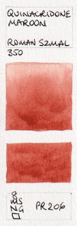
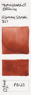
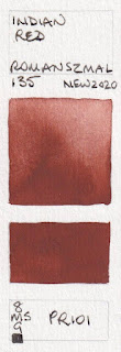
The red earth colours are quite lovely. PBr23 is a unique pigment. The new Indian Red has the pink undertone I look for in an earth red.


Aquarius Watercolour - Quinacridone Maroon, English Red Deep, Benzimidazole Brown (new 2023
Transparent Brown, Mars Red, Indian Red.


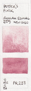
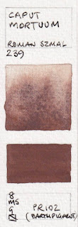
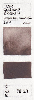
Aquarius Watercolours: Porter's Pink, Caput Mortuum, Lava (new 2024), Manganese Brown (new 2021),
Hematite (Violet Shade),Iron Chrome Brown, (new 2021)
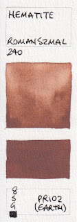
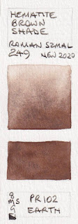
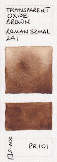
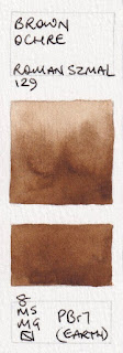
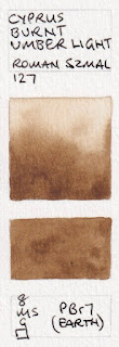
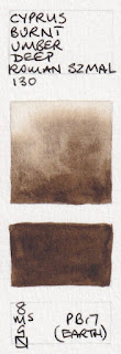
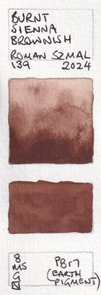
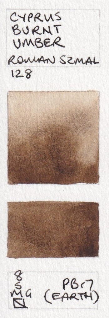
Brown Ochre or Cyprus Burnt Umber is my choice for a Burnt Umber colour. While it can be mixed as a hue using burnt sienna and ultramarine, having a warm dark brown is often useful.


Aquarius Watercolour - Hematite, Hematite Brown Shade (new 2020), Transparent Oxide Brown, Brown Ochre,
Natural Umber Reddish (new 2023), Cyprus Burnt Umber,
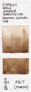
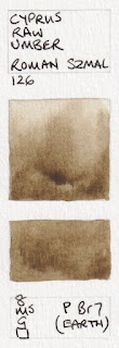
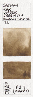
There are many raw umber variations. German Raw Umber Greenish painted out the smoothest…


Aquarius Watercolour - Cyprus Burnt Umber Light, Cyprus Raw Umber Brownish, Dark Ochre, Cyprus Raw Umber, German Raw Umber Greenish, Cyprus Burnt Umber Deep.
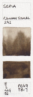
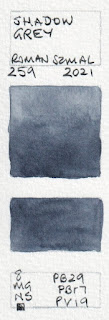
...however Cyprus Raw Umber Deep is my favourite of these cool dark browns. Shadow Grey is very close to my Jane's Grey. Urban Grey is the colour of lead pencil.
.jpeg)

.jpeg)


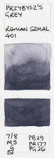
Aquarius Watercolour - Cyprus Raw Umber Deep, Sepia, Van Dyck Brown, Shadow Grey (new 2021),
Przybysz's Grey, Urban Grey (new 2024)
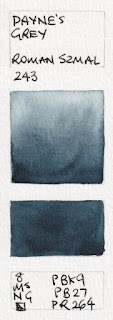
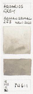
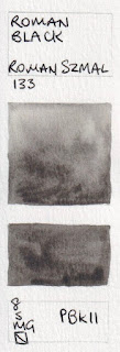
Aquarius Grey is a great addition - useful for concrete and urban sketching.

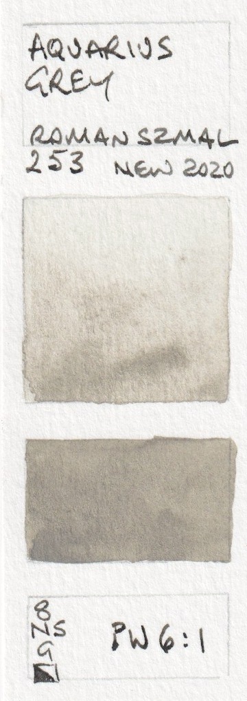


Aquarius Watercolour - Payne's Grey, Davy's Grey (new 2024), Aquarius Grey, Roman Black,
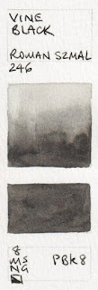
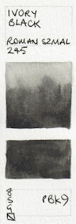
Vine Black, Ivory Black.
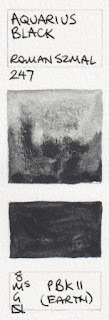
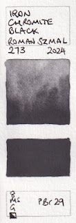
I don't tend to use black pigments - with the exception of PBk31 (Perylene Green) and PBk11 - here seen in Aquarius Black - for its amazing granulation. I do use mixed blacks, and especially like the combination used in Velvet Black. I've created a version of this - Jane's Black (red/green) for years.


.jpeg)


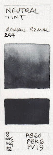
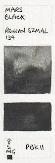
Aquarius Watercolour: Neutral Tint, Velvet Black (new 2023), Graphite (new 2023), Mars Black,
Aquarius Black, Iron Chromite Black (new 2024)
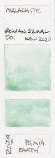
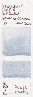
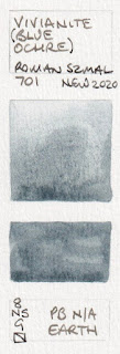
These are the mineral colours available.
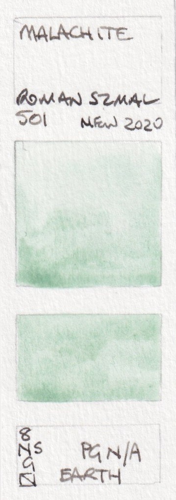


Aquarius Watercolour: Malachite, Lazurite (Lapis Lazuli), Vivianite (Blue Ochre) and Lapis Lazuli (Afghan)
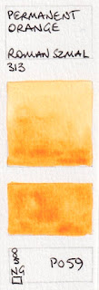
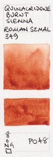
Discontinued colours: these pigments are no longer available.


.jpeg)
Aquarius Watercolour - Permanent Orange, Quinacridone Burnt Sienna,
Pyrrol Orange, Lapis Lazuli (limited edition 2023)
.
While my preference is for paints made without honey, I was asked to suggest a 24 colour set of Aquarius colours. It is daunting to come up with a set when faced with such a huge choice, but here is my suggested set.
- Buff Titanium
- Hansa Yellow Medium
- Quinacridone Gold
- Aquarius Orange
- Pyrrol Scarlet
- Pyrrol Rubine
- Quinacridone Red
- Mineral Violet
- Ultramarine Intense
- Cobalt Cerulean Blue
- Phthelo Blue (Green Shade)
- Cobalt Turquoise
- Phthalo Green (Blue Shade)
- Perylene Green
- Aquarius Green
- Sap Green Light (or Autumn Green or Hooker's Green)
- Gold Ochre
- Goethite
- Mummy Transparent Red
- Blue Ridge Burnt Sienna
- Indian red
- Cyprus Burnt Umber
- Cyprus Raw Umber Deep
- Shadow Grey.
Here they are painted out. This is a really lovely balanced palette for any subject, with the convenience of an orange and a purple, along with a great range of earth tones and realistic mixed greens.


Some colours are available in half pans, and tubes are in progress.
Here is the newest little mini set for Urban Sketching.
It comes in a range of colours. It contains 8 half pans and you can choose the extra four colours. Many larger metal boxes with full pans are available, along with a great range of brushes.Happy Painting.
Beautiful colors. I have a set of these and like them more than my W&N or Schminckes. I just hope they‘ll bring out tubes, since I like to pour my own palettes.
ReplyDeleteThey may add half pans to the range, but it is a very small company and I actually hope they stick to just pans and half pans. Trying to do everything adds a huge cost.
Deletereplying to Jane- Honestly the full pans are so affordable that I hope they keep them that way! The colors are so gorgeous for the price.
DeleteI second the question below about what palette to fit these in. Do you have anything specific you recommend that will fit ~16?
For 16, consider the Herring Compact - you can see it on my website - it holds 16 full pans if you fill in the thumb hole. Great mixing areas.
DeleteThank you! Waiting for Jackson to stock up on them. My collection has actually grown to 30 now! Do you know if it's possible to get the wooden 36 pan box on it's own with no paint or any other suggestions for 30+ pan box.
DeleteThis blog is invaluable! I've used it to select all of my Aquarius colors. Thank you so much for it!
I use just regular 48 metal pallet from aliexpress and additional white nights plastic pallet - it need to be altered though. I cut the small dividers with scalpel and it works perfectly.
DeleteThank you so much for providing this information! It is so helpful and I am learning a lot!
ReplyDeleteDid you omit a row of swatches by accident? I'm not seeing 118 Eng Red Lt, 122 Eng Red Dp, 121 Venetian Red, 119 Terra Pozzuoli, 350 Quin Maroon. With so many earths I understand the oversight!
ReplyDeleteWas just about to make the same observation
DeleteI've updated it to add those colours - thanks for letting me know :-)
DeleteThank you so much for this! I'm new to watercolours and your blog has been a blessing. Which empty palettes would you recommend to fit 14 or 20 of these pans?
ReplyDeleteThe metal palettes are one option - you can find them from a range of manufacturers. Or my favourite is from the UK - the Herring Compact (full pan version). You can see that on my website here https://www.janeblundellart.com/palettes.html - just go down until you find it.
DeleteIf you don't need the mixing area (I mix on ceramic platter or flower palette)I highly recommend the metal tins sold on Amazon. There are a couple of distributors, I've purchased both Booyee and FClub, they are exactly the same. They hold 20 full pans or 40 half pans with magnets.. they come with the pans but it's easy to just add your own to existing pans (you can buy the self adhesive magnet squares on Amazon too or at local craft store).. come in multiple designs.. take up very little space...and are cheap.
DeleteThank you for all the information! Roman Szmal has become on of my favorite brands. I love their earth tones. I just wish they came in tubes as well so I could add a few colors to my porcelain studio palette. I wonder since they have honey in them if I could soften them enough to scoop some out with a palette knife and add to my palette... hmm.. I will have to think on this. Do you have any suggestions on this? Thanks again for the swatches! They are lovely :)
ReplyDeleteThey do have lovely earth colours and some unique pigments. Some are soft enough to scoop out with a metal knife.
DeleteI actually hope they stick to pans and half pans rather than branching out to tubes - they are a small company and if they spread too thin they may not be able to control all the factors as well.
Just to follow up on Jane's answer. I used a dry steak knife to scoop out my RS paint. It's winter in my city so my paint behaves like claydoh, super easy for the task. Maybe put your pans into a fridge for 10 mins to minimize the sticky mess?
DeleteThank you for this information. Can you recommend a palette to put these pans in. I am collecting a few here and there and would love to put them in a palette but am afraid to buy one blindly. Thank you for all you do for watercolorists.
ReplyDeleteMy favourite for pans or half pans is the Herring Compact but you may have too many colours for that, in which case consider one of the metal palettes.
DeleteI have made a good compact palette for full pans from a pocket tin of Romneys Kendal Mint Cakes. They are far too expensive via mail order, but I happened across one in a local store; about 12-16 full pans will fit in, and a bit of flexible plastic magnet on the bottom of the pan holds them well in place. I cut a really cheap plastic mixing palette in halves and hot glued them into the lid of the tin. I secure the whole thing to my board (also my carrying kit) with velcro. Looks fancy too--mountain climber in the foreground, Mount Everest in the background.
DeleteI keep 7 full pans in an Altoids tin. I find that plenty for a split primary with an extra (I like burnt sienna), or a fully functional earth palette. You can actually pop two extra half pans in there too if you wish. I toss a little ceramic flower palette in for mixing.. they are strong and deep enough to hold a wash, yet fit in a pocket.
DeleteDo they have Pbr6
ReplyDeleteJane, your blog's RSS feed stopped working today or yesterday. "There are no news in this feed" is the message I get on my Netvibes RSS feed reader(?). Other blogs from the same host are still working for me. Just thought you should know.
ReplyDeleteI didn't get the usual email for the latest blog post either. I found out it was here when I searched google for the information it contained. I get notifications for replies to comments still though.
DeleteI'm looking forward to your palette arriving,as I have just ordered it from Jackson's. If anyone is interested artemiranda.com has all the new palettes available. I had to hunt around for some of the colour ways in them.
ReplyDeleteI have been very well pleased with St. Petersburg watercolours--they have been good value for money. Your reviews were very helpful in figuring out a palette that pleased me. In view of the current international news, I feel obliged not to order anything from Russia any more, which is a shame. Maybe Roman Szmal will work out well; any other suggestions are welcome.
ReplyDeleteRosa Gallery are made in the Ukraine. Very similar to the St. Petersburg paints. Available on Etsy and Amazon.
DeleteI think I have worked out a selection of Aquarius watercolours that approximates my St. Petersburg selection, plus one or two interesting additions. I might order them tomorrow.
DeleteI have swatched out the Aquarius colors I ordered, and have three or four others coming in before long. They are in fact pretty close to my customary White Nights colours. Out of curiosity I ordered the caput mortuum and find it most interesting; I wonder what sorts of colours I will get by mixing it with various others. I produced remarkable granulation when mixing Aquarius French ultramarine with a warm yellow to make green.
DeleteI think I will give away my White Nights colours to students enrolled in the watercolour course at the local junior college; many of them are hard pressed for art supplies. Maybe free pigments will enable some to purchase all rag paper.
Thanks for the Rosa Gallery idea--I have one I received as a bonus with a set of Russian coloured pencils.
DeleteI just bought this set, love it. Best choice of colors .Thank you for making this available , saved me a lot trouble selecting . I always trust your taste.
ReplyDeleteI think the quality is way better than white night. Can be compared with winsor newton and schmincke.
ReplyDeleteI expect you are right; I went with White Nights because they were very good value for money and I couldn't justify the cost of experimenting with more highly reputed brands. It isn't fair to punish them for Putin's abhorrent acts, but I have done so. Probably can't pay for them anyway because of the trade restrictions placed on Russia.
DeleteHow does Rosa compare to Roma Szmal in terms of quality? Rosa is much cheaper so I'm considering purchasing a 24 pan set instead.
ReplyDeleteJane here - I haven't tried Rosa at all so I can't comment sorry.
DeleteI would say Rosa is more comparable to White Nights. Kind of in the middle between student level and professional. Roman Szmal is a higher level with more expensive pigments and more single pigments available, plus some elaborate mixed colors. I own all three, I like all three, but I have to be more selective with Rosa and White Nights. That is not to say that everything from Roman Szmal is 100% either.. they have some fugitive issues.. but that is true for almost every professional brand.
DeleteSo just letting anyone know that reads this blog that Roman Szmal is now available in half pans for their most popular colours. At the moment Adamstown art doesn't have them but Jackson's does.
ReplyDeleteOh and thank you Jane for such a useful blog post I refer to it frequently when I'm choosing my colours.
Jane, if you could add four more colors to your Roman Szmal palette, what would they be?
ReplyDeleteIt depends what you like to paint, but I'd add interesting pigments like Potter's Pink, Naples Yellow Deep, perhaps a granulating single pigment violet and perhaps Aquarius Black.
DeleteFantastic, and many thank’s from Sweden for this post with painted tests. Is it possible to buy the full pans from Szmal och where do you order?
ReplyDeleteMaybe you could order them from Finland? Diverse in Helsinki stocks them. Just bought a 12-pan Szmal travel set from them.
DeleteJackson's Art carries the full pans, and I think they carry tubes as well.
ReplyDelete----Alan Barbour
This comment has been removed by the author.
ReplyDeleteHello! I just want to correct a mistake that I spotted. Gamboge Hue is made with PY95 not PY65.
ReplyDeleteCheers,
awatercolourist
Thank you - corrected.
DeleteThere are 3 new colors: Titanum brown, Chrome oxide green dark and Cobalt blue light!
ReplyDeleteI haven't seen those colours but will request a sample so I can add them. They look interesting - very granulating!
DeleteThank you this post was so helpful and exactly what i was looking for!
ReplyDeleteThank you very much for your invaluable blog. How would you compare Roman Smalz watercolors to Daniel Smith? Thank you for your advice!
ReplyDeleteHi Jane. Would you be able to let us know what you think of their newest color. Chromium Oxide Green Dark. Do you think it could pass as a zoisite style of granulating dark deep green? thanks!
ReplyDelete