

The name of the pigment comes from the chemicals that form this colour - Yttrium, Indium and Manganese.
Manganese oxide is normally black, Yttrium and Indium are yellow and white, so creating a blue when they were heated was a total surprise! It is a stable and non-toxic inorganic pigment, that reflects heat and absorbs ultraviolet so may be used for insulation.
The colour is described as being between ultramarine and cobalt blue. It is also compared with cobalt deep blue. I think of it as rather like a granulating Indanthrone blue - like a mix of PB60 and PB74. Very beautiful.
I've been curiously watching for it to be made into a paint. I saw an acrylic limited edition made by Matisse, and an oil version made by Gamblin but these were described as very opaque paints. Here it is in watercolour. The granulation really makes it something special.
The pigment originally cost about 6 times more than cobalt or cerulean pigments due to the cost of the rare earth element Indium. It was not necessarily likely to be made as a watercolour...

Since then, this pigment has begun to trickle out in various forms and many other companies are exploring it. It is available from Kremer pigments, and Golden did some custom testing. Derivan has an acrylic version in their Matisse range and it is also available in oils. I'd only be interested in this pigment for its granulation, which shows up in watercolour.
The first sample is the Daniel Smith R&D version. This is by far the most granulating and unique version I have come across. The second watercolour sample is from A.Gallo, a hand-made Italian brand. Schmincke has also released a version, added below. You can find it here (affiliate link). Interesting how different these first two samples are in colour - scanned together. The third sample was scanned separately but with the same scanner, as was the fourth sample from Kremer. You can find that here. The fifth sample is from Dirty Blue, and is a little darker.


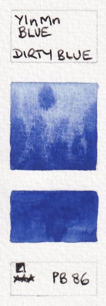
YInMn Blue from Daniel Smith (sample only), from A.Gallo (available for sale), from Schmincke (limited edition),
from Kremer (available for sale) and from Dirty Blue (available for sale)
I read about this some time ago and I even contacted Daniel Smith about possible use in the future.
ReplyDeleteLooks like it won't be cost effective.
But things change. It may be 6 times the cost now, but if there is enough of an industrial use and if it can be produced at an industrial level, I think we'll see it in paint. Until we don't. (Like PY153).
The scientist (or his wife or a child, I don't remember) paint and I found a link to a website that had some of their paintings and they used some of this new pigment in the paintings. It's a beautiful blue.
If I ever hear of it being offered, even in a limited supply, even at a higher price than the current DS primateks, I will buy a tube.
It's like many man-made pigments - if the big industries want them (such as the car industry), they will be made in large enough quantities to be available for artistic purposes. I don't think it adds much to the oil and acrylic range, but with this sort of granulation it is certainly of interest in watercolour. It's the colour I expected Lapis Lazuli to be...
DeleteI managed to get my hands on it, but now I can't get myself to use it. Will you be using it in a painting from the A. Gallo paints soon?
DeleteThank you Jane for this post....you are awakening in me a new adventure into colours in watercolour.
ReplyDeleteI wonder about the accuracy of the colour on the internet. I also now am curious about my personal ability to read colour as I am developing cataracs that will eventually be surgically corrected. I read that several masters had cataracs while they were painting masterpieces. Do you have any advice, or suggestions about the effect of them on mixing pigments?
Sary while I try to match colours, without using more sophisticated software, there are some that are really difficult - especially on the yellow-orange to orange red area. The blue sample about is very close to the 'real thing' on my screen, but different screens are also calibrated differently!
DeleteMonet was said to have had cataracts, and Lloyd Rees I believe. Both painted with quite a different palette late in life. I don't have any particular advice, except that I'd certainly want to have them removed when possible. Good luck.
The most important aspect isn't color.. it's value (light to dark). You can be as creative as you wish with color provided the values are correct. I've seen artists paint beautiful animals, landscapes, etc with "rainbow" colors that are completely "unnatural" but turn out great because they put the lights and darks in the right places. You can also paint monochrome.. I know of at least one colorblind artist who paints in monochrome.
DeleteCataracts will make colors yellowish and somewhat dim. When you get cataracts removed (a very routine and safe procedure nowadays) you'll be astonished at how gorgeously blue the sky suddenly looks.
DeleteI would absolutely love to have this pigment in my palette, but I am afraid that I couldn't afford it.
ReplyDeleteI think a limited edition 5ml run would be the way to go to get this into more people's hands to play with :-)
DeleteYes as a colour I don't see it as an essential, but the granulation is gorgeous, and so unexpected, given the opaque images I had seen.
ReplyDeleteI would buy it, just to see if I like it. It would be nice even if it was a limited edition. I'd prefer to get it as a 15mL tube, just because otherwise I'd be afraid to use it all up, and I like working big.
ReplyDeleteI am thinking this is a rather grayish blue from what you are showing, which is fine, but the blue powder looks more like a pure RGB blue ( like you see on computer screens ), that is kind of disappointing. I think I'd really have to see it, but was hoping for a more intense blue from this pigment.
I see the blue pigments as relatively limited, and this seems like it would really add a lot to the ranges. The fact it's got strong granulation makes me think Daniel Smith would be a nice home for it. I'm wondering if its ground really finely though, if it would change the color/behavior so it's more like a staining color.
From what I have read, it can be created in a range of hues. This Daniel Smith sample may be made from the pigment exactly as provided, or they may have ground it up further, I don't know. It will be up to the big industries to decide what THEY want if it is to become more readily available.
DeleteAs for this sample - there is a slight greyness about it, but not in a bad way.
Very pretty color. After seeing the gorgeous granulation on your swatch, I'm tempted to get it. BTW, were the 2 swatches on the card painted wet on wet? Why go light to dark in the square shaped area? Wouldn't doing the reverse be easier?
ReplyDeleteThe granulation is quite lovely. It is not currently available, but perhaps if there is enough interest it might be?
DeleteThat's how I paint out every watercolour I try - there are almost 1000 on my website here - http://www.janeblundellart.com/painted-watercolour-swatches---introduction.html
I always paint the square swatch wet-into wet at the top - to see how the pigment reacts with water, then get stronger as I go down the square. The bottom swatch is the ideal full strength colour painted onto dry paper.
I would buy a 5ml tube of this, I love granulating paints and this looks quite special. Thank you for the write up.
ReplyDeleteI attended a workshop with the owner of Daniel Smith on Friday, Apr. 27 at The Art Stash in San Diego. He showed two different lapis samples, talked about their sources and went through their process for making paints and for primateks. It was very interesting. I did ask about YInMn blue. He said it wasn't a very interesting color, but then he had said earlier he's an engineer, not an artist so I kept that in mind. He did mention he got a very small sample of the stuff and had three tubes made up and sent one to you. I told him you did write a blog post on it. (He mentioned you a few times. I guess he brought a tube of Aussie Red Gold to Australia before Daniel Smith decided to put it in their line. It's beautiful and I bought a tube after the workshop.)
ReplyDeleteHe talked about all of the Quin Gold he bought after Toyota stopped using it in their cars and how he doesn't develop a primatek color unless he has enough TONS of the stuff.
And he said we probably won't be seeing YInMn because of the cost but if the industry finds it useful for insulation or something that may change. I doubt the car industry will be interested as granulating paint isn't popular for cars.
But he did mention your blog a few times.
I met John when he came to Sydney last year and did a couple of his pigment and colour presentations. It was so interesting to hear it from the engineer's point of view rather than from the artist's point of view, as I do them of course. He had a sample of the Aussie Red Gold with him then and it really is a lovely colour - it was always one of my favourites from the Art Spectrum range.
DeleteI hadn't realised I received one of only three tubes of YInMn blue - I feel VERY special :-) I think it is a very interesting colour for watercolour artists. Not necessarily as a palette staple, but as a special effect colour, perhaps for ice/water paintings. It might be perfect for Arctic/Antarctic studies (when I get there one day!)
I'll be looking for ways to include it in my paintings to see what id does when mixed with other colours as well as alone. Daniel Smith really excels at creating gorgeous granulating paints!
Hello,
DeleteThanks so much for sharing so many excellent, super informative posts! This new pigment looks intriguing. I hope it will become available for us to try on a broader scale.
Hooray for possible Antarctic/Arctic studies! I hope you're able to make it there someday. We (taking the liberty to speak for all of your readers, heh :D) would be absolutely delighted to see glacial studies from you! I love your work, and it would be splendid to see your interpretation of the fascinating forms and palettes of glaciers, ice flows, the midnight sun, northern/southern lights, etc. Anyway, just thought I'd share that the thought of you travelling to either region had me dancing in my chair. Many happy travels to you, and happy painting! :)
Cheers,
L. Nance
Now that Crayola is using it, maybe the cost will come down?
ReplyDeleteIf they were using the actual pigment I am sure it would ;-)
Deletehttps://news.artnet.com/art-world/crayola-yinmn-blue-crayon-973373
ReplyDeleteBefore I even started doing water colours I was fascinated with watercolours paints, the way they flow, granulate etc etc and Daniel Smith's granulating paints are so beautiful as are all his paints in my opinion, I bought many of the DS paints even then and looking at the swatch you shown us here it is so amazing and I can already imagine in my minds eye just how wonderful it will look on paper . I too would be happy to purchase a tube, I think I will start saving for it now . LOL. Thank you for this Jane very interesting and informative.
ReplyDeleteIs there a way to get a small tube of this pigment to try it out? I tried searching, but couldn't find it for sale anywhere. Not that I could afford much of it, but I am very curious to try it, so I'd likely end up with it just out of curiosity's sake.
ReplyDeleteI heard that only three tubes were made so feel very lucky to have been sent one of them. It is just too expensive to use commercially at this point, though if ever it were to be, watercolour would be the best medium to use it - the gorgeous characteristics show up in this medium where they wouldn't in oil or acrylic.
Deletethe Yinmn Blue pigment PB86 is now available at Kremer Pigments of Germany/NYC
ReplyDelete10 g (Glas) €41.65 * €4,165.00 * / 1000 g Prices incl. VAT plus shipping costs
50 g (Glas) €177.31 * €3,546.20 * / 1000 g Prices incl. VAT plus shipping costs
https://www.kremer-pigmente.com/en/new-products/pigments/8036/yinmn-blue
Thank you for the link. If anyone gets some please let me know what it is like!
DeleteSomeone is selling this pigment as watercolor on etsy for $17 in small pans
ReplyDeleteIt is now available from A. Gallo, added above, and Schmincke have it available as a watercolour now. Here's the (affiliate)link to Jacksons for the Schmincke https://www.jacksonsart.com/en-us/schmincke-horadam-watercolour-paint-5ml-yinmn-blue-limited-edition-us?___store=jacksonsart_us&acc=884d247c6f65a96a7da4d1105d584ddd
DeleteI'll try it out and add it here.
I would have to see some independent lightfast testing first for sure. The granulation is lovely though.
ReplyDelete