Wednesday, 28 April 2021

New Colours from Schmincke

Granulation is one of the characteristics of some pigments that is best seen in watercolour. You may not notice it in oils or acrylics, and certainly not in pastels and pencils. However in watercolour, granulation is a fabulous characteristic to explore. It is also very important since watercolour is basically a 2-dimensional or flat medium, so granulation is a way of adding texture to the wash.

Granulating pigments show their true nature best on damp cold pressed or rough paper though they will tend to granulate to some degree on any paper. For those new to watercolour, it may look as though something is wrong!

Some of the most granulating pigments have been used to create the Super Granulating colours from Schmincke - some released in 2020, some in 2021 and then another 15 later. They are available in boxed sets or individual tubes or half pans.

The full initial range of 25 were made from quite a limited number of granulating pigments. You can see all the colours used to create them in my blog post here - it may be useful to have that open side-by side on your computer screen. The 15 colours added later use some different pigments and are are shown below.

There are five colours in the 'Forest' set. The most useful and realistic greens are often created using two or three pigments so these might be useful colours in foliage paintings. 

Forest Olive contains Viridian, a PBr7, in this case probably Green Umber, and Yellow Ochre, which is interesting as there isn't a PY43 Yellow Ochre in the Schmincke range. 

Forest Green contains Cobalt Green and the brown pigment used in the colour Mahogany Brown (It was also used in the old colour Walnut Brown, which was darker.) 

Forest Blue contains Cobalt Green Turquoise (or possibly Cobalt Cerulean) and the Mars Black pigment. Forest Brown contents Cobalt Green Dark, Cobalt Turquoise and Yellow Ochre.

Forest Brown is not as brown as Forest Olive, and contains the stronger tinting Cobalt Green Dark, a PBr7 earth pigment and Yellow Ochre. 

Forest Grey contains a brown earth pigment along with Cobalt Turquoise and Mars Black.


Schmincke Watercolours - Forest Olive, Forest Green, Forest Blue, Forest Brown and Forest Grey


There are five colours in the 'Deep Sea' set. 

Deep Sea Violet is made from French Ultramarine and PBr33, which is used in Mahogany Brown and the Daniel Smith colour Lunar Earth. It is a fantastic pigment that creates gorgeous texture. 

Deep Sea Blue is made using Cobalt Green pigment, Manganese Violet and French Ultramarine. 

Deep Sea Indigo is made from Viridian and PV62, which I haven't seen as a colour though it makes a lovely granulating violet-blue here. The greens and violet don't show up much in my little dot sample. 

Deep Sea Green uses Viridian and French Ultramarine to create this granulating turquoise. 

Deep Sea Black uses the incredibly granulating PBk11 (used in Schmincke Mars Black and Daniel Smith Lunar Black amongst others) with Cobalt Blue Deep and Cerulean pigments (used in Cobalt Azure), to create this deep blue-grey with spots of black.

Schmincke Watercolours - Deep Sea Violet, Deep Sea Indigo, Deep Sea Blue, Deep Sea Green, 
Deep Sea Black.


The 'Glacier' set of 5 evokes the cool depths of frozen water. 

Glacier Blue is made with the same pigments as Galaxy Blue, but the other way around - more blue this time. It isn't obvious that the PG50 is doing anything as it is very like French Ultramarine. 

Glacier Turquoise has an intriguing mix of cobalt green and Manganese Violet. A green and a violet can make a blue - as you can see. 

Glacier Green has particles of Potter's Pink floating in a sea of Cobalt Green. 

Glacier Brown has particles of Cobalt Green Dark mixed into the granulating brown oxide. 

Glacer Black has cerulean (Cobalt Azure) mixed into the Mars Black this time for a cooler black.

Schmincke Watercolours - Glacier Blue, Glacier Turquoise, Glacier Green, Glacier Brown, Glacier Black.


The set of 5 'Galaxy' colours includes 

Galaxy Violet made from Potter's Pink and French Ultramarine, creating a rich granulating red-purple.

Galaxy Pink is made with Manganese Violet and the mahogany brown pigment. 

Galaxy Blue is more subtle - like Deep Sea Blue without the violet. 

Galaxy Brown has specks of violet in the granulating oxide brown. 

Galaxy Black is a mix of French Ultramarine and Mars Black.

Schmincke Watercolours - Galaxy Pink, Galaxy Violet, Galaxy Blue, Galaxy Brown, Galaxy Black.

The set of 5 'Tundra' colours have some interesting mixes. However I do rather wonder how useful many of these are.

Tundra Orange contains Yellow Ochre, Potter's Pink and an earth brown - possibly burnt Sienna this time.

Tundra Pink is a granulating violet made with Ultramarine and Potter's Pink. 

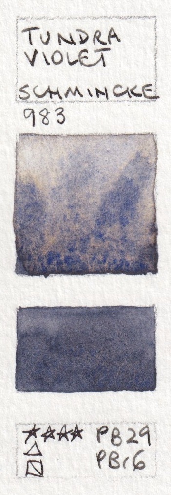
Tundra Violet is a dark grey-violet due to the reddish Mars Brown pigment mixed with Ultramarine.

Tundra Blue has a small amount of a brown earth mixed with Ultramarine.

Tundra Green is the Mars Brown mixed with Cobalt Green.


Schmincke Watercolours - Tundra Orange, Tundra Pink, Tundra Violet, Tundra blue and Tundra Green

Often, when making colours, manufacturers are producing 'hues' and blending the pigments into new compounds that effectively behave like a single pigment. Mixtures like these are intended to keep the different pigments in the mix separate, so they can each contribute to the liveliness of the colour. What is interesting is that the mixtures in tubes may behave differently from the mixtures of the same pigments then mixed in your palette in your own studio.

I certainly wouldn't suggest this whole range is necessary, but some granulating watercolour mixtures can be really lovely to explore in watercolour painting. 

The Volcano set, Shire set and Desert set were added tot he range later. These are based around some rarely seen pigments - PY159 ( Zirconium Praesodymium Silicate Yellow), ad granulating yellow which is only used in W&N Lemon Yellow Deep and Kremer Intensive Yellow as far as I know; and PV62 (Strontium Phosphate Violet) which I have only seen in Aquarius Strontium Violet. The cadmium red used is a very granulating version.

There are five colours in the 'Volcano' set, including

Volcano Yellow which is the pure gently granulating PY159. This is one I would purchase if I want to create more granulating mix myself.

Volcano Orange which has PY159 mixed with a gently granulating cadmium red

Volcano Red which is just the very granulating cadmium red

Volcano Violet which uses the cadmium red mixed with PV62

Volcano Brown which is a mixture of the cadmium red and Mars Black
Schmincke Watercolours - Volcano Yellow, Volcano Orange, Volcano Red, Volcano Violet, Volcano Brown.


The five 'Shire' colours are all based around PY159. They are pretty, but simple to mix.

Shire Yellow is made with the PY159 yellow and the PV62 Violet

Shire Olive is a very soft granulating yellow-green made with the PY159 and cerulean.

Shire Green is another gentle granulating green made with PY159 and Cobalt Green Deep

Shire Blue is a very greenish blue made with ultramarine, cobalt green deep and PY159

Shire Grey is made with Mars Black, Cobalt Blue Deep and PY159.

Schmincke Watercolours - Shire Yellow, Shire Olive, Shire Green, Shire Blue, Shire Grey.


The five 'Desert' colours are softly granulating earth colours, also mostly including PY159. 

Desert Yellow contains the PY159 and an earth brown - an umber or Sienna.

Desert Orange contains PY159 and Zinc Iron Chromite Brown (used in Schmincke's Mahogany Brown and Daniel Smith Lunar Earth)

Desert Brown contains the PY159 yellow, Cadmium Red and Mars Black

Desert Green contains Cadmium Red and Cobalt Green Deep

Desert Grey contains PY159 and Mars Black/

Schmincke Watercolours Desert Yellow, Desert Orange, Desert Brown, Desert Green Desert Grey.

You can see them all at Jacksonsart (affiliate link).


2024 update.

Two new super-granulating series have been added - the Urban set and the Haze Set, taking the range to 50.

I haven't tried these out, and really can't get enthusiastic about them to be very honest. You can create these mixes yourself with a basic set of granulating pigments. This just feels like marketing gone a little mad. However, if I come across anyone with samples to share I'll add them to keep up to date.

Urban set
These all have PY159, an interesting granulating mid-yellow. Most also have PR108, a cadmium red. 
Urban Yellow - PV16, PY159
Urban Red - PR108, PB35, PBr6, PY159
Urban Green - PB36, PBk11, PY159
Urban Brown - PR108, PBk11, PY159
Urban Grey - PR108, PB35, PBk11, PY159

Haze Set
Haze Pink - PB36, PR233
Haze Blue - PB29, PBr7, PY43
Haze Brown - PBk11, PBr7
Haze Indigo - PB29, PG26, PBr33
Haze Black - PB36, PBk11, PBr33

Monday, 8 March 2021

White Nights 2019 full range, with 2020 and 2021 updates


White Nights, also known as St Petersburg, has been one of the many generous sponsors of the Urban Sketchers Symposium for the last few years now. They have been expanding their range, moving from just full pans to the addition of 10ml tubes for many colours, and expanding their range with 9 extra colours in 2017 and another 9 new colours in 2019. They have also added 7 metallics. I am grateful that they have given me samples to try to keep up, though somehow Venetian Red slipped through the cracks.


The colours that were added increased the range to 75 colours and the new colours are mostly lightfast and largely single pigment additions. I've updated my previous post but decided to create a new post of the full range here, this time with most colours scanned rather than photographed, where possible.


These are very reasonably priced watercolours that perform well. Setting up with full pans is simple and gives easy brush access so they suit beginners, though of course many professional artist use them as well. They are made with genuine pigments though some feel to have some sort of filler? And some of the pigments are not lightfast, such as PY1, PV3, PR2, PR4, PO13, PG8 and others. As far as I know the colours with less lightfast ratings have remained in the range so do check pigment numbers if you are working on paintings for sale or exhibition. In a sketchbook, watercolours are protected from light.


I'll add the full 2019 range below.


March 2021 update - many more colours were added, and some changes so the full range now consists of 108 colours, including 18 pastel shades and 7 metallic. Many of the previous colours have been updated with more lightfast pigments, which is fantastic. With the addition of new colours to close the gaps and better pigments for greater light-fastness, this range has really improved dramatically over the last few years. While I haven't painted the new colours or the new versions, I'll update the information for each colour. Eventually I'll do a new blog post if I get new samples. 

November 2022 update - The range is now 120 colours so I am a long way out of date. You can see the latest Colour Chart here.  There are 80 'classic' colours, 59 of which are single pigment; 18 pastel colours, 7 metallic colours and a new range of 15 granulating colours that can be seen in action here.


As always, yellows, oranges and reds are difficult to represent accurately. I've scanned all the swatches but I needed to use a couple of photos for better accuracy for the oranges. As I haven't yet found an updated colour chart, I've used my own system to arrange the colour swatches.

The new Aureolin gives an even better primary yellow option. 211 - Yellow (PY154) and has been added to the range, possibly replacing the fugitive 215 Hansa Yellow (PY1) which isn't on the new colour chart, but is still shown here.
White Nights Watercolour - Zinc White, Lemon, Cadmium Lemon,
Aureolin (new 2019), Hansa Yellow.


PY216 used in the new Naples Yellow Light and Naples Orange is also known as Turner's Yellow. I haven't seen the orange version before. Both are more opaque colours. I like the Indian Gold as a warm yellow option as it will mix interesting greens. Indian yellow is a very transparent mid yellow option. 206 - Ochre Light (PY43) has been added but is not shown here.
White Nights Watercolour - Indian Yellow (new 2017), Cadmium Yellow Medium,
Naples Yellow Light (new 2019), 
Indian Gold (new 2017), Naples Orange (new 2019).


It is difficult to capture the true colour of oranges and yellow-oranges.
White Nights Watercolour -Golden, Golden Deep, Cadmium Orange, Orange Lake,
Orange (new 2019)


Geranium Red is interesting as it looks like a warm red but has a rose undertone in a wash so I suspect it might mix purples too - I'll check that out.
White Nights Watercolour - Titan Red, Cadmium Red Light, Vermilion (Hue)
(Old version - now made with PR188 & PY154), Geranium Red (new 2019),
Scarlet (Old version - now called Scarlet Light and made with PR 188). 


368 Neon Pink (PR122, PV10) has been added but is not shown here.
White Nights Watercolour -Ruby, Madder Lake Red Light, Venice Purple (new 2019),
Claret, Carmine (Old version - now made with PV19, though this is referred to as PR19).


368 - Neon Pink (PR122& BV10) has been added but is not shown here. 627 - Perylene Violet (PV29) has also been added but is not shown here.
White Nights Watercolour - Quinacridone Red (new 2017),
Quinacridone Violet Rose (new 2017), Quinacridone Rose, Rose, Quinacridone Lilac. 


There are still some of the lovely but fugitive pigments in the range - PV2, PV3, PB1 seen here. Use with caution.
White Nights Watercolour -Violet-Rose, Quinacridone Violet (new 2017),
Ultramarine Violet (new 2017), 
Violet, Blue Lake.


521 - Ultramarine Deep (PB29) has been added but is not shown.
White Nights Watercolour - Indanthrone Blue, Ultramarine, Cobalt Blue, Azure,
Blue (New 2017).


PB36 used in Cobalt Azure Blue is my favourite choice for a cerulean pigment. A good addition to the range.
White Nights Watercolour - Bright Blue (Brilliant),
Indigo (Old version - now made with PBk7, PB15 & PV23), Prussian Blue,
Ceruleum Blue, 
Cobalt Azure Blue (new 2019). 


Cobalt Turquoise is an incredibly popular watercolour. 533- Cobalt Chrome Turquoise (PB36) has been added - often known as cobalt turquoise or cobalt turquoise deep.
White Nights Watercolour -Azure Blue, Cobalt Turquoise (new 2019),
Turquoise Blue, Green Light, Emerald Green.


White Nights Watercolour - Green Original, Yellowish Green, Sap Green (new 2017),
Green Earth, Olive Green.

I love yellow ochre as a colour but shy away from this mix with PY1. 257 Irgazin Yellow (PY129) has been added but is not shown here, along with 206 Ochre Light (PY43).
White Nights Watercolour - Chromium Oxide, Green (Russian), May Green (new 2019),
Yellow Ochre (old version - now made with PY43 & PY154), Naples Yellow.

White Nights Watercolour - Raw Sienna (Old version - now made with PY43) , Red Ochre,
Burnt Sienna, Shakhnazarskaya Red, English Red.


604 Caput Mortuum (PR101) has been added, but is not shown here. 401 Van Dyck Brown (PR102&PBk8) has also been added.
White Nights Watercolour - Venetian Red (New 2017, not shown), Burnt Umber,
 Mars Red, Umber, Sepia. 


Two new blacks are 801 Lamp Black (PBk7) and Ivory Black (Hue) P(R102 & PBk7)
White Nights Watercolour - Voronezhkaya Black (old version - now made with PBk8),
Payne's Grey (Old version - now made til PBk7, PB15 & PV55) Neutral Black. 


The 7 new metallic colours...
White Nights Watercolour - Silver Light, Inca Gold, Bronze, Aztec Gold. 

White Nights Watercolour - Antique Gold, Silver Deep, Copper. 


I haven't tried any of the 18 new pastel colours.


With all these new colours, my suggestions for a White Nights 12-colour plein air sketching palette has changed.


I'd look at Aureolin, Indian yellow, the new Scarlet Light or Geranium Red (I need to test that in mixes), Quinacridone Red, Ultramarine or the new French Ultramarine, Cobalt Azure Blue, Emerald Green (for mixing only), Sap Green, Raw Sienna or perhaps the new Ochre light, Burnt Sienna, English Red (or possibly Venetian Red - I haven't tried that one) and Payne's Grey. That would now be a lightfast set :-)


To match my Ultimate Mixing Set, the closest options are Aureolin, Indian Yellow, the new Scarlet Light, the new Carmine (not a perfect match), Quinacridone Red, Ultramarine, Cobalt Azure Blue, Bright Blue, Emerald Green, Raw Sienna (not a perfect match), Burnt Sienna, English Red (or possibly Venetian Red - not perfect matches), Umber (not very strong) and Paynes Grey (also not a perfect match)


If you would like to send samples of any of the missing colours, please get in touch :-)

Happy painting :-)