They are made in Shanghai, China.
The naming is not completely consistent. The Cadmium hues are labelled as such but the Cobalt, Vermilion, Viridian and many of the earth hues are not.
I painted these from dried dot samples from tube colours. Apparently they shrink quite a bit as they dry. Mostly they re-wet well though some were a little more difficult to get a strong wash. There are some excellent pigments and some great colours in the set, but also some less interesting mixes. There are 43 colours, excluding iridescent and interference colours.
The stars represent lightfast ratings where I am guessing 4 is the best. The letters A, B or C refer to the series where I am assumed A is the most expensive. I did not find a website to check. Tubes are 9ml and are very affordable - find them in Australia here for only AU$4.35 per tube regardless of series.
As usual, the oranges and crimsons are hard to scan accurately so I've taken photos of some swatches and will note colour differences below.
These yellows look fairly close to the originals. The Cadmium Orange (Hue) is actually just a little more yellow than it looks on my screen.
 |
| Marie's Masters Watercolours - Lemon Yellow, Cadmium Yellow Light (Hue), Cadmium Yellow (Hue), Gamboge (Hue), Cadmium Orange (Hue) |
I had to take a photograph to try to replicate these colours. Most are pretty close but the Crimson is just a bit more 'crimson-looking' than it appears here.
 |
| Marie's Masters Watercolours - Transparent Red, Crimson, Prose Permanent Crimson, Permanent Rose. |
This is another photograph and is also better than the scan but the colours are a little brighter than they look here. The pigment used in Cadmium Red (Hue) is my favourite for a lovely warm red.
 |
| Marie's Masters Watercolours - Vermilion Red, Cadmium Red Pale (Hue), Cadmium Red Hue), Cadmium Red Deep (Hue). |
The colours in this scan are fairly close - only the Alizarin Crimson (should be called a hue, as it is not made with PR83) looks a little less crimson in this image.
 |
| Marie's Masters Watercolours - Alizarin Crimson, Purple Lake, Purple Red, Brilliant Purple, Ultramarine. |
Cobalt blue should be called a hue since it doesn't contain PB28. Prussian Blue was difficult to activate.
 |
| Marie's Masters Watercolours - Cobalt Blue, Sky Blue, Phthalo Blue Green Shade, Prussian Blue. |
Viridian should also be called a hue, or be called Phthalo Green Blue Shade, which is what it is.
 |
| Marie's Masters Watercolours - Peacock Blue, Viridian, Phthalo Green, Emerald Green. |
Yellow Ochre was quite lovely to paint out.
 |
| Marie's Masters Watercolours - Sap Green, Hooker's Green Light, Hooker's Green Dark, Yellow Ochre, Raw Sienna. |
Burnt Sienna, like many of the earth colours, should be called a hue - it doesn't contain PBr7 at all. Deep Umber and Light red were very nice to paint out.
 |
| Marie's Masters Watercolours - Burnt Sienna, Raw Umber, Burnt Umber, Deep Umber, Light Red. |
I love Indian Red, though it can be overpowering. This version was nice and rich, but easily controlled. While I am not a big pan of greys made with black pigments, the Payne's Grey was a nice version as it uses ultramarine rather than phthalo blue so is not as cold as Payne's Grey often can be.
 |
| Marie's Masters Watercolours - Indian Red, Vandyke Brown, Payne's Gray, Indigo. |
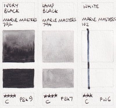
I couldn't get the Lamp Black any darker than this but perhaps it is stronger from the tube.
 |
| Marie's Masters Watercolours - Ivory Black, Lamp Black, White. |
I wish everyone all the best of health in these challenging and difficult times. Like so many, I have cancelled my trips, classes and workshops for the foreseeable future and will be working from home. I plan to get a lot done on my online classes and set up video classes for my regular students. I am also thinking of setting up a Q&A sessions once a week via Facebook, Instagram, Zoom or other - suggestions welcome.
kind regards.
Jane

Don't like the watercolors, but love the palettes especially for painting on location. Even add a few extra half pans down the center if needed. I save the half pans for my grand children and fill the palette with my go to colors.
ReplyDeleteReally informative! So glad that I found this <3
ReplyDeleteThank you for the information, i am a beginner in watercolor, never try any other brand of watercolor supplies
ReplyDeleteThank you Jane! The colors are great, vibrant and saturated. I'll definitely buy them because those paint is cheap, it's just $1.50 per tube in here (Indonesia)
ReplyDeleteThank you for sharing about this watercolour! I am a beginner and this is so informative for me because i never try tube watercolour
ReplyDeleteThank you for this fair review. I recently purchased it and waiting for delivery. I wanted to buy DS, Schminke or Holbein, but they're just too pricey for me. I'm a bit disappointed to learn that the colours are not accurate. But I'll fke do til I can affoyd the good ones.
ReplyDeleteWhat do you think of Shinhan, Kuretake and Ecole professional?