
You have the choice of opaque or transparent yellows, with the very popular cadmiums being more opaque. You also have the choice of single pigment and mixed pigment colours. I use single pigment colours where possible. You also have a choice of staining or non-staining colours and to some extent granulating or not.
Cool Yellows
The cool yellow range includes many lemon yellows, cadmium light, hansa light and so on. These colours lean towards green and have no apparent red in them so will make very bright greens when mixed with a cool blue and more neutral greens when mixed with a warm blue. My favourite is Hansa Yellow Light PY3, made by Daniel Smith or Da Vinci. Art Spectrum use the same pigment in their Lemon Yellow. It is a bright, pure lemon yellow with plenty of tinting strength. Bismuth Yellow is more opaque, as are the genuine Cadmium Yellow Light colours. I don't like the Nickel titanate Yellows PY 53 at all - it is weak and ugly. I have added DS Aureolin here though it could equally be in with the mid yellows - either way it is not recommended as PY40 is not a reliable pigment. |
| Nickel Titinate Yellow Daler Rowney, Cadmium Yellow Winsor &Newton, Lemon Yellow Art Spectrum, Cadmium Yellow Light DS, Cadmium Yellow Light Hue DS, Winsor Lemon W&N, Bismuth Yellow, Steven Quiller |
 |
| Nickel Titanate Yellow Daniel Smith, Bismuth Vandate Yellow DS, Hansa Yellow Da Vinci, Hansa Yellow Light DS, Aureolin DS, Aureolin Hue Lukas |
Mid Yellows
The mid range are yellows that are neither warm nor cool - they don't lean toward green or orange - but can be tinted with a blue to cool them or with a red to warm them. They are ideal in a limited palette, but I rather like them in my regular palette too. The best known mid yellow is Cobalt Yellow or Aureolin PY40. Unfortunately, though you will see this recommended in many many watercolour books, it is not a good choice as the pigment fades in washes and goes grey in mass-tone so look for better alternatives if you want your paintings to last. If you have Aureolin, use it in a sketch book only, where it is protected from light, and photograph or scan your work for posterity.I have written more about Mid Yellows in a previous post here as I tend to use a mid yellow rather than a light yellow in my palette, but have tried out a few more colours since then. There are many that are good, my favourites being Hansa Yellow Medium DS and Arylide Yellow Medium Da Vinci. Schminke Pure yellow and Winsor and Newton Winsor Yellow are also good. In my experience Mayan Yellow didn't rewet well once dry on the palette. W&N Transparent Yellow made with PY150 is shown here, the DS and MG versions are with the warm yellows below, though they are all fairly similar slightly neutral yellows.
 |
| Arylide Yellow DV, Hansa Yellow Medium DS, Mayan Yellow DS, Schev Yellow Light Old Holland, Tranparent Yellow W&N. |
 |
| Azo (Aureolin) M. Graham, Azo Yellow DS, Pure Yellow Schmincke, Aureolin W&N, Cadmium Yellow Medium Hue DS, Winsor Yellow W&N. |
Warm yellows are yellows that lean towards orange. These will mix with blues or phthalo green to make more olive-greens due to the neutralising red in them. In Australia I find the warm yellows make wonderful realistic greens. In Europe mid or cool yellows may be more useful. The first two rows are the brighter hue warm yellows. My favourites of all these are New Gamboge by Daniel Smith and Hansa Yellow Deep by Daniel Smith or Da Vinci. As always, I am less interested in the mixed pigment yellows.
 |
| Isoindoline Yellow DS, Indian Yellow W&N, Cadmium Yellow Deep Hue DR, Cadmium Yellow Deep DR, Indian Yellow DS, New Gamboge DS, Gamboge Hue DV |
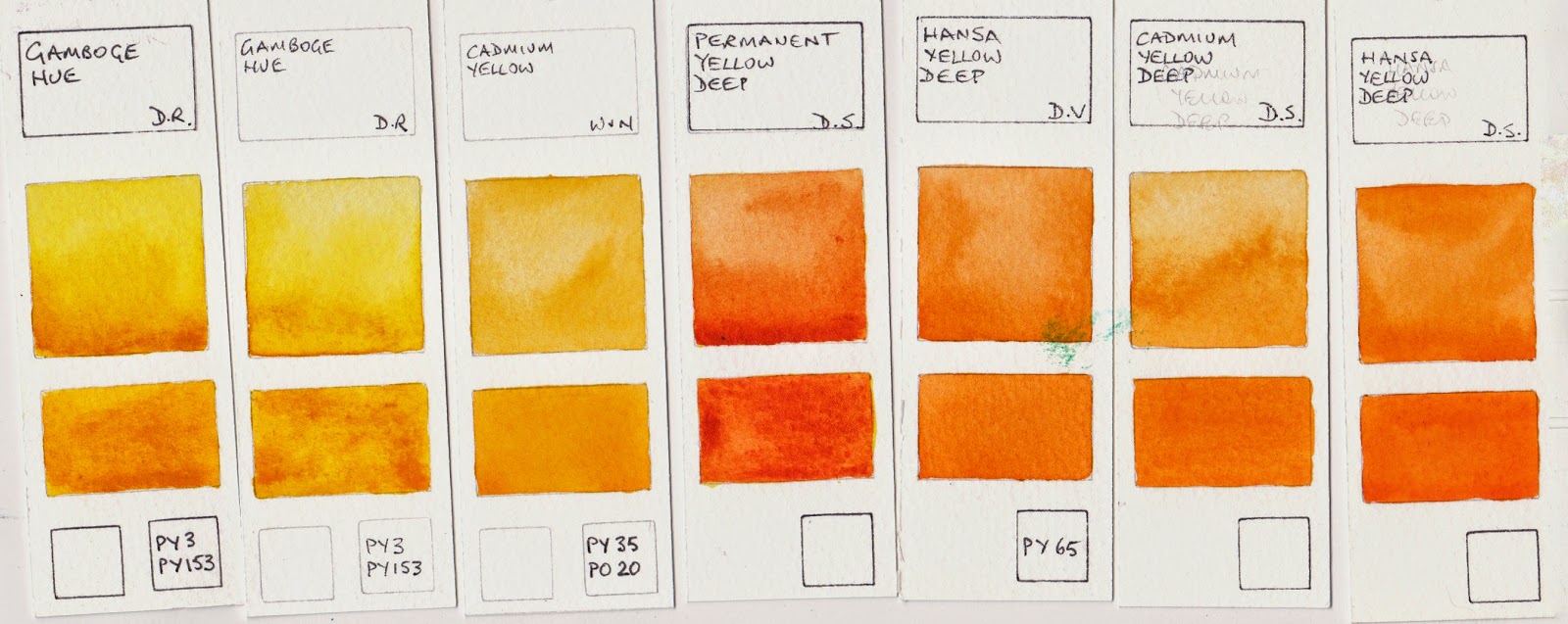 |
| Gamboge Hue DR, Gamboge Hue DR, Cadmium Yellow W&N, Permanent Yellow Deep DS, Hansa Yellow Deep DV, Cadmium Yellow Deep DS, Hansa Yellow Deep DS. |
The next group are slightly neutralised yellows. Quinacridone Gold PO49 by Daniel Smith is one of my favourite warm yellows and can double as a transparent yellow earth colour. Nickel Azo Yellow washes out to a lighter almost lemon yellow but has a deeper, slightly dirty masstone. W&N Transparent Yellow uses the same pigment.
 |
| Nickel Azo Yellow DS, Nickel Azo Yellow MG, Quinacridone Gold W&N, Quinacridone Gold DS, Australian Red Gold AS, Quinacridone Gold Deep DS. |
Watercolour Comparisons 1 - Ultramarine Blue here
Watercolour Comparisons 2 - mid yellows here
Watercolour Comparisons 3 - Primary Red here
Watercolour Comparisons 4 - Burnt Sienna here
Watercolour Comparisons 5 - Greens (Single Pigment, convenience mixes and special effect) here
Watercolour Comparisons 6 - Reds (Cool, mid and warm) here
Watercolour Comparisons 7 - Yellows (cool mid and warm) here
Watercolour Comparisons 8 - Blues here
Hi Jane, I am new to watercolour painting and I wondered what your thoughts were on Art Spectrum watercolour. I have purchased quite a few of their tubes (wanting to go with an Australian made product) only to be advised recently that other brands such as WN, DS and Holbein are far superior and I won't know myself if I make a change to these brands. Prior to this advise I was enjoying my AS paints. Is there really that much difference between AS and other brands?
ReplyDeleteArt Spectrum have some great colours using very good pigments. Their Burnt Sienna Natural is one of the most gorgeous granulating burnt siennas I have tried. The Australian Leaf Green deep is wonderful and they are great to use straight from the tube. What I found though was that they tend to dry out in the palette. If you are having that issue, add just a drop of glycerine (available from a pharmacy) to each pan and stir well when you top up your palette and they should be fine. I would not suggest switching to another brand for any of the colours you are enjoying unless you discover the pigment is fugitive or you decide that you don't like the colour. Holbein watercolours often contain more white and are often more opaque and you need to check the light-fast rating of the pigments, W&N are often multi pigment hues rather than single pigment colours and while I prefer the fact that DS colours usually dry nicely in the pan, Art Spectrum are an excellent brand to use. Enjoy them!
DeleteThank you Jane. I have been enjoying them, I love the Australian colours and they're well priced and easy to access here in Melbourne. Yes, a few colours have dried and cracked in the palette so the glycerine is a great tip to avoid this. I appreciate your vast knowledge in this area and will definitely continue to use them. I think I might treat myself to the Australian Grey and Burnt Sienna colour next! Thanks again. Donna
ReplyDeleteI don't know if they still have both the burnt sienna hue and the burnt sienna natural - both are good but the natural was with PBr7. I don't know what you are painting and what colours you already have but I didn't find the Australian Grey terribly useful. That's one colour that I would go for the Daniel Smith Buff titanium instead and mix it to your chosen hue with other colours. I love the Australian Red gold :-) Makes wonderful greens with ultramarine or phthalo green.
DeleteOk, I thought the Australian Grey would be a good alternative to DS Buff Titanium. Perhaps not. I thought it would be good for mixing creamy corals and dusky pinks. The Australian Red Gold is another one on the wish list. :)
ReplyDeleteOn another note, I love your website and I've been learning a lot about mixing hues to obtain beautiful greys and yummy mauves. Your latest book is on my birthday wish list.
Australian Grey is odd - it contains PBr7 and PY42 which are a burnt sienna and a yellow oxide but looks as though it also has a lot of white, even though none is note, and it is slightly pink in colour. By all means use it if it's creamy corals and dusky pinks you are after :-)
DeleteWhat would you suggest to replace my DS, cool, transparent aureolin yellow with? The painter who recommended it, says lemon yellow is not transparent and is chalky, although DS labels it transparent. Mayen or Lemon look like possibilities, hansa light looks good but is semi transparent...So confusing!
DeleteCarol one one the most transparent yellows is Nickel Azo Yellow. Used in mass tone it can look a little neutralised but it washes out into a lovely bright transparent yellow. The hansas, light and medium, are also very pretty and totally pure in colour but are semi transparent so not what you are looking for.
DeleteHi Jane, I was wondering how the M Graham Azo Yellow compares with Daniel Smith Azo Yellow? I saw an artist (Jean Haines) use DS's Azo Yellow and loved the result she got from dropping it into her greens, letting it mix in the paper. However M Graham's is so much cheaper. $5 USD less than DS! Do you think the two look and handle the same? Or at least close enough not to notice? Thanks, Jessica
ReplyDeleteIt's a tricky one to reply to. M.Graham use wonderful pigments and both brands are PY151 so colour-wise it will be similar. Handling-wise, perhaps not so. I allow watercolours to dry in my palette before use - makes them very convenient. If you do the same you would have to use only a very small amount of the MG at a time as it doesn't really dry (in Sydney Australia) due to the honey content. If you work with wet watercolours straight from the tube you may notice less difference between them. I'd suggest that you give the M.G. a try :-)
DeleteWow, that was fast! Thanks so much for your input. I only paint in my studio here in western NY state, so sometimes a paint dries before I use it and sometimes not. It's a shame Daniel Smith is the only company that sells try-it dots. I like to try before I buy and also would like to compare colors from different companies. Seems like they'd sell more paint, too.
DeleteThanks again! Jessica
As you live in NY, the M. Graham paint should be equally as good (in my opinion). I live in Canada and do not have an issue with M. Graham paints. Steve Mitchell of "The Mind of Watercolor" thinks very highly of M. Graham paints.
DeleteDear Jane,
ReplyDeleteWhile painting dark and cold winter nights. Think a cottage and Forrest maybe some aurora... For dark sky and background which blue black tone is best in Daniel smith?
And my second question is if we want to give window light or candle light effect which yellow can be use or mix blue black areas. So it's needs to be transparent am I right? :)
For the blue, Indanthrone Blue - a deep, gorgeous single pigment blue. More powerful than ultramarine but without the black that you get in most indigos.
ReplyDeleteFor the glow, you have to be careful not to make a green with the blue right? If they don't actually mix, you could use quinacridone gold. That creates a beautiful warm glow. If they do mix you might be safer with raw sienna - it won't go green with the blue. Sounds stunning :-)
Hi Jane, thank you for sharing the information! I have a question regarding the DS New Gamboge. I initially thought it was a single pigment color (PY153 according to handprint) until I had a look at the DS website. It is obviously a mixed pigment yellow (PY97 + PY110). http://www.danielsmith.com/ItemSearch--search-New-Gamboge--srcin-1 I wonder what's the difference between the two?
ReplyDeleteMy name is Xiaopei Wu, for some reason Blogger's have errors displaying my profile. Thank you Jane!
Deletethe lovely pigment PY153 has run out :-( Often a pigment is manufactured for an larger industry - such as the car industry - and if they cease to use the pigment, manufacturing stops. DS New Gamboge was made with the single pigment PY153 but is now a mixed hue using PY97 and PY110. Daniel Smith are pretty good at matching their hue colours to the original version, though you may find the odd 'old stock' tube of the lovely PY153 around still. I will add the new hue version to my website when I try it.
DeleteYou still can get PY153 watercolour from Lukas (Indischgelb 1024), Jackson's and Semnelier (Jaune Sennelier Clair 578).
DeleteSchminke still sells it as a dry pigment. Hurry up to sock up!
Good to know :-)
DeleteI stocked up on the DS New Gamboge so have the original PY153 when I need it. I think PY65 (found in Hansa Yellow Deep and others) is a good alternative as a bright, warm yellow.
SCHOOL BUS YELLOW - Is the street term for this.
ReplyDeleteOnly 2 needed here aureolin and genuine gamboge . Gamboge has a multitude of names and is the same product .Gamboge is produced in India from the urine of cattle fed on a diet of mangoes .It is dried and the final product is processed. So Indian yellow is gamboge as the word gamboge is an English corruption of the Indian word for its more basic name .
ReplyDeleteThese will produce granulating and non granulating effects and mix well in the vast majority of palettes to produce an amazing array of colours and effects .Genuine gamboge being urine is sterile and non toxic .It is easy to differentiate from hues and tints because of its odour !
The problem is that Aureolin is going to fade in tints and go grey in mass-tone, so not a good choice outside of the protection of a sketchbook.
DeleteGamboge is, in fact, derived from the word Cambodia, where the resin is extracted from trees. It is a stunning colour until it, too, fades. It is Indian Yellow that is said to have been produced from the urine of mango leaf-fed cows. More reliable versions of both have been produced, hence 'new gamboge'.
Hi Jane!
ReplyDeleteI'm just learning to paint in watercolour and am sorting my paints by pigment. I'm confused about Windsor & Newton's 'Windsor Yellow', which according to the Handprints site has a pigment of PY175 -- but, you have it listed as pigment PY53. According to the Handprints site PY53 is actually 'Nickel Titanium Yellow' which was discounted in 2005. I'm finding the discrepancies confusing (but maybe it doesn't matter?) Thanks for any advice you may have.
Deb Sullivan
Sennelier sell a Nickel Yellow PY53 which seems a light transparent lemon similar to PY3 and has low tinting strength (quite nice for mixing though), but Windsor and Newton were selling a 'special' PBr24 nickel yellow titanate similar to gold ochre PY42. Not sure this makes a lot of sense from a chemical viewpoint - is it the degree of calcination? Anyone understand why these are so different?
DeleteThink I have the answer - PBr24 is actually a chrome titanate and Winsor and Newton just called it a special 'yellow titanate'. Maybe they thought the word chrome would put off buyers?
DeleteYour blog provided us with valuable information to work with. Thanks a lot for sharing. Keep blogging.
ReplyDeletebest alternatives to AZO
As an ex employee of Winsor and Newton in Wealdstone , I was one of the last people to make Gamboge genuine , it is very labour extensive , only made by hand and time , to pigment stage ,also the Rose Madder pigment , takes 6 weeks , one man , one person with the knowlege which takes 18 months to understand the process to pigment.How lovley every morning to see my lakes of Rose Madder , gaz
ReplyDeleteI would love to hear more about the processes of both Gaz if it is not all trade secrets. I have written a post about Gamboge and another about Rose Madder (and Potter's pink) and it would be great to add more detail to both. The rose madder lakes would have smelt lovely I presume :-)
DeleteIf you can send more information, my email address is jane@janeblundellart.com.
gaz, thank you for this information. You are amazing! It really is an artistic process to produce such beautiful paint. Amazing!
DeleteWell Gamboge arrived as a solid lump that was sock shaped 3" x 6" , the sock was used to collect the resin in Cambodia ! , till it dried , the first process was for it to be broken down to 5mm x 5mm , which was to sit in a booth table , full safety gear , as you have said it is a not good to breath the dust , then with varying hammers broke it down on a metal plate , removing all the bad bits , including bullets , which the people who harvested it added for weight , and twigs , which effected colour with a brown hue , i will post more if it's of interest to the artists out there . G
ReplyDeletePlease do! I have some lumps of gamboge - I wrote about them in another post.
Deletetaking all your advice about aureolin i still plan to add it to my palette. do you have a recommendation for a brand? i didn't see any comparison on the pigment through the various makers.
ReplyDeleteMy recommendation is not to use any PY40 Aureolin watercolours. There are other pigments with the same colour that don't go grey or fade. Add an aureolin hue, by any means. You can see many different and lovely yellows on my website here. https://www.janeblundellart.com/yellow-watercolour-swatches.html
DeleteI am signed up for a Don Andrews workshop and his list of recommended colors includes lemon yellow. I have cadmium yellow, WN transparent yellow, American Journey sour lemon and DS quinatholaone yellow & Sennelier yellow light. Will one of these suffice or should I look for something else? Thanks in advance!
ReplyDeleteA lemon yellow simply means a cool yellow - one that leans towards green. I think your AJ Sour Lemon or Sennelier Yellow Light will both be cool yellows. Certainly no need to buy another :-)
DeleteHi Jane,
ReplyDeleteThis may be somewhat late to the party (so to speak)but I've just got a tube of PY 155-Lukas Permanent Yellow Light.Like PY 150 its a Benzimidazolone but does not have that browning in masstone. I can't find out much about it except from Lukas who say its lightfast and pigment suppliers who rate it as moderate. Its a rather good, useful yellow and less staining than PY 150. Have you come across it yet ?
Keep up the good work and Many thanks,
Melusine.
Hi just wanted to say I love your blog and often find myself here figuring out about my color palette.
ReplyDeleteI thought PY3 was not very lightfast. How does it compare to the other lemon yellow pigments?
ReplyDeleteJust wanted to say that your blog has been a great source of information for me many times. Thank you, Jane!
ReplyDeleteThank you for this. Very helpful.
ReplyDeletePY3 has lightfastness issues. PY175 is more reliable. If opacity isn't as much of a concern, PY184 is also a good choice — being more lightfast than PY175. Hansa yellows and many other organics do offer greater saturation and purity but at the cost of often inferior lightfastness, versus inorganic pigments like PY184.
ReplyDeleteI've encountered a mystery and am wondering if you have any insight to throw on the subject: I recently (Feb 2023) bought a 5ml tube of Schmincke Yellow Orange. When I got it home I saw, to my surprise, that the label said it was PY153, a pigment discontinued a decade ago. I figured perhaps I'd encountered some very old stock. But when I checked my various downloaded catalogues, going back to 2012, I saw that Yellow Orange was introduced by Schmincke as one of their new colours in 2017 and it has always been listed as a PY110 colour. Very strange…
ReplyDeleteAfter I posted here, I wrote to Schmincke and they explained it was a typo/printing error on an early batch of labels and that Yellow Orange has never been PY153, only PY110.
DeleteI was looking for an orange that was close to Winsor orange watercolor
ReplyDeleteWhich DS can I use to substitute for H. Hookers green?
ReplyDeleteWhat is a good substitute for quinacridone gold?
ReplyDelete