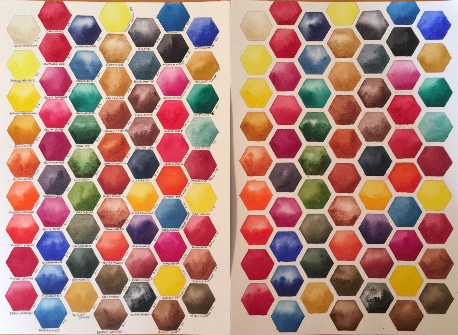
In this test I just used the colours I most like. I painted all the ones in my palette or that I was considering using in my palette, and the 'extras' that I use occasionally...and a couple that hadn't made it into the previous tests that I was interested in trying. So you will notice there are a few versions of Quin Rose, Phthalo Blue, Phthalo Green, a few different crimsons and a few different Ultramarines etc as I tried one brand against another. I can't make the page any larger so if you are interested in a particular colour and can't read where it is, just ask me. Carmine, which wasn't in my other tests, is top left next to Buff Titanium. It is very similar in hue to W&N Permanent Alizarin which is third from the bottom on the right.
I really wanted to test the primateks too. Jadeite, Green Apatite and Piemontite are three that I love to use in my paintings that are framed and sold and of course I don't want them to fade. Since there isn't much research on these colours I wanted to do some more of my own.
The unlabelled swatches have been in a north facing window in my studio for 5 months so far. The labelled page has been in a dark drawer. Hopefully they will stay there for 2 years. So far I can see no change in any of them.


June 2016 update.
I had a good look at the pages today. They have now been in a north facing window in the harsh Australian sun for over three years. That's a pretty tough call for watercolour. I think a couple of the quinacridone colours have deepened slightly, but or lost some brightness, but I see no fading.
This is a photo since I don't have a large enough scanner. The exposed sheet is on the right.