Showing posts with label Jane's Black. Show all posts

Thursday, 2 March 2023

Jane's Blacks.

I wrote a blog post in 2015 Custom Watercolour Mixes - a question of Greys about creating various mixed greys, without the use of black or white pigments. Daniel Smith Art Materials created Jane's Grey - the lovely mix of Burnt Sienna and Ultramarine - as a signature colour in 2019. From 2018, I've also been working with their wonderful chief chemist on some interesting mixed blacks. We looked at an earth grey as well, but as a three pigment mix it was rather complex. We also looked at a Red/Blue mixed black but eventually narrowed down to just two.

Jane's Black R/G (Red/Green) began last century when I mixed Anthraquinoid Red with Phthalo Green BS and discovered a fabulous range of colours from a deep green and deep maroon to a rich black. I love it when colours totally and perfectly neutralise each other! This mixing pair creates gorgeous fig, plum, aubergine, Perylene Maroon and Perylene Green hues - colours that are otherwise quite tricky to mix. 

Over the years I modified this to use Pyrrol Crimson PR264 instead and created tubes of this colour as a premix for myself and my students. The neutral black created is staining and non-granulating, so can also be useful for tonal underpainting or wherever a rich black is required, without the deadening effect of black pigments.


Various paint-outs of Jane's Black R/G in development


We exchanged emails and samples over a number of years to get the perfect neutral black. Not too much PG7, not too much PR264. 

I use Jane's Black R/G for paintings that are largely red and green - roses, tulips, and so on, but also as a general rich black as it is easy to mix from my palette colours. This keeps colour harmony in paintings. Add a little phthalo green for rich deep greens, or add a little more Pyrrol Crimson for wonderful maroon colours - the colours of crimson in shadow.


I needed it a lot when painting in Amsterdam, as many buildings are painted in a rich black or grey. This sketch of the cafe that dates back to 1695 shows Jane's Black (Red/Green) in action. I mixed it up from tubes in my hotel room to create enough to work with on a number of buildings. This makes it more consistent than mixing it in the palette on the fly and having the colour gradually change. In the windmill is was diluted to a grey for the look of faded paint.


Jane's Black (Red/Green) in use on a fabulous building, now a cafe, built in 1695, and as a faded black for the windmill.


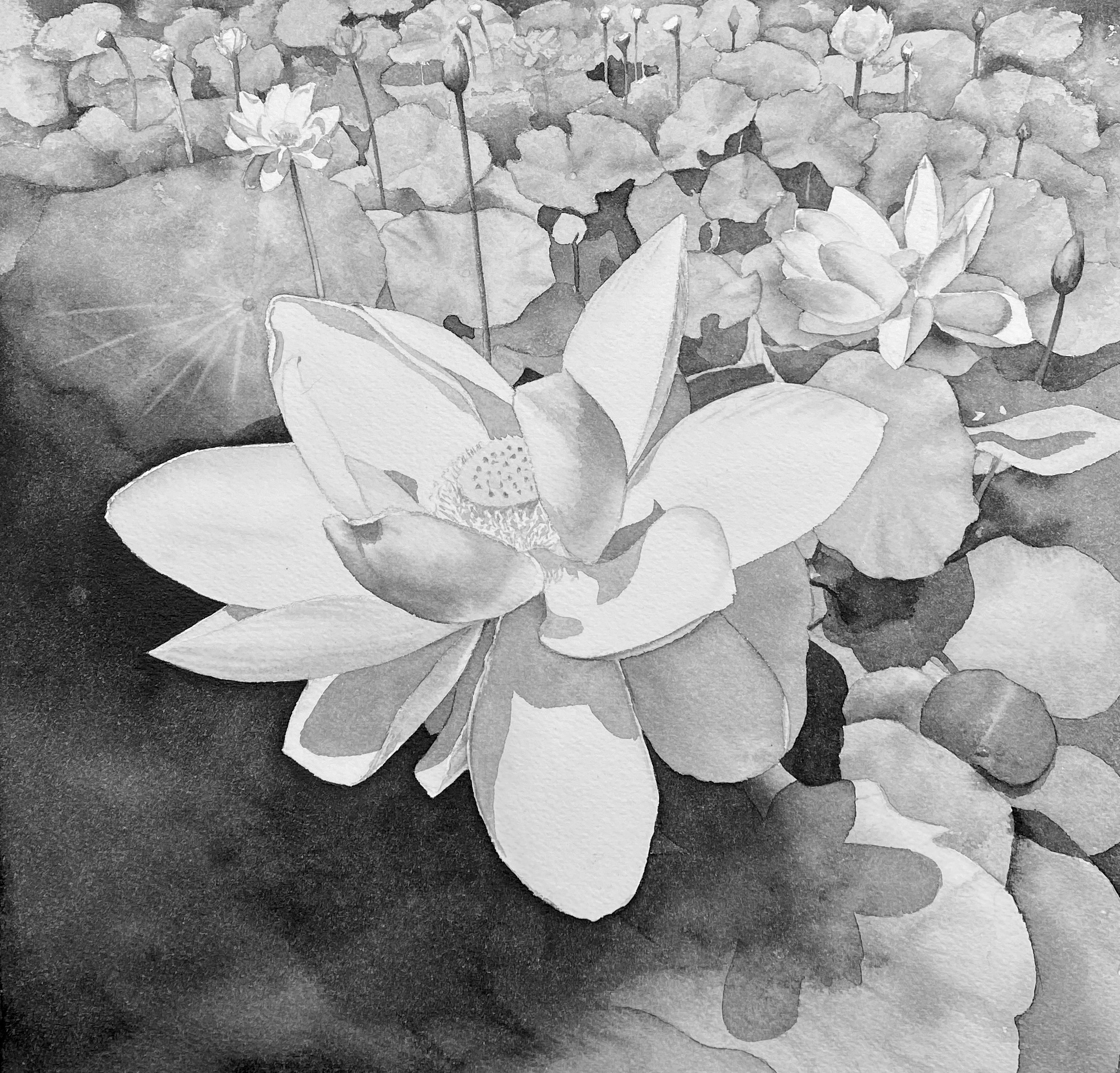
The tonal flower study also shows the use of Jane's Black Red/Green as a black and also non-granulating staining neutral grey. This is known as Grisaille painting. The subtle greys are lovely. They are non-granulating and fairly staining so can be glazed over with colour if desired.


Jane's Black (Blue/Orange) is useful when painting subjects that are based around earth colours or, of course, dominated by blue and orange. This colour was a little more complex. It was the perfect mixing pair when the more red version of Daniel Smith PO71 Transparent Pyrrol Orange was available. However that changed in 2019. To create this lovely black a little PR188 needed to be added to the mix. The range of beautiful browns and deep blues that this mixing pair can create is also inspiring, and it suits bird paintings with orange and blue feathers or rocks and stones.


The black created is also a neutral black, staining and non-granulating and not really distinguishable from Jane's Black R/G, but I would choose to use them differently so that the gradual adjustment to warm or cool the black can vary. This is warmed with an orange such as transparent pyrrol orange (or a red), and cooled with a blue - in this case Phthalo Blue Red Shade, though other blues will also work. I've used it in this painting of 'Stones, Kiama' though I could have used either black for this subject. 


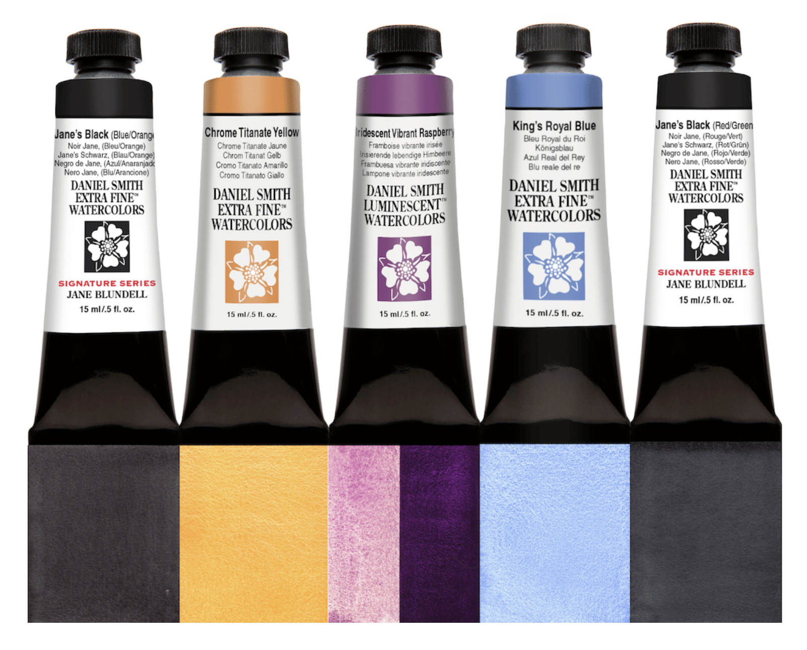
Jane's Black Red/Green and Jane's Black Blue/Orange have been released as signature colours by Daniel Smith, along with three other new colours - Chrome Titanate Yellow - a terrific Naples yellow option made with PBr24; Iridescent Vibrant Raspberry; and King's Royal blue.

New Daniel Smith colours - Jane's Black (Blue/Orange), Chrome Titanate Yellow, Iridescent Vibrant Raspberry
and King's Royal Blue.

I plan to continue to explore Jane's Black Yellow/Purple options looking for the perfect mixing pair to complete the series. It is more difficult to find a two-pigment mix, but it can be done with a three-pigment mix. It would be the perfect black for yellow and purple studies - irises, sunflowers etc.

Happy painting!

Tuesday, 21 February 2017

Quick demonstrations


I've been doing a lot of sorting lately, since moving into a smaller house. It's a good chance to assess what is useful and what is not and reduce the clutter. I thought, however, that some of the things that I don't need to keep may still be useful, so I took a few photographs before recycling these pages. 

When I am running workshops and doing demonstrations I do a number of pages of quick studies and sketches and though they are not carefully finished, they still show what I was explaining. I've selected sections of a few pages to share here.

Anyone familiar with my work will know about Jane's Grey. Here's a quick demo of the mix. I don't suggest for a moment that you don't also explore the gorgeous range of hues you can create mixing ultramarine and burnt sienna on the palette or on the paper, but as a pre-mix it's incredibly useful.
Jane's Grey mix.
Jane's Black mix.
Jane's Black is another favourite mix. Whereas Jane's Grey is a deep slightly blue-grey that is granulating and liftable, Jane's Black is non-granulating, staining and a neutral black - neither looking red nor green. It washes out to a neutral grey. It's very useful for passages of very dark hue - whales or penguins for example. 
My students are currently using it to create a tonal underpainting that will be glazed later with washes of colour.

Here is a demonstration about the various strengths I aim for in watercolour. Starting with a very thick (like cream) mix of watercolour - as shown on the bottom - I add a 'brushful' of water to create gradually lighter tones.
Determining tones in watercolour
The 'cream' mixture will move slowly on the palette, just as pouring cream would. The 'milk' mixture moves a little more freely, but is not as liquid as the 'coffee' mixture. Think of black coffee here - liquid but not at all thick. Then 'tea' is more diluted, just as black tea is usually transparent. The weak tea is exactly that - rather like coloured water.

As we are talking about watercolour, we must always add water - the paint straight from the tube needs to be diluted before use, otherwise it will do what is called 'bronzing' and dry with an ugly sheen.

This quick demonstration shows in a very immediate way what sorts of colour mixes can be obtained when working with a well-chosen warm and cool red, yellow and blue. Here I've used hansa yellow medium (which is strictly speaking a mid yellow, but works much the same as a lemon yellow) along with quinacridone gold (a warm but neutralised yellow); quinacridone rose and pyrrol scarlet as the cool and warm reds respectively and ultramarine and phthalo blue GS as the warm and cool blues. 

Mixing a warm and cool red, yellow and blue.
It's apparent that the greens vary greatly, more than the oranges, and that you can't make a purple with a cool blue and a warm red. 

I have many pages of this sort of sketch explanation. Do you want to see more? And if so, about any particular aspect of watercolour?

Thursday, 5 January 2017

All that Grey...

Happy New Year. It's been a busy time getting our new house sorted and I still haven't unpacked everything I need in my art room - including my scanner - so please excuse the less than ideal photos. I wanted to share some ideas with you...

Back in 1999, when we lived in New Jersey, USA, my then very young son looked out the window one very grey February day and said plaintively "I wish that the world was all the colours of the rainbow."

While those of us in the Southern Hemisphere are getting our massive dose of vitamin D and watching out for the extreme UV over the Summer, for many of you this time of the year is all about grey - grey skies, grey roads, grey trees, grey buildings. There are many ways to mix greys and I thought I'd share a few.

Jane's Grey mixture


I am sure you will be familiar with my favourite grey mix - Jane's Grey. I generally prefer to create two-pigment greys since they are simple and can easily be moved between the two colours without any loss of colour harmony.


A cool dusty grey


Burnt Sienna and Cerulean Chromium is another lovely grey - I use this for dusty greys especially in the sky in the northern hemisphere if the grey is rather cool. It is granulating and liftable so, like Jane's Grey, you can splash it around and lift out the clouds.


A cool staining grey


Pyrrol Scarlet and Phthalo blue GS will also make an interesting range of greys and near-blacks, including one I call 'Jane's Black R/B', but these will be non-granulating and staining. Where the above mixes can move between blues and browns, this will move between deep indigos and Indian red hues. It will also mix darker greys than the above. 


A variation of this is Transparent Pyrrol Orange mixed with Phthalo Blue RS - this pair makes a gorgeous deep black and a range of browns and burnt oranges that I call Jane's Black B/O and use for bird or stone studies where the common colours are browns/oranges and blues. (Note: DS Transparent Pyrrol Orange has changed from a red-orange to a mid orange so this is no longer a neutralising pair.)


A neutral staining grey is created when you 
dilute Jane's Black


Another favourite two-colour mix is Phthalo Green BS and Pyrrol Crimson - at full strength this makes Jane's Black (R/G) - a wonderful deep staining black. It can be watered down to a very soft range of greys. It can lean towards the deep maroons or deep greens so can be useful for foliage and landscape greys and blacks.


For a greater range of greys, try mixing three primaries together.


Granulating greys.

A lovely general purpose primary triad consists of ultramarine, Quinacridone Gold or another warm yellow (New Gamboge/Hansa Yellow Deep etc) and Pyrrol Crimson. This is a very useful triad in Australia as it mixes slightly dull greens, oranges and purples that suit our landscape. This Aussie Triad will also mix a rich black that can be watered down to a lovely granulating grey. As there are three pigments in the grey, it can also be moved to a more purplish grey, a more green-grey, a more brown-grey or of course more blue, more yellow or more red. That adds complexity in mixing but is fun to explore.


A versatile range of greys.

If you start with a cool triad - phthalo blue GS, Hansa yellow light (or medium as a pirmary yellow) and Quinacridone Rose - you can also mix a gorgeous rich and staining black. Watered down, this will make a range of soft greys that can be adjusted warmer or cooler as you prefer.


Warm greys


A rather classical triad of a warm red, a yellow and ultramarine will also make a rich black, and watered down the greys will be granulating. They will tend to be warmer greys too.


Brown-greys


Phthalo blue, Quinacridone gold and pyrrol scarlet make another deep black but the greys tend to be difficult to neutralise if you add the yellow - alone the scarlet and blue make a rich neutral black as seen above.


My favourite granulating earth greys


One of my favourites is the grey made with Cerulean Chromium, an earth yellow such as Yellow Ochre and Indian Red. This will be a granulating grey and rather lovely to explore for snow.


Versatile granulating greys


Ultramarine,  Hansa Yellow medium and Quinacridone Rose is one of the most versatile primary triads - you can make pretty much any colour with this set. Mixed together they make a lovely rich black and a range of beautiful greys.


To make blacks and greys with any primary triad, I suggest making a mid orange first, then gradually add the blue. You could equally make a green and add the red or make a purple and add the yellow, but making the orange and adding the blue seems to be the most reliable method. And of course use very strong pigments with very little water to get a rich black.

You can read more about three-pigment greys on Liz Steel's blog - she uses three colours to make her premixed greys, including her new soft grey, which is a little like the earth grey above.

Enjoy your mixed greys and blacks :-)

Thursday, 22 October 2015

Custom watercolour mixes - a question of Greys

I have been adding a number of greys to the Painted Watercolour Swatches section of my website, which you can see here. I noticed how much the colour of 'Payne's Grey' varies between the different brands, ranging from a warmer blue-grey to a cooler blue-grey to a more neutral grey. Pretty much all have black in the mix, which makes it a convenience colour that doesn't interest me as black pigments seem to dull a painting badly.

It got me wondering, though, who Payne was. A little Googling and Wikipedia had the answer - William Payne was an English watercolourist, and the colour was made for him. The term has been used in English since 1835. Interestingly though, the original version did not contain black. It contained iron blue (known as Prussian Blue, PB27), Yellow Ochre (PY43) and Crimson Lake, which as far as I can find is a fugitive carmine pigment PR23. I don't have any PR23 to look at but I thought I'd mix some Yellow Ochre, Prussian blue and a Permanent Alizarin together and see what I could get. (All watercolours Daniel Smith unless otherwise noted.)

Traditional Payne's Grey mix of pigments - yellow ochre, Prussian blue and a crimson.

It makes some interesting greys. With more Prussian blue it turns into a cool dark blue-grey, similar to the commercial black and blue mixes available. The interesting thing is the way the yellow ochre and crimson pop up in blooms. I made these mixes using tube paint mixed in a pan to get it really strong, to have plenty to play with. Yellow ochre, Prussian Blue and Permanent Crimson actually make a rather interesting old-fashioned looking triad to paint with.

Since I don't use Prussian blue in my palette, I thought I'd experiment with some other colours. I switched to Ultramarine PB29 and PV19 Alizarin Crimson Quinacridone - a single pigment crimson from Da Vinci - and tested that trio in a strong wash. Two granulating colours made it too dull. 
     
Next I tried the same yellow ochre and crimson with Phthalo Blue GS - another cool transparent blue, like Prussian blue. I think this may be fairly authentic - I can see this being a useful mixed grey.                                  
I switched to Indanthrone Blue to try making a warmer grey. I like this - rather like my Jane's Grey - so not necessary to create.  
Exploring Payne's Grey variations

Then I tried both transparent blues with Quinacridone Gold instead of Yellow Ochre. This makes almost a black, that could be warmer or cooler depending on the amount of blue added, and which one is used. Interesting to explore, perhaps also with Quinacridone Rose, but not mixtures I feel I need. Though why do all of the commercial mixes contain blacks instead of these wonderful colours?

Next I come to Davy's Grey - another grey named after an Englishman, Henry Davy. It was a mix of powdered slate, iron oxide and carbon black. The commercial versions are quite different, though interestingly QoR make an Ardoise grey using PBk19 which was in the original watercolour for Davy. Winsor & Newton use a white, a green and a black pigment today. It's not a colour I have ever seen a use for.

So then I thought about Neutral Tint - another grey that has been around since the 18th century. It was designed to be used in mixing to darken colours without changing their hue. Today most also contain a black pigment, with a couple of exceptions such as Neutral Tint by M.Graham, which is PG7 + PV19, Schmincke Neutral Grey, which is PR255 + PB60 + P062,  and Old Holland has a 4 pigment mix of PB15:2 + PV19 +PR259 + PBr7!

Bruce MacEvoy of Handprint fame mentions his 'synthetic black' recipe with uses PB60+PB25+PG7 in roughly the ratio 8:6:1. I have Indanthrone Blue and Phthalo Green in my palette, but the only available PBr25 I could find are DS Permanent Brown and W&N limited edition Indian Red Deep - both transparent reddish brown watercolours. I mixed them as suggested and created a rich and rather lovely RGB black. [Update - Mission Gold also have a PBr25 Red Brown, though I haven't tried it.]

However you can easily make a rich transparent black with just Phthalo Green and Pyrrol Crimson, which I premix to make 'Jane's Black (R/G)'. This is a fantastic mixed black that can easily be adjusted to a deep green or a deep maroon when painting and is perfect for floral subjects - especially red flowers.

Mixing blacks and greys - MacEvoy's Synthetic Black, Jane's Black R/G, Jane's Black B/O,
Jane's Black R/B and Jane's Grey.

You can also mix Phthalo Blue RS with Transparent Pyrrol Orange to make my other favourite custom black 'Jane's Black (B/O)'. (2019 Update - Transparent Pyrrol Orange has changed to more of a mid-orange rather than the red-orange I originally used for this mixed black.)

Phthalo Blue Green Shade will make another black with Pyrrol Scarlet, Jane's Black R/B. It could be useful in landscapes where prussian blue and indigo blue hues are also needed.

And then of course there is Jane's Grey that I premix that works as a neutral tint, without the addition of a black pigment. The other advantage of this pair is that the grey is liftable. Many mixed greys are staining. 2018 update - available in the Daniel Smith Ultimate Mixing Set in a half pan. 2019 update - now available in a tube as a signature colour from Daniel Smith (affiliate link to Jacksonsart.com)

There are two single pigment darks that interest me - DS Lunar Black, the fantastic granulation creates wonderful effects, and DS Graphite Grey. This is like painting with liquid pencil - it even has a slight sheen. Really interesting to use.

It is easy to mix a number of greys and blacks with regular palette colours but mixing them from the tube paints and allowing them to dry in the palette does speed up the painting process and enable you to get good darks fast. I'd still rather mix them myself than buy the commercial versions currently available. What about you?

Update - here are some extra swatches of the colours shown above and discussed in comments below. Notice that DS Burnt Sienna PBr7 is slightly more orange than the DS permanent Brown PBr25 or W&N Indian Red Deep PBr25. W&N Burnt Sienna PR101 is much more of a burnt orange hue. Brown Madder W&N or DS Quinacridone Burnt Scarlet are made with PR206 - another transparent earth red option. There is also the option of PR179 Perylene Maroon is another interesting transparent neutralised red but it varies hugely by manufacturer. I have shown the more burnt scarlet version by W&N. In Daniel Smith is is far more of a maroon and in Daler Rowney it is a deep crimson.


Many more interesting red and brown watercolour samples can be found on my website in the Painted Watercolour Swatches section. They are arrange by colour first, then by pigment.