Wednesday, 25 March 2020

I created a blog post about a few of the Daler Rowney colours here in 2018, but now have swatches of most of the colours due to the generosity of another of my readers, Kamal. Just a few more to complete...

The English company Daler Rowney is not as well known as Winsor & Newton, but it is another high quality watercolour brand. The dried watercolour dots rewet with ease and most colours painted out beautifully. Once again, I've added a couple of photos (rather than scans) of the oranges and reds to better show the colours. Scans of the rest of the colours are fairly accurate.

Some pigments have changed so I'll note that in the comments and captions below. 


Nickel Titanate Yellow is never a strong colour - it's a very weak pigment - but it is a granulating yellow. Lemon Yellow, Cadmium Yellow and Bismuth Yellow are all lovely cool yellows, with PY3 being the most transparent option.


Daler Rowney Watercolour - Titanium White, Chinese White (now called Zinc White and made with PW4 and PW6), 
Nickel Titanate Yellow, Lemon Yellow, Cadmium Yellow Pale. 

Permanent Yellow is a lovely bright mid yellow option.


Daler Rowney Watercolour - Bismuth Yellow, Permanent Yellow, Aureolin (not shown), Cadmium Yellow, 
Cadmium Yellow (Hue) (not shown). 

These scans look a little brighter in real life. I just love the PY153 pigment found in Gamboge Hue and Indian Yellow, however the new stock of Indian Yellow is now made with PY83.


Daler Rowney Watercolour - Cadmium Yellow Deep, Cadmium Yellow Deep Hue, Gamboge Hue, 
Indian Yellow (now made with PY83), Naples Yellow. 

The photo of these swatches is better than the scan but they still look a little dull compared with the originals. Warm Orange looks more red on my screen than in reality. though it certainly leans towards red.


Daler Rowney Watercolour - Cadmium Orange, Cadmium Orange Hue, Warm Orange, Permanent Red, 
Cadmium Red Pale (not shown) 

These swatches all look more red in my screen. They are all quite similar, with the Vermilion (Hue) being my favourite pigment for a warm red option. Cadmium Red (Hue) is now made with PR254 and PY74, as is Cadmium Red (Hue). Quinacridone Red is the classic coral colour of this pigment.


Daler Rowney Watercolour - Cadmium Red Pale (Hue) (now made with PR254 and PY74), Vermilion (Hue), 
Cadmium Red, Cadmium Red (Hue) (now made with PR254 and PY74), Quinacridone Red. 

Perylene Red is a really rich and less 'dull' version of this pigment than most.


Daler Rowney Watercolour - Cadmium Red Deep (not shown), Cadmium Red Deep (Hue) (not shown) 
(now made with PR264 and Pr255), Carmine, Alizarin Crimson, Perylene Red. 

Permanent Rose looks a bit more magenta on my screen - it is the classic rose colour.


Daler Rowney Watercolour - Alizarin Crimson (Hue), Permanent Rose, Quinacridone Magenta, 
Permanent Magenta, Cobalt Magenta. 

This is a really nice version of Ultramarine Violet, which can be quite weak. I am not a fan of Prussian Blue. This one wouldn't brush out nicely.


Daler Rowney Watercolour - Ultramarine Violet, Permanent Mauve, Indanthrene Blue (not shown), 
Prussian Blue, Indigo. 

Phthalo Blue GS is a basic cool mixing blue. Cobalt Turquoise (Green Shade) is a lovely 'extra' colour in a palette.


Daler Rowney Watercolour - Phthalo blue (Red Shade), Phthalo Blue (Green Shade), Cobalt Blue, 
Cobalt Turquoise (Green Shade), Manganese Blue Hue. 


Daler Rowney Watercolour - Cobalt Blue Deep, Ceoruleum, French Ultramarine, Permanent Blue, 
Cobalt Turquoise (Red Shade). 

Viridian is now viridian Hue and is made from PB36 and PG7, which means it will have different characteristics. PG18 is granulating and very liftable.


Daler Rowney Watercolour - Transparent Turquoise, Cobalt Green Deep, Phthalo Turquoise (not shown), 
Viridian (now Viridian Hue made with PB36 and PG7), Phthalo Green. 


Daler Rowney Watercolour - Hooker's Green Dark, Terre Verte Hue, Sap Green, Oxide of Chromium Green, 
Hooker's Green Light. 


Daler Rowney Watercolour - Vivid Green (not shown), Olive Green (not shown), Green Gold, 
Yellow Ochre, Raw Sienna. 

I like the various PR101 red-browns, but not the Burnt Sienna so much.


Daler Rowney Watercolour - Burnt Sienna, Light Red, Venetian Red, Indian Red, Transparent Red Brown. 


Daler Rowney Watercolour - Perylene Maroon (not shown), Mars Violet, Burnt Umber, Vandyke Brown (Hue), Raw Umber. 


Daler Rowney Watercolour - Warm Sepia, Payne's Grey, Neutral Tint, Ivory Black (not shown), Lamp Black. 


Happy painting!

Tuesday, 24 March 2020

Marie's Masters Watercolours

While I have known about Marie's Chinese Watercolours for many years (they have a hundred year history) I wasn't aware until recently that there was also a Masters range. Thanks to one of my kind readers and workshop students Garnet, here they are.

They are made in Shanghai, China.

The naming is not completely consistent. The Cadmium hues are labelled as such but the Cobalt, Vermilion, Viridian and many of the earth hues are not.

I painted these from dried dot samples from tube colours. Apparently they shrink quite a bit as they dry. Mostly they re-wet well though some were a little more difficult to get a strong wash. There are some excellent pigments and some great colours in the set, but also some less interesting mixes. There are 43 colours, excluding iridescent and interference colours.

The stars represent lightfast ratings where I am guessing 4 is the best. The letters A, B or C refer to the series where I am assumed A is the most expensive. I did not find a website to check. Tubes are 9ml and are very affordable - find them in Australia here for only AU$4.35 per tube regardless of series.

As usual, the oranges and crimsons are hard to scan accurately so I've taken photos of some swatches and will note colour differences below.


These yellows look fairly close to the originals. The Cadmium Orange (Hue) is actually just a little more yellow than it looks on my screen.
Marie's Masters Watercolours - Lemon Yellow, Cadmium Yellow Light (Hue), Cadmium Yellow (Hue), Gamboge (Hue), Cadmium Orange (Hue)

I had to take a photograph to try to replicate these colours. Most are pretty close but the Crimson is just a bit more 'crimson-looking' than it appears here.
Marie's Masters Watercolours - Transparent Red, Crimson, Prose Permanent Crimson, Permanent Rose.

This is another photograph and is also better than the scan but the colours are a little brighter than they look here. The pigment used in Cadmium Red (Hue) is my favourite for a lovely warm red.
Marie's Masters Watercolours - Vermilion Red, Cadmium Red Pale (Hue), Cadmium Red Hue), Cadmium Red Deep (Hue).


The colours in this scan are fairly close - only the Alizarin Crimson (should be called a hue, as it is not made with PR83) looks a little less crimson in this image.
Marie's Masters Watercolours - Alizarin Crimson, Purple Lake, Purple Red, Brilliant Purple, Ultramarine.

Cobalt blue should be called a hue since it doesn't contain PB28. Prussian Blue was difficult to activate.
Marie's Masters Watercolours - Cobalt Blue, Sky Blue, Phthalo Blue Green Shade, Prussian Blue.

Viridian should also be called a hue, or be called Phthalo Green Blue Shade, which is what it is.
Marie's Masters Watercolours - Peacock Blue, Viridian, Phthalo Green, Emerald Green.

Yellow Ochre was quite lovely to paint out.
Marie's Masters Watercolours - Sap Green, Hooker's Green Light, Hooker's Green Dark, Yellow Ochre, Raw Sienna.

Burnt Sienna, like many of the earth colours, should be called a hue - it doesn't contain PBr7 at all. Deep Umber and Light red were very nice to paint out.
Marie's Masters Watercolours - Burnt Sienna, Raw Umber, Burnt Umber, Deep Umber, Light Red.

I love Indian Red, though it can be overpowering. This version was nice and rich, but easily controlled. While I am not a big pan of greys made with black pigments, the Payne's Grey was a nice version as it uses ultramarine rather than phthalo blue so is not as cold as Payne's Grey often can be.
Marie's Masters Watercolours - Indian Red, Vandyke Brown, Payne's Gray, Indigo.

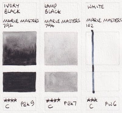
I couldn't get the Lamp Black any darker than this but perhaps it is stronger from the tube.
Marie's Masters Watercolours - Ivory Black, Lamp Black, White.

I wish everyone all the best of health in these challenging and difficult times. Like so many, I have cancelled my trips, classes and workshops for the foreseeable future and will be working from home. I plan to get a lot done on my online classes and set up video classes for my regular students. I am also thinking of setting up a Q&A sessions once a week via Facebook, Instagram, Zoom or other - suggestions welcome.

kind regards.
Jane