Pages

Sunday, 28 September 2014

National Coffee Day

43 Beans. Pen and watercolour in Stillman
and Birn Alpha sketchbook.


Apparently 29th September is National Coffee Day in the US. As a bit of a coffee fan (!) I thought I'd do a quick sketch of my latte today before I finished drinking it :-)


Coffee doesn't have the same traditions as tea. I did this sketch while having a traditional cuppa with a friend last month. The ritual of heating the pot and spooning in the leaf tea is rather lovely and soothing. However tea keeps me awake!

And here is a little sketch I did on a plane from a flight magazine some time ago showing coffee berries. So gorgeous!

Wednesday, 24 September 2014

A Question of Hues - Jane's Gold

I recently found an old pan of Winsor and Newton genuine Quinacridone Gold watercolour. PO49. (I had already stocked up on old supplies of the W&N acrylic version :-) Needless to say I snatched it up as I was curious to see how their version compared with the Daniel Smith colour I know and love. Daniel Smith bought up the last supplies of this pigment many years ago and are the only ones still making the genuine version. On the screen they look very alike, though in real life the DS is a little warmer. It is interesting to note that a number of the DS colours that used to have PO49 are now using PO48 or other pigments.


What I have always tried to understand is why Winsor & Newton make such a complex and ugly hue of this colour. They use PY150 - a lovely slightly acid transparent yellow that is an excellent base colour, and is available in W&N as Transparent Yellow or M.Graham and Daniel Smith as Nickel Azo Yellow; PR206 a burnt red, available in W&N as Brown Mader, Daniel Smith as Quinacridone Burnt Scarlet and Daler Rowney as Transparent Red Brown; and PV19 - a rose to violet pigment. W&N Quin Gold (hue) ends up being a very dirty colour, with too much violet-red though once again that is difficult to see on the screen. If they simply mixed the PY150 with their own Burnt Sienna PR101 they would have a cleaner colour that exactly matches genuine Quinacridone Gold. Other companies make the hue with PY150 + PO48 or other variations. Once again, the simplest solution is the best? Anyway, my quin gold hue - Jane's Gold - is PY150 (DS Nickel Azo Yellow) + PR101 (W&N Burnt Sienna) :-)

So how much of each? Making Jane's Gold :-)

 I have used with a half pan and added a decent blob of Nickel Azo Yellow PY150, but left room to mix. Then a much smaller blob of W&N Burnt Sienna PR101. It really depends on the brands you are using how much you need. I mixed these thoroughly with a very fine quill (or use a metal skewer of needle) and came up with a colour that is still too yellow.


 Here is the first mix - not enough PR101

So I added another small blob using the tip of a palette knife - you can see the small blob in the corner of the palette
 The second mix is warmer, but not deep enough and still too much yellow in a wash.

So I added the third small blob amount again, stirred it well, and came out with a very close match, pictured on the left.

Here is my mix compared with the actual PO49 paint. I estimate it is 5 parts PY150:1 part PR101, but the different brands will be different thicknesses so there is no magic formula.
Here is my testing page. You can see Quin gold mixed with Ultramarine on the top left, Jane's gold with Ultramarine below it. It could still have a little more PR101 but is very close. The thing about making your own custom mixes is you can decide exactly what warmth to take it to.

Other good Quin gold hue mixes are PY150 + PO48, PY129 + PBr7 and even PY97 as a base yellow colour.
And here are the pigments in their pure form.

Happy custom mixing :-)


To see my Jane's Grey custom mix, click here
For Jane's Black and other custom mixes click here
For more custom mixes (Jane's golden Earth, Jane's Sienna and Jane's Earth Rose) click here.

Thursday, 18 September 2014

Working with pen

I have been working on my on-line watercolour course, adding the painted watercolour swatches to my website and making up dozens of watercolour palettes lately so it has been nice to take a couple of breaks (between all the rain we've had) and do some sketching. With limited time, I drew in pen first. I like to use a fountain pen (Sailor, Lamy or Pilot Falcon) with waterproof ink (De Atramentis Document Black or Archive).

I am very much a pencil first artist - I like to do a pencil layout, then start with pen if I am using it, or watercolour, but that takes more time and ends up being more precise than I wanted. Working directly with pen takes out the setup steps and forces you to work more quickly and arguably more loosely. You end up with a black line drawing, with or without cross-hatching or shading. Adding watercolour becomes a little like filling in the colouring books of childhood. The decisions have already been made. The lines are all there - you just fill in the colour. With a degree of stylisation already in play due to the black lines, a lesser degree of 'realism' is required so adding the colour is much faster.

Neil's garden over a glass of wine in large Canson All Media sketch book.
This is very much an unplanned 'sketch' rather than a finished painting, which was what I set out do do. But does working in pen automatically make a drawing look sketch-like? I spent another hour or so in my own garden, drawing the strelitzias we planted quite some years ago. Having drawn the foreground plant in pen, I chose to brush in the background shapes directly with watercolour without any drawing at all. Once again it is very 'sketchy', but loose and relaxed.

My garden - quick sketch in large Canson media spiral sketchbook.
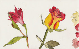
I was given some lovely flowers yesterday so spent an hour or so doing another quick sketch. Pen first, once again, then quick washes of watercolour. Taking more time over the drawing and less over the painting is really a reverse from my usual more botanical style where lines are hidden or merged under the watercolour washes.

A bouquet sketch. Right hand side of the page
A5 Moleskine watercolour notebook

Flowers in detail (left hand side of spread)
A5 Moleskine watercolour notebook


Then I decided to add some closer studies to the opposite page in the Moleskine sketchbook. I started these in pencil but wanted the 'freedom' of pen lines so switched to my fountain pen.

I don't know if I will try to do a 'finished painting' by drawing straight in with pen, but for sketching I am enjoying the freedom of black lines :-)


Sunday, 14 September 2014

Next lightfast test results - 19 months

My watercolour lightfast tests on the outside
of a north-facing glass window.
I painted a number of watercolour swatches in January 2013, cut them in half, and placed half on the inside of a north-facing window for two months. I checked the samples and noted any changes. Then I put the exposed sections in plastic sleeves and stuck them to the outside of a north facing window, and scanned them in October after a total of seven months. I reported on them here.


I returned them to their north facing window, which is a pretty harsh environment for watercolour, and have just scanned them. Note I am in Sydney, Australia, so that is the same as a south-facing window in the Northern Hemisphere, though Australian sun is very harsh. The biggest changes happened during the first seven months. Not much further change has occurred.


Sheet 1
The first row is all fine except Aureolin, PY40, which should not be used as a watercolour. Notice the light wash is now creamy and not yellow at all. The mass-tone is dull and greyed.
I couldn't see any change in the bottom row of the first sheet. All Daniel Smith unless marked otherwise.

Sheet 2
The top row of sheet 2 all look fine :-)
The bottom row of sheet 2 also looks fine. I expected a possible change in the last one, Permanent Red Deep, but can't see any. As before, Quinacridone Rose looks different on the screen but not in real life. This is true of Quinacridone Coral and Quinacridone Red as well, so I guess there is some change but not one we see, or a slight difference in the angle of the sample in the scanner.

Sheet 3
The top row of sheet 3 had Opera Rose as my control as I expected this to fade, just as I expected Aureolin to fade above and the crimsons to fade below. There is only the slightest loss of brightness in the original though so far. The scanned colour looks much more dull as the scanner doesn't pick up the florescent dye. Rhodonite has continued to dull, but so has the sample that was in a draw unexposed to light as apparently it is exposure to oxygen that changes the colour of rhodonite.
On the bottom row, all samples seem unchanged.

Sheet 4
All the samples on the top row seem unchanged.
On the bottom row, Prussian blue PB27 has faded, as noted after the 2 month and 7 month scans. Vivianite has lost some more of its 'blue' hue. Kingman Island Turquoise Genuine has faded slightly and Sleeping Beauty Turquoise Genuine has dulled down further to a grey-green from its original Turquoise. The other samples appear unchanged.

Sheet 5
I can see no changes in any of the samples in the first row. I am delighted that these wonderful Primatek green pigments have held up. 
In the bottom row, all samples are unchanged. :-)

Sheet 6
All of the top row samples seem unchanged including the Primateks Hemetite Burnt Scarlet, Garnet and Piemontite Genuine. I love all these granulating earthy colours :-)
The samples in the bottom row also appear unchanged. 

Sheet 7
In the top row, there is a possible slight yellowing of Manganese Blue PB33 Old Holland but it is very slight. Flesh Tint, Old Holland, with is a mix of a number of pigments, has really faded out.
On the bottom row, a number of faded colours are obvious. These are largely unknown Japanese pigments bought in Tokyo as a fun set for sketchbook work couple of years ago. At a guess, the yellow is genuine Gamboge, which has faded. The yellow has also faded out of what was a green on the left. The vermilion is fine but the alizarin crimson has also faded. The burnt sienna must have had some gamboge in it as well, which has faded leaving an indian red hue. On the right, the prussian hue has also faded. Thank goodness these were not finished paintings! These colours may be OK in a journal where they are protected from light, but should not be used in work to be framed.

Sheet 8
The final sheet has more traditional Chinese pigments that were bought as pellets many years ago in Hong Kong. On the bottom row you can see that once again the genuine gamboge yellow has faded badly, as has the indigo. The vermilion red has faded a bit, the alizarin crimson a lot and the bright red has faded in the lighter wash. Even the burnt sienna has faded in mass-tone. I don't know what these pigment numbers were but it is interesting to see what faded watercolour looks like! It is no fun in a finished painting.

 On the bottom row, the watercolours by Liquitex, Art Spectrum, Daler Rowney and Lefranc et B all appear unchanged.

It is a very valuable exercise to do a light-fast test of the colours you use as the manufacturer's labels may not always be accurate. Keep away from PY40, PR83 and, it seems, PB27.

September 2014 update: My other lightfast tests, using the colours I have chosen for my palette and other extras, were reported here. They have continued to hang inside my window and I see no changed in any of these colours. Whew!


Friday, 12 September 2014

Beginner workshop in Watercolours

Want to get started in watercolour?

Art Est is a very welcoming environment. This workshop will get you set up and painting with watercolour. Take along whatever you have or get set up from scratch. Click here for more information. See more palette options on my website here.


Thursday, 11 September 2014

Schmincke Gouache swatches

Here is my small range of Schmincke Horadam artist quality gouache. I don't use them often, but there are times a more opaque watercolour is needed and Schmincke gouache will rewet well so can be squeezed into a palette ready for use. They intermix with the watercolours too.

Schmincke Horadam Gouache Indian Yellow, Cadmium Yellow Hue, Vermillion, Carmine and Ultramarine Deep

Schmincke Horadam gouache Helio Blue, Helio Green Bluish, Burnt Sienna, Neutral Tint and Ivory Black.

Here is the link to the full range PDF

I like the fact that the neutral tint does not contain black. I do have black and white, though, for monochromatic sketches or working on a coloured or watercolour washed paper. I also have a yellow ochre. It's a good basic 12 colour gouache range. :-)

Fra Angelico blue pigment extraction - no wonder genuine lapis lazuli paint was expensive


This is quite a long video but well worth watching if you want to know why they needed to develop Ultramarine pigment :-)

Monday, 8 September 2014

Schmincke Watercolours

I have always had a soft spot for Schmincke. My first watercolour set was a Cotman travel set that I had for a very long time until my car was broken into :-(

My first artist quality watercolour set was 24 Schmincke half pans in a metal tin. The tin is rather battered these days after 30 years and many moves, and many of the paints will now have been replaced with more lightfast versions...

...so I was very pleased to have a bit of a play with some more recent Schmincke Horadam colours at an Art Society meeting thanks to Canson Australia, who distribute Arches paper, Schmincke, Princeton brushes, Pebeo and a number of other art products.

The bright primary colours are gorgeous and paint out really nicely. The product information is outstanding.

Note that four stars **** represents 7 on the Blue Wool Scale and 5 stars ***** represents the highest rating of 8. Three stars is a bit of a concern for watercolour as it only represents 5 & 6 on the Blue Wool scale - not perfect for watercolour though considered lightfast.

I have posted about Pure Yellow before as a lovely mid yellow option. Transparent orange features in a few recent posts too.

Schmincke Horadam watercolours. Lemon Yellow, Pure Yellow, Chrome Yellow Deep, Translucent Orange, Cadmium Red Light, Permanent Carmine, Ruby Red and Purple Magenta.
Permanent Carmine was new to me and is very interesting as it is a PV19 crimson that will, I think, be an excellent single pigment red option - cleaner than the Da Vinci PV19 version. More testing to follow. Purple Magenta is also fabulous for this and has featured in many previous Blog posts such as the 6 bright palette here and the gorgeous triad here and 4 colour bright palette here.

Schmincke Horadam watercolours. Ultramarine Finest, Prussian Blue, Phthalo Green, Permanent Olive Green, Yellow Ochre, English Venetian Red, Sepia Brown and Ivory Black.

I prefer earth colours made with the genuine earth pigments so I like Yellow Ochre made with PY43 rather than the synthetic PY42. Nor am I a fan of mixed pigment earth colours, or added black. I'd rather have the real pigment, so I won't be getting the Burnt Sienna (not tried but made with PR101 + PBk9 rather than PBr7) or Sepia Black in this range, but the bright colours are glorious.

I also prefer a deep dark Raw Umber too rather than this light version (left), though this can be good for flesh tones.

I'll do further tests with the English Venetian Red - it is a gorgeous flesh colour in diluted washes but I want to see whether it neutralises with a warm blue or a green-blue... I think if you are working with Schmincke, Burnt Umber PBr7 would be a nice option instead of Burnt Sienna for an earth burnt orange, though I haven't tried it yet....

Anyway I thought I'd post up the selection of Schmincke watercolours I've tried as they are lovely and often easier to find that the American brands, especially in Europe. I will do a post about some of the lovely Schmincke gouache too. I don't have many, but as they are one of only two brands that I know of that can be re-wet (the other being M.Graham) I really like them.

You can find all the watercolours I have tried, arranged where possible by pigment number for easy comparison, on my website here.

Monday, 1 September 2014

Watercolour Swatches on my website.

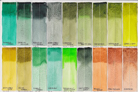
I have been making painted swatches of all the watercolours I have tried and am finally adding them to my website.

Each swatch is as pictured - with a coloured wash into wet paper, then a 'juicy' wash on dry paper below

You can see them here. Click on any swatch to see the full card. Hover to see the paint name, manufacturer and pigment number.

There are hundreds to go but I have made a start. If there is a colour you hope to see, let me know and I'll add it if I have it.

Paint samples to add are also welcome :-) Contact me here.