Sunday, 30 March 2014

More Colour wheels and templates - mixing opposites to create neutrals


Colour wheels take a bit of drawing up, especially as they get more complicated. I use a compass with an ink ruling pen adapter to draw them, and I like to leave a bit of space between each section so the paint doesn't run together.

Here are a couple you may like to choose from to try doing yourself. Each has 18 spaces around the outside. There is no need to have 18 tubes of paint to create these outside colours - it can be done with 8 or less placed carefully at the appropriate place around the circle and then mixed together in different ratios to create the secondary colours in between.

There is a link to the jpeg on my website here so you can download and print it onto watercolour paper and paint is with your own paints.

This one was painted using a small palette of two yellows (Quinacridone Gold and Hansa Yellow Medium), Phthalo Green, Two blues (Phthalo Blue GS and Ultramarine) and three reds (Quinacridone Rose, Pyrrol Crimson and Pyrrol Scarlet. The other reds, oranges, purples, green and turquoise around the outside were all painted with these pigments, then the opposite colours mixed together to create the tertiaries through the middle.

18 colour wheel with 8 mixed opposites creating dozens of neutrals.

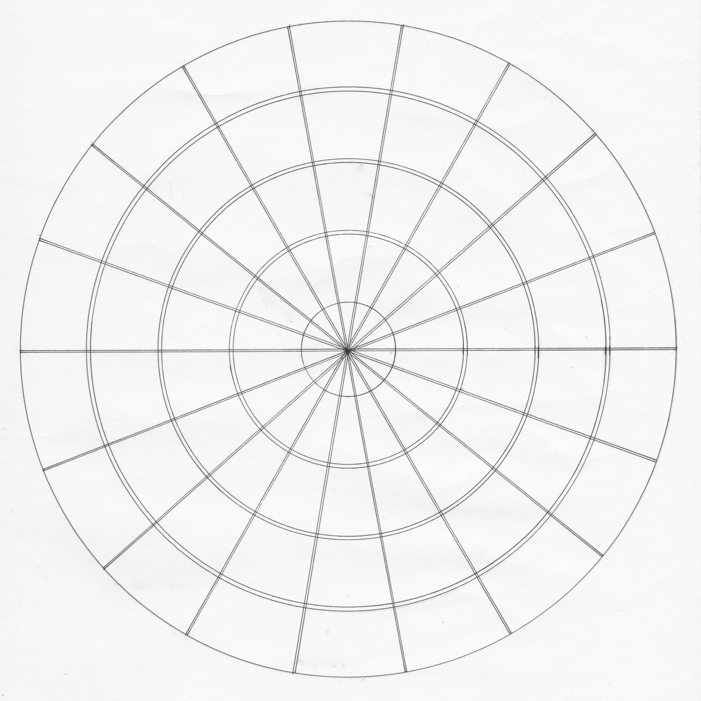
Template for 18 colour wheel with 8 mixed opposites
Here is the template for the wheel above - it has 18 colours around the outside and space to mix 8 tertiaries  through the middle section.

Click here to see more about it in my website, or here to link to a jpeg that you can print.


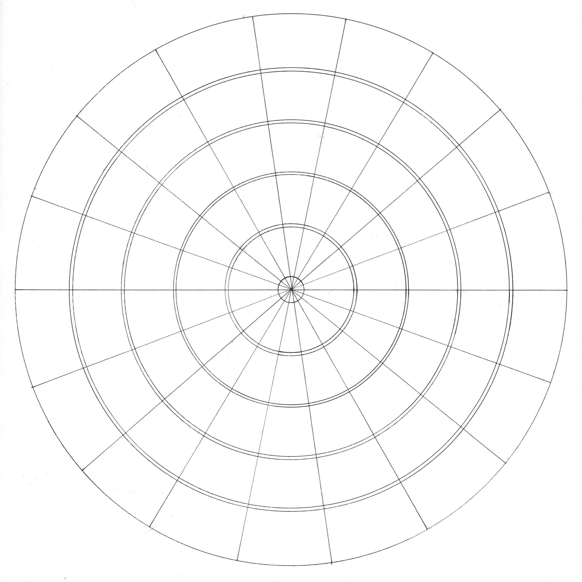
Template for 18 colour wheel with 6 mixed opposites


This version is a little simpler as it has less spaces for the opposite mixtures through the middle.

To print this one click here.

Saturday, 29 March 2014

Warm and Cool Primary colour wheel with template


Template for warm and cool red, yellow and blue
mixes wheel.

Colour wheels can take a bit of drawing up, but can be a great way to learn about your colours. This colour wheel allows you to see the green, purple and orange secondary colours you can make by mixing just 6 primary colours together in separate pairs.

You need a warm and a cool yellow, a warm and a cool blue and a warm and a cool red. It is helpful if your red is a rose or magenta or carmine colour that washes down to a pink so you can create lovely clear purples. It is also helpful if your yellows are not too close together - one a lemon or mid yellow, the other more on the orange side. Decide whether you are going to follow the key on the left as I have below or the key on the right and stick to it throughout.

Paint your primary colours into their labelled sections, then begin to mix each pair as they sit around the circle, adding a little of one colour to the other as you gradually move around the circle. For example, you may start at the top with Y1 and mix a little R2 and paint the next section, then add a little more R2 and paint the next section and so on. Or start my mixing an orange that sits equally between Y1 and R2 and paint that in the middle first.

Mine below is created using

  • Y1 Quinacridone Gold, Y2 Hansa Yellow Medium
  • R1 Pyrrol Scarlet, R2 Quinacridone Rose
  • B1Ultramarine Blue, B2 Phthalo Blue RS

Warm and Cool red yellow and blue colour wheel.
There is more information on this chart on my website here, or just click here to link to a jpeg so you can print this onto watercolour paper and have a go.

Once you've done this you will have a great understanding of how six of your colours mix in pairs. Notice how the warm red and cool blue don't make purples but interesting red earth hues - very useful! And the warm yellow and warm blue make the most dull but often realistic greens.

Next perhaps explore what would happen if you add a bit of red to you bright greens.


Thursday, 27 March 2014

Cockatoo Island Sketching

I went back to Cockatoo Island on Saturday to meet the Urban Sketchers after their two day workshop, and did a bit more sketching. I have no idea what these various machines do but they are so interesting to draw. I'll add the ones from January again as well as Saturday's March visit. All done in Moleskine watercolour notebooks, A5 size, with watercolour and some pen.
A rusted structure near the ferry. I love those granulating colours!
This was painted on Saturday. The sky behind us was very threatening but looking towards the bridge was fine.

An abandoned machine in one of the large warehouses.
This was painted on my first trip to the island in January. I love the minimal colour scheme of this view from inside the large warehouse.

Another machine of unknown purpose...
This machine is located out in the open near a bar. I painted this on Saturday and really enjoyed dripping in the rust colour.

The colours on the walls are amazing.
This was painted in January once again in the main warehouse. It was very hot that day so I painted inside. This is a wall with some ladder sections attached.

Another wall in one of the large warehouses.
Painted in January, this is typical of the many buildings that have seen many uses. Doors and windows are often closed in, covered up, repainted or changed in other ways.

I'll keep going back to this interesting place. I am doing some abstract oil paintings of some of the amazing locations.

Sunday, 2 March 2014

Travelling light with colour


There are so many ways you can carry some colour with you when you are out and about. Some are so light and slim you can have them with you all the time. Others are more suitable for a planned painting kit. I have a set up for both - a portable kit I keep in my handbag and a more comprehensive kit that I take with my on planned sketching trips or travels. Here are a few ideas...

Coloured pencils - you can have a few coloured pencils with you in a small pencil case. Make them watercolour pencils and take a water-brush and you increase your options immediately.

Use water-colour pencils to make a tiny colour palette in the back of a sketch book on on a separate sheet of watercolour paper. Carry a travel brush or water-brush with you and you can wash in some colour with ease.
  • A water-soluable pencil palette
    Just a touch of a brush gives you a wash of colour.


You can buy paper impregnated with colour from Peerless, who have been making their transparent watercolours since 1885! The sheets were originally designed to tint black and white photographs. They can be cut up and stuck onto a paper palette, into a sketch book or a piece of plastic film.
Peerless transparent watercolours made into a palette. The colour has been washed in behind, then plastic contact applied, then the dark Peerless colours pasted on top.


Daniel Smith make 'try it dot' kits with many of their colours. You could make your own tiny palette with a drop or two of your favourite tube watercolours on a sheet of watercolour paper or plastic. Allow to dry and slip it into your sketch book.


Daniel Smith Try It Dots.

Or you can buy or make up small a travel palette with your favourite water-colour paints. Buy the half pans or buy empty pans and fill them from your own tubes.
Pocket palette made in Italy from Arters.com.sg This little cutie is painted black on the outside and has a thumb-ring. It is set up with 12 colours but 15 can be squeezed in with a bit of a fiddle :-)
Tiny hinged tin with 6 full pans.
An Art Basics 12 colour half pan palette with 14 colours and a Pocket Palette with 14 colours, all set up and ready to go.   The one on the left has a thumb-ring on the back. 
Update 21/6/2014: The colours in both of these are my suggested 'ultimate mixing colours' - Buff titanium (Daniel Smith), Hansa Yellow Medium, Quinacridone Gold PO49 (Daniel Smith), Pyrrol Scarlet, Pyrrol Crimson, Quinacridone Rose, Ultramarine, Cerulean Chromium PB36, Phthalo Blue GS, Goethite (Daniel Smith), Burnt Sienna PBr7, Raw Umber PBr7 and Jane's Grey, which is a custom mix of Burnt Sienna and Ultramarine. You can see this palette painted out on my website here. Available for AU$65 plus shipping if you want one from me filled with artist quality colours.


Small tin with 12 half pans.


There are a number of other small portable palettes for watercolour, or you could have one hand-made in brass like this one - my travel palette, which is lacquered brass and has a thumb-ring on the other side


There are so many ways to get some colour into your sketches and still travel light. 
Happy sketching!


Monday, 24 February 2014

Pocket palette

This is a really clever idea from Maria Coryell-Martin. It is a pocket travel palette the size of a business card holder. It holds 14 colours in small, shallow metal pans that are held in by a magnet. Such a good idea! You can read about how it was developed on her website.
Pocket Palette from
http://expeditionaryart.com/shop/product/pocket-palette/

The palette open as it arrives.
There is no doubt it is small with a very flat mixing area, but if you are working with a water-brush on a small sketchbook, which was the intention for this palette, then it is amazing how little paint you actually need. I've just filled mine with my ultimate mixing palette that you can see here. I'll try it out and will be curious to see how long the paint will last.
Mine filled with my perfect beginner palette selections.

She sells extra pans and also larger square pans (that hold as much paint as a half pan) if you want to work with less colours. Her sample colours are lovely, and coming from Seattle it's not surprising that they are Daniel Smith. Hansa Yellow Medium, Quinacridone Gold, Pyrrol Red, Quinacridone Rose, Indanthrone Blue, Phthalo Blue RS and Phthalo Green BS.
Here is my new Pocket Palette all filled up, along with the optional larger pans, it's protective bag,
and the sample colours Maria recommends.
So if ever you are looking for a super-slim travel palette, this could be for you! I just think it is a lovely idea and worthy of sharing.


2018 update - the palette has been slightly re-designed with an edge to the mixing area and the extra tabs on the lower lip removed. It is also now in aluminium so is even lighter.

The little pans are now coated to resist rust and come in half sizes. I have shown one here made up with my Ultimate Mixing Set. The phthalo blue and phthalo green are in the new tiny pans. I think for urban sketching pyrrol scarlet and pyrrol crimson are better as tiny pans.

There are also super larger pans - the size of 4 normal ones - that some use as an extra mixing space.

If you want one in Australia let me know as I have them filled (AU$90) or empty (AU$40) plus shipping.


Friday, 21 February 2014

Books - to publish? to self publish? iBooks?

I have written a couple of posts about my black book collection, which is largely a private thing. I am working on another book for publication, so thought I'd write about that process.

I have a published children's book, 'Kayla & the Magical Tree', which I created with the author Steve Stine in 2003. Lots of fun. It was a small print run but they can still be found on Amazon in the new and used section. You can see it here. It was unusual in that we worked on it together and then took it to a publisher - a wonderful way to work but rare I understand.

I have another book that I self-published on Blurb.com on colour mixing. It is 100 pages of watercolour mixes, visual images only. The preview is here. I like the fact that I can up-date it if I do another chart so the print-to-order is not a a bad idea on this one. I also like the space for notes to be added by the buyer to make it their own.

I also have a gorgeous book of my artwork covering over 30 years of drawing, painting, etching, calligraphy and so on that my husband made on Apple  - a lovely coffee table book that many of my students, friends and family have bought, though it is not publicly available. It would be nice to publish it...

My published and self-published books.
Now I am working on another book which will be on watercolour. A mixture of colour mixing, painting exercises, examples, tips and tricks set out as a series of lessons to take a beginner from setting up a palette to planning and painting their own work. 

But how to publish this one? It would be fun to make it an iBook with links to videos of techniques. It would be useful for my students and on-line tutoring. But there are so many books out there!


The other book in the wings is on sketching and sketchbooks. I have had all my plein air paintings and drawings professionally photographed but that also needs some thinking......More on this soon...

Friday, 14 February 2014

Custom made watercolour mixes - 'Jane's Grey'.

If you have a favourite mix that you use a lot, it's very easy to premix it from tubes so it is available in your palette whenever you need it. You may want to do this with a favourite green mix or a purple. It certainly cuts down on the number of tubes of paint you need to manage and the time spent mixing colours on the run. It's especially useful if it is a dark colour.

Recipe for Jane's Grey

For a small amount, just squeeze your favourite mix of colours directly in your palette, or into a half or whole pan, in the proportions of tube paint you need, and mix them thoroughly. Test the mix on paper, making a strong and a weak wash to make sure it is what you like and allow to dry naturally. Make sure you label it. :-) Also make sure you don't put too much paint in initially, as you may need space to add more of one colour or the other.


For larger quantities I make up a tube of colour. I do this all the time with my 'Jane's Grey' mix. I squeeze out the required proportions of my two paint colours using a tube wringer to get out all the paint. It takes 4x15ml tubes! I squeeze it into an egg cup and then stir it very thoroughly. It is important to make it consistent all the way to the bottom. I then test the colour full strength and in a wash and adjust and remix if necessary. Then I pour it into the empty tube.

'Jane's Grey' all mixed up to a just cool grey.

Paint poured into the tube.
I use the wringer to seal the bottom of the tube, squeezing carefully to try to remove any air but not cause the paint to squeeze out the bottom. I crimp the tube and fold the bottom up and it's nice and safely sealed.

If there is paint left over in the egg cup, which there is likely to be, I add a few drops of distilled water, mix again and pour the more liquid version into my palettes to top up my colours, and make a few half or full pans ready for use. There is basically nothing wasted, and I save a lot of time while painting having my colour available as a nice rich slightly cool dark, without the black you get with many commercial greys.

I don't use any other additives with the Daniel Smith paints, but if you find your tube colours dry out too much you can add a drop or two of Glycerine or pure honey to keep the paint from cracking. M.Graham paints are famous for staying soft due to the honey added. Their range includes Neutral Tint which is made with Phthalo Green and Quinacridone Violet, so it doesn't contain black, but that is the only commercial version that I am aware of. 2014 update - QoR watercolours by Golden also have a Neutral Tint without black. It is made from the almost CYM colours Phthalo Blue, Quinacridone Magenta and Transparent Yellow Oxide.

You can mix a beautiful rich deep black with Phthalo Green (BS) and a deep crimson such as Pyrrol Crimson, Anthraquinoid Red or Permanent Alizarin too. That's another of my favourite darks to premix myself (Jane's Black 2!) Have a look at this mix towards the top here, labelled Phthalo Green and Anthraquinoid Red. Jane's Black 1 is also in one of the charts - Phthalo Blue RS + Transparent Pyrrol Orange.

I find that Neutral Tint and Payne's Grey commercial mixes containing black tend to dull the painting so I don't choose to use them, though many do and love the way they can be used to deepen other colours. Here is the Daniel Smith version of Neutral Tint. It's a lovely hue. Very like mine :-) but mine is made without black.

Maybe one day Daniel Smith will make my Jane's grey and save me the trouble!

Paint tube crimped shut with as little air in it as possible.
My labelled 60ml tube of Jane's Grey. It's a wonderful mix
that my students and I use all the time.


Update February 2019

Well I got my wish! Delighted to see this really useful colour now readily available :-)