Pages

Sunday, 18 June 2017

M.Graham Watercolours

M.Graham watercolours have been produced in Oregon for over 22 years. The M.Graham colour chart shows 70 colours and the website is very helpful.

It's been challenging testing the MG paints since they are made with a high honey content, making them tricky to for people to mail me samples. However people have been ingenious - as they have been with the Sennelier range - so I've tested all but 6 of them and they are beautiful paints, just best suited for studio use and/or less humid environments I think.

As always, I have tried to match the colours accurately. The first section are all single pigment cool to mid yellows. The first four are almost the same in hue though vary in characteristics. 

* I will be updating all the swatches during the first quarter of 2023.

M.Graham Watercolours - Hansa Yellow,  Cadmium Yellow Light Bismuth Vandate Yellow, Azo Yellow,
Hansa Yellow Deep.


The Gamboge swatch is fairly accurate but Indian Yellow is just a bit more orange than it looks here. PY110 is a perfect mid yellow-orange or orange-yellow colour.

M.Graham Watercolours - Cadmium Yellow (not shown), Cadmium Yellow Deep (not shown), Gamboge, Indian Yellow, Cadmium Orange (not shown).


These swatches are fairly accurate in hue.
M.Graham Watercolours - Azo Orange, Scarlet Pyrrol, Quinacridone Red, Cadmium Red Light, Naphthol Red.


These swatches are fairly accurate though the Permanent Alizarin Crimson has a slightly brown cast here that is not visible in reality. The Alizarin Crimson is the fugitive pigment PR83 so shouldn't be used in paintings that will be exposed to light. Permanent Alizarin is made from the lovely rich PR264 that mixes so well with PG7 to make blacks.
M.Graham Watercolours - Pyrrol Red, Cadmium Red, Maroon Perylene, Alizarin Crimson, Permanent Alizarin Crimson.


I find Quinacridone Rose to be a fabulous primary red as it mixes beautiful purples with almost any blue, but sometimes a more textural purple can be useful. the colours of these swatches are fairly accurate. Ultramarine Pink is now made with PV15.
M.Graham Watercolours - Cadmium Red Deep, Quinacridone Rose, Quinacridone Violet, Mineral Violet, 
Ultramarine Pink (original version).


The colour of these swatches if fairly accurate. PV14 and PV15 are lovely granulating pigments.
M.Graham Watercolours - Cobalt Violet, Ultramarine Violet Deep, Dioxazine Purple,
Ultramarine Violet (not shown), Ultramarine Blue.


The colours of these swatches are fairly accurate. Lots of beautiful single pigment blues. The Cerulean Blue Deep is really rich and a great partner to Ultramarine for a sketching palette.
M.Graham WatercoloursAnthraquinone Blue, Cobalt Blue, Phthalo Blue Red Shade, Cerulean Blue, Cerulean Blue Deep.


These swatches look slightly richer than in real life but are fairly accurate. 
M.Graham Watercolours - Prussian Blue, Phthalo Blue, Manganese Blue Hue, Cobalt Teal, Turquoise.


M.Graham Viridian is one of the stronger versions of this often weaker or more gentle pigment.
M.Graham Watercolours - Phthalo Green, Viridian (not shown), Phthalo Green Yellow Shade, Cobalt Green,
Permanent Green Light.


There is slightly more difference between Sap Green Permanent and Hooker's Green that shows here - the latter being less yellow. Either work as useful convenience foliage greens with the Sap being slightly brighter and the Hooker's being slightly more neutralised.
M.Graham Watercolours - Permanent Green Pale, Sap Green Permanent, Hooker's Green, Olive Green, Azo Green.

There are also plenty of lovely earth colours to choose from. I like the purity of the MG pigments -  PY43 for yellow ochre... Naples Yellow is now listed as a single pigment PBr24.
M.Graham Watercolours - , Yellow Ochre, Nickel Azo Yellow, Naples Yellow, Nickel Quinacridone Gold,
Transparent Yellow Iron Oxide.

...PBr7 for raw siena, PBr7 for Burnt Sienna. Transparent Red Oxide is now a single pigment PR101.
M.Graham Watercolours - , Raw Sienna, Transparent Orange Iron Oxide, Quinacridone Rust, Transparent Red Oxide (original version), Burnt Sienna.


Terra Rosa is a gorgeous version of an earth red and Raw and Burnt Umber make an excellent warm and cool dark brown pair. I really like the Neutral Tint being a mix of two bright coloured pigments (in this case Phthalo Green and Quinacridone Violet) rather than a black pigment - it keeps life in watercolour paintings and is difficult to find commercially (which is why I make my own).
M.Graham Watercolours - Terra Rosa, Burnt Umber, Raw Umber, Sepia, Ivory Black.


M.Graham Watercolours - Payne's Grey, Neutral Tint, Lamp Black (not shown), Chinese White,
Titanium White Opaque (not shown).

Those who use M.Graham watercolours speak very highly of them. Hopefully I'll be able to eventually try the whole lovely range, even though they don't suit my plein air style of painting.

For paint-outs of other brands of watercolour, use the search button :-)

Lukas watercolours

Lukas it a German company founded in 1862. They make watercolours in half and large 24ml tubes in their Aquarelle 1862 artist range. They also make studio gouache and various watercolour mediums. I have only tried a little over half of this range, but I've decided to post them up as they paint our very nicely. They are available from Jacksonsart (affiliate link) and Jerry's in the US. The colour chart can be found here and shows 70 colours. They no longer include the lovely Manganese blue shown below.


Lukas Watercolours - Chinese White (not shown), Opaque White (not shown), Lemon Yellow (Primary), 
Aureolin Hue, Cadmium Yellow Lemon. 


Lukas Watercolours - Cadmium Yellow Light (not shown), Permanent Yellow Light, Gamboge, 
Indian Yellow (not shown), Naples Yellow (not shown). 


Lukas Watercolours - Yellow Ochre Light, Permanent Yellow Deep, Cadmium Orange (not shown), 
Permanent Orange (not shown), Cadmium Red Light. 

I like PR255 as a warm red so would be interesting in trying the Cinnabar Red. Lukas Red and Madder Lake Deep are made from another favourite crimson pigment - PR264.

Lukas Watercolours - Cinnabar Red (not shown), Permanent Red, Cadmium Red Deep, Lukas Red (not shown), 
Madder Lake Deep (not shown). 

It is a shame they use PR176 in many of their hues - it drops the lightfast rating in every colour it is added to.

Lukas Watercolours - Carmine Red (not shown), Alizarin Crimson (not shown), Genuine Rose, 
Magenta (Primary), Ruby Red (not shown). 

I am guessing that Purple would look like Quinacridone Violet in many ranges. Dioxazine Violet is very similar across brands - a powerful mid purple.

Lukas Watercolours - Purple (not shown), Dioxazine Violet (not shown), Cobalt Violet, Indanthrone Blue, Ultramarine Blue. 


Lukas Watercolours - Ultrmarine Blue lIght, Cobalt Blue, Paris Blue (not shown), 
Prussian Blue (not shown), Cerulean Blue. 


Lukas Watercolours - Phthalo Blue, Permanent Blue, Cyan (Primary), Prussian Green (not shown), 
Manganese Blue (discontinued). 


Lukas Watercolours - Turquoise, Cobalt Turquoise, Indigo, Green Yellow, May Green (not shown). 


Lukas Watercolours - Cinnabar Green Light (not shown), Sap Green, Permanent Green Yellowish (not shown), 
Permanent Green, Cobalt Green (not shown). 


Lukas Watercolours - Phthalo Green, Viridian (not shown), Verona Green Earth, 
Oxide of Chromium, Olive Green. 


Lukas Watercolours - Raw Sienna, Gold Ochre (not shown), Naples Yellow Reddish, 
Burnt Sienna, English Red Light. 


Lukas Watercolours - English Red Deep (not shown), Caput Mortuum Deep (not shown), 
Burnt Green Earth, Burnt Umber (not shown), Van Dyck Brown (not shown). 


Lukas Watercolours - Raw Umber, Sepia (not shown), Ivory Black (not shown), Payne's Grey (not shown), 
Neutral Tint (not shown), Gold (not shown).


There are many more to add of course, which I will do as I come across them. I have read that Lukas is a very affordable watercolour range available in Germany, from Jacksonsart in the UK and from Jerry's in the US. Happy painting!

Wednesday, 7 June 2017

Australian Watercolour Institute 94th Annual Exhibition.

One of the themes I return to again and again is that of decay. Rusted metal, dried up plants, fallen leaves... I love to depict the beauty in the unexpected.

I guess one of the reasons they appeal is that those subjects have interesting colour and texture. Take a leaf, for example. So many species, so many colours. Some have darker veins, some lighter - lots of techniques can be used to depict them. There are also so many shades of green, with or without other colours. I often tell my students that if they were to just find and paint a new leaf every day they would learn so much about drawing, colour mixing and painting with watercolour.

'Fallen Colour' watercolour. A3 Arches medium paper.

The subject that I first started drawing about 35 years ago is the dried Strelitzia (Bird of Paradise). They appeal for the line-work that is to much fun to explore with a pen. These grew in my garden and remained on the plant until they had dried up completely. I've used Sailor 1911 EF and Pilot Falcon pens with De Atramentis Document ink to draw the lines, and watercolour in a range of earth pigments to paint them. 
'Past Their Prime'. Ink and Watercolour, Arches medium 300gsm watercolour paper A2.
Those on Instagram (janeblundellart) may have seen some photos and videos of both of these paintings in progress.

They'll be exhibited at the 94th Annual Australian Watercolour Institute exhibition at Juniper Hall, 250 Oxford Street, Paddington. Open from 10th June until the 9th July 2017. Closed Mondays.

Sennelier Watercolours - full range

The French brand Sennelier, which has been around since 1887, make a huge range of wonderful art materials - inks, pastels, all sorts of paints, dry pigments and so on. I've used their oil pastels for years but I've actually never bought any of their watercolours, so this post is created entirely with the help of others :-)

The watercolour range of 98 colours was reformulated a few years ago with a higher honey content. Quoted from the Sennelier website -

"Honey has many virtues: a symbol of light and sun, an emblem of poetry and science and has been used since Ancient times as a remedy for dry skin and to help heal wounds. This nectar is used in L'Aquarelle Sennelier not only as a preservative but as an additive giving incomparable brilliance and smoothness to the paint. Always striving for excellence, Sennelier has reworked its watercolor formula with increasing the amount of Honey in the paint to reinforce the longevity of the colors, their radiance and luminosity."

Unfortunately, honey also makes watercolours stay more runny, so this has made it far more challenging to get hold of samples as they don't necessarily dry enough to be posted through the mail - lots of inventive solutions including using blister packs from chewing gum, contact lenses and tablets have needed to be devised.

48 half pan set of
Sennelier L'Aquarelle Watercolours

However they are also available in 1/2 and full pan form, and one of my students lent me her 48 colour pan set so I was able to fill a number of gaps.

In March 2019 I was finally able to fill the rest of the gaps and show the full range :-) So here is the Sennelier professional or L'Aquarelle range. There is also a student range called La Petite.

The set uses the same palette as Rembrandt, but includes this useful overlay showing what each colour is.

The full colour chart can be seen here

There is a Sennelier shop in Paris, opposite the Louvre at 3 Quai Voltaire that is apparently a joy to visit - see some comments below. In Australia, they can be found at Adamstown Art

For those who use watercolours straight from the tube, Sennelier (and M.Graham) tube colours are a possible choice. For those who, like me, use them dried out in palettes, the pan versions are the best options with this range. They rewet beautifully.

Here is the 48 colour set open.


As always, I have tried to colour-match as well as possible but this is just a guide to the actual colours. Here is the key to the symbols
Nickel Yellow is often a very weak yellow but this version, while still relatively gentle, painted out nicely.
Sennelier L'Aquarelle professional Watercolours - Titanium White, Chinese White, Nickel Yellow,
Lemon Yellow, Cadmium Lemon Yellow.


 The Indian Yellow is warmer than it looks here.
Sennelier L'Aquarelle professional Watercolours -  Aureoline (not a recommended pigment),
Primary Yellow, Cadmium Yellow Light, Sennelier Yellow Light, Indian Yellow.


Sennelier L'Aquarelle professional Watercolours - Yellow Lake, Naples Yellow, Yellow Sophie,
Naples Yellow Deep, Cadmium Yellow Deep .

These warm yellows and oranges are lovely.
Sennelier L'Aquarelle professional Watercolours - Sennelier Yellow Deep, 
Cadmium Yellow Orange, Red Orange, Sennelier Orange, Chinese Orange.


There are some gorgeous bright warm reds in this range!
Sennelier L'Aquarelle professional Watercolours - French Vermilion, Scarlet Laquer, 
Rose Dore Madder Lake, Bright Red, Cadmium Red Light.


Rose Madder Lake is the colour usually referred to as Quinacridone Rose or Permanent Rose - a great cool red option, hough Carmine is the same pigment and also very pretty if you want a slightly more crimson option..
Sennelier L'Aquarelle professional Watercolours - Alizarin Crimson (this is a permanent hue),
Carmine, Crimson Lake, Quinacridone Red, Rose Madder Lake.


Sennelier L'Aquarelle professional Watercolours - Sennelier Red, Perylen Brown,
Cadmium Red Purple, Alizarin Crimson Lake (not recommended due to poor lightfast rating of this pigment), Venetian Red.


Sennelier L'Aquarelle professional Watercolours - Opera Rose, Cobalt Violet Light Hue,
Permanent Magenta, Cobalt Violet Deep Hue, Red Violet.


Sennelier L'Aquarelle professional Watercolours - Helios Purple, Blue Violet, Dioxazine Purple, Prussian Blue, Indigo.


The French Ultramarine Blue is a two pigment mix so go with the Ultramarine Deep if you want a single pigment Ultramarine.
Sennelier L'Aquarelle professional Watercolours - Blue Indanthrone, Cobalt Deep, Cobalt Blue, Ultramarine Deep, French Ultramarine Blue.


'Blue Sennelier' is often referred to as Phthalo Blue Red Shade. 
Sennelier L'Aquarelle professional Watercolours - Ultramarine Light, Blue Sennelier, 
Phthalo Blue, Cinereous Blue, Royal Blue 


  It's unusual to see a Cerulean made with PB28 rather than PB35 or PB36.
Sennelier L'Aquarelle professional Watercolours - Cerulean Blue, Cerulean Blue Red Shade,
Turquoise Green, Cobalt Green, Phthalo Turquoise.


There isn't a single pigment Phthalo Green PG7, but the mixed pigment Viridian is a rather nice option.
Sennelier L'Aquarelle professional Watercolours - Forest Green, Phthalo Green Deep, Viridian, Emerald Green, Sennelier Green.


The Olive green is a lovely premixed green. I don't know where the 'Brown Pink' gets it name...
Sennelier L'Aquarelle professional Watercolours - Olive Green, Phthalo Green LIght, Bright Yellow Green, Brown Green, Brown Pink.


The Sap Green is also a very usable foliage green mix. I love the granulation of the opaque Chromium Oxide Green - a colour I've never used but always rather like...
Sennelier L'Aquarelle professional Watercolours - Cadmium Green Light, Hooker's Green,
Chromium Oxide Green, Green Earth, Sap Green.


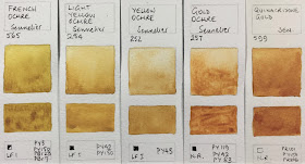
 The Quinacridone Gold is a nice version, even though a three pigment mix.
Sennelier L'Aquarelle professional Watercolours - French Ochre, Light Yellow Ochre,
Yellow Ochre, Gold Ochre, Quinacridone Gold.


 I'm always happy to see a PBr7 Burnt Sienna. Caput Mortuum is like a deep Indian Red.
Sennelier L'Aquarelle professional Watercolours - Burnt Sienna,
Permanent Alizarin Crimson Deep, Caput Mortuum, Payne's Grey, Neutral Tint.


Sennelier L'Aquarelle professional Watercolours - Van Cyck Brown, Warm Sepia, Raw Umber, Raw Sienna, Burnt Umber.


Sennelier L'Aquarelle professional Watercolours - Transparent Brown, Warm Grey, Sennelier Grey, Greenish Umber,
Light Grey


Sennelier L'Aquarelle professional Watercolours - Lamo Black, Ivory Black, Raw Sepia

I hope this will be useful for those looking at Sennelier - especially if you are in or near France :-)

A 12-colour sketching palette suggestion would be pans (rather than tubes) of Lemon Yellow (as a cool yellow) or Primary Yellow; Sennelier Yellow Deep or Quinacidone Gold as a warm yellow; Scarlet Laquer or Rose DOre Madder Lake (my favourite warm red pigment) or French Vermilion as a warm red; Rose Madder Lake or Carmine as a cool red; Ultramarine Deep as a warm blue; Cobalt Green as a cool blue - an unusual choice as it is a turquoise, but it is non-staining, or use Phthalo Blue; Sap Green or Olive Green as a convenient green; Yellow Ochre as an earth yellow; Burnt Sienna as an earth orange; Caput Mortuum as an earth red; then Warm Grey as a convenience light for marble and stone; Payne's Grey as a convenient dark.
Happy painting!